Introduction: a ‘wayward genius’
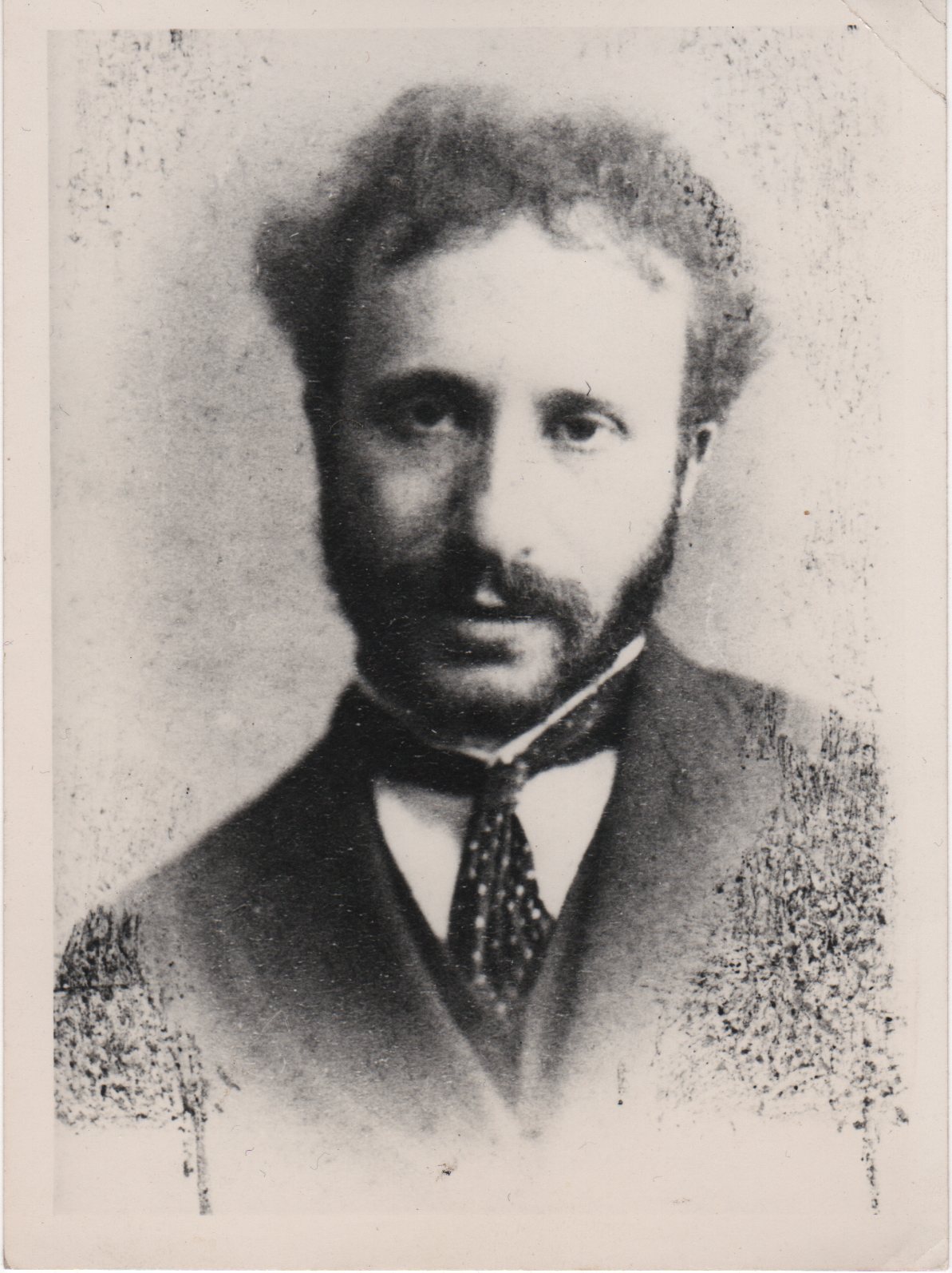
Simeon Solomon. Daguerreotype by Frederick Hollyer, circa 1866. Reproduced with permission of Dr Carolyn Conroy'.
Simeon Solomon is in many ways a problematic artist. To a large extent, his achievements have been eclipsed by the circumstances of his tragic life. Some modern commentators have endowed him with the status of a gay icon, a martyr to the cause who suffered for his sexuality in an intolerant age; while others have viewed him as an advocate for a Jewish minority. In either case, Solomon becomes a sort of emblematic figure whose perilous lifestyle has a sort of heroic allure. Percy Bate described him in 1905 as a ‘wayward genius’ (p.64), and in a recent article in Out he is described as altogether ‘too wild for England’, possessed by ‘agony and ecstasy’ and animated by the pleasures of his ‘vagabond life’ (Collard, pp. 67–70).
Promoting a notion of the painter as bohemian and iconoclast, such hyperbole is a romantic distortion, replacing sober assessment with the anachronism of hindsight. Of course there is no doubt that Solomon suffered for his sexuality: he was fined in 1873 for ‘attempted buggery’, and went to prison in Paris for the same offence. It is also possible that he was the recipient of negative treatment at the hands of the anti-Semitic, with even his erstwhile friend, Edward Burne-Jones, giving him the ‘pet name’ of ‘Jewjube’ (qtd. Collins, p.86). But there is no evidence of his consciously acting as a champion for gay or Jewish rights. His public disgrace ruined his career and his ‘martyrdom’, living in poverty on the streets or in the workhouse, selling matches from a tray or working as a pavement artist, was partly self-inflicted and far from a proud assertion of an alternative lifestyle in the manner of Oscar Wilde. Following his charges for indecency he was assisted by a variety of supporters, and might have re-entered the artistic mainstream; a broken man beleaguered by alcoholism, he was unable to regain his bearings and lived the rest of life in penury.
It is impossible know the psychology of his behaviour or the extent of his suffering. All that remains, of course, is the work. Recent scholarship has sought to rescue the art from the biography, to assess its qualities and to re-position it within the intricate nexus of styles and influences that operated in the middle of the nineteenth century. Colin Cruise (1996) and Robyn Asleson (1999) have focused on his drawing style and influences, and to a large extent his importance as a mid-Victorian member of the avant-garde, with connections to both Pre-Raphaelitism and Aesthetic neo-classicism, has been re-established.
These enquiries have identified many of the complexities of his paintings, although far less attention has been directed at his activity as an illustrator. Scholarship of Solomon’s drawings on wood is mainly divided between the usual cast of critics, with Reid (1928), Gleeson White (1897), Goldman (1996, 2004) and Cooke (2007, 2010, 2014) offering general assessments. These writers explore the artist’s contributions to The Leisure Hour and Once and Week, and there is a general consensus that Solomon’s greatest work is in the form of his twenty Biblical illustrations for the Dalziels’ Bible Gallery (1880–81), which only appeared in their entirety in 1894. Yet criticism exploring this key work is surprisingly slight: Carolyn Conroy’s essay (2005) establishes the main facts, and other readings have been provided by Cooke (2007, 2014). Complex and interesting, Solomon’s involvement with his project deserves closer attention. The following sections provide an overview of the artist’s contributions to the Bible Gallery, focusing on his styles and themes, and the contexts in which he operated.
Contexts: The Dalziels and Solomon’s Illustrations:
What eventually became known as the Bible Gallery was planned by the Dalziels in 1862–4 as an illustrated Old Testament, a luxurious, album-sized book for an elite audience with engravings taken from the original blocks rather than electrotypes. It was intended to build on the growing interest in pictorial Bibles, exploiting the taste for vivid representations in black and white. The Dalziels had already engraved J.E. Millais’s Parables of Our Lord, which had originally appeared in Good Words in 1863, and their Bible was intended as a natural extension of this sort of elaborate picture-making. The rapid expansion of the market for wood-engraving seemed to know no bounds, and the Dalziels were always looking for business opportunities in the context of stiff competition. Yet the projected Bible was far more than a financial venture. Money was important, but there were other motivations too.

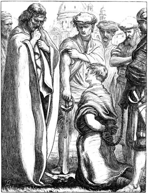

Three Bible illustrations by Everett Millais. Left: The Hidden Treasure. Middle: The Unmerciful Servant. Right: The Prodigal Son. [Click on images to enlarge them.]
In an age when the term ‘high class’ was a selling point, the Dalziels envisioned their Bible as an assertion of their excellence as engravers and particularly as a visual statement that would demonstrate their status as patrons of the arts who commissioned the work in the manner of Renaissance patrons. Reluctant to accept their role as technicians and resentful of the way in which they were treated by some illustrators as class inferiors – notably Fred Sandys and Dante Rossetti – they intended their Bible to affirm their genteel credentials, positioning them in an aestheticized market-place as the purveyors of the finest of fine books. The Dalziels were also anxious, it seems, to publish a book with a patriotic resonance. Julius Schnorr von Carolslfeld’s Bible Pictures had been published in London in 1855, and the Brothers wanted to produce a British equivalent to outstrip the excellence of the German wood-engravings and insist on British superiority in a period when Germanic illustration, exemplified by the work of von Carolsfeld and Alfred Rethel, was an influential import. A final consideration was their knowledge of the scriptures. As stern evangelicals, they knew the holy texts and wanted to express their faith. Much of their work involved pious images for the devout Alexander Strahan in Good Words, and the Bible seemed a logical extension of the tone and range of this sort of material. The book was developed, in short, as a curious mix of piety, professional pride, nationalistic competiveness and (of course) the desire to generate profits (Cooke, ‘Notable Books’, pp. 61–63).


Left: Death on the Barricades by Alfred Rethel. Right: Christ at the Sea of Galilee by Julius Schnorr von Carolsfeld. [Click on images to enlarge them.]
The Dalziels’ trump card in the preparation of this elite issue was the commissioning of the best ‘draughtsmen on wood’, who were already practising their craft in gift books and illustrated periodicals. The line-up was impressive: Fred Sandys, Frederic Leighton, George Pinwell, Frederick Pickersgill, Ford Madox Brown, G.F. Watts and Edward Poynter were enlisted from the Brothers’ network, and others of a lesser rank, such as Arthur Murch and William Small, were also given opportunities. Each was tasked with several designs – although not all were completed – and the largest number was assigned to Solomon. Though a relative newcomer, Solomon was engaged to produce twenty designs on wood. Impressed by the artist’s early Biblical paintings, the Dalziels recognized his talent as an interpreter of Old Testament subjects; according to Conroy, the Dalziels were most engaged by The Mother of Moses (Delaware Art Museum, Wilmington) which was exhibited at the Royal Academy in 1860 and seemed a good qualification for a draughtsman at work on the pages of an illustrated Bible.

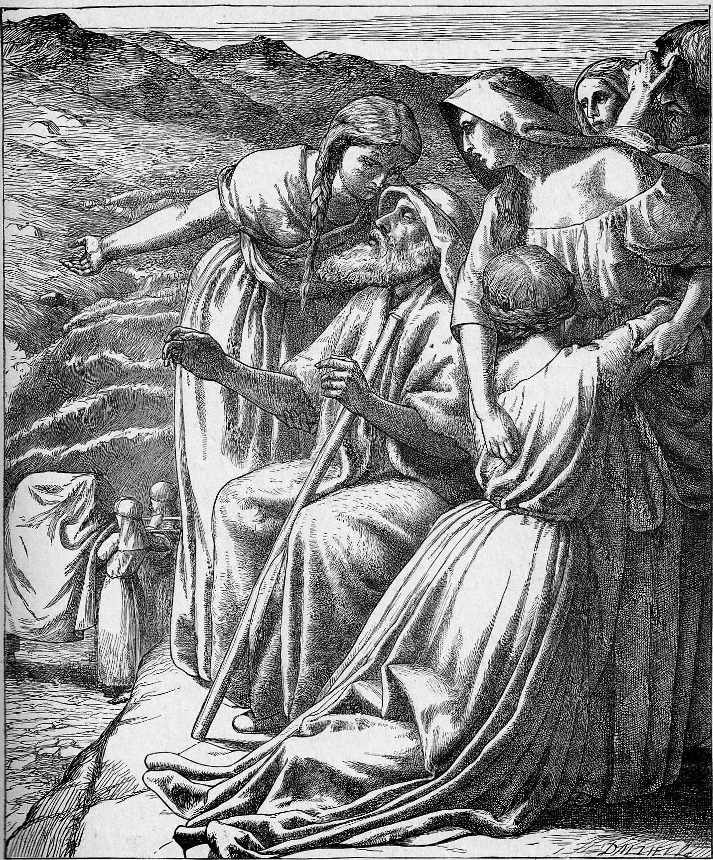
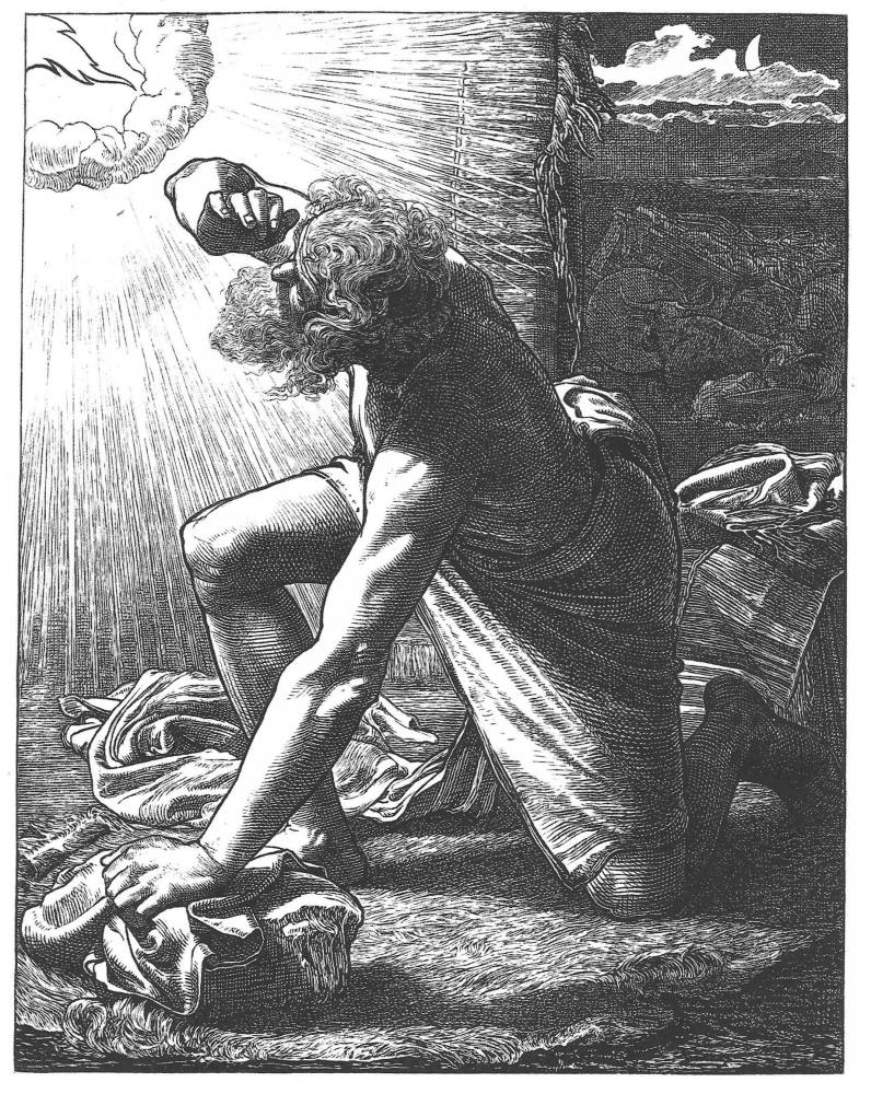
Left: Elijah and the Widow’s Son by Ford Madox Brown. Middle: The Passage of the Jordan by Frederick Richard Pickersgill. Right: Jacob hears the voice of the Lord by Frderick sandys.
All twenty of Solomon’s designs were drawn and engraved on wood, and most of the preparatory material, in the form of studies and blocks, survives (Tate Britain; Birmingham Museums and Art Gallery, U.K.). However, the book quickly ran into difficulties. Though Solomon completed his work, others procrastinated, failed to deliver, ignored the deadlines and were otherwise uncooperative; in the Dalziels’ own words in their Record, there were many ‘disappointments of help which we had confidently relied upon’, only to be forced to ‘hang fire’ (p.101). Millais, Sandys, Watts and several of the others delayed publication, and what had seemed straightforward was mired in uncertainty; indeed, the book was not to appear for almost twenty years from its inception. Post-dated to 1881 though finally issued in October of 1880, it was re-titled as the Dalziels’ Bible Gallery and sold at the exorbitant price of £5 and 5 shillings (£275 in modern sterling). Issued in limited editions of 1000 and a deluxe version of a 100 as well as a portfolio of loose sheets, it appeared without a text and with only some of the designs commissioned in the early sixties. Just six of Solomon’s were published and the others remained in the form of engraved blocks (Birmingham). Overpriced, unwieldy and impracticable in its vellum casing, the Gallery was condemned by many reviewers as an outdated piece of vanity, a book out of its time. Only 200 copies were sold and it quickly lapsed into obscurity; as Conroy observes, it ended up at a cut price in the catalogues of second hand dealers. This was a poor end for such an ambitious work, and a huge disappointment for the Dalziels, who described it as a ‘dead failure’ (p.256) and only recouped some of their costs by selling it as a remainder to Scribner’s of New York. A monumental fragment, it is now one of rarest books of the period, prized by modern collectors and sold for large sums.


Two of Solomon’s Bible illustrations. Left: Melchisedek blesses Abram. Right: Hosannah!. [Click on images to enlarge them.]
However, it was not until 1894 that the remaining Solomon blocks were published. All twenty of his designs were printed in Art Pictures from the Old Testament; issued by The Society for the Promotion of Christian Knowledge with commentaries aimed at children by Alex Foley, the book is poorly printed. The Bible Gallery designs were printed on India paper from the original blocks, but the images printed in Art Pictures are probably taken from electrotypes or from photographic transfers. Solomon’s illustrations appeared in another re-issue in 1900 and 1921, published by Edwin Dalton. Again, production is poor. Nevertheless, this version presents the range of Solomon’s work as he intended it to appear in 1863.
Solomon’s Designs: Style, Influences, and Idiom
Executed in 1862–3, when ‘Sixties’ illustration was emerging as the dominant style, Solomon’s designs are bound by the conventions of ‘poetic realism’ (Reid, p.2). Academic in manner but infused with a combination of deep feeling and psychological complexity, they recreate the painterly intensity that is also found in the illustrations of Fred Sandys, George Pinwell and A.B. Houghton.
As in the case of these fellow practitioners, Solomon’s illustrative imagery is in many ways a transfer from his paintings, recreating the Biblical figures, costumes, settings and accessories found in works such as David Dancing Before the Ark (1860, Private Collection) and Isaac Offered (1858, Private Collection). This transfer is sometimes quite literally a re-working of a painted image: for example, The Mother of Moses (1860, Delaware Art Museum, Wilmington) is re-presented in the Gallery as the Infant Moses (1863), while the watercolour Ruth, Naomi and the Child Obed (1860, Birmingham) becomes the illustration Naomi and the Child Obed (1863). Both engravings are recycled versions of these pre-existing designs which appear in reverse on the printed page, mirror-images in black and white of works in colour. By re-using these compositions Solomon exploited his back-catalogue as a means to furnish the publishers’ requirements in an efficient (and cost-effective) way, and without wasting energy on the creation of new designs.
Solomon was able, in any case, to draw on wide experience in representing scenes from the Old Testament. In the period from 1856–60 he was predominantly concerned with interpreting this material, and produced many images in watercolour and pencil which explore Biblical themes. Babylon Holding a Golden Cup (1859, Birmingham) and Eight Scenes from the Story of David and Jonathon (1856, Tate Britain) are typical examples of his reading of the holy texts, and he was able to apply his understandings of these types of composition to service the work commissioned by the Dalziels. The Dalziels were said to have employed Solomon on the basis of his painting The Mother of Moses (Delaware), but they may also have known that he was an expert interpreter of Biblical stories. Yet there are differences too. The early Biblical works are sometimes tentative in style, while the Dalziel engravings are clearly developments of the earlier compositions, and demonstrate a much greater fluency and dramatic impact than the drawings on paper. The Dalziel illustrations are generally an improvement on these works of the fifties, and the projected Bible was an opportunity for Solomon to focus and showcase his specialism in this type of imagery.

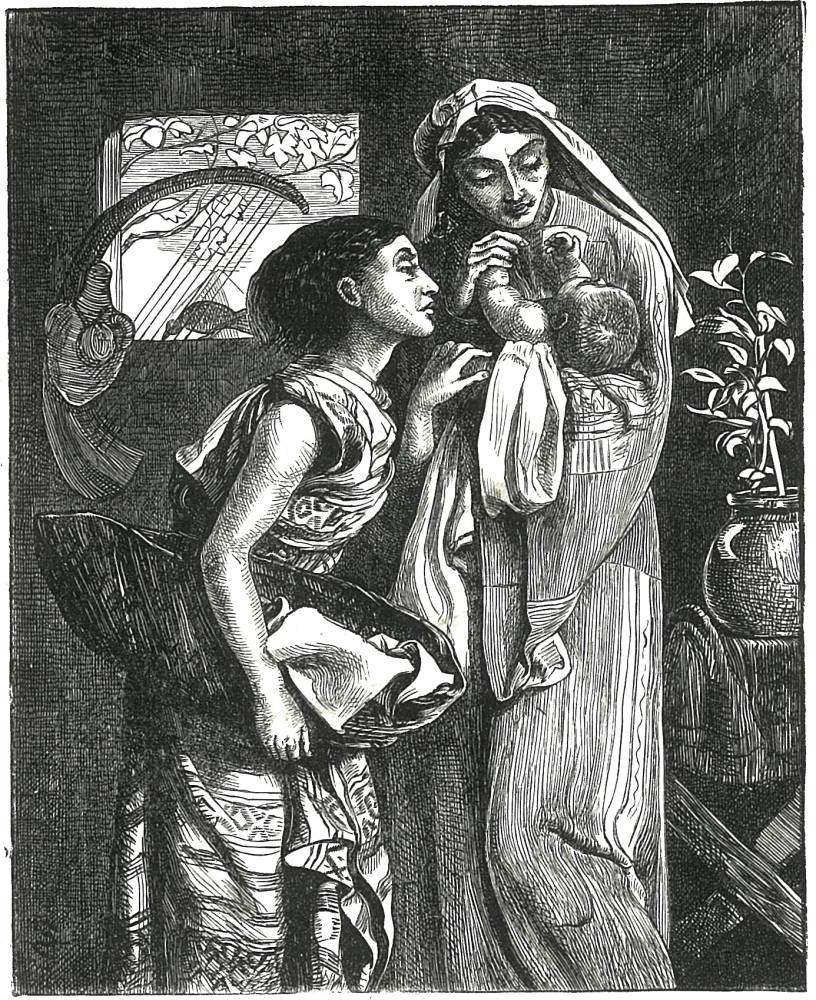
Two of Solomon’s Bible illustrations. Left: Naomi and the Child Obed. Right: The Infant Moses. [Click on images to enlarge them.]
Solomon’s twenty illustrations are efficient representations of the Biblical scenes, and they also represent a sophisticated manipulation and synthesis of competing styles. Working within the conventions of The Sixties, Solomon is usually classified as a Pre-Raphaelite illustrator (Suriano, pp. 237–47; Goldman, pp. 56–57), although he was equally influenced by neo-classicism of the sixties and was closely associated with the painter Albert Moore. In his illustrations for the Dalziels Solomon intermingles the two stylistic tendencies, creating a hybrid in which tensions are resolved in service of a particular notion of Aesthetic Beauty.
Solomon’s Biblical Illustrations: Pre-Raphaelitism
Solomon was a personal friend of Dante Rossetti and Edward Burne-Jones, and his work generally reflects the influence of what is sometimes called ‘Second stage’ or ‘Second phase’ Pre-Raphaelitism. The Rossettian vocabulary of idealized beauty, often in the form of androgynous portraits and figures, is a key constituent in Solomon’s illustrations, and so is the interest in emblematic detail, shallow perspective, psychological drama, inward expressions and shallow space (Collins, pp. 84–5). Solomon would have scrutinized this lexicon in Rossetti’s neo-medievalist paintings of the late fifties and almost certainly saw designs in which the older artist employed these devices in the interpretation of Biblical themes. For example, Rossetti’s Dante’s Vision of Rachel and Leah (1855, Tate Britain, London) presents a notion of ideal beauty which is replicated in many of Solomon’s designs. The still introspection and shallow space which characterize this design find many echoes in Solomon’s Bible illustrations: Rossetti creates an enclosed space of contemplation and feeling in which beautiful figures consider their situation and this is also Solomon’s approach, notably in Hagar and Ishmael (Art Pictures, p. 19), Abraham and Isaac (p. 21) and The Infant Moses (p.55).
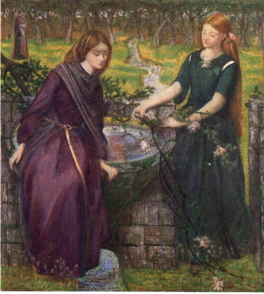
Rossetti’s Dante’s Vision of Rachel and Leah.
Goldman notes how Solomon had ‘a unique insight into Jewish spirituality’ (p.56), and his sensitivity to the inner life is largely expressed, as these comparisons suggest, in terms of the artist’s manipulation of Pre-Raphaelite style. If Rossetti and Burne-Jones discovered a poetic, spiritual reverie in the world of medievalism and an abstracted, dream-like classicism, then Solomon found a parallel territory in the lives of the ancients in the Old Testament. Solomon’s deployment of a Rossettian visual language enabled him to find a pictorial solution to the questions of representing a complex text, but it also had the advantage of casting his designs in a contemporary visual idiom which was accessible to the original audience. Though Pre-Raphaelitism was outmoded by the eighties when the (Bible Gallery was published (1880–81), Solomon’s designs cast their material in what was still a legible form.

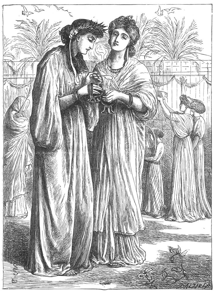

Left: Solomon's Mercy and Truth Met Together. Middle: Solomon's Jewish Women Burning Incense. Right: Rossetti's The Palace of Art (St Cecilia).
Some of Solomon’s designs are explicitly Rossettian, deploying signs that the Victorian readership would have understand as part of a series of conventions. One of these is androgyny, which is a key constituent of Pre-Raphaelite style. Androgynous figures, both men and women, feature throughout Rossetti’s paintings and illustrations, with men seeming effeminate and women seeming masculine, and the same is true of Solomon’s merging of the genders. Detractors infamously pointed to Solomon’s presentation of effeminate men as signs of a homoerotic perversion and accused him, in the words of Robert Buchanan’s scurrilous attack on ‘The Fleshly School of Poetry’, of producing ‘veritable monsters’ which were ‘unmanly’ in feeling (The Contemporary Magazine, 1871). But this connection is unsophisticated, based on the contemporary (and enduring) prejudice that gay men are necessarily effeminate and must therefore produce an effeminate art in which their ‘confusion’ is given voice. In fact, Solomon is as much concerned with gender indeterminacy as he is with a notion of masculinity. Following Rossetti’s lead, he fuses men and women to articulate a notion of perfect beauty; his own sexual orientation may have been a factor in this arrangement, but it is important to note that the heterosexual Rossetti was its inventor and that the Rossettian model was widely imitated by Burne-Jones, Fred Sandys, George Du Maurier and every other straight artist practising in a Pre-Raphaelite idiom. We can also say that while Solomon deployed a Rossettian language he stretched its expressive possibilities and the development of this theme is partly a matter of homage and partly an imaginative pursuing of its ultimate implications. These issues are pursued in detail in an essay by Colin Cruise.
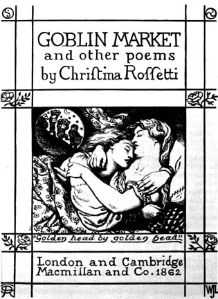
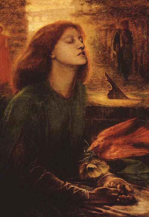
Two of Rossetti's mannish ‘stunners’ whose gender identity is elided and manifests itself in the form of an ambiguous beauty. Left: Goblin Market. Right: Rossetti's Beata Beatrix.
In the first instance, Rossetti’s impact on Solomon can be traced in the strict parallels between their imagery. There is a close relationship, for instance, between Solomon’s figure of ‘Righteousness’ in Mercy and Truth are Met Together (Art Pictures, p. 112) and Rossetti’s St Cecilia for the first illustration to Tennyson’s ‘Palace of Art’ in his celebrated (Moxon) edition of 1857 (Poems, p.113). Solomon’s beauty is clearly modelled on the Rossettian prototype, merging the signifiers of gender to create an ideal type. Cecilia’s cascading hair, the eroticized sign of femininity, is replicated in the swirling coiffeur of Righteousness, while the masculine signs in the form of the saint’s pronounced jaw-line and chin, are also included in Solomon’s portraiture. Other linkages can be made between the figures in Jewish Women Burning Incense (Art Pictures, p. 167) and many of Rossetti’s portraits of the early sixties, as well as his illustrations. The profile of the figure to the left is a typical example of Solomon’s masculinized type, and bears direct comparison with the profiles of the sisters in the pictorial title-page for Christina Rossetti’s Goblin Market (1862) and, in the treatment of the jaw-line, especially, Beata Beatrix (1862–64). Rossetti created this type, but Solomon makes a distinct contribution to the development of the mannish ‘stunner’ whose gender identity is elided and manifests itself in the form of an ambiguous beauty.


Solomon’s treatment of males conflates the signs of sexual identity and recreates Rossetti’s ambivalence. Left: Abraham and the Three Angels. Right: Hosannah!.
The same can be said of Solomon’s treatment of males, which again conflates the signs of sexual identity and recreates Rossetti’s ambivalence. The feminized faces of the men in Abraham and The Three Angels (Art Pictures, p. 15) generally recall the many portraits in Rossetti’s Mary Magdalene at the Door of Simon the Pharisee (1858, Fitzwilliam Museum, Cambridge, UK), where the characters are gender-indeterminate and only differentiated by the men’s possession of facial hair; and there are other connections between Solomon’s Hosannah! (Art Pictures, p.153) and the androgyny of sketches and drawings such as Dantis Amor (1860, Birmingham).

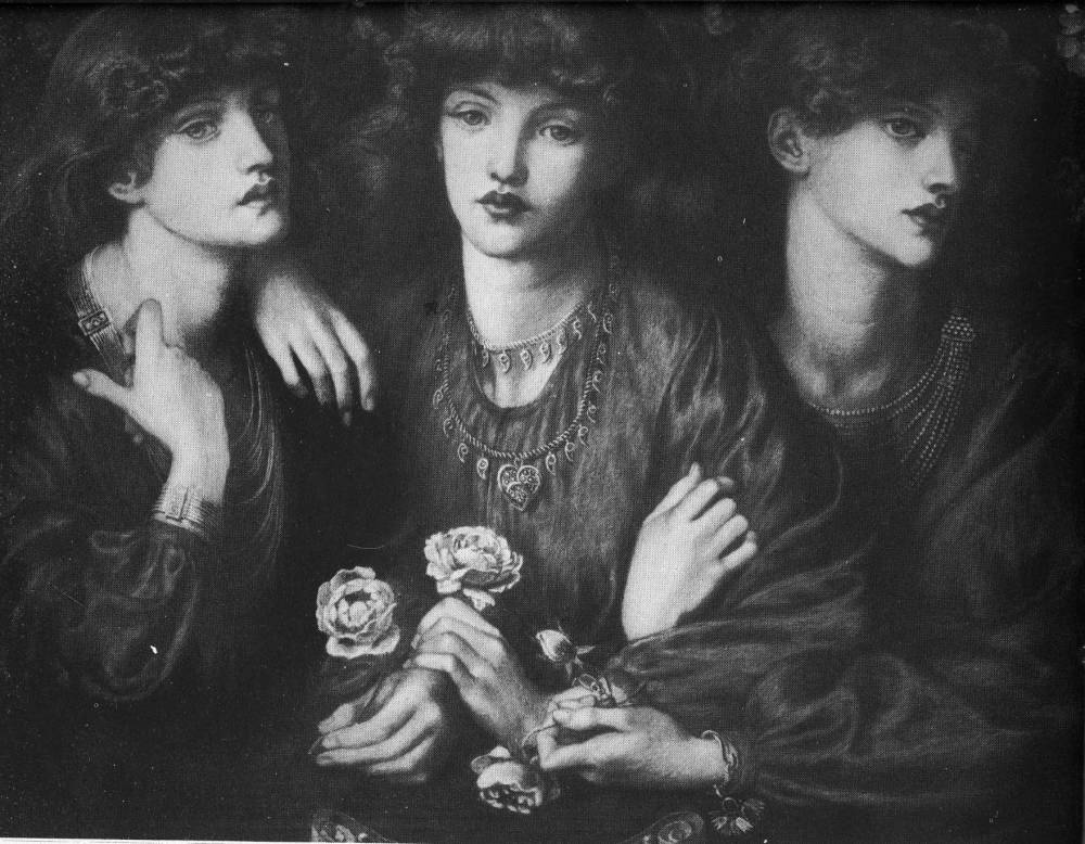
Left: Solomon's Shadrach, Meshach, and Abednego. Right: Rossetti's Rosa Triplex..
All of these designs were instrumental in the development of Solomon’s figure drawing, but it is also true to say that in several of the Gallery illustrations he extends the Rossettian formula, sometimes presenting images in which it impossible to tell which gender is being presented – so creating a true androgyne. In Hosannah!, Solomon takes the Rossettian influence to a logical conclusion, refiguring his mentor’s depiction of soulful women in enclosed spaces by showing a figure which is apparently sexless. Illustrating a scene from Chronicles, the subject is nominally a young man, endowed, as Alex Foley explains, with ‘a beautiful face’ (Art Pictures, p. 152); but others have identified the character as a ‘priestess’. Indeed, every element is poised between possibilities: the profiled face suggests both genders, the arms and hands are similarly configured and the figure is too contained in its robe to give any definite sense of its contours. The subject is both male and female and neither: a sexless formulation in which the effect is one of perfect beauty, a fusion of all that is perfect about both genders and re-figured as one. This does not reflect any sort of sexual confusion but a calculated attempt, it seems to me, to discover a material form for an abstract notion of aesthetic perfection. Working with a Rossettian grammar and deploying elements within a pre-existing code, Solomon finds a synthesis which is unmistakeably his own; though vilified by some of his contemporaries, this achievement was recognized by many Victorians and still represents the Solomon ‘brand’. In the florid words of Algernon Swinburne, the artist manages to naturalize the extraordinary, imagining an ideal race of refined beauties ‘in which the lineaments of women and of man seem blended as the lines of the sky and landscape melt in burning mist of heat and light’ (qtd. Bullen, p.192).

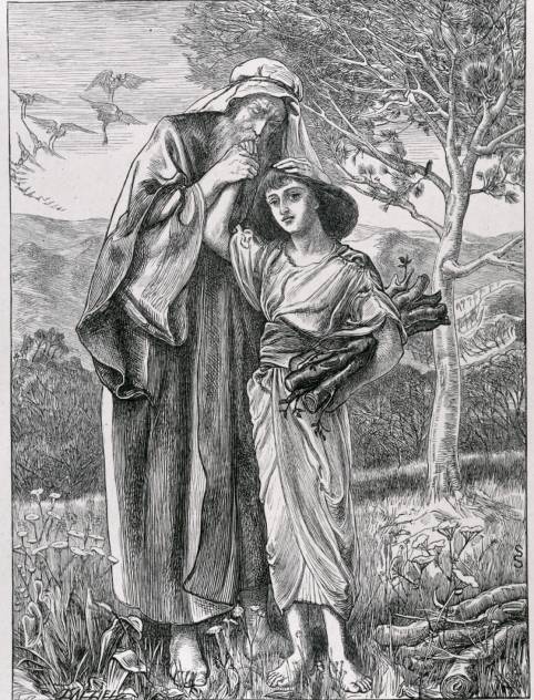
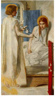
Left: Solomon's Mercy and Truth Met Together. Middle: Solomon's Abraham and Isaac. Right: Rossetti's Ecce Ancilla Domini (The Annunciation).
Solomon’s capacity to appropriate and re-work aspects of Rossetti’s imagery is an important point, contradicting detractors who have tended to view his art as purely imitative and lacking in originality. His distinctive voice lay in his ability to manipulate Rossettian style for his own purposes, and it is not impossible, in return, that he influenced the older artist. Though undocumented, Rossetti may have borrowed some of Solomon’s devices. The composition of Shadrach, Meshach, and Abednego (Art Pictures, p. 179), with three identical faces with one full face and the others in profile, could have been a source for Rossetti’s three-fold repetition in Rosa Triplex (1874) as well as finding an echo in The Beloved (1863, Tate Britain). Closer still is the relationship between Solomon’s illustration and Rossetti’s large oil painting, Astarte Syriaca (1877, Manchester City Art Gallery, UK). Rossetti’s canvas replicates the engraving’s design: as in Solomon’s composition, it consists of what is essentially the same person, repeated in full face and with profiles on either side. The positioning of the hands has been changed, but Rossetti recreates Solomon’s central device, which shows the main figure looking directly at the viewer as if making a sombre accusation.
The relationship between these images is telling, and may well be firm evidence of Solomon’s status within Rossetti’s circle. Though Shadrach was not published until 1894, Rossetti would have had opportunities to see the design when it was first cut and printed in proof form in the early sixties, consciously or unconsciously absorbing its lessons into his own practice.
This stylistic interplay is a central part of Solomon’s engagement with Pre-Raphaelite idealism, although he responds to other aspects of the discourse as well. If he absorbed Rossetti’s androgyny, then he also appropriates the type of emblematic details, which fuse the real and the symbolic, that feature throughout Pre-Raphaelite art. Some of these are obvious, part of a common parlance of Biblical imagery. In Mercy and Truth are Met Together (Art Pictures, p. 112), the figures are surrounded by doves and lilies, the tokens of peace and innocence. This combination features in Rossetti’s Ecce Ancilla Domini! (1850, Tate Britain), and Solomon deploys this vocabulary to create unambiguous effects; the dove holding a twig of olive makes the message transparent. Lilies and twigs of laurel feature in several other designs as signs of peace and poetic beauty, and these floral accessories signify within a dense surface of plants and flowers. As in Pre-Raphaelite art as a whole, Solomon incorporates a symbolic code which was probably accessible to all, reinforcing the idea of the legibility of God’s universe while stressing the sacramental nature of the material world.
At the same time, Solomon’s treatment of the natural world has a more personal dimension which goes beyond the use of floral codes and asserts a poetic reading of phenomenal reality. The flowers function as emblems, but Solomon emphasises the vitality of God’s creation by showing his plants, trees and flying as dynamic arabesques which seem to burst out of the frame. This symbolism is especially telling in Abraham and Isaac (Art Pictures, p.21), in which the natural setting comments upon the narrative. The plants springing up in the foreground suggest the youthfulness of Abraham’s intended sacrifice, and the boy’s vitality is further suggested in the curvaceous line of the tree in the background, which forms a visual rhyme with the outline of his figure. Both details intrude the natural order of life in opposition to the unnatural task which is demanded by God of Abraham: nature asserts the growth of new life, Abraham is instructed to cut it short. The chopped-up logs stress the point: an image of life curtailed. Solomon also comments on the vexatious nature of Abraham’s sacrifice by placing a ‘number of storks flying in the air’ seeking food for their young ones’ (Art Pictures, p.20) at the very moment that Abraham prepares to dispatch his son. What appear to be merely decorative or realistic accessories are presented as signs in counterpoint to the narrative, interrogating the horror of the forthcoming moment and, in so doing, stress the depth of Abraham’s unquestioning faith. Solomon’s relationship to Pre-Raphaelitism might thus be described as a complex interaction made up of borrowing, homage, appropriation and re-configuration. Recognizably working in this idiom, he still manages to assert his own artistic identity.
Solomon’s Illustrations and the Influence of Neo-Classicism
Solomon’s response to Pre-Raphaelitism was at its strongest in the period 1856–62, and in the sixties the influence of Rossetti was partly replaced by an interest in neo-classicism of the sort practised by Frederick Leighton and Albert Moore. Solomon’s paintings closely reflect this trend; typically showing languorous figures in ancient robes, surrounded by the attributes of classical myth and placed within the Arcadian landscapes of the Golden Age, they are clearly modelled on the airless, elegant designs of the neo-classicists. Prime examples of Solomon’s readings are In the Temple of Vesta (1862, Private Collection) and In the Temple of Venus (1865, Victoria & Albert Museum, London). These pictures are imbued with the ‘poetic’ stillness of Aesthetic classicism, and Solomon contributes to this discourse as he does to the language of Pre-Raphaelitism.
His Biblical illustrations can be read as part of this growing interest in the classical world, fusing the conventions of Pre-Raphaelitism with imagery of the Roman, Greek and mytholological, world. Reaching both forward and back at the same time, Solomon’s graphic style embraces both tendencies and represents an eclectic synthesis of the two.
Solomon’s Biblical figures are essentially classical: their costumes are generalized versions of ancient robes, and incorporate many of the motifs featuring in the paintings of Leighton and Moore. Jewish Women Burning Incense (Art Pictures, p. 167) has the poised stillness which characterizes Moore’s pictures of female figures and bears direct comparison with their linear designs and airless ambiance. The effect is contemplative, of time transfixed as it is focused in a moment of reverie, so creating an ideal world which though Jewish could easily be an idyllic version of Greece.

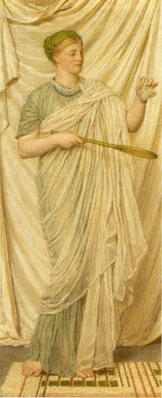

Left: Solomon's Mercy and Truth Met Together. Middle: Moore's Battledore. Right: Moore's Pomegranates.
Hosannah! (p.133) also has the inwardness of many of Moore’s compositions, recreating the emphasis on pattern, ornament and the harmonious arrangement of form that is so much a part of the Aesthetic notion of beauty; later turned into a painting, it bears comparison with Moore’s A Musician (1867, Asleson, p. 127). Another classical strand is detectable in Solomon’s organization of his group-designs as linear tableaux, with the figures moved to the foreground and the background closed-off by a wall or curtain. A device which features throughout the paintings of Leighton and Moore, this arrangement features in The First Offering of Aaron (Art Pictures, p.85), Offering the First Fruits of the Harvest (p.91), Jewish Women (p.167) and The Feast of the Tabernacles (p.128). Each of these brings the figures into sharp proximity with the viewer while eliding the background or reducing it to a decorative pattern.
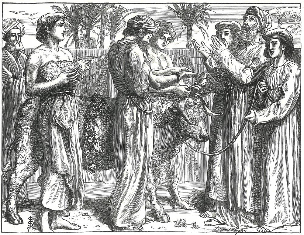
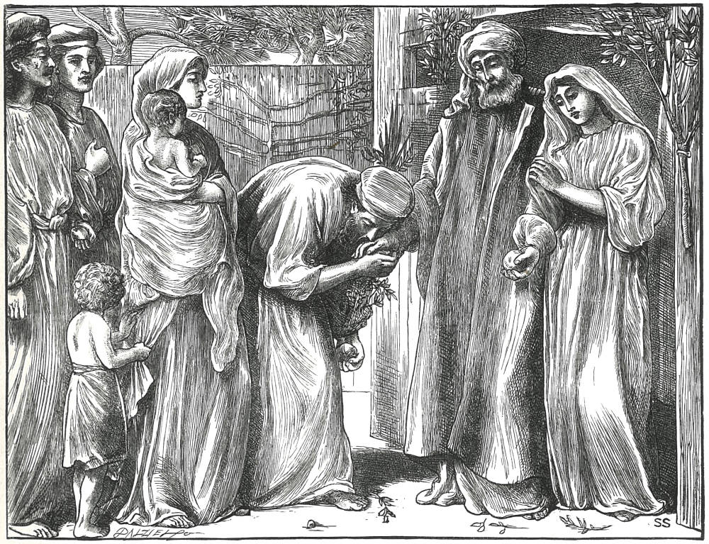

Three by Solomon. Left: The First Offering of Aaron. Middle: The Feast of the Tabernacles. Right: Offering the First Fruits of the Harvest.
Why, then, does Solomon use these neo-classical features? As in his manipulation of Pre-Raphaelitism, his strategies are complicated, but with a specific series of aims. In a general sense, Solomon deploys the vocabulary of classicism in order to provide his reader with a stable visual reference, enabling the contemporary audience to engage with the subjects by connecting them with a painterly language with which they were already familiar. This was a clever move bearing in mind that the great majority of viewers would be Christians rather than Jews; many of the original audience would be familiar with the Old Testament but less knowledgeable of the instruments of the scripture, with its many ritual objects. Solomon’s approach to the representation of the holy rites is uncompromisingly Jewish and historically exact, but the distance created by this precision is overcome by his casting of the drama in familiar imagery. His characters are Jews, but many of them, notably the younger ones, could be classical heroes in a mode which was already established in the sixties and was common currency by the time the series was issued in full in 1894. He used Pre-Raphaelitism in order to exploit a visual currency of androgyny and significant detail, and he uses classicism in order to engage an audience which was familiar with its tropes and heroic iconography. Comprehensibility was thus achieved through a process of visual linkage.
‘Deeply human’: Solomon’s Interpretation of the Old Testament
Solomon integrates the neo-classical and Pre-Raphaelite styles to create a vision of the Biblical past which is both elegantly beautiful and infused with half-concealed but legible meanings. These pictorial vocabularies articulate his highly personal reading of the Old Testament. Other contributors to the illustrated Bible produced epic images such as G. F. Watts’s Noah Building the Ark (Art Pictures, p.3) and Frederic Leighton’s magisterial figures of Moses (p.111); Solomon’s designs, on the other hand, are small-scale, enclosed compositions in which the subject is always one of quiet reflection and the celebration of family life. If Watts and Leighton stress the grand gestures of The Old Testament, then Solomon is concerned with the intimate lives the chosen people, exploring the workings of God’s will in domestic settings, ritual, and the rhythms of common experience. The effect, as Forrest Reid observes, is ‘full of pathos, and deeply human’ (p.104).
At the heart of Solomon’s treatment is his emphasis on family life, and especially on the relationships between the generations. This focus is exemplified in the contrasts between the patriarchs, who embody the conventional signs of age and wisdom, and the young, who are by turns guileless and idealized into a type of timeless beauty. More particularly, Solomon explores the relationships between parents and children; this is partly realized in the images of Moses and his mother (p.54) and Hagar and Ishmael (p.19), but his central interest is the bond between fathers and sons. In ‘He Shall Order the Lamps’ (p.93) the rituals are enacted as intimate exchanges between Aaron and his heirs; the ancient patriarch holds a lamp while his sons look on, linked by affectionate embraces within the shallow space of their tent. This loving bond is also explored in scenes where the patriarch is a surrogate father: Offering Incense (p.89) is similar to ‘He Shall Order the Lamps’ (p.93), with ‘young priests’ (p.88) taking the role of Aaron’s sons, and in Abraham and the Three Angels (p.15) the divine characters are placed, once again, as if they were attentive children who have come to speak with their sire.


Left: Abraham and the Three Angels. Middle: Offering the First Fruits of the Harvest. Right: He Shall Order the Lamps.
This emphasis stresses the essentially patriarchal nature of God’s word: Abram’s name is changed to Abraham to signify his status as the ‘Father of a Multitude’ (p.14), and Aaron and David follow him as the fathers of their nation. Solomon’s focus on paternity materializes the idea of the protective father as a type of God, and the notion of protectiveness is visually embodied in the many scenes of intimate touching and gesturing as well as in the small enclosures which enfold the characters as surely as God enwraps his chosen ones in love. Angels’ wings enclose Abraham in reassurance at the very moment that he is about to sacrifice Isaac (p.23), and another angel, this time with the face of Christ, encloses Shadrach, Meshach, and Abednego (p.179), the outline of his wings providing a barrier against the flames.


Left: Abraham and the Three Angels. Right: He Shall Order the Lamps.
These inclusive compositions act as a visual metaphor which stress both the strength and fragility of faith, but Solomon is careful to assert the doubtfulness of even the most faithful and observant. Some of his characters are robustly engaged in observance of the rituals, as in The Passover (p.67), The Burnt Offering (p.86) and The Feast of the Tabernacles (p.129); yet Abraham seems doubtful when he meets with the angels (p.15) and Saul is tormented by indecision and uncertainty (p.149) as he listens to music played by David. This notion of uncertainty is brought to its sharpest and most telling expression in Abraham and Isaac (p.23), which depicts the moment before the sacrifice is enacted; Abraham is shown holding and kissing his son’s hand, while the father’s other hand is placed on the boy’s head. Isaac looks directly at the viewer, his expression, in contrast to Abraham’s anguish, one of complete trust. As noted earlier, the naturalistic details have emblematic meanings, although the power of the image lies in its dramatization of doubt: torn between God’s command and his love for his son, Abraham’s gestures – divided between tender love and purposefulness – are resonant signs of mental conflict. Abraham’s facial expression is similarly telling in Abraham’s Sacrifice (p.23), where it is one of fixed horror rather than relief. Solomon thus celebrates the word of a Judaic God in his demonstration of rituals and the characters’ commitment to performing them, while suggesting their very human failings. The effect, as Reid observed, is one of delicate observation.


Left: Abraham and Isaac. Middle: The Passover. Right: The Burnt Offering.
The emphasis on human drama – essentially the effects of the word of God on His people – is further amplified in Solomon’s treatment of the natural world. His treatment, as noted in an earlier section, is sacramental in effect. The objects of nature, as in Pre-Raphaelite art, are infused with a spiritual significance in which birds, flowers and fruit connote hidden messages, making reality itself into a holy text.


Left: Pickersgill's The Passage of the Jordan. Right: Solomon's Mercy and Truth are Met Together.
Nature more generally materializes God’s plenty in the form of verdant shrubs, trees and flowers, and acts, as a backdrop which is far from purely decorative, to position the cast of characters in a specific Biblical moment. The placing of the action in what in effect is a series of lush gardens links the figures to the unspoiled innocence of Eden and at the same time prefigures the pleasures of the Promised Land. Other contributors, such as Pickersgill, provide powerful representations of the wilderness (p.105), but Solomon’s treatment makes Egypt look like an English garden, containing flora which, despite the inclusion of palms, must surely be a home-grown product. Abraham and The Three Angels (p. 15) apparently takes place in what could easily be an English copse of shrubs, while Mercy and Truth (p.113) seems like a carefully planted garden in Surrey.
The lushness of England – a setting his original viewers would immediately identify – is therein applied to the representation of the holy story, symbolizing the characters’ spiritual health by framing them in the world of thriving plant-life. Solomon deploys the pathetic fallacy throughout his series and stresses the connection between human nature and nature in two key scenes. In Ruth and Naomi (p.141) the ‘famine of the Land of Canaan’ (p.140) is both a literal drought and a symbol of the characters’ state of mind; the deep recession suggests uncertainty, while the lowering sky and bare hills are visual metaphors for their emotional condition. In Offering the First Fruits of the Harvest (p.91), on the other hand, the overflowing plenty of the vines is at once the evidence of God’s harvest and an exuberant excess that links to the figures’ animated poses and movement. More touching still are the two plates of Abraham and Isaac. As noted earlier, a contrast is made between nature and the unnatural act demanded of Abraham, with flourishing trees and plants placed in opposition to Isaac’s impending death (p.21). In the next scene, however, the verdant bush containing the struggling ram seem to suggest that nature can indeed thrive: Isaac will live, and Abraham reconnect with his natural paternal instinct, becoming once again a man of nature as well as a man of God (p.23).


Left: Ruth and Naomi. Right: Offering the First Fruits of the Harvest.
These ‘elements from the natural world’, as Goldman describes them (p.56), are an important ingredient in creating Solomon’s domesticated, introspective and deeply felt interpretation of the scriptures. In his diatribe against the ‘fleshly school of poetry’ Robert Buchanan argues that all derivatives of Pre-Raphaelitism are unwholesome and lacking in ‘tenderness’. However, this nuanced emotion is the very quality Solomon presents in his delicate and moving series for the Dalziel Brothers.
Works Cited and Sources of Information
I am especially indebted to the excellent website, Simeon Solomon Research Archive. (http://www.simeonsolomon.com). Written and edited by Dr Carolyn Conroy and Dr Roberto C. Ferrari, this resource unites original and annotated secondary material, a wealth of biographical facts, critical readings, and details of the paintings and drawings. Conroy and Ferrari draw on many years’ research in Solomon studies and I am especially grateful to Dr Conroy for providing me with visual material.
Art Pictures from the Old Testament and Our Lord’s Parables. With letterpress by Alex Foley. London: Dalton, n.d. [1921].
Asleson, Robyn. ‘Nature and Abstraction in the Asethetic Development of Albert Moore’. After the Pre-Raphaelites. Ed. Elizabeth Prettejohn. Manchester: Manchester University Press, 1999. pp.115–134.
Bate, Percy. The English Pre-Raphaelite Painters. London: Bell, 1905.
Brothers Dalziel, The. A Record of Work. 1901; rpt. London: Batsford, 1978.
Bullen, J. B. The Pre-Raphaelite Body: Fear and Desire in Painting, Poetry, and Criticism. Oxford: The Clarendon Press, 1988.
Carolsfed, Julius Schnorr von. Bible Pictures. London: Norgate, 1855.
Collard, James. ‘The Agony and Ecstasy of Simeon Solomon’. Out (May 2000): 66–71.
Collins, Jeffrey Laird. ‘Prototype, Posing, and Preference in the Illustrations of Frederick Sandys and Simeon Solomon’. Pocket Cathedrals: Pre-Raphaelite Illustration. Ed. Susan Casteras. New Haven: Yale Center for British Art, 1991. pp.79–92.
Conroy, Carolyn. ‘Dalziels’ Bible Gallery: 1881’. http://www.simeonsolomon.com Accessed 20 June 2015.
Cooke, Simon. Illustrated Periodicals of the 1860s. Pinner: PLA, London: The British Library & Newcastle, Delaware: Oak Knoll Press, 2010. pp. 188–191.
Cooke, Simon. ‘Interpreting Masculinity: Pre-Raphaelite Illustration and the Works of Tennyson, Christina Rossetti and Trollope’. Pre-Raphaelite Masculinities. Eds. Amelia Yeates & Serena Trowbridge. Farnham: Ashgate, 2014. pp. 127–150.
Cooke, Simon. ‘Notable Books: The Dalziels’ Bible Gallery’. The Private Library 5th Series 10:2 (Summer 2007): 59–85.
Cruise, Colin. ‘Lovely Devils: Simeon Solomon and Pre-Raphaelite Masculinity’. Re-framing the Pre-Raphaelites: Historical and Theoretical Essays. Ed. Ellen Harding. Aldershot: Scolar, 1996. pp. 195–210.
Dalziel’s Bible Gallery. London: Routledge, 1881 [1880].
Goldman, Paul. Victorian Illustration: The Pre-Raphaelites, the Idyllic School and the High Victorians. Aldershot: Scolar, 1996, 2004.
Good Words (1863).
Maitland, Thomas [Robert Buchanan]. ‘The Fleshly School of Poetry’. The Contemporary Review 18 (October 1871); reproduced in full on The Victorian Web.
Reid, Forrest. Illustrators of the Eighteen Sixties. 1928; reprint, New York: Dover, 1975.
Rossetti, Christina. Goblin Market. London & Cambridge: Macmillan, 1862.
Suriano, Gregory R. The Pre-Raphaelite Illustrators. Newcastle, Delaware: Oak Knoll Press, 2000.
Tennyson, Alfred. Poems. London: Moxon, 1857.
White, Gleeson. English Illustration: The Sixties, 1855 –1870.1897; reprint, Bath: Kingsmead, 1970.
Created 26 June 2015