
Want to know how to navigate the Victorian Web? Click here.
[Thackeray created the decorative initial “T” for Vanity Fair]
Brief Introduction
he periodical press of the 1860s was dominated by three illustrated magazines: The Cornhill Magazine, Once a Week, and Good Words. Each was a show-case for contemporary illustrators. The Cornhill was an organ for illustrated serials and Once a Week promoted visualized readings of poetry. Good Words also contained miscellaneous literature, but was primarily intended as an ‘improving publication’ incorporating fine visual material. Set up in 1860, issued monthly and sold at sixpence, it was a challenge to other illustrated magazines of a similar kind such as the Leisure Hour; and as an alternative to its secular rivals.

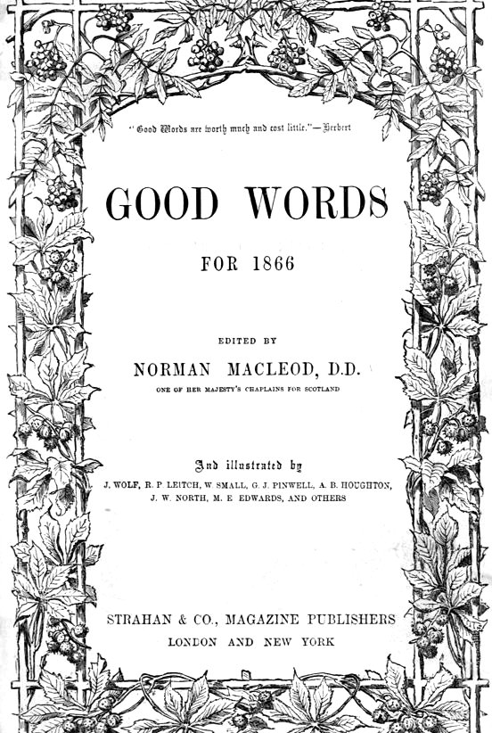
Title-page for Good Words and the image on the top of the page containing the beginning of Mrs. Oliphant's Madonna Mary. Click on these images and those that follow to enlarge them.
Devised by the Evangelical publisher Alexander Strahan (1833–1918), whose books for children were also of the moralising variety, its focus was firmly fixed on the workings of Christian belief. Written by a variety of philanthropists, ministers of the church, pious versifiers and the converted, its texts are strictly traditional. Rarely read today, they provide a representative cross-section of this type of writing and provide a model representation of orthodox faith in mid-Victorian Britain; though aimed at non-conformists, the magazine was also read by Anglicans as an act of devotion, perhaps on a Sunday evening, following worship in church. A best-seller which briefly challenged the vast audience enjoyed by The Cornhill Magazine, it gained currency as the classic ‘fireside read’, where it could be shared by adults and children, servants and masters.


Three covers for Good Words: Left: The heavily symbolic limp paper wrapper of individual issues of the magazine. May 1864. Middle: Navy blue cloth gilt binding of the annual version of Good Words. 1862. Right: The 1880 annual issue. [Click on these images for larger pictures.]
Designed to support the texts, the illustrations provide a powerful representation of orthodox Christianity and the travails of believers. Sombre in tone, they depict scenes from the Bible, moments of crisis where characters are challenged by adversity and re-discover their faith, acts of charity, and other similar themes. This picturing of morality and debate was facilitated by the first editor, Norman Macleod (1812–72). Macleod viewed the images as part of the process of preaching, making the messages more memorable by giving them a vivid visual form, ‘the Word made Flesh’.


Two illustrations for other publications by Thomas Dalziel and a third by his brother Edward: (a) The Genie Brings the Hatchet and the Cord. (b) Bedredden Hassan Giving Away Sequins.(c) At the station they had been sitting about, in their threadbare homespun blue garments . . . . sad enough at heart, most of them
The crucial development in striving to realise this idea was Strahan and Macleod’s decision to give the Dalziel Brothers ‘entire control’ (A Record, p.156) over the art-work. The Dalziels were the foremost wood-engravers of the time and had working relationships with most of the leading illustrators practising the style of ‘The Sixties’. Tasked with the commissioning and material production of the images in Good Words, the Brothers were uniquely efficient in furnishing the magazine with bold and impressive designs. In the Dalziels’ own, rather self-important words, ‘we asked all our most distinguished artist friends to make drawings for the journal’ (A Record, p. 162).
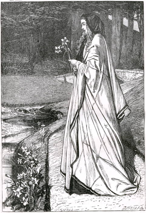

Left to right: (a) Lilies by William Small. (b) Bridget Dally's Change by George Pinwell. (c) The Hidden Treasure from Parables of Our Lord> by John Everett Millais.
Arthur Boyd Houghton,John Everett Millais, Robert Barnes, William Small, Thomas Morten, George Pinwell, Edward Burne-Jones and others were all commissioned in this way, in each case deploying the monumental forms and painterly draughtsmanship that were characteristic of the style of the Sixties. These qualities were accentuated by the solid blocking and bold contrasts of black and white which feature throughout the Dalziels’ engraving style.
Perhaps the greatest series was Millais’s Parables of Our Lord. First published in Good Words in 1863 and later in the form of a gift-book (1864), the Parables exemplify Macleod’s notion of visual telling in a dramatic and imposing way, demonstrating the artist’s impressive range while also providing a show-case of the Dalziels’ technical expertise.
Page decoration from Good Words
In addition to commissioning work from major illustrators, Good Words also used other kinds of images, such as the unattributed Whirling Derishes used “By permission of the Proprietors of the Illustrated London News” and Swain's engraved reproductions of photographs by F. Bedford — The Mosque of St. Sophia from the South-east and The English Burying-ground at Scutari.
Related Material
- List of illustrations in the 1866 issue
- Arthur Boyd Houghton's depicts of harvest in Good Words: Reaping and Binding
- Arthur Boyd Houghton's depicts of harvest in Good Words: Carting and Gleaning
Works Cited
Good Words. London: Strahan, 1860–70.
The Brothers Dalziel. A Record of Work, 1840–1890. 1901; reprint, with a Foreword by Graham Reynolds. London: Batsford, 1978.
Last modified 1 November 2014