The Victorian Cult of Death
he bare facts of death and the limitations of mortality are inevitably subjects of speculation and fear. In modern Britain, as in all multicultural societies, there are many ways of dealing with the inevitable. However, it is probably the case that the Christian majority regards death as extrinsic, and move it as far as possible from the business of everyday living: treated by many as a taboo and confined to private grief, it is anxiously mediated through a variety of euphemisms, in humour, in the official language of the state, and in the traditional codes of religious belief. These attitudes prevail and do not seem to have changed, despite the terrible losses of the pandemic of 2020–21. Victorian responses to death, on the other hand, are more explicit. Living in an age when life was always threatened by disease and with relatively limited means to treat illness, the Victorians had to engage with the stark realities of death and were always aware of its presence. Life was tenuous and at the population was often ravaged by vast numbers of fatalities that have not occurred in our own, modern time, despite the depredations of the coronavirus.
Of course, the impact of such high levels of mortality was nuanced by class and social position, an issue greatly complicated by social upheavals of the Industrial Revolution. Access to the basic requirements for healthy living was unequally distributed, and it is well-known that the Victorian middle-classes lived longer than the ‘lower orders’ because they could afford to have nourishing food, clean water to drink and to wash with, and decent housing. Such advantages made for a healthier life, extending longevity from around 50 (for the average mid-Victorian worker) to 70 or more for the genteel. Indeed, the bifurcation of the capitalist system, which divided labour into manual and ‘brainwork’, was openly deleterious for those who worked with their hands, and those doing routine or physical jobs were far likelier to die as a result of poor conditions than those employed in a professional or office job. In an age before antibiotics a wound received while digging a mine was always going to be more dangerous than a paper-cut received in a counting-house. Nevertheless, all classes were afflicted by the conditions of contemporary living, and were universally exposed to the contagions and epidemics of untreatable illnesses; a child born into a hovel in industrial Manchester in the ‘Hungry Forties’ might die of dysentery or cholera, but a parallel fate afflicted Prince Albert, who died of a typhoid infection in 1861.
United by the experience of grieving, the Victorians developed what James Curl has dubbed a ‘celebration of death’ or, more tellingly, a ‘cult’ or ‘culture of death’. This ‘culture’ developed as a means of managing grief by encoding it in a series of forms and practices which deflected or ameliorated the rawness of loss. The manifestations of what is essentially the Victorians’ coping mechanism, as they searched for solace and reassurance, are complex and wide-ranging.
To a large extent, the suffering was diffused by making death into a social display: for the mid-Victorian bourgeoisie, at least, funerals became ostentatious, elaborate and ritualized, a ‘pageantry’ (Arnold 181) outlined by Dickens in Oliver Twist (1838). Post-mortem celebration of a life similarly took the form of large and expensive headstones and tombs in the new municipal cemeteries set up in imitation of Kensal Green and Highgate, and wealth and importance were asserted in defiance of death as the great leveller. Grieving also became a long-standing and demonstrative event, with the heartbroken displaying their feelings in a series of codes. The condition of being ‘in mourning’ was symbolized by the colour black; men wore black armbands, envelopes announcing a death had a black perimeter, jet jewellery was worn, and widows often dressed in black for years following their spouses’ passing, a practice conducted in imitation of Victoria’s lifetime remembrance of Albert. Grieving took another, stranger turn in the development of séances conducted by clairvoyants; driven by the rise of Spiritualism and the Fox sisters’ ‘spirit knocking’, these popular events became a fad, despite their artifice and despite their shameless exploitation of the heart-broken.


Some responses to death in Victorian culture: Left: James John Berkley’s tomb; Right: An advertisement for mourning dress. [Click on these and the following images to enlarge them, and for more information about them.]
A fascination with death and the afterlife was further vested in the rise of ghost-lore and the emphasis on what Deborah Lutz describes as the ‘relics of death’. Unwilling to forget, Victorians commemorated their loved ones’ lives in the form of jewellery inscribed with a name, letters and other mementoes such as the deceased’s personal items; there was a particular fascination with keeping a lock of hair, an act which asserted the dead person’s presence in the land of the living. Objects were informed, in Benjamin’s terms, with the ‘aura’ of the dead, and were treasured as signs of the loved one’s presence in the minds of the bereaved. Each of these rituals and practices were an important part of bourgeois family life and were echoed in the hard-bitten sufferings of the Victorian proletariat.
Dealing with mortality was similarly reflected, as we might expect, in literary and visual culture. The Victorians’ ‘obsessive interest in death’ was particularly registered, so Michael Wheeler remarks, in its theology – a predictable development – and in the ‘imaginative literature of the period’ (28). Almost all of the fiction of the period involves deaths of some kind, and it would be fascinating to make a simple body count in the writings of Dickens, Thackeray, George Eliot, Wilkie Collins, the Brontës and Thomas Hardy; a focus of recent criticism, themes of loss have been explored by Jolene Zigarovich in Writing Death and Absence in the Victorian Novel (2012) and the ways in which the writing ‘uncannily evokes and embodies the dead’ (2). The same might be said of the poetry; echoing novelistic themes, much of Victorian poetry is fascinated with bereavement. Elegies were a popular form: Tennyson’s In Memoriam (1850) is an extended lament, and morbidity features in Robert Browning’s dramatic monologues as well as in Christina and Dante Rossetti’s sonnet sequences. The emotion invested in death was paradoxically a hot topic, a short-cut way to engage the reader, and the many minor poets of the period added to the canon by offering maudlin pieces, often in magazines, for fireside consumption.
The Victorian image-hoard runs in parallel with the corpus of literature, often presenting an idea of death which for modern observers might seem ridiculous, uncomfortable or even repugnant. At one extreme are ‘spirit’ or ‘spectral’ photographs, which were often presented as records of an apparition’s appearance at a séance. Purportedly evidence of the afterlife, and offered as scientific proof in an age when science and faith were in conflict, these bizarre images are risible fakes, and were described as such even in their own time. Stranger still is the development of post-mortem photography as a means of preserving the deceased’s appearance in life; held up with stands or lying in repose, images of adults and especially infants provided what was supposed to be a true remembrance of the departed loved one. Modern observers might be troubled by this practice, especially when the corpse shows distinct signs of decomposition; cosmetics were used to suggest the subjects were still alive, and open eyes were painted onto closed lids or lifeless pupils. This seems like a cross between Gothic morbidity and the freak-show. But we have to acknowledge that post-mortem imagery was informed by a pitiful longing and desperate unwillingness to let the dead go. In an age when many were not photographed when they were alive, a manipulated print might be the only record of a person’s appearance.
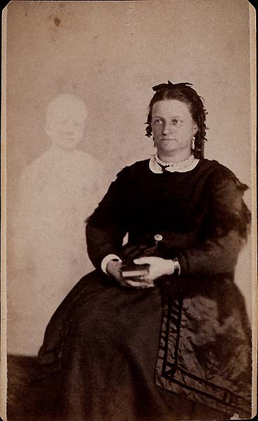


Some images of Victorian grieving, both ridiculous and moving, from the period 1860–70: a) a ‘spirit photograph’ by William Mumler of Mrs French and the ghost of her son; b) a photograph by Frederick Augustus Hudson of Lady Helena Newenham and the spirit of her daughter; and c) a post-mortem photograph of a boy.
More uplifting, perhaps, is the rhetorical treatment of death in Victorian painting. At one extreme are the heroic sacrifices of classical or romantic heroes who embodied the social mores and values of the time, and at the other were social realist designs which offered a grim depiction of the mortality of the suffering poor. Such diversity can be traced, moreover, in graphic art. Closely linked to literature and responding to the morbid themes of many texts, book and magazine illustrations present numerous readings of death and dying. In many ways illustration provides a more intimate reflection of Victorian tastes than painting: produced for and consumed within the home, it mirrors the belief systems and anxieties of the age, offering what Julia Thomas describes as a ‘inscription’ of values within a domestic art-form (Pictorial Victorians).
Interpreting these representations of mortality, which embody many of the preoccupations surrounding death, is an interesting project; surprisingly, scholarship on the subject has been limited to piece-meal observations on individual designs. The aim here is to take a wider view, reading Victorian illustration as a material sign of the Grim Reaper’s omnipresence and the ways in which the Victorians made sense of the final curtain.
‘Ars Moriendi’: Good Deaths
Victorian dying was informed by the concept of a ‘good’ or ‘bad’ death. The ‘good’ death, as historians such as Mary Riso and Pat Jalland have explained, was derived from the medieval concept of ‘ars moriendi’, or ‘the art of dying’, and was codified in terms of a series of elements. In the words of Catherine Arnold, the Good Death
refers to death as the right end of a Christian life, with the promise of an Eternal one to follow. A Good Death meant dying peacefully in your own bed, surrounded by family and friends, with a clergyman on hand to administer the Last Rites and your children brought in to kiss you goodbye … [these] Elaborate Victorian customs eased the transition from deathbed to the final resting place of the grave, from natural sleep to the sleep of death. A good death meant the opportunity for famous last words … [182]
This was naturally the preferred option, while a ‘bad death’ was one that involved dying alone, in pain, in violence, suddenly, or in unexpected circumstances. Both events, good and bad, are explored in Victorian illustration, but the most often depicted is the first. Designs representing a peaceful death appeared in books, magazines and juveniles; making use of the codified language of a restful passing, artists, could convey their messages in a ready-packaged form and could make it fit practically any of the many final moments in Victorian literature. This was a means to communicate unambiguous and highly conventionalized messages, but it also had an economic dimension. As Julia Thomas explains in her study of ‘Happy Endings’,
The fact that the iconography of these pictures was so uniform despite different verbal imperatives … meant that such images could be produced at short notice and speed by a skilled artist. With Victorian illustrators used to working to tight deadlines … it might have come as a relief to be commissioned to design yet another stock deathbed scene. [80]
At the same time it is important to recognize that the illustrated ‘good death’ had a number of variants and did not always include all of the elements. Sometimes the dying person was shown on his or her own, in bed or a couch; sometimes comfort was given by a husband or lover; and sometimes the declining character is surrounded by several grief-stricken members of the family. Within this narrow lexicon the emphasis is on either the moment of passing or the final moments before death. Some of the most moving of these involve the peaceful decline of an elder. In Walter Bayes’s Good Bye (1866), for instance, the emotion of the old lady’s death is powerfully conveyed by her granddaughter’s holding of her hand as she looks on compassionately. J. E. Millais’s The Grandmother’s Apology (Once a Week, 1859) similarly conveys the easy transition from sleep to death, with the young girl’s gesture and gaze being used, again, to represent the moment of realization and deep feeling.
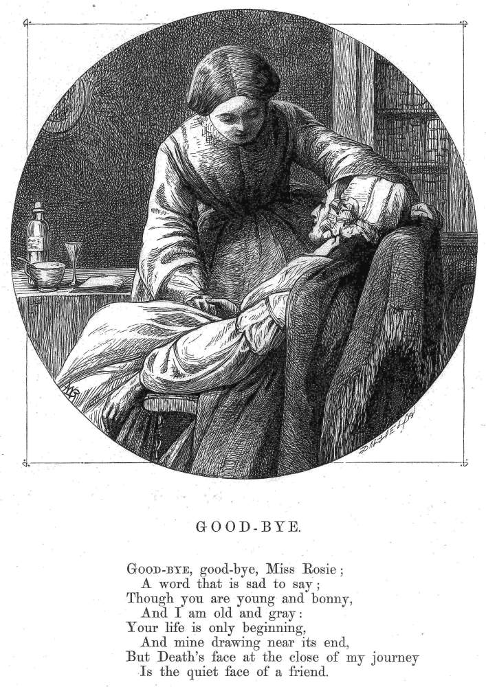
The elderly passing away in peaceful repose. Bayes, Good Bye.
These theatrical devices are typically used in conjunction with symbols and symbolic emblems which express Christian understandings of the heavenward journey to salvation and eternal life with God. This iconography is exemplified by George Cattermole’s illustration of Little Nell’s deathbed in Dickens’s The Old Curiosity Shop(1841). His starting point is the author’s description:
She was dead. No sleep no beautiful and calm, so free from trace of pain, so fair to look upon. She seemed a creature fresh from the hand of God, and waiting for the breath of life; not on who had lived and suffered death … Her couch was dressed with here and there some winter berries and green leaves. [Master Humphrey’s Clock, 2, 209]
Dickens presents Nell in idealistic terms that ameliorate her dying, and Cattermole provides a visual equivalent. In accordance with the usual convention, Dickens describes her final rest as sleep rather than death, and Cattermole shows her tucked up in bed as if she were merely sleeping, in echo of an earlier design where she is indeed asleep. The illustrator also matches the author’s aestheticizing of the body: Dickens specifies her appearance as ‘beautiful and calm,’ a ‘fresh’ beauty ‘fair to look upon’, and she features in the image as a emblematic type of female innocence with a ‘mild and lovely look’ (2, 210). The ‘winter berries and green leaves’ are likewise visualized, and Cattermole suggests rebirth in Christ by incorporating the unlikely detail of a nativity scene in the bed’s head panel.
Following authorial information, the artist underscores the writer’s emphasis on the natural process of death, freed from ugliness and despair. At the same time, he embellishes the message of a peaceful demise, including other emblems not found in the text to suggest the smoothness of the spiritual journey. An hour-glass, its sand run out, suggests the inevitability of time’s passing, while the closed book implies the closing of her life, and (if it is a Bible), her faith in God; the opened window symbolizes the release of her soul and a tiny bird, an emblem of the flight heavenward and the embodiment of Nell’s soul, perches on the sill. Foliage, the sign of eternal life, adds another dimension to the imagery of ‘winter berries’, and the whole scene is suffused with sunlight, another symbol of the resurrection and the continuance of life.
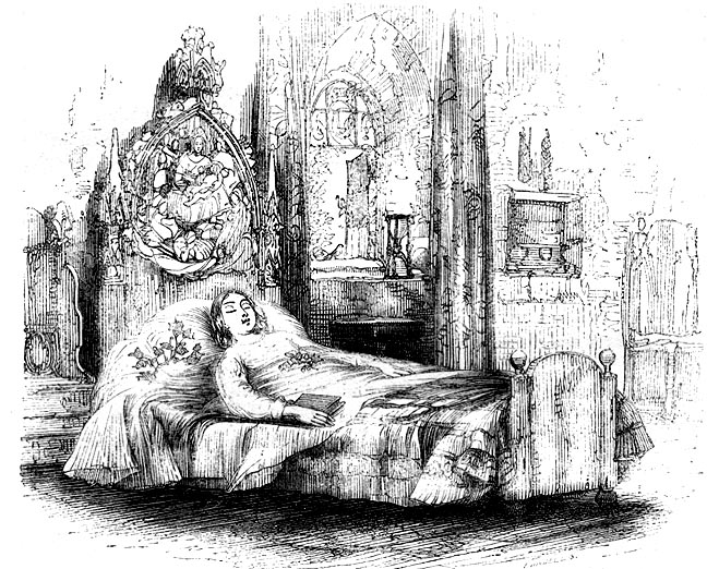
Cattermole’s At Rest [the death of Little Nell].
These tiny details are weighted with huge significance, and Cattermole’s design contains several of the devices that were later to become a central part of the reassuring imagery of death. Most typical is the combination of floral emblems and opened windows or doors. Fred Sandys’s Sleep (1863) elegantly combines the two, with a flowering shrub positioned in a window opening to a summer’s evening, again conveying hope and release. Evelyn Vere Boyle’s illustration of the May Queen’s final moments (1862) similarly unites a bouquet and an opened door, an image given an extra charge of hopefulness by positioning the floral display in the foreground, with its flowers bursting back into life on an otherwise withered stem. Produced in parallel with paintings such as Henry Wallis’s Death of Chatterton (1856), which has the same iconography, these illustrations embody a legible code.

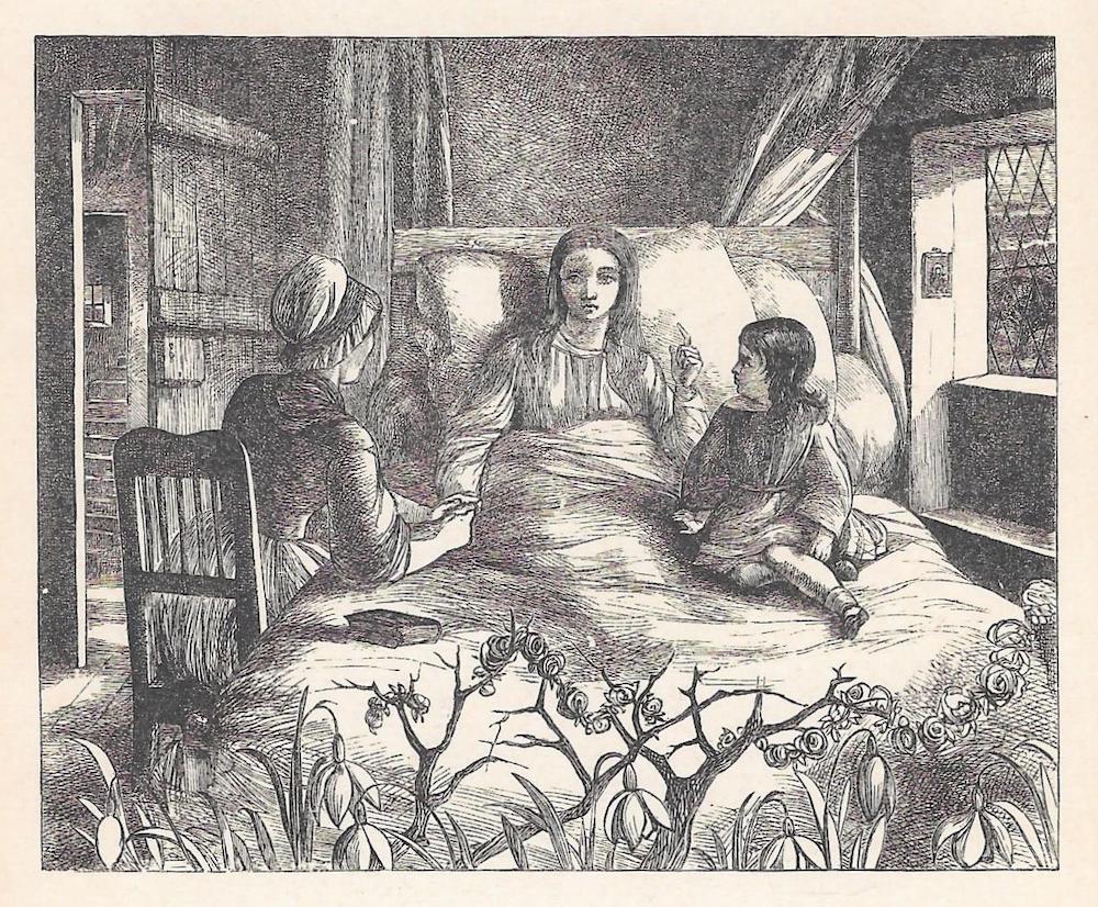
Left: Sandy’s Sleep, and Right: Eleanor Vere Boyle The May Queen’s death-bed.
Equally comprehensible, as already noted in relation to work by Bayes and Millais, was the emphasis on gesture. The focus was developed in the many scenes of relatives witnessing the loved one’s decline. These physical signs vary between the melodramatic and the overwrought, and the psychologically insightful and moving. The Sailor’s Bride, by Fred Sandys (1861), exemplifies the over-manipulation of the human form to convey the desolating feelings of loss; embodying a typical situation – a lover returning home too late – it shows a heartbroken mariner, his body distorted by anguish, being comforted by the beloved’s mother. A parallel excess can be found in Matthew Lawless’s One Dead (1863), with its mourners’ grieving embodied in a series of hands covering anguished faces.
Such gestural arrangements have a raw emotional charge, but could be viewed as sentimental rather than deeply felt. More telling, perhaps, is the quiet dignity of the grieving companion in Sandys’s Sleep. In this design the artist focuses on the final, meaningful interactions, with the gaze acting as a sign of loving tenderness. Small, intimate gestures are also deployed, to powerful effect, in William Holman Hunt’s At Night (1860). The image illustrates an anonymous poem in which the ‘young wife’ (Once a Week 102) vacillates between fear and comfort in the idea of God’s protection, but interprets these troubled moments in the form of a simple embrace that stresses earthly, rather than spiritual love. The husband’s arm reaches around his wife’s head as one of her hands lies over his other arm and both characters appear be either asleep or united in silent reverie. Understated and uncomplicated, the effect is one of great feeling, of togetherness in the face of despair. If Cattermole’s design is pious, this design is a work of humane (and humanistic) understanding.

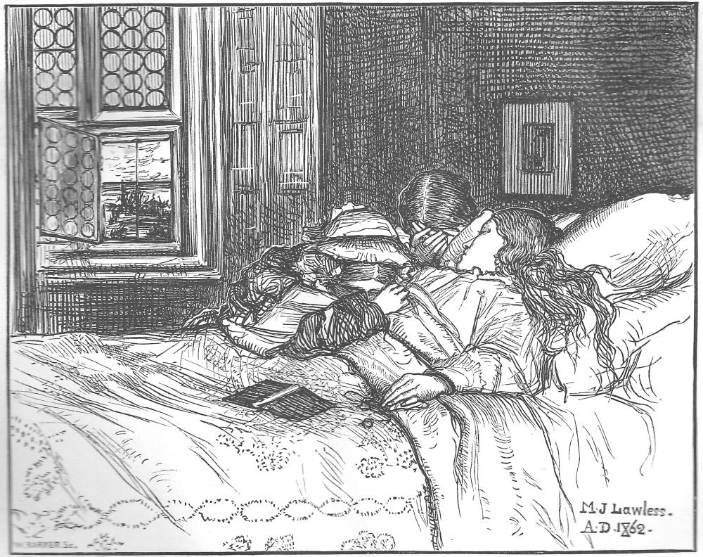
Versions of the ‘good death’. Left: Sandy’s The Sailor’s Bride. Right: Lawless’s One Dead
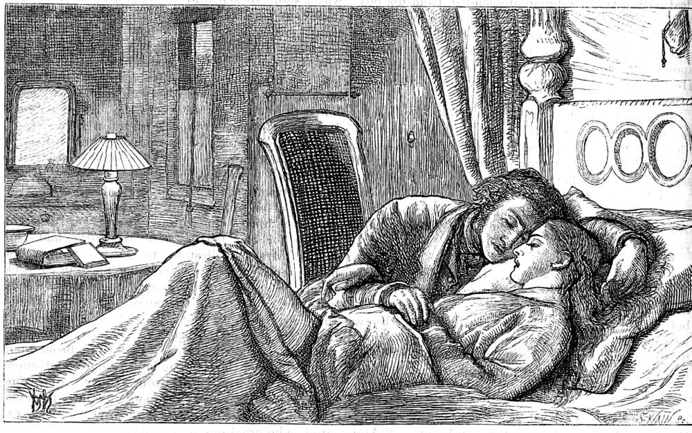
Another version of the ‘good death’: Holman Hunt’s At Night.
In all of these designs the artists offer ways of negotiating the impact of dying by turning it into a codified celebration and lament. What unites them is their obfuscation of anguish by making the moment into an aesthetically pleasing image in the manner of Cattermole’s doll-like Nell, placed in a nest of comforting signs. In this sense the illustrations act as a sort of cultural emollient, stripped of terror or doubt: as Thomas remarks, ‘the construction of death as a ‘beautiful’ event serves to obscure it … this might account for the appeal of deathbed illustrations, where the reality … concealed from view’ (84).
Nothing could be more benign, Thomas points out, than John Dawson Watson’s Last Words (1862), a ‘gorgeously rendered scene … ‘helped along by the fact that the girl is so pretty and her father so dashingly handsome [that] ‘he could easily be mistaken for her husband’ (84). Here, as elsewhere, beauty replaces fear and domestic order occupies the place of chaos and loss. Serene acceptance is also projected in Millais’s illustration for Tennyson’s ‘The Lord of Burleigh’ in the Moxon Poems of 1857 (353). Unlike Watson, Millais removes the husband from the scene – the cause of the wife’s discontent – and focuses on the woman’s final moments in the company of servants, people of her own class. Never able to cope with the ‘burthen’ (356) of her upward move, she only finds a peaceful death when she is not reminded of her anxiety and can die contentedly once order, in the arms of God, has been reasserted. The intimate grouping of her retainers, offering comfort at the end, generates a pathetic and moving effect.


Two more versions of the ‘good death’. Left: Watson’sLast Words; and Right: Millais’s The Lord of Burleigh.
All of these illustrations have a powerful charge; sometimes sentimental and overstated, they are nevertheless an effective embodiment of what Mary Riso describes as ‘the narrative of the good death’. Deploying visual languages of the time, they reinforce an existing ideology. At their most effective they convey their messages with great economy. Most elegant, perhaps, is Millais’s ‘Burleigh’ illustration. The artist includes a telling detail in the form of a closed portfolio. It partly acts as a metonym for the husband, a landscape painter; but it also represents the closing of the marriage and the closing of the wife’s mortal life. Barely noticeable, Millais’s emblem is a poetic sign, typical of his capacity to infuse in the inanimate with psychological resonance.
A Bad Death
As we have seen, all of these approaches are predicated on the notion of Christian belief, affirming the continuance of the soul and its ultimate triumph in the form of the resurrection. Yet the Victorian age was racked with uncertainties, especially in the post-Darwinian period following The Origin of Species (1859); but religious crises and the terror of death were already evident in Tennyson’s In Memoriam (1850) and throughout the writings of early Victorian culture. It was not surprising, then, to find that the relics of death in all of their forms could be ambiguous, embodying what Lutz describes as a critical interplay of ‘faith and doubt’ (12).
Illustration accordingly embodies some of these doubts, matching the love-surrounded dying of the domestic scene with images of suffering, wickedness and the painful process of deaths too sudden to allow for the individual to repent. It also includes a wider, metaphysical doubtfulness which roundly contradicts the optimistic assertions of Christian redemption and the spirit’s survival.
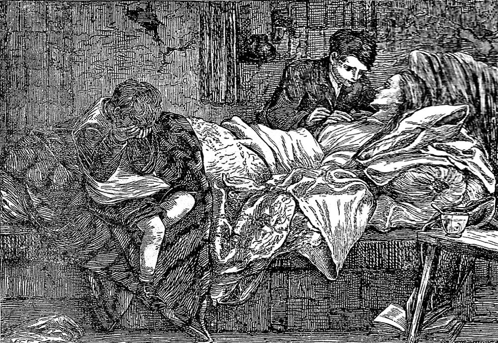
M. E. Edwards’s Mother’s Last Words.
In some illustrations the transfer from life to death is shown in a grotesque and troubling way, far from the plangent decline of the benign death-bed. This situation is sometimes the suffering of the innocent. In her work for Mary Sewell’s Mother’s Last Words [1893], for example, Mary Ellen Edwards depicts the matriarch’s final moments as she dies in pain, stricken with poverty and anguished by leaving her sons unprotected. The artist focuses the mother’s frailty by accentuating the angularity of her jaw, stressing her cadaverousness, and other devices amplify the despair: one of the children anxiously engages in the final conversation while the other weeps at the foot of the bed, his face in his hands; the closed book is replaced by an opened volume, its leaves fluttering, to stress the incompleteness of her life, with a story cut short; and instead of the emblems of natural life and an opening vista we are shown a cup emptied of medicine and a blank, cracked, imprisoning wall. The agitated striations of the bed-clothes and the grey palette are likewise deployed in place of the order and luminous light of the traditional death bed, and the overall effect is melancholy and unsettling. Interestingly, Edwards chose to take this approach despite the textual specifications in which the mother piously recounts how she is ‘going to a happy place/So beautiful and dazzling bright’ (6). Given the opportunity to present what Thomas has called the ‘stock deathbed scene’ (‘Happy Endings’ 80) she bypasses what can be a cliché and shows the simple facts of poverty, of death experienced as it was for the many, and not for the few; having worked as a staff artist for the reforming Graphic (1869–80), she shows how dying was often a matter of unalloyed suffering, and depicts it in the terms of social realism.


Two versions of the ‘bad death’. Left: Phiz’sThe Death of Quilp; and Right: Du Maurier’s The poisoning of Madame R.
The counter-approach to conventional iconography was more generally used to represent death as pain and/or punishment, and typically deployed expressionistic distortions of the body directly after life has passed. The ‘ugly death motif’, we might say, is epitomized by George Du Maurier’s visualization of Madam R’s poisoning in Charles Adams’s ‘The Notting Hill Mystery’ (Once a Week, 1862). The author describes her death as ‘instant’ and ‘horrible’ (91), and the artist shows the body as a misshapen mass, awkward and contorted. Hablôt Knight Browne (Phiz) similarly presents a bad end in his treatment of the Death of Quilp, for Dickens’s Old Curiosity Shop (1841). Wicked in life, Quilp can only be the recipient of a grotesque death. Dickens describes his mortal remains as an ‘ugly plaything’ and a ‘deserted carcase’ (Master Humphrey’s Clock, 2:187), and Phiz presents him as a bedraggled manikin, with the convolutions of his corpse symbolizing his moral crookedness. If Nell had a good death, then Quilp’s is decidedly bad, and the two scenes embody the novel’s moral division into alternative ways of living.
Phiz’s design is visual exemplification, but his treatment of the setting points to another aspect of the bad death. Dickens writes of Quilp’s cadaver as an object, a piece of debris which comes to rest in ‘long rank grass’ and a ‘swamp’ (Master Humphrey, 2:187) and Phiz amplifies the description, stressing the character’s deadness by dissolving his limbs into a chaotic tangle of reeds, mud and rotten stalks of wood. Quilp is shown, in other words, as purely subhuman, a creature of nature whose body dissolves back into the mire and is stripped of any sense of spirituality or divine status as a creation of God. Of course, this depiction makes sense for a character repeatedly likened to the devil and associated with animals. But Phiz’s design suggests a wider recognition, current from the 1840s onwards, that all people, good or bad, were simply beasts and bound by the same rules as every other creature in creation.
This worrying thought, as Lorraine Janzen Kooistra has argued in a detailed and provocative study, was largely derived from Robert Chambers’s Vestiges of the Natural History of Creation (1844). Chambers formulated the idea that all human kind were bound by evolution, and though he does not spell it out the implication is clear: if humans are animals, then there is no reason to assume that they have souls. A dead person is therefore no different from a dead animal and all that is left is lifeless flesh. In place of death as a sleep, a sloughing of the body to release the soul, death becomes in these terms a horrifying end that resolves itself into decay and decomposition as the empty vessel – like Quilp’s – returns to nature. This spectre grins, cadaver-like, throughout Victorian culture.
The secularization and horror of death was given another impulse, moreover, in the form of the ‘burial crisis’ of the 1830s and 40s, when the overcrowding of the old city graveyards led to delays in internment (Brooks 34), and the same problem scandalously resulted in the re-emergence of putrid bodies buried in shallow graves. What to do with the urban deceased in the period before the setting up of municipal cemeteries such as Highgate and Kensal Green was a painful issue, and awareness of the body’s physicality as the source of disease was pronounced and troubling. Informed with this grisly information, several illustrators depicted their texts with visceral immediacy, showing the corpse as lumpen flesh and bone, a repulsive thing to be disposed of rather than the figure of a loved one.
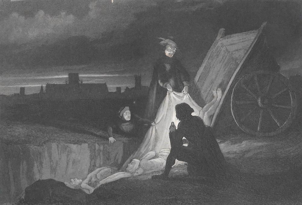
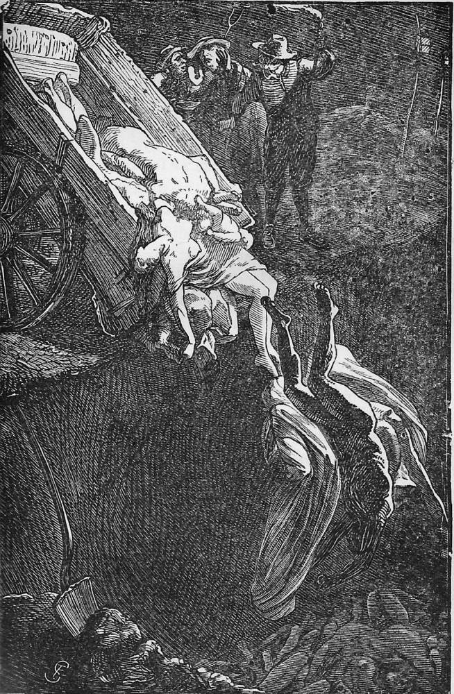
Disposing of the dead. Left: Franklin’sThe Plague Pit; and Right: Shields’sThe Dead Pit.
The notion of the dead as just dead is powerfully conveyed in John Franklin’s design of The Plague Pit for W. H. Ainsworth’s Old St Paul’s (1841). Franklin shows the moment when Leonard scrutinizes the ‘heaving mass of many disjointed limbs and ghastly faces’ (200). The artist does not represent the horrible sight directly, but his depiction of fluid, formless bodies wrapped in shrouds is a near equivalent; the naked legs of a cadaver slithering out of the cart add another repulsive touch, and to stress its unsettling eeriness the scene is illuminated by crepescular light, chiaroscuro in the manner of Goya’s painted nightmares. Even more explicit is Frederick Shields’s treatment of Defoe’s History of the Plague Year (1863). In The Dead Pit the emphasis is placed on the bodies’ descent – men, women, and children – as they tumble into a hole that recalls the medieval maw of Hell, but without the sense of any moral judgement or spiritual dimension. Both texts are representations of mass deaths of the seventeenth century, but it is hard to read the images as anything other than a locus of Victorian horror, a commentary on the present refracted through events of the past.
Surely a direct echo of the scandals surrounding burial in the earlier part of the Victorian period, the artists’ treatment of the ungainliness of human corpses is remarkably candid and entirely unsentimental: in place of the maudlin emotionalism of Little Nell’s demise we have some rotting flesh. The same is true of Ford Madox Brown’s depiction of the body in his illustration for Byron’s ‘Prisoner of Chillon’ in The Poets of the Nineteenth Century (1857). Based on a real cadaver that he studied in the process of decomposition, the image registers the simple fact of a dead body. Madox Brown describes his subject is a ‘poor creature’ and allows that ‘the substance has fled’, but what strikes him is its grotesque materiality, noting ‘Often as I have seen horrors I really did not remember how hideous the shell’ may remain, which he thinks looks more like a ‘wooden imulation’ [sic, imitation] of a person, a mere ‘thing’ (Diary 167).
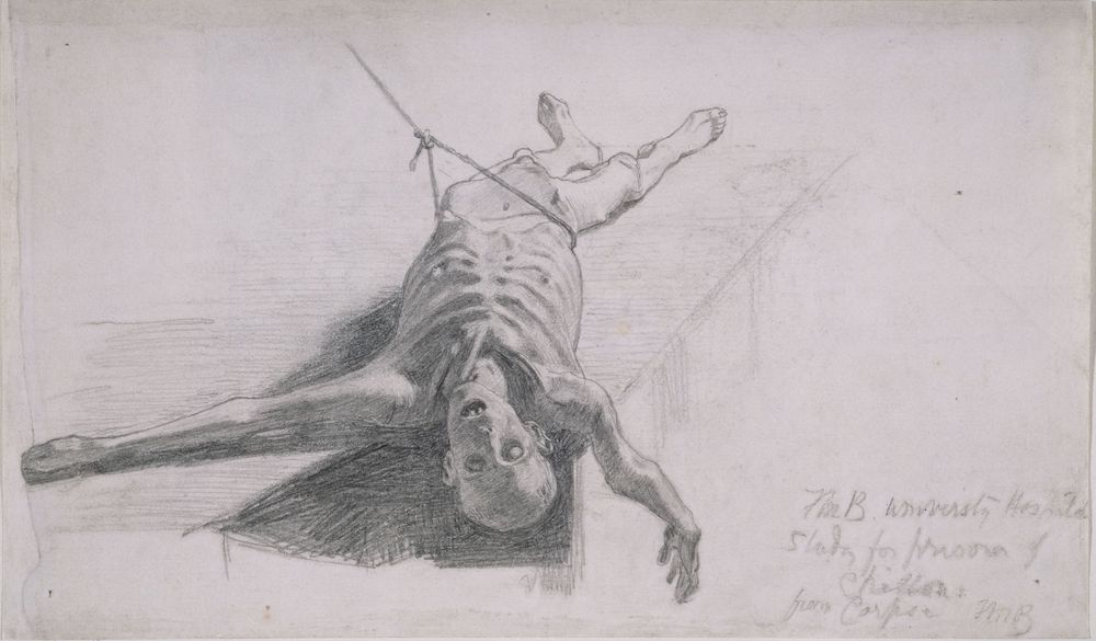

Studies from the dead. Left: Ford Madox Brown’s study of the cadaver; Right: The completed design by the same artist for The Prisoner of Chillon.
Studied from the flesh, Madox Brown’s treatment is uncompromisingly direct, and so Sandys’s approach in Amor Mundi (1865). Working in the manner of the medieval art and Dutch genre pieces and fascinated by morbidity, Sandys develops his troubling theme by juxtaposing the living and the dead as a warning of what is to come, with the rotten body of the toad-gnawed lover placed in stark opposition to the plump and vital couple as they celebrate their sensuality. The message is clear. Enjoy the pleasures of life but annihilation awaits you: to ‘this favour’, he argues in echo of Hamlet, you ‘will come’. Sandys is at his baldest, however, in his illustrations of Until Her Death (1862) and Yet once more on the organ play (1861), both pictures of morbid poems. Inspired by Dürer while responding to the influence of Alfred Rethel, these designs combine skeletons with the robustly corporeal; caught in the spell of the dead, who dominate the living, the fleshly characters await their fate. Sandys’s illustrations therein provide a match with Victorian relics (which aim to preserve the deceased’s memory and so achieve a sort of immortality), but counter any sense of faith-driven optimism by offering a type of Gothic memento mori. Indeed, all such images acted to remind the viewer of the imminence and immanence of death as fleshly horror. Stripped of faith, they playfully explore the territories of doubt and existential dread.
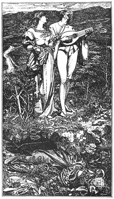
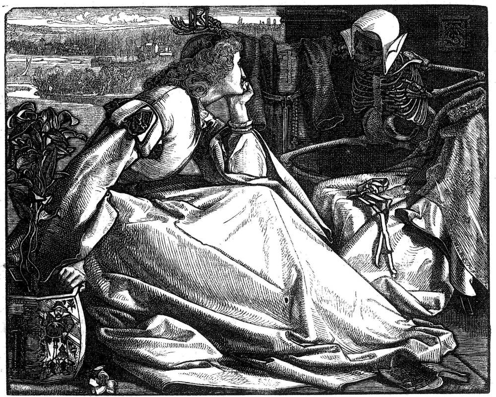
Examples of Sandys’s obsession with the deathly. Left:Amor Mundi; and Right: Until Her Death.
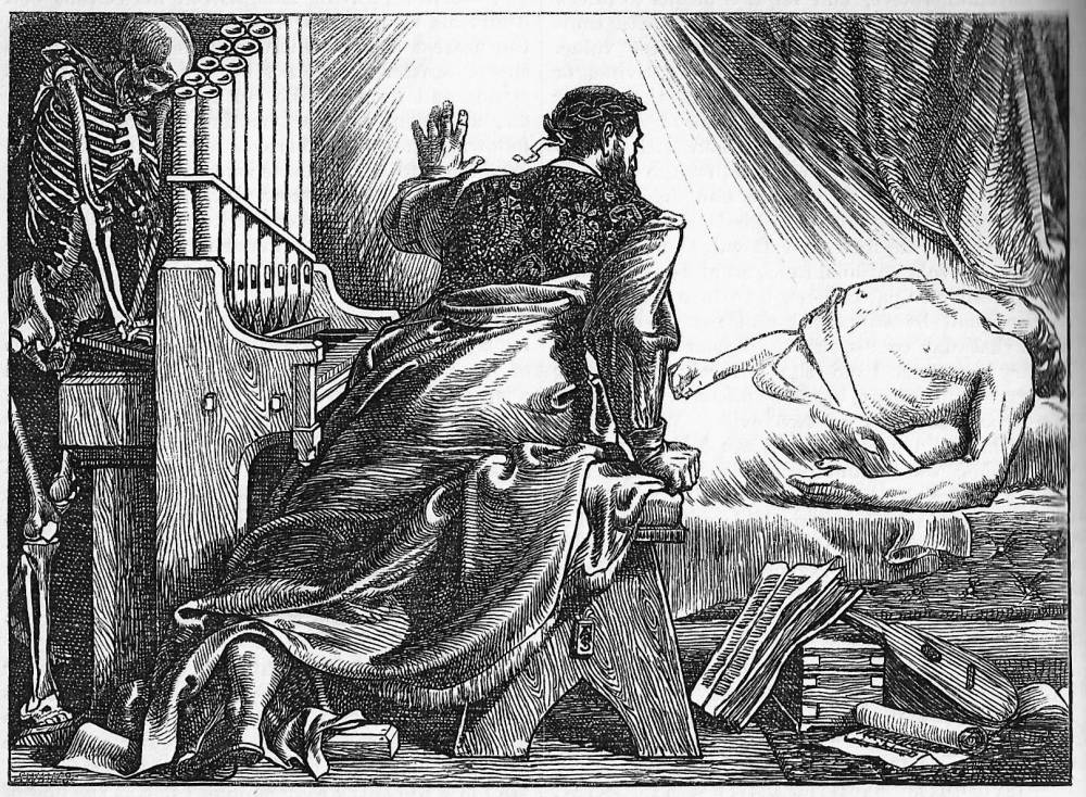
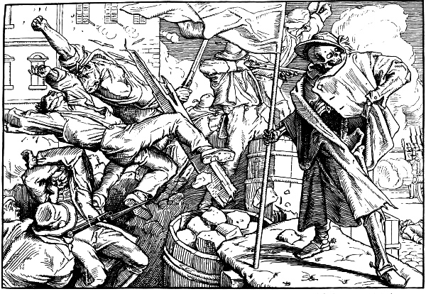
Two examples of ‘Germanic’ morbidity: Left: Sandys, Yet once more upon the organ play; and Right: Rethel, Death on the Barricades.
Dying: Here Today, Gone Tomorrow
We have then a clear division between the death-bed scene (which sets out to ameliorate the situation) and the memento mori as reminders of death’s terrifying inescapability and its ruination of the body. However, between these extremes is a third mediation of human mortality. To a startling degree, Victorian illustrators were concerned not simply with death but with dying and the fragility of life, depicting many scenes of characters are poised at the moment of their demise. This corpus of designs (pun intended) explores the omnipresence of death and suggests the unexpectedness of the literary characters’ – and, by implication, the readers’ – passing. The artists’ theme is summarized by Chambers, who gloomily notes how ‘death is at work upon all ages’:
In one instant the blood of him who has the promise of many years may cease its circulation. Accidents may assail us. A slight fall may precipitate us into eternity. An exposure to rain may lay us on the bed of our last sickness … A thousand dangers beset us on the slippery path this world … and no age is exempted from them. [Potter 38–39].


Left: Edwards’s The Dance of Death. Right: Sandys, Manoli.
Illustrations dealing with this theme are driven forward by the texts they illustrate, enshrining the moment of death in suspended time. Edwards offers a prime example of this approach in The Dance of Death (1865). The anonymous poem narrates the story of doomed lovers who choose suicide rather than separation, and Edwards intensifies the horror of their choice by depicting the exact moment at which they step into an abyss: three of their four feet are in space, and although the verse does not speculate on the lovers’ demise the artist compels us to imagine the next instant, lying lifeless and mangled at the base of a cliff. Sandys similarly conveys a baroque urgency in Manoli (1862), an image of the master-builder honouring God’s demand to manifest his faith by sacrificing the first woman he sees – his wife. Sandys depicts the spouse pleading with her husband as he pushes her into a niche and is about to seal her in; the artist focuses on the frisson of terror, with the wife’s clutching gestures and distorted face vividly conveying her anticipation of what happens next.

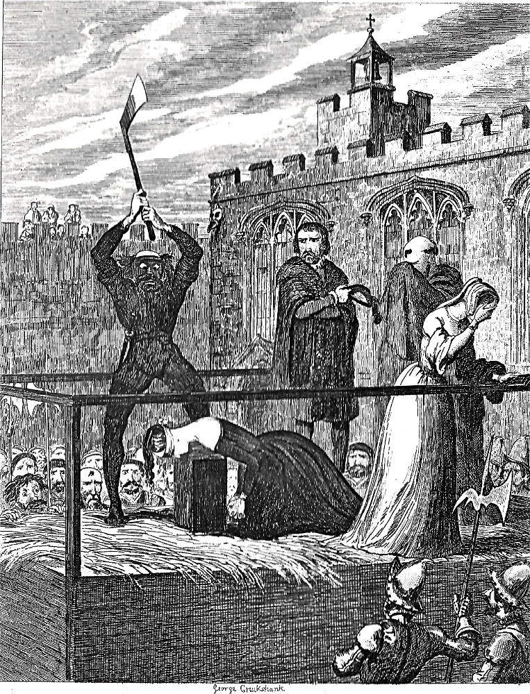
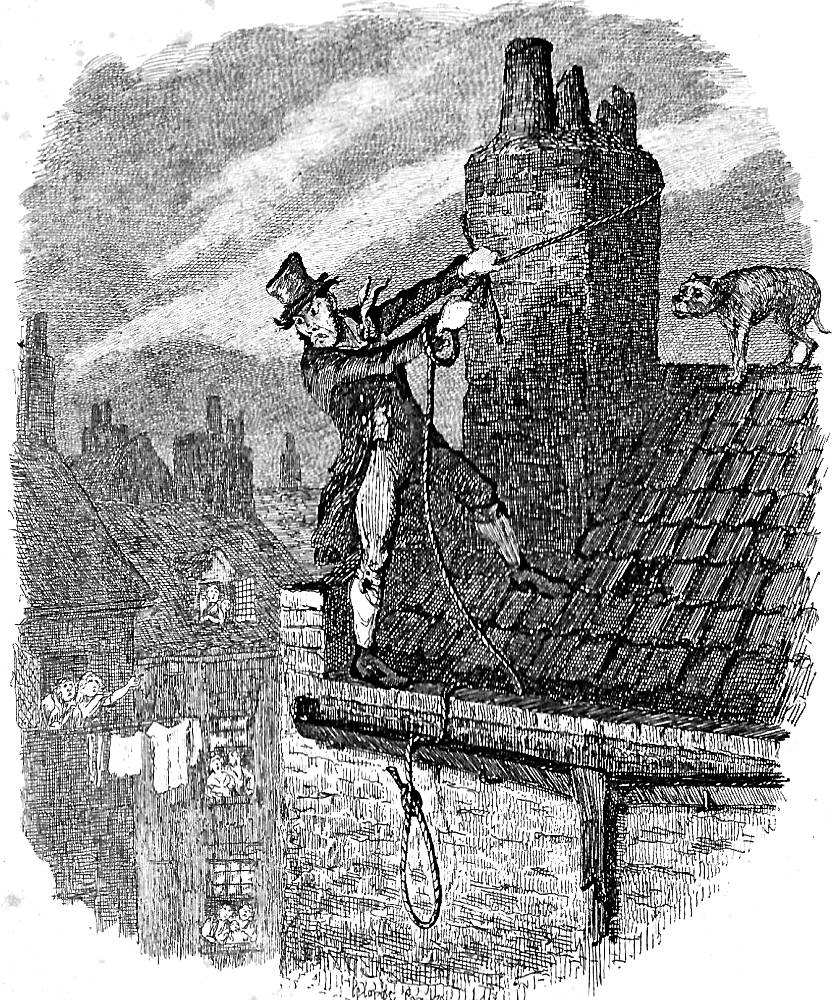
Three examples of Cruikshank’s depiction of imminent death. a) The Fate of Nightgall; b) The Execution of Lady Jane Grey; c) The Last Chance [Bill Sikes’s final moments].
Many other artists chart the same sort of melodramatic situations, death looming as the characters are shown taking their final breath. Overwrought excess features particularly in the historical and picaresque novels of the 1830s and 40s, with George Cruikshank providing grisly psychological portraits of the very moment of expiry. His arresting of time is exemplified by The Fate of Nightgall and The Execution of Lady Jane Grey, in W. H. Ainsworth’s The Tower of London (1840). In both cases Cruikshank figures the slippage between living and dying in grotesque terms: Lady Jane is about to be despatched by a blackened executioner, more monster than man, his taut pose contrasted with the objectified passivity of his victim’s outstretched neck; and in the Nightgall design the artist endows the falling figure with distorted limbs and a claw-like hand, clutching in despair as he drops downwards in a composition in which the vertical is accentuated so as to stress the inescapability of his descent. Bill Sikes’s death in Oliver Twist (1838) is also represented as a poised moment, his life literally preserved by a string that is about to become the executioner’s rope. Cruikshank suggests his precariousness by making the pitch of the roof unrealistically steep and the drop implausibly high and precipitous; held in place only by the noose looped around a rotten chimney that looks as if it will collapse at any moment, Bill’s life is ticklish.
Death in Life: Dying and Social Class
The imminence of death pervaded the consciousness of all social classes, as noted in the opening section of this essay, but the working classes were always much nearer extinction than their putative betters. The lives of the poor were threatened by starvation, disease, the impact of filth and poor diet, the effects of being poorly-clothed, and industrial accidents. Engels explores these factors in his Condition of the Working Class in England in 1844, concluding that the ‘industrial proletariat … cannot be healthy and can reach no advanced age’ (96); in the mid-century the lives of the working poor were dramatically curtailed, and the average life expectancy of a Manchester labourer could be as little as 40 and was sometimes even less.
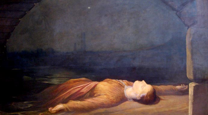
Painters responded to this situation in a series of canvases in parallel to the ‘Condition of England’ novels of Elizabeth Gaskell, Charles Kingsley and Dickens. Wallis’s The Stonebreaker (1858) is a prime example of this approach. Deeply felt, his image of a worker who dies of exhaustion forms a sharp contrast with the same painter’s Death of Chatterton (1856): the second frames the character’s death in the conventional signs of the easy transition, while the first brutally asserts the simple facts of a worn-out body. Another dimension was added by representations of those who met their deaths in unexpected ways, notably in the form of G. F. Watts’s Found Drowned (1867), a portrait of a suicide driven to take her own life in despair generated by poverty.
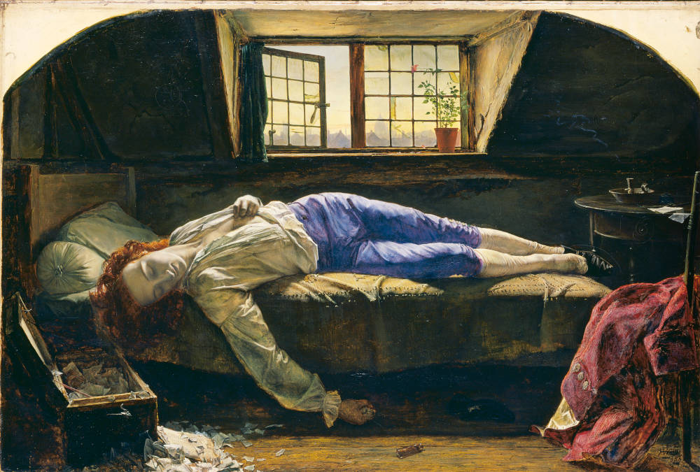
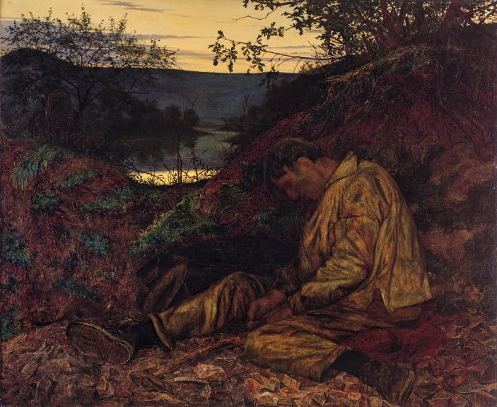
Two examples of socially-nuanced representations of death. Left: Wallis, The Death of Chatterton. Right: The same artist’s The Stonebreaker.
 >
>
Watts’s Found Drowned.
Illustrators recreate this powerful and disturbing imagery, always conveying the working classes’ tenuous hold on life. John Leech’s designs for Punch and for Dickens’s Christmas books are an accurate reflection of the conditions of the ‘Hungry Forties’, figuring the poor as one step ahead of extinction. In Substance and Shadow (1843), the artist dramatizes the labouring classes as less alive than the paintings they scrutinize, mere shadows of the portly, well-fed characters appearing within the frames. Leech is equally powerful in his representation of Ignorance and Want for Dickens’s A Christmas Carol (1843). These starving figures are emblematic of the brutality of Malthusian capitalism that condemns them to death and to death in life; both children are cadaverous and are dressed in rags that look like shrouds. In a novelette that includes the character of Tiny Tim, a child on the point of death as a result of poverty, Leech graphically conveys the author’s message: deprivation is a killer, and support for the inequalities that give rise to this situation is for the sufferers a death-sentence. Leech is at his most powerful, however, in his controversial The Poor Man’s Friend (Punch, 1843), with its grisly pairing of starvation and the Grim Reaper; praying for salvation is shown to be pointless. The image is another, radical take on the serene death-bed.
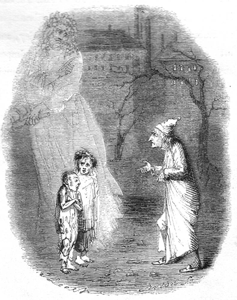

John Leech at his most hard-hitting. Left: The Poor Man’s Friend. Right: Ignorance and Want.
The impact of economic policies which led to starvation was further explored later in the century. Fred Sandys and James Whistler set out to shock their middle-class audiences in designs revealing the brutal facts of the situation as it unfolded in the 1860s, with a special emphasis on the slump in the weaving trade. In Sandys’s The Waiting Time (1863) the artist presents a female weaver sitting in front of her idle loom; nominally waiting for work to pick up, she is also waiting to die. Gestures convey her anguish and her extended hand is surely an appeal for help, the desire, quite literally for a helping hand, in the form of relief. Sandys depicts the scene with journalistic exactitude to highlight the urgency of the situation; though still well-formed, the woman has nothing to sustain her and will soon decline. Whistler intensifies the threat in his illustration of The Relief Fund in Lancashire (1862). In this design the artist uses an abstracted style to show what will happen: with nothing to eat, the figure is literally fading away, both living and already a ghost.
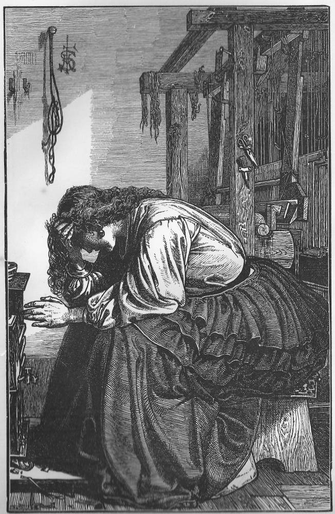

Two images of working-class suffering and the imminence of death. Left: Sandys, The Waiting Time. Right: Whistler, The Relief Fund in Lancashire.
Parallel imagery, with the emphasis on suffering and the omnipresence of death, appears in The Graphic magazine in the final third of the nineteenth century. Set up to confront social injustice, it includes many scenes of the working classes and destitute as they struggle to survive. Perhaps the most telling of these is Luke Fildes’s Houseless and Homeless, a cut that was reworked as the painting Applicants for Admission to a Casual Ward (1869). Fildes descibes his figures as wretched examples of humanity at the very edge of existence: cold, hungry and dressed in rags, all that stands between them and fatal decline is the slender provision of a night’s squalid rest in a workhouse.

Fildes’s vision of death in life. Applicants for Admission to a Casual Ward.
Heaven, Hell, Angels and Graveyards
Prolonged, rapid or unexpected, Victorian death was framed by the contexts of traditional Christian belief: the worthy went to Heaven to live in the protection of God, while sinners went to perpetual torment in Hell; a good life meant reward, a bad life, punishment. Book and magazine illustration was instrumental in reinforcing this belief system, deploying an orthodox, Biblical iconography to map the difference between the fate of the virtuous and the wicked. At the same time, the imagery is fissured with uncertainty, and creaks under the pressure of religious doubt.

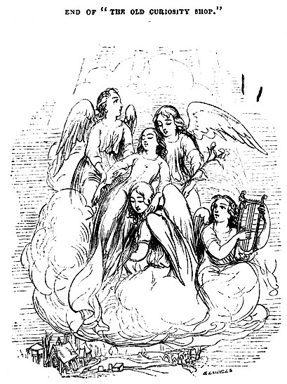

Contemporary views on punishment for the wicked and reward for the virtuous. a) Cruikshank’s Folly of Crime; b) Cattermole, The Spirit’s Flight [Nell ascension into Heaven]; c) Phiz’s treatment of Paul Dombey’s heavenward journey (top right of image).
Most conventional as a version of Christian teaching is Cruikshank’s Folly of Crime (1845). Conceived as a narrative montage, it presents a Gothic version of Hell as the domain of grinning demons: the ground opens under the feet of the scoundrel, with blackness and torment awaiting him. Fusing the dream-like and grotesque, Cruikshank conveys the physical immediacy of the punishment in an age of short lives and unexpected extinction. Nevertheless, Victorian illustrators were more typically concerned with the imagery of angels and the ascension to paradise. Cattermole and Browne (Phiz) provide effective embodiments of Dickensian sentimentality in their responses to The Old Curiosity Shop (1841) and Dombey and Son (1848). Having already depicted Nell in her death-bed, Cattermole shows her, still apparently sleeping, being carried up to Heaven by angels, while Phiz provides visionary imagery of Paul Dombey as a baby in the arms of the celestial host. In both designs the emphasis is on the delicacy of the experience: though one is a wood-engraving (Cattermole) and the other (Phiz) an etching on steel, the artists use a delicate line to convey the ethereality and lyricism of paradise, reflecting and reinforcing contemporary notions of Heaven as a place of perfect repose.

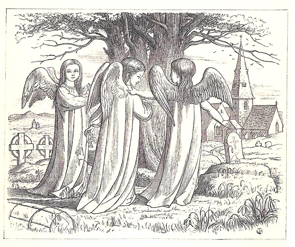
Left: Mason, Angels Holding Torches. Right: Boyle, Angels in the churchyard.
Others depict angels in more tangible terms. Fred Mason offers an Art Nouveau manifestation in his illustration of the dead Renaud being watched over by supernatural beauties; the artist rhymes the vitality of their swirling, dynamic robes with the arabesques of the plants surrounding him, and by so doing he focuses attention on the idea of perpetual growth and renewal. On the other hand, Evelyn Vere Boyle applies a realistic approach to suggest the angels’ materiality – as emissaries from the spiritual domain who can ease the transition from life to death. In her reading of Tennyson’s The May Queen (1862), she figures the divine characters as real-life visitants – once appearing on the Queen’s bed (28), a detail not appearing in the text – and again as winged children, not quite cherubs, in the graveyard she will eventually occupy.
Boyle’s visualization in one sense confirms the iconography of Anglicanism: married to a rector in the Church of England, her imagery is on the face of it entirely predictable. Yet within this apparently stable domain there is again evidence of doubt: the angels come to reassure the dying girl, but she is afraid of the angel of death, a terrifying masked figure (The May Queen, 26), while the redeeming entities are several times depicted as melancholy and menacing. Once again, the tensions between faith and fear and faith and scepticism are brought to the fore. The effect is unsettling, both reassuring and curiously unconvincing, a visual response to a writer whose doubts were never far from the surface of his texts. Not for the last time, Christian belief seems paper thin, a positing of bogus iconographies.
Boyle is uncomplicated, however, in her depiction of peaceful graveyards, an approach that epitomizes the discourse as a whole. Although the condition of dead bodies was a source of anxiety, there is no graphic registration of the difficulties of internment, and no image of ugly urban burial grounds of the sort that appear in Dickens’s Bleak House (1853) and A Christmas Carol(1843). The graveyards of illustration are exclusively the old-style blessed plots of rural England which act to reassert the notion of a ‘good death’: drawing on two discourses, with religious faith symbolized by the proximity of the church and eternal peace suggested by the beauty of the English idyll, the images offer a reassuring notion of death, presenting it as part of timeless, natural process that fuses spirituality and a pantheistic oneness with nature. Thomas Creswick’s design of Tennyson’s ‘Claribel’, the first illustration in the Moxon edition (1857), epitomizes this approach. The artist responds to Tennyson’s pastoral verse, preserving details of Claribel’s resting place in a rustic grave; the ‘babbling runnel’ (Poems2) is placed in the foreground and although the illustrator’s tree is not an oak, he nevertheless preserves the ‘thick-leav’d’ (2) calm in the form of a Picturesque composition. Though oddly positioned, Claribel’s tomb is indeed a part of nature, with a church standing by reassuringly. This is a notion of death without fear, a celebration of humanity’s position in a God-given order, and one that demands both respect and acceptance.
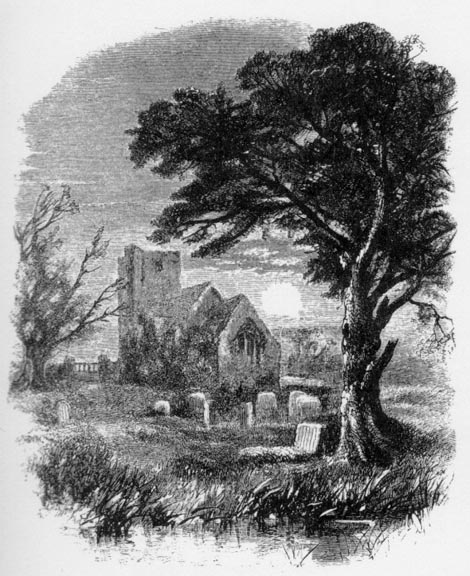

Two views of journey’s end. Left: Horsley’s Circumstance. Right: Creswick’s Claribel.
The idea of interconnectedness is also nuanced in designs which stress the intergenerational relationship between the youthful and the aged, the dead and the living. J. C. Horsley’s second illustration of Tennyson’s ‘Circumstance’ (again in the ‘Moxon Tennyson’) is a prime example of this approach, stressing how young lovers, shown in the opening design, will eventually age and be the subject of a funeral; children look on, but they too will undergo the same, immutable process as a matter – as the poem’s title indicates – of inevitability. Indeed, the immanence of death is especially pronounced in illustrations connecting childhood and death as the generations roll through time. Sandys makes the linkage in The Little Mourner (1863); picturing a sentimental poem, it shows a grieving child for whom maintenance of a grave is an act of acceptance and love, rather like Pip putting flowers on his parents’ grave in Great Expectations (1861). The perfect formulation, though, is J. W. North’s design for Philip Doddridge’s ‘How swift the torrent flows’ (Spirit of Praise 161–2). The verse, like Tennyson’s ‘Circumstance’, is a meditation on the truism that:
There where the fathers sleep,
Must all their children dwell;
Nor other heritage can keep
Than each a narrow cell. [162]


Children in the churchyard. Left: Sandys’s Little Mourner; Right: North’s "There, where the fathers sleep.""
North visualizes this sentiment in a literal way, depicting children in a country churchyard surrounded by their forebears in absolute continuity with past generations. The children are picking flowers and seem to be having a conversation while in the background the sun illuminates the walls of the ancient church; the imagery is in the idyllic mode, the notion of England as paradise, and the composition’s geometry suggests order and balance. North thus exemplifies the poem’s message of cosmic rightness: the children fit with the past generations and the fabric of the material world reflects the designing hand of God.
Revisiting Grief and Loss
Victorian illustration acts in multiple ways to reflect and manage the Victorian experience of death. Essentially another sort of relic which laments and commemorates the transition from earthly life to whatever lies beyond, it is in equal measure a comforting reassertion of certainties and a registration of anxious doubts. The hope is always that death is not an end, with God protecting the human spirit, even if gross corporeality, the fear of decay and valueless extinction, looms close behind. Victorian illustration ritualizes these thoughts, embodying them in visual tropes which run in strict parallel with other cultural forms of mourning. Of course, all of these proceedings are paradoxically for the benefit of the living, not the dead. The survivors need to manage their emotions while the deceased, despite the Victorian fascination with ghosts, are either contented souls in the afterlife or speechlessly locked in non-existence. There remains the question of the sincerity of these representations, and it could be argued that the imaging of death is not so much an amelioration of feelings as a substitute for genuine dismay. Some illustrators had doubts, viewing the ‘cult of death’ as so much humbug.
Richard Doyle hilariously travesties the display of Victorian grieving in one of his initial letters for Thackeray’s The Newcomes(1855). Doyle presents the response to the death of Lady Kew, exemplifying the hypocritical crocodile tears of those who will benefit from her passing in the form, quite literally, of a lachrymose reptile; dressed in the full regalia of the ostentatious funeral, the figure symbolizes the survivors’ insincerity. The letters ‘sacred’ and ‘here lies’ randomly appear on glimpses of gravestones as platitudes to be ridiculed, and the whole effect is one of knowing, sardonic mockery.

Richard Doyle’s blunt, anthropomorphic
comedy in the form of Crocodile Tears.
So how sincere, as such, are Victorian graphic images of grief? Without doubt, much of it is formulaic, a readymade or conventional way of communicating emotion in a sentimental or overwrought way. Nevertheless, many illustrators invest their designs with a genuine sense of traumatic loss. Typically, the most convincing images are those in which the emphasis is not on the immediate impact of bereavement – as in the many deathbed scenes of lovers and relatives prostrating themselves on the still warm corpse – but on the long-term effects of grieving as it unfolds long after a burial has taken place and the body is out of sight. These illustrations negotiate the troubling domain of an emotional wound that never heals and is never subject to any sense of closure; working with the texts they are illustrating, several artist greatly extend the source material and infuse it with additional layers of meaning and psychological implication.
Two illustrations stand out as treatments of deep feeling, and both are responses to verse by Tennyson in his Poems (1857). The first is Millais’s sparse design for ‘Edward Gray’, a lyrical elegy exploring the unexpected passing of the narrator’s beloved. Millais recreates the moment when the main character explains his loss to ‘Sweet Emma Moreland’ (340–42), although he changes its focus. The poet recounts a narrative of Edward’s grieving at his lover’s grave, but Millais shows him in a suspended moment, with his face and back turned away; too possessed by grief, he is incapable, according to Millais, to speak to his companion directly. His feeling is further conveyed by his stooping gesture, leaning on his stick as he grasps Emma’s hand. The effect is on of heart-rending intensity: beyond the reach of a troubled facial expression, his grief in enshrined in his awkward, helpless stance, with his physical condition expressing his psychological trauma. Tennyson uses a semantic field of loss – notably ‘cruel’ and ‘bitterly weeping’ – while Millais reduces the emotional content to an economical formulation that resonates with raw directness. Edward is a broken man, and looks it. In short, Millais’s arrangement typifies his deployment of significant gestures, depicting his grieving character in a realistic, plausible way.
Equally honest and painful is Holman Hunt’s second illustration for ‘The Ballad of Oriana’, a tragic narrative in which the hero inadvertently kills his beloved and is left to lament her passing. As in Millais’s response, the artist takes some of the writer’s material and recasts it in his own terms. Hunt makes no attempt to explore the narrator’s sense of guilt – conveyed in the obsessive refrain of Oriana’s name – but focusses on the moment when he is about to leave her in her tomb. Gestures, again, are important, visualizing his grief in the kiss he delivers to her effigy, but more important is the landscape. Tennyson positions her grave ‘beneath the greenwood tree’ (55), but Holman Hunt locates the farewell in a glacial landscape, with bare hills rising in the background. This setting is used symbolically, adding a visual detail to materialize the character’s sense of emotional emptiness, a void of grieving that will never again be filled with Oriana’s presence.
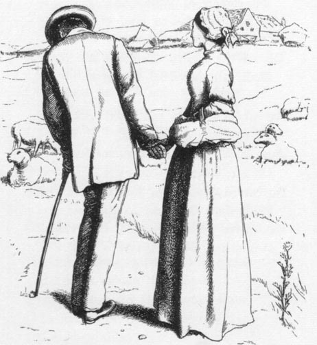

The emotions of grieving. Left: Millais’s Edward Gray. Right: Holman Hunt’s second design for The Ballad of Oriana.
Both images exemplify the emotional depth of Pre-Raphaelite illustration, taking it well beyond the conventional iconographies of loss. The Victorian culture of death sought to fill the emptiness of the experience with tokens of meaning – locks of hair, letters, jewellery, the image of a dead child fixed into the surface of a daguerreotype, the prayers and gestures of the death-bed families in graphic art. What Millais and Hunt depict, however, is the void, the absence and emptied space that is left when a loved one disappears. All that is left is memory, and no creative act, as artists and writers struggled to restock the Victorian imagination, could finally overcome the survivors’ emotional scars as they struggled to make sense of the hard facts of death.
Related Material
- "Frail Treasures": Child Death and the Victorian Novel
- The Last Moments of a Convict and a Bishop
- Death in Phantastes and Great Expectations
- Sentimentality: The Victorian Failing
Works Cited
Primary
Ainsworth, W. H. The Tower of London. London: Bentley, 1840.
[Brown, Ford Madox]. The Diary of Ford Madox Brown. Ed. Virginia Surtees. New Haven: Yale University Press, 1981.
[Chambers, Robert]. Vestiges of the Natural History of Creation. London: 1844.
The Churchman’s Family Magazine, 1863.
The Cornhill Magazine. 1860–70.
Cruikshank’s Table Book. London: The Punch Office, 1845.
Darwin, Charles. The Origin of Species. London: Murray, 1859
Defoe, D. History of the Plague of London. London: Laurie, 1863.
Dickens, Charles. Bleak House. London: Bradbury & Evans, 1853.
Dickens, Charles. A Christmas Carol. London: Chapman & Hall, 1843.
Dickens, Charles. Dombey and Son. London: Bradbury & Evans, 1848.
Dickens, Charles. Great Expectations. London: Chapman & Hall, 1861.
Dickens, Charles. ‘The Old Curiosity Shop’. Master Humphrey’s Clock. 3 Vols. London: Chapman & Hall, 1840–41.
Dickens, Charles. Oliver Twist. 3 Vols. London: Bentley, 1838.
Engels, F.The Condition of the Working Class in England in 1844. Marx/Engels Internet Archive.
Favourite English Poems. London: Sampson Low, 1862.
Good Words. 1860–70.
The Graphic, 1869 –1880.
Once a Week . 1859–70.
The Poets of the Nineteenth Century. London: Routledge, 1857.
Potts, J. H. The Golden Dawn. Chicago: Ziegler, 1884.
Punch, 1841–50.
Renaud of Montauban. London: George Allen, 1897.
A Round of Days. London: Routledge, 1866.
Sewell, Mary. Mother’s Last Words. London: Jarrold [1893].
The Shilling Magazine (1865).
The Spirit of Praise. London: Warne [1870].
Tennyson, Alfred. In Memoriam. London: Moxon, 1850.
Tennyson, Alfred. The May Queen. London: Sampson Low, 1861.
Tennyson, Alfred. Poems. London: Moxon, 1857.
Thackeray, W. M. The Newcomes. 2 Vols. London: Bradbury & Evans, 1855.
Secondary
Arnold, Catherine. Necropolis. London: Pocket Book, n.d.
Brooks, Chris. Mortal Remains. London: Wheaton, 1989.
Curl, James. The Victorian Celebration of Death. Stroud: Sutton, 2004.
Jalland, Pat. Death in the Victorian Family. Oxford: Oxford University Press, 1996.
Kooistra, Lorraine Janzen. ‘Science and Art: Vestiges of Corpses in Pre-Raphaelite Illustration.’ Reading Victorian Illustration, 1855–75.. Eds. Paul Goldman and Simon Cooke. Burlington: Ashgate, 2012. 97–114.
Lutz, Deborah. Relics of Death in Victorian Literature and Culture. Cambridge: Cambridge University Press, 2015.
Riso, Mary. The Narrative of the Good Death. London: Routledge, 2017.
Thomas, Julia. ‘Happy Endings: Death and Domesticity in Victorian Illustration.’ Reading Victorian Illustration, 1855–75.. Eds. Paul Goldman and Simon Cooke. Burlington: Ashgate, 2012. 79–96.
Thomas, Julia. Pictorial Victorians. Athens, Ohio: Ohio University Press, 2004.
Wheeler, Michael. Heaven, Hell, and the Victorians. Cambridge: Cambridge University Press, 1994.
Zigarovich, J. Writing Death and Absence in the Victorian Novel. London: Palgrave Macmilland, 2016.
Created 20 April 2021