Want to know how to navigate the Victorian Web? Click here.
Introduction: a personal approach
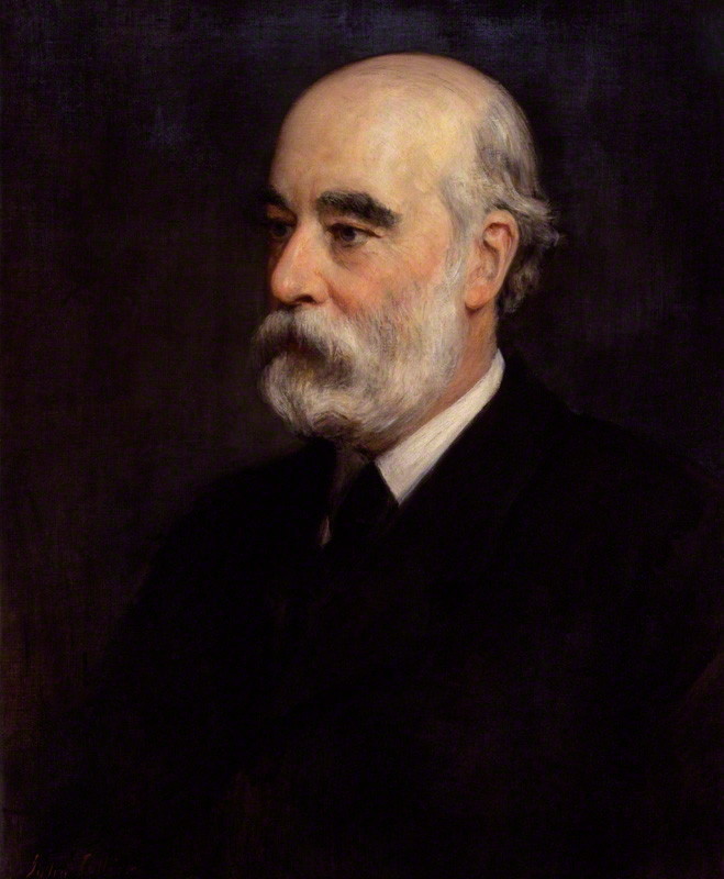
George Murray Smith (1824–1901) of Smith Elder is well known as one of leading Victorian publishers. Transforming the company’s fortunes when he took over in 1843, he expanded its narrow portfolio of authors and quickly developed a special interest in literature. Smith scored an early hit as the driving force behind the Brontës, and went on to publish the work of some of the outstanding novelists of the fifties and sixties, a stable of talent that ultimately included Trollope, Thackeray, Reade, Gaskell, Collins, George Eliot, and Hardy. Eventually overtaking Chapman and Hall and Bradbury and Evans as the foremost purveyor of fiction, he made the imprint of ‘Smith Elder & Co, 65, Cornhill’ into an outstanding marque.

George Smith by John Collier. [Click on image to enlarge it.]
He was also a figure of crucial importance in the promotion of book illustration, and established or helped to establish many of the artists of ‘The Sixties’. Known as ‘The Prince of Publishers’, an epithet applied to him by Charles Reade (Glynn, p.81), Smith was regarded by contemporaries as a type of Renaissance patron who had impeccable taste and was willing to risk his capital in the pursuit of excellence. This approach was directed at the production of a series of illustrated novels, a medium in which he combined his interest in both fiction and its pictorial representation. Smith’s published this work in his prime creation, The Cornhill Magazine.
He established his periodical in 1859 and issued number one in January 1860. Sold at a shilling and issued monthly, it was bound in limp yellow wraps with an image of sowing and reaping on its front cover; designed by Godfrey Sykes, the illustration punned on the magazine’s name while also suggesting its rich and promising contents in the form of four roundels contained within a Renaissance frame, rather like a coffered panel in an Italian palace. The front cover appealed to civilized values, and it had to impress: intended to rival Once a Week, which was first published by Bradbury and Evans in the middle of 1859 and sold at 3d, it needed to compete for readers. Once a Week was already taking a large share of the market when its competitor came onto the scene, and Smith’s magazine was always a risky venture.
To deal with the threat of Once a Week Smith adopted a variety of strategies. To attract the large middle-class audience that was needed to make his periodical into a profitable venture the magazine would have to be demonstrably ‘superior’, and to that end the publisher combined outstanding literature with the best of contemporary illustration, so appealing to the readership’s taste for recent developments in graphic design. This approach was not in itself original: Smith’s competitors at Once a Week and Good Words were following a parallel strategy; but Smith primarily employed the ‘new men’ of the period. Richard Doyle, a long-established cartoonist with a large public was given a slot in the form of his satirical ‘Bird’s Eye Views of Society’ (The Cornhill Magazine, July 1861– June 1862), yet Smith’s preference was always for those practising the ‘poetic realism’ of the style later known as ‘The Sixties’. Commissioning, among others, George du Maurier, Frederic Leighton, Robert Barnes, Frederick Walker, George Housman Thomas, and John Everett Millais, Smith ensured The Cornhill was largely free of the older traditions, making it seem both conventionally ‘respectable’ (with its blatant appeal to good taste) and modish (in its emphasis on fresh artistic talent).
Figured as a show-case of the latest styles, Smith’s periodical combines the work of Trollope, Eliot, Gaskell and Thackeray with striking images; unlike Once a Week, which focused on illustrated poetry and positioned the illustrations within the dense columns of text, The Cornhill Magazine was primarily concerned with serial fiction and its imaginative interpretation in the form of initial letters and full-page engravings. Physically separated from the letter-press, these full-page designs were given added status and power by printing them on high quality, gloss paper, encouraging the reader to view them as if they were prints in a portfolio. This presentational arrangement forms a marked contrast with Once a Week’s approach, uniting the illustration and its text on the same page, and on low-quality paper.
The Cornhill was thus presented as a journal for the connoisseur – for readers, the material features imply, who understand and value the best of fiction and its associated pictures. This is essentially marketing by flattery, creating a clientele by appealing to the cultural aspirations of a growing bourgeois audience. The approach is shrewd, and the emphasis on quality.
But Smith’s treatment, while canny, is far from cynical or impersonal. On the contrary, the emphasis on illustrated fiction is a personal act; indeed, his approach to the development of his magazine is entirely idiosyncratic. In his own words, he ‘had a certain faculty for reading men’ (qtd. Glynn, p.31) and did everything on the basis of intimate relationships. Although he employed Thackeray as the first editor, who had wide experience of the processes involved in preparing illustrated texts, most of the work connected with the commissioning of designers was done by the publisher. Following Thackeray’s resignation in 1862, Smith dealt with all aspects of hiring, payment, consultation and quality control. Business was conducted informally, invariably at the dinner parties he regularly offered at the family home in Gloucester Square; there were no contracts and all arrangements were made, before the wine had been taken, on the basis of a ‘gentleman’s agreement’. This informality impressed Smith’s contributors: artists (and writers) respected their employer and there appears to have been a genuine warmth in the dealings between the publisher and ‘his’ illustrators, who relished the kudos of being Smith’s retainers. For Smith, too, this arrangement was both financially rewarding and psychologically nourishing. In the words of his biographer Jennifer Glynn, he ‘saw himself as a middleman between ‘men of genius’ and his readers … had tremendous admiration [for them], and [took] pleasure and pride in their friendship (p. 32).
Although it is impossible to test one way or the other, Smith’s charisma and fair dealing must have resulted in better results than if he had dealt with illustrators purely as co-respondents in a business transaction. His positive attitude was also a powerful agent in enlisting the unknown and untested. He was willing to take risks when he detected potential, famously giving Frederick Walker his first opportunity as the illustrator of Thackeray’s Philip. Walker had turned up at the Smith, Elder office looking for work; following inspection of his portfolio, the publisher decided that he could risk the nervous Walker in the pages of his magazine, if only, to start with, as someone to ‘improve’ on the author’s own illustrations. As Smith explains:
On one occasion I saw a young gentleman, quitting the outer office, whose appearance attracted my attention: I enquired who he was, and was told by the clerk … that he was a young artist of the name of Walker, who wished to draw for The Cornhill. When Mr Walker paid another visit, and I saw his drawings, it occurred to me that he was the artist who would redraw Mr Thackeray’s designs satisfactorily. [Huxley, pp. 141–42]
Following a further small task, which involved asking the artist to draw a picture of Thackeray’s back – being too nervous to draw this face – Walker quickly proved he was a considerable artist, and after working Thackeray’s designs into a presentable form went on to illustrate Philip in his own style (Cooke, pp.141–46). Smith’s judgements thus facilitated the entrée Walker was looking for. Yet the publisher had other ways of attracting talent and achieving the best results. In the manner of all businessmen he offered significant financial incentives, attracting and retaining outstanding talent by paying the most generous fees, regularly outdoing those available at Once a Week and Good Words, and occasionally over-stepping the mark with reckless investments. He secured Leighton’s services by paying him £480 for his work on Eliot’s Romola, even though the issues containing the novel performed poorly. Nevertheless, he consistently paid £20 per full page engraving at a time when £10–£15 was the standard remuneration, and he even paid fees of £15 to artists of a lesser reputation such as Robert Barnes, the illustrator at work on Reade’s Put Yourself in His Place (1869–70).
This generous accounting is preserved in the business ledgers of Smith, Elder, some of which are held in Princeton’s University’s Special Collections and some in the National Library of Scotland, Edinburgh (MSS. 23189). Most telling, though, is a small pocket-book among the Edinburgh ledgers. Obviously for Smith’s personal use, this apparently insignificant item details what was paid and to whom; not content to record all of his dealings in the formal columns of the business account-books, Smith used the book as an aide-memoir. We can imagine how he might consult its dog-eared pages, glancing through his notes between the sherry and cheroots, and before making an offer.
But Smith’s easy-going generosity and ample fees were only part of the equation. There is no doubt that he enjoyed acting the patron, being the centre of a group of artists vying to please their employer and win a reputation by appearing in the pages of his magazine; yet he was also a stern taskmaster when an illustrator fell below expectations. Du Maurier, among others, was deeply disappointed when his work was rejected, and Smith’s quality control, as he saw it, was extremely rigorous. Astonishingly, he inspected most of the drawings for illustrations as they were produced, and every single proof before the engravings were turned into electrotypes and printed. If, at proof stage, the work were deemed unsatisfactory, he turned it down; the engraver might have to re-cut it, or the artist might have to do it all over again – if he wanted to be paid. This arrangement was accepted by the magazine’s illustrators as part of the deal. They flourished within Smith’s liberal regime, but they had to meet his exacting standards. This paradox is central to the publisher’s powerful hold over his contributors.
Smith and the setting up of collaborations
Smith was both a businessman and a connoisseur. He wanted (and needed) to make money, but he also had a good eye, only approved the illustrations that met his own standards, and saved all of the proofs he had validated, placing them in a large personal collection (some of which is now in my possession). However, Smith’s sensitivity for design extended well beyond aesthetics. He was deeply aware of the fact that illustration responds to a literary text, and that illustrated serials have to be based on an artistic accord, of one sort or another, between the images and the words. Artistic compatibility is of course a complicated issue, one often contested and analysed; but Smith was unusually adroit in selecting artists whose thematic and stylistic interests were in many ways equivalents to those of the writers he linked them with. A classic combination of reasoned judgement and instinct – the qualities shared by all successful entrepreneurs – Smith identified a range of suitable collaborators, placing artists and authors in a series of relationships which, for the most part, had creative results.


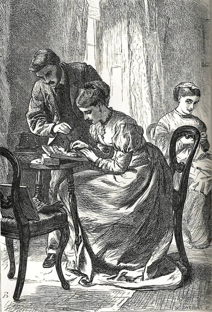
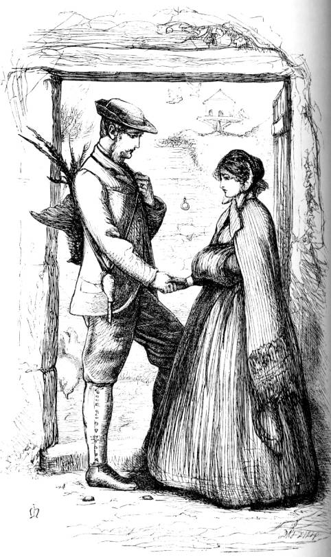
From left to right: Honest Work and Death by suffocation by Robert Barnes. The Crawley Family and Lord Lufton and Lucy Robartes by John Everett Millias. [Click on these images to enlarge them.]
Some of the best of these are among the outstanding collaborations of the period, all of them set up by a publisher who (along with the engraver) becomes a creative partner in the equation. We have, for example, the union of Trollope and Millais, who worked together on Framley Parsonage (April 1860–January 1861) and The Small House at Allington (September 1862–April 1864). Others include the collaboration of Gaskell and du Maurier, notably producing Wives and Daughters (August 1864–January 1866); the partnering of Reade and Barnes, the co-producers of the now largely forgotten Put Yourself in His Place (March 1869–July 1870); Walker’s designs for Thackeray’s Philip (May 1861–August 1862); and the famous interaction of Eliot and Leighton, the writer and artist of Romola (July 1862–August 1863).
In each of these dual-texts there is a fundamental agreement, a process of matching and equivalence, compelling the sign-systems of words and images to interact as part of a symbiotic process in which meaning is presented, re-represented, interrogated, extended, enriched and re-figured. Of course, these collaborations were not necessarily harmonious: as several critics have pointed out, the working relationships of authors and artists were often tense, and sometimes acrimonious. Eliot’s collaboration with Leighton was a power struggle, and so were many of the others. But it was Smith’s achievement to bring these collaborators together; his instincts were to a remarkable degree the right ones, and the end result a series of rich and intricate novels in images and words.
Smith’s strategy of creating these series was risky but generally a great success. The public enjoyed the matching of Trollope and Millais, du Maurier and Gaskell and the rest, and their approval was registered in the magazine’s economic success. Early numbers achieved a circulation of 100,000 and although there was a slump when Thackeray left in 1862, high sales were recorded until the end of the 1860s (Glynn, p.143).
Taken as whole, The Cornhill’s success was a vindication of Smith’s approach: he set out to create a periodical containing the best contemporary fiction and illustration, drawn together into an impressive unity. Though its outstanding period was its first decade, it continued for the rest of the century, and only came to a close in 1975.
Works cited
Cooke, Simon. Illustrated Periodicals of the 1860s. Pinner: PLA; London: The British Library; Newcastle, Delaware: Oak Knoll Press, 2010.
Cornhill Magazine, The. London: Smith, Elder, 1860–70.
Glynn, Jennifer. Prince of Publishers: a Biography of George Smith. London: Allison & Busby, 1986.
Huxley, Leonard.The House of Smith Elder. London: Printed for Private Circulation, 1923.
Bibliography of studies of illustrated Cornhill novels
Burton, Antony. ‘Thackeray’s Collaborations with Cruikshank, Doyle, and Walker’. Costerus, 2 (1974): 141 – 87.
Cooke, Simon. ‘A Forgotten Collaboration of the Late 1860s: Charles Reade, Robert Barnes, and the Illustrations for Put Yourself in His Place’. Dickens Studies Annual, 30 (2001): 321 – 342.
Cooke, Simon. Illustrated Periodicals of the 1860s. Pinner: PLA; London: The British Library; Newcastle, Delaware: Oak Knoll Press, 2010.
Goldman, Paul. Victorian Illustration. Aldershot: Scolar, 1996.
Gresty, Hilary. ‘Millais and Trollope: Author and Illustrator’. Book Collector, 30 (1981): 43 –61.
Hall, N. John. Trollope and His Illustrators. London: Macmillan, 1980.
Leighton, Mary Elizabeth & Surridge, Lisa. ‘The Plot Thickens: Towards a Narratological Analysis of Illustrated Serial Fiction in the 1860s’.Victorian Studies 51 (2008): 65 – 102.
Mason, Michael. ‘The Way we Look Now: Millais’ Illustrations to Trollope’.Art History, 1:3 (September 1979): 309 – 40.
Reid, Forrest.Illustrators of the Sixties. London: Faber & Gwyer, 1928; New York: Dover, 1970.
Suriano, Gregory R.Pre-Raphaelite Illustrators. Newcastle, Delware: Oak Knoll Press, 2000.
Turner, Mark. ‘Drawing Domestic Decline: Leighton’s version of Romola’.Frederic Leighton: Antiquity, Renaissance, Modernity. Eds. Tim Barringer & Elizabeth Prettejohn. New Haven: Yale University Press, 1999. pp. 169–192.
Turner, Mark. ‘George Eliot v Frederic Leighton: Whose Text is it Anyway?’From Author to Text: Re-reading George Eliot’s Romola’. Eds. Caroline Levine & Mark W. Turner. Aldershot: Ashgate, 1998, pp. 17 –35.
Witemeyer, Hugh. George Eliot and the Visual Arts. New Haven: Yale University Press, 1979. [full text on this site]
Last modified 26 November 2012