
 t would be misleading to suggest that the illustrated novel dominated
Victorian fiction, since throughout the era many writers, major and minor,
published their books without pictures, and without any apparent sense that
something was lacking. The Brontës come immediately to mind among the major
Victorian novelists, and with a few exceptions both
George Eliot and
George
Meredith published their novels unillustrated, while
Anthony Trollope's novels contained
illustrations during only a limited segment of his long career. Nonetheless, the
illustration of novels in their first appearance was widespread; for certain
authors it was a significant factor in the process of creation and in the total form of
their books. Generalizations about so large a field are inevitably treacherous, but if we
are to understand the role of illustrations in Dickens' novels, and in particular those
of its main illustrator, Hablot Knight Browne, we must hazard some theories about the
historical, aesthetic, and interpretative implications of this mixture of artistic media.
t would be misleading to suggest that the illustrated novel dominated
Victorian fiction, since throughout the era many writers, major and minor,
published their books without pictures, and without any apparent sense that
something was lacking. The Brontës come immediately to mind among the major
Victorian novelists, and with a few exceptions both
George Eliot and
George
Meredith published their novels unillustrated, while
Anthony Trollope's novels contained
illustrations during only a limited segment of his long career. Nonetheless, the
illustration of novels in their first appearance was widespread; for certain
authors it was a significant factor in the process of creation and in the total form of
their books. Generalizations about so large a field are inevitably treacherous, but if we
are to understand the role of illustrations in Dickens' novels, and in particular those
of its main illustrator, Hablot Knight Browne, we must hazard some theories about the
historical, aesthetic, and interpretative implications of this mixture of artistic media.
To account historically for the pervasiveness of illustrations in Victorian fiction we must look back to the Posthumous Papers of the Pickwick Club, whose publication began in 1836. Dickens' financial success with Pickwick's mode of publication — monthly, one-shilling parts, with two full-page illustrations in each — encouraged other authors and publishers to try something similar. Among the many novelists operating at least sporadically in [1/2] this mode we may mention Charles Lever, W. Harrison Ainsworth, William Makepeace Thackeray, and Anthony Trollope. It can be argued that the non-intellectual, largely middle class audiences to whom the publishers hoped to sell the novels of Dickens, Lever, Ainsworth, Thackeray, and Trollope found the illustrations especially attractive as a supplementary form of visualization, whereas more intellectual novelists such as Eliot and Meredith did not require illustrations for their particular audiences.
Even if these generalizations are valid, further distinctions must be made among the five illustrated novelists mentioned. Lever and Ainsworth were both something more than hacks and something less than artists. Dependent to some degree upon their illustrators to attract sales, they made no particularly complex or original use of illustrations. Trollope (though he was gratified to have so famous an artist as Millais to illustrate several novels) was not very interested in the illustrations, and the fact that he would always complete his novel before the publication of Part 1 — in contrast to the other four novelists, who published the installments while the novels were in progress — would tend to diminish if not eliminate meaningful collaboration between author and illustrator. On the other hand, even though their work in the dual medium originated in a series of historical accidents, Thackeray and Dickens found it a congenial mode and made it into a distinct subgenre of the novel.
Despite their very great differences as men and as novelists, Dickens and Thackeray shared common influences, such as the emblem book and the satirical engraving, which made available to them a range of visual and verbal techniques including metaphor, allusion, and analogy. Thackeray, as his own illustrator, used these techniques most frequently in the wood-engraved initial letters and tailpieces to chapters, illustrations additional to the two etchings per monthly part. Thus in Vanity Fair the fool in cap and bells recurs as a visual motif, while Becky Sharp appears as a mermaid, a female Napoleon, and, in a full-page etching, as Clytemnestra. But Vanity Fair is also conceived verbally in similar terms from its title onward: the puppet motif is carried through the novel, and the clock bearing the sacrifice of Iphigenia as an emblem (which represents the sacrifice of an Osbourne daughter's fulfilment in life to her father's [2/3] selfish needs) occurs first in the text, and only later in an illustration. In Dickens' novels, such a detail appears in one of Browne's illustrations (to Dombey and Son — published concurrently with Vanity Fair).
By the time Vanity Fair began publication [in January 1847], Dickens and Browne had already established their relationship in five novels, three of which were in what became the commonest format for their collaboration: monthly parts with two etched illustrations in each, usually a total of nineteen parts in all, the final one of double length with four etchings. (Because of the haphazard nature of its origins, Pickwick was a few parts longer, and A Tale of Two Cities, the last Dickens novel to be illustrated by Browne, appeared in only eight installments.) Dickens' comfort with the format is suggested by the fact that he used it twice more after dropping Browne as illustrator, in Our Mutual Friend and the unfinished Edwin Drood. From the very beginning, as I hope to demonstrate, Browne seems to have taken it upon himself to introduce his own emblematic details, thereby commenting upon or pointing up some aspect of the text, and by the time of Martin Chuzzlewit, the third collaboration with Dickens in monthly installments, a complex relationship had developed between text and illustration.
Victorian illustrated novels, and in particular those of Dickens and Thackeray, present certain aesthetic and interpretative problems. In many of Thackeray's novels we have a self-illustrated writer, whose artistic intention may be thought of as unified even though he works in two media. But with Dickens and his illustrators we cannot, despite Dickens' practice of giving detailed instructions, assume such a single intention. Because the illustrations include elements which are specified by the author, but are not the author's own creations, and further because the artist introduces details of his own, we find that the illustrator is at once collaborator, attempting to express the author's intention visually; interpreter, offering his own comments on the meaning of the work;and perhaps even an artist, sometimes creating independently valuable works of art. The paramount problem for readers of Dickens, a problem at once both aesthetic and interpretative, is how to "read" the text and illustrations in conjunction with one another. In the renowned etching for Vanity Fair, in which Becky Sharp appears in both the caption and a small [3/4] allusive detail as Clytemnestra (i. e., a murderess), Thackeray's intentions can hardly be doubted. The critic may feel that to make Becky a murderess is incompatible with her character as presented in the novel, but Thackeray surely intended this illustration as a hint (rather a heavy-handed one) about something never directly confirmed in the text.
In Browne's illustrations for Dickens we cannot always be certain of such a unity of intention. There are many examples, indeed, of discrepancies, as when the author — both in his text and his instructions to Browne — specifies ten young gentlemen at Doctor Blimber's academy (Dombey and Son) and the illustrator depicts seventeen (A list of some twenty such discrepancies has been kindly made availbale top me by Mr. Nicholas Bentley, and and as Mr. Bentley remarks, there are undoubtedly many more.). Such instances do not, however, pose the main theoretical problem. In some cases they are the result of inadequate direction from the author, in others, of the illustrator's carelessness. At any rate, such discrepancies may be seen as artistic slips which do not affect the meaning of the novel — although they may disrupt the full enjoyment of the reader determined to read the work as an integration of words and pictures.
But emblematic detail, seemingly introduced by the artisit without the author's direction or overt approval, raises more serious problems. There seems to be no alternative but to recognize Hablot Browne as both collaborator and interpreter; however, the problem is complicated by the fact that we often lack adequate evidence to distinguish with certainty between Dickens' intention and Browne's, between collaboration and interpretation. For the readers of Dickens the problem is made less formidable, even if it is not resolved, by the consideration that Dickens and Browne, though widely different in temperament and talent, like Dickens and Thackeray shared certain artistic traditions. Dickens' use of emblematic details, whereby perceptions of the sometimes daunting and sometimes comical circumstances of human existence may be expressed in condensed allusions — not reduced to them, but signposted, as it were, in a form reminiscent of the poem-plus-picture of the emblem book.
The degree of insight and originality of this image varies in both author and illustrator, and in Browne's illustrations they can at times seem almost crude. Thus the book titles, Paradise Lost [4/5] and Tartuffe, in the illustration depicting Mr. Pecksniff's defeat in Martin Chuzzlewit, may seem merely facile comments on the fawning hypocrite's fall from grace with the wealthy. But upon further reflection the analog with Satan implies a much broader significance: Blake's observation that Milton was on the devil's side without knowing it still has force for many readers of Paradise Lost, and equally, many readers see Mr. Pecksniff's linguistic brilliance and personal resiliency as qualities which make him perhaps the most interesting character in the novel (and which are not dissimilar to the author's own qualities).
Such a flight into implicit meanings raises the further question of the extent of Browne's awareness of such complexities, and also of the Victorian reader's ability to notice and interpret such details and integrate them into his reading of the text. I have uncovered no evidence of how subtly contemporary readers "read" Browne's illustrations, nor do we have access to Browne's or Dickens' thoughts on the matter. What we do know is that Dickens was capable of an astonishing range of insight and expression, and that Browne was a literate man, widely read and fully conscious of his predecessors on English graphic art, from Hogarth through John Doyle ("HB") and the Cruikshanks. Even if not a single Victorian reader recognized the complexities of the illustrations they are there, like the complexities of the texts; they are at once an expression of Dickens' intentions and Browne's interpretation, at once a visual accompaniment to the text and a commentary upon it. They were important to Dickens, and they can be important to any reader who makes the effort to recapture a mode of "reading" graphic art which may have already been dying out in the mid-nineteenth century.
Hablot Knight Browne (with no circumflex over the o, a journalistic addition unaccountably followed by some modern scholars) was born on 11 June 1815, the ninth son in a middle-class family which would ultimately number ten sons and five daughters. His father having died in 1824, the main influence upon the early course of Browne's life seems to have been his brother-in-law, Mr. Elnahan Bicknell, a wealthy, self-made businessman and self-taught collector of modern English art (Turner in particular), who was in later years a neighbour and friend of [5/6] Ruskin. It was Bicknell who encouraged Browne's artistic talent and arranged for his apprenticeship to the prominent steel engravers, Finden's, as a way of acquiring a trade which would provide a means of self-support for this ninth son in a family of fifteen children (Thomson, p. 19). The biographical sources agree that Hablot was not very happy with the tedious labor of engraving, and although he always described his profession as that of "engraver," (Browne, p. 3) not use this technique during his long career and the few steel engravings he designed were executed by others. He did certainly become proficient in etching, for in 1833 he was awarded a medal from the Society of Arts for "John Gilpin's Ride," a rather crude performance which nevertheless shows considerable skill in the drawing of horses and the use of light and shadow to indicate modeling offorms (Reproduced in E. Browne, fac. p. 4.). There are stories of Hablot's truancy (visits to the British Museum) and his penchant for fanciful drawing rather than tedious engraving. Whatever the immediate cause, his indentures were canceled in 1834, two years early by mutual consent, and he set up shop sometime during the next two years with Robert Young, a fellow apprentice at Finden's, as etcher, engraver, and illustrator (Thomson, p. 21; E. Browne, p. 5).
Finden's was engaged in the production of many of the popular engravings of the time, including picturesque views and plates for the annuals, which were intended largely as gift books for young ladies. The subjects of such plates were usually portraits of titled ladies and scenes from Byron or Moore, with the occasional comic scene thrown in. Browne must have been influenced to a degree by his tenure at Finden's, but the only known work tying him even indirectly to his unloved masters is Winkles's Cathedrals (1835-42), the first two volumes of which contained designs by Browne. Winkles had been an apprentice at Finden's, and a number of the line-engraved plates of English and Welsh cathedrals are signed "HKB"; we can perhaps see Browne's characteristic touch in the incidental figures that populate some of the views, but there is really no hint at all of the illustrator about to emerge into public favor, briefly as "N.E.M.O.," and then permanently as "Phiz".
The early life of Charles Dickens, three years Browne's senior, is too familiar to recount here; but a few points about his early [6/7] writings should be recalled. Dickens' first book-length work, Sketches by Boz, is perhaps more dependent upon its illustrations for appeal than anything else he subsequently wrote; in fact its illustrator, George Cruikshank, was the famous member of the duo, the pseudonymous "Boz" a complete unknown. The original intention of Chapman and Hall for The Posthumous Papers of the Pickwick Club was that the author "write up to" a series of comic illustrations on sporting subjects, after the fashion of the Combe-Rowlandson collaboration in the Doctor Syntax books (1817-22), or the Egan-Cruikshank brothers' collaboration on Life in London (1821), with four etchings per monthly part forming the basis for the text. Dickens was evidently not even the first choice as an author, but once hired he took over the reins with great assurance and immediately reversed the intended relationship between himself and his artist, Robert Seymour. It is useless to conjecture whether this relegation to secondary status somehow led to Seymour's suicide: the important point is that Dickens, almost accidentally, as it were, created a new art form in his simultaneous composition of the texts for the novel's parts and supervision of its illustrators. But new as the form was, both he, and his most frequent illustrator, Hablot Browne, drew upon a rich set of iconographical traditions.
Iconography is a term used more than a bit loosely by modern literary
scholars, possibly because the word
Thus, one can without difficulty speak of the iconography of the text of Bleak House, though one may have in mind the use of the images of fog and mud, the parallels between Chancery, Parliament, and Tom-All-Alone's, or the structure of the plot centering on Esther Surnmerson's lost and recovered identity. These are distinct systems of meaning in that novel, though they overlap and intersect at various points: in the connection between Esther's identity, the family of the Dedlocks, the place of the [7/8] Dedlocks in the social system (including the iconographical significance of their name), and so on. The relation among systems of iconography in Dickens can be taken as parallel to systems of meaning in graphic art, and particularly in reference to the moral art of William Hogarth — for as soon as one turns to a title such as Oliver Twist; or, The Parish Boy's Progress, the conscious connection to Hogarth (though possibly to Bunyan as well) becomes apparent.
Indeed, each of Dickens' novels presents some kind of progress — whether Pickwick's or Copperfield's or Pip's — and while to say this may be little more than to say that they are each some variety of Bildungsroman, most of them are specifically linked to Hogarth via their illustrations, which from the beginning function in a number of ways. First, they offer fixed visual images of the characters, something some modern readers may feel constricting to their reading experience (such a complaint is offered by Lauriat Lane, p. 245), but which may have served a necessary function in the original serial versions by maintaining continuity over the many months of publication. Further, through inscription and emblem, the illustrations frequently emphasize moral meanings which are understated or even unstated in the text; at times they provide crucial information absent from the text; and finally they offer interpretations of certain aspects of the novel, revealing implications of which the novelist himself may be fully conscious. In the latter respect, the illustrators are Dickens' first critics.
Only Hablot Knight Browne, more familiarly known as Phiz, illustrated the whole of more than one of Dickens' novel in its original form; thus only he can be seen developing as an artist during Dickens' career in ways parallel to the novelist's development. My subsequent chapters dealing with individual novels will trace such parallels; but first three general topics require examination: Browne's inconographical methods and their relationship to tradition; his methods of work; and the nature of his collaboration with Dickens. Perhaps the most controversial issue is the degree of his independence as an interpreter of the novelist's works.
Browne's and Dickens' most obvious mutual influence is the satiric work of William Hogarth, in particular his "progress" — [8/9] series of plates telling a story. According to Ronald Paulson visual-narrative art develops in its modes of expression from a predominant use of "learned and popular" iconography and of "meaning based primarily on explicit readable "structures to meaning based on spatial and formal structures" (Emblem and Expression, p. 46). Plate I of A Harlot's Progress (1732) reads like a printed text from left to right — the elements representing the young girl's past (her countrified and innocent appearance in the plate's center), and future (the bawd, and to her right the girl's first customer as a prostitute) (Paulson, Hogarth, 1: 265). It also implies to the astute "reader" a parody of the Choice of Hercules between vice and virtue. On a less classical level, the goose in the basket alludes to the girl as a "silly goose" (Emblem and Expression, pp. 38, 43). Typically, these early engravings are full of such objects as clocks, suggesting the passage of time, and paintings, such as those in A Harlot's Progress, II, which "imply the stern Old Testament justice that Moll can expect from the Jew" (Paulson, Hogarth's Graphic Works, 1: 145).
The later series, Industry and Idleness (1742), Paulson shows, is virtually devoid of emblem or allusion, and seems to put forth a very simple industry-idleness, good-evil opposition. But Hogarth now uses the more subtle means of arranging figures and paralleling the positions of the Industrious and Idle apprentices in the last two plates, undercutting the apparent opposition and implying an ambiguous analogy, a moral uncertainty about the "good" apprentice (Emblem and Expression, pp. 64ff). Without claiming that I can prove a direct influence of this development in Hogarth upon Browne, I think it is interesting that it is in some ways paralleled by Browne's career as Dickens' illustrator: having begun with an emphasis upon emblematic details and progressing through a more ingenious and involved use of such techniques in his middle career, Browne also developed the technique of visual parallelism of structures and gradually reduced the use of emblems in Dickens' later novels, finally relying upon the inventive use of striking tonalities (through the innovative use of what was called the "dark plate," a specially prepared etching resembling the mezzotint).
As Paulson tells us, eighteenth-century painting tended to move from an appeal from difficultas, the pleasure of reading complex visual structures, to a preference for claritas, "totally [9/10] and immediately graspable impression." (Ibid., p.51.) Similarly, the development of nineteenth-century British book illustration would move in such a direction: from complex emblematic structures to simple pictorial design. By the 1860s Browne's art as an illustrator would be noticeably out of step with this development.
In the early Victorian period, however, the illustrative work of Cruikshank, Thackeray, and Browne still drew extensively on the techniques of Hogarth and his followers in "lower" graphic art — the multitude of graphic satirists from Gillray to Cruikshank himself the mode of the "progress" was already familiar to early Victorian readers not only through Hogarth (whose works were frequently reprinted, often in very portable book form, as in by the late 1840s, Trusler's Hogarth Moralized), but also through many subsequent series of comic or satiric aquatints and etchings, published with or without letterpress, right up through the 1830s. (See Kunzle, for examples of sequential graphic satire.) Furthermore, the use of emblems with traditional, more or less fixed meanings would be familiar from numerous sources in addition to that mass of comic graphic art: from reprinted and original emblem poetry such as that of Quarles; translated versions of such continental emblematists as Alciati and Ripa; and perhaps most widely, moral and instructive emblem books for children, of which Bunyan's Divine Emblems (1686 — first printed with illustrations in 1724 and frequently reprinted), Wynne's Choice Emblems, Natural, Historical, Fabulous, Moral and Divine; For the Improvement and Pastime of Youth (1772), and W. Pinnock's Iconology: Or Emblematic Figures Explained (1830) may serve as representative titles.

Illustration for W. H. Maxwell's BrianO'Linn by John Leech illustration 1].
But by the early 1840s the coming change in illustration was already heralded by the work of at least one popular illustrator, John Leech, whose work superficially resembles Browne's and Cruikshank's but who abandoned the old emblematic modes for a simpler and clearer style. (Citations in the form "Illus. I" refer to illustrations following Chapter Six of this volume.). Leech was never really comfortable in Browne's and Cruikshank's favorite technique, etching. He became known primarily as the designer of straightforward, humorous, wood-engraved cartoons—in our modern sense — for Punch. In turn, Leech's art influenced Punch artists and illustrators including Tenniel, Du Maurier, and [10/11] Keene, while simultaneously the dominant mode of book illustration by these artists and such others as Marcus Stone, Fred Walker, and John Everett Millais became by the 1860s almost totally divorced from Browne's mode. Thus, wood engraving replaced etching, a quasi-caricatural way of drawing characters be came a blander, rather idealized style, and emblem and allusion disappeared almost totally. It is not insignificant that some of these younger artists had pretensions to high art, nor that Millais in particular may have been slumming (though for very good pay) when he did illustrations for Trollope and others.
Cruikshank was already having difficulty finding employment by the late 1840s, but Browne worked steadily into the 1850s, to some extent varying his style (as distinct from his iconographic techniques) to suit the new tastes. It is important to stress here that serious interest in Browne s emblematic and somewhat caricatural art has been revived only in the 1960s, and that for many decades it was fashionable to champion the more austere "Sixties" illustration as the great maturation of the English illustrated book — Cruikshank and Browne being seen as rather vulgar, inartistic craftsmen.


Illustration for Can You Forgive Her by E. Taylor illustration 2].
Illustration for Can You Forgive Her by E. Taylor illustration 3].
Browne's failure to make the transition to the new kind of illustration is epitomized in his etchings for the first ten parts of Trollope's Can You Forgive Her? in 1864. These wholly nonemblematic depictions of Trollope's rather mundane characters simply lack the life of Browne's best work; and although they displeased Trollope because of their inaccuracy, one may speculate that in addition they still looked too much like the famous illustrations for Dickens. That the second half of the novel was given instead to a woman who drew for the woodblock (Illus. 3) was a real slap in the face to Browne, and when Dickens (who had not employed Browne since 1859) hired Marcus Stone to illustrate Our Mutual Friend with wood engravings at around the same time, the rejection was complete. (The circumstances have been most fully outlined by John R. Harvey, p. 164.) Although we may feel that Browne at his best would have been a more suitable illustrator than Stone for Dickens' last completed novel, it is clear that Browne, like Uncle Sol Gills, was behind the times. Yet the inference one draws from such critics as Gleeson White and Forrest Reid that Victorian popular book illustration can be taken seriously only from the 1860s onwards, must be thoroughly resisted — unless, that is, one is [11/12] willing to reject Thackeray's writing along with his illustration and Dickens along with Browne. For a nonallusive, nonsymbolic writer like Trollope the rather static, totally nonemblematic, and ostensibly realistic art of a Millais may be fully adequate, though it is hardly essential. But Dickens' literary art is of a different kind. Allusive, symbolic, and yet in some ways more overtly didactic than the work of Trollope, Dickens' novels are also strongly visual, and his influences are as much those of the graphic as of the verbal artist. In fact, in many ways it can be argued that Dickens inherited Hogarth's mantle as the great English comic and satiric artist, developing his own artistic vision of the realities of his society without becoming a simple portrayer of "hard times," and penetrating below the human surfaces without adopting psychological realism as his primary method. And it is Dickens who, after being thrown into authorship of an illustrated novel in monthly parts by Chapman and Hall's failure to obtain William Clarke, author of the 1830 work, Three Courses and a Dessert, illustrated by George Cruikshank (see Johnson, I, 115-16), developed his own kind of novel, the illustrations to which were to be his continuing concern over a period of twenty-three years.
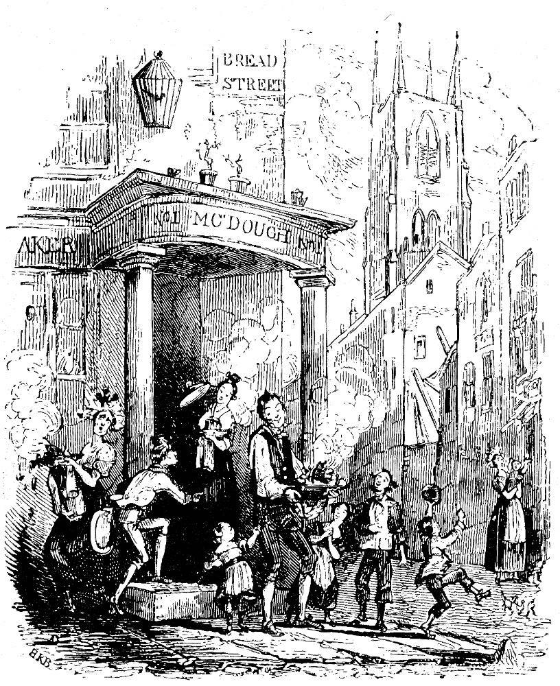
Charles Dickens, Sunday under Three Heads, 1836. Wood engraving [illustration 4].
The first collaboration between Dickens and Browne was on something considerably less than a novel, but it clearly shows their joint debt to the Hogarthian tradition (since both Sunday Under Three Heads and the fourth part of Pickwick, for which Browne was engaged, were published in June 1836, the order of events is not certain.). The first two of the three small wood engravings for the anti-Sabbatarian pamphlet Sunday Under Three Heads demonstrate the complementary nature of Browne's and Dickens' art, for they make explicit a quality which is only latent in the text. Dickens conceived his tendentious pamphlet in the mode of Hogarth's Beer Street and Gin Lane (1751), posing alternative consequences which will result from two opposed ways of ordering British society. The immediate occasion of Hogarth's pair of engravings was a measure to limit the sale of gin (Paulson, Hogarth's Graphic Works, 1, p. 207), while Dickens was concerned with the repressive Sabbath Bills, but both men present contrasts of healthy and depraved London life. Dickens mentions beer often enough in the first essay to make reasonable the connection with Hogarth's plates; for the drinking of beer "in content and comfort" is clearly contrasted with "outward signs of profligacy or debauchery." (Sunday Under Three Heads, in The Nonesuch Dickens, 23 vols. (London: Nonesuch Press, 1938), 22: 507). Although the second essay does not mention the beer which is earlier associated with innocent recreation, it predicts that the restrictive Sabbath laws will produce much more profligacy, idleness, drunkenness, and vice." (Ibid., p. 516.) [12/13]
Charles Dickens, Sunday under Three Heads, 1836. Wood engraving [illustration 5].
Despite their technical weakness, the two cuts illustrating these two essays make evident the twenty-one year old Browne's maturity as an interpreter of the moral significance of his author's text. In particular they make use of iconographic techniques developed by Hogarth and his followers, especially emblematic detail — the church, the clock, and the inscription ("Bread Street") — to underline certain implications of the text. These sorts of devices are employed by Browne in every Dickens novel he illustrated through Little Dorrit (as well as in many by other authors), and they increase in frequency from Pickwick on, reaching a high point in Martin Chuzzlewit, Dombey and Son, and David Copperfield, then diminishing in Bleak House and Little Dorrit, and disappearing entirely from the sixteen illustrations for A Tale of Two Cities. The particular categories of emblematic detail are various, from biblical allusions to titles of plays, sculptures or pictures representing classical mythology, references to Hogarth and Aesop, book titles of various kinds, and fairly standard emblematic objects such as clocks, cobwebs (usually indicating that the hero is somehow trapped, like a fly), maps, pictures of ships sailing smoothly or sinking — the list is almost endless.

Traddles and I, conference with the Misses Spenlow, illustration 5].
At times the use of such details may seem crude and obvious, as when David Copperfield's suit to Dora via her aunts in "Traddles and I, conference with the Misses Spenlow," is commented on by a trio of pictures captioned "The Momentous Question," "The Last Appeal," and "Arcadia," as well as the books Paradise Regained and The Loves of Angels, and the figurine of a girl picking the petals off a flower. It could be argued, I suppose, that the very obviousness of these details has a comic effect appropriate to David's passion for silly little Dora; but the same illustration contains two more details of greater significance: in a cage, two lovebirds sit apart while in small bowl one goldfish seems to pursue the other. If these pairs of creatures represent David and Dora, the fact that they are fulfilling their loves in small, enclosed containers from which there is no escape is a subtle and easily overlooked comment on the realities of the new status in life to which David so enthusiastically aspires.
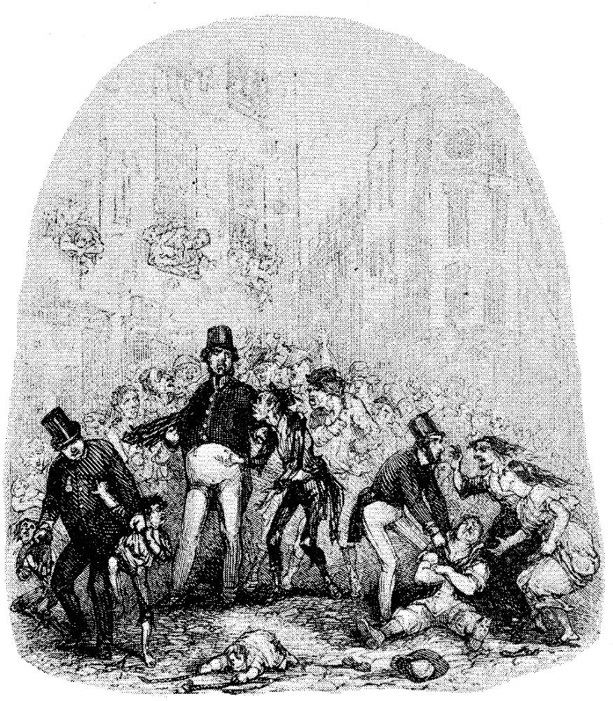
The Discovery of Jingle in the Fleet, illustration 22].
Examples of both seemingly simple as well as subtle emblematic details are numerous, but I shall offer only one more at present. In Pickwick Papers, "The Discovery of Jingle in the [13/14] Fleet" is especially interesting because it includes an emblematic detail that seems to have its origin in Dickens' text: the prisoner's wife
who was watering, with great solicitude, the wretched stump of a dried-up, withered plant, which, it was plain to see, could never send forth a green leaf again; — too true an emblem, perhaps, of the office she had come there to discharge.
[The Posthumous Papers of the Pickwick Club (London: Chapman and Hall, 1837), p. 453. All subsequent references to passages from Dickens' novels will be to the first published editions and will be given in the text.]
Not mentioned in the text but present in the illustration, however, is a poster on the wall, apparently the famous antislavery poster, "Am I Not a Man and a Brother?" The reference is surely to the appearance of the haggard jingle and Trotter, two rogues whose imprisonment Pickwick was eager to effect early in the novel, but whose suffering has made the imprisoned hero suddenly conscious of his common humanity with them. Whether Dickens or Browne is responsible for such nontextual details is a question I shall take up presently.
The use of emblematic details is perhaps most complex in a number of the covers Browne designed for the monthly parts and in a few of the frontispieces. These designs employ allegorical structures which comment upon the novel as a whole, although their sources are comparable to those from which the emblematic details in the regular illustrations derive. A less common kind of iconography is allusion via the partial or entire structure of an illustration, perhaps most notably achieved in the title page to Martin Chuzzlewit , which (as I shall demonstrate in the chapter on that novel) refers directly to Plate I of A Harlot's Progress, (Illus. 58), and by so doing makes an important comment upon both the novel's hero and its comic-grotesque villain, Pecksniff. This etching is but one of many executed by Browne for Dickens that are "readable" in the Hogarthian sense.


Left: A model of parental deportment
illustration 90]. Right: Mr. Chadband "improving"
a tough
subject, illustration 92].
The disposition of shapes and figures in an illustration can be as iconographically simple a matter as the placement of Dombey in the center of the picture, while his neglected and scorned daughter Florence is relegated to a space outside the doorframe (in "The Dombey Family"); or as subtle as the position of the horizontal building support at the top of the picture in "Tom all alone's" (Illus. 98), as though it were supporting not merely the buildings but the sky, implying an imminent collapse of society [14/15] as a whole. But the disposition of figures becomes a more immediately understandable device for expressing meaning when it is used as a way of drawing parallels between two illustrations — usually, though not always, a pair in a single monthly part. Thus, the raised right hand of Mr. Turveydrop and that of Mr. Chadband in, respectively, "A model of parental deportment" and "Mr. Chadband 'improving' a tough subject" suggest a parallel between these two charlatans, which, though implied in the text, is never stated therein. This use of various sorts of parallels among illustrations becomes one of Browne's most effective ways of implying meanings, of interpreting the text.
In the last two of Dickens' novels in which Phiz's illustrations play an important part,Bleak House and Little Dorrit, yet another iconographic mode — at times in combination with the earlier ones — represents what may be the peak of Browne's accomplishment. In these two novels Browne makes heavy use of a technique commonly called the "dark plate" (though that term is misleading since certain plates are anything but dark), which allows for much more subtle uses of light and shades of dark, rather like the technique of mezzotint. It contributes greatly to the dark and pessimistic atmosphere of the text, and among other things enables Browne to suggest the insignificance and helplessness of individuals in an institutional world, with an effectiveness scarcely possible by any other method.
Browne's early development of the dark plate technique seems to have taken place outside of his collaboration with Dickens, particularly in his work for Charles Lever, and the really heavy use of emblematic detail first occurs not in Martin Chuzzlewit but a year or two earlier, in Thomas Miller's Godfrey Malvern.
And this brings us to the difficult question of the respective roles of Dickens and Browne in the invention and execution of the illustrations. For years it has been standard to assume in discussions of Dickens' illustrations that because the novelist gave his illustrators detailed instructions regarding each plate, we may consider the author to be "throned in the chair of authority, with his hand guiding the pencil of the artist at his own free will" (Arthur Waugh, pp. 33-34). This assumption has at times been questioned, most notably in the articles of Robert L. Patten and to some extent in [15/16] John Harvey's Victorian Novelists and Their Illustrators (although as we shall see, Harvey is at times a champion of authorial control), but the subject has never been thoroughly aired. In order to provide such an airing, I must turn first to some rather technical matters, the question of how Browne's plates were produced; then to what I consider the very strong evidence of a high degree of independence on the part of Phiz, and finally to the typical pattern of collaboration.
The two main modes of graphic reproduction for which Hablot K. Browne made designs throughout his career are the wood engraving and the etching. Wood engraving is a relief method; that is, it involves cutting away the wood from around the lines intended to print black, leaving them standing in ridges; it differs from woodcutting, strictly defined, in that the latter entails cutting upon the plank grain of the wood with a knife, while the wood engraver works on the end grain of the wood with engraver's tools. Both differ fundamentally from line or steel engraving and etching, where the lines that print black are cut into the metal (intaglio). Whereas steel engraving is done by hand, with a burin, in an etching the lines are "bitten" into the copper or steel with acid.
Since wood engravings, like type, are in relief they can be printed along with a text, while steel engravings and etchings must be printed separately, with the moistened paper pressed into the inked grooves of the metal. There are many ways in which a design may be transferred to the woodblock or the steel (including direct drawing or etching, without any transfer), but I shall describe only those methods which Browne typically used. A different method of transfer for etchings is described by Harvey, p. 183, which may be correct for George Cruikshank, but is demonstrably not the method Browne used. Normally, he made use of a thin paper covered on one side with red chalk (sanguine) and placed it, chalk side down, on the woodblock, which was already covered with Chinese white; the drawing was then placed on this, face up, and the main outlines were traced over with a blunt point. The red outlines on the white surface were then used as the basis for drawing directly on the block in black pencil (E. Browne, p. 164.). In this form it would go to the wood engraver, upon whose skill a great deal would ultimately depend, as can be seen readily by a comparison of the various engravers employed for the cuts (a term I shall use throughout [16/17] when speaking of wood engravings) in Master Humphrey's Clock.
The production of an etching was more complicated, and the whole process remained in the hands of Browne and his associate, Robert Young. (My account of the method of transfer is derived from E. Browne, pp. 160-62.) First, a polished steel plate was prepared by applying a specially composed wax to its surface; this "ground" would then be coated with lampblack. The drawing, in more or less detail, would be transferred via sanguine paper to the etching ground in much the same way as described above for wood engravings. It is possible that at this point Browne also may have drawn directly on the ground, adding details which could not easily be traced. Once the transfer was complete the job of etching commenced with a special needle the artist cut through the ground exposing the steel below, wherever lines were to appear in the final print. Then followed the biting-in, a process of successive baths whereby the exposed portions of the steel were cut into acid. Varying degrees of tone were achieved by stopping-out some areas, after early acid baths, with varnish. The process could be more complicated than this, for the etcher might first bite only the main lines, then remove the ground and "pull" a proof to check the progress of his work, then apply a new ground (which, without the added lampblack, would be transparent) and add with his needle certain shadings and other fine details. The number of acid baths might be considerable, though each bath might last only a few seconds; and Browne (or Young) sometimes pulled proofs at three or more stages of the biting.
This last point is confirmed by some of the proofs in the Dexter Collecttion at the British Library, which show several stages of biting. The method of transfer described by Edgar Browne may be corroborated in two ways. First, the vast majority of Browne's surviving drawings for his etchings are reversed from left to right indicating that some such method of transfer with the drawing face up must have been used. Second (as no one has previously noted), in most of such reversed drawings blind indentations are visible on the recto side, sometimes closely following the drawn lines, sometimes diverging from them, and sometimes adding details to the etching which are present on the drawing only in this blind form. Stich indentations are clearly visible as early as the drawings for the seventh part of Pickwick Papers; [17/18] earlier drawings, and some of the later ones for that novel (also reversed), seem to contain graphite lines pressed in heavily over the original ink lines. These pencil lines may have fulfilled the same function as the blind indentations, which became almost universal in the drawings for the later novels.
A few of the extant drawings are not the reverse of the final etching, and for this there are at least two possible explanations. Certain drawings are preliminary sketches not used in the transfer, and these are — surprisingly — sometimes drawn in the reverse of those used for transfer (which I shall throughout call the working drawings). Second, it is possible that Browne occasionally used another method of transfer, perhaps tracing the drawing and then using this tracing, face down, on the sanguine paper; a number of tracings on transparent paper for the Master Humphrey's Clock cuts (Gimbel Collection) indicate that he did use this method for wood engravings at times.
Understanding Browne's method of transfer enables us to distinguish between the final, working designs (since the latter will usually be reversed and exhibit the blind indentations I have described) and those which are preliminary. Thus the left-right orientation of certain Dickens illustrations — such as "Paul and Mrs. Pipchin" and the title page for Martin Chuzzlewit — can be seen as calculated and not the result of chance, since for these plates both unreversed preliminary and reversed working drawings exist. (The importance of this left-right positioning will be discussed in the relevant chapters.) In addition, it is possible to see that in some cases Browne seems to have added details at the last moment, for although not visible in ink or pencil, they are nonetheless present in blind indentations. Thus the "ROMA" of the map in "Paul goes home for the holidays" is present only in this form, suggesting a last-minute addition of a small yet significant detail — since study of Latin is an important stultifying force in Blimber's system of education.

I make the acquaintance of MissMowcher illustration 61].
Still other details present in the etchings are sometimes missing in the working drawings, and this fact brings us to the question of artistic responsibility. Some critics have offered "proof" that Dickens at least occasionally instructed Browne in the inclusion of emblematic details in addition to giving him the topic and caption of each plate (Anthony Burton, in his review of Harvey's book, calls it a proof" — see Dickensian 67 (1971): 109). In question is the illustration from David Copperfield, "I make the acquaintance of Miss Mowcher" [18/19], in which the dwarf is grooming Steerforth's hair and (in the text) making sly remarks to the ingenuous and uncomprehending David. The plate has three emblematic details: a ship in a storm (probably representing Emily's impending fall but also conceivably foreshadowing Steerforth's death in a shipwreck), a comic reference to Miss Mowcher's size and performance in a print showing Gulliver performing for the Brobdigagians, and a scene from Faust.
John Harvey has shown that this last detail, containing Faust, Margaret, and Mephistopheles, clinches the text's hint of Miss Mowcher as an intermediary in Steerforth's seduction of Emily because Mephistopbeles is standing behind Faust as she is standing behind Steerforth, while the feather in her bonnet resembles that in Mephistopheles' cap. Harvey traces the source of this detail to Moritz Retzsch', but his most important discovery would seem to be that the detail was a "late addition to the plate," because "unlike the biblical scenes in 'Martha' [the companion illustration], it is absent from Browne's sketch." "Presumably," Harvey continues, "on inspecting the sketch, Dickens saw his opportunity to make clearer a suggestion that was fogged in the text, and he dictated the necessary amendment" (Harvey, p. 150). It may well be that Dickens specified to Browne that Miss Mowcher was to be a panderess, but otherwise Harvey seems to fall afoul of the evidence.

Left: The Picture Gallery — Sir Andrew
Puzzled illustration 8]. Left: The Decision of
the Flowers by Moritz Retzsch illustration 9].
First of all, as Harvey himself mentions, a detail much like the one in this plate appears in an etching Browne did a few months before for Lever's Roland Cashel, where it apparently derives from the text, which in turn makes it clear that the original is Retzsch's engraving, "The Decision of the Flower" (Retsch's Series of Twenty-six Outlines Illustrative of Goethe's Tragedy of Faust (London: Boosey and Sons, 1820), fac. p. 39 (British publisher anglicized spelling of Retzsch's name). It is also worth noting that Mephistopheles is present in this engraving though not standing next to Faust, and that the similarity of feathers is also to be seen here.) (Illus. 9). There is even an insignificant visual parallel between the feather in Faust's cap and Kennyfeck's bonnet in the Lever etching, and a significant one between Roland's stance and Faust's. This earlier illustration would seem to indicate that the scene from Faust was in Browne's mind around the time he was working on David Copperfield.

Study for I make the acquaintance of Miss Mowcher illustration 7].
But in addition, Harvey is wrong about the drawing for Copperfield: it does contain the Faust detail. As is often the case it is very rough, but it is clear that two figures, in approximately the positions of Faust and Margaret (reversed, as is the entire drawing), are intended. What the etching adds, aside from [19/20] finish, is the figure of Mephistopheles, present in the Retzsch original though in a different position, distant from Faust, and absent in Phiz's illustration for Lever. We have no way of knowing for certain whether Dickens suggested the addition of Mephistopheles or Browne invented it on his own. But the former possibility seems less likely for the simple reason that the Faust detail in the drawing would probably be unintelligible to Dickens when first submitted to him for approval. Given the fact that Phiz bad already made use of the Faust motif for Lever, and that the intention to use it in the Mowcher plate is apparent in the drawing, the most plausible conjecture is that Browne carried through the whole thing himself on the basis of Dickens' general instructions about the meaning of the subject in relation to later developments in the text.
It may seem excessive to argue over such a small detail at such length, but it must be emphasized that even if it were correct, Harvey's partly faulty evidence would be inconclusive. Yet it is the only evidence ever offered that Dickens instructed Browne in details down to this level of specificity. All other surviving evidence seems to point the other way: among those extant sets of directions to Phiz (and unfortunately Phiz burned most of his correspondence in 1859 (E. Browne, p. 53.)), not one contains such specific details. Most telling are those instances in which Dickens offers extremely lengthy instructions for drawings which contain numerous such details. For the etching "Major Bagstock is delighted to have that opportunity" in Dombey and Son, two sets of directions survive, the second set a request to Browne for improvement on his initial drawing, but none of the emblematic details are mentioned in either set. Similarly, the instructions for the last four illustrations to Martin Chuzzlewit are again lengthy and specific, but with no mention of a single emblematic detail.
I find it difficult to imagine that if Dickens did not specify iconographic devices in these five cases (and there are other, less dramatic instances) where emblematic detail is so profuse, he would have done so elsewbere (Two extant letters contain such details: one is to Maclise, regarding that artist's single design for The Old Curiosity Shop; the other is to Cattermole, about the cut for the death of Nell and the one following. In the first case, Dickens specified "an old broken hour glass," which Maelise ignored; in the second case, he asked Cattermole for holly and ivy around Nell's bed, with which the artist complied, and another hour glass in the church where her grandfather is mourning, which Cattermole put instead in the death-bed scene. See letter to Daniel Maclise of ?6 November 1840," P, II, p. 146; and letter to George Cattermole of ?22 December 1840, P, II, p. 172.). Not only are the devices similar to those used throughout the novels, but they are similar to those Browne used in his work for other authors, especially Charles Lever, who seems to have given Browne much less instruction than did Dickens. Thus we find Lever writing to his [20/21] Dublin publisher from Brussels during the publication in monthly parts of Harry Lorrequer (1838-39),
H. K. Brown [sic] has not yet written to me, and I regret it the more because if I knew the scenes he selected, I might have benefited by his ideas and rendered them more graphic, as an author corrects his play by seeing a dress rehearsal (Letter to James M I Glashan, 11 January 1839, in Edmund Downey, Charles Lever, His Life in His Letters, 2 vols. [Edinburgh and London: Blackwood, 1906], 1: 109-11).
The mention of Phiz selecting the subjects himself and the author altering his text to fit recalls what John Harvey has shown about Cruikshank's relationship to Harrison Ainsworth (Harvey, pp. 38-42.). Edgar Browne's summary of his father's professional relationship to Lever seems plausible: "From the beginning he [Lever] leant upon Phiz; he was very easily satisfied with his illustrations, so long as they agreed with the general drift of the text, he was not solicitous about details." (E. Browne, p. 171.) If Browne could supply emblematic details drawn from the traditional stock for Lever, why must we must assume that he was unable to do so for Dickens? Perhaps the question can never be settled, but on the basis of the evidence it seems to me harder to present a convincing argument for Dickens, complete dominance over his artist than for Browne's independence in matters of iconography.
Typical conditions under which Browne worked would make frequent last-minute additions under Dickens' instructions unlikely. From the early years of their association the novelist and illustrator followed a standard pattern of collaboration: for each forthcoming monthly number Dickens would give the subjects of the two illustrations (or four, for the final, double numbers) and include proof copy or a bit of manuscript whenever possible. Browne would execute these as drawings and submit them, time and distance allowing, to Dickens, who would either approve them or suggest alterations. If approved, the design would be etched by Browne on a steel previously prepared by Robert Young and then sent along to Young with the drawing and perhaps some further instructions regarding the biting-in; according to Browne's son, Young also "came down to Croydon nearly every Sunday, and sometimes during the week," for consultation (Ibid., p. 167.). Here is a "diary" (evidently intended for a publisher's guidance) of Browne's typical procedures: [21/22]
Friday evening, 11th Jan.........Received portion of copy containing Subject No. 1.
Sunday........................................... Posted sketch to Dickens.
Monday evening, 14th Jan..........Received back sketch of Subject No.1 from Dickens, enclosing a subject for No. 2.
Tuesday, 15th Jan.....................Forwarded sketch of Subject 2 to Dickens.
Wednesday, 16th Jan...................Received back ditto.
Sunday .......... .
Tuesday, 22nd Jan....................... First plate finished.
Saturday, 26th Jan.........................Second ditto finished.
— Supposing that I had nothing else to do, you may see by the foregoing that I could not well commence etching operations until Wednesday, the 16th.
"I make ten days to etch and finish four etchings. What do you make of it?" Browne comments at the bottom of this "diary." (Thomson, p. 234). (Four etchings means two in duplicate.)
We may take this to be a description of the normal process based on Browne's work for a novel later than Pickwick Papers (in the Preface to which Dickens states that "the interval has been so short between the production of each number in manuscript and its appearance in print, that the greater portion of the Illustrations have been executed by the artist from the author's mere verbal description of what he intended to write").
Three Studies for The Goblin and the Sexton illustrations 10-12].
Throughout their collaboration the availability of copy would depend upon how far ahead Dickens was with his writing. It seems evident that at times Browne received only a generalized instruction, the initial execution of which failed to jibe in some respect with the final text. For example, "The Goblin and the Sexton," second of a pair of Christmas plates for the tenth monthly part of Pickwick, was done in three distinct versions. In the first (Illus. 10), two pencil sketched figures sit together on a flat tombstone before a church porch; the second (Illus. 11) reverses the scene and is executed in enough detail so that it could Dickens did easily have seen the final drawing. But it turns out that the text describes the goblin as seated on an "upright tombstone." Presumably Dickens directed Browne to bring his illustration in line with the writing, and a drawing of the final version, in which one can see clearly the indented transfer lines, was produced [22/23] (Illus. 12). The church porch has been changed to a church or abbey building, but the memento mori inscription and skull of the second drawing are repeated here.
For the most part, however, one would expect that such multiple versions (and, presumably, instructions) were unusual, given the time pressures under which author and illustrator operated. It is also noteworthy that Browne remarks, "Supposing that I had nothing else to do," surely implying that he usually did have other work. And well he might, considering what he was paid for the Dickens illustrations. John Harvey has shown that Browne's fee from Dickens' publishers rose from approximately £4 per etching for Pickwick to seven guineas for David Copperfield, fourteen years later, and that although the pay per etching for Bleak House and Little Dorrit was higher still (£11. 8s. 6d.), his actual pay per monthly number was less because most of the plates were no longer etched in duplicate (Harvey, pp. 187-88). Thus, we may calculate roughly that at his peak Browne was earning £30 per month from Dickens (from which he had to pay Young, his "biter") hardly a huge sum for an illustrator with fifteen years' experience and a large family to support. Moreover, such income could be counted on for intermittent periods only: calculation reveals that during the twenty-four years from 1836 through 1859 Browne had thirteen years of employment on Dickens' novels. Thus it would be essential to have several jobs in progress at once (see the Appendix for a year-by-year list of Browne's work during his career as Dickens' illustrator); and thus the most amazing thing about Browne is that his illustrations-especially for Dickens, but often for other writers as well-are as technically finished and iconographically complex as they are. Considering the differences between an independent master engraver such as Hogarth and an etcher using his imagination on the creations of others, Browne is to say the least a phenomenon; for he was Dickens' collaborator and interpreter, and developed artistically as Dickens did.
Created 23 November 2009 Last modified 14 August 2024