
Introduction and background
The contribution of decorated cloth designs to the history of the book in the mid-Victorian period is significant. The catch phrase in the title ‘Handsomely bound in cloth’ was used endlessly in the publishers’ lists, which were frequently bound at the back of their books. The focus of this article is primarily upon UK designs blocked onto cloth, or those using papier mâché. Despite the temptation, the lure of straying into describing the designs on cloth of other countries, of the same period, particularly America, has been resisted, an area considered in detail by Allen, Gulluns and Minsky. Excluded also are designs printed, engraved, or lithographed onto paper, which was then pasted onto boards. There is plenty of merit in such designs, but it is not possible to dwell on this aspect of trade binding. The development of edition binding in the 19th century, and the impetus to bind large runs of Bibles and Annuals is described by Esther Potter. The history of book cloth and the development of its use throughout this period are well documented elsewhere. The method of imparting grain patterns to the dyed cloth was described in contemporary sources. The matter of the identification of cloth grain types is also enumerated by others, and will not be detailed here. The listing of bookbinder’s tickets, and a discussion of the possible link between publisher, printer and binder, also awaits further exposition. Nor will this article give much detail about machine blocking of book covers, as this process is described in several contemporary accounts, notably in The Penny Magazine(pp.377 –84). However, what hopefully will strike the reader is the great skill of the die engravers, who created from artists’ drawings so many varying effects of line, and so many subtle contrasts between blocking on cloth, either as an impression or as relievo, which leaves the cloth proud of the blocked or impressed surface.
In the 1890s, Gleeson White, in an article entitled: ‘The Artistic Decoration of Cloth Book Covers’ in The Studio October, 1894, stated six points for the design of an appropriate book cover:
1. Fitness of the design to the contents of the book.
2. The size and style of lettering.
3. The proportion of the details of the decoration to the character of the surface of the fabric to be decorated.
4. The larger symmetry of the whole design in relation to the cover.
5. The cost of carrying out the design.
6. The skill of the firm who will undertake the production of the design. [White, p. 20]
As we shall see, the book covers with designs by various artists will show us that these points remain most relevant.
What impelled my research was the need to identify a specific copy of these designs, primarily those in the British Library, and, where possible, in other UK libraries. This was because many of the prior publications, such as Ruari McLean’s works, lacked a shelfmark of a copy in a public library, which the interested user could consult. In addition to his fine work of 1985, Victorian Publishers’ Bindings, Douglas Ball had catalogued earlier a collection of publishers’ bindings in Wales, so these books were in theory available, but the catalogue (1979) itself was not fully published, as far as I am aware. The gift in 1992 of the Robin de Beaumont Collection to the Department of Prints & Drawings, British Museum, brought nearly six hundred books and individual prints into the public domain, and the collection was listed in 1994 by Paul Goldman. However, the cover designs have yet to be fully described, and cataloguing these is work in progress. The significant exhibition by Morris and Levin of 254 books at the Grolier Club in 2000 cited books then in private hands. Their catalogue provided good descriptions of the designs, however, this was a private collection. There are now many websites, especially those based in the North America, which list UK cover designs of this period, and this will cited below.
I published a brief survey of UK designs of the period in 1996. In 2003, the British Library published my bibliography of the books and designs which I had found in the preceding ten years,Victorian Decorated Trade Bindings 1830–1880. There are 752 entries in this book, and it amounted to a small census of work in progress, reflecting the discovery and description of designs, primarily held at the British Library (British Library Database). Since 2012, the uploading has been done of these descriptions, together with scans of the book covers, into the British Library’s online database of book bindings, so that these are available to a wider audience. As this is a relational database, users can search and start to explore relationships between the publisher, cover designer, the printer and the bookbinder.
The early research work also concentrated upon the artists who made designs for covers, and who caused their names, initials or monograms to be incorporated into the cover designs. This article does focus upon these artists, for when taken together, they do provide a window into the forms of decoration and designs applied to book covers during this period. Of the identified designers, John Leighton provided the most designs, over the longest period, from the mid-1840s to 1902.
A portrait of Leighton appears as the frontispiece to his On Japanese Art, a Discourse Delivered at the Royal Institution of Great Britain [1863], published when he was about forty. Fifty copies were privately printed. This is an early tract on this subject, as the craze for Japonisme did not take hold in Britain until the 1870s. A later portrait of Leighton, showing him dressed in a cape, in a cap, with his watch chain displayed, was published as the frontispiece of Tubular Transit, 1902, when he was nearly eighty. When I addressed the Bibliographic Society in December 2003 on ‘John Leighton: book artist and cover designer’, I had catalogued over 430 of his designs, drawing largely on my article of 1998 and making use of the research of Graham Dry.
Leighton created many ornate designs; Barham’s Ingoldsby Legends was published by Bentley in 1864 and was enormously popular, with the British Library copies numbering six, all with the same Leighton design. The ‘all over’ design provided by Leighton for Payn’s The Lakes in Sunshine 1867, is typical of the more expensive type of travel book of the 1860s, with photographs pasted in to accompany the text.
These were expensive books, and in my 2003 talk I did not fully recognise the work of Leighton (and many others) in providing small designs for thousands of cheaper books, for which he, as a commercial artist, provided many dozens of upper cover vignettes and spine designs. The subjects of the books with Leighton vignettes were varied: fiction, children’s books, adventure, etiquette, religion, travel history, engineering, sports.
In James Gilbert’s The Change; or, the Passage from Death unto Life (1853) a remarkable feature of this vignette is the tiny, hidden initials ‘JL’, measuring about one millimetre across, in the lower hem of the angel’s dress. For a vignette to accompany a travel book by Edmund Spencer, Turkey, Russia, The Black Sea, and Circassia (1854), on the other hand, Leighton used the Imperial Russian double eagles. And in Friedrich Gerstaecker, The Little Whaler or, The Adventures of Charles Hollberg (1854) we see a charming scene of a whale tossing a boat, and its occupants, into the air. The title in cursive letters is also unusual. Leighton had a great sense of humour, which is frequently seen in his early engravings for book, and in his cover designs. In another image Leighton uses the motif of the steam engine, the upper cover vignette on Mrs Burrows, The Triumphs of Steam; or, Stories from the Lives of Watt, Arkwright, and Stephenson (1859); the illustrations are by John Gilbert.
A charming evocation of animal life, again authored by Mrs Burrows, is Tuppy; or, the Autobiography of a Donkey (1860). The author, Frances Broderip, was the sister of Tom Hood, the humourist and playwright, and he provided the illustrations for her work, Crosspatch, the Cricket and the Counterpane, A Patchwork of Story and Song (1865). This is a singular design, with a witch-like lady, standing on a stool, holding the patchwork up for us to view.
C. A. Wheeler edited Sportascrapiana. Cricket and shooting. Pedestrian, Equestrian, Rifle, and Pistol Doings. The title page shows a pun on his name, a crow within a shield, its beak uplifted to a scroll with the author’s initials , ‘CAW’, printed within it. Leighton created a vignette design incorporating many sporting elements.
With regard to prices in the 1850s and 1860s, other books with similar designs were priced at between 2s. 6d. and 3s. 6d, sometimes more for gilt edges and bevelled boards. This obtained a ‘standard’ binding, with, on the lower cover, blocking on blind, normally just blocking on the borders and on the corners; sometimes there would be a central vignette in blind as well. Then the upper cover would have identical blocking on the borders and on the corners, with a central vignette also applied, frequently blocked in gold, and also a spine design blocked in gold.
Like John Leighton, other artists managed to have their initials cut into brass dies, and this allows ready identification of their work. I shall now illustrate the work of a number of artists, in alphabetical order. Charles Henry Bennett (1829-1867) was a prolific book illustrator in his short lifetime. His work as a binder and illustrator is frequently brilliant, showing high levels of originality. His illustrations for children’s books provided ample scope for his inventiveness. He could also be strongly satirical: his illustrations for his and Robert Brough’s Character Sketches (1872) are a witty yet profoundly perceptive satire on Darwin’s theories. This book also has a upper cover design by John Leighton. In several instances, engravers copied his illustrations within the book directly onto brass for cover blocking. Bennett’s monogram of linked letters ‘CHB’ is distinctive.
This is true also of The Nine lives of a Cat; here, we see the vignette and a close up of Bennett’s monogram. Mr. Wind and Madam Rain has a striking vignette, with the letters tumbling out beneath the wind generated by a bird-like figure above. His monogram on the spine of Quarles’s Emblems is used to great effect in combination with that of William Harry Rogers.
Walter Crane (1845-1915) achieved fame as a painter, illustrator, designer, writer and teacher. He was apprenticed to William James Linton in 1859, and in the next three years learnt the technique of draughtsmanship on wood blocks. An early example of Crane’s work is his drawings for John Wise’s The New Forest (1863), which were engraved by Linton. The Blue Beard Picture Book, published by Routledge in 1875, features a good example of Crane’s rebus blocked prominently on the front cover.
Richard Doyle (1824-1883) was well known as book illustrator. He was the uncle of Arthur Conan Doyle. He joined the staff of Punch in 1843, and part of his design for the sixth issue of the magazine was retained for the masthead for over one hundred years. Many of his cover designs are those derived from his illustrations. The Scouring of The White Horse was published by Macmillan in 1859. In November 1858, the company of Richard Clay printed 6000 copies, with a further 4000 printed in December. The publication price was eight shillings and sixpence. The busy scene is transferred from half title and title pages onto the covers. The lower cover is blocked in blind. The same use of an illustration within the book is applied to The Adventures of a Watch (1864). Doyle’s use of the distortion of line transfers well to the covers of these two books.

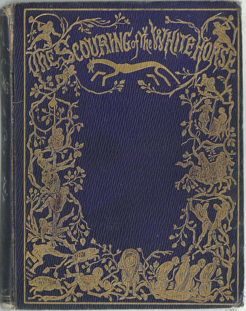
Two bindings using images by Richard Doyle: Left: A binding by an unknown technician, reproducing Doyle’s title-page design for the cover of Julie Gourard’s The Adventures of a Watch. Right: Thomas Hughes’s The Scouring of the White Horse. [Click on images to enlarge them.]
Robert Dudley (1826-1900) worked in the office of Digby Wyatt, the architect. He was principal draughtsman, under Wyatt, of the Mediaeval and Renaissance Courts of the Sydenham Crystal Palace in 1854. He accompanied the Great Eastern on its cable-laying expedition on the Atlantic Ocean in 1866. All but one of Dudley’s cover designs that I have so far found are on books published in the 1860s. I reproduced three works published by S. O. Beeton. All have upper cover vignettes by Dudley, and two have elaborate spine designs also. In Danes, Saxons, and Normans; or, Stories of our Ancestors (1863) the initials ‘R. D.’ are quite clearly visible. Cressy and Poictiers; or, The Story of the Black Prince’s Page (1865) was illustrated by both Dudley and Gustave Dore. Dudley’s initials are visible at the base of the decoration of the upper cover vignette. Also of 1865 was Beeton’s Historical Anecdotes of Animals, with Dudley’s initials within the central vignette.


Two book cover designs by Robert Dudley: Left: Atlantic Telegraph. 1866. Right: Historical Anecdotes. c. 1865. [Click on images to enlarge them.]
Dudley provided a lithograph for the title page of the Atlantic Telegraph, published by Day & Son in 1865. Although the cover design is not signed, it is probably by Dudley. The nautical themes of scallops and ropes are evident on the borders, and, perhaps uniquely, the centre of the design, an on lay, is a reproduction of the core of the cable laid underneath the Atlantic by the Great Eastern. This shows the gutta percha outer case, which had the effect of insulating the metal core, and the metal in the middle. Incidentally, gutta percha was seen as a valuable product of this time, with many uses, one of which was to insulate underwater cables, and another of which was to bind the leaves of book together, at the spine edge of books. Books could be opened fully to view the content, and the material was regarded in its day as being durable.
Henry Noel Humphreys (1810-1879) experimented with different forms of bindings. There are at least three examples of his work with Paul Jerrard. All were likely to have been published in 1852; all were intended to be gift books. Published in time for Christmas, a gift book was intended to be a consumable which, as critics such as Simon Cooke have explained, was produced to create a passing sensation, an elegant, pretty but superficial artefact which continued the Keepsake and Annual traditions of the thirties and forties. Jerrard’s patent application for this type of binding for gift books is dated 1 November 1852, no. 604: ‘Ornamenting japanned and papier-mâché surfaces, as also the surfaces of varnished and polished woods.’ This provisional specification was made void by the Commissioners of Patents: ‘by reason of notice to proceed not having been given within the time prescribed by the Act.’
The Book of Exotic Birds has colour lithographs of the birds which are printed separately and pasted onto the verso of leaves, within a gold printed border. In a list of publisher’s titles bound at the end of Flower Painting in Twelve Lessons this work is advertised as: ‘Preparing for Publication, Exotic Birds, Price 21s. In one handsome volume, Imperial 8vo. Richly bound, suitable for Birth-day or Marriage Presents, with Ornamental Decoration Page, and 10 Plates.’ On the upper cover, a single coloured lithograph on a sheet of paper has been pasted onto the board. It has elaborate tendrils and a branch border pattern, and shows flowers at the end of long stems, with the title: ‘The Book of Exotic Birds’ attached to the stems, whose letters are shaped like small stems. The lithograph has been lacquered and this has cracked.
Flowers from Stratford on Avon. A selection from the Flowers Mentioned in the Plays and Poems [of] Shakespeare is advertised as in the publisher’s titles at the end as: ‘In Patented Binding, imperial 8vo, price 1l 11s 6d.’ The binding is gutta percha, with gilt edges. The boards are made up to resemble the thickness of wood, and are smooth bevelled. Paper (yellow dyed in appearance) has been drawn over the boards, which has then been blocked in gold, and then lacquered. At the base of the design, on the right hand side, the words: ‘/ Paul Jerrard/ Patentee/’ are blocked in gold.
The upper cover of The Humming Bird Keepsake Book of Bird Beauty. The Birds Painted among Nests and Flowers by Paul Jerrard. has a glazed white paper on lay, which is chromolithographed and signed: ‘/ Paul Jerrard litho/ 111 Fleet St./’ Chromolithography, which is the use of lithography using drawings made on different stones for each different colour, was by this time gaining more widespread acceptance since its early use in the 1820s, and with Owen Jones being one of its leading exponents and practitioners in the 1840s.
Humphreys also produced papier mâché bindings. A long established technique used in a variety of decorative situations, such as a substitute for wood or for plaster, papier mâché, made up of paper pulp and a starch adhesive or similar, found its way briefly in this period into use as book covers. Sometimes the term carton-pierre is used to describe these bindings, although the materials used in the composition of this medium was different, consisting of paper pulp mixed with calcium carbonate.
A Record of the Black Prince (1849) has a design described by Humphreys in paragraph 8 of the ‘descriptive index’ at the end as: ‘8. The carved cover is taken from one of the compartments of the Prince’s tomb at Canterbury, slightly altered for its present purpose by the addition of the label to receive the title, and the extra enrichment of the mouldings; in which however, the decorative feeling of the period has been carefully preserved.’ In the publisher’s titles at the end of The Book of Ruth this work is stated to be: ‘In a carved and pierced binding, price 21s.’ Ruari McLean states that 1000 copies were printed (p.113).
Humphreys also designed the covers for The Origin and Progress of the Art of Writing (1853). All the colour plates of this work are signed: ‘H. N. Humphreys. Lith. Day & Son Lith.rs to The Queen.’ All the black and white plates are signed: ‘Printed by Paul Jerrard, 111, Fleet St.’ The binding has gilt edges, with green head and tail bands. On the cover, the centre is occupied by a large foliage stem which surrounds the title. It originates as the horizontal bar for the capital ‘T’ of ‘The’; it then encircles the title: ‘/ The/ history/ of writing/’. The curling end of the stem forms the bar of the lower case ‘t’ of the word ‘writing’. Red paper backing is placed underneath the carton-pierre.
The Book of Ruth is bound in red leather: The Book of Ruth, from the Holy Scriptures. Enriched with Coloured Borders (1850). Each opening is alternately printed in gold and grey, and in several colours. The text has chromolithographed borders. In the list of works printed at the end is the description: ‘In a highly embossed leather binding, price 21s. (Just ready.)’ The book has gilt and gauffered edges and bevelled boards. There is a pattern of flowers and cornstalks blocked inside the outer rectangle. Poppies are blocked on the top left hand and bottom right hand corners of the inner rectangle. Cornstalks are blocked on the centre sides. Flower stems form a central frame, with straps at its head and its tail. Inside the frame, the title: ‘/ The/ Book/ of/ Ruth/’ is blocked in relief, in gothic lettering. The spine is blocked in blind. A corn stalk is blocked at the head and at the tail. The title: ‘/ The Book of Ruth/’ is blocked in relief along the spine.
Humphreys and Owen Jones worked together to publish The Illuminated Books of the Middle Ages (1849). Jones (1809-1874) was consciously involved with the minutiae of book production for a long period, from the early 1840s to the late 1860s. Carol Flores has listed books that were authored, edited, designed by Jones, a list which includes bindings by him. After publishing Plans, Elevations, Sections, and Details of the Alhambra in 1842-45, Jones continued to be involved in the production of gift books. He experimented with techniques, using a design impressed upon wood for The Preacher (1849). The great depth of the letters and of the decoration must have required considerable force to achieve. The boards are attached to the text block with a gutta percha binding. The renown of Jones’s The Grammar of Ornament should not obscure his other achievements in chromolithography, which were often published by Day and Son.
In 1860, Paradise and the Peri was published. This work was illustrated by both Owen Jones and Henry Warren, and drawn on stone by Warren’s son Albert Warren. In the list of titles bound at the end of Indian Fables from the Sanscrit of the Hitopadesa (1862). Paradise and the Peri is described as: ‘Small folio, 54 splendidly illuminated pages, elegantly bound, bevelled boards, 2l. 2s. [presumably this was for copies issued in cloth], or calf embossed extra elegant, price 2l. 12s. 6d.’ The title: ‘/ Paradise/ and the/ Peri/’ is blocked in relief on the centre of the upper cover. On the centre of the lower cover, the monogram of Day & Son is blocked in relief.
In 1864 One Thousand and One Initial Letters Designed and Illuminated by Owen Jones was published by Day & Son. The recto of each of the twenty-eight leaves is chromolithographed with the multiple forms of each alphabetical letter, in gold, in red, in blue, and in black. The capital ‘I’ of the word ‘Initial’ runs down the left hand side. It is highly decorated with stems and leaves. The cover design is an extension of the many designs for the initials printed within.
Day & Son issued The History of Joseph and his Brethren probably in 1865. As with Paradise and the Peri, the work was illustrated by both Owen Jones and Henry Warren, and drawn on stone by Albert Warren. We see a design in Egyptian style, on red pebble-grain cloth, with a green on lay on the borders, blocked in gold with a zig-zag pattern. The title letters on the covers and on the spine reflect this style.
William Harry Rogers (1825-1874) was one of a number of talented artists who worked on providing illustrations for books in the middle of the nineteenth century. He was a contemporary of John Leighton and the eldest son of William Gibbs Rogers, a renowned wood-carver, he began drawing artwork for book covers in his twenties. His illustrations for page borders, head and tail-pieces, are to be found in many books. He is notable for intricate cover design work, often showing elaboration of title letters, or dense foliage. He invariably used his full initials ‘WHR’ as a monogram, as shown in this example above. The position of the three letters remained the same whenever he used this monogram, with the ‘W’ ‘on a ‘stalk’ above a conjoined ‘HR’. Rogers is also distinctive for the way he placed his monogram in his designs, sometimes small or very small, and, at other times, inserting it within an overall design, seemingly inviting the viewer to hunt for it. I have found so far nearly fifty of Roger’s designs, and there are undoubtedly more.
As for several other artists, the Great Exhibition of 185I provided significant opportunity for work, and Rogers provided the cover design, blocked on cloth and leather deluxe copies, for The Art Journal Illustrated Catalogue: the Industry of all Nations, 1851. The title page of this work is a wood engraving by G[eorge]. and E[dward]. Dalziel, from a drawing by Luke Limner [John Leighton]; printed by Bradbury and Evans, London. It is likely that Rogers, John Leighton and the Dalziel Brothers all knew each other. The enormous popularity of this volume allowed Rogers’s artwork to be widely viewed. The same design by Rogers was used on two books, probably issued some seven years apart. Both were published by Griffith and Farran, and printed by Whittingham and Wilkins, Chiswick Press. Spiritual Conceits was published in 1852, bound by Bone and Son, and the blocking is on green morocco vertical-grain cloth. Rogers’s small monogram is blocked in relief on the spine, towards the tail.
Emblems of Christian Life was issued later, probably in 1871, with the same blocking, apart from the title, on purple sand-grain cloth. With the exception of the title on the covers, only the title page has been altered. It is likely that Bone retained the die for the covers after 1862, and simply changed the title for the later issue. The cross and the crown are most prominent on the covers and also on the spine, with the motif being repeated continuously within the text. Rogers provided the illustrations throughout the book, making a unified artistic effort of both covers and interior.
Quarles’ Emblems was published by James Nisbet in 1861. The page borders were by Rogers and the illustrations were by Charles Henry Bennett and engraved by Joseph Swain and Edmund Evans. The British Library copy has gilt edges and bevelled boards typical for the more expensive bindings, with red morocco horizontal-grain cloth. Both covers are blocked identically in gold and in blind and relief.
The copy on blue dyed cloth, in Robin de Beaumont’s private collection, is in superb condition, which shows us what an impact these designs must have had when they first appeared. We see elaborate decoration on the outer borders, and the eye is then drawn to the central large medallion. It is blocked in gold, showing crossed tulip flowers and leaves, The title words: ‘/Quarles’ Emblems/’ are blocked in relief within a heart at the centre and signed ‘WHR’ in relief as a monogram at the base of the heart. The spine is fully blocked in gold and in relief. The title: ‘/ Quarles’/ Emblems/’ is blocked in relief within two rectangular gold lettering-pieces.
Rogers also made many designs for upper cover vignettes. It is not certain that this vignette for Julia Maitland’s Historical Acting Charades (1858), is by Rogers, as it is not signed; however, his signature, albeit blocked in reverse, is visible on the spine to the right.
Harriet Myrtle’s A Visit to the New Forest was published by Sampson Low in 1859, with Rogers’s monogram at the base of the upper cover vignette. Bunyan’s Pilgrim’s Progress with illustrations by Charles Bennett (1860), and bound by Westley in brown morocco vertical-grain cloth, bears Rogers’s monogram just above and to the left of the hilt of the sword. Illustrated by Birket Foster and G. H. Thomas and H. Brandling (probably Henry Charles Brandling), The Most Excellent Historie of the Merchant of Venice was issued by Sampson Low in 1860. Underneath the elaborate title lettering, Roger’s monogram is most distinctive.
In the period 1869-73 Routledge published its Five-shilling Juvenile Books. Four books in the series have covers and spines designed by Rogers: The Great Battles of the British Army; The Great Sieges of History; The Great Battles of the British Navy; and British Heroes in Foreign Wars. All of the books have identical upper-cover designs. Rogers’s monogram is blocked in black towards the bottom left-hand corner, the wrong way round, in reverse letters. The design juxtaposes curling stems and leaf decoration, blocked in black, with the use of onlays running vertically near the spine sides. The on-lays are blocked in gold showing flower symbols of Britain in relief, in red, or in blue. Between these on lays, there are two small blocks in gold, depicting military objects. For each spine, Rogers provided a different design, which is signed with his monogram in gold. The designs make common use of red or black paper on lays, on which the title words are blocked in gold. Wide stems, blocked in black and in gold, curl up the spines, providing the structure for the symbols of each book to be expressed (the Army, the Navy, etc.). The Great Battles of the British Army was bound by Bone & Son, so it is likely that the other volumes were also executed by the same bookbinding company, with re-use of the engraved blocks for the upper covers being simple to achieve. Although clearly executed to a formula, there are significant differences to the details of each spine, showing Rogers’s ability to create a separate appearance for each book.
Unlike Leighton, Rogers’s imaginative powers did not extend much into the pictorial, as the delineation of human or of animal forms scarcely occurs on his cover designs. His death in 1874 prevented any further development of his draughtsmanship. However, he paid a strong attention to the detail of ornament, a mastery of the forms of its proportions, seeming to delight in providing intricacy and denseness.
Dante Gabriel Rossetti (1828-1882) found fame within the Pre-Raphaelite movement. His work illustrating books formed only a small part of his artistic endeavour, creating but ten significant illustrations in four books published between 1855 and 1866. The involvement of Rossetti in the designs of a number of books in the 1860s exerted a real influence in favour of simplicity of line for book cover design, a technique traced in detail by Giles Barber. Rossetti provided the design for Christina Rossetti’s Goblin Market and other Poems, which was first published for Macmillan in 1862, at a price of five shillings. The design is blocked on blue rib vertical grain cloth, a conventional choice for the covers. For the second edition of 1865 the same design is blocked onto bright blue ungrained cloth, with the same use of broad fillets intersecting horizontally and vertically, continuing across the spine. The blocking of three small circles at the intersections of the fillets focuses the eye at these points, providing a simple symmetry. This design and binding for the second edition of Goblin Market was out of step with many of the showy, densely ornamented designs of the 1850s and 1860s. It was much copied, not least on other Macmillan publications, all being bound by Burn and Company. Lionel Darley labelled a similar design: ‘the new Macmillan fashion of simplicity’ (p.38).
Book cover designs by D. G. Rossetti: Left: Christina Rossetti’s Goblin Market. Right: Rossetti’s Francesca Rossetti’s A Shadow of Dante. [Click on images to enlarge them.]
The design for Goblin Market must have been particularly successful, as the 1865 design was repeated on two other publications much later. Christina Rossetti’s A Pageant and other Poems was published by Macmillan in 1881; Poems by Christina Rossetti was issued in 1890. Executed on green un-grained cloth, the designs are identical to the second edition of Goblin Market.
John Sliegh (1819-1881; active 1841-1872) was clearly a gifted artist, whose life and work have recently been the subject of analysis by Simon Cooke. He was one of the twenty employed on copying exhibits at the Hyde Park Great Exhibition for Digby Wyatt’s The Industrial Arts of the Nineteenth Century. Sliegh was a friend of the illustrator and Punch artist Charles Keene. Keene immortalized their antics when they travelled abroad in a series of drawings in Punch in 1856.
Robert Pollock’s The Course of Time, published in Edinburgh by Blackwood and printed by R. & R. Clark in 1857, was bound by Edmonds & Remnants in orange morocco horizontal-grain cloth. (The cloth grain is hard to determine, as the gold blocking all but obscures it.) The design has oriental overtones, and it is the spine that has Sliegh’s monogram.
Sliegh created an ‘all over’ design for Odes and Sonnets Illustrated. The pictures in this book are by Birket Foster, the ornamental designs by John Sliegh. Published by Routledge in 1859, the design is blocked identically on both covers (possibly indicating an early issue of the work), on blue morocco vertical-grain cloth. The central oval, or mandorla, is a device frequently used at this time, with John Leighton using the motif many times for his designs. The symmetry is appealing, with the title letters in blocked relief within lettering-pieces on the centre. Sliegh’s monogram ‘IS’is blocked at the base of the central oval.


Book cover designs by John Sliegh: Left: Odes and Sonnets. 1865. Right: Robert Pollock’s The Course of Time. 1857. [Click on images to enlarge them.]
There are two examples of the elaboration of lettering carried out by publishers at this time, both with designs by Sliegh. Longfellow’s Evangeline was published by Routledge, 1856, bound by Edmonds & Remnants, using red morocco horizontal-grain cloth. The title letters on the cover and on the spine are embellished, but retain the sense of proportion in relation to the size of the book. Sliegh’s monogram ‘IS’ is at the base of the design.
The designs of Albert Henry Warren (1830-1911) were varied. He was the eldest son of Henry Warren (1794-1879), who was President of the Royal Institute of Painters in Water Colour. He was articled to Owen Jones and worked with him on the construction and decoration of the 1851 and 1862 Exhibitions. As we have seen earlier, Albert Warren drew on stone the illustrations for Paradise and the Peri (1860); and for 1001 Initial Letters (1864). He assisted Jones with the illustration of The Grammar of Ornament and The Alhambra. Of the twenty-one Warren entries in my 2003 bibliography, nine were published by Routledge; and five were published by Sampson, Low.
Several of his designs were published by Routledge. Charles Mackay’s The Home Affections Pourtrayed by the Poets has red morocco horizontal cloth, which is almost obscured by the very full ‘moorish’ design. It is the spine which has Warren’s monogram, with the ‘A’ being inside the ‘W’. Published in 1859 was The Poems of Oliver Goldsmith. This is another design influenced by motifs derived from the Alhambra. Ball states that Warren’s monogram is within the central roundel (p.164), although Pantazzi says that the design is unsigned (p.96). It is possible that the monogram ‘AW’ may be seen at the base of the roundel of the lower cover.
Thomas Miller’s Common Wayside Flowers was published in 1860 and also has illustrations by Birket Foster, with Edmund Evans providing the engraving. The brown morocco horizontal-grain cloth has been impressed to make four panels, into which coloured paper on lays, depicting ‘wayside flowers’, have been placed. The elaborate border and centre-piece decoration provides a strong contrast to the panels, not least because this is a raised surface. Warren’s initials are blocked in gold on the centre tail of each cover.


Book cover designs by Akbert Warren: Left: Common Wayside Flowers. 1860. Right: Robert Pollock’s The Home Affections of the Poets. 1856. [Click on images to enlarge them.]
Besides all of these cover designs, which can be variously attributed to individual artists, there are many hundreds (if not thousands) more designs which have no signature or initials blocked on the covers. Great numbers remain to found and described. A few curiosities have emerged in this voyage of discovery.
The Irish Tourist’s illustrated handbook for visitors to Ireland in 1852(1852). A few designs were blocked in silver during the 1850s, and this one has not become too tarnished by exposure to oxygen. It is also fairly unusual to have maps blocked on to covers, possibly because they were tricky to render accurately via blocking. The map on the lower cover shows the route from London to Holyhead, then to Dublin Bay, with routes south to Wexford Harbour and to Cork Harbour. Town names on the map are blocked in relief, with names immediately adjacent to the map being blocked in silver and the railway lines also are depicted in relief. Latitude and longitude lines are shown.
Cloth with dyed stripes do occur. The Semi-Detached House. Edited by Lady Theresa Lewis (1859). It was bound by Westleys, with dark green bead-grain cloth, with horizontal light green stripes. These are not particularly common. Another good example is on the covers of Henry F, Brooks, The Victories of the Sutlej, A Prize Poem. Published in 1848 at the Dublin University Press, and bound by Cavenagh, of 26 Wicklow Street, it has dark red rib diagonal-grain cloth, with light red horizontal stripes.
A third example has double stripes. It is on Spring flowers and Summer Blossoms [1849]. The grain imparted on the cloth is blue rib diagonal-grain. The covers are also dyed alternately with light blue horizontal stripes: 1. straight 2. zig-zag. Examples of different dyed and grained cloths being placed together over boards are equally uncommon. So far, I have found just the example above of three different dyed cloths being separately attached to the boards. This work is also unusual, as it attempts to link the cloth covers to the subject matter within. Published by Hurst and Blackett in 1862, Red, White and Blue: Sketches of Military Life is a three decker. Volume one was bound by Leighton Son and Hodge, and so presumably was the whole set. The blue and red dyed cloths are pebble-grained; the white cloth in the middle has morocco horizontal-grain. Apart from the title lettering at the head of each volume in gold, the blocking has been applied in blind, leaving the patterns proud ‘in relief’.
In 1881, Gall & Inglis issued The Landscape Series of Poets. The British Library has twenty-two volumes of this series. Volume three in the series is the Poetical Works of Milton. All the volumes have the same blocking in gold and in black, the only variant being the colour of the on lays in the oval recessed central panels, the colour of the cloth and the lettering on the upper cover. All the volumes have the recessed central panel on the upper cover, a feature familiar twenty years earlier. The on-lays within the central panels are probably of paper, coloured and lacquered, and blocked in gold. Here is mass production indeed, with the inventive element of design being diluted by continued re-use of the same. Perhaps the publisher believed that a uniform set would look good on the bookshelves of the buyer.
Online resources for UK binding designs 1840-1880
It is not difficult to find links to websites in the UK and in North America which offer details of individual books with decorated covers. A few examples allow an assessment of what is available.
The British Library database of book bindings now has numerous examples of UK nineteenth-century trade bindings. Simply knowing, via a quick search of this database, how many books in this period were published by some of the more prominent publishers of this period, such as George Routledge, or Griffith & Farran may be useful, as may be a census of the numbers of books containing tickets of the large binders, such as Bone, Burn, Leighton Son & Hodge, Edmonds & Remnants, Westleys. In the search box on the home page, if you type ‘England’ [space] ‘cloth’ [space] ‘19c’, five hundred and twenty three entries are retrieved. A search on the publisher ‘Routledge’ and ‘19c’ yields one hundred and fourteen entries; a search on ‘Routledge’, ‘19c’ and ‘Burn’, the bookbinding company, yields six entries.
Amongst the million images of British Library nineteenth-century books, uploaded by the British Library to Flickr in 2013, one can find the front covers of books. However, it requires some familiarity of Flickr to secure specific copy details, rather than a mass of information. If you wish to find book covers, one is presented with a wealth of covers by selecting the ‘Album’ tag at the top of the screen, and then the ‘book covers’ album. There is a quantity of material here awaiting further description.
Work that I have carried out since late 2013 on cataloguing the cover designs of the Robin de Beaumont collection at the British Museum is starting to yield more information. A search on British Museum Collections page under ‘De Beaumont’ and ‘bookplate’ will show all of the books so far catalogued. Clicking on any of the covers brings up more details of the binding.
There are several links to images and descriptions of UK decorated covers, created as a result of exhibitions of them, notably the University of Reading; the University of Aberdeen; theUniversity of Columbia; the University of North Texas; and the University of Iowa. Recently found is a large resource created by the Universities of Alabama and Wisconsin, with in excess of 5,300 publishers’ bindings and cover designs available, together with bibliographic records, which includes detailed subject information.
The University of Toronto has made available two extensive lists of publishers’ bindings of this period. Both are part of the collections of the Thomas Fisher Rare Book Library. The first is Publishers’ Cloth Bindings: Pantazzi Collection. This set of 132 photos showcases a selection of Leighton’s bindings from the Pantazzi Collection. The second is Publishers’ Cloth Bindings: Victorian Natural History offers one hundred and eleven photos of covers on this subject. The web page of David Mason, of Toronto, shows us that collectors can also show some of their acquisitions.
As quickly as the number of images of book covers are appearing on the web, it is simple to create several boards on Pinterest, into which I have copied some 300 designs of the period 1840-1880, most of which I have not seen before, and which now await the finding of a copy in a library, and the provision of a description. All this online information contributes to a wider understanding of both the individual book, to a sense of the sheer quantity of designs created in this period, and also the condition of the book in a particular collection.
Conclusion
What can we make of all the evidence put forward? We can certainly say that many of the cover designs created in this period were derivative. The period 1840-1880 saw a great growth of interest in the application of the designs of civilizations past to book covers. John Leighton, possibly inspired by the example of Owen Jones’s Alhambra of the 1840s, published his Suggestions in Design in 1853, a volume which contains many plates illustrating the motifs and designs of past ages, and from which Leighton himself drew extensively for his book cover designs in the 1850-1870 period. Owen Jones published his Grammar of Ornament in 1856, a hugely influential work, providing many examples upon which artists could draw inspiration for their designs. Simon Cooke discusses extensively the role of the publisher, the editor, and the author, in managing in detail the production of the artists employed to create illustrations for periodicals. There is a strong likelihood that some of the publishers took an equal interest in managing and in vetting the illustrations made by artists for cover designs. This is certainly borne out by the practice of Macmillan in vetting the artwork of book covers, before the books were bound by Burn and Company. We can say that some of the Gleeson White criteria for the appropriateness of a cover design have been met: for example, the size and style of lettering has been experimented with constantly; proportionality of the details of the design to the surface of the fabric has also been demonstrated. Having looked at many hundreds of designs, I can say with confidence that the artists frequently had an eye for the use of designs –whether blocked in blind or in gold or in black, or whether blocked in blind or in relief – in relation to the dye colour of the cloth, and to the type of grain that had been applied to the cloth. There are also some wonderful examples of symmetry of the design in relation to the cover size.

W. Harry Rogers’s book cover design for Quarles’ Emblems. 1861.
The more I have studied, the more I believe that the blocking of spine designs play a significant part in the whole design, both in relation to the thickness of the book text and the length of the spine. And there may be more discoveries of this kind to be made. The period 1840-1880 experienced a significant increase in books published with cloth covers (Eliot, pp. 24–5). Factory style binderies grew to satisfy the desire of publishers to use cover decoration from the simple, to the very complex and expensive. The amount of decoration related to the intended sale price of the book, and the aim was always to promote sales through decoration. Commercial artists sold their services to publishers, with the aim of enhancing those sales. From the inexpensive to intricate deluxe designs, the artists used their creativity and sense of proportion to great effect. In most instances, the blockwork on the covers is the only evidence we have of this artistic creativity, as their original drawings have mostly been lost. During a period of great changes in UK society as a whole, designs made and blocked on books contributed significantly to raising of public awareness of the power of decoration. Having feasted upon the delights of the cover decoration, the purchaser could look forward to more pleasure by reading the text and admiring the illustrations within.
Acknowledgements
This paper is an expanded version of the Homee and Phiroze Randeria lecture, given to the Bibliographical Society on 19 May 2015. I am grateful to the Bibliographical Society for inviting me to give this lecture. I owe thanks to Mirjam Foot, who encouraged me to undertake the work of describing Victorian designs on cloth, and also to Paul Goldman, and Robin de Beaumont, who were similarly supportive as the research progressed. I am also most grateful to Philippa Marks, Curator of Bookbindings at the British Library, for her support over many years, and particularly with regard to the use of the Library’s online Database of Bookbindings. She has also read this paper in its draft form, and made suggestions for its improvement.
Works Cited: Primary, A Select List
Bibliographies of bindings by the key artists are found at the following links and references
Walter Crane: full details can be found in King, Edmund Victorian Decorated Trade Bindings 1830-1880 (London: The British Library, 2003). p. 9.
Robert Dudley. Further details can be found in Ball, Douglas.Victorian Publishers’ Bindings (London: The Library Association, 1985). pp.147–8; King, pp. 11–16.
H. N. Humphreys: full details of his books can be found in King, pp. 19–25.
Owen Jones: full details of his books can be found in: Ball, pp. 151–55; King, pp. 25–9.
John Leighton: full details of his books can be found in King, pp. 30–200.
W. H. Rogers: full details of his books can be found in: King, pp. 204–221.
John Sliegh.Other details can be found in Ball, p. 162; King, 224–5.
Albert Warren. Other details can be found in Ball, pp. 162–7; King, pp. 257–64.
Works Cited and Sources of Information: Secondary
Allen, Sue and Gullans, Charles. Decorated Cloth in America. Publishers’ bindings, 1840-1910 (LA: William Andrews Clarke Memorial Library,1994).
Ball, Douglas. A Catalogue of the Appleton Collection of Victorian Colour Printing and Signed Bindings (Aberystwyth: College of Librarianship, 1979).
---.Victorian Publishers’ Bindings (London: The Library Association, 1985).
Barber, Giles. ‘Rossetti, Ricketts, and Some English Publishers’ Bindings of the Nineties.’The Library 5th Series 25 (1970): 311–40.
">---. British Library database of Bookbindings. http://www.bl.uk/catalogues/bookbindings/
Cooke, Simon. Illustrated Periodicals of the 1860s (Pinner: Private Libraries Association; London: The British Library, 2010).
Darley, Lionel. Bookbinding Then and Now: a Survey of the First Hundred and Seventy-Eight Years (London: Faber & Faber, 1959).
Dodd, George. Days at the Factories (London: Charles Knight,1843).
Dry, Graham. John Leighton and Book-Binding Design in England Unpublished Doctoral Thesis, University of Munich, 1981.
Eliot, Simon.Some Patterns and Trends in British Publishing, 1800–1919.Occasional Papers of the Bibliographical Society 8 (1994): 24–5.
English Cyclopaedia, Arts and Sciences. 8 Vols. Vol 1. (London: Charles Knight, 1854).
Flores, Carol A. Owen Jones: Design, Ornament, Architecture and Theory in an Age of Transition (New York: Rizzoli, 2006).
Gaskell, Philip.A New Introduction to BibliographyOxford: The Clarendon Press, 1972.
Gleeson White, Joseph. ‘The Artistic Decoration of Cloth Book Covers.’ The Studio 4 (October 1894): 15–23.
Goldman, Paul. Victorian Illustrated Books 1850-1870. The Heyday of Wood-engraving. The Robin de Beaumont Collection (London: The British Library, 1994).
---.Victorian Illustration: The Pre-Raphaelites, the Idyllic School and the High Victorians (Aldershot: Scolar Press, 1996, rev. ed. 2004).
King, Edmund M. B. ‘Book Cover Designs made by Burn for Macmillan: the First Forty Years.’ The Book Collector 51 (2002): 520–52.
---.‘The Book Cover Designs of John Leighton, FSA.’ British Library Journal 34 (1998): 234–55. Reproduced at this link.
---.‘The Book Cover Designs of William Harry Rogers.’ For the Love of Binding: Studies of Bookbinding History Presented to Mirjam Foot (London: The British Library, 2000): 319–28. Reproduced at thislink.
---.‘Victorian Books with Decorated Cloth Covers.’ Bookbinder 10 (1996): 47–67.
---.Victorian Decorated Trade Bindings 1830-1880 (London: The British Library, 2003).
Krupp, Andrea. Book cloth in England and America 1823-1850 (Newcastle, Delaware: Oak Knoll, 2008).
Leathlean, Howard. ‘Paul Jerrard, Publisher of “Special Presents.” The Book Collector 40 (1991): 169–96.
The Penny Magazine24 September 1842: 377 –
Ruari McLean, Ruari. Victorian Book Design and Colour Printing 2nd edn. (London: Faber, 1972).
---.Victorian Publishers’ Book-Bindings in Cloth and Leather (London: Gordon Fraser, 1974).
---.Victorian Publishers’ Bookbindings in Paper (London: Gordon Fraser, 1983).
Minsky, Richard. The Art of American Book Covers 1875-1930 (New York: George Braziller, 2010).
Morris, Ellen K. and Levin. Edward S. The Art of Publishers’ Bookbindings 1815-1915. An Exhibition held at the Grolier Club, New York, 17 May – 19 July 2000 (Los Angeles: Grolier Club, 2000).
Packer, Maurice. Bookbinders of Victorian London (London: The British Library, 1991).
Pantazzi, Sybille. ‘Four Designers of English Publishers’ Bindings, 1850-1880.’ Papers of the Bibliographical Society of America55 (1961): 88–99.
Potter, Esther.‘The London Bookbinding Trade: from Craft to Industry.’ The Library, 6th Series, xv (1993): 259–80.
Tanselle, Thomas.‘The Bibliographical Description of Patterns.’,Studies in Bibliography 23 (1970): 7–102.
Tomlinson, William and Masters, Richard. Bookcloth 1823-1980. A Study of Early Use and the Rise of Manufacture, Winterbottom’s dominance of the trade in Britain and America (Stockport: 1996).
Twyman, Michael. A History of Chromolithography (London: The British Library, 2013).
Wootton, David. ‘John Leighton, FSA FZS, also known as “Luke Limner” (1822-1912).’ The Illustrators. The Art of British Illustration 1786-2003 ( London: Chris Beetles 2003): 42–3.
Last modified 16 August 2016