THE chief aim of this article is to identify and describe the signed cover designs by John Leighton on books in the British Library.1 What follows is a summary of work in progress.2 This reveals the enormous creativity and versatility of Leighton's cover designs, of which over four hundred have been traced to date. Leighton worked with many publishers, all of whom had London offices, or were based exclusively in the capital. Between 1845 and 1902, he was employed by nearly seventy.3 Of this number, he provided three designs or less for forty publishers, and it is likely that his skill as a designer made many different publishers or printers keen to commission his services.
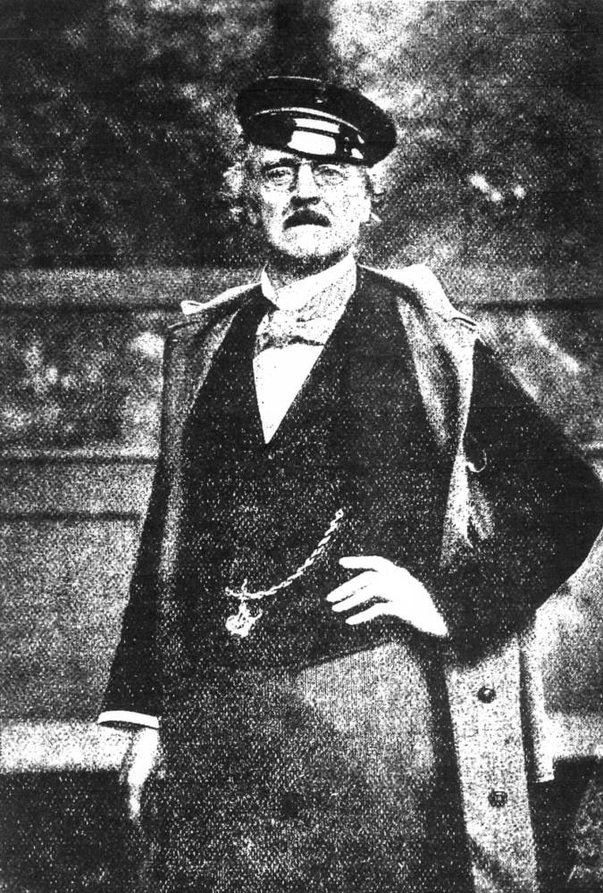
John Leighton: the frontispiece of his Tubular Transit for London (1902); British Library no. 8235.bb.87(4).
Leighton is now distinguishable from the other cover designers of his period by his sheer proficiency, as well as his artistic talent. He designed covers for a wide range of subject material, including religion, engineering, history, natural history, and particularly imaginative literature. He had work over a long span of years from at least four publishers - Bogue, Griffith and Farran, Blackie and William Mackenzie. His spine designs are frequently a marvel of intricate line within a confined space. Above all, Leighton provided designs that the publishers wanted, often incorporating deft flourishes of humour.
Previous evaluations of Leighton's achievements in the wider context of Victorian design developments have been made by Pantazzi4 and by Ball.5 There is also much Leighton material in the Bodleian Library.6 John Leighton was a long-lived man (1822-1912), of exceptional ability, with wide-ranging interests.7 His work as a cover designer was but one aspect of his activities.8 He was also a prolific book illustrator. Leighton's family was a large one, he being the eldest of seven. His mother, Sarah, was the daughter of the artist James Baynes (Panazzi 263). His father, John, was in business with his uncle James, as J. & J. Leighton, bookbinders (Ball 75).
Leighton studied as an artist in the studios of Henry Howard, R.A., and Thomas Seddon (Ball 75). He wrote and illustrated a number of works in the 1840s under the pseudonym of Luke Limner, almost certainly taking his pseudonym from St Luke, the patron saint of artists. Small bookplates that he used add weight to this.12 Leighton executed the artwork for at least three publications for David Bogue at this time. The lithographic press of Leighton and Taylor printed Comic Art-Manufactures, possibly in 1845, issued in orange paper covers. In this work, the sincere efforts of Henry Cole, and like-minded contemporaries, to raise the standard of art in design are satirized.13 David Bogue also published The Ancient Story of the Old Dame and Her Pig (1847). This shows on the front paper cover a farmyard setting for the Old Dame.14 Bogue published London Out of Town. Or the Adventures of the Browns at the Sea Side [1847].
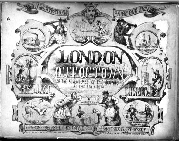
John Leighton (writing as Luke Limner), London Out of Town.
The upper cover of this work features medallions depicting events in 'watering places.'15 Grant & Griffith published Leighton's The Cries of London [1847].16 This work is distinctive for Leighton signing the majority of the twenty-four plates with the monogram 'JL' with the 'J' crossing the 'L.'. You have to look hard in the illustrations to find them. For instance, in plate 3 the monogram is on a small poster affixed to railings in the background. In these early works, we see the beginning of Leighton's habit of signing his wvork with monograms. The monogram is used habitually later on his cloth cover designs.17

John Leighton (writing as Luke Limner), London Cries & Public Edifices.
The covers of these works all possess characteristic features which mark the work out as Leighton's. The designs occupy the whole of the cover space available. There is much humorous detail, with groups of figures, or of animals. Leighton has instinctive sympathy with the British traditions of social comedy and satire. The designs of Cries of London, and of the Old Dame, show how Leighton was experimenting with figures in very different settings. In the same period, but undated, Ackermann & Co. published Contrasts and Conceits for Contemplation, a series of twenty plates, featuring social contrasts, such as 'tragedy-comedy'; 'wedding clothes-funeral clothes'; 'before and after the railway'.18 For The Royal Picture Alphabet, Leighton drew the plates, and his brother Henry Leighton engraved them. Some of the plates are signed with Henry Leighton's monogram, a joined 'H' and 'L'.19
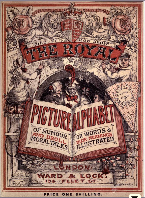

Left: Leighton's design for The Royal Pictorial Alphabet. Right: Leighton as author writing under the name of Luke Limner: The Ancient Story of the Old Dame and Her Pig.
The Great Exhibition of the Works of Industry of All Nations in 1851 offered Leighton great scope for his talents. He executed a number of bookbinding designs for the firm of J. &. J. Leighton, under his pseudonym of Luke Limner. His design for King William IV's royal Bible is reproduced in the Official Descriptive and Illustrated Catalogue.20 Leighton also designed the commemoration shield of the Great Exhibition, which was executed in electrotype by the Elkington company.21 The shield was used as ornamentation on blotting books.22 Leighton was awarded a prize medal for his designs by the Jury of Fine Arts (Class XXX).23 Amidst these endeavours, Leighton found time, under his pseudonym, to draw some seventy illustrations for The Rejected Contributions to the Grent Exhibition of All Nations. This is a delightful series of fictitious exhibits which 'failed' to be accepted.24

Frontispiece and title-page of The Royal Pictorial Alphabet.
In 1852 and 1853, David Bogue issued Leighton's Suggestions in Design. In this work, Leighton's mastery of line in relation to the design of all past ages is readily apparent. The work was issued in parts in paper covers. In the British Library copy, only the cover to issue no. 1 has been bound in. Plain as the design is on light green-dyed paper, Leighton took obvious pride in the medal he was awarded at the Great Exhibition of 1851, as it features prominently on the cover.25 From it comes much of the inspiration for Leighton's designs for cloth covers in the 1850s and 1860s. In it, examples of Leighton's monogram are on every plate. This work was updated and reissued by Blackie in l880, with an introducton letterpress text by J. K. Colling. In this later work, Leighton's monogram is a single capital 'L'.26
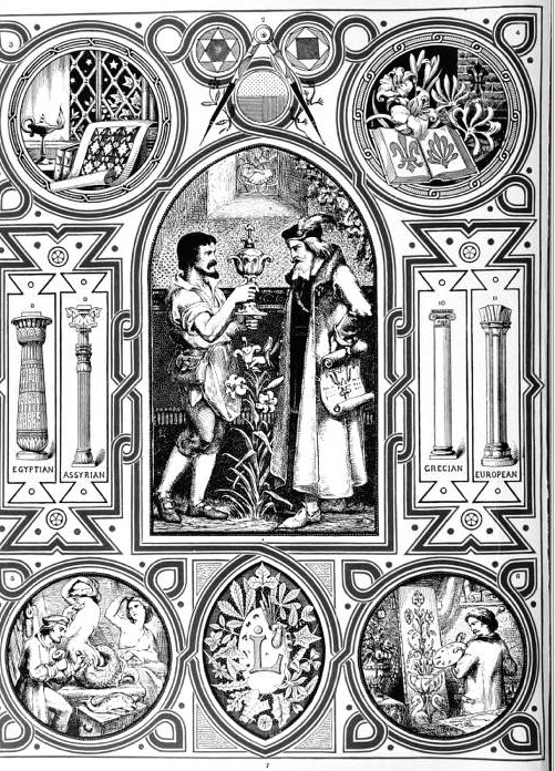

Frontispiece and title-page of Leighton's Suggestions for Design.]
Leighton's designs for cloth covers arose quite naturally. He had provided designs which were executed on paper, and it would have been logical for him to extend the scope of his work. There are cloth designs by Leighton before 1850. One of the most conspicuous is that for The Keepsake.27 This annual had commenced publication in 1828. Westley's may have carried out the binding for the early years, as the 1830 and 1848 volumes contain their binder's tickets.27 The year 1849, which was also bound by Westley, has Leighton's design. This was used again for the years 1850-1857. The years 1853 and 1855 have binder's tickets of Leighton, Son & Hodge. All the volumes of the British Library set for 1849-1857 were produced in the same way, with red morocco-grain cloth. The design is blocked identically on both covers, with the upper cover blocked in gold, and the lower cover in blind. The spine is fully blocked in gold. The design has an intricate tracery of vine leaves and grapes, intermingled with strapwork. The title, in fanciful letters, is surmounted by an oriental style 'vase bowl' lid. The volume for 1850 has inexact registration of the blocking on the upper cover, which suggests the design may have been cut as two blocks, which were assembled, together with the title letters, on the blocking press.
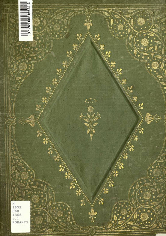
Leighton's cover for The Court Album [Copy from Robarts Library, University of Toronto].
Another example of work for Bogue was a series of Leighton's designs for The Court Album, which was issued annually from 1850 to 1857. The covers for 1851 and 1852 are light green morocco horizontal-grain cloth. Both covers are fully blocked in gold, with an identical design. There is an elaborate tracery of branches and flowers surrounding the title, which is blocked in relief within a small central diamond lettering-piece, blocked in gold. For 1853 and 1854, the same cloth is used as for 1851 and 1852. However, a different design of Leighton's was used. This features rose branches, stems and leaves on the borders and on the corners. The centre-piece shows two small figures, under a cupola, surrounded by stars, creating an 'open sky at night' effect. The volume for 1855 has light green ripple vertical-grain cloth and the same blocking in the borders and the corners as for 1853 and 1854. Leighton has designed a new centre-piece, a large recessed diamond with a border pattern blocked in blind, and a small vignette of a rose and a crown blocked in the centre of the diamond. For 1856, there is a break. The block used is on red leather, and is consciously imitating an earlier binding stvle. In 1857, Leighton provides a renaissance design, of elaborate lines. The centre-piece has two ovals, joined by strapwork and a tracery of leaves and stems.28
In 1856, Grant and Griffith issued Geraldine Jewsbury's Angela; or the Pine Forest in the Alps. This book is blocked in blind on the borders and on the corners of both covers. The vignette is typical: a small group, blocked in gold on the upper cover only, with the title in fanciful lettering. Leighton's monogram is frequently situated at the base of these designs, as is done in this instance.30 In 1857, Griffith and Farran, the successors to Grant and Griffith, issued Julia Maitland; or, Pride Goes Before a Fall by Mary and Elizabeth Kirby. This copy has the same red morocco horizontal-grain cloth as Angelo, and the same blocking in blind on both covers. Only the vignette blocked in gold on the upper cover is different.31 The same format is observable for Emma Davenport's Fickle Flora and Her Friends published by Griffith and Farran in 1863. The cloth is dyed red, and embossed with a dot and line vertical-grain. There is blocking in blind on the borders and on the corners, with the vignette featuring the heroine. This copy was printed in Edinburgh by R. & R. Clark, and then bound in London by Bone and Son (BL, 12808.b.30). All three works have illustrations by John Absolon.
In 1858, Leighton provided a delightful upper cover vignette design for Jack Frost and Betty Snow. The couple are seated on a bank by a pond, and are melting slowly in the rays of the rising sun.33 In the same year, Griffith & Farran published The Bridal Souvenir, with illuminations by Samuel Stanesby. For this work, Leighton made a design of a far more ambitious nature. The cloth is dyed white, and has pebble-grain embossing. The design is the same for both covers, with the borders blocked in gold and roses blocked in gold on the corners. There are turquoise paper onlays, which form an arabesque. They are blocked m gold, with flower and leaf patterns showing in relief. Medallions and hearts surround the title. This is a highly original design, bound by Bone and Son, and is worthy of the fine chromolithographs which accompany the text.34 Leighton's originality is again evident in the design for Crosspatch, published by Griffith and Farran in 1865. The upper cover design shows a lady, perched on a three-legged stool, holding patchwork. The patterns for each patch are different, blocked in relief, with the title letters blocked in gold within individual patches.35
Leighton worked extensively for Routledge. James Northcote's Fables, Original and Selected, published in 1857, has blocking in blind on the borders and the vignette on the front cover blocked in gold. On the blue wave-grain cloth, Leighton manages to fit many features into the small design.36 In the same year, Routledge issued Charles Pierce's The Household Manager. The vignette blocked in gold on the upper cover shows a bunch of keys on a ring, in which the title letters are blocked. The key tags are blocked in gold and each tag's letters are blocked in relief, with the key tag letters denoting the door to which the key gives access."37 Between 1853 and 1861, Routledge published five works by Anne Bowman, all on travel, printed by Cox and Wyman, with designs by Leighton. In her The Bear Hunters of the Rocky Mountains (1861; BL, 12807.bb.ii) the vignette blocked in gold on the upper cover features a bear with its arms clasped around a tree, its tongue licking at the bark. At the base of the tree are placed a rifle with a broken barrel, a shoe and a stick. The spine is also blocked in gold, and shows a medley of dead game, arrows, hatchets, a rifle, a spear, and the head of an Indian. The designs Leighton executed for Routledge were often for low cost publications.39 One exception to this is the design he made for Eliza Cook's Poems, published in 1861. The Brothers Dalziel engraved the illustrations of John Gilbert, J. Wolf, J. Weir, and J. D. Watson. The blue morocco horizontal-grain cloth has an identical design on both covers, and there is strapwork blocked on the corners, and also at the top and bottom of the central circle, which contains the title blocked in relief. Ivy leaves are blocked in gold between the strapwork, with no area left undecorated. This copy was bound by Edmonds and Remnants.40
The formula of the design and blocking of these works can be guessed.41 There was no need to block the lower cover in gold. As the spine and upper cover were most likely to be seen, these received the most decorative elements, although space was often limited. Leighton displays his proficiency in spine design, with a series of motifs which are appropriate to the subject matter of the book, and with a detailing of the line of small objects which engages the attention. Two examples of Leighton's spine designs illustrate this. The spine thickness of Emily Prentice's Dew Drops for Spring Flowers, published by Ward and Co. in 1857, is only ten millimetres. The title lettering on the upper cover is rustic in style, similar rustic letters curl down the spine in a very attractive manner. There are also two beautifully delineated spring flowers, one above, one below the title letters. The aim is to catch the eye, and the spine design certainly succeeds in this.42
The second example is on a slightly wider spine of twenty millimetres. Thomas Nelson published John Balfour's The Plants of the Bible Trees and Shrubs... in 1857. The small central vignette blocked in gold on the upper cover is standard, with the title word blocked in relief within a ribbon gold lettering-piece. There is plenty of space showing the blue-ched cloth around the centre-piece. However, on the spine, not a millimetre is wasted. The whole design is within a thin fillet on the perimeter, blocked in gold. The height of the book is emphasized by the coconut tree running down the length of the spine, with the leaves and nuts at the top, then the title panel, then a medallion with the author's name, and near the base, a Biblical quotation blocked in relief within the roots of the tree. the whole design is extraordinarily compelling.43
There are several instances of Leighton's vignette designs being reused. An example of this is Sunbeam Stories. Lockwood & Co. published four editions in the years 1860, 1863, 1860 and 1870. All of the editions have different dyed and embossed cloth. The edition of 1860 has a striking vignette of Leighton on the upper cover, featuring sunbeams, and an angel holding up a gold lettering-piece wwith the title words blocked in relief within it. This vignette is repeated on all the upper covers of the subsequent editions.44 Another example appears on the series Routledge's British Poets. In 1858, Routledge published the poetical works of Cowper, Milton, Goldsmith, Southey, Wordsworth, and Burns. Leighton designed a central vignette with two fuchsias on either side of a medallion, which contains a rearing Pegasus. This block appears in gold on the upper covers of all six volumes, and also on an 1861 reissue of Cowper's poetical works. Four of these seven books were bound by Bone & Son.45
Two other instances of reuse of Leighton's designs are worth mentioning. He designed a vignette of a lyre with branches and leaves. It is blocked in blind on both covers of Ralph Emerson's Poems, published by Routledge in 1850. The volume was bound by Westley.46 The same vignette is blocked in blind on both covers of Sophia Milligen's Original Poems published by Hurst & Blackett in 1856. This volume is bound by Leighton Son & Hodge.46 The vignette is used for the third time blocked in gold on the lower cover of A Book of Favourite Modern Ballads published by Ward, Lock and Tvler in 1865.48 The use of this vignette suggests some form of hiring or loan of it for these publications. Alternatively, it is possible that the same binder bound the latter two books, with the reuse of the block for different publications.
Leighton designed a vignette for the upper cover of the second edition of Nicholas Michell's Ruins of Many Lands published by William Tegg in 1850.49 This volume was bound by Westley. The vignette is in gold and shows a pyramid, columns and medallions, with a lyre formed at the top out of merging leaves and branches. The base of the vignette displays Leighron's monogram. The sixth edition of the work was published by Tegg in 1875, and features the same block as for the second edition, published twenty-five years earlier. Leighton's monogram is omitted in 1875. It seems unlikely thai the design was re-cut (unless it was worn), so retention and reuse is the more likely practice.50 It was the practice of the bookbinding company of Burn to keep binding patterns for many years.51 If Westley operated a similar system, it would not have been diflicult to retrieve the pattern and also to trace the block used for an earlier edition, and then reuse the block.
The continued publishing success of Defoe's Robinson Crusoe, and the desire of publishers to profit from its popularity, led to Leighton being commissioned by other publishers to execute different designs. There are four copies of Crusoe in the British Library with designs by Leighton. The first is on the Adam and Charles Black edition of 1859, issued in brown pebble-grain cloth. This shows a vignette blocked on both covers, in blind on the lower and in cold on the upper. The profile of Crusoe is accompanied by a dog to his left and a cat to his right, and a ram's head below.52 Leighton provided two designs for Routledge in 1864, both with bevelled boards and gilt edges. The smaller of these editions rud illustrations by J. P. Watson, engraved by the Brothers Dalziel. The design is blocked on brown pebble-grain cloth, and features a diamond centre-piece containing medallions of Crusoe and Man Friday, above and below a man-of-war.53 The larger edition, described as a 'new edition', was illustrated by Phiz (H. K Browne). This is a smaller design, on blue pebble-grain cloth, with Crusoe and Man Friday carrying game slung over a pole.54 Knight & Son also published the work in 1864, '...carefully compared with the edition of 1719. Illustrated in oil-colours by Kronheim.' Leighton's design is on green hexagon-grain cloth, showing within the central vignette on the upper cover the rear of a warship, and its dinghy. The spine is fully blocked, with much detail typical of Leighton. 'There is a copy of the Bible, in front of a group of objects: a sword, a rifle, a spade, an axe, an arrow, and a parasol.
Higher levels of payment for cover designs were presumably made for those works which publishers thought would sell well, or were for new editions of authors which had sold well. A common feature of these books was the use of bevelled boards and gilt edges, with coloured endpapers and pastedowns. Variations of cloth colour and embossing also gave a different appearance at little or no extra cost. Leighton's elaborate design for the Richard Bentley edition of The Ingoldsby Legend shows a continued reuse of his design. The British Library has six copies with original cloth, published between 1864 and 1874. Three copies were published in 1844, one in 1865, one in 1866 and one in 1874. The same design is blocked in full gold onto all the copies. For the copies issued in 1864, three different dyed cloths were used, with two grains: maroon pebble-grain; brown dot and line-grain; and green pebble-grain.56 The edition for 1865 (BL, 11651.f.2) has the blockwork on purple sand-grain cloth, and the 1866 edition (BL, 11651.f.3.) is on green sand-grain cloth; the 1874 edition (BL, C.70.d.10) repeats the use of purple sand-grain cloth of 1865. This copy belonged to George Cruikshank, and was given to the British Museum by his widow Eliza in 1888.
Longfellow was an author who enjoyed huge popularity at this time. There are twenty-three publications of Longfellow's poetical works between 1850 and 1860 in the British Library General Catalogue of Printed Books. The entries for his single works run to many pages of the catalogue. Leighton's design for Hyperion, published by David Bogue in 1853 has both covers and the spine fully blocked in gold on blue ripple-grain cloth, with plant and leaf patterns blocked on the corners and on the spine. The diamond-shaped recessed panels on each cover are a strong feature of the design. In the centre is further blocking of plants and leaves, with Leighton's monogram at the base of the centre-piece. The illustrations were drawn by Birket Foster and engraved and printed by Henry Vizetelly.59 In 1854, the samb elements were repeated for Bogue's publication of Longfellow's The Golden Legend. Vizetelly again engraved and printed the illustrations by Birket Foster and Jane E. Hay. Leighton provided a design on blue wave horizontal-grain cloth, with full blocking on both covers and spine. The central recessed panels on each cover are 'onion dome' shaped at top and bottom. The gold centre-pieces have leaf and flower patterns blocked in relief.60
Leighton provided two charming designs in 1856 and in 1857 for a very different type of work. Groombridge & Sons published Shirley Hibberd's Rustic Adornments for Homes of Taste, and Recreations for Town Folk in the Study and Imitation of Nature. The 1856 edition is m red morocco vertical-grain cloth, with both covers blocked in gold with an identical design. The title letters are of the rustic style, resembling branches, and the centre-piece shows a fish bowl with a rockery, from the centre of which a fountain arises to bisect the 'S' and 'T' of the title word 'RUSTIC'. The 1857 edition, issued on green morocco horizontal-grain cloth, was bound by Westley, and has the same border and corner decoration and the same title letters as for 1856. Leighton provided a new centre-piece for the 1857 edition, showing a landscape of trees, a statue on a plinth, an urn and a fountain. The spine design is particularly detailed, with a bird cage and a plant holder, and the author's name blocked in an extended lettering piece underneath the plant holder. Both editions were printed by Benjamin Fawcett in Drimeld.61
The publisher Longman provided Leighton with opporninkies to design more complex, expensive work. The cover design for James Doyle's A Chronicle of England published in 1864, with illustrations by Doyle engraved by Edmund Evans, has an identical design blocked on both covers in gold, on brown pebble-grain cloth. The design displays symmetry, with coats of arms on the corners, and a chequerboard of thistles and roses blocked on the inner rectangle. The central medallion shows the royal coat of arms. Unusually, the cover design is also signed with the name of the die-cutter, as the words 'Timbury Sc.' appear on the bottom right hand corner of each cover.62 Longmans also published Moral Emblems with Aphorismss, a work illustrated by Leighton, edited and translated by Richard Pigot. The only British Library copy with its original covers intact is the third edition of 1865, bound by Simpson and Renshaw. It has red sand-grain cloth, identically blocked on both covers. The strapwork is a prominent feature of this design. It is in wide bands, blocked in black, with gold fillet line edges. The central mandorla, a common Leighton device, has the title letters blocked in relief.63
Richard Pigot and Leighton collaborated again on The Life of Man, published in 1866. Leighton provided all the numerous illustrated borders and half or full page illustrations. The cover design provided by Leighton is one of his most intricate and compelling. For it, Leighton again employs blocking in gold with black ink for the borders and for the strapwork surrounding the cemral mandorla. This has a red sand-grain cloth onlay, showing the figure of Adam holding the apple next to Eve. The crowned serpent coiled round the apple tree above Adam and Eve is finely executed. The title letters are blocked in relief inside a gold lettering piece in the shape of a shield. Above this is blocked a helmet containing a skull. The British Library has two copies of this work, both bound by Edmonds and Remnants. One copy is in orange sand-grain cloth. The fore-edge of this copy has been decorated in red ink and gilt alternately, to index each month. The other copy has green sand-grain cloth and gilt edges.64
Longmans published several editions of Lyra Germanica: the Christian Life. For the 1868 edition, Leighton again provided the illustrations, in collaboration with Edward Armitage, Ford Madox Brown. The covers are of green pebble-grain cloth. Both covers are blocked identically. The mandorla is a red pebble-grain cloth onlay, and shows a figure of an angel, crowned and at prayer, with an open book in front of her. Ingeniously, the wings of the angel rise to form the outer edge of a lyre, and the points of the angel's crown also rise to form the strings of the lyre. The title is blocked in gold above the lyre.65
Leighton also worked for other publishers at this time. In 1865, he produced a sumptuous and complex design for The Voices of the Year published by Charles Griffin. Both covers are blocked to identical designs. Their borders are blocked in gold and in black, the inner rectangle in gold and the central circles in gold and black. In a deft touch, the extensive strapwork on the covers ends in birds' heads, with the benks of the birds doubling back on themselves to grip the strapwork. Tn this design, extensive use is made of fillets, blocked in gold, with repeating dots blocked in blind. This is used for the borders, the strapwork and the central circles, and highlights the purple sand-grain cloth.66 Leighton provided an unusual design for Chapman and Hall's publication in 1867 of The Prince of the Fair Family. Both covers are blocked in gold with an identical design. The decorative elements of butterflies on the comers and a group of figures within the central vignette are straightforward. A distinctive feature is the inner border, which consists of Hower heads blocked in gold on raised circles. The book was both printed and bound by Virtue & Co. It is also uncommon to find Leigbton named as the cover designer at the end of the list of illustrations67
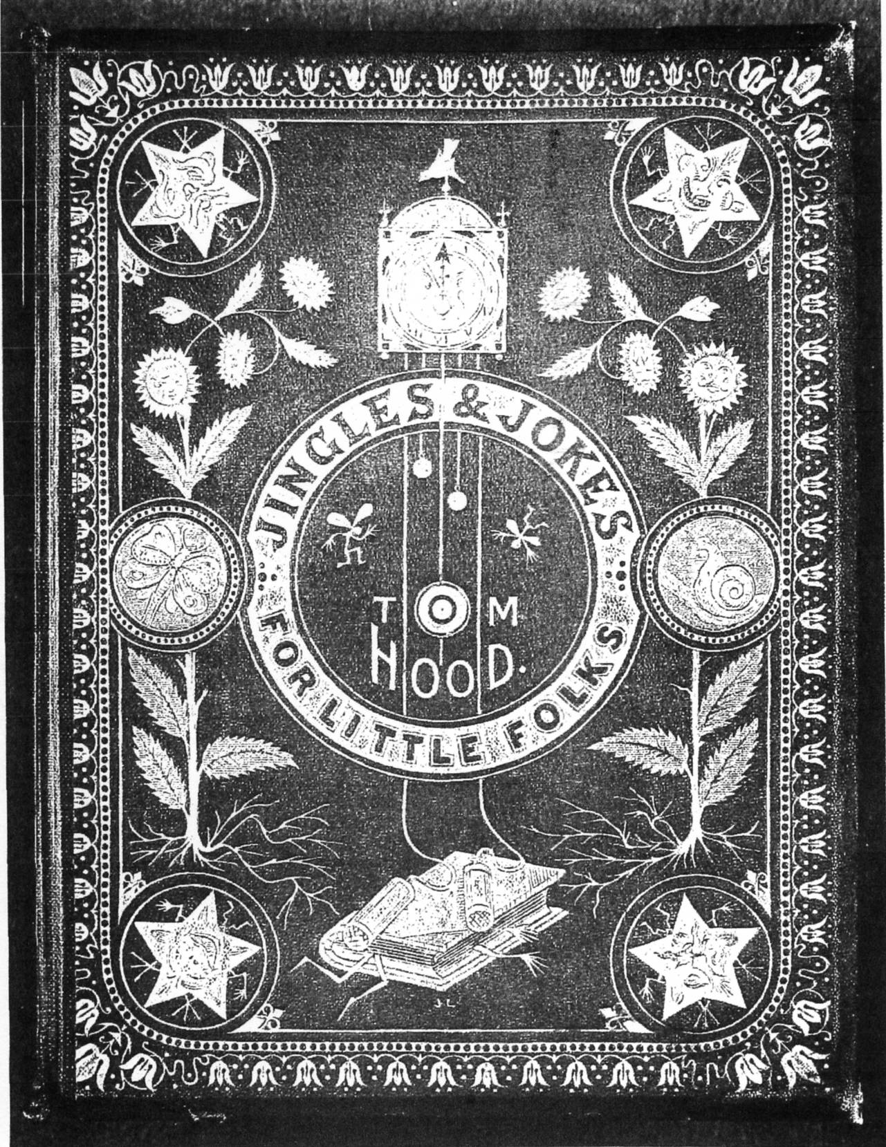
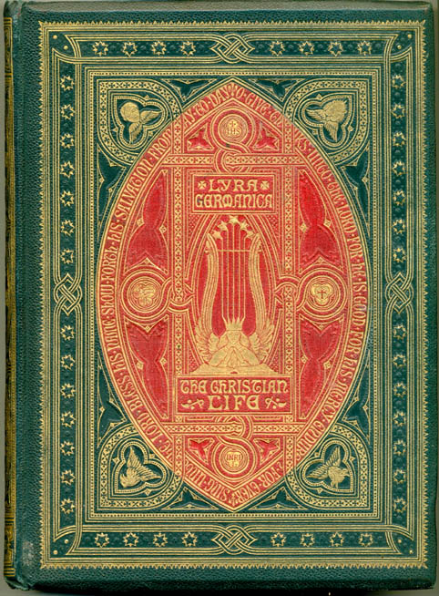
Two bindings designed by John Leighton: Left: The upper cover of Thomas Hood's Jingles and Jokes for Little Folks. Right: Lyra Germanica: the Christian Life.. [Click on these images for larger pictures.]
Leighton's designs often have humorous features within the overall design. Two works allowed his imagination full rein. Thomas Hood's Jingles and Jokes for the Little Folks, published in 1865 hv Cassell, Petter, and Galpin, has an identical design blocked on both covers, which are of red sand-grain cloth. However, the blocking in gold is only on the upper cover. The stars blocked on the corners have arms, legs, and faces. The clock above the title lettering also has a human face. The weights of the clock trail down the cover and press upon a book, in which is trapped one of the 'Little folks'. The whole design is innocent, charming and full of activity (fig. 2).68 Mark Lemon's Tmykins Transformations published by Bradbury and Evans in 1869, has a design on the upper cover only blocked in gold and in black. A solitary winged fairy, blocked in gold near the head, is seated in a quarter moon, blowing a horn and beating a drum. At the base is a group of fairies, charmingly drawn, dancing above a pond containing fishes and bullrushes. The contrast between the orange sand-grain cloth, and the gold and black blocking is visually pleasing.69
The fashion for all things medieval found a ready outlet in the mid-Victorian period. In books, the illustrations reflected many forms of gothic design and decoration. The use of monograms was one instance of the fashion, and in 1866, Longmans published John Eliot Hodgkin's Monograms. The entire book is in the shape of a shield, and consists of seventy-nine plates of monograms. For the covers, Leighton has designed a helmet above a shield, both surrounded by pennants. Both covers are blocked in gold and in black. The blockwork is on green sand-grain cloth, with a red bead-grain cloth onlay for the shield. The monograms in each shield are blocked in relief, showing the red cloth. The monogram for Hodgkin, 'JEH' is on the shield of the upper corner. The detail of the design is particularly fine, as the book is a small one, measuring only 120 x 140 mm.70

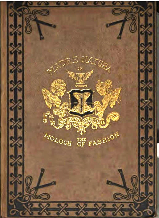
Left: Leighton's design for John Eliot Hodgkin's Monograms. Right: Leighton's cover design for his own Madre Natura Versus the Moloch of Fashion. [From a copy in the Univertsity of Oxford Library. [
Perhaps one of the oddest cover designs that Leighton made was for his own work Madre Natura Versus the Moloch of Fashion. This essay, a tract against the evils of female corsetry, was originally issued in paper covers in 1870 by Bradbury & Evans.71 The work must have achieved some success, for Chatto and Windus issued the fourth edition in 1874. This edition has grey ungrained cloth covers, and the British Library copy was bound by Leighton Son and Hodge. Both covers are blocked to identical designs in black on the borders to resemble the lacework of a corset. On the corners are the ends of the corset laces, knotted.72 The upper cover has a remarkable centred coat of arms, blocked in gold and in black, which is also printed on the title page. This is the coat of arms of the Mantua makers. It shows two harpies, with their claws pulling at a corset placed between them (fig. 4).73
Leighton remained very active in designing for subsequent internal ional exhibitions held in the 1850s and 1860s.74 Knowing ihis, one wonders at his prodigious production of cover designs in these years. Leighton also continued to publish as an illustrator and author. He was still designing covers in the 1870s, but the scale of his activitw lessened greatly. This may have been for two reasons, besides his involvement in exhibitions. Firstly, the publishers wanted far less of the style of designs that Leighton and other cover designers had produced. This diminution was driven by technical developments which permitted the blocking of covers far more cheaply.75 Secondly, from 1870, Leighton was proprietor of a weekly periodical. The Graphic, which may well have taken up his time.76
There are many later designs which show that Leighton had not lost his creativity. Felix Pouchet's The Universe was published by Blackie & Son in 1870. Leighton created a complex design, executed in gold and black. The two small medallions at the head and tail of each cover are complemented by the central blocking of an armillary sphere. Inside the sphere, some of the signs of the Zodiac are delicately blocked in relief. Leighton signed this design with a single 'L', with a full stop above the initial. This work was published again in 1871 and 1876 with Leighton's design repeated.77 Blackie had used Leighton for many years previously to design covers for their annual Literary and Commercial Almanack. Leighton provided covers for the years 1853-4, and 1857-72 (BL, P.P.2468.cc.).
Between 1879 and 1895, Leighron executed a number of designs for William Mackenzie. An analysis of fifteen copies of seven titles published by Mackenzie with Leighton designs shows that Leighton made designs for the same text, issued either in parts with paper covers, or in cloth covers.79 Leighton also continued his collaboration with his brother Henn (begun at least in the l850s)80, who engraved the designs for the paper covers for the three publications: The Family History of England,81 The Russo-Turkish War,82 and The National Burns.83 Typical of John Leighton's designs for William Mackenzie was that for the covers of The Age We Live In. The work was issued in twenty-four parts in 1884, at a cost two two shillings, each containing eighty pages and two engravings. The covers are of blue paper, printed in blue and in red. The design has border decorations, medallions, and the central medallion shows the crowned head of Queen Victoria. It has rays emanating from the medallion, making the Queen seem like the centre of the sun.84
In his later years, Leighton became interested in local government,85 and was the author of a small tract, The Unification of London, whose third edition appeared in 1895. The prime paper cover for this work was designed by him. The cover, although unsigned, possesses his distinctive design features, with a prominent central coat of arms of the Corporation of London.86 His last published work that I have so far found in the British Library appeared in 1902. In it, Leighton proposes improvements to the London underground system. The front cover is a repeat of the 1895 work, with the new title substituted. The frontispiece shows a contemporary half length portrait photograph of Leighton, wearing a peaked cap (see above).87
As has been seen, several publishers provided regular commissions. Leighton's relationship with David Bogue must have been profitable to both. Bogue had published Comic Art-Manufactures in the mid 1840s, with London Out of Town and The Old Dame and Her Pig both being published in 1847. The relationship continued with Leighton's cover design for The Keepsake being first used in 1849. Leighton also provided warious designs for another annual, The Court Album from 1850 until 1857. It was Bogue who published Leighton's own Suggestions in Design in 1852 and 1853. Leighton designed some of his most compelling covers for Bogue in the 1850s.88 This work did not appear to continue beyond 1857, when W. Kent & Co., successors to David Bogue, issued Tennyson's The Miller's Daughter with a Leighton cover design.89 Blackie & Son provided much work for Leighton in the 1860s and 1S70s, and published the second edition of Suggestions in Design in 1880.
Leighton enjoyed a longer relationship with Grant & Griffith, later Griffith & Farran.90 His earliest design was for Cries of London in 1847. The last example so far found was a design for Darcy Thompson's Fun and Earnest, published by Griffith and Farran in 1865.91 Routledge provided many simple commissions in the 1850s, the earliest so lar found being in 1850, with the publication of the second edition of Emerson's Poems92 and the latest being in 1868, with the publication of Wilhelm Hey's One Hundred Picture Fables.93 Leighton also had significant work from Richard Bentley, who gave him considerable freedom for the designs for The Ingoldsby Legends, Bradbury and Evans provided important commissions for Leighton in the 1860s. They published the only work which has photographs by Leighton, The Book of the Royal Horticultural Society, 1862-1863,94 and also Mrs Candle's Curtain Lectures,95 which has a delightful design on red leather. Bradbury and Evans printed the Selected Poems of Tennyson published by Moxon in 1865,96 The Life of Man,97 and .98
Of his mastery of line there can be no doubt. His work as outlined in the two editions of Suggestions in Design is testimony to this. His designs repeatedly show many varied historical influences. However, Leighton blends these into his distinctive style, which was much in keeping with High Victorian taste. Time and again, Leighton provided designs that were both appropriate to the subject matter of the book and pleasing to the eye. In them he clearly took delight in the unexpected, in the seeking of strange imaginative combinations, and in the deflation of all pretension.
Firm evidence of the relationship between book cover designs and the retail price of the published work demands a different kind of research from that carried out here. However, there is no doubt that Leighton had many dozens of commissions in the 1850s and the 1860s for books with prices that ranged from three to five shillings. For this price, a formula is apparent: blocking in blind on the borders and on the corners of both covers; blocking in gold for the upper cover vignette and for the spine. It is often in the detail of these small designs that his imaginative talent is most apparent. In those instances where he was able to provide more elaborate work at greater cost, Leighton produced complex designs, which experimented with the combination of the colour and grain of the cloth, the use of gold and black blockwork, the use oF blocking in gold and in blind and the use of onlays. Sometimes many of these elements would be used together, as in his designs for The Life of Man or for Monograms.
Leighton had to work within restrictions: the proportions of a book cover provided only a limited medium in terms of size, and the dyes of the bookcloth. Gold and black were normally used, as it was difficult, until the 1890s, to app1w other coloured inks to bookcloth. The use of the design had to be maximized to achieve the strongest effect. There is not much evidence to suggest that Leighton experimented with new techniques. His originality lies in the way in which he used design to render new effects of line, or juxtaposition of black and gold, within the limitations of the medium. Certainly, his most elaborate designs must have stretched the skills of the engravers. Of course, Leighton was dependent upon the skills of die-cutters to copy his work as accurately as possible and also upon the successful registration of the heated blocks upon the book cloth. Looking at his designs in the British Library, there is ample evidence that designer die-cutter, and finisher worked very well indeed, creating designs which continue to fascinate and to charm us.
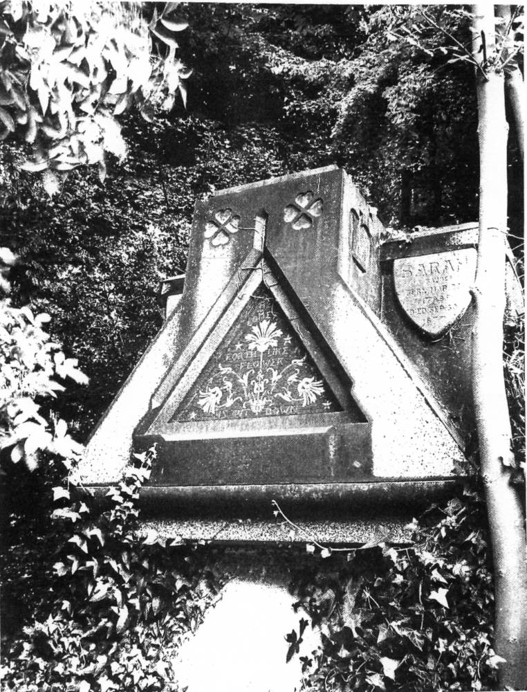
The west end of the Leighton family tomb, designed by John Leighton, 1867, in the graveyard of St. Mary, Harrow. Photograph by L. Pordes.
Leighton died on is September 1912, his ninetieth birthday.99 The family tomb is situated in the graveyard of the Church of St Mary, Harrow (fig. 6) The sarcophagus is large and deep, on an Last-West axis. The East end of the tomb has the date '18 J[U]|L[Y 18]67', with a small spade carved above this. There are eight shields, two on each side of the tomb, each shield bears the name, dates of birth and death of the family memher, including Leighton himself. There are mosaics on the West, North, and South sides. Thf one on the South shows a red lion rampant within a shield, the crest supporting a helm above. The motto 'Light On' (a pun on Leighton) is carved underneath the lion. On the North side, on the right hand corner, the letters: 'L DEL: D.M. & J. NEWELL Sc.' are carved. Leighton's single initial, with its exaggerated serifs and a full stop above it, is typical of his signature made in his later years on his book covers. In death, as often in his life, Leighton identities himself and his kin through his monogram and a pun on his name.
Last modified 14 September 2013