
Dante Gabriel Rossetti was a revolutionary figure who had a significant impact on mid-Victorian culture. Well-known as one of the founder-members of the Pre-Raphaelite Brotherhood (1848), he was later associated with William Morris and the Arts and Crafts Movement. Not only an accomplished illustrator, painter, poet and translator, he also created stained glass windows, furniture, picture-frames, book illustrations and bindings.
He redefined the forms of each of these disciplines and was especially radical in his revision of Victorian book art. His wood engravings for William Allingham and Alfred Tennyson in the 1850s inaugurated a new stage in the development of Victorian illustration, and his books-covers of the 60s and 70s entirely changed the aesthetics of trade bindings.
In the mid-Victorian period publishers’ editions tended to divide between plain cloth and the luxurious excess of the Christmas gift book; however, Rossetti negotiates a pathway between these two extremes. Indeed, comparison of Rossetti’s casings with those by others reveals the extent of his radicalism. It is instructive, especially, to compare the livery of Tennyson’s Idylls of the King (1859) with Rossetti’s binding for his Poems of 1870.
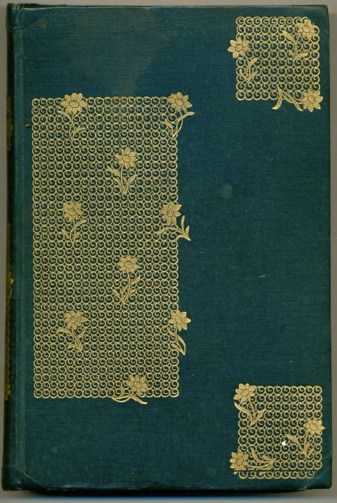
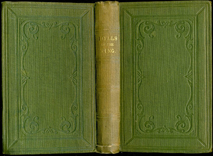
Left: Dante Gabriel Rossetti’s binding for his own collection of Poems (1870). Right: Anonymous binding for Tennyson’s Idylls of the King (1859).
The first, anonymous design is purely functional, only embellished by a lightly-embossed pattern in the form of a Renaissance motif; Rossetti’s, on the other hand, is an elegant gilt fret-work, animated by ornamental flowers in intervals organized into panels which may allude to the clasps or hinges of medieval incunabula, thus creating a cool, sophisticated effect. Rossetti’s tight control over his material is also demonstrated by the differences between his designs and A. H. Warren’s. In Warren’s cover for Wayside Posies (1867) we have a typical example of the ostentatious ornament of Victorian gift-books, with every part of the surface covered in intricate devices combined with polychromatic effects; while in Rossetti’s design for his own translation of Dante and His Circle (1874) we are presented with a pared-down minimalism of parallel gilt lines on a ground of dark green.
This approach typifies his work: in the words of Gordon Ray, ‘most of [Rossetti’s] designs … are marked by a simplicity and elegance that set them apart from the elaborately ornate work’ of his contemporaries (101). Stripping away the decorative excess and horror vacui of mid-Victorian design, Rossetti’s bindings are generally lean and spare, ‘simple and asymmetrical’ (Seiler, 18), with only his work for Thomas Hake’s Parables and Tales (1872) displaying a greater elaboration.

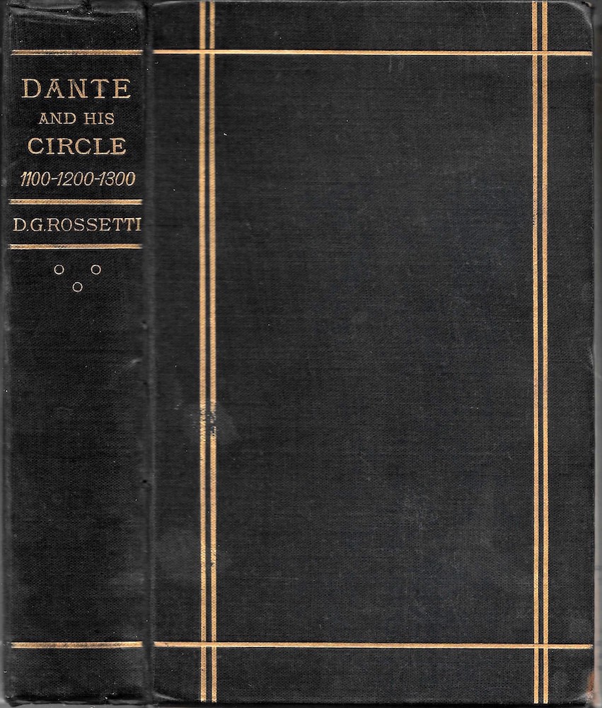
Left: Dante Gabriel Rossetti’s binding for his own translationDante and His Circle (1874). RighT: The elaborate front cover of Wayside Posies, Ed. Robert Buchanan, designed by A. H. Warren (1867).
Rossetti’s book covers might thus be regarded as idiosyncratic treatments of a purely commercial form, raising trade issues to the level of carefully-authored art-works which break with convention and reframe the book’s purchasers as connoisseurs. Deeply informed with Morris’s emphasis on the aesthetic improvement of household goods, Rossetti’s books dignify a commonplace artefact; in many ways they are figured as the ideal product of Art and Crafts philosophy, objects both beautiful and useful. Yet they are also engaged in a complex nexus of styles which embraces both Arts and Crafts and Art Nouveau; hugely influential, they were imitated by practitioners of both idioms and had a significant effect on book designers of the 1890s and beyond.
Rossetti’s bindings have been considered at some length by commentators such as Alistair Grieve (1973), Giles Barber (1970), Douglas Ball (1985) and William E. Fredeman (1996). These commentators focus primarily on bibliographical issues, with some discussion of stylistic complexities. Another, central concern, and one less often considered, is the relationship between the bindings and the texts they enclose. This account focuses on the complex relationships between the bindings’ imagery and the books’ contents. I also consider questions of authorship and the covers’ influence on later designers.
The Emblematic Book Cover
Rossetti’s covers generally act as proleptic signs which are closely linked to, and project, the books’ contents. He sometimes deploys emblematic details which represent aspects of the texts’ imagery, and otherwise uses more abstract forms to suggest their tone or focus.
His first emblematic binding was produced in 1865 for his brother William Michael’s translation of Dante’s Comedy, Part One – Hell. In this design, Rossetti illustrates the key constituents of Dante’s cosmology: the three roundels on the front cover are emblems of the fire and stars, while the four circles at each corner contain an A placed within an O, which stand for Alpha and Omega. These overlapping letters remind the reader of the divine love in which Dante’s adoration of Beatrice is framed; asked by St John to explain his soul’s aim, he answers by invoking the love of God, which is the beginning and end of all, Alpha and Omega fused into one as it is in the roundels. Austere and intense, the cover’s hieroglyphics point to the Comedy’s absolute focus on the extremes of life – fire and stars, beginning and end – which are unified by the power of God.


Left: Dante Gabriel Rossetti’s binding for his brother’s The Comedy of Dante Allighieri – The Comedy (1865). Right: Rossetti’s design for Thomas Gordon Hake’s Parables and Tales (1872).
Rossetti similarly adopts a philosophical approach in his treatment of Thomas Hake’s Parables and Tales (1872), one of the rarest fine books of the entire period. Hake’s poems are melancholy reflections on life and mortality, a focus interpreted by Arthur Hughes in a series of wood-engraved illustrations, and Rossetti extends the visualization of Hake’s themes in the form of an elaborate gilt design.
Each part of the design corresponds with a poem. ‘The Lily of the Valley’ (60–76), a sentimental assertion of childish innocence and perfect love, is represented by a lily; positioned opposite is deadly nightshade, a contrasted sign which corresponds with a poem about blighted youth (77–88). Rossetti also points to the other binary oppositions: he places the cradle (‘Mother and Child’, 2–10) in the centre ground and immediately contrasts birth and childhood with death in the form of a spade, a sign of the inevitability of death that underpins all of the verse and creates a strong atmosphere of mid-Victorian morbidity. All that is left is redemption, the ‘soul-illumining ray’ (25) which Rossetti visualizes as a cascade of toy-like stars and a crown of thorns – the emblem of suffering to cleanse all suffering in the torment of Christ.
Rossetti’s design acts, in short, to encapsulate Hake’s parables in which the argument is one of conventional Christian moralizing, of suffering on earth only redeemed by belief in the Almighty. Hake pursues his theme through a series of narrative ‘tales’, but Rossetti focuses his theme in just six emblems: birth and death (the cradle and spade); innocence and the poison of experience (the lily and the deadly nightshade); the spiritual (the stars); and redemption and new life in the house of God (the crown of thorns). Figured in a realistic style which specifies the cradle’s wicker and draws the flowers with botanical exactitude, the effect is nevertheless decidedly dream-like, compressing all life into a scheme of apparently randomly juxtaposed objects where a cradle and a crown of thorns are forged into an unexpected linkage.
Both poetic and philosophical, Rossetti’s cover is intensely beautiful: the carefully-drawn items are animated by curving lines in the manner of Japanese design, and the combination of the prosaic – with the cradle’s rockers drawn as if they were part of cottage furniture – and the simplified outlines of the stars is both complex and pleasing, rather like an image in a children’s book, and redolent of the imagery of Arthur Hughes’s illustrations contained within. The impression it gives is decidedly optimistic; though he crystallizes Hake’s message, Rossetti interprets the writing in light, uplifting forms. Indeed, the artist makes the verse, which is purely sentimental rhyming of the period, seem more appealing than it is. The contemporary buyer, looking at Rossetti’s cover, might have purchased Hake’s poems purely on the basis of its material presentation. Interestingly, Rossetti wrote a positive review in The Fortnightly Review – supporting his friend in words as he did through the application of his striking design in gilt.
Rossetti’s designs for Hake’s Parables and his brother’s Divine Comedy are complicated, although his treatment of his sister’s Maria’s A Shadow of Dante (1871) is figured of equally arcane symbols. Composed of two sets of wings, a star, a flame and a blossoming iris placed in a circle, each is related to the author’s intricate decoding of Dante’s life and cosmology. Rossetti experimented with several solutions for the design – including motifs that were never used – and his final choice is elegant and unsettling. Though he does not explain his iconography, it does yield to interpretation. The wings, placed at the corner as contrasting version of each other, represent Heaven and Hell: the feathered ones are those of angels, while the other set, resembling those of bat and redolent of the imagery of Gothic, connote the leathery wings of the residents of Hell. Dante’s universe, so closely explained by Maria Rossetti, is made up of this binary, and the cover reinforces the idea of the great moral choices between Good and Evil. The message is continued, moreover, in the placement of star and flame: the flame is in the same lower zone as the devil’s wings, the emblem of the eternally burnt and burning, while the star, a token of Heaven, corresponds with the angel’s aerial equipment. In the centre ground is a Florentine iris, the sign not only of Dante as the bard of his home city, but a symbol of the beauty of spiritual life. The flower is shown, we suppose, at the very moment of blossoming – a powerful image of refined gainfulness. Maria Rossetti’s text is a complicated, academic analysis, but her brother, following his approach to Hake’s leaden verse, lightens the effect of dour seriousness by endowing it with a vibrant material identity.

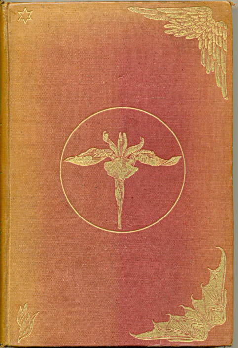
Left: Dante Gabriel Rossetti’s binding for his Maria Rossetti’s A Shadow of Dante (1871). Right: Rossetti’s design for Swinburne’s Songs Before Sunrise (1871). This is a later reprint.
Working on other books his approach is simpler. In his binding for Swinburne’s Songs Before Sunrise (1871) the three roundels, showing the sun, the stars and the moon, are a play on the title. Swinburne’s poems are dedicated to the Italian reunification, and the binding acts metaphorically to suggest the new world, the beginning of a new day which supposedly accompanied independence and the establishment of Italian self-rule. The cover is again a lyrical extension of the text, this time emphasising its romanticising of a political revolution.
In short, Rossetti’s use of emblematic designs greatly enhances the impact of his covers, which he conceives as a field of expression; integrating the binding with the text, he prepares the reader for his or her encounter with the letterpress. In his hand, the paratextual and textual are fused into one.
Sophisticated Strategies
These covers are unlike any others of their period, introducing the book buying public to the avant-garde. Rossetti had pursued a parallel project in his picture frames, and his designs for book covers are part of the same desire to explore the expressive range of applied art. Yet, though complicated, his emblematic bindings are essentially legible schemes, enabling the viewer to focus on key constituents which are taken up and expanded in the writing. Rossetti creates other covers, however, which extend beyond emblematic detail and are placed in highly suggestive relationships with their texts. In this vein, the artist deploys three strategies: the first involves the workings of allusion; the second is designed to project the book’s aura, or tone; while the third is mischievously misleading, setting out to surprise or mislead the consumer by creating a deliberate clash between the outer surfaces and the book’s contents. This final approach does not fit with his emphasis on prolepsis and stresses the fact that Rossetti was never bound by formula, and explores each text anew.
His deployment of suggestive allusion is exemplified by his binding for Christina Rossetti’s The Prince’s Progress (1866). Composed of a geometrical pattern enlivened with tendril-like arabesques, the cover alludes to the gilt-bound bindings of medieval books and, in so doing, prefigures the contents’ neo-medievalism. Indeed, the bindings establish the poet’s frame of reference: Christina explores the parameters of disappointed love and courtliness, religious belief and superstition, and Rossetti’s archaic design positions her verse in the world of some distant, dream-like past where these values were believed to co-exist. Christina Rossetti’s poems are Pre-Raphaelite voices from an imagined history, and her brother’s design suggests they should be read in exactly these terms as echoes recovered from times lost. The gilt pattern also suggests the surface of a medieval door or lid, with the two innermost whorls suggesting the fixings of hinges. If read thus, the upper board becomes a portal to a church or some depository of treasures contained in chest: a positive imagery pointing to the gem-like intensity of Christina Rossetti’s finely-worked verse. In a brilliant move, Rossetti suggests that the reader is about to encounter unexpected delights; all s/he has to do is raise the lid or open the door.
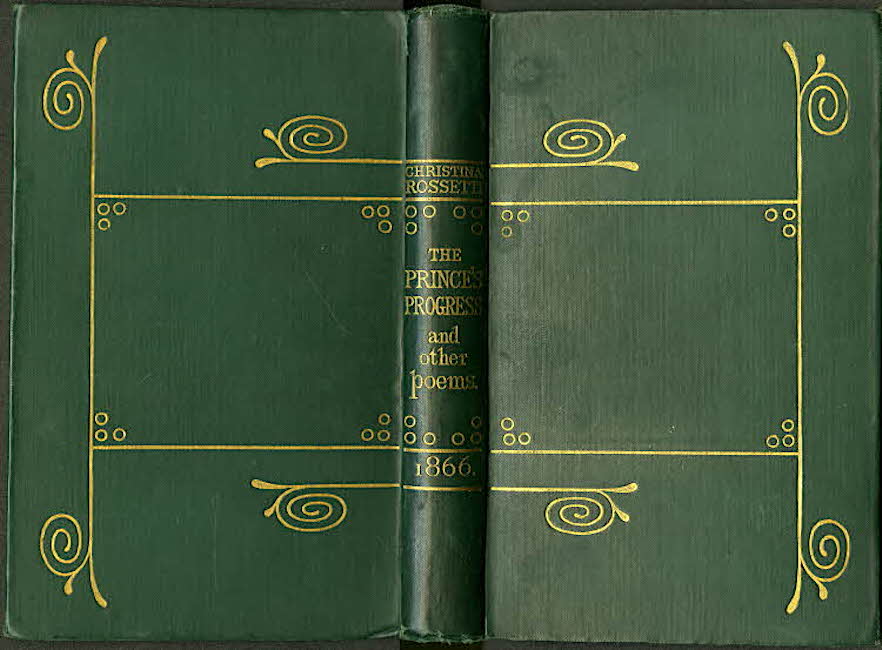
Left to right (a) Dante Gabriel Rossetti’s binding for his own book, Poems (1870). (b) Rossetti’s design for Christina’s Rossetti’s The Prince’s Progress (1866). (c) Rossetti’s design for his sister’s Goblin Market (1862).
The notion of preciousness is given another twist in his design for his own book of Poems (1870), which subtly conveys the text’s sophisticated tone. As noted in the opening section of this essay, the cover’s imagery of fretwork and flowers is a visual delight, a veritable posy to prepare the reader for Rossetti’s extended use of floral imagery which is repeated, in a slight variation, on the end-papers. In particular, the image of the trained flower, emanating from its fret-work is figured as a piece of refined gardening, and this symbol stands for Rossetti’s poetic craft as it is exemplified by manipulation of tightly-controlled forms, notably his sonnets. The binding thus acts to suggest both nature and artifice – a combination typical of Aestheticism of the 1860s and 70s and one projected in this object in a particularly delicate and memorable form.
This cover generates the text’s aura. In complete contrast are his bindings for Christina Rossetti’s Goblin Market (1862) and for his own translation of The Early Italian Poets (1861), which he reused for Dante and His Circle (1874). Each of these is a sort of calculated mismatch, setting out to amplify its text’s effects by figuring a visual opposite, a tonal contradiction to the tenor of the writing. The austerity of each binding is completely unlike the sensuousness of the contents: in the case of the two volumes of translations, the austere, geometrical design is at odds with the rich verse, and the same is true of the plain cover, which Ball describes as ‘Japanese in its simplicity’ (56), for Goblin Market.
Rossetti’s treatment of his sister’s work is especially surprising. Figured as a grid of single gilt lines with groups or triples of small circles, the cover implies a severe or religious content, and is not unlike the simple designs that appeared on the bindings of contemporary prayer books. When we open the book, however, we are faced with a series of surprises. Instead of high seriousness, we are presented firstly with Rossetti’s sensual frontispiece and title-page, and then taken in by the signature poem, ‘Goblin Market’; lush sexuality, registered both visually and in the writing, stands in absolute opposition to the plain binding. Rossetti figures the book, in other words, to unsettle, to beguile the reader/viewer by posing a calculated mismatch which suggests further unexpected turns and encourages the interpreter to read on: what will happen next?
Rossetti’s trade bindings are placed, in short, in a series of contrapuntal relationships with the books’ contents. Sometimes they enshrine the texts’ principal ideas in the form of emblematic iconographies, and sometimes the artist’s approach is challenging and playful, manipulating the reader’s expectations. He enshrines these strategies in designs quite unlike those of contemporary work: startlingly modern and ‘entirely fresh’ (Ball, 37), some seem to belong not to the nineteenth but to the twentieth century, prefiguring Art Deco as much as they anticipate Art Nouveau.
Authorship and Aesthetic Control
In contrast to contemporaries such as A H Warren, John Leighton and John Sliegh, Rossetti did not sign his covers. His authorship is established in most cases by documentary evidence, principally in the form of letters where he discusses his intentions. Gaps in the record can be filled by stylistic analysis. But there are a few anomalies in which Rossetti’s authorship is unsure. Ball attributes the cover for William Michael Rossetti’s Fine Art, Chiefly Contemporary (1867) to his brother (161), but seems to me far too timid a design to emanate from Dante’s hand. The livery for Shelley’s Poetical Works is also disputed: Barber judges it to be one of the artist’s (320–1); Grieve thinks not (79). Equally uncertain is Rossetti’s involvement with Alexander Gilchrist’s Life of Blake(1880). This spectacular cover is usually attributed to Frederic Shields, although it is likely that he was guided by suggestions from Rossetti. The absence of documentary evidence complicates the issues.

Bindings perhaps by Rossetti. Left: for William Michael Rossetti’sFine Art, Chiefly Contemporary (1867). Right: for Shelley’s Poetical Works (1876–80); this is an image of a later reprint.
These uncertainties aside, Rossetti’s style is highly distinctive, and the bindings fit together as part of a coherent corpus of work. Nevertheless, creating the Rossettian ‘look’ was hard won; he treated each commission with as much seriousness as one of paintings or illustrations, subjecting each piece to intense intellectual scrutiny which involved trying out several ideas, drawing many roughs and sketches and experimenting with colours for the background field.
This process is preserved in several of his letters, and is epitomized by his correspondence with Alexander Macmillan, the publisher of Christina’s Prince’s Progress. Rossetti’s first missive written in January 1865 ruminates on the need to choose an appropriate colour: ‘But please let me choose a colour. I think white’s best perhaps’ (Rossetti — Macmillan, 38). In April he is still thinking about white (50) — although the book was finally issued in green — and in the previous month he writes in detail, complaining that the binding is somehow incorrect, noting that ‘I hope to find that there is a mistake in a report I hear that my design for the binding has been somehow clipped or altered’ (48).
As far as Rossetti was concerned, his work had to be to his specification and never subject to the interventions of others; having worked in so much detail to create the effects he was looking for he would not tolerate compromises in the appearance of the published design and defied the process of artisanal collaboration. Well-known for his fastidious monitoring of the engravers’ work on his illustrations for the ‘Moxon Tennyson’ (1857), he insists, always, on being the bindings’ author.
Rossetti’s Influence on Later Designers
Rossetti’s bindings had an immense influence on subsequent practitioners, especially those working in the idiom of Art Nouveau. Conceived as small works of art, his book covers acted as exemplars for designers of the Nineties, notably Charles Ricketts and Gleeson White. These artists emulated Rossetti’s emphasis on the interconnectedness of the contents and the cover while also observing his insistence on the binding’s aesthetic quality.
The impact of his sophisticated design is clearly evidenced by the several covers in which Rossettian devices are borrowed and re-worked, sometimes coming dangerously close to plagiarism. One of his most influential works is his cover for Poems (1870), a work several times imitated. In his cover for Practical Designing (1893) Gleeson White subtly alludes to Rossetti’s tripartite division of a flower pattern, varying the original by inserting two sets of titling, and Ricketts’s binding for Michael Field’s Wild Honey (1908) is another, playful re-reading.


Left to right: (a) Dante Gabriel Rossetti’s binding for his own book, Poems (1870). (b) Gleeson White’s design for Practical Designing (1893). (c) Ricketts’s design for Wild Honey (1908).
Rossetti’s format was also influential in America. J. A. Schweinfurth’s livery for Montague Chamberlain’s Ornithology of the United States and Canada (1891) is closely modelled on Rossetti’s Poems, and the same is true of several of Sarah Whitman’s bindings. Whitman also came under the spell of Rossetti’s cover for his sister’s The Prince’s Progress (1866), which, as noted earlier, extends the lines of the back-strip to the board and links all three units as if they were part of a medieval hinge (Haslam, 115). This device features on her composition for H. W. Longfellow’s Courtship of Miles Standish (1896) and again in her work for Henry Thoreau’s Walden (1897). In both of these works the design seems to emanate from the back-strip and flow onto the front and rear covers. Recreating the organic principle of The Prince’s Progress, Whitman extends Rossettian design into the Nineties and beyond, a project Gleeson White promoted in England in bindings such as the one he created for J. L. Thudichum’s Louis A Treatise on Wines (1894).
Book covers designed by Rossetti
Gilchrist, Alexander. The Life and Works of William Blake. London: Macmillan, 1880.
Hake, Thomas. Parables and Tales. London: Chapman & Hall, 1872.
Rossetti, Christina. Goblin Market. London: Macmillan, 1862.
Rossetti, Christina. The Prince’s Progress. London: Macmillan, 1866.
Rossetti, Dante Gabriel. Dante and His Circle. London: Ellis & White, 1874.
Rossetti, Dante Gabriel. The Early Italian Poets. London: Smith, Elder, 1861.
Rossetti, Dante Gabriel. Poems. London: Ellis & Elvey, 1870.
Rossetti, Maria Francesca. A Shadow of Dante. London: Rivingtons, 1872.
Rossetti, William Michael [trans]. The Comedy of Dante Allighieri, Part 1 – The Hell. London: Macmillan, 1865.
Rossetti, William Michael. Fine Art Chiefly Contemporary. London: Macmillan, 1867.
Shelley, Percy B. Poetical Works. Ed. H. Buxton Forman. 8 Vols. London: reeves & Turner, 1880.
Swinburne, A. C. Atalanta in Calydon. London: Moxon, 1865.
Swinburne, A. C. Songs Before Sunrise. London: Ellis, 1871.
Variants
Rossetti’s bindings were re-used on other publications following their original appearance. These are listed in Ball, 159–162.
Other Primary Works
Allingham, William. The Music Master. London: Routledge, 1855.
Chamberlain, Montague. Ornithology of the United States and Canada. 2 Vols. Boston: Little, Brown, 1891.
Field, Michael [Katherine Bradley and Edith Cooper]. Wild Honey. London: T. Fisher Unwin, 1908.
Longfellow, H. W. The Courtship of Miles Standish. Boston: Houghton Mifflin, 1896.
Tennyson, Alfred. Idylls of the King. London: Moxon, 1859.
Tennyson, Alfred. Poems. London: Moxon, 1857. [the ‘Moxon Tennyson’].
Thoreau, Henry, Walden. Boston: Houghton Mifflin, 1897.
Thudichum, John Louis William. A Treatise on Wines. London: Bell, 1894.
Wayside Posies. Ed. Robert Buchanan.London: Routledge, 1867.
White, Gleeson, Ed. Practical Designing. London: Bell, 1893.
Secondary Works
Ball, Douglas. Victorian Publishers’ Binding. London: The Library Association, 1985.
Barber, Giles. ‘Rossetti, Ricketts, and Some English Publishers’ Bindings of the Nineties’. The Library 5th Series 25 (1970): 314-30.
Fredeman, William E. “‘Woodman Spare That Block”: Published and Unpublished Illustrations and Book Designs of Dante Gabriel Rossetti’. The Journal of Pre-Raphaelite Studies n.s. 5 (Spring 1996): 7–41.
Greive, A. ‘Rossetti's Applied Art Designs, 2: Book Bindings’. The Burlington Magazine 115:839 (February 1973): 79–84.
Haslam, Malcolm. Arts and Crafts Book Covers. Shepton Beauchamp: Richard Dennis, 2012.
Ray, Gordon. The Illustrator and the Book in England from 1790 to 1914. New York: Pierpont Morgan Library, 1976.
Seiler, Robert M. The Book Beautiful: Walter Pater and the House of Macmillan. London: Bloomsbury, 2014.
Created 9 March 2020