
Contexts and Backgrounds
he origins of the Silver Studio are well-known. In the words of the website run by the Museum of Domestic Design and Architecture (Middlesex University, UK), which holds an extensive archive of the Studio’s work, the company was ‘founded in 1880 by Arthur Silver as ‘a commercial design practice’; based in Hammersmith, London, it was highly successful and continued as a viable business ‘between 1880 and 1963’. During this time the Studio’s practitioners ‘completed more than 20,000 designs’ for a variety of makers, and were best known for ‘furnishing fabrics, wallpapers, tablecloths, rugs and carpets’. Many of the designers were anonymous, with few of the Studio’s creations being signed. Among those who have been identified are Silver, Harry Napper, Archibald Knox and John Illingworth Kay. These key figures were versatile and eclectic, shifting effortlessly from one type of design to another.
Their work, as Mark Turner and Lesley Hoskins have pointed out, was initially bound by late Victorian aesthetics (34–59). Under Silver’s direction, the Studio was heavily influenced by the work of Morris and Co, the successor to Morris, Marshall and Faulkner, and though not concerned with the physical making of objects, the Silver practitioners designed all sorts of decorative items in the manner of Morrisonian Arts and Crafts. At the same time, Silver was more than willing to move with the times; having catered for the taste in Arts and Crafts by the end of the 90s he was mainly concerned with patterns in the style of Art Nouveau.
The Silver Studio established a strong reputation for excellence on the basis of such designs, which democratized taste by making the avant-garde available to a large middle-class audience while helping to engage the industrial producers in the creation of high-quality, ‘modern’ design.
Silver Studio Book Bindings
The Studio’s promotion of the best contemporary styles, notably Art Nouveau, was carried forward in its bindings. The lack of documentation makes it difficult to establish the range of the Studio’s creations, and (once again) the question of authorship is problematic; it is known that Napper designed several covers, but most remain unattributed and to some extent have to be viewed – like the great bulk of the Studio’s designs for the home – as small variants on a generic style. Within this idiom several contextual facts can be established along with a number of characteristic visual features.
Commissioned by Blackie of Glasgow, all of the Studio’s liveries were designed for the juvenile market, and mounted on cloth and card. Talwin Morris, the art-director at Blackie, engaged the Studio to design covers in the style of Art Nouveau to supplement his own creations and those of the publisher’s in-house designers. It is not surprising, therefore, to find that most of the Silver Studio covers reflect the influence of Morris’s ‘Glasgow style’. There is a marked similarity, for instance, between Napper’s binding for The Household Physician (1897) and Morris’s pared down, linear composition for his Shakespeare series. At the same time, both Morris and Napper were deeply influenced by Aubrey Beardsley’s bindings, and taken together all three practitioners can be viewed as exponents of what might be called the ‘austere’ element in British Art Nouveau as it was applied to book-design. A simple comparison confirms the familial relationship of motifs and approaches:


Left to right: (a) Napper’s design for The Household Physician; (b) Talwin Morris’s cover for Shakespeare’s Two Gentlemen of Verona; and (c), Beardley’s binding for Dowson’s Poems.
However, the Studio covers were not always in this ascetic idiom. Many reflected Nouveau’s more flamboyant style, and featured extravagant designs of floral devices which emanate sinuously, in a series of arabesques, over the books’ front covers and spines. One composition, perhaps by Kay (Haslam 70) for F. B. Harrison’s The Battlefield Treasure (1897), typifies this approach. Figured as a dense interlace, the cover includes stylized objects in the form of birds’ nests, tendril-like branches, heart-shaped leaves, birds and rabbits. The designer subordinates each of these elements to the unifying pattern, and the effect is complex and ostentatious, drawing on several influences. Though redolent of the Glasgow style and made up of devices borrowed from Morris, particularly the animal motifs and leaves, the composition’s overstated energy and extreme curvilinearity also pay homage to the elaborate patterns created by A. A. Turbayne. Both influences are contemporary and progressive, but there is another echo of the preciousness of Christmas gift books of the 1860s; Art Nouveau was supposed to be new, but its resplendence links it to earlier Victorian book-style as well.


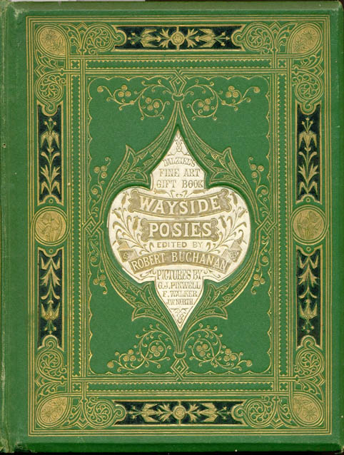
Left to right: (a) Kay’s design for Harrison’s The Battlefield Treasure; (b) Turbayne’s cover for The King’s Own; and (c), A. H. Warren’s Wayside Posies.
Viewed in these contexts the Silver Studio covers seem purely eclectic, the products, as noted earlier, of a generic impulse. Nevertheless, a number of them embody a more independent approach and present what is essentially a company trademark. Probably by Harry Napper, these bindings combine naturalistic motifs with abstract design, a process in which figures and other devices are arranged (as in The Battlefield Treasure), within a series of rigorously-organized and muscular arabesques. The dominant feature, however, is repetition, figuring the books’ front surfaces as if they were the recurring patterns of wallpaper or textiles. This approach goes beyond symmetry – in which organic forms mirror each other – and involves multiples of threes, fours and sometimes five repetitions of single motifs.
In the binding for Georgina Squire's A Sprig of Honeysuckle (late 1890s), notably, Napper places his figures in triplicate, framing them with lush and abstracted trees; and he uses a parallel arrangement for In the Summer Holidays, a book by Jennett Humphreys. Napper varies this approach in his design for Ascott R. Hope’s The Lost Dog (late 90s), placing three dogs at the bottom margin and four singing birds in the style of Morris placed along the top; and he closes his experimentation with an image for Penelope Leslie’s Mrs Holland’s Peaches, uniting, this time, three reading girls within a frame of simplified bushes.
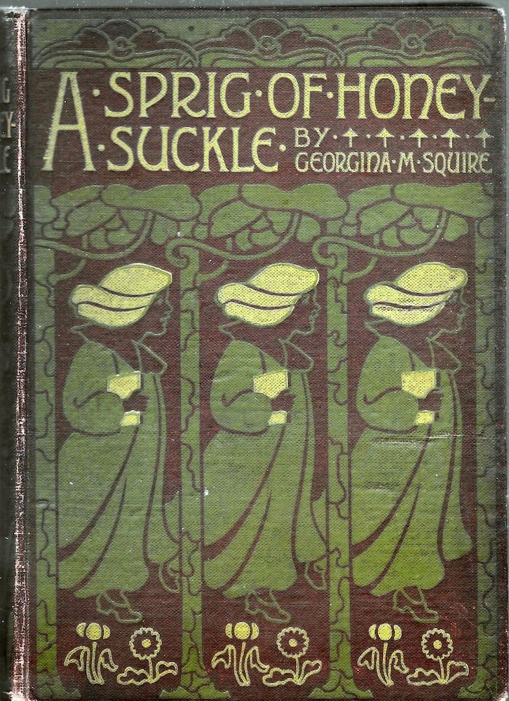

Left: Napper’s design for Squires's A Sprig of Honeysuckle, and Right: the same designer’s cover for Penelope Leslie’s Mrs Holland’s Peaches.
The effect, in each case, is both conservative and daring. The figurative elements root the books in their domestic context and assert their identity as unchallenging material for children, while the abstractions point to the designer’s promotion of new and memorable forms of embellishment.
Silver Studio covers are thus positioned as artefacts making a small but interesting contribution to the development of late Victorian book design. Under-recorded and rarely studied in any detail, they represent another interesting strand in the evolution of the discourse, especially in their contribution to Blackie’s catalogue and in their movement from the aesthetics of Arts and Crafts to the more ‘modern’ styles of Art Nouveau. Often reprinted, with covers being re-used for several publications, the Studio’s bindings bridge the cultures of the Victorian and Edwardian periods, and, as telling artefacts of their time, closely reflect unstable developments in design as the old century morphed into the new.
Bibliography
A Note on Primary Sources
All of the Silver Studio covers were commissioned by Blackie and Son, starting in 1892 and continuing into the early years of the twentieth century. None of the work is signed and none of the books are dated; where a date is given, it is taken from details inscribed on the original designs in The Museum of Domestic Design and Architecture. As noted above, covers were re-used for different titles and it is probably impossible to know when each appeared for the first time. The following is a preliminary list of the Silver Studio’s catalogue.
Harrison, F. Bayford. The Battlefield Treasure [probably by John Illingworth Kay].
Harrison, F. Bayford. The Battlefield Treasure [probably by John Illingworth Kay].
Hope, Ascott R. The Lost Dog [probably by Harry Napper].
Humphreys, Jennett. In the Summer Holidays [probably by Harry Napper].
Leslie, Emma. Our Little Nan, 1896 [probably by John Illingworth Kay].
Lysaght, Elizabeth. Brother and Sister, 1897 [probably by John Illingworth Kay].
McGregor, Robertson, J. The Household Physician [probably by Harry Napper].
Peach, Leslie. Mrs. Holland’s Peaches [probably by Harry Napper].
Squire, Georgina.A Sprig of Honeysuckle [probably by Harry Napper].
Tiddeman, L. E. Little Ladybird, 1896.
Secondary Sources
Haslam, Malcolm. Arts and Crafts Book Covers. Shepton Beauchamp: Richard Dennis, 2012.
The Silver Studio Archive, The Museum of Domestic Design and Architecture, Middlesex University. Accessed 15 November 2021.
Turner, Mark & Hoskins, Lesley. Silver Studio of Design. Exeter: Webb & Bower, 1988.
Created 15 November 2021