
dward Burne-Jones is best known as one of the leading painters of the final quarter of the nineteenth century. Closely associated with D. G. Rossetti and the Pre-Raphaelites, his medievalist fantasies exemplify the movement’s second stage, although he also developed a distinctive brand of neo-classicism. Positioned between several tendencies – Pre-Raphaelitism, Aestheticism, Gothicism and the aesthetics of Arts and Crafts – Burne-Jones created a refined vision of female beauty combined with interior transcripts of love, desire, yearning and a sort of existential fatigue. Usually conceived as large and imposing canvases, his paintings of mythological scenes and pale dream-worlds are among the most imposing images of their time.

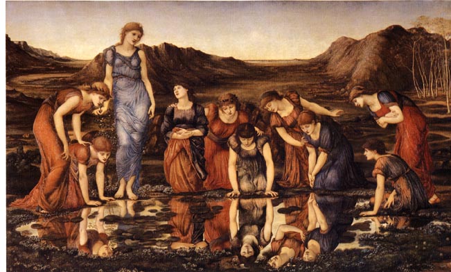
Two typical paintings by Burne-Jones: Left: The Love Song (1869–73). Right: The Mirror of Venus (1898).
Scholarship exploring this work is vast, and continues to expand. Much less familiar are his illustrations, which have only been considered in general accounts of the period. Nevertheless, Burne-Jones was a flawed but interesting illustrator whose work divides naturally into two parts: he made a small contribution to mid-Victorian book design (1857–68) in the form of Pre-Raphaelite illustrations, and later embellished a series of books for William Morris’s Kelmscott Press in the idiom of Arts and Crafts.
Commentators such as Forrest Reid (1928) and Paul Goldman (1996) have tended to separate these two periods, but it is more revealing to view his work as a whole. That oeuvre is generally inconsistent, veering between the sophisticated and the gauche, and its significance lies principally in its interest as the work of an accomplished painter who experimented with book-art, rather than a graphic professional in his own right. Burne-Jones’s stylistic development as an illustrator is especially challenging, an issue that was greatly influenced by the contexts in which he worked.
Working as an Illustrator: Contexts and Connections
Burne-Jones’s origins as an artist in oil and watercolour were complicated by his struggle to gain commissions and produce work of a saleable quality. In the late 1850s and early 1860s he was ‘quite unknown to the general public’ (Dalziel 164): forced to compete in a highly competitive market, his success was far from guaranteed. With this in mind, he tried to find parallel work in the form of book illustration, which would at least provide small sums of £10–£15 per ‘drawing on wood’ and a similar amount for images engraved on steel. There were plentiful opportunities for this sort of commission as the interest in visual material expanded in the form of illustrated books and magazines, and Burne-Jones published his first illustrations, for Archibald Maclaren’s The Fairy Family in 1857. However, this work was tentative, and seemed amateurish to some; it did not lead automatically to other opportunities, and the artist was forced to rely on the support of his colleagues.
His work was advocated by Richard Doyle and William Holman Hunt, both of whom wrote persuasive letters to potential employers who were making use of the new milieu of wood engraving. In August 1860 Doyle corresponded with John Leech, then acting as an assistant art-editor at Once a Week, with a plea on Burne-Jones’s behalf. Doyle insists the ‘young artist’ ‘would be well-suited to the illustration of ballads of early times such as sometimes appear’ in the magazine’s pages, and he bolsters his case by describing his friend as a draftsman of ‘much refinement and taste’, with a talent for ‘gothic beauty’ (Hodgkins no. 132). Unfortunately, Leech was unimpressed; no work was offered, and Burne-Jones was still without an illustrative commission more than a year later. In November 1861 another attempt was made to find employment, this time in the form of a letter to the Dalziel brothers, the foremost wood-engravers, who were then acting as the art-editors of Good Words. Holman Hunt outlines his case in detail, striking a well-judged balance between acknowledgment of Burne-Jones’s inexperience and his belief in the artist’s potential:
I write to speak of a friend of mine who I feel very strongly might be of great value to you in the illustrating of Good Words. He is perhaps the most remarkable of all the younger men of the profession for talent, and will, undeniably, in a few years fill the high position in general public favour which at present he holds in the professional world. He has yet, I think, made but few if any drawings on wood, but he has had much practice in working with the point both with pencil and pen and ink on paper, and so would have no difficulty with the material. I have not seen him lately, but remember he has sometimes said that he should like to try his hand at drawing on wood … [Dalziel 162]
This is a sophisticated piece of advocacy. Holman Hunt’s careful qualification of his statements negates the charge of hyperbole, while at the same time downplaying the very considerable difficulties that were traditionally experienced by newcomers to the art of drawing on the woodblock. Hunt is remarkably prescient in suggesting that Burne-Jones would gain ‘public favour’ and his confidence was enough to convince the Dalziels that the new artist would be worth a try. The result was two bold designs: King Sigurd the Crusaderwas published in Good Words in 1862 and was followed up in 1863 by The Summer Snow.
Burne-Jones published no further illustrations in journals of the period, but he did contribute to some books. In 1861 the brothers employed the artist as one of the painters engaged on their projected bible; in the event only one image, The Parable of the Burning Pot, was completed and did not appear until the end of 1880s, when it was published in the pages of the Dalziels’ Bible Gallery. The Deliverer featured in Mrs Gatty’s Parables (1865), and was followed by a title-page illustration for Morris’s The Earthly Paradise (1868). This was the last of his first period, and he did not resume illustration until the 90s.
Burne-Jones produced his most characteristic designs in this decade. Employed by Morris, one of his closest friends, he embellished twelve luxurious, hand-printed books for the Kelmscott Press. These finely-printed illustrations appeared in a series of medieval romances and in Morris’s Victorian versions of the form, notably The Well at the World’s End (1896) and The Dream of John Ball (1892). Burne-Jones’s finest work is probably found in the celebrated ‘Kelmscott Chaucer’, for which he executed 87 drawings on wood. Fitted into an elaborate printed page with devices and a letterpress designed by Morris, the illustrations create a rich and complicated effect which invokes the example of incunabula.
These later books seem to sit uneasily with his earlier productions, and Burne-Jones’s career as an illustrator is always uneven. His initial work in the late fifties and sixties is a patchwork of piecemeal contributions, while his final commissions are sustained and developed as part of the Kelmscott house-style. These activities ran in parallel with his principal work as a painter, and the relationship between the two arts closely reflects a broader trend, with artists of the canvas turning to illustration to supplement their main incomes. Indeed, his engagement with the print trade is emblematic of the travails of many Victorian designers who for economic reasons had to develop expertise as a master of colour and as a draftsman working in the hard discipline of ‘drawing on wood’. Burne-Jones’s practice as an illustrator particularly reflects a key element in this narrative: the reliance on networking, usually in the form of membership of coteries. Like many a Victorian painter/illustrator, he could not have succeeded were it not for his associations – firstly with the Pre-Raphaelites and later with Morris – who acted as advocates and employers. The small world of Victorian illustration may have been market-driven and competitive, but having influential friends was often a deciding factor.
Style and Idiom: The Fairy Family
In the first part of his career, Burne-Jones’s illustrative style is difficult to conceptualize and underwent a series of dramatic changes. Striving to find his individual voice and far from technically proficient, he worked in several idioms and came under the influence of his associates’ work and their particular styles. By turns eclectic and tentative, his mid-Victorian illustrations are difficult to judge.
His earliest work, for Maclaren’s Fairy Family (1857), is especially problematic. This set of four illustrations – frontispiece, title-page, a roundel and an end-piece – is barely recognizable as coming from Burne-Jones’s hand. In the words of Gleeson White, ‘it is safe to say that no human being, who did not know by whom they were produced, would recognize them’ (176–77). They are certainly quite unlike his painted imagery and at first glance seem ungainly and discordant; however, it is possible to explain them in terms of their response to the text, and in terms of the artist’s response to a number of influences.
It is important to point out that the four designs are all that was published of a projected montage of twelve. Maclaren wanted his book to be illustrated in full: most of the unpublished work survives and shows that the strained imagery of the title and frontispiece is part of an extended project. Viewed in the context of the proposed whole the opening designs would have made more sense, acting as the introductory sections of a series. Indeed, it can also be argued that although the figure drawing is ‘untutored’ and the treatment of space far from naturalistic, the strange dislocations are at least in part an accurate response to Maclaren’s dreamy text.
The pictorial frontispiece, especially, is a visual equivalent to the scenes described in the signature poem, ‘The Elf-Folk and Little Mabel’ (Maclaren 5), which imagines an orphaned child finding solace in her imagination. This poem is privileged because the main character is the namesake of the author’s daughter, to whom he dedicates the book, and Burne-Jones is clearly at pains to project what is essentially the writer’s address to his child. Supposedly unsophisticated, the illustration is both a literal and an interpretive approach to the poem. It efficiently depicts the information contained in the opening and closing stanzas. First of all, it materializes the setting of ‘listening trees’:
Whisper, whisper through the grove
‘T is the evening breeze
Telling all its tale of love
To all the aspen trees,
And its earnest wooing brings
Tremblings strange and flutterings
To the listening tree. [MacLaren 5]
The image represents the grove made up of ‘aspen trees’, which are depicted accurately, and literally shows the ‘whisper, whisper’ in the form of ethereal letters blowing in the ‘evening breeze’. It also mirrors the final two stanzas, as the ‘Elfin band’ mill around in the light of the ‘bright’ moon (10) with Mabel in their care, ‘wrapped in one of their ‘mantles green’, and the idealized portrait of the child in the centre ground could be a representation of the author’s child.
These details moor the illustration in the text, but the artist is principally concerned with the representation of the poem’s theme of innocent ‘happiness’, projecting an ‘Elfin land’ where all is ‘good and fair (10) and acts as the embodiment of Mabel’s infantile purity (9–10). He embodies this idea in the doll-like treatment of the figures. Deploying a well-known convention which stresses children’s innocence by giving them the physical proportions of babies, and working on the author’s emphasis on ‘Baby Mabel’ (6), he endows the prime figures with diminutive trunks and overlarge heads. Their features, especially their ‘dreamy eyes’ are similarly enlarged to suggest guilelessness, while their ‘little feet’ (8) are practically invisible. Burne-Jones acts, in other words, to visualize a sentimental equivalent of a sentimental poem: the verse is dense with imagery of cloying mawkishness, and the same is true of the illustration.


Burne-Jones’s earliest drawings for the page for Maclaren’s book of fairy tales. (a) pictorial frontispiece, and (b) pictorial title-page (1857). The title-page was likely influenced by Richard Doyle’s drawings of fairies surrounding a sleeping or day-dreaming figure, as in (c) one of his designs for Thackeray.
At the same time, he manipulates visual devices to suggest the weirdness of the fairy-folk who metaphorically abduct an innocent and take her to a dream-world of ‘Tremblings strange’ (7) and ‘dewy meadows’ (9). This is a zone outside reality and Burne-Jones conveys its dislocating qualities by distorting the perspective and scale. The composition is divided into five spatial layers, and within these passages the figures are of varying sizes. The characters closest to the picture plane (to the right) are smaller than the central figures; those in the middle and background are randomly tiny and gigantic. Easy to dismiss as incompetence, Burne-Jones’s manipulation of space might be re-read as a clever evocation of the poem’s fantastical weirdness.
Of course, he was not alone in depicting the elfin-world in these terms. Richard Dadd uses dislocations of scale in his illustrations for ‘Robin Goodfellow’ (1842), which Burne-Jones probably viewed, and he was certainly aware of Doyle’s manipulation of the same device. As we have seen, Doyle was a close friend who advocated his work, and Burne-Jones was unquestionably influenced by the older artist’s representation of fairy-world. John Christian has suggested that he came under the spell of Doyle’s illustrations for W. M. Thackeray’s The Newcomes (‘Burne-Jones’s Drawings’ 98), which Burne-Jones reviewed in The Oxford and Cambridge Magazine (1855), but it is equally likely that Doyle’s designs in Punch were an important influence in Burne-Jones’s treatment of space.
Doyle therein provides a visual template for many aspects of Burne-Jones’s designs for The Fairy Family. The title-page, with the sleeping child surrounded by the projections of a dream, is very much in the idiom of Doyle’s work, and can be compared to an illustration in his Journal. The title closely resembles the Germanic rusticity of his wording in The King of the Golden River (1851) and the formulation of letters, made up of diminutive figures, is close to his comic treatment in the front cover of Punch (1849).


Two examples of work that probably influenced Burne-Jones. Left: An illustration by Richard Doyle. Right: One by Richard Dadd.
Burne-Jones synthesizes all of these elements, creatively borrowing from a pre-existing idiom to provide appropriate illustrations. Put in these terms, we can see that his work for The Fairy Family is far from naïve or unsophisticated: on the contrary, its weird dislocations and imagery were applied in order to match and interpret Maclaren’s text. Burne-Jones also manipulates the Victorian language of fairy art in order to cater for the audience’s expectations, framing its written contents within a pre-existing tradition and drawing upon conventions of fanciful illustration that had been established by Dadd, Doyle and George Cruikshank. Burne-Jones later disavowed his illustrations for Maclaren – which were never identified as his work – but there is no doubt that they are far more valuable than the artist and his critics have allowed.
A Pre-Raphaelite at Work
Burne-Jones’s dislike for his first set of illustrations was largely the result of his having seen the Pre-Raphaelites’ designs for the ‘Moxon Tennyson’, which were in preparation (1856–7) while he was working on The Fairy Family. These bold images, by turns neo-medieval and modern, had a significant impact on the impressionable Burne-Jones and according to Christian persuaded him that his illustrations were old-fashioned (Burne-Jones 80); only ever wanting to be part of the avant-garde, the artist terminated the series and denied that he was the author of those appearing in print.
In the late 50s Rossetti became Burne-Jones’s mentor, replacing Doyle, and Burne-Jones’s next illustrations, appearing in Good Words, are written in a Rossettian visual language. In King Sigurd, the Crusader (1862), the artist responds to a neo-medieval poem by William Forsyth, selecting a weighted episode as the king meets with his wife and maids ‘waiting on the shore’ (Good Words, 1862, 248). In the poem this is an imaginary scene, a moment of wistful desire, and Burne-Jones converts it into a typically Rossettian moment of yearning and expectation by showing the king about to embrace his beloved. Closely linked to Rossetti’s many images of idealized love, the illustration counterpoints the text by converting happiness as ‘dear as life’ (248) into a moment of sad introspection as the king remembers what he was lost. Indeed, the effect is one of melancholic weariness rather than an exultant celebration, a note which echoes the tenor of Rossetti’s illustrations for the Moxon Tennyson.

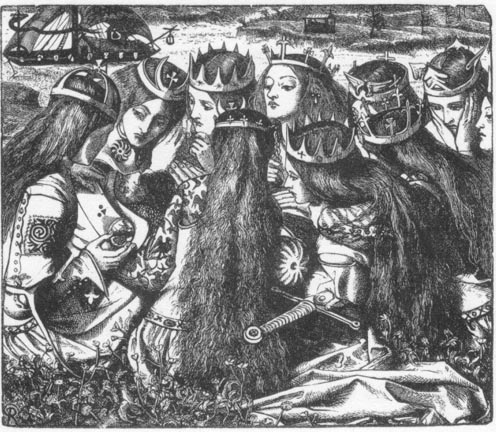
Two works by Burne-Jones: (a) King Sigurd, and (b) Summer Snow (1862–3). (c) is Rossetti’s Weeping Queens. Burne-Jones’s work grows naturally out of Rossetti’s.
Operating in the same emotional register as his Pre-Raphaelite mentor, Burne-Jones also incorporates several of the older artist’s characteristic devices, notably the emphasis on idealized and monolithic beauty – with all three women having exactly the same face – elongated figures, surface patterns which animate neo-medieval details, arcane paraphernalia in the form of the costumes and crowns, and flattened and diminishing space which is populated, nevertheless, by tiny items such as the ships in the far background. Burne-Jones appropriates these elements for his own purposes, although it is impossible to lose sight of his illustration’s origins. We have only to compare King Sigurd with Rossetti’s Weeping Queens (1857) to see how much he borrows from his mentor’s designs in black and white.
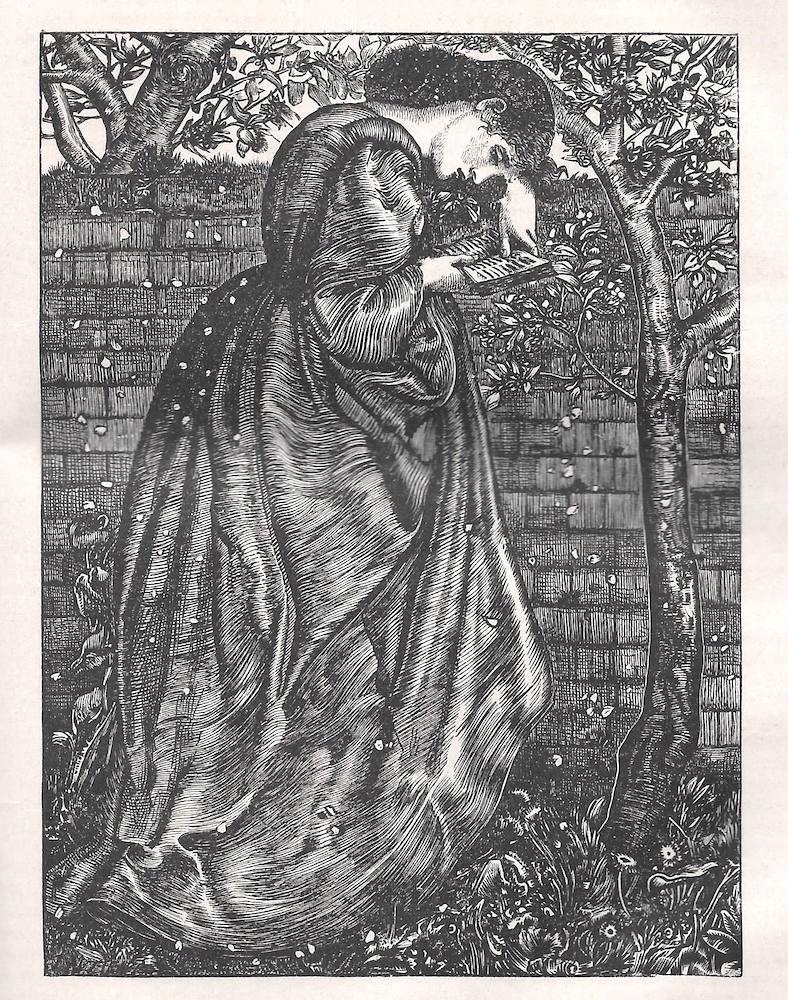
King Sigurd further asserts Rossetti’s insistence on interpreting a text as he saw fit, and in Summer Snow (1863) Burne-Jones takes the process of artistic interpretation much further. Disregarding the fact that the anonymous poem is a dialogue between personified leaves and buds, he substitutes an idealized women in a bower, surrounded by flowers and reading an illuminated book. Like Rossetti, he takes the poem only as a starting point, suggesting an analogy between the endless life and death of nature and the ephemerality of beauty in the form of a young woman who lives both in the present (framed by the ever-changing flux of nature) and the past (perusing a book, the sign of history and recollection). This distinctive reading is primarily realized, as before, in a Rossettian language, exemplified by the figure of the beloved; but Burne-Jones also uses elements from the art of Holman Hunt, notably in his sharply-particularized treatment of the floral display of blossoms and plants and the jarringly detailed wall. Mediating between neo-medieval fantasy and the prosaic materiality of a piece of brick-work, the illustration exbodies the contradictions and irresolvable tensions of Pre-Raphaelite style.
Burne-Jones’s final piece of Pre-Raphaelite illustration is his Deliverer, in Gatty’s Parables from Nature (1865). The text is the usual concoction of turgid pieties, but the illustration raises the tone by presenting an exultant Nativity. As in the most effective Pre-Raphaelite designs, the emphasis is on the psychological interconnectedness of the main characters: the Holy Family is touchingly shown, while above them the angels ring bells. Once again, the language is Rossettian: Burne-Jones probably borrowed the concept of the bell-ringing angels from Rossetti’s watercolour, The Wedding of St George and Princess Sabra (1857), although the primary influence may have been Botticelli’s Mystic Nativity (1501, National Gallery, London), which depicts a celebratory ring of angels dancing above the barn’s roof. First exhibited at the Manchester Art Treasures Exhibition in 1857 and widely illustrated, the painting was one of Rossetti’s favourites, and he may have shared his interest with Burne-Jones.

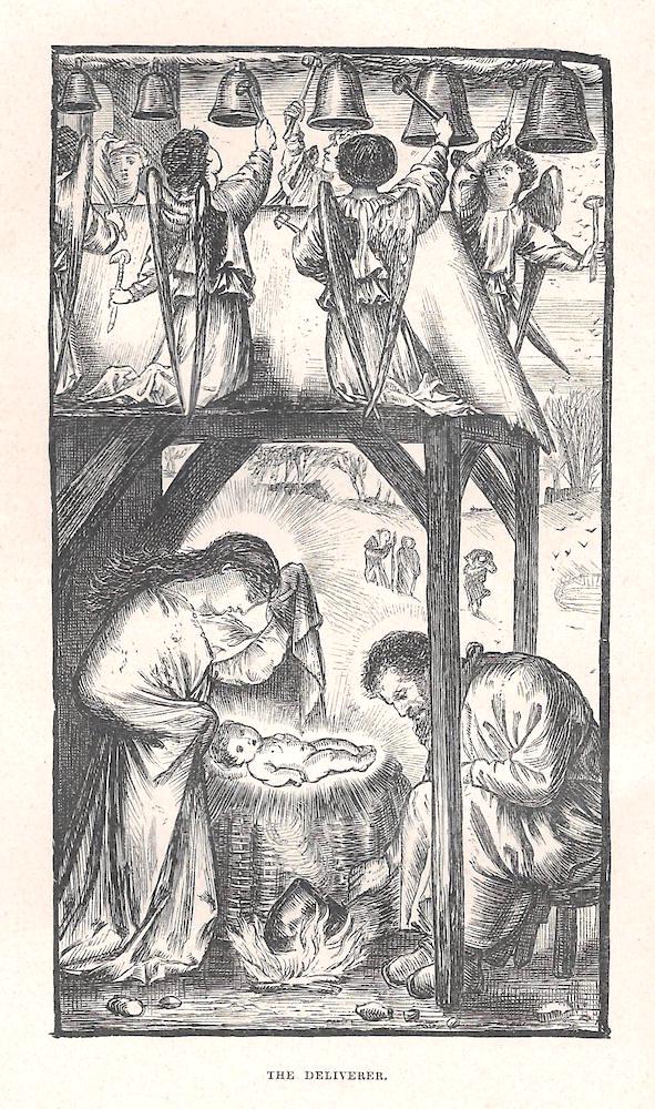
Two works by Burne-Jones. Right: The Deliverer (1862–5). Left: The Boiling Pot.
Burne-Jones’s other important piece of work in the 1860s was his single design for the book ultimately published as the Dalziels’ Bible Gallery, The Parable of the Burning Pot. Here, however, his Pre-Raphaelite style has begun to change into the dramatic, realistic style known as ‘The Sixties’. His depiction of Ezekiel 24 stresses the heat of the pot, with flame and steam emanating in dramatic white striations which stand in stark opposition to the languorous figures in the background.
An Arts and Crafts Designer
The title-page motif for Morris’s The Earthly Paradise (1868) represents another shift in idiom. Moving away from Pre-Raphaelite fantasy and the poetic realism of the Sixties, Burne-Jones draws his image, of three lute-playing figures, in the style of Arts and Crafts medievalism. Offered as an imitation of the wood-cut imagery of early illustrated incunabula, it prefigures the ‘much later and grander Kelmscott’ (Goldman 12) editions of the 90s. The most famous of these books is the Kelmscott edition of The Works of Geoffrey Chaucer (1896), for which the artist designed 87 illustrations.
These images contribute to the book’s impressive visual effects: framed by Morris’s border and calligraphic text, they help to define the volume’s identity as a striking piece of neo-medieval revivalism. Burne-Jones’s cuts certainly recall the stark, sparse effects of fifteenth century illustrations; reproduced from engravings on wood and cut by Hooper, they have the linearity and graphic boldness of ancient woodcuts. Though projected as exemplars of archaic honesty and truth to materials, they are really prime examples of Victorian illusionism, which misleads the viewer by suggesting the reproductive technique is more primitive than it is.
Indeed, every aspect of Burne-Jones’s contribution to the Chaucer is fraught with contradictions and inconsistencies, reproducing a pattern that resonates throughout his work for the page. First of all, it is noticeable that his response to the verse is extremely partial: only interested in scenes of courtly love, dreaming reverie, suffering and heroic grandeur, Burne-Jones does not represent any of Chaucer’s ‘bawdy’ episodes (MacCarthy 432) and gives no sense of the author’s oft-quoted vulgarity. The ‘streaky bacon’ heterogeneity of Chaucer’s tales – veering between the elevated and the uncouth – is a defining feature of his work as an English writer, but it would be impossible to achieve that understanding by viewing the illustrations alone, which are stifled by Victorian proprieties. As Gordon Ray observes, Burne-Jones ‘hardly does justice to Chaucer’s varied and lively depiction of the human comedy’ (158).
In this respect Burne-Jones’s interpretation fails the text, which he uses, like Rossetti, only as an imaginative starting point. But unlike Rossetti Burne-Jones’s re-figuring diminishes the writing, and does not expand it in the way that Dante’s designs generate new fields of speculation for the poems of Tennyson and William Allingham. Instead, Burne-Jones recasts Chaucer entirely in his own terms as an opportunity to represent a dream-world in strict accordance with the imagery of his paintings. This approach never slips, and is monolithic in its application.
So what remains? Burne-Jones’s Chaucer designs are still interesting as examples of dream-like imagery, a vision of medieval otherness. The figures are elongated with small heads in the manner of Gothic statuary and we glimpse their encounters as if through a series of oblong apertures which open into cramped claustrophobic interiors or enclosed bowers; dressed in a dream-version of medieval costume, the characters are engaged in weighted gazing, with each action suspended at the point of happening; the faces are barely differentiated or exactly the same; and the backgrounds are flattened to create a linear, decorative effect.
The overall impression is one of static introspection, inviting the reader/viewer to look at each composition not as a piece of literary representation, but as a series of autonomous designs which could just as easily be paintings as wood-engravings. The Frankleynes Tale (165) is a prime example of this approach. It represents the main ingredients in the poem: the lovers Averagus and Dorigen are shown as courtly lovers, conjured in a vision, while Aurelius, the new suitor, is depicted in the foreground, with the magician casting his spell. The illustration gives a limited sense of the text for those who already know it, but the eye is immediately drawn to the stylized treatment of the magical fumes emanating from the pot.
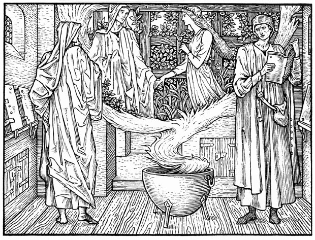

Two examples of Burne-Jones’s work for Morris. Left: The Frankleynes Tale. Right: Troilus and Criseyde .
The design’s abstraction acts, in other words, to focus attention on its style and away from the subject matter it is intended to illuminate. This strategy reinforces the notion of the Kelmscott Chaucer as an artefact to be inspected only as a material object, a precious thing rather than a book to be read; as Jeffrey Skoblow observes in a highly suggestive essay, all of the imprint’s volumes are ‘fetish objects, not commodities’ (Maxwell 246) intended to communicate written information. How they look is far more important than how they read, and Skoblow further suggests that the various devices – abstracted illustration, dense borders, archaic spelling, the spatial arrangement of boxes and compartments – greatly complicates and may even confound the act of reading.
We can see, in short, that Burne-Jones’s career as an illustrator is far from straightforward. Emerging from a tangle of influences as he sort to define a style and approach, he finally settles on a type of illustration that is fundamentally pictorial rather than literary, inspired by the effects of plasticity and design as ends in themselves rather than setting out to find visual equivalents to the written word. He is not, we might say, a natural illustrator, and some of his best interpretive designs are not those for the Kelmscott Press but his earlier experiments. His woodcut style in the manner of Arts and Crafts was nevertheless extremely influential; taken up by Arthur Gaskin, Florence Rudland, Fred Mason and others of the Birmingham School, it became an important element in the development of book illustration of the 90s.
Bibliography
Primary Sources: Illustrated or co-Illustrated by Burne-Jones
Chaucer, Geoffrey.Works. Hammersmith: Kelmscott Press, 1896.
Dalziels’ Bible Gallery. London: Routledge, 1881 [1880].
Gatty, Mrs Alfred. Parables from Nature. London: Bell & Daldy, 1865.
Good Words (1862–3).
[Maclaren, Archibald]. The Fairy Family. London: Longman, Brown, Green, Longman and Roberts, 1857.
Morris, William. The Dream of John Ball. Hammersmith: Kelmscott Press, 1892.
_____. The Earthly Paradise . 3 Vols. London: F.S. Ellis, 1868–70.
_____. The Well at the World’s End. Hammersmith: Kelmscott Press, 1896.
Secondary Sources
Christian, John. Burne-Jones. London: The Hayward Gallery, 1975.
_____. ‘Burne-Jones’s Drawings for The Fairy Family.’ The Burlington Magazine 115 (February 1973): 93–100.
Dalziel brothers. A Record of Work, 1840–1890. 1901; new ed. London: Batsford, 1978.
Goldman, Paul. Victorian Illustration. Aldershot: Scolar, 1996; Lund Humphries, 2004.
Hodgins, Ian, & Co.Miscellany 2006. Stroud: Hodgkins, 2006).
MacCarthy, Fiona. The Last Pre-Raphaelite. London: Faber & Faber, 2012.
Ray, Gordon. The Illustrator and the Book in England from 1790 to 1914. New York: Pierpont Morgan Library, 1976.
Reid, Forrest. Illustrators of the Sixties. London: Faber & Gwyer, 1928; rpt. New York: Dover, 1975.
Skoblow, Jeffrey. ‘Beyond Reading: Kelmscott and the Modern.’ The Victorian Illustrated Book. Ed. Richard Maxwell. Charlottesville: The University Press of Virginia, 2002. 239–258.
Created 14 November 2020