Introduction: artist and binding designer

ugh Thomson (1860–1920), an Ulsterman, is best known as a late Victorian illustrator who specialized in Regency-style designs for texts by Jane Austen, her contemporaries, and others of the artist’s own time. Thomson was a prolific illustrator, and his version of ‘Old England’ was immensely popular from the late eighteen eighties to the period before The Great War. His greatest successes were in the nineties, when he illustrated the ‘Cranford’ and ‘Peacock’ series for the publisher Macmillan, and similar lines, which imitated the Macmillan books, for Kegan Paul and George Allen. Fey, anachronistic, and self-consciously escapist in tone, Thomson’s illustrations are nevertheless intelligent visual responses to their texts, a quality analysed at length in a recent study by Thomas Reccio (pp.75–115).
Relatively undocumented is Thomson’s work as a book-cover artist. Though never the subject of detailed investigation, Thomson was a distinguished creator of cloth bindings, designing many of the covers for the works in which his illustrations appeared. In so doing he contributed to the development of the nineties tradition in which the illustrator was also the designer of his books’ exteriors. Laurence Housman, George Heywood Sumner, Charles Ricketts and Aubrey Beardsley were all engaged in this dual-project, and Thomson extends this arrangement from the avant-garde into the popular (Carter, p.48).


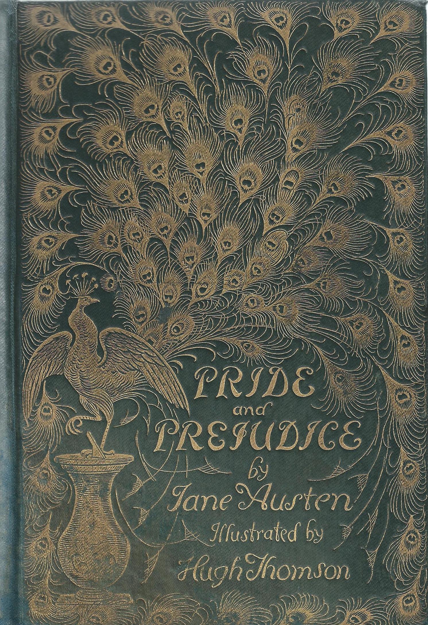
Threee covers by Thomson: Jane Austen's Pride and Prejudice, George Eliot’s Scenes of Clerical Life, and Elizabeth Gaskell's Cranford. [Click on thumbnails for larger images and additional information]
Attributing his designs is nevertheless a problematic task. One of his bindings, the famous cover for Elizabeth Gaskell’s Cranford is signed ‘HT’, and Thomson’s authorship can be established for the front cover of Richard Brinsley Sheridan's School for Scandal. This exists in the form of several preparatory sketches, working studies that show how carefully the artist considered his effects (The Coleraine Museum, Northern Ireland). None of his other bindings is signed or represented (as far as I am aware) in preliminary drafts, so the task of establishing his body of work is mainly a matter of stylistic attribution. Several themes underpin Thomson’s approach to the task of cover-design, and analysis of purpose and style enables us to characterise this distinguished work.
The style of Thomson’s bindings

hompson’s cover designs, like those of all Victorian gift-books, were intended to attract the viewer and celebrate the festive season. Percy Muir notes how ‘a Thomson book became a feature of the Christmas market’ (p.198). All of his publications of the nineties were figured, like the ‘Dalziel Fine Art Publications’ of the sixties, as a gift to beguile the recipient when it was unwrapped from plain paper in front of the Christmas tree, and some of the books had wrappers to intensify the moment of revelation. Visual pleasure was the focus, and this effect was realized in the form of elaborate gilt decoration on a field of dark green cloth: ostentatious and flamboyant, Thomson’s designs achieve high impact with only a simple contrast between the yellow gilt and the dark background. Their visual splendour is amplified by the fact that the books are octavos rather than the quarto size favoured by earlier publications; small and compact, the size of a standard novel, they present themselves as precious confections for the pocket, to be read at home or taken out and read on a journey. Published in quick succession in the nineties, and endlessly reprinted, it is probable that booksellers presented the volumes in elaborate window displays – cheerfulness embodied on dull winter days.
Such showiness encouraged the act of looking and Thomson manipulates the process of looking. Figured as dynamic compositions in which the eye is directed through a series of complex patterns, the artist deploys sinuous arabesques to create a series of luxurious, Art Nouveau patterns. This approach is exemplified by the radiating peacocks’ tails on the front cover of Austen’s Pride and Prejudice, and again in the form of the foliate interlace embellishing Mary Mitford’s Our Village. Others involve pattern-making in rhythms of repeated motifs. In the binding for George Eliot’s Scenes of Clerical Life, for instance, the image is combination of sheep and flowers contained within a floral margin, while the front cover for Charles Reade’s Peg Woffington is a pattern of butterflies framed with neo-classical figures and swags.
All of Thomson’s designs are excessively ornamented when compared with the spare economy of covers by Beardsley and Ricketts. There seems to be only a peripheral relationship between Thomson’s binding for Pride and Prejudice and Beardsley’s design for Dowson’s Poems (see below). Yet Thomson manages to combine visual exuberance with delicacy; though flamboyant, his covers have a refined intensity that represents another way of manipulating the conventions of Art Nouveau. If Beardsley and Ricketts use the style to convey a notion of urbanity and aesthetic sophistication, then Thomson’s bindings are unashamedly populist and celebratory, framing the books as a celebration of Christmas values for the middle-class home, and materializing the context in which they were produced and consumed.
Thomson’s bindings as a means to interpret the text

homson’s bindings are decorative additions, but they also work as proleptic, emblematic symbols of the text contained within the boards. In this sense he was bound by convention of his time; as Esther Wood remarks in her extended essay on modern bindings in The Studio Winter Number of 1900, ‘the decoration of books must always bear some distinct relation to the literature within’ (p.9).
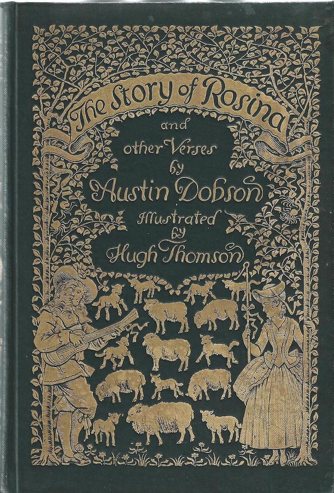
In Thomson’s cover this is sometimes a matter of showing a key scene. The simplest arrangement is the front design to Coridon’s Song, which represents the angler sitting on the river bank as he appears in the opening pages (p.21) and draws the reader/viewer into the book in the manner of a modern illustrated dust-wrapper. The same can be said of The Story of Rosina, in which the elaborate upper board prefigures the signature tale. In both cases the covers are linked to illustrations, allowing the reader to view the binding and then relate it to the image in black and white. Visual signs are thus deployed to point to key moments in the book, moving the reader/viewer’s gaze from the ‘outside’ to the important moment highlighted by an illustration in the following pages.


Two covers by Thomson and a third by Beardsley: Coridon’s Song, Austin Dobson’s The Story of Rosina, and Aubrey Beardsley's The Poems of Ernest Dowson. [Click on thumbnails for larger images and additional information]
Thomson’s bindings are further concerned with the visualization of tone. Representing key scenes and characters is a fundamental device, but Thomson tries to convey the texts’ ambience as well. The gilt extravagance establishes a cheerful note, yet at a deeper level the bindings crystallize the tenor of novels’ imaginative worlds. The image on the front board of Pride and Prejudice exemplifies this approach. Austen’s tale is primarily concerned with wealth and display, but Thomson suggests that its main focus is courtship and the working of vanity, symbolising the various love-stories in the emblem of a peacock with spreading tail-feathers. Thomson’s design is extravagant, excessive, self-indulgent, and, in a calculated sense of the term, pointless beyond its ornamentalism: the very qualities that characterize the lives of Austen’s personae and are summed up in his luxurious image. In Cranford, on the other hand, the emphasis is on an optimistic domesticity, here embodied in a spreading plant and in the foreground a tea-pot and cups – signs of the narrowness of a world where tea and its consumption is an important issue.
The bindings more generally present the fictions’ rusticity, celebrations of a notion of Englishness that is inscribed in all of these canonical texts. Rural imagery prevails, and there is no sense of the industrial world of the period when the books were re-published. Thomson’s neo-Regency imagery might generally be viewed as another version of Victorian escapism – a mode of displacement and evasion that also informs Pre-Raphaelite medievalism, neo-classicism and the art of fairies – and his bindings are part of this discourse of denial. Indeed, Thomson’s illustration and cover designs assert a reassuring notion of Englishness, England the idyll of quaint towns and picturesque landscapes. As Thomas Reccio explains, ‘In presenting “delightful” images of English country life … the Cranford editions made this statement: there is an English nation and an English literature that confirms it. These are the pictures to prove it (p.100).
Thomson’s binding designs can be read, in short, as complex mediations between the representation of festivity, the books’ narratives, characters and atmosphere, and the political stance of the middle-class readers who purchased the books. Apparently no more than ornamental, they fuse several domains of experience, merging aesthetics and symbolic meanings.
Works Cited
The following three listings contain books with illustrations and bindings by Hugh Thomson.
The Cranford Series
Allen, James Lane. A Kentucky Cardinal and Aftermath. London: Macmillan, 1901.
Burney, Fanny. Evelina. London: Macmillan, 1900.
Coridon’s Song; and Other Verses. With an introduction by Austin Dobson. London: Macmillan, 1892.
Days with Sir Roger de Coverley. London: Macmillan, 1892.
Eliot, George. Scenes of Clerical Life. London: Macmillan, 1906.
Gaskell, Elizabeth. Cranford. London: Macmillan, 1891.
Goldsmith, Oliver. The Vicar of Wakefield. London: Macmillan, 1894.
Mitford, Mary Russell. Our Village. London: Macmillan, 1893.
Thackeray, W.M. The History of Henry Esmond. London: Macmillan, 1905.
The Peacock Series
Austen, Jane. Emma. London: Macmillan, 1896.
Austen, Jane. Mansfield Park. London: Macmillan, 1897.
Austen, Jane. Northanger Abbey. London: Macmillan, 1897.
Austen, Jane. Sense and Sensibility. London: Macmillan, 1896.
Other publishers’ books
Austen, Jane. Pride and Prejudice. London: George Allen, 1894.
Dobson, Austin. The Story of Rosina. London: Kegan Paul, 1895.
Reade, Charles. Peg Woffington. London: George Allen, 1894.
Secondary works
Carter, John. Publisher’s Cloth: an Outline History of Publisher’s Binding in England, 1820–1900. 1935; rpt., Aberystwyth: College of Librarianship, 1970.
Muir, Percy. Victorian Illustrated Books. 1971; rpt. London: Batsford, 1985.
Reccio, Thomas. Elizabeth Gaskell’s ‘Cranford’: a Publishing History. Burlington, V.T: Ashgate, 2009.
Wood, Esther. ‘British Trade Book Bindings and their Designers’. The Winter Number of The Studio, 1899–1900, pp. 3–37.
Last modified 18 January 2014