
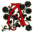
Introduction: a glittering reputation
lbert Angus Turbayne (1866–1940) was one of the most distinguished binding designers of the final decade of the nineteenth century, and worked in several styles. Some of his commissions took the form of elaborately tooled bindings in leather which were directed at the expensive tastes, while others, and those which have still have currency, were trade bindings for the modest (or middle-class) pocket.
Often linked to the Arts and Crafts designs of William Morris, and credited as one of those who sought to improve public taste by promoting work of the highest quality, he is also viewed as a sophisticated proponent of Art Nouveau, whose bindings bear comparison with those of Laurence Housman and Charles Ricketts. Framed by Morris’s Kelmscott Press and the extravagance of Aubrey Beardsley, Turbayne occupies a complex position within the discourse of Victorian book design.
Famous among his contemporaries, and known principally for the ‘Peacock edition’ produced by Macmillan and Co. in the 1890s, Turbayne was hailed by critics as a ‘genius’ (J.S.R., p. 213). H. Orrinsmith, the art director of Burns and Co., described him in 1898 as a designer of exceptional ability, praising his bindings as those which ‘come nearest to perfection’ (Haslam, p.73). Other eulogies followed. Favourable reviews appeared in The Artist and The Sketch, The Inland Printer, The Art Journal and elsewhere, and his name was featured a selling point in advertisements for each new publication. This was an important development in a period when binding designers were mainly anonymous, and Turbayne’s achievements were promoted on both sides of the Atlantic. Impressive when placed on the shelf, it is quite likely that his books were purchased for the beauty of his covers rather than their contents; working within a long Victorian tradition, Turbayne’s editions were objects to be seen, not read, a fact attested by the unusually good condition of most of the surviving copies.
Their status as fine art was often remarked and their value as artefacts was acknowledged in 1900, when Turbayne won third prize (in the form of a bronze medal) in the book binding competition at the Exposition Universelle in Paris; he continued to design cloth covers in the early part of the twentieth century. His reputation has endured into our own time, and features in every account of the period. Yet Turbayne’s life and work have never been the subject of a detailed monograph. Only basic facts about his circumstances and career can be recovered, and the following sections are at the time of writing (2014) the most complete account of his career and achievements.
Life and work
orn in Boston, Mass., on 3 May 1866, Turbayne is usually listed as an American. However, most of his life was spent elsewhere. He went to school in Canada in 1881 and moved to England in the early 1890s, living principally in Bedford Park, London, and in the south-east. In 1911 he was resident in Sandown, a quiet seaside resort on the Isle of Wight, although he seems to have had houses both here and in the capital. He died in London on 29 April 1940, in the opening year of the Second World War. It is not known if he became a British citizen, but his connection with the United Kingdom was motivated by much more than the need to pursue employment. His family background was essentially British rather than American, and he never returned to his country of birth.
Although they were listed as Americans, his parents were Scottish and of Scottish-Canadian extraction; his father was from Montreal, the son of Scots immigrants, and his mother was born in Scotland. ‘Turbayne’ is Scottish, and the artist’s middle name, ‘Angus’, was his mother’s maiden name. The choice of ‘Angus’ also suggests his parents’ need to maintain a cultural link with their country of origin, and this idea is reinforced by the fact that he was brought up as an ex-patriot member of The Kirk, the Presbyterian faith of the Church of Scotland. Turbayne’s engagement with his Caledonian heritage is otherwise uncharted, although he produced an interesting binding for Walter Scott’s The Lady of the Lake, embellishing it with an Art Nouveau interlace composed of that most Scottish of emblems, a jagged thistle.
His upbringing appears to have been comfortable, although his background was working rather than middle-class; his father was employed in a blue-collar job as a machinist working in a factory or workshop, and the family’s standard of living must have been modest. His father died in 1877 and after his passing, Turbayne, one of several children, was brought up by his mother. This straitened background may have meant that he had a limited education. Aged fifteen (in 1881) he was sent to Canada to be educated in Coburg, Ontario, where he was joined by the rest of the family in 1886. It is not known what school he attended. It has been claimed that he was a student at Trinity College School at nearby Port Hope, which was set up in 1865 and was (and is) the most prestigious institution in the area; yet a search of the school archive there draws a blank. Nor is it true that he attended Toronto University. However it is possible that he was enrolled at Victoria College in Coburg, an establishment set up as a Methodist school in 1829 and from 1842 as a university conferring its own degrees in a range of subjects. Turbayne may have studied here, both as a grammar school pupil – with a curriculum based on the British model of the time, which stressed classical learning – and as an undergraduate; perhaps he won scholarships and bursaries to cover his fees; perhaps he took an Arts degree. The dissolution of the college in 1892 means that only fragmentary records survive (now held in the archives at Trent University), and Turbayne’s time at Victoria, if there is any at all, remains obscure. It is likely, however, that after leaving school he trained or worked as an intern in a local printers’ workshop. Here he acquired the technical skills of a graphic artist, with an expertise in lithography.
He practised either for this unknown institution or as a free-lance. His early work was of the jobbing variety, with an emphasis on graphic advertisements for the local press. One of these includes an undated promotional flyer for the Toronto Daily and Weekly Mail in which business people are encouraged to advertise in these periodicals. Drawing on the metaphor of the Canadian wheat fields, one caption urges investors to ‘Sow in the Mail and reap a harvest in business’. This sentiment is dutifully supported by Turbayne’s imagery of stalks of wheat, conveying a notion of rural innocence that seems strangely at odds with the practicalities of the hard sell (Toronto Public Library).
These commissions were executed in the mid and late 80s, and in 1890 Turbayne relocated to England. Little is known of his work from the earlier part of the nineties, but in 1898 he was appointed by the London County Council School of Photoengraving and Lithography (known as the ‘Bolt Court School’) as a teacher (or ‘demonstrator’) of graphic design. He continued here until 1920, a continuity suggesting conservatism. Yet Turbayne was an inventive and ambitious character, and his activities from the end of the century to the early 1900s included numerous other ventures as well.
In addition to working for the Council he set up The Carlton Club, which, as Sybille Pantazzi has noted, became one of the largest studios of commercial art in London. Housed at number 108, Fleet Street, he ran the Club in business partnerships with his fellow Canadian émigrés, William Wallace, Norman Price and A. A Martin. These colleagues were former members of the Toronto Art Students’ League, and it is possible Turbayne had been a member too. From the end of the nineties until 1907 (when it was formally dissolved), The Carlton Club operated as business servicing diverse commissions, producing everything from advertising to visiting cards, bookmarks, book-plates, certificates and anything else that could be serviced. Turbayne specialized in decorative lettering, initials and motifs, publishing two books, Monographs and Ciphers and Alphabets and Numerals, in which he displayed his designs and those of his associates. These were partly Morrisonian in the manner of The Kelmscott Press, and always neo-medieval or Renaissance in style. Turbayne drew inspiration from typefaces and decorative head and tailpieces in incunabula, and his intricate letters and monograms were informed, as the artist notes in the introduction to Monograms, with the ‘experience of many years of actual work’ (p.ix).
At the same time he was producing a variety of book-cases and designs for leather bindings; both types were exhibited at the Arts and Crafts Exhibitions in London, and (as noted in the previous section) his leather pieces were acclaimed at the Exposition Universelle in Paris. Turbayne continued to design books into the twentieth century, although his most accomplished work was produced before 1910. The facts of his life are otherwise fairly conventional; twice married, with two children, his personal circumstances remain obscure, only mapped in his very considerable achievements as a graphic designer and especially in his work as a designer of bindings.
Turbayne as book binding designer

n 1900 Turbayne was commissioned in by The Oxford University Press to design a series of leather bindings for editions of Shakespeare, Milton and Spenser. Heavily tooled in gilt, and reminiscent of medieval bindings while also embodying the decorative values of their period, these books were offered as luxurious products for an elite audience. The publisher’s aim was to challenge the dominance of the Kelmscott Press, using the Exposition Universelle in Paris (1900) as a showcase. Turbayne’s items won a third prize and were lauded as prime examples of bespoke design, the embodiment of Arts and Crafts expertise. Encomia appeared in several periodicals and Turbayne was viewed at that moment as one of the most influential binders in the field. The reaction is typified by a long review (by ‘J.S.R.’) in The Artist, which describes Turbayne in extravagant terms and goes on to offer a detailed analysis of his combination of intricate design and devoted craftsmanship (pp.212–17). Turbayne, the critic observes, is a master-practitioner:
Mr Turbayne’s genius and long experience in the art of book decoration eminently fits him for such an important work. [The designs] are from his own pencil; and he has, from first to last, supervised every detail of the production of each exhibit with the most loving and minute attention, which, perhaps, is only to be adequately understood and appreciated by art-workers themselves [pp.212–213].
The critic also credits him with the invention of the tools that produced such fine results – despite the fact that the making itself, the cutting, shaping, and gilding, would have been done by a professional bookbinder and not by the artist (p.217). That aside, the Paris books consolidated Turbayne’s reputation as an Arts and Crafts designer, whose bindings had earlier been exhibited, as examples of this style and type of production, at several exhibitions in London. His position as an important figure working in this idiom is widely recognized, and in a recent study (2102) Macolm Haslam places him in the company of international practitioners in this field.
Turbayne’s connection with this style was nevertheless only one aspect of his extended practice. Some of his activity was directed at the production of Kelmscott-style artefacts, but his work is most characteristically embodied in his trade bindings for a large general audience. These books are markedly different from his luxury editions: issued for a few shillings, and published by mainstream mass-producers such as Macmillan, they take the form of gilt designs on cloth bindings in the manner of those offered byHugh Thomson and others servicing the gift-market of the 1890s. What is interesting, moreover, is the way in which Turbayne shifts idiom: the Arts and Crafts books are informed with Morris’s aesthetics, but his popular editions are far more radical, casting off the calculated anachronisms of the Kelmscott Press and putting in their place a dazzling version of Art Nouveau, the visual language of contemporary visual culture. Haslam does not differentiate these books from those working within the Guild style, but their ambience and style owes far more to Beardsley and Ricketts than to Morris or Cobden-Sanderson. Usually embellished with illustrations by artists such as Hugh Thomas and F. H. Townsend, these are splendid books, and Turbayne’s ownership of his work is signalled by the fact that almost all of them are signed – a monogram of an overlapped A and T, which was sometimes encircled by a line to create his famous ‘beetle’ signature.
Turbayne’s version of Art Nouveau is one that unashamedly stresses splendour, animating the surface of the upper board and spine with elaborate, intricate designs. His bindings are nevertheless anything but formulaic, and his treatment of the idiom is complex and various. Some of the books (mainly for A & C Black) are ‘Art Nouveau’ in what at the time was known as ‘the Scottish style’ or ‘the Glasgow style’, using the attenuated linearity associated with the practitioners C. R. Mackintosh, Jessie King and Talwin Morris; while others are swirling arabesques that link to European versions of the idiom, notably recalling the rich patterns of jewellery made by Rene Foy and Édouard Colonna. Both versions of Art Nouveau were freely accessible in England in this period, and Turbayne could have seen examples of artefacts at first hand, in dealers’ windows, or in periodicals such as The Studio and Portfolio.


Two of Turbayne’s bindings: The Life of Christ as Represented in Art. and Suppressed Plates. [Click on these images for larger pictures.]
Turbayne’s version of the Glasgow version of Art Nouveau are typified by his bindings for Frederick Farrar’s The Life of Christand G. S. Layard’s Suppressed Plates. Published in 1894, the first of these is a piece of elegant geometry, placing three stylized trees – nominally grape vines – above austere tendrils that sweep up from the bottom margin. The text is a rather dry account, but the binding, with its details of grapes and emanating leaves, is a sophisticated celebration of gainfulness. Even closer to the Glasgow style is the binding for Layard’s Suppressed Plates of 1907. This design, with its abstracted flowers, is strongly reminiscent of Mackintosh’s posters as well as his patterns for stained glass and furniture; austere and imposing, it gives no impression of the slightly subversive contents of the letterpress. As in Mackintosh’s art, it strongly prefigures the forms of Art Deco, and seems to belong to the nineteen twenties rather than the turn of the century. There are indeed few differences between this design and the strict geometry of Turbayne’s covers for A & C Black in the period after 1920.
Turbayne is far more lyrical in his covers inspired by European exemplars. Working with the curvilinear version of Art Nouveau, he creates a range of inventive variations, although the principal structures can be classified as either symmetrical or asymmetrical. The symmetrical version is exemplified by the binding for Captain Marryat’s The King’s Own. This is a typically proleptic design of the period, prefiguring the nautical theme in the form of a ship on the high seas; but the main effects are created by the stylized abstractions of the ship’s prow and the radiating waves, enclosing extravagant creatures, which curve outwards and are rhymed by the swelling shapes of the sail. The cover for Maria Edgeworth’s Ormond follows a similar pattern, and in both cases the end result, made up of muscular, sinuous lines, is bold and imposing. Containing curvilinear lines within a symmetrical frame, the artist creates a strong sense of dynamic movement, as if the arabesques were bursting out of a geometrical grid.
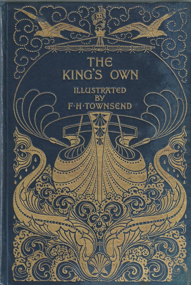

Two of Turbayne’s more lyrical bindings: Captain Marryat’s The King’s Own. and Maria Edgeworth’s Ormond. [Click on these images for larger pictures.]
Turbayne is perhaps at his most striking, though, when he focuses on a sort of elegant asymmetry. His most characteristic designs are tangled interlaces, usually figured as naturalistic vines, tendrils or briars, that seem perpetually on the point of overbalancing. In the cover For Reynard the Fox he offers a key image from the text – with the fox reaching uneasily for the chickens – but casts it in the form of a swirling briar of dog-roses. The bindings for Tom Cringle’s Log and The Lady of the Lake are similarly figured as plants, with the first presented as another vine of roses, and the second a skein of thistles and thistle stalks. Animated with implied movement, both exemplify one of Art Nouveau’s key motif – its emphasis on organic forms which blur the distinction between nature and art, and seem both realistic in their treatment of signs of the natural world and highly abstracted in their emphasis on decorative pattern-making. As Oscar Wilde famously remarks in his preface to The Picture of Dorian Gray, ‘all art is at once surface and symbol’: a judgment that interestingly applies to his contemporary’s bindings.

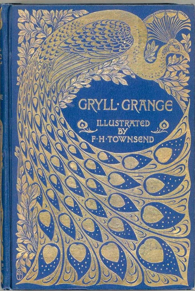
Elegant symmetry in Turbayne’s bindings: Reynard the Fox. and Thomas Love Peacock’s Gryll Grange. [Click on these images for larger pictures.]
These patterned versions of nature embellish his designs for Jane Austen’s Sense and Sensibility and Emma, books which were highly prized at the time of publication and now command high prices. More extravagant still are covers incorporating the image of a peacock. This is essentially Turbayne’s signature motif, an ostentatious design in which the peacock’s head is moved to the top right hand corner and the tail, with its flame-like eyes, expands over the surface. Turbayne used this pattern for the (punning) cover of Thomas Love Peacock’s Gryll Grange, although he used it elsewhere as well. It features, in various colours, as the decorative end-papers of several of his books for Macmillan, and it was used as an advertisement to launch the ‘Peacock series’. This was displayed across America and Europe, was widely admired, and functioned, once again, to consolidate his reputation as one of the prime practitioners of a new and exciting style.
These early books from the nineties were Turbayne’s most accomplished. He later produced diverse bindings in a more conservative style which lacked the dynamism of his gilt patterns. His contribution to the development of fine books for the public is nevertheless a significant achievement. This was an aim, as he explains in his ‘Chat about Book Covers’ (1898), that acted as his guiding purpose. Flamboyant, inventive and unashamedly showy, his work demands further investigation.
Acknowledgements
Thanks are due to Ms. Viola Lyons, Archivist, for research in the Trinity College School archives, Port Hope, Ontario, Canada. Ms. Lyons also liaised with other archivists in pursuit of details of Turbayne’s education, and I am grateful for the generosity of these colleagues.
Works Cited – books designed or written by Turbayne
Austen, Jane. Emma. Illustrated by Hugh Thomson and binding by Turbayne London: Macmillan, 1895 (Peacock Series).
Austen, Jane. Mansfield Park. Illustrated by Hugh Thomson with a binding by Turbayne. London: Macmillan, 1897 (Peacock Series).
Austen, Jane. Sense and Sensibility. Illustrated by Hugh Thomson with a binding by Turbayne. London: Macmillan, 1896 (Peacock Series).
Edgeworth, Maria. Ormond. Illustrated by Carl Schloesser with a binding by Turbayne. London: Macmillan, 1895.
Farrar, Frederick. The Life of Christ as Represented in Art. London: Adam & Charles Black, 1894. Binding by Turbayne.
Layard, G. S. Suppressed Plates. London: A & C Black, 1907. Binding by Turbayne.
Marryat, Frederick. The King’s Own. Illustrated by F.H.Townsend and with a binding by Turbayne. London: Macmillan, 1896. [This binding was re-used by other books in the series].
Peacock, Thomas Love. Gryll Grange. Illustrated by F.H. Townsend, with a binding designed by Turbayne. London: Macmillan, 1896 (Peacock Series). [this cover was extensively re-used by Macmillan].
Reynard the Fox. Illustrated by Frank Calderon with a cover design by Turbayne. London: Macmillan, 1895.Scott, Michael. Tom Cringle’s Log. Illustrated byJ.A. Symington and a binding by Turbayne. London: Macmillan, 1895.
Scott, Walter. The Lady of the Lake. Illustrated by Charles Brock and with a binding by Turbayne. London: Service and Paton, 1898.
Toronto Daily Mail [1886]. Advertisements designed by Turbayne.
Turbayne, A.A. ‘A Chat about Book Covers with A.A. Turbayne’. The House: a Monthly for the Artistic Home 2 (September 1897 –February 1898): 107–109.
Turbayne, A.A. Alphabets and Numerals. London: Jack, 1904.
Turbayne, A.A. Monograms and Ciphers. London: Jack, 1906.
Secondary material: works cited and sources of information
Ancestry.co.uk
‘Announcements’. The London Gazette. 29 January 1907:684.
Haslam, Malcolm. Arts and Crafts Book Covers. Shepton Beauchamp: Richard Dennis, 2012.
‘J.S.R.’ ‘A. A. Turbayne’s Book-Bindings at the Paris Exhibition’. The Artist 28:248 (September 1900): 212 –217.
Pantazzi, Sybille. ‘Book Illustration and Design by Canadian Artists, 1890–1940’. National Gallery of Canada Bulletin 7, 4:1 (1966). On-line version at: www.gallery.ca/bulletin/num7/pantazzi4.html
Wood, Esther. ‘British Trade Book Bindings and their Designers’. The Studio, Winter Number, 1899–1900: 3 –37.
Last modified 30 January 2014