I am indebted to the Ormonds and to Gordon S. Haight for helping me to identify the stages through which Leighton's work passed. — H. Witemeyer
 omola was the only one of George Eliot's novels to be illustrated in its first edition. It acquired this distinction when the novelist decided to place the manuscript with George Smith instead of with her usual publisher, Blackwoods of Edinburgh. Smith was proprietor of The Cornhill magazine, one of the leading Victorian outlets for serialized, illustrated fiction. In The Cornhill Thackeray illustrated his late novels, Lovel the Widower and The Adventures of Philip, and Millais illustrated Trollope's Framley Parsonage and The Small House at Allington; all of these illustrations were reprinted in The Cornhill Gallery (London, 1865).
It was only natural that Smith should want a novel by the author of Adam Bede to receive similar honors. After all, literary illustration was to the Victorian publisher what literary pictorialism was to the Victorian novelist: an attempt to satisfy the boundless public appetite for visualized narrative.
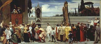
Frederic Leighton, Cimabue's Celebrated Madonna Is Carried in Procession through the Streets of Florence, 1855.
In May of 1862, Smith gave the Romola commission to a rising young painter named Frederic Leighton. "It is to be illustrated by Leighton who is by far the best man to be had in England," Lewes wrote enthusiastically to his son (Letters, IV, 37). Leighton seemed clearly the best man because he had lived in Florence and studied in its academy in 1845 46, and because he had made rather a specialty of Florentine Renaissance subjects in his early work (see Ormond, pp. 5-6). Leighton had also studied in Frankfurt with Eduard Steinle, sometimes called "the last of the Nazarenes"; see Andrews, The Nazarenes, p. 69. In pictures such as Cimabue Finding Giotto in the Fields of Florence (1850), The Plague in Florence (1851), Signorelli Painting His Dead Son (1851), The Death of Brunelleschi (1852), and Cimabue 's Celebrated Madonna Is Carried in Procession through the Streets of Florence [157/158] (1855) Leighton met the demand for what he called "correctly drawn historical genre" (Barrington, I, 48). Ruskin praised Cimabue's Madonna for the realism of its costumes, setting, and vegetation; and Queen Victoria purchased the painting for 600 guineas (Barrington, I, 186n. Peter Conrad, The Victorian Treasure-House, p. 126, compares the conscientious historicism of Cimabue's Madonna with that of Romola).
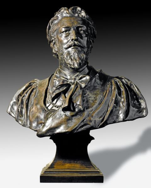
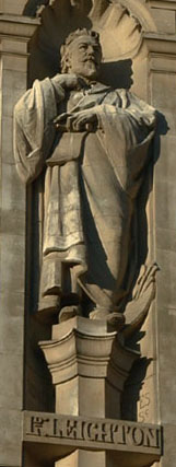
(Left) Thomas Brock, Frederic Leighton. c. 1892. Bronze. 32 1/2 inches. (Right) Alfred Drury. Frederic Lord Leighton. Statue on the façade of the Victoria and Albert Museum. London, near the Brompton Avenue entrance. [Photograph by George P. Landow, December 1999.] Neither work in print version.
Leighton rode the fashion for subjects from Vasari well into the 1860s.5 Of the six paintings he displayed at the Royal Academy in the year of the Romola commission, Michael Angelo Nursing His Dying Servant impressed the Leweses most powerfully (Letters, IV, 37n). The artist had already demonstrated his abilities in black and white by successfully illustrating two of Elizabeth Barrett Browning's poems for The Cornhill in 1860.7 And he was later to contribute nine highly distinguished illustrations to the Dalziel's Bible Gallery (Dalziel, pp. 237-44, and Boase, p. 363). All told, it would be difficult to imagine a better-qualified illustrator for George Eliot's historical novel of Florence in the 1490s. Romola appeared in twelve installments between July of 1862 and August of 1863. Leighton contributed twenty-four illustrations (two for each number) together with fourteen initial letters and a tail-piece to the Proem. His commission brought him �40 per number or �480 in all (Barrington, II, 95.). He worked from the page proofs of each installment, without an overview of the finished story. He first sketched his designs in black and white chalk on gray paper; then he recast them in pen-and-ink on woodblocks (Ormond, p.58). Photographs of the drawings were made by Smith before the blocks were turned over to the engravers, Joseph Swain and W. J. Linton, who cut away those portions of the blocks that were to appear as white in the finished illustrations, leaving in relief the portions that were to print black. The blocks were then locked directly into the printer's form, and inked on their raised surfaces at the same time as the type. This was the technique of wood-engraving that Thomas Bewick had revived late in the eighteenth century (Muir, pp. 6-7). The original chalk drawings by Leighton are now in the hands of Mr. Philip Hofer and Professor Gordon S. Haight (Letters, IV, 39). Either the drawings or the photographs (probably the latter) hung for a time in George Eliot's drawing room at the Priory (Letters, V, 8). The photographs are now owned by Leighton House.
Leighton and the "Sixties" school of English illustration
In style Leighton's black-and-white work belongs to the "Sixties" school of English illustration, so named by Gleeson White even though it arose in the mid-1850s and continued well into the 1870s.12 The Sixties school represented a departure from the tradition of comical-satirical caricature in English illustration, the tradition of Hogarth, Rowlandson, Gillray, Cruikshank, Leech, Seymour, Browne, Doyle, May, Meadows, and Thackeray. Many of the Sixties illustrators were academically trained and therefore brought to their work a classical sense of the human form and a mimetic mode of representation derived from the life-classes of the academy. Pre-Raphaelite ideals of naturalism and precise symbolic meaning also influenced the movement through the black-and-white work of Rossetti, Millais, and Holman Hunt — especially their contributions to the Moxon edition of Tennyson's Poems (1857). The tone of Sixties illustration was predominantly serious and sentimental. The artists aimed to bestow some of the, dignity of painting upon their medium, and to that end invested great care in the conception and execution of their designs. Millais remained the dominant figure of the new school, which also included Charles Keene, Ford Madox Brown, Fred Walker, Frederick Sandys, Arthur Boyd Houghton, Arthur Hughes, George du Maurier, Frederick Shields, George J. Pinwell, William Small, Thomas and Edward Dalziel, Luke Fildes, Edward J. Poynter, Whistler, the early Burne-Jones, and Leighton.
Partaking in the style of Sixties illustration did not, of course, guarantee a picture's success. Leighton's illustrations of Romola are in fact highly uneven, and much less consistently effective than his designs for Dalziel 's Bible Gallery. Although some of the Romola designs are strikingly good both as pictures and as interpretations of the novel, others are stiff, inanimate, and heedless of the text. For several important characters in the story — Savonarola, Baldassarre, and Piero di Cosimo-Leighton never found adequate pictorial forms; indeed, he positively avoided the well-known features of Savonarola. Leonée and Richard Ormond rightly observe that the best illustrations in the series tend to be "those with one or two figures, placed in a landscape setting or a domestic interior"; whereas the more crowded scenes of Florentine street life are rarely effective (Ormond, p. 59.). [159/160] Perceiving this unevenness, George Eliot herself had mixed feelings about her collaborator's work. Her side of an extensive and detailed correspondence with Leighton survives (Barrington, II, 96-102, and Letters, IV, 39-64). In it can be glimpsed her deep disappointment with some of his pictures, her genuine delight in others, and finally her resignation to the inevitable discrepancy between the artist's conception of the scenes and her own. Her mature position is well represented by the following passage:
But I am quite convinced that illustrations can only form a sort of overture to the text. The artist who uses the pencil must otherwise be tormented to misery by the deficiencies or requirements of the one who uses the pen, and the writer, on the other hand, must die of impossible expectations. [Letters, IV, 55-56]
Only "a mind well accustomed to resignation," George Eliot told John Blackwood in 1877, can bear to see its vivid conceptions altered by the mind and hand of another person (Letters, VI, 335). Eliot did not care for the illustrations in Blackwood's "cheap edition" of her works and personally requested Mrs. William Allingham, whose work she admired, to undertake the illustration of Romola for inclusion in that edition (Letters, Vl, 341). Eliot did, however, like Birket Foster's title-page vignette of the Hall Farm in the 1867 Illustrated Edition of Adam Bede (Letters, IV, 366). In later years George Eliot told P. G. Hamerton that she was pleased with the Romola illustrations, especially with "Leighton's conception of Tito" (317).
The experience of being illustrated brought home to Eliot the truth which Lewes articulated in his 1867 introduction to Wilhelm von Kaulbach's illustrations of Goethe: "no two minds form precisely similar conceptions of the same poetic presentation; each mind forms its own Gretchen and Lotte, its own Frederike and Leonore, its own Dorotea and Ottilie; none of these having more than a general resemblance to the images in the poet's mind" (Lewes, "Introduction" to Female Characters). Illustration, in other words, always involves an interpretive restatement of its subject.21 It is never a simple transcription. At the beginning of her collaboration with Leighton, George Eliot harbored the naive ideal of a "perfect correspondence between the text and the illustration" (Letters, IV, 41). But she had to abandon the dream 5 of complete mimesis as soon as she realized that the literary text is seldom the sole determinant of the illustrator's rendition. The text is only one of several important factors that enter into the creation and interpretation of literary illustration as J. Hillis Miller and Ronald Paulson have recently emphasized.22
Like paintings, illustrations also acquire meaning from their relation to other pictures. As the identification of a biblical or literary [160/161] source is only one step in the analysis of a Renaissance painting, so comparison with the text is only one step in the analysis of a Victorian illustration. In either case the artist's choice and handling of his subject may be determined more by established stylistic and iconographic traditions in the visual arts than by an author's words. Catherine Gordon has shown, for example, that early illustrations of Scott are decisively shaped by late eighteenth-century historical literary painting such as the Boydell Shakespeare Gallery (Gordon). Likewise, Hillis Miller has argued that "Cruikshank's pictures draw their meaning from their relation to other works of art [in the tradition of English caricature] to which they implicitly refer and on which they depend for the creation of their own significance" (Miller, p. 52).
Furthermore, any illustration has a place in the illustrator's personal oeuvre, and may gain significance from its developmental relationship to other pictures within that oeuvre. By this I do not mean what Miller (p. 49) calls the artist's "unique sensibility or angle of vision on the world." I am referring to a property of the artist's pictures, not of his mind. Finally, an illustration may, if it belongs to a set, generate meanings by repeating and varying visual forms that appear in other pictures within the set. To elucidate such meanings, Miller notes, "the investigation moves back and forth from one plate to another in an attempt to identify the motifs and structuring forms which recur from one picture to another" (Miller, p. 53). In short, the pictorial contexts of an illustration are at least as important to its interpretation as the literary context. Unfortunately, those best qualified to provide and evaluate the relevant pictorial contexts — namely, the art historians — have with a few notable exceptions treated illustration as infra dig and have ignored it completely.
The rest of this chapter will consider the pictorial contexts of several of Leighton's Romola illustrations. The first example will involve a design whose main formal source is an identifiable picture that has no connection with George Eliot's text. Then I shall place several of the Romola illustrations in the context of Leighton's oeuvre, noting their developmental affinities with earlier and later pictures. The final group of illustrations to be considered will include several examples of the repetition and variation of pictorial structures within the Romola series, a technique by which the artist can imitate temporal narrative sequence. In this interpretation of [161/162] Leighton's images, the criterion of fidelity to the text will not be abandoned, but it will be applied flexibly enough to accommodate the meanings revealed by a pictorial approach.
The tenth picture in the Romola series is entitled Niccolò at Work," and shows Tito Melema entering the workshop of the blacksmith, Niccolò Cappara, to buy a shirt of chain mail.

Frederic Leighton. Niccolò at Work.
The composition of the illustration derives directly from Joseph Wright's An Iron Forge (1772), which was displayed at the South Kensington Museum in the International Exhibition of 1862 (Romantic Art, pp. 68-69). The exhibition opened in May, several months before Leighton set to work on the illustrations for part 5 of Romola — for this dating, see Official Catalogue of the Fine Art Department, International Exhibition 1862, p. 14, and Letters, IV, 50. When Leighton encountered George Eliot's description of a smith's shop, Leighton conceived the scene in terms of Wright's striking picture.
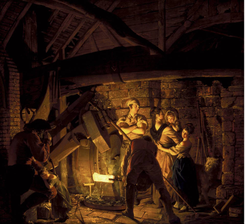
Joseph Wright, An Iron Forge (1772)
Following his eighteenth-century model, Leighton centers his composition upon a powerful workman frontally placed who turns his head to the viewer's right. The artificial sources of light in both pictures are to the left of the principal figures and are related to the business in hand: a white-hot piece of iron in Wright's painting, and the forge in Leighton's drawing. The strong diagonal line provided by the pole which runs from lower right to upper left in An Iron Forge is echoed by the handles of the hammer and spear which Niccolò and his apprentice hold, while the group of rods on the right side of An Iron Forge are replaced by the rods emerging from Niccolò's Gothic lantern, which, according to Ormond (p. 59), is based on one at the Strozzi Palace in Florence that Leighton sketched in 1852. Both pictures are framed on the left by a jutting wall and a figure whose back is to the viewer. There are, of course, some compositional differences between the two pictures, as well as "period" differences of costume and technology. But these modifications do not obscure Leighton's indebtedness to Wright for the basic form of his design. "Niccolò at Work," then, belongs to a tradition of forge-painting that extends from Wright of Derby back through the Dutch Caravaggists to Renaissance depictions of Vulcan's smithy; for more on the sources of Wright's painting, see Romantic Art in Britain, p. 68, and Nicolson.
A pictorial source in this case determined the illustration far more decisively than did the literary text. In fact, Leighton's picture does not follow George Eliot's text very closely. Here is the passage which "Niccolò at Work" purports to illustrate: [162/163]]
Preoccupied as [Tito] was, he could not help pausing a moment in admiration as he came in front of the workshop. The wide doorway, standing at the truncated angle of a great block or "isle" of houses, was surmounted by a loggia roofed with fluted tiles, and supported by stone columns with roughly carved capitals. Against the red light framed in by the outline of the fluted tiles and columns stood in black relief the grand figure of Niccolò , with his huge arms in rhythmic rise and fall, first hiding and then disclosing the profile of his firm mouth and powerful brow. Two slighter ebony figures, one at the anvil, the other at the bellows, served to set off his superior massiveness.
Tito darkened the doorway with a very different outline, standing in silence, since it was useless to speak until Niccolò should deign to pause and notice him. That was not until the smith had beaten the head of an axe to the due sharpness of edge and dismissed it from his anvil. But in the meantime Tito had satisfied himself by a glance around the shop that the object of which he was in search had not disappeared.
Niccolò gave an unceremonious but good-humoured nod as he tumed from the anvil and rested his hammer on his hip.
"What is it, Messer Tito? Business?" [26:336]
The description is highly pictorialized, perhaps even preconcerted expressly for the illustrator. The workshop is viewed from the street through a frame-within-a-frame, and the figures are silhouetted by a red light which bestows infernal connotations upon the business about to be transacted.
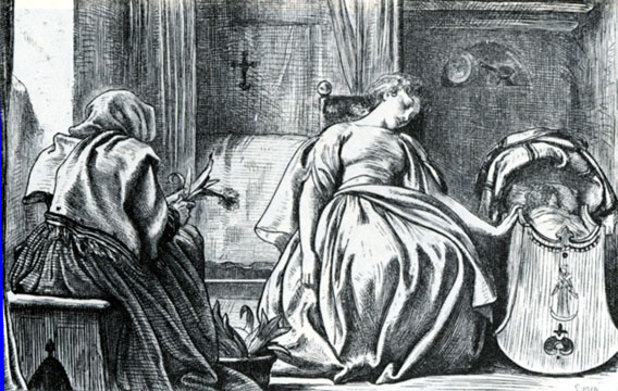
Frederic Leighton. Left: "Tessa at Home" Engraved by Joseph Swain and William James Linton.
The organization and implications of the scene are quite different from those of Leighton's illustration. Leighton has ignored both the viewpoint and the lighting suggested by his author. By moving his light-source from the anvil to the furnace he has actually diminished the effect of silhouette and chiaroscuro, which are stronger in Wright's Iron Forge. And Leighton's Niccolò is not particularly dark or vulcanic; indeed, he is altogether cleaner and more statuesque than the unwashed, barrel-chested figure described in chapter 1 of Romola. Leighton's departures from the text were prompted by his [163/154] admiration for Wright's Iron Forge, but they were not equally inspired by a coherent interpretive vision of his literary source. The illustration loses in force what it gains in prettiness.

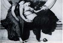
Left: "Lieder ohne Worte" Study. London, Leighton House." Right: Summer Moon.
As his experimentation with Wright of Derby suggests, Leighton's art was in a transitional phase during the early 1860s. He was moving, as he himself later put it, from the Gothicism of his early work to the classicism of his maturity (Ormond, pp. 55, 85). As a result, his Romola illustrations have interesting developmental affinities with both earlier and later pictures in the artist's oeuvre. A case in point is "Tessa at Home," the twenty-first of the Romola series. This design represents an important stage in Leighton's handling of the motif of the seated, sleeping female figure. This motif, which may derive from the Demeter-and-Persephone group of the Elgin Marbles (see Hook," p. 124), arises in one of the artist's early neo-medieval pictures, Lieder ohne Worte (1860-61), and comes to fruition in several of his later neoclassical paintings: Summer Moon (c. 1872), The Garden of the Hesperides (1891), and Flaming June (c. 1895). The affinities between Lieder ohne Worte, 'Tessa at Home" and Summer Moon are especially strong. The illustration, then, shows Leighton on his way to becoming the great Victorian painter of lassitude, the artist for whom, as Disraeli observed, beauty is inseparable from "the sentiment of repose" (Ormond, p. 66).
"Tessa at Home" is not only profoundly characteristic of its creator but also entirely faithful to the details of George Eliot's text. The scene in question shows Tessa as Romola sees her through an open door at the beginning of the providential visit which reveals to the heroine the existence of her husband's "other wife":
On a low chair at the farther end of the room, opposite the light, sat Tessa, with one hand on the edge of the cradle, and her head hanging a little on one side, fast asleep. Near one of the windows; with her back turned towards the door, sat Monna Lisa at her work of preparing salad, in deaf unconsciousness. [56:261]
The point of view, the attitudes and relationships of the figures, and the function of the window in George Eliot's description are all carefully rendered in Leighton's version of the scene. Both pictorially and interpretively, the illustration is an admirable success. [164/165]
The Romola illustrations repeat or anticipate many other details of costume, attitude, expression, and landscape composition that appear elsewhere in Leighton's work. The Ormonds have noted the similarity between the slightly sinister hooded cloaks worn in many of the illustrations and those worn in Leighton's frescoes of The Wise and Foolish Virgins at Lyndhurst (1862-64) and his Dante at Verona (1864) (p. 59). The eloquent attitude of Romola in "Coming Home" is repeated in Salome Dancing (1863?) and much later in The Last Watch of Hero (ca. 1887; p. 77, pl. 166). The heroine's figure and facial expression in "At the Well" look forward to one of Leighton's worst paintings, Clytemnestra from the battlements of Argos watches for the beacon fires which are to announce the return of Agamemnon (ca. 1874). This Clytemnestra, as the Ormonds have observed, "is based on a caryatid"; she is "stilted and operatic," achieving "monumentality, but no more" (p. 89, pl. 102). The same strictures apply to the Romola of "At the Well." But the landscape background in the same illustration is far more imaginative than the figures, dropping suddenly away to a panoramic, bird's-eye view of the bay which Romola's boat has just crossed. The same abrupt landscape vista occurs in "Escaped" and "'You Didn't Think It Was So Pretty, Did You?"' The technique anticipates what the Ormonds have called the "vertiginous composition" of the landscape backgrounds in Daedalus and Icarus and a number of Leighton's other late pictures (p. 89.). In the Romola illustrations, then, Leighton first tested many of the pictorial formulae that were to reappear in his best-known paintings.
Leighton also repeated and varied motifs within the series to generate pictorial meanings. A set of novel illustrations, as Anthony Burton has pointed out, can "take on a sequential or narrative force" because the artist has twenty or more opportunities to represent the beginning, middle, and end of a story (p. 94). He can render narrative contrasts and developments by repeating the patterns of earlier pictures in the set while varying them dramatically. A group of illustrations, in other words, can generate an internal iconography (for more on this subject, see Cohen, p. 257, and Steig).
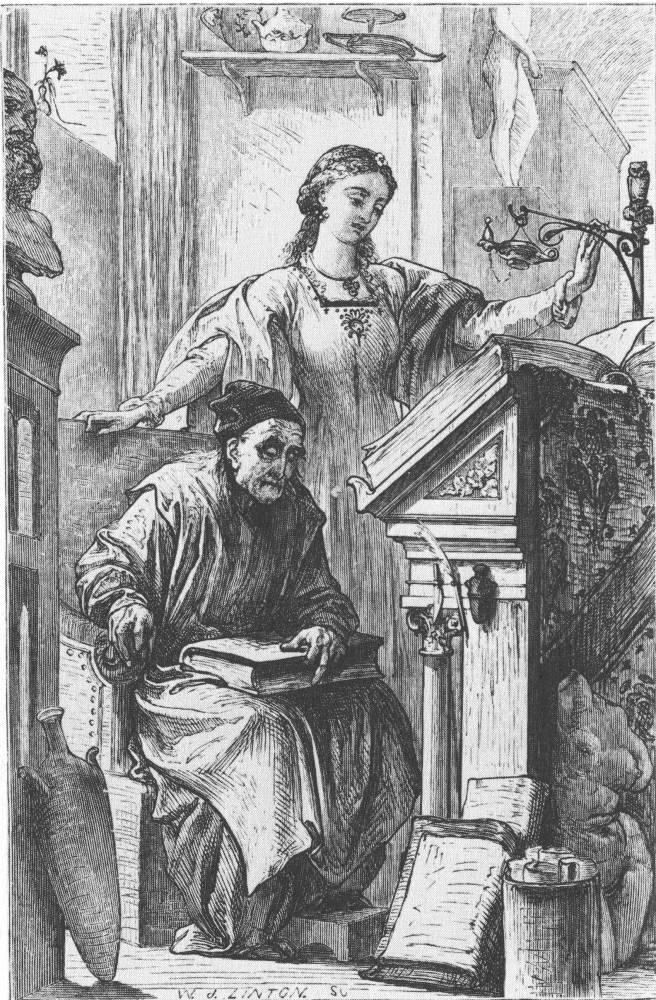
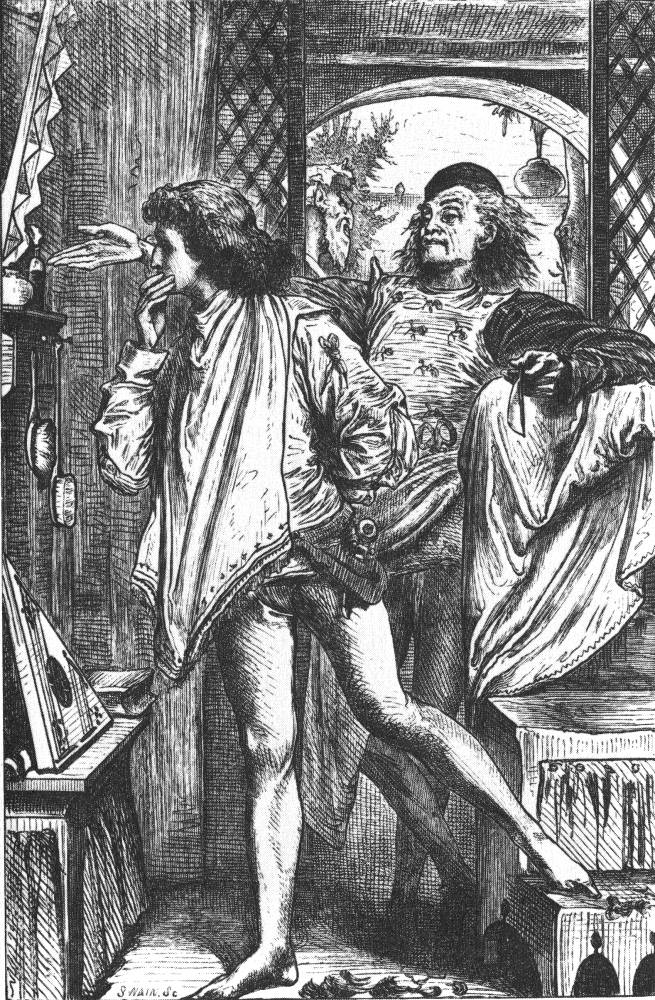
Left: Frederic Leighton. "The Blind Scholar and His Daughter" right: "Suppose You Let Me Look at Myself" both Engraved by Joseph Swain and William James Linton.
Leighton created a deliberate pictorial contrast in the two illustrations which he designed for the opening number of Romola (figs. 32-33). The pictures introduce the heroine and the hero-villain, [165/166] Tito Melema, in complementary scenes which form a sort of diptych. The characters are related by the repetition of pictorial motifs but distinguished by significant variations in treatment. In "The Blind Scholar and His Daughter" Romola stands erect and central, one hand resting on her father's chair, the other outstretched towards the lamp and the book she is reading aloud. In "Suppose You Let Me Look at Myself" Nello usurps, nearly parodies, Romola's attitude, as he rests one arm on the barber's chair and flamboyantly stretches the other toward the mirror imaging Tito's enigmatic face. Whereas Romola contemplates light and knowledge, Tito reenacts the traditional emblem of vanity ("it is a Venetian mirror from Murano, the true nosce teipsum, " says Nello). The question raised in the novel about the moral reality behind Tito's physical appearance is also raised in the illustration, where the newly shaven face seems not quite unmasked and rather perplexed by its own-reflection. George Eliot accurately praised the picture of the barbershop because "it makes so good a variety with Bardo and Romola" (Letters, IV, 41).

Frederic Leighton. "The Painted Record" Engraved by Joseph Swain and William James Linton.
Having established these motifs, Leighton repeated them in a later picture where Tito's image is also at issue. In "The Painted Record" Romola contemplates Piero di Cosimo's portrait of Tito as a fearful reveller. Her attitude, one hand on the back of a chair and the other outstretched toward what she sees, is a third variation of the central attitude used in "The Blind Scholar and His Daughter" and "Suppose You Let Me Look at Myself." The props and the lighting deliberately echo those of the earlier pictures, while Piero replaces Nello on the right side of the picture as the maker of the framed image on the left. Romola has undergone a pictorial transition from the independent maiden in the library to the implicated wife burdened by the question of her husband's identity that was first raised in the barbershop. The transition is manifested by the repetition and variation of motifs within the structurally coherent group of three illustrations.
Considered individually, however, these pictures are not equally successful. "Suppose You Let Me Look at Myself" is a magnificent triumph of expressive and energetic design. Leighton's barber is more imposing than George Eliot's, even a little frightening as he [166/167] ushers Tito into the story ("better than my Nello," said the author, impressed). The unpleasantness of the smile on Nello's harlequinlike mask of a face is emphasized by its visual association with the grimace of the satyr's bust in the garden.
The satyr-face reappears in "The Painted Record," but generates no energy in that relatively lifeless design. Romola and Piero are too inert for the occasion: she is serene and static, slightly worried rather than deeply anxious; and he is a wooden Don Quixote with a tall, inordinately skinny body, gigantic artist's hands, and amusingly baggy hose. Here and throughout the series Leighton's Piero is a comical figure, entirely lacking the visionary power of his namesake in the novel. His uncertainty about Piero prompted Leighton to ask George Eliot whether she knew of any extant portraits of the artist (Letters, IV, 55).
The figures are also unsatisfactory in "The Blind Scholar and His Daughter," though the setting is skillfully composed in the mode of conversation pieces which portray a gentlemanly collector amidst his collection.41 Leighton's Romola is indecisively drawn and, as George Eliot herself pointed out, very different from the Romola of the text (Letters, IV, 40, and Pantazzi, p. 47). The illustrator has reversed nearly every important visual association connected with the heroine in the author's introductory word-portrait. Eliot's "square-cut gown of black rascia," which reflects the ascetic side of Romola's character, gives way to Leighton's light and ornamented gown (5:72). In the novel Romola's "reddish gold" hair is the principal source of light in Bardo's library, a naturalistic nimbus which hallows the reader's first impression of a secular Madonna. But in Leighton's illustration Romola is not blonde and the principal source of light is the sun, which the novel explicitly describes as "not yet high enough to send gleams of brightness through the narrow windows" (5:72). Tonally, the illustration is to the text very nearly what a negative is to a photograph.
As for Bardo, George Eliot specifies that he "sat with head uplifted and turned a little aside towards his daughter, as if he were looking at her" (5:72-73). Leighton has ignored these details and drawn instead a head very like the one he gave to Signorelli Painting His Dead Son in the chalk drawing of 1851 (Ormond, pl.16). That is why, when Romola views Piero di Cosimo's portrait of Bardo later in the novel, she says to the artist: "Ah . . . you have done what I wanted. You have given it more of the listening look" (28:392). Leighton's [167/168]liberties with the text in "The Blind Scholar and His Daughter" are not dictated by the logic of its pictorial grouping with the two other illustrations we have just examined. That logic does not prescribe the gratuitous changes of tone and attitude which the illustrator chose to make.
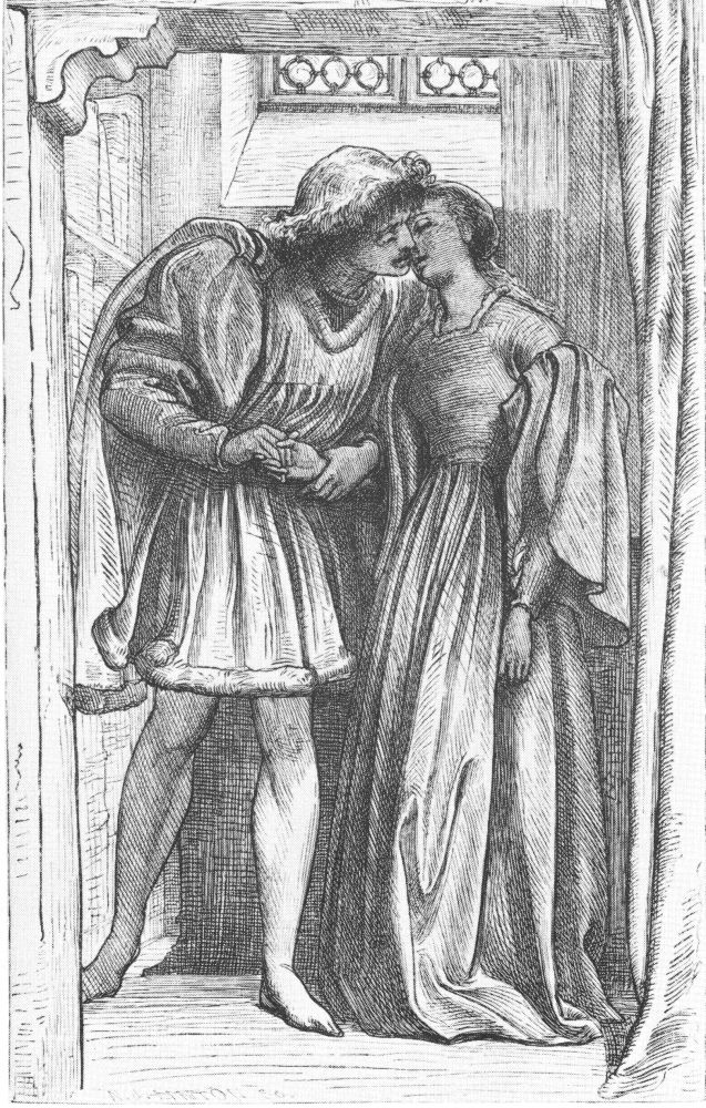
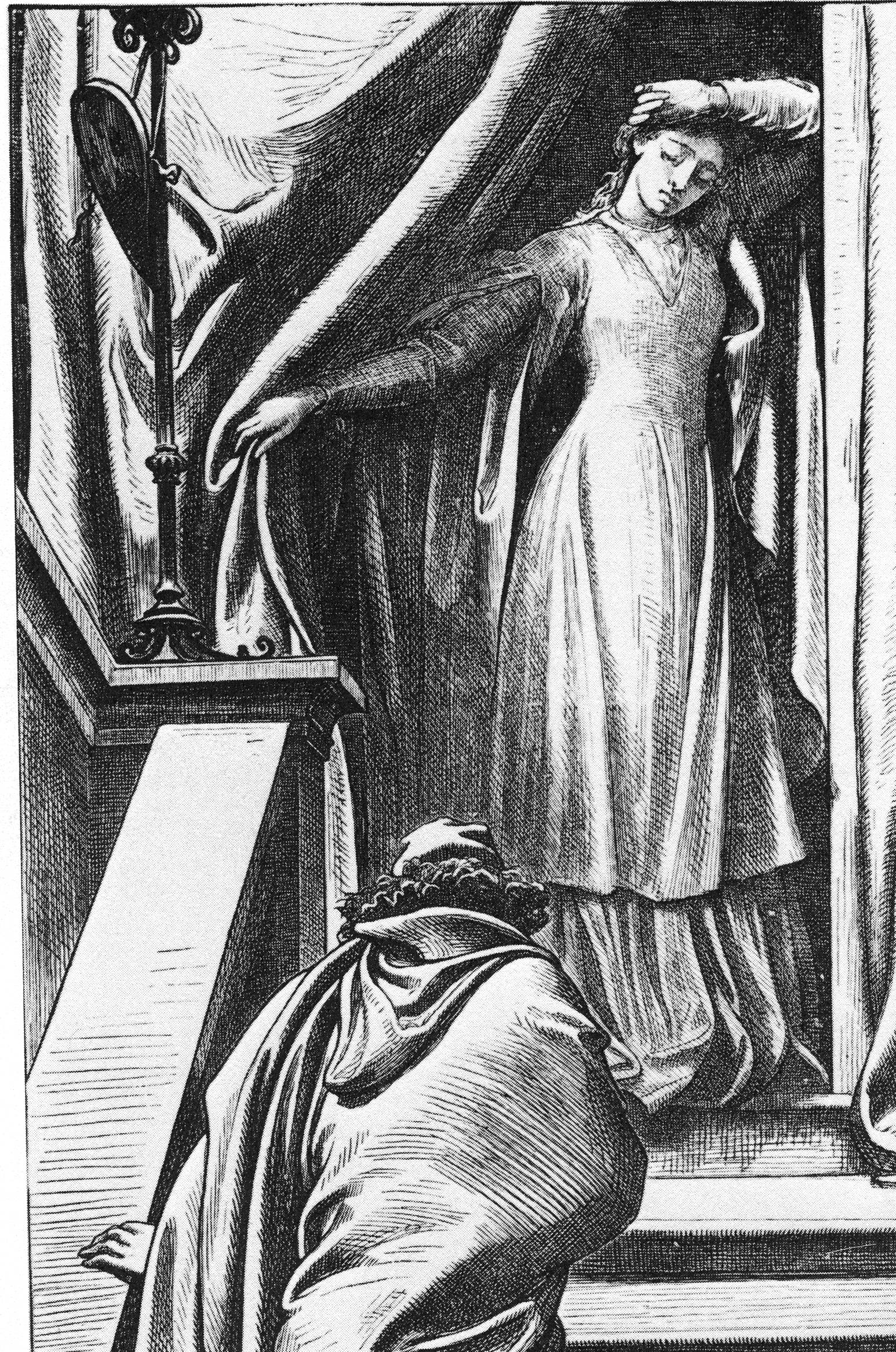
Left: Frederic Leighton. "The First Kiss;" right: "Coming Home" both Engraved by Joseph Swain and William James Linton.
But Leighton is at his very best in another pair of designs which employ the technique of repetition and variation. The artist depicted Romola and Tito alone together only twice in the set of twenty-four illustrations. The pictures in question represent the dramatically different stages of courtship and marriage (figs. 35, 36). Presenting images of "before and after," the illustrations give an illusion of narrative growth and development, rather like two photographs of the same person in the same setting at different times in his or her life.
In "The First Kiss" Tito has just followed Romola into a small book-lined cabinet adjoining her father's library. Here they first declare their mutual love: 'The faces just met, and the dark curls mingled for an instant with the rippling gold" (12:184). In Leighton's illustration the cabinet becomes a stage. There is just the faintest hint of books in the upper left corner. The more prominent overhead beam and curtain constitute a distinct proscenium, and one has the sensation of witnessing an intimate scene from which the curtain has only moments ago been drawn back.
"Coming Home" reflects the changes that have taken place in the eighteen months since the lovers were married. The narrative has just entered Romola's mind for a lengthy analysis of her marital disillusionment. The objective correlative of the change that has come over her is seen at the end of her meditation, when Tito comes home wearing the chain-mail shirt we have seen him purchase from Niccolò Cappara as protection against Baldassarre's dagger.
She waited and listened long, for Tito had not come straight home after leaving Niccolo Cappara, and it was more than two hours after the time when he was crossing the Ponte Rubaconte that Romola heard the great door of the court turning on its hinges, and hastened to the head of the stone steps. There was a lamp hanging over the stairs, and they could see each other [168/169] distinctly as he ascended. The eighteen months had produced a more definable change in Romola's face than in Tito's; the expression was more subdued, less cold, and more beseeching, and, as the pink flush overspread her face now, in her joy that the long waiting was at an end, she was much lovelier than on the day when Tito had first seen her. [27:379]
Leighton's illustration, perhaps the finest of the entire series, emphasizes not so much the change in Romola as the change in the relationship between the two characters. It shows Romola holding open the curtain on a landing of the stairs, her arms, her dress, and the curtains themselves forming a graceful harmony of S-shaped curves picked up below in the contours of Tito's cloak. The artist has been astonishingly successful in suggesting the effort with which Tito toils up the steps under the unfamiliar weight of his new coat of mail. The drawn curtain recalls the proscenium effect of "The First Kiss," but the moral change in the relationship between the two characters is visually underlined by the change in their physical positions. The figures stood on an equal plane in the earlier illustration, but now Tito is below Romola's level and seems to conceal his face as well as his chain mail and his treachery. The lighting and the handling of draperies give the two pictures a stylistic kinship which complements their structural similarities.
A pictorial approach to literary illustration can discover visual meanings that a narrowly literary approach might overlook. The illustrator, after all, is primarily a picture-maker; and pictures, as Gombrich and other art historians have demonstrated, are largely born of other pictures which establish the conventions that our minds use to order their perceptual experiences (see Gombrich). It is natural for the illustrator to ask, as Leighton did when confronted by George Eliot's description of the blacksmith's shop, what kind of painting the literary scene calls to mind. It is equally natural for the scene to mold itself around a visual motif which the illustrator has used before. To ignore this pictorial modeling may be to overlook the most decisive influence upon a given illustration. The text, to be sure, establishes certain limits of permissible meaning, and the illustration ought not to violate those limits without good reason. [169/170] But departures from the letter of the text may serve the spirit if they are governed by a coherent interpretive vision expressed in distinctively pictorial terms. As George Eliot learned, the illustrator's barber may well be better than the author's.
Created 2000; reformatted 2007 and 14 April 2015Last modified 2 January 2025
