
ickens’s writing was intimately connected with early and mid-Victorian illustrators, but his later novels, Our Mutual Friend (1864-5) and Edwin Drood (1869-70) were interpreted by Marcus Stone, a practitioner of the realistic style known as ‘The Sixties’, and Hubert Herkomer, a social realist who helped to form the documentary idiom of The Graphic. Each of these artists modernized Dickens’s appeal by linking his prose to current developments in contemporary illustration, in each case complementing his vivid descriptions of the urban poor with an urgent immediacy.

The Bird of Prey by Marcus Stone. Wood engraving by Dalziel. 9.3 cm high x 15.2 cm wide. Illustration for Our Mutual Friend, Chapter One, "On The Look-Out."
Stone is especially powerful in showing the everyday scenes in Our Mutual Friend, rooting the novel in lived experience of the time. In the opening design, The Bird of Prey (May 1864), he stresses the Hexhams’ economic troubles as the thread-bare couple search for corpses; the father scans the water anxiously while Lizzie looks ahead of her. The background is a journalistic portrait of the river, with its tied-up ships and smoky atmosphere on a strong tide, which Stone conveys in rhythmic force-lines and alternating patterns of and black white. The overall effect is one of pared-down intensity; unlike George Cruikshank, whose illustrations for Oliver Twist locate the life of the poor in an overcrowded underworld of dark rooms and seedy details, Stone shows working class life as a matter of emptiness and isolation.
Stone’s response exemplifies the verisimilitude of graphic art of the Sixties, although most social realism of the period focuses on the travails of rural rather than urban privation. This interest is exemplified by the work of the ‘Idyllic School’ – a term coined by the critic Forrest Reid suggesting sentimental idealism but meaning the very reverse: rather than presenting a Wordsworthian notion of country life, contributors to the idiom focus on the material and psychological aspects of rural poverty. Published in the illustrated journals and gift books of the period, the principal participants are William Small, George Pinwell, J. W. North, Robert Barnes and Frederick Walker, each of whom offers personal interpretations of labour, home-life, and the relationship between the classes. This imagery, usually presented in the form of wood-engravings, is informed with a radical agenda that goes well beyond the didacticism of earlier illustration and often sets out to be confrontational.

The Vagrants by Fred Walker, an extra composite woodblock engraving from Good Words, 27 January 1866.
Frederick Walker’s approach is typified by The Vagrants (1866) in Good Words, an uncompromising report of gypsies struggling to keep warm on a bitter day. The coldness of the day is vividly conveyed by the blank sky and sparse vegetation. Homeless, the gypsies are unable even to rest, standing awkwardly in a landscape of angular surfaces and clumps of grass that look like blades: no sign of the English idyll is this composition.
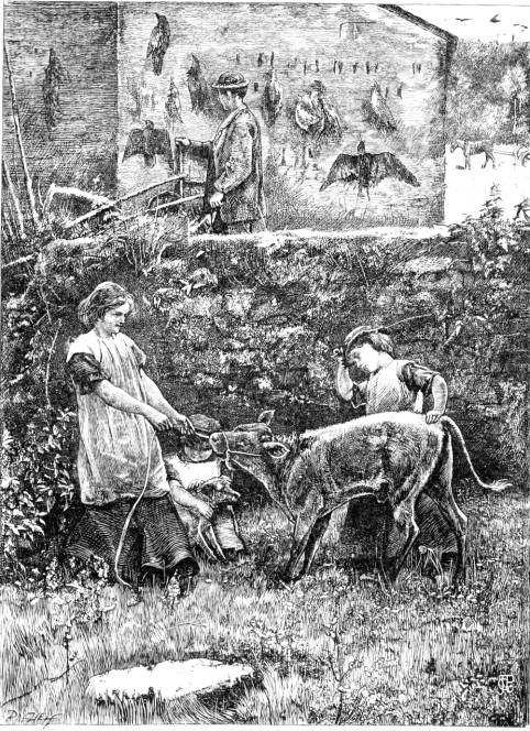
The Shadow. George Pinwell, artist. Wood engraving by the Dalziels. 1867. 6 1/2 x 5 inches.
Heavily influenced by Walker, Pinwell strikes a parallel note in his opening design for Wayside Posies(1867), an elaborate gift book containing traditional verse for Christmas consumption. In he illustrates an anonymous poem lamenting human ‘cruelitie’ (2), with a calf being led to slaughter and dead birds hanging on the wall. The representation documents rural life and its appearance on the first page is surely intended, as I have argued elsewhere, to affront the bourgeois readers who inspected the book on Christmas day. At the very time when middle-class consumers were enjoying festive plenty, Pinwell presents a vision of the hard facts of country living. More to the point, he visualizes his characters as children – an image intended to remind the comfortable classes that child labour, engaged in hard physical work, was typical of agricultural life.
This approach, facilitated by the editor Robert Buchanan, who placed the image, typifies Pinwell’s unconventional approach to hardship and working class poverty. This interest in the suffering of children develops as a theme throughout his work. Always unsentimental and psychologically penetrating, he focuses on the interrelated themes of work and its mental impact. Some of his most challenging designs appear in the Evangelical journals such as The Quiver and The Sunday Magazine, in each case making a strong visual appeal to readers’ sense of social responsibility.
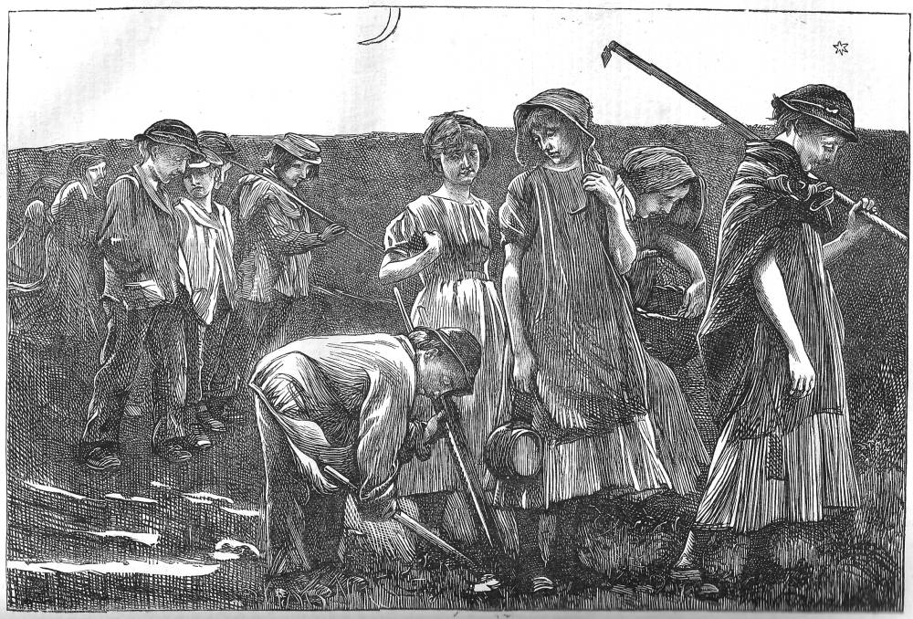
The Gang Children by George Pinwell. Wood engraving by the Dalziels, 5¼ x 7¾ inches. 1868.
Pinwell’s notion of underage suffering is painfully explored in The Gang Children (The Sunday Magazine, 1868), a complex image of exhausted juveniles returning from hard labour in the fields. Once again, he emphasises the journalistic: the children are equipped with a type of hoe used to extract turnips, with one of the boys leaning forward to pull up another root, and their dress is a factual representation of contemporary workers’ clothes. However, his primary focus is the characters’ utter exhaustion, both physical and mental. Stripped of their energy, the children shuffle through the scene; their facial expressions, drawn on pallid and prematurely aged faces, suggest grief as much as tiredness; and each is silent as they look vacantly at each other or withdraw into themselves. As Paul Goldman remarks, these are ‘introverted creations’ (119), members of a working community with no social interaction. Pinwell places them in a muddy field with a blank horizon, far from the English idyll, and their low mood is symbolized by the dark tones of their clothes, which mingle with the darkness of the setting; worn out, they are intimately linked to the blankness of the landscape. Pinwell adds a final, bitter note of commentary in the contrast between the naturalism of the characters and the simplified outlines of the moon and a star. These are signs of childhood perception, the imagery of the nursery, and assert the magic consciousness and imaginative freedom that children should enjoy; here, though, they are simply workers, forced into adulthood, and reduced to another unit of labour to be exploited for their employer’s benefit. This sort of sophisticated commentary is trenchant, creating a considerable impact within the pious pages of a Sunday magazine.
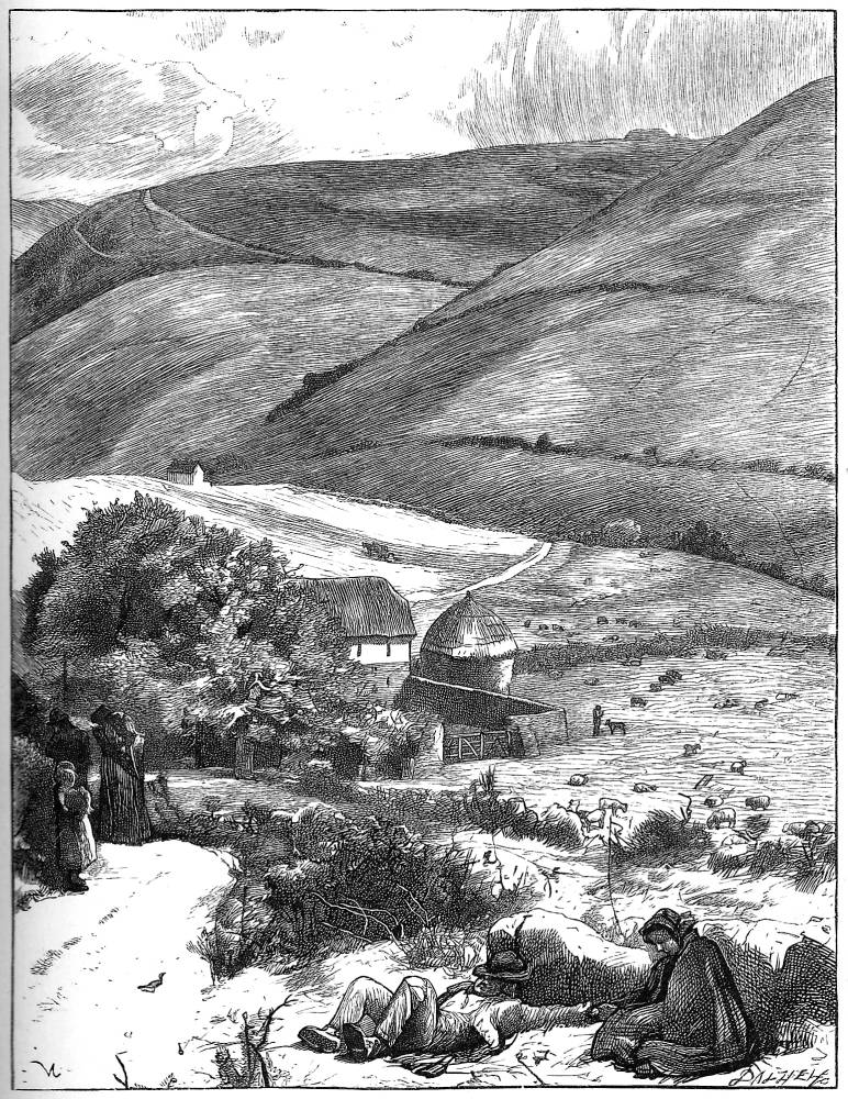
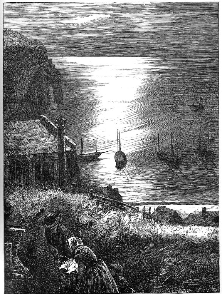
Left: Glen Oona. Right: On the shore. Both by J. W. North. 1867. Wood engraving by the Dalziels, 6½ x 5 inches.
J. W. North’s approach is more oblique. Though well-known for his radical politics, North’s visual critiques are subtle rather than explicit. His focus is not on the bodies of the poor, but on their relationship with the landscapes they work. Typically, his social commentaries are expressed in terms of a contrast between the beauties of the natural setting and the workers’ privations as they struggle to survive. Glen Oona, again from Wayside Posies, exemplifies his ironic approach. Nominally intended to illustrate a sentimental poem reflecting on the narrator’s love for the landscape, his image presents an idyllic version of the glen but includes two additions in the form of an exhausted man and women who have travelled from elsewhere to find employment in a period when an agricultural depression was creating vagrancy and unemployment. Positioned in the foreground, the figures undermine the lyrical beauty of the countryside, and point to disparity between the mentality of those who only have to appreciate the natural world, and those who have to work it. On the Shore likewise creates an unsettling juxtaposition of idealized sea and the hurried movement of some fisher-folk carrying a basket of fish, probably the small amount due to them from the catch; and in Spring the only character is reduced to an emblematic sign of humanity within a beautiful but indifferent landscape. North’s strategy is thus a matter of point and counterpoint: he celebrates the Romanticism of Constable and Wordsworth but subverts it with telling details of social privation. His emphasis on a conflicted reading makes his art uncomfortable, an assertion of the ubiquity of poverty in the heart of the most appealing of rural scenes.


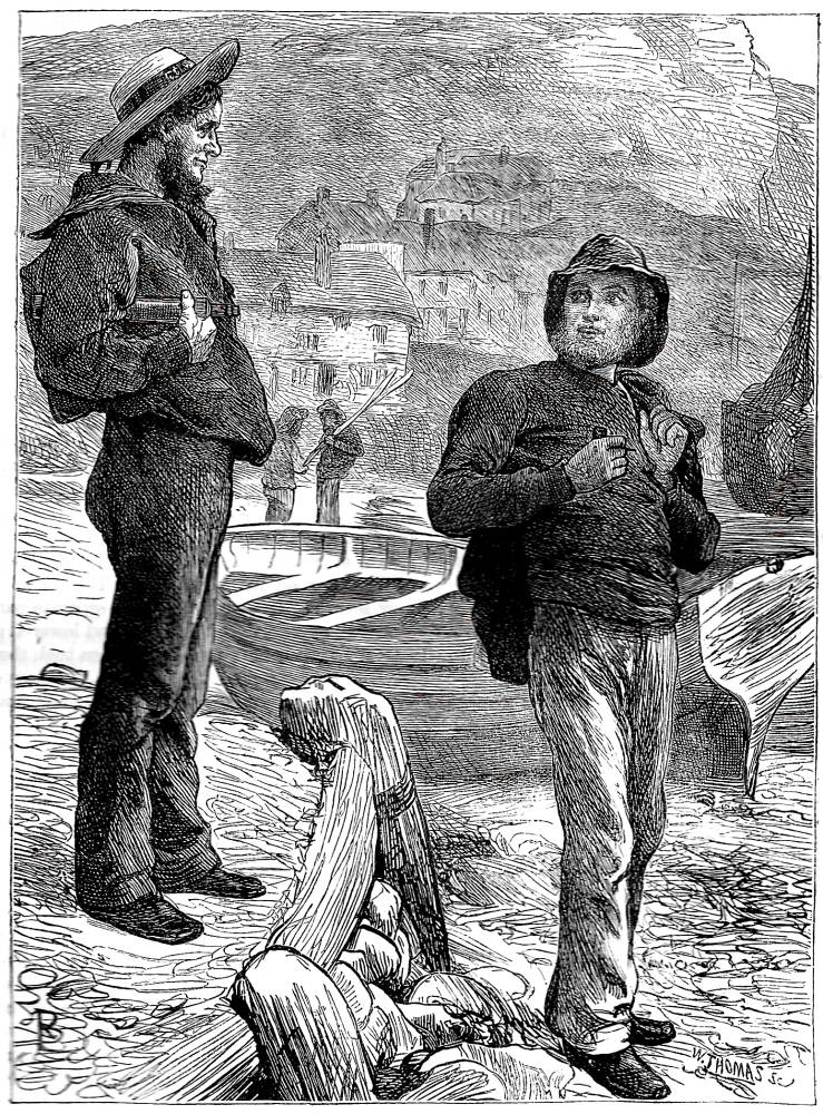
Three by Barnes: Left: Snow Track, or the Impressions We Leave Behind Us. 1869. Middle: The Pitman to his Wife. 1866. Right: ‘What, Bob, off again’? 1869.
Robert Barnes’s reading of poverty takes a contrary view, however. Of humble stock and brought up in straitened circumstances, Barnes stresses two aspects of the social problems of the poor. Some of his work is a sentimental promotion of the underclass as deserving of middle-class support; social change is never on the agenda, but charitable giving, he urges, is a necessity. Snow track, or the impressions we leave behind us (1869) exemplifies his conventional moral argument as a young man realizes his moral duty to help an elderly pauper. More typically, however, he validates the poor by making them seem respectable, as worthy recipients of support whose lives are barely differentiated from those of their social betters and whose attitude to their lot is sustained by stoical optimism, as in What Bob, off again? and The Pitman and his wife.
William Small, another artist of working-class origin, follows a parallel trajectory, sometimes focusing on the privations of the poor, but more typically upholding the dignity of labour as a sort of heroic ideal. Small repeatedly asserts the nobility of his rural workers, stressing their powerful physiques and emphasising their qualities as types of English masculinity. His characteristic formulation pictures a labouring man at work, a scene visualized with elegant directness in his showing of the hero of George Eliot’s Adam Bede (1869) and Jean Ingelow’s workman appearing in the Carpenter and Scholar (1867).
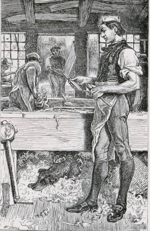

Two illustrations by Small: The frontispiece to Eliot’s Adam Bede (1880) and Carpenter and Scholar from Ingelow’s Poems (1867).
The artist stresses their muscular forearms and dynamic pose, a type probably derived from the upright figure of the young navvy in Ford Madox Brown’s celebration of physical labour in Work (1852, Manchester City art Gallery). Small’s designs emphasise this sort of uplifting activity, insisting on the workers’ capability rather than their dependence. Indeed, in his illustrations we arrive at a new idea of the lower orders, one that is markedly different from the degradations of the 1840s. Small’s figures are the embodiment of the worker as artisan rather than beggar, and he makes his appeal not by asking for the reader’s pity but for their respect. This is a new way of approaching the relationship between classes, and it is developed elsewhere, in illustrations by Barnes and John Gilbert, in The British Workman, The Quiver and The Sunday Magazine.
Social Commentary and Victorian Illustration: The Representation of Working Class Life, 1837–1880
- Introduction: The People of the Abyss
- The Life of the Streets and Punch
- Dickens, Illustrating Poverty, and the Interconnectedness of Rich and Poor
- Gustave Doré, The Graphic, and Social Realism of the Seventies and Eighties
- Bibliography: Works Cited
- Bibliography: Suggested Secondary Materials
Created 20 April 2019