Photographs and text by Jacqueline Banerjee [You may use these images without prior permission for any scholarly or educational purpose as long as you (1) credit the photographer and (2) link your document to this URL or cite it in a print one.]
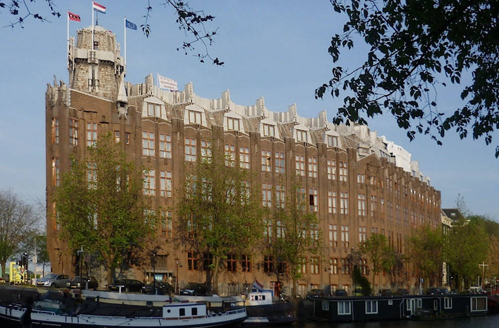
The former Shipping House [Scheepvaarthuis], by J. M. van der Mey (1878-1949) and others: Van der Mey designed the exterior with M. de Klerk (1884-1923) and P. L. Kremer (1881-1961), while the Van Gendt brothers were responsible for the concrete structure and construction.. The commission was given in 1912, and the building was constructed 1913-16. Prince Hendrikkade, Amsterdam.
This remarkable building was built for a consortium of the six shipping companies of the Netherlands. It stands in a prominent position close to the the harbour, looking as though it might itself set sail at any minute. Even from a distance its bold silhouette and height give it almost as much presence as P. H. L. Cyupers' nearby Central Station, and indeed it makes a similar statement about Amsterdam's past and present status. In fact, the station preceded it by not much more than twenty years, and there is a clear line of descent: Van der Mey had trained in Cyupers' nephew's office, where he also worked with de Klerk and Kramer, while the Van Gendt brothers were the sons of A. L. van Gendt, who worked with Cyupers himself on the Central Station: John Godart van Gendt (1866-1925) and Adolf Daniël van Gendt (1870-1932).
But the Shipping House also announces a new era of architectural and artistic collaboration. Standing further along the line from Ruskin to Le Corbusier (as suggested, for example, by Maristella Casciato, 7), it shows how commitment to architectural integrity, and wholeness of approach, could produce not only a functional building but a highly distinctive monument to the contemporary ethos. It is considered the first work of the Amsterdam School, the distinctive Dutch movement of this time that (rather like the work of Charles Rennie Mackintosh in Glasgow) incorporated elements of Arts and Crafts and Art Nouveau into a form of Expressionism.
Exterior
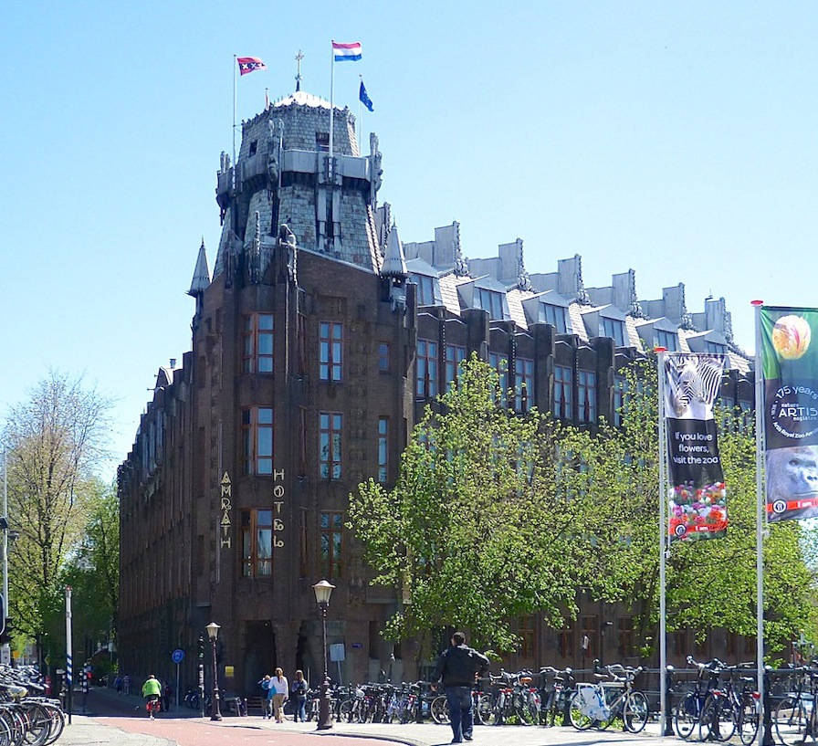
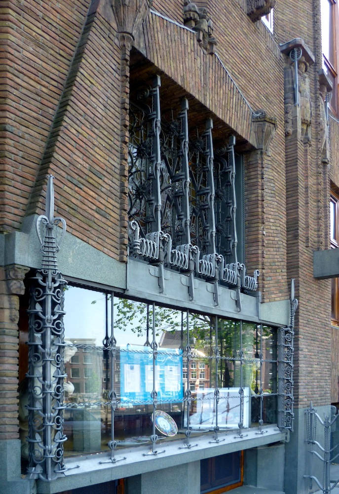
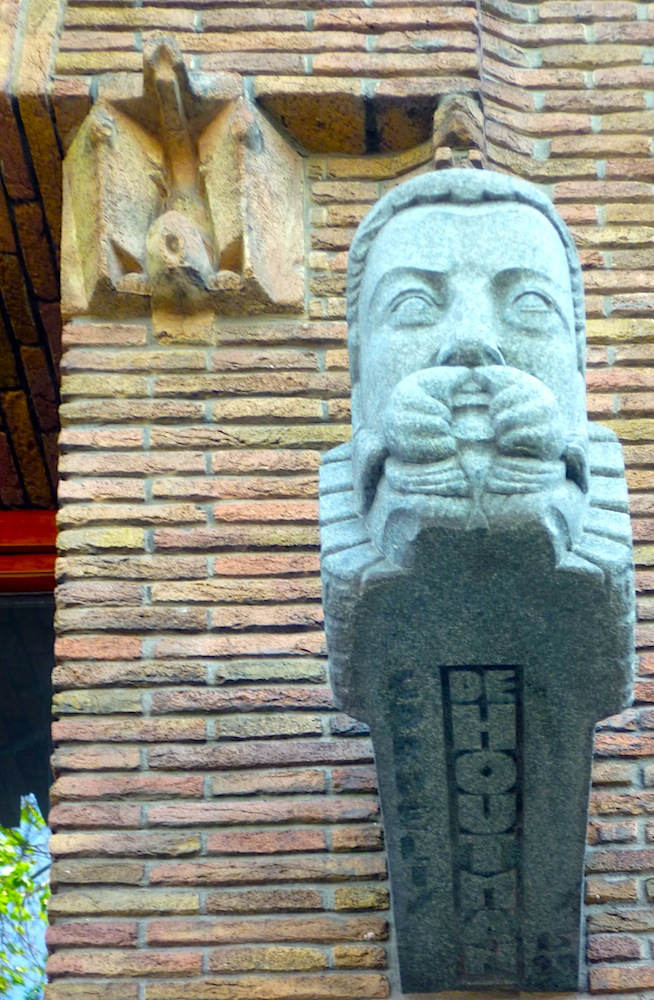
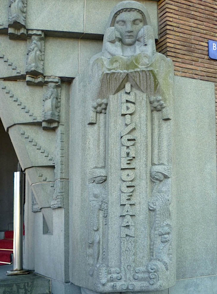
Left to right: (a) The corner, where the main entrance is. (b) Ironwork on the façade. (c) Sculpture of Cornelis de Houtman on the façade. (d) Representation of the Indian Ocean on the right side of the entrance.
A corner plot like this could be turned to dramatic advantage (see for example the Felix Pontin building in Paris of 1904). There was once a plan to make the tower 60 metres tall (see "From Shipping House"), but an impression of height was achieved even with a more modest tower: "The decoration at the fantastically sculpted entrance gives the corner a strong vertical thrust" (Groenendijk and Vollard 259). The sculptural work on the building was by H. A. van den Eijinde (1869-1939), H. l. Krop (1884-1970) and W. C. Brouwer (1879-1933). and the interior by T. Nieuwenhuis (1886-1944) and C. A. Lion Cachet (1864-1945).
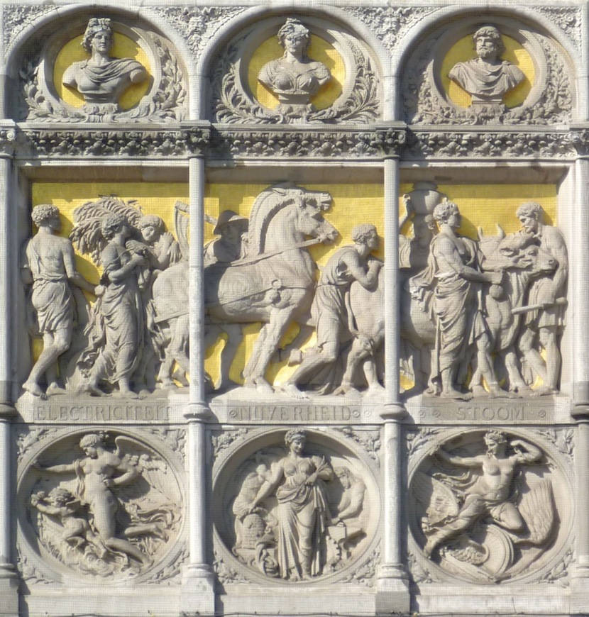
Compare the use of representational sculpture with text at the Shipping House with this earlier sculptured panel on the façade of the Central Station, which has "Electricity, Industry, Steam" written on it in Dutch. The influence, and the change in style of representation, are both obvious.
The Shipping House's façade is richly and curiously embellished in various ways, both symbolic and literal, and in a variety of materials. As one commentator says, Van der Mey has "brought its mass to life with an explosion of detail in wood, sculpture, brick, iron and glass" (Van Dijk 19). Everything is meaningful. For example, the twenty-nine sculptured faces protruding round the walls commemorate important figures in the history of Dutch shipping: shown above is the explorer De Houtman, who pioneered the spice trade in the sixteenth century. At the entrance, all four great oceans are represented, rising as pillars to reinforce the verticality here. Besides that, the oceans look meek and serene, and suggest the openness of the world to Dutch shipping (see also Wintle 74).
Entrance
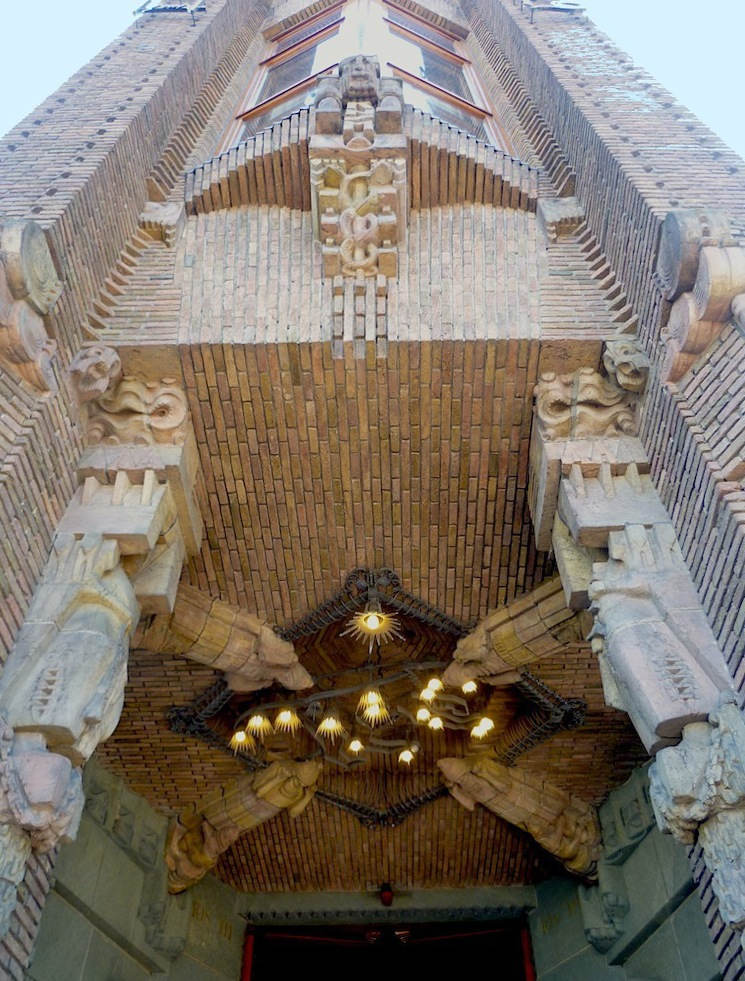
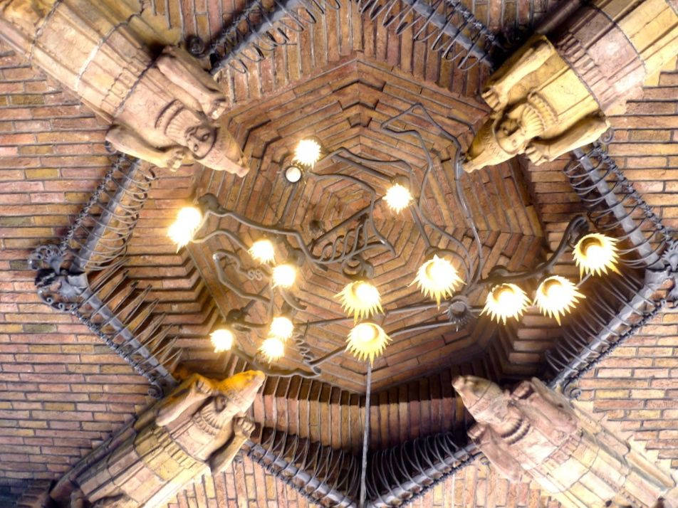
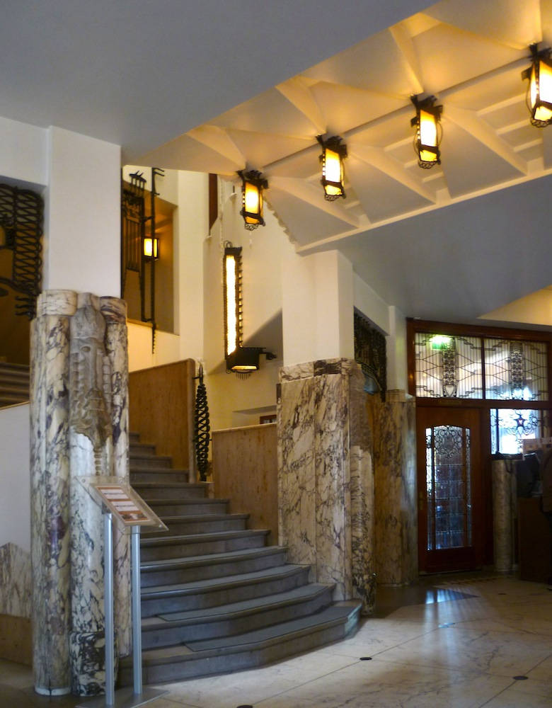
Left to right: (a) The main entrance, replete with symbolism related to shipping. (b) The sculptured ceiling above the entrance, with figures representing perhaps the four points of the compass, and a light fitment based on an uncoiled ship's rope (c) The lobby area.
The sculptural work on the building was by H. A. van den Eijinde (1869-1939), H. l. Krop (1884-1970) and W. C. Brouwer (1879-1933), and the interior by T. Nieuwenhuis (1886-1944) and C. A. Lion Cachet (1864-1945). At the top of the steps, below its fantastic ceiling, the lobby is entered through a revolving door decorated with Neptune's forks, and revolving underfoot on a mosaic compass. Inside, everything was to be "a practical, modern and functional ... and at the same time point back to the prosperous shipping tradition of the Netherlands" ("From Shipping House"). The lobby area, with its rich carved marble, original ironwork and off-centre stairs beneath diamond-patterned ceiling rises, balances functionality with a sense of progress as well as tradition. Despite the different designers involved at the Shipping House, and the variety of materials and elements here, there is a great sense of harmony. It is not difficult to see how the building can be associated with both the Arts and Crafts movement and Expressionism.
Interior
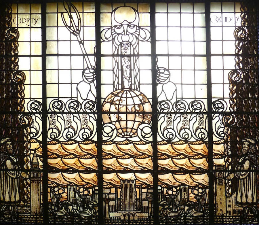
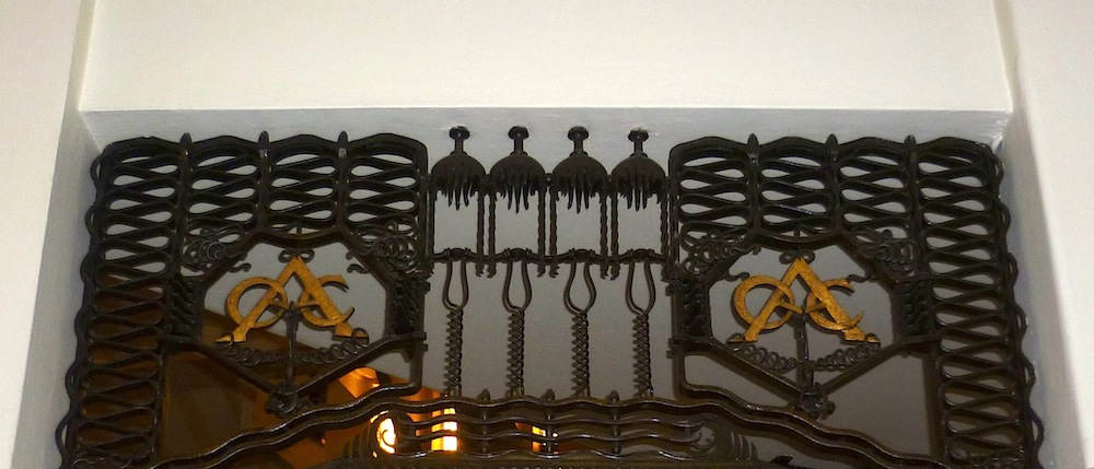
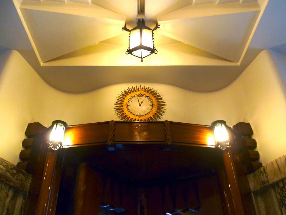
Left to right: (a) A window in the lobby. (b) Ironwork over a doorway or corridor, with the initials of one of the shipping companies. (c) A typically spiky light fitment and sun-ray clock above an elevator door.
The stained glass was by by Willem Bogtman (1882-1955), who recieved the commission in 1915 (Casciato 229-30). Windows on each side of the lobby show Poseidon and Hermes (as god of trade) presiding over the globe. In the window shown above, trading ships ply between merchants under layers of seahorses and waves. A campanile indicates trade with Venice.
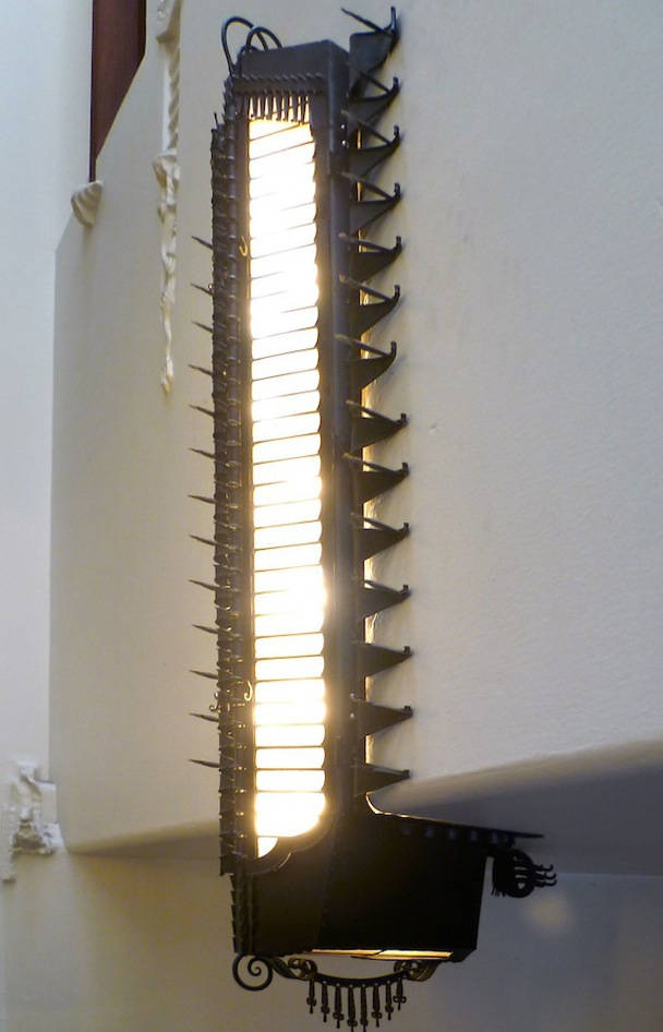
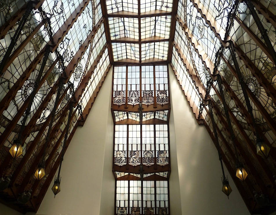
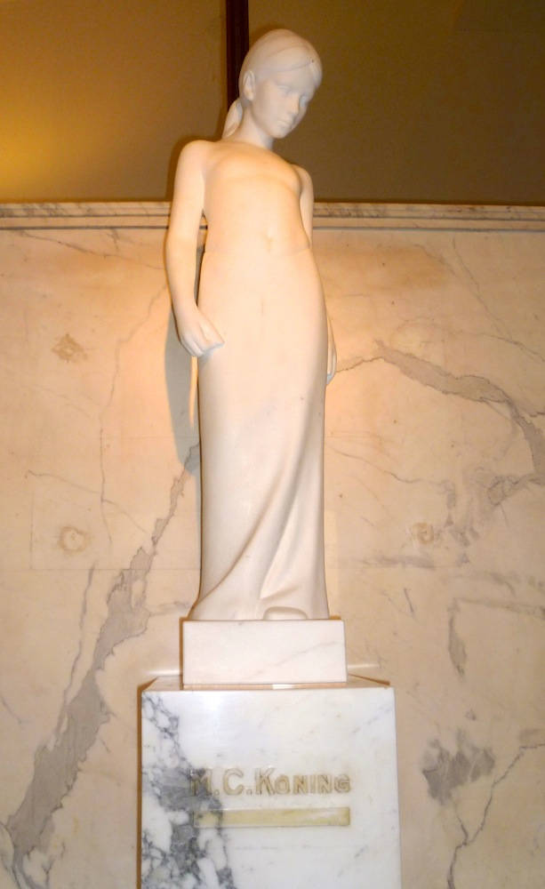
Left to right: (a) Another type of light fitment. (b) View on the top landing of the stairwell. (c) A free-standing sculpture on an upper floor.
In its planes, sheer expanse, and details, the design of the stained glass at the top of stairwell is extraordinarily effective: "The building's crowning achievement spatially is its geometrically ornamented central well" (Groenendijk and Vollard 259). It is 106 square meters in diameter: "The designer used the globes and the symbols surrounding the globes as an indicator of the fact that one could encounter a Dutch ship during all seasons and throughout the entire world" ("From Shipping House"). The building became a national monument in 1972. The latest stage in its history was its conversion to the luxurious Grand Hotel Amrath in 2005-7.
References
Casciato, Maristella. The Amsterdam School. Rotterdam: 010 Publishers, 2013. Google Books, full view. Web. 12 August 2013.
"From Shipping House to Five Star Deluxe Hotel." Information sheets from the Grand Hotel Amrath. Print.
Groenendijk, Paul, and Piet Vollard. Architectural Guide to the Netherlands: 1900-2000. Rotterdam: 010 Publishers, 2006. Google Books, full view. Web. 12 August 2013.
Van Dijk, Hans. Introduction. Architectural Guide to the Netherlands: 1900-2000. By Paul Groenendijk and Piet Vollard. Rotterdam: 010 Publishers, 2006. 8-54. Google Books, full view. Web. 12 August 2013.
Wintle, Michael. "Visualizing Commerce and Empire: Decorating the Built Environment." In Imagining Global Amsterdam: History, Culture, and Geography in a World City, ed. Marco de Waard. Amsterdam: Amsterdam University Press, 2012. 67-82. Google Books, full view. Web. 12 August 2013.
Last modified 12 August 2013
