
Herbert Granville Fell (1872–1951) designed a variety of book covers for children and adults. Some were luxury editions using the ‘vellucent’ technique pioneered by the binder Cedric Chivers, and others were divided between trade covers in cloth for the upper and lower end of the market. It was usually the case that Fell designed the book as a whole, so creating unities between the bindings and the illustrations.
Fell’s bindings are characterized, like his illustrations, by their eclecticism. Drawing freely on the intermingled idioms of the Nineties, he designed some of his liveries in the style of Art Nouveau and some in the manner of Arts and Crafts. In both cases he links his imagery to the second-stage Pre-Raphaelitism of Dante Rossetti and Edward Burne-Jones, synthesizing all of these tendencies to create a complicated effect which oscillates between the decorative and figurative; he also moves seamlessly between the traditional pattern-making of mass-imprints embellished in gilt-stamping and black line, and the exotic colours of his books for Chivers.
Bindings for the Trade: Some Successes, and a Failure
In his casings in the style of Art Nouveau, Fell deploys a sophisticated interplay of sinuous lines and organic motifs. One of his most imposing designs is the front cover for Herrick’s Lyrical Poems (1895), which was issued in two formats – one mounted on vellum for the elite market, and one for the trade. In this small book Fell manipulates the most characteristic features of Nouveau: the border is made is made up of a muscular, arterial stem that frames the central panel, and a secondary stem is placed in an entwining pattern with heart-shaped leaves that emanate dynamically against a ground of gilt pellets. Fell continues the same pattern on the spine, and both domains (front cover and back-strip) are designed to foreground the simple enclosure surrounding the title. The effect is one of preciousness, as if the book were an elegant container of treasure which acts as a visual preparation for the sweet lyricism of Herrick’s verse.
Equally sophisticated are Fell’s covers for The Book of Job (1896) and The Song of Solomon (1897). For both books the artist again emphasises the notion of resplendence in the form of elaborate gilt patterns. For The Book of Job, he offers an intricate interlace, and in The Song he displays exultant female figures who sing to the viewer with their hands upraised in joyous celebration. Nouveau arabesques are used to animate the surface and act, along with the floral patterns, to suggest an elevated tone.
The Song of Solomon more generally asserts the artist’s focus on figures. Most of his bindings include idealized personae of both gender, recreating the imagery of his illustrations and in strict continuity with his books’ contents. The bold front cover of Wagner’s Heroes (1899) is an idealized hero, and other, parallel characters appear in his designs for Ali Baba and the Forty Thieves and Fairy Gifts (1895), both of which appear in the Banbury Cross series.
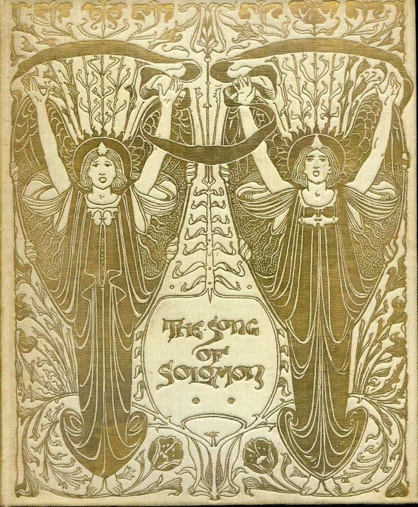

Two cloth gilt bindings by Fell: Left: The Song of Solomon; and Right: Wagner’s Heroes.
These are very personal utterances, and in most cases, the artist was free to create whatever he wanted because he was serving classic texts, with no writer to collaborate with or please. He was also given freedom of interpretation when he worked with a living contemporary, W. B. Yeats. Fell designed a cloth binding for Yeats’s Poems (1895), for which he drew another heroic figure. It is best described by Warwick Gould, who explains how Fell composed a motif encompassing a ‘an aureoled, winged and helmeted angel, presumably St Michael (mentioned in the poem ‘The Countess Cathleen’) vanquishing a serpent, all enclosed within a celestial harp-shaped border of thorned roses’ (‘Yeats and His Books’).
This binding is strictly in accordance with Fell’s usual imagery, but what makes it stand out is the author’s response to it. Although Fell’s covers were positively reviewed by contemporary commentators, Yeats took exception to his work for the Poems: Gould notes how he regarded the angel as ‘expressionless’ (‘Yeats’) and Karen Brown has commented on the poet’s disdain for what he saw as its ‘facile meaninglessness’ (85). Gould goes even further, adding his own judgement that the design is ‘banal’, an example of ‘debased Pre-Raphaelitism’(‘Yeats’). Fell was unused to such censure, and his reaction is unrecorded. However, Yeats and his publisher quickly replaced what they regarded as an unsuccessful cover with a new, more heavily symbolic one in the form of the elaborate piece by Althea Gyles (1897), which was thereafter regarded as a more appropriate response.


Two contrasting bindings for Yeats’s verse: Left: Fell’s design for Poems; and Right: Althea Gyles’s treatment of the same book.
It is of course debatable if Gyles’s design is superior to Fell’s, although it is certainly the case that whereas Fell adopts a generic symbolism, Gyles’s work is arcane and links more obviously to Yeats’s esoteric verse. Granville Fell’s failure to satisfy an author is nevertheless an interesting example of how the imagery of binding, like the imagery of illustration, may occasionally be viewed as a mismatch with the text.
Fell and ‘Vellucent’ Binding
Fell projected his characteristic mix of styles and motifs in his work for the ‘vellucent’ bindings developed from an eighteen century model by Cedric Chivers, for whom he was initially the chief designer and adviser (Prideaux 33). The Song of Songs is a luxurious re-issue of The Song of Solomon, and reproduces its cover design in brilliant colour rather than gilt. He also produced a number of books – probably around 10 – in the same idiom for Chivers’s series of elite publications. What differentiates them from other work, of course, is their elaborate colouring, which was produced by using transparent vellum laid over painted compositions. Fell, an able writer, describes how these books were made in a detailed article in The Studio. ‘The designs’, he explains,
were first painted or drawn in colours with a full palette or as subdued a richness of colouring as the artist chose to employ. Various iridescent materials and precious metals, pared to the thinness of paper and even leaf gold … were often introduced to enhance the richness of the scheme; mother-o-pearl, shell, beetles’ wings … were utilized in the carrying out of the design. The transparent vellum was then laid upon the surface of the painting and the two pressed together until they became disseverable … [The] design, however beautiful and precious is permanently secured from dirt and damp is one of the strongest materials ever used for the binding of a book. [‘A New Method’, 173]
Fell gives a clear sense of how the process worked, which was a refinement of a technique used in the eighteenth century. The end result, in all of his books for Chivers, is overpoweringly colourful and luxurious. As the artist continues, vellucent bindings give the binding designer the opportunity to manipulate ‘the whole field of colour, of gold and iridescence …’, should he elect to work in this medium. His sensuous descriptions suggest how much he relished the chance to create elite bindings that involved a high level of artistry and craftsmanship, with only a very limited number of such books being published at a relatively high cost of around £5.

Left: A ‘vellucent’ binding by Fell, for The Song of Songs.
Fell is slightly disingenuous, however, in seeming to imply that he was the sole author of the books and their effects: for although the editions were extremely small, ranging between 30 (for The Song of Songs) and 105 (Hood’s Serious Poems), he did not paint every binding individually. Rather, he provided a design that was then passed to a team of female copyists, principally Dorothy Carelton Smyth, who applied his colour schemes to the books’ paper and card bindings in preparation for the application of transparent vellum. Fell was in this sense the originator of the visual material, but it was realized, made into an artefact, by the skilled hands of craftswomen. Chivers also employed about 40 female artisans at his premises in Bath whose jobs included cutting, folding and preparing the high quality (typically Japanese) paper, collating the pages, and sewing the books together (Tidcombe 40).

Another example of a binding by Fell for Shelley’s Poems.
In short, Fell’s late Victorian designs for Chivers assert authorship insofar as they are embellished with hand-painted images by a well-known artist, but, like all book bindings, are ultimately a collaborative effort; Fell was essentially an Art Nouveau artist, but he engaged with a return to ‘honest’ craftsmanship that is more redolent of the technical team-work of Arts and Crafts than the suave individuality of the New Style. In so doing, Fell set high standards that were carried forward by other contributors to Chivers’s library of luxurious imprints, many of which were published with graphic work by illustrators such as Thomas Brock and bindings by Alice Shepherd and S. Poole. He remained Chivers’s ‘technical adviser’ (Prideaux 33) even when he was not working on a project for himself, and vellucent binding as a whole was heavily influenced by his guiding presence.
Such books are today extremely rare and command high prices. Few were published and even fewer have survived, a situation exacerbated by the fact that although Fell and Chivers claimed the bindings to be durable, the shrinkage of the vellum has meant that many copies are distorted out of shape. Complex in terms of their imagery and production, in part personal utterance and in part hand-crafted treasure, these elaborate books are among the curiosities of Victorian book design.
Link to related material
Bibliography of Books with Bindings (and illustrations) by Fell
Trade Bindings in Cloth Gilt
The Art Bible. London: Newnes, 1901.
The Book of Job. London: Dent, 1896.
Fairy Gifts: and Tom Hickathrift. London: Dent, 1895 (Banbury Cross Series).
[Herodotus]. Wonder Stories from Herodotus. New York: Harper, 1900.
The History of Ali Baba. London: Dent, 1895 ( Banbury Cross Series).
The History of Cinderella. London: Dent, 1895 ( Banbury Cross Series).
Maud, Constance. Wagner’s Heroes. London: Edward Arnold, 1900.
Nesbit, E. The Book of Dragons. New York: Harper, 1901.
The Song of Solomon. London: Chapman & Hall, 1897.
Wicksteed, P. H. Our Lady's Tumbler. London: Dent, 1896.
A Wonder Book. London: Dent, 1903.
Yeats, W. B. Poems. London: T. Fisher Unwin, 1895.
Vellucent Bindings by Fell, a Select List
The Book of Common Prayer. London: Newnes [1901].
de La Tour Landry, Geoffrey. The Booke of Thenseygnementes and Techynge that the Knyght of the Towre made to his Doughters. London: Newnes, 1902.
Hood, Thomas. Serious Poems. London: Newnes, 1901.
Lefèvre, Raoul. The Recuyell of the Historyes of Troye. 2 Vols. London: The Kelmscott Press [circa 1898].
Shelley, P. B. Poems. London: George Bell, 1902.
The Rubaiyat of Omar Khayyam. London: Macmillan, 1899.
The Song of Songs. London: Chapman & Hall, 1897.
Troye. London: The Kelmscott Press, [1898].
Other Primary Material
Fell, Herbert Granville. ‘A New Method of Decoration for Bound Books – the “Vellucent” Process.”’ The Studio 29 (1903): 169–176.
Secondary material
Brown, Karen E. The Yeats Circle, Verbal and Visual Relations in Ireland. Farnham: Ashgate, 2011.
Gould, Warwick. ‘Yeats and His Books.’Yeats Annual: A Special Number, Essays in Honour of Eamonn Cantwell. Ed. Warwick Gould, 20 (2016) [online edition].
Prideaux, S. T. Modern Bookbindings. London: Constable, 1906.
Tidcombe, Marianne. Women Bookbinders 1880 –1920. London: The British Library, 1996.
Created 10 December 2021