[The illuminated “F” is based on one of the drawings Thackeray created for Vanity Fair.— George P. Landow]
Introduction


irst published in twenty serial parts from January 1847 to July 1848, when it was issued in bright yellow wrappers to challenge the light blue of Dickens’s novels, selling in large numbers, quickly reprinted, praised by the critics and received by its middle-class audience as a shocking piece of satire, Vanity Fair is regarded as Thackeray’s greatest novel. It is also his most perfect synthesis of image and word, in which the text and illustrations are presented as parts of an intricate whole containing 40 full-page etchings, 77 wood-engraved vignettes and 67 initials. Taken as a whole these varieties of illustration interact with the written text to produce a visual and verbal hybrid of unusual richness and complexity; uniquely placed as the author and artist, Thackeray creates a synthetic work which can only be read by deploying an interdisciplinary approach. Its intricacies have been the subject of detailed investigation by generations of critics, although it is unusual for all of the cuts to be considered as an homogenous scheme.
The roles assigned to these images are various. To some extent, they act as a paratext, repeating and reinforcing the information inscribed in the letterpress. One of the Thackeray’s prime motifs is the looking-glass, and many of the images mirror the words. As in the illustrated novels of Dickens, we read a description of a character or scene and test its validity, as it were, by glancing at the accompanying designs. However, this approach is only a part of Thackeray’s approach; more characteristically, he focuses on the idea of visual mismatch, creating a dissonance in which the engravings challenge, extend, interrogate and sometimes contradict the written information. This is the strategy deployed in his Christmas books, and it is used in Vanity Fair to generate a series of ironies. The mirrors, in other words, are often cracked and distorted, creating a refracted or shattered view of the verbal text. The illustrated title-page shows a clown gazing in a broken glass, and this image is emblematic of the relationship between the two sets of signs.
The effect is sometimes one of ironic gainsaying that we find in his festive entertainments: we read a straight-faced account, and we are confronted with another, less complimentary version of the same material. In the words of Judith Fisher, Thackeray empowers his interpreters to engage in a ‘process of reading and seeing that compels readers to endlessly revise what they what read and seen’ (p.72). The disjuncture is most obviously embodied in Thackeray’s endless punishing of his anti-heroine; Becky is uniformly described as a beauty, but is always shown in the full-page etchings and smaller designs as either unappealing or downright ugly, a strategy applied to greatest effect in her meetings with lovers and admirers such as Pitt (Vanity Fair, p.128). This visual sarcasm points to the delusory effects of vanity and the ways in which sight itself can be manipulated by those who operate within the moral register of deception and self-regard; the characters are (sporadically) deceived by each others’ antics, but the process of dramatic irony empowers the reader/viewer to see the reality of the situation from outside the text, as a grotesque illusion.


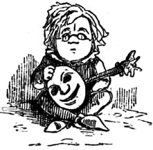
This technique is Vanity Fair’sprime means of interrogating Thackeray’s social theme, and is often noted by commentators. In a famous and oft-reprinted end-piece Thackeray shows himself as a jester having just removed a mask, to reveal his own, bewildered face looking directly at the viewer: a visual metaphor for his capacity to strip away deception and show the truth that lies behind (p.78). De-masking is not limited to visual disjuncture, however. Within his three types of illustration – full-page plate, initial letter and vignette inserted into the text – Thackeray develops a wider range of possibilities that go well beyond sarcasm and allow him to approach his characters and themes from diverse perspectives. Critics have mainly focused on his initial letters, but Vanity Fair’s full effects, as a withering critique of its life and times, can only be explained by considering in detail the roles ascribed to each type of design, their placement within the dense letterpress, and the inter-pictorial relationships between them.
Related material
- William Makepeace Thackeray and Book Illustration
- Style and Purpose
- Thackeray's Christmas Books
- Thackeray’s Illustrations for Vanity Fair — the full-page engravings
Works Cited
Fisher, Judith. ‘Image versus Text in the Illustrated Novels of William Makepeace Thackeray.’ Victorian Literature and the Victorian Visual Imagination. Eds. Carol T. Christ and John O. Jordan. Berkeley: University of California Press, 1995. pp. 60–87.
Thackeray, W. M. Vanity Fair.London: Bradbury & Evans, 1849 [this is a reprint of the first edition, retaining the same pagination].
Created 20 January 2014