
[Thackeray created the illuminated “T” for Vanity Fair.]
he interactions of image and word in Dickens’s Christmas books have been the subject of wide-ranging scholarship. Much less attention has been directed at Thackeray’s amusements for the festive season, which are usually viewed as satirical picture books in the manner of albums such as George Cruikshank’s Comic Almanack (1835–53). Thackeray contributed a number of pieces for this work, and his humour is reminiscent of Cruikshank’s; however, his Christmas books are far more tightly structured than the Almanack or any of George’s publications. In Mrs Perkins’s Ball, The Rose and the Ring and The Kickleburys on the Rhine (1847–55), Thackeray manipulates the relationship between the words and the illustrations as a means to expand his analysis of contemporary society, taking it far beyond the ironies inscribed in the written text.
Irony is of course a calculated mismatch in which one type of information is revealed to be untrue or risible by comparing it with another, by deploying an ill-fitting tone, or by incongruously voicing a body of ideas in an inappropriate way. These types of mismatch lie at the heart of Thackeray’s dual art, and to achieve an ironic effect he schematically exploits a clash between the written information and the information contained in the illustrations. The letterpress articulates one version of reality, while the illustrations are positioned in counterpoint. The truth of the situation is revealed by the contrast between them: the grand is juxtaposed with the pathetic, the impressive with the pitiful, the portentous with plain facts. Illusion appears in the letterpress, bald reality in the designs. The interactions of word and image are thus conceptualized as versions of the mock-heroic, exposing the falsity of modern life in a process which creates an overwhelming sense of bathos and empowers us to see through the layers of pretence and conventionality.
This strategy is employed to droll effect in The Rose and the Ring. Though nominally a children’s book, Thackeray’s fantasy is child-like rather than childish, and in navigating this important distinction he invokes the example of Gulliver’s Travels. The running joke presented here is embodied in the contrast between the heroic pretensions of the mock-royalty of Paflagonia and the inane comic-book imagery enshrined in the illustrations. The mismatch is established in the opening design. The King, we are told, is ‘So absorbed in the perusal of the King of Crim Tartary’s letter that he allows his eggs to get cold, and leaves his august muffins untasted’ (p.1). This comic description of the Royal breakfast is Swiftian in its mock-heroic juxtaposition of the affairs of state and domestic trivia, but the illustration takes the effect much further. The detail of allowing the eggs to get cold is humorously multiplied: we might expect the King to be eating no more than two, but his table is crowded with twelve of them, arranged in a tiny cluster like toys. The grandeur of the moment, inscribed in the elevated vocabulary, is immediately deflated by the illustration’s comedic hyperbole.
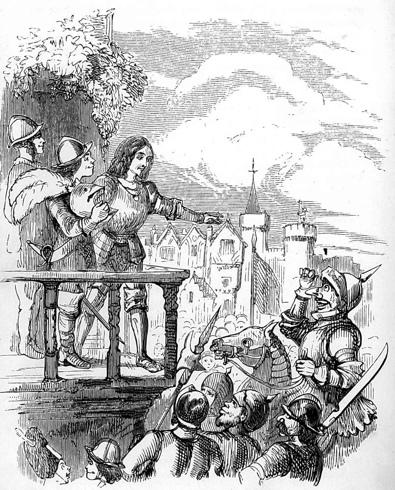
Prince Giglio’s Speech to the Army
The difference between the writing and the accompanying design is similarly developed in the texts depicting ‘Prince Giglio’s Speech to the Army’. This ‘was all in blank verse … it lasted three days and three nights … during which not a single person who heard him was tired’ (p.95). Not tired, perhaps, but certainly bored; far from engaged in adoration of their leader, the figures in the illustration look listlessly around, laugh, look at him in incredulity, and engage in private conversations. This is the truth of the situation which shows the Prince’s droning voice is far from inspiring; no-one wants to hear him. By glancing from text to illustration we are invited to assess, to watch his heroism collapse into absurdity.
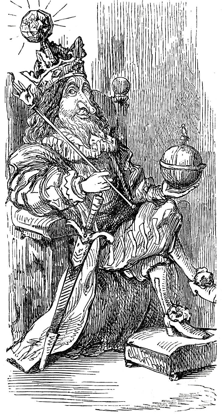
Thackeray also depicts the difference between appearance as a register of social importance and its realities. The royals are described in mock respect which is instantly contrasted with caricature portraits, and as before Thackeray playfully invites us to make the comparison. Countess Gruffanuff is presented as a ‘haughty’ ‘person of the highest birth’, and we are asked to consider ‘would you not fancy, from this picture’ that she is of high status (p.9). What we have, though, is a hideous cartoon which shows her as anything but dignified. The King and Queen are likewise described as ‘pleasing’ and uplifted by ‘grandeur’ (pp. 6–7), but pictured as caricatures.


Left to right: (a) The Queen. (b) The King. (c) The Royal Family at Breakfast [Click on these images for larger pictures.]
Humour is thus generated in the disparities between two sets of competing signs which articulate the tensions between the elevated and the mundane. This is essentially the technique deployed in Punch, and closely reflects Thackeray’s contributions to the magazine in the early 1840s. We should also remember that The Rose and the Ring is a children’s book, to be read in the nursery or the bedroom, and we can imagine the laughter generated by asking small children to reflect on the difference between what is written and what is shown.
Thackeray’s approach is heavily influenced by the example of Cruikshank, and (as noted above) there are many parallels between Thackeray’s designs and those of the older artist. In his celebrated essay on Cruikshank, Thackeray notes the illustrator’s ability to make the reader/viewer laugh ‘outright’’ (p.7) at his ‘admixture of the grotesque and the wonderful’ (p.10), and in his own art we have a similar laughing at the effects of comic mismatch. What he always achieves is ‘true insight’ (p.36), stripping away pretension by its ironic placement next to ‘homely’ truths (p.40).
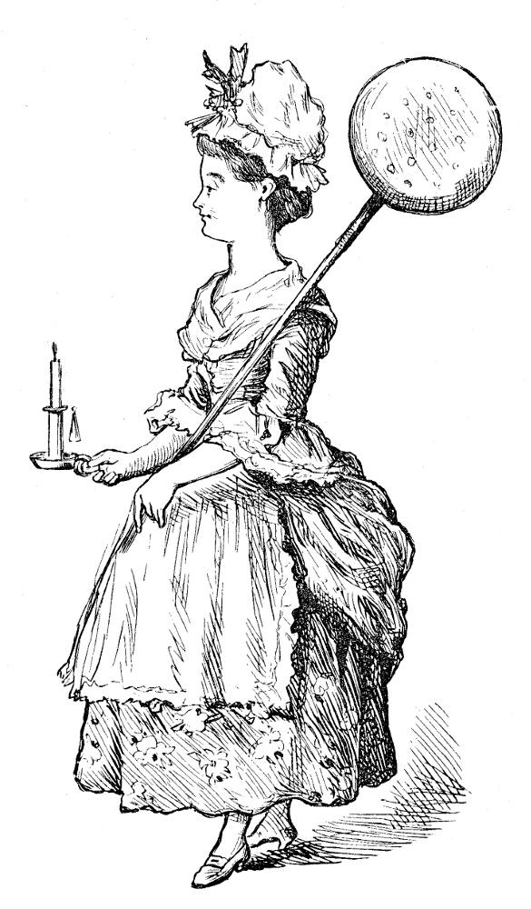
In The Kickleburys and Mrs Perkins’s Ball this technique is given another twist. These books are very unlike Dickens’s Christmas tales, which are didactic in effect. Thackeray’s, by contrast, are sharp insights into the vanities of social behaviour, while providing no moral alternatives. The linkage between text and image in these books is far from stable; some information is inscribed in both, but it is typically the case that the ironies are magnified through a process of contradiction and/or addition.
Left to right: (a) The Interior of Hades. (b) The Water Cure. (c) The German Peasant Maiden [Click on these images for larger pictures.]
In The Kickleburys on the Rhine (1850) Thackeray satirizes the behaviour of the British abroad by pursuing a series of contrasts. This is sometimes a matter of presenting alternatives in the manner of The Rose and the Ring, but also depends on a more complex synergy. His technique is exemplified by the illustration, More Wind than Pleasant. The image nominally shows the Millikens being ‘ill together on deck’ (p.20). The pallid faces and unstable planes cleverly suggest the impending sea-sickness and buttress the description of their suffering. However, the illustration’s prime function is point to the pretentions of the following passage in which the pompous narrator eulogizes about love, ‘images of beauty’ and the ‘boundless azure’ (p.21) of the night sky. These words immediately follow the vertiginous scene showing the bilious couple, so that we read this romantic hyperbole with the after-image of their illness still in our minds. The satirical effect is clear: romance is contaminated with gross reality, framing the ideal in an image of the young pair as they contain their need to vomit. This false prolepsis acts to unsettle the reader/viewer and works, once again, to make a sharp, and very amusing, point about vague speculations about love. It is enough, Thackeray implies, to make us want to throw up.
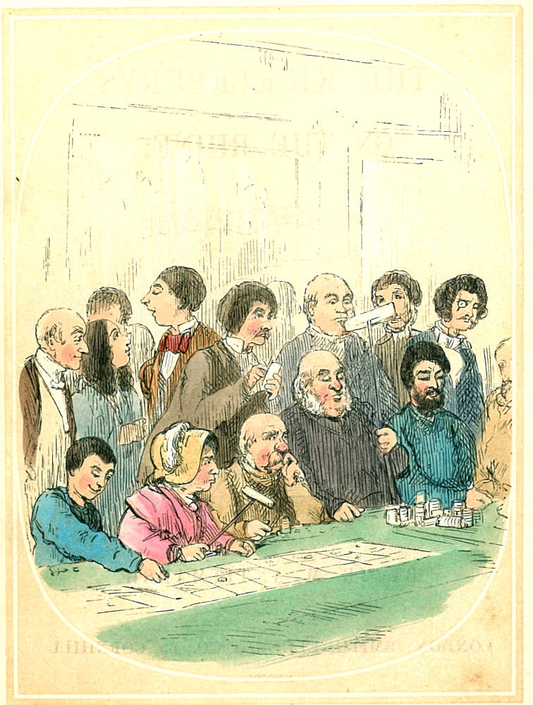
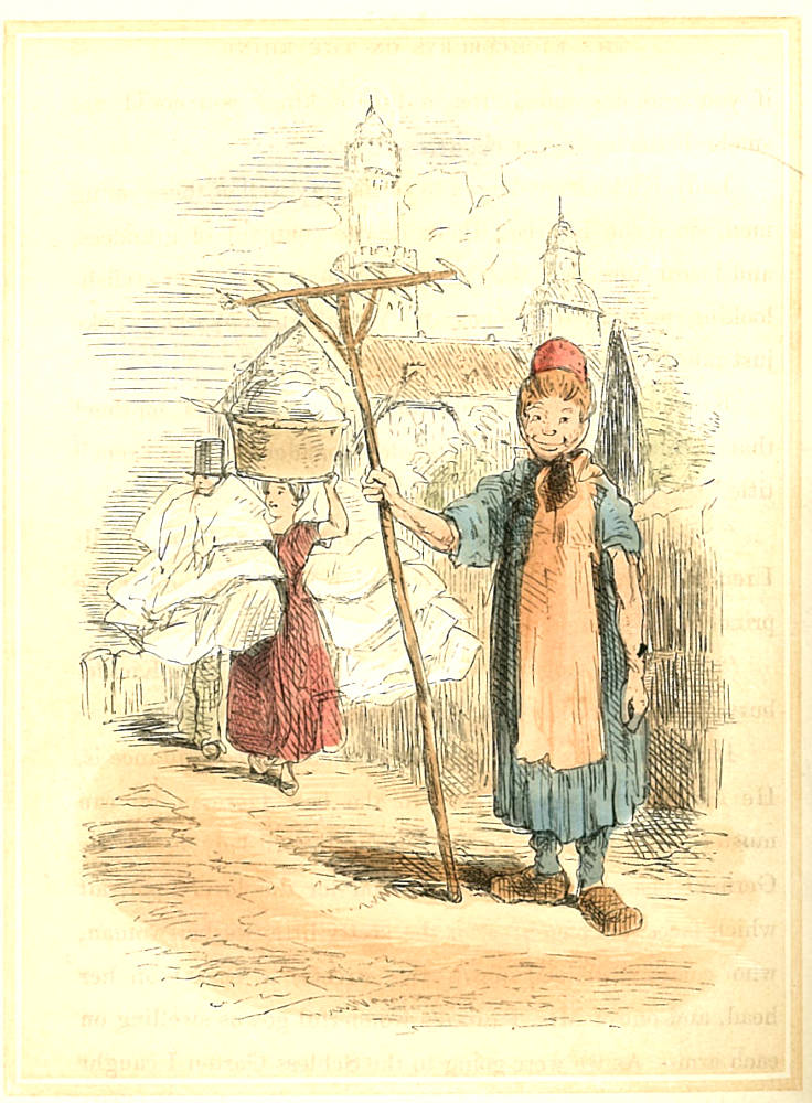
Other disparities abound. The ‘lovely portrait’ of the German peasant girl is matched with a grotesque (facing p. 65), and the healing effects of the water countered by an image which shows how horrible it tastes (facing p.59). In each case elevated claims are deflated: ‘high-bred grace’ (p.45) turns out to be a portly bearded man smugly holding court, and The Interior of Hades turns out to be a banal collection of middle-aged gamblers greedily contemplating their tricks.
Though amusing, the effect is always one of destabilization in which the reader/viewer moves uneasily through the patterned contrasts. Issued with coloured plates, The Kickleburys on the Rhine promises to be a pleasing entertainment, but its interaction of image and word articulates an often harsh critique. As one early observer noted in a review of The Paris Sketch Book in words that are equally applicable to The Kickleburys, Thackeray is ‘too severe and biting to be pleasant’, presenting illustrations of ‘grotesque drollery, of a caustic kind’ (qtd. Critical Heritage, p. 25).
Miss Bunion. [Click on image to enlarge it.]
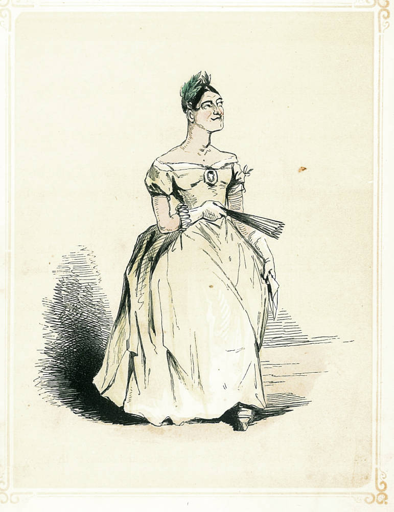
His use of illustrations and text as a sort of double-headed satirical weapon is taken to its most ‘most ill-natured’ (qtd. Critical Heritage, p.18) extreme in Mrs Perkins’s Ball. Like the other Christmas books, this publication seems light-hearted but makes a series of points that are more like sarcasm than irony, more like spite than objective observation. His strategy this time is subtly different from the other publications. In this book Thackeray’s mockery is shared between the two sets of texts and at first glance his comments seem to be symmetrically arranged, rather than opposed. In Miss Bunion, for example, he travesties the pretensions of an erstwhile poet in equal measure. She is said to be suffering from a ‘withering passion’, but is far from ethereal in the manner of the stereotypical versifier, being overweight and motivated by ‘a hot mutton chop’ (p.17). The illustration similarly mocks her self-image, showing her as a mannish character with a square jaw. On this occasion, Thackeray does not focus on counterpoint and contradiction. However, a closer examination reveals small disparities between the text and illustration, and it is in these details that the character is cruelly punished. Most tellingly, he shows this ‘illustrious literary’ (p.17) personage with a laurel crown. This is not mentioned in the written description and its inclusion in the engraving is harsh indeed – a vivid sign of the extent of her self-delusion, and a sign of the author/artist’s lack of compassion.

Left to right: (a) Miss Meggot. (b) Mr Ranville Ranville. (c) Mr Hicks [Click on these images for larger pictures.]
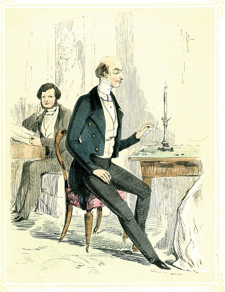
Loneliness and inadequacy rather than social vice are anatomized in other designs, and Thackeray uses his designs to deepen what can only be described as a highly nuanced cruelty. Ranville’ssocial incompetence is described in the letterpress, but his character is revealed as cold and isolated as he ruefully plays cards with himself next to a single candle; Miss Meggot is a spinster, squashed into a fashionable dress, with a bright hair-piece; while Mr Hicks is shown in a classic pose, clumsily lifting up a chair as he looks into space, supposedly rapt with inspiration. The gaucherie of these characters is subtly revealed in the illustrations and each gives the impression of being punished, viewed through a satirical lens which pretends to be making a generalized comment on social behaviour, but was surely based on close observation of the frailties of individuals.
Inscribed in image and text, and revealed through the interactions between them, Thackeray’s satire is the product of a complex relationship. Sometimes supporting each other, sometimes placed in contradictory relationships, and sometimes changing the tone through the addition of small details, the illustrations and letterpress create an intense, rhythmic structure in which we are forced to move restlessly from one to the other, and back again. Indeed, Thackeray’s Christmas books are synthetic products, the work of a dual artist who does not divide his messages between the media, but uses their differences to complicate and enhance their implications.
Works Cited
The Comic Almanack. London: John Hotten, 1835–53.
Thackeray: The Critical Heritage. Eds. Geoffry Tillotson & Donald Hawes. London: Taylor & Francis, 2003.
Thackeray, W.M. An Essay on the Genius of George Cruikshank. London: Henry Hooper, 1840.
Titmarsh, M.A. [W.M. Thackeray]. The Kickleburys on the Rhine. Written and illustrated by Thackeray. London: Smith, Elder, 1850.
Titmarsh, M.A. [W.M. Thackeray]. Mrs Perkins's Ball. Written and illustrated by Thackeray. London: Chapman & Hall, 1847.
Titmarsh, M.A. [W.M. Thackeray]. The Rose and the Ring. Written and illustrated by Thackeray. London: Smith, Elder, 1855.
Last modified 28 October 2014