
[I am indebted to Graham Dry for guidance in unravelling Tymms’s complicated contribution to Victorian cover design.]
Tymms and Questions of Attribution

illiam Robert Tymms (1828–78) is best known as a chromolithographer and illuminator who embellished a series of extravagantly coloured books for Day and Son, the foremost publisher of this sort of material in the mid-Victorian period. The company also employed him to design book covers for the volumes in which his lithographs appeared. Three titles can be identified with certainty, which the artist signed: Tennyson’s May Queen (1861), Florence Lacomb’s Indian Fables [1863], and Jane Euphemia Browne’s The Child: from The Dove on the Cross (1863). In an age when binding designers claimed authorship in tiny gilt initials (‘AW’ for Albert Warrren, for example), each of these works is marked on the front cover as ‘W R Tymms, inv. et del’ (‘Tymms designed and drew this’).
It is also likely, as Douglas Ball remarks in Victorian Publishers’ Bindings, that he designed several ‘other splendid but unsigned covers for the same firm’ (92). Knowledge of this situation is bound to remain speculative, but it is possible to attribute some bindings stylistically, and in relation to work practices of the time.
Tymms’s authorship of covers which are unsigned is plausible, given that Day and Son typically engaged their designers to create the binding. For example, Robert Dudley produced the illustrations and cover for The Atlantic Telegraph (1866), and Owen Jones did the same for Paradise and the Peri (1860) and The Grammar of Ornament (1856). Of course, these were the prime designers, while Tymms was usually the technician engaged in converting the illustrations into chromolithographs and not the originator of the images. However, there seems to have been some flexibility in this arrangement, with the publisher willing to entrust Tymms with the task of designing the cover even when he was limited to the role of transcribing the work of others. He was the technician translating Lacomb’s illuminations into chromos for the Indian Fables, but designed the binding; and he converted L. Summerbell’s [Mrs Hartley’s] illustrations into prints for The May Queen, and designed that cover as well.
If this logic holds true, it is reasonable to assume that the same practice was at work in creating bindings for other anonymous covers which enclosed his chromolithographs. It is quite likely that Tymms produced two liveries for Matthew Digby Wyatt’sThe Art of Illuminating (1861), and another one for a condensed version of the same book which was issued as The History, Theory, and Practice of Illuminating [1860]. His collaborations with the architects William and George Audsley may likewise have been characterized by work in which he transcribed the illuminations and designed the bindings. Ball conjectures that the Audsleys’ version of Byron’s Prisoner of Chillon (1865) is enclosed in a cover by Tymms (caption, facing 55), and is equally possible that he was the designer of the variant bindings for the Audsleys’ Sermon on the Mount [1861, 1875]. Other pieces, possibly by Tymms, include the casings for Pensées Choisies [1862], for which he chromolithographed designs ‘par M. Simpson’, and another for Keble’s Morning Hymn [1861], with illuminations by ‘BBB’.
But what of the books where he designed the chromolithographs as well as creating the illuminations? In the case of these volumes it again quite likely that he did the bindings as well. A precedent is provided by his signed work for Jane Euphemia Browne’s The Child: from The Dove on the Cross (1863), for which he drew the illuminations, converted them into colours, and designed the covers. Again, if logic holds true it is probable that he created the unsigned exterior for at least one other book in which he is known to have to have been the author of the illuminations and their execution: The Church’s Floral Kalandar [1863]. This binding is stylistically linked to the illuminations appearing inside and is harmonized with their effects.
Tymms’s Style as a Binding Designer
Tymms’s covers are stylistically diverse, and at first glance they do not seem to constitute a body of work in the way that, for example, John Sliegh’s bindings are recognizably the product of one hand. Nevertheless, it is possible to identify a number of formal similarities which link them together, can be read as evidence of Tymms’s authorship, and allow us to make a clear attribution.
As a designer, Tymms was concerned with a number of key themes. Of central importance is his emphasis on the interconnectedness between the books’ contents and their exteriors, a strategy he shared with other Victorian cover designers who set out, in the words of Esther Wood, ‘to contrive a garb becoming to … the nature [of the] work’ (3). In Tymm’s work this approach is in part a matter of creating series of visual continuities so that the splendour of the chromolithographic interior is embodied in an equally imposing exterior which prepares the reader/viewer for what lies within. His focus is exemplified by the covers for The Prisoner of Chillon, which presents on its front board a medievalist design incorporating the types of motifs and decorative borders that appear in the coloured engravings; made up of a polychromatic mix of brown, blue, red and plentiful gilt outlining, it projects the pages’ imagery and announces the volume’s status as a precious artefact. The passage of more than 150 years has meant that few copies have survived in pristine condition, but there can be no doubt that in its original issue the binding must have been a resplendent sign of the luxurious effects within. Tymms does the same with his covers for Wyatt’s The Art of Illuminating and The Sermon on the Mount, using the bindings to announce the volumes’ luxuriousness.

Tymms’s binding for The Prisoner of Chillon.
He also makes thematic links between his bindings, which act as proleptic signs, and the books’ contents. For The May Queen he deploys a floral composition which anticipates the text’s rusticity and reinforces the imagery and tonal effects of Summerbell’s (Mrs Hartley’s) floral borders and illustrations. This approach is not unlike the work of many of his contemporaries.
In particular, Tymms displays a distinct liking for symbolism and emblematic detail, especially as it is attached to religious and moralizing texts. In one of his covers for The Sermon on the Mount [1861], he establishes the book’s Christian themes in the form of traditional iconography, with a Gothic mandorla containing the Christogram ‘IHS’. He may also have designed the elaborate cover for a later issue (1875) of the book in a smaller format, which again makes use of Christian symbolism. Alice Beckwith explains its imagery:
There is a consistent pattern of references to Greek design and texts on the cover, done in brown pebble-grained cloth with thirteen colored-paper … The cover’s main feature is a version of the Greek cross in a form reminiscent of a monstrance. Inside the circle at the center of the arms of the cross, a lamb, symbol of Christ, holds a banner with a cross on the flag and on the top of the staff [there is] additional reference to Greek culture by using Greek letters in their design. Two gold- and black-stamped rules with quatrefoils set into their corners containing the Greek letters IE and IX form the outer vertical borders of the central cross.
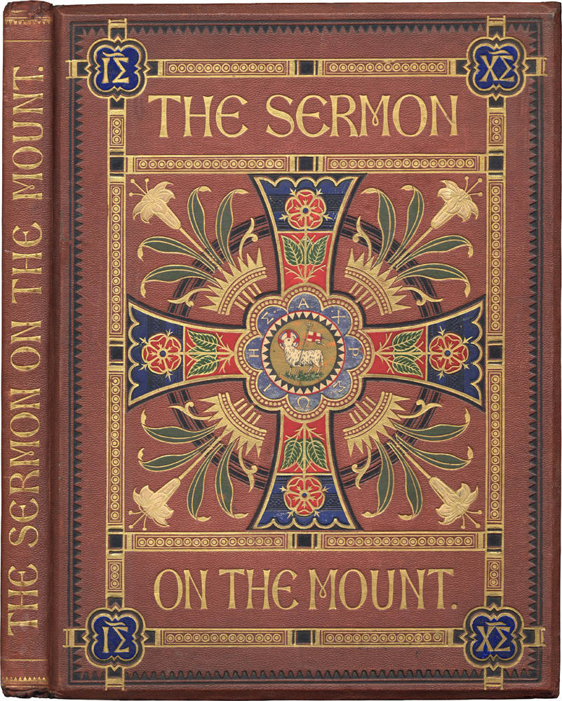


Three bindings, probably by Tymms, left to right: (a) for The Sermon on the Mount, (b) for The Church’s Floral Kalandar, and (c) for Indian Fables.
Beckwith ascribes the design to the Audsleys rather than Tymms, but its relationship to his other religious bindings suggests that it may be by him and not by the illuminators. There is an especially marked similarity between this version of The Sermon, with its combination of emblematic signs and floral imagery, and the front board of The Church’s Floral Kalandar, which has roundels at the corners containing images of the four evangelists; the treatment of the lamb on the cover of The Sermon is very similar to the animals denoting the saints on the Kalandar, and a further link is embodied in the deployment of a necklace of circles placed within the enclosing borders.
Tymms’s use of emblematic animals and roundels is also found in his casing for Lacomb’s Indian Fables, which introduces the animals appearing in the stories. Placed in the border in the form of ten panels, these signs feature Lacomb’s menagerie in the form of small gilt images of a tortoise, tiger, elephant and the rest of the animal cast.
All of these works are economical and direct, and Tymms seems to have believed in using his casing to create an unambiguous effect. His cover for The History, Theory, and Practice of Illuminating [1861] exemplifies his approach, presenting the title as a gilt banner which stands out from the Gothic lettering placed around it. Indeed, Tymm’s covers are unusually well-labelled in the form of large calligraphic scripts which catch the viewer’s eye and project the books’ contents.
On the other hand, at least two of his bindings are more abstract in approach. For one of his Sermon covers and for one of those for The Art of Illuminating he abandons his thematic approach and creates abstract patterns of interlocking circles and strap-work. A middle point, which stands between these two is Pensées Choises, which frames a figurative motif, a bouquet of flowers, within a design which is formally closely linked to the others.
Reducing Tymms’s style to a simple definition is, in short, difficult to achieve. Nevertheless, it is possible to characterize his work as being made up of a series of interests which include a liking for emblematic detail which makes a link to the text, bold lettering, a desire to project luxuriousness, and an interest in formalized arrangements of abstract and geometrical patterns.
Bibiliography
Primary Material
Browne, Jane Euphemia. The Child: from The Dove on the Cross. Illuminated, chromolithographed, and with a binding designed by Tymms. London: Day and Son, 1863.
Byron, George. The Prisoner of Chillon. Illuminated by W. and G. Audsley, chromolithographed and with a binding by Tymms. London: Day and Son, 1865.
Cuyler, Emily. The Church’s Floral Kalandar. Illuminated, chromolithographed and with a binding by Tymms. London: Day and Son [1863].
Jones, Owen. The Grammar of Ornament. Illuminated by Jones and chromolithographed by Tymms. London: Day and Son (1856).
Keble, John. Keble’s Morning Hymn. Illuminated by B.B.B. and chromolithographed and with a binding designed by Tymms. London: Day and Son [1861]..
Lacomb, Florence. Indian Fables from the Sanscrit of Hitopadesa. Chromolithographed and with a binding designed by Tymms. London: Day and Son [1863].
Pensées Choisies. Illuminated by M. Simpson, chromolithographed and with a binding designed by Tymms. London: Day and Son [1862].
The Sermon on the Mount. Illuminated by W. and G. Audsley, illustrated by Charles Rolt and chromolithographed by Tymms, who also designed a series of three bindings. London: Day and Son [1861, 1875].
Tennyson, Alfred. The May Queen. Illuminations by L. Summerbell [Mrs W. H. Hartley], chromolithographed and with a binding designed by Tymms. London: Day and Son, 1861.
Wyatt, Matthew Digby. The Art of Illuminating. Chromolithographed and with a binding by Tymms. London: Day and Son, 1859.
Wyatt, Matthew Digby. The History, Theory, and Practice of Illuminating. Chromolithographed and with a binding by Tymms. London: Day and Son [1860–61].
Secondary Material
Ball, Douglas. Victorian Publishers’ Binding. London: The Library Association, 1985.
Wood, Esther. ‘British Trade Book Bindings and their Designers.’ The Winter Number of The Studio (1899–1900): 3–37.
Created 30 August 2020