
I am indebted to Edmund King for comments on an earlier draft, and especially to Graham Dry for suggesting important revisons.—Simon Cooke
eaturing in accounts by Pantazzi, Ball and King, John Sliegh designed elaborate covers for Christmas gift books, creating outstanding examples of the extravagant, flamboyant style that characterises the genre. His covers were issued in a variety of colours, from crimson to navy blue and are heavily embellished with gilt. Intended to be as eye-catching as possible, they set out to attract the mid-Victorian buyer and create a moment of excitement when the recipient unwrapped the books on Christmas morning.
Unlike many practitioners of the period, Sliegh identified his work, signing his bindings with a tiny gilt monogram as the creation of ‘IS’, with the ‘S’ encircling the ‘I’ in the manner of Roman insignia. His status in his own time was considerable, gaining a position, as Pantazzi has shown, as one of the most important cover designers of the period.
His rivals were John Leighton, W. H. Rogers, Robert Dudley and Albert Warren. Sliegh’s approach is nevertheless quite distinct from those of others in the field, and is generally characterised by its extreme geometry. Unlike the bindings of Leighton and Warren, his covers do not include emblematic details which represent the contents of the books they embellish, but are figured strictly as intricate arrangements in colour and gilt. Devoid of humour – often found in Leighton’s designs – or narrative anecdote and prefiguration (as in Warren’s), Sliegh’s bindings have a formal purity which is calculated rather than playful.
There is marked contrast, for example, between Warren’s design for Robert Buchanan’s Wayside Posies (1867) and Sliegh’s binding for The Poets of the Nineteenth Century (1857). In the first of these, Warren includes figurative details to embody the notion of pastoral poetry. The enclosing margins contain images of flowers in roundels, while the central panel is an organic form enclosed by swirling arabesques suggestive of growth and rusticity. In Sliegh’s work, on the other hand, the composition is purely decorative; though it includes a cluster of ivy-like forms surrounding the central panel, the treatment is far from naturalistic and is placed only as part of a decorative arrangement.
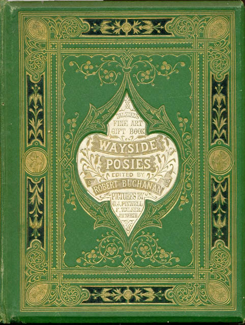
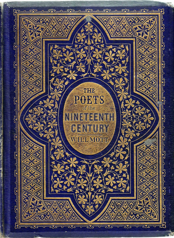
Left: A. H. Warren’s binding for Robert Buchanan’s Wayside Posies. Right: John Sliegh’s design for W H. Willmott’s The Poets of the Nineteenth Century.
Sliegh’s interest in geometry is most obviously embodied in his use of concentric designs. A prime example is his cover for Robert Pollok’s The Course of Time (1857), which presents a central panel enclosed by a variety of decorative borders and devices. Densely blocked in gilt, its effect, as a review noted in the Art Journal, is ‘richly’ ornamental (68). Yet Sleigh’s work is unusual rather than beautiful, as such, and his effects are sometimes startling. In the front cover for Thomas Campbell’s Gertrude of Wyoming (1857), he stretches the conventions of mid-Victorian design by presenting a central panel within a simple gilt margin; the mandorla is embellished with flange-like forms and the lettering is huge in relation to the overall surface of the upper board. Bold and imposing, a contrast of space and simplified outlines, it is unlike the overcrowded designs of the period; figured as an exercise in geometry, it bears no thematic relation to the text within and asserts its value only as a piece of autonomous design.


Left: Sliegh’s design for Robert Pollok’s The Course of Time. Right: The same artist’s work for Campbell’s Gertrude of Wyoming.
The same can be said of his cover for Longfellow’s Evangeline(1856), with its intricate, over-large and mannered calligraphy, and of the elaborate casing for Odes and Sonnets (1859, 1863). In the second design the central panel is a severe oval within another, containing the title; this is framed by two concentric margins, with four roundels placed in the interstices. The effect is again a curious combination of extreme luxuriousness and formal austerity.
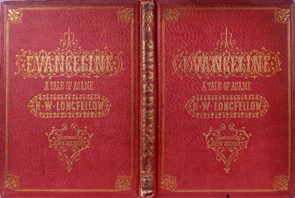
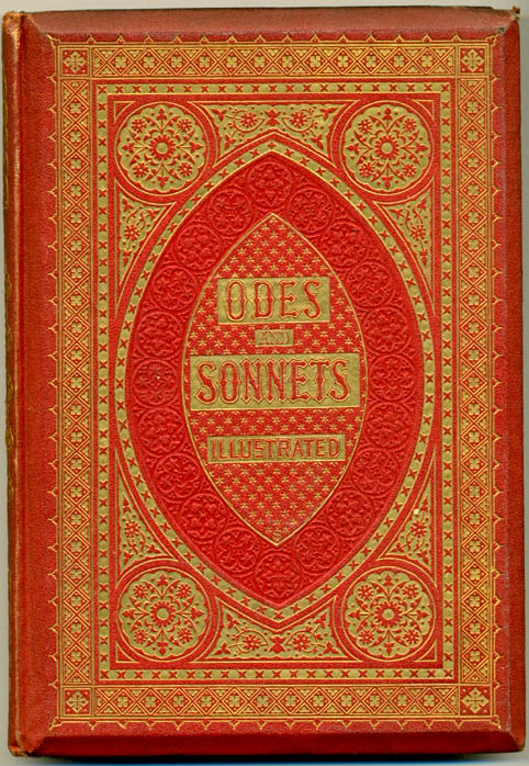
Left: Sliegh’s design for Longfellow’s Evangeline. Right: His cover design for Odes and Sonnets.
Most striking of all, perhaps, is Sliegh’s design for Longfellow’s Poetical Works (1857). This work combines a lozenge-shaped panel with the title, in large lettering, placed in the middle; foliate forms are placed around the inscription and simplified vines and lines populate the spandrels. Sliegh never wasted a resource, and the Longfellow design is very similar to the strict geometry appearing in his composition for Edward Rimbault’s The Juvenile Pianoforte Album [1860]. Sliegh’s devices are boldly conceived, and it is interesting to compare them with other gift-books covers of the late fifties, such as John Leighton’s rustic treatment of Thomson’s Seasons (1857). Placed in conjunction, Leighton’s seems overworked and Sliegh’s almost austere.

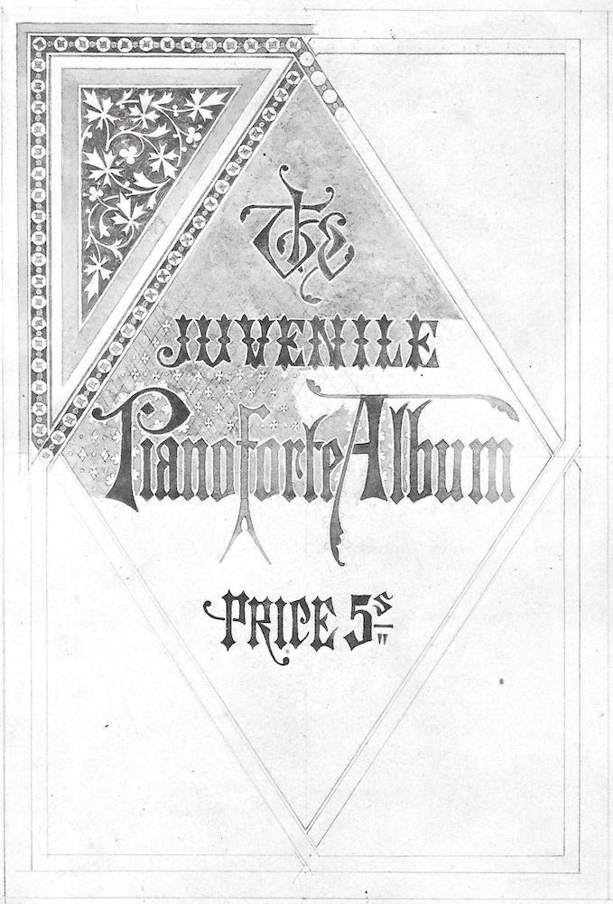

Left to right: (a) Sliegh’s design for Longfellow’s Poetical Works. (b) An unfinished study for The Juvenile Pianoforte Album. (c) John Leighton’s cover for Thomson’s Seasons.
Sliegh’s tendency to treat the cover-design as an hermetic composition in its own right features throughout his other creations, and it is interesting to reflect that he must have regarded himself as a designer of patterns rather than a book-artist. The motifs deployed in his covers are closely related to his colour designs for Odes and Sonnets, and treats his bindings in the same manner as his initial letters, borders and headings.
Sliegh’s voice is distinctive, and yet he drew eclectically from a variety of sources. Like many contemporaries, he came under the spell of Owen Jones. Sleigh collaborated with Jones as a copyist, translating his designs into chromolithographs in Matthew Digby Wyatt’s The Industrial Arts of the Nineteenth Century (1853), so it is barely surprising that his art should bear some relationship to the imagery of the older designer. He was directly influenced by Jones’s The Grammar of Ornament. Published in 1856, Jones’s album provides a series of colour plates which represent some of the most typical designs of a series of historical periods. Inspection of Sliegh’s work reveals his indebtedness to Jones’s imagery, especially in his adoption of medievalist or specifically Gothic styles. There is a clear relationship, for instance, between the trefoil floral elements in the cover design of Odes and Sonnets and those appearing in Middle Ages no. 5. Other bindings can be linked to a variety of Jones’s designs.

Owen Jones’s Middle Ages no. 5, one of the many pages that influenced Sleigh’s design.
Related Material
Bibliography
Works with bindings designed by Sliegh
Campbell, T. Gertrude of Wyoming. London: Routledge, 1857. Illustrated by Birket Foster.
Longfellow, H. W. Evangeline. London: Routledge, 1856. Illustrated by John Gilbert; cover design by Sliegh.
Longfellow, H. W. Poetical Works. London: Routledge, 1857. Illustrated by John Gilbert.
Odes and Sonnets. London: Routledge, 1859. Illustrated by Birket Foster. Cover, spine and coloured decorations by Sliegh; engraved by the Dalziels.
The Poets of the Nineteenth Century. Ed. R. A. Willmott. London: Routledge, 1857. Illustrated by Millais et al. Cover designed by Sliegh.
Pollok, R. The Course of Time. London: Blackwood, 1857. Illustrated by Birket Foster, John Tenniel.
Rimbault, Edward. The Juvenile Pianoforte Album. London: [1860]. [No publisher given].
Untraced
It is quite possible that Sliegh produced other covers which are either untraced or no longer survive. The ephemeral nature of both cloth and paper covers means that many were replaced by later bindings; this is especially true of institutional copies. Finlay mentions a chromolithographic paper livery designed for The Art Union, which must have been produced before 1849 – when the magazine became The Art Journal – but I have been unable to find any traces of this work.
Other contemporary material
Buchanan, Robert. Wayside Posies. London: Routledge, 1867. Cover designed by Warren.
Jones, Owen. The Grammar of Ornament. London: Day, 1856.
Thomson’s Poems. London: Blackwood, 1857. Cover designed by Leighton.
Secondary Works Cited
Ball, Douglas. Victorian Publishers’ Bindings . London: The Library Association, 1985.
'The Course of Time.' The Art Journal. (1857): 67-8.
Finlay, Nancy. Entry in The Philip Hofer Collection in the Houghton Library. Cambridge, Mass: Harvard College Library, 1988.
King, Edmund. Victorian Decorated Trade Bindings, 1830–1880. London: The British Library & Newcastle: The Oak Knoll Press, 2003.
Pantazzi, Sybille. ‘Four Designers of English Publishers’ Bindings, 1850-1880’. Papers of the Bibliographical Society of America 55 (1961): 88–99.
Last modified 26 August 2020