Instead of rural life, the emphasis in the final quarter of the century is re-focused on urban deprivation, offering images as transcripts of working-class life. The Graphic magazine was a powerful instrument, exposing the iniquities of the Poor Law, but the foremost most influential single publication is Douglas Jerrold’s London: A Pilgrimage (1872), a picture book with illustrations by Gustave Doré. This bi-modal text is a curious mix: though nominally a collaboration, the two participants do not always complement each other. Jerrold’s writing is partly journalistic observation, related to the brutal honesty of Engels. He reports the physical impact of poverty as it appears in the squalid places of the London underworld, those
shabby, slatternly places, by low and poor houses, amid shiftless riverside loungers, with the shipping-littered Thames on our right, we push on to the eastern dock between Wapping and down Shadwell. Streets of poverty-marked tenements, gaudy public-houses and beer--shops, door-steps packed with lolling, heavy-eyed, half-naked children; low-browed and bare-armed women greasing the walls with their backs, and gossiping the while such gossip as scorches the ears; bullies of every kind walking as masters of the pavement-all sprinkled with drunkenness-compose the scene … (Chapter 3).
Yet Jerrold often writes idealistically, romanticising the poor and their environments, proclaiming their ingenuity as the bedraggled toilers of the street who somehow manage to make a living; he also idealizes some of the poverty-stricken districts as picturesque subjects for him to ‘sketch’. Speaking of the ‘Busy Dock-Side’ he observes:
Who says that all this movement is ugly? At every turn there is a sketch. Every twisting or backing of a cart, every shifting of the busy groups, suggests a happy combination of lines and light and shade. About the Tower there are picturesque studies by the score. The Jewish quarter is at hand, and therein may be found in plenty such dark alleys and by-ways for such venerable or striking figures as would have warmed the genius of Rembrandt to enthusiasm. Or take the line of marine-store dealers facing the brown, unbroken walks of the docks! Their shows abound in delightful accidents of form and color. The hard-visaged dealers and the slouching customers form themselves into well-contrasted groups. (Chapter 2)
Recounting what he sees as if he were a tourist of poverty, watching as an amused outsider, Jerrold confirms what every late Victorian knew of the state of the poor while ameliorating the realities of degradation by endowing the proletariat with a sort of poetic, fairy-tale glamour. The London poor, he says, are the embodiment of resilience and good humour: ‘It is not possible … to overpraise the greatness of heart with which the English working classes have passed through famine’, and for every ten who pass into vagrancy and crime, ‘ten thousand end honest lives in misery’, putting up with despair but never breaking the law (Chapter 2). Such commentary is markedly at odds with the brutal findings of Engels and Henry Mayhew, whose London Labour and the London Poor (1861) showed how little had changed since the early and middle part of the century; it is also completely different from Doré’s illustrations, which do not support his essentially complacent view of working class suffering.
If Jerrold’s text is often misleading, an entertainment professing to be journalism, Doré’s remains uncomfortable viewing. Moving between near-photographic journalism and expressive exaggeration, his engravings provide a portrait of the lives of the London poor in their employment, their place of work, their squalid accommodation, and on the streets. The effect is both overpoweringly direct and troublingly strange, depicting the lower-classes in various stages of degradation as members of a vast teeming mass crammed together or overwhelmed by the merchandise and industrial technologies of late Victorian Britain.
This revelatory showing is partly organized in terms of a striking juxtaposition of figures and their architectural setting. One half of this equation is the artist’s emphasis on the dull repetitiveness of the built environment, which he represents in the sort of obsessive detail most associated with Pre-Raphaelite verisimilitude and also bears some relationship to contemporary photographs of the urban, such as Thomas Annan’s views of Glasgow.

Over London – By Rail by Gustave Doré.
In Over London – By Rail, the most celebrated of the series, he depicts proletarian housing as an agglomeration of Pre-Raphaelite ‘facts’: the individual bricks and tiles of the walls and roofs are minutely specified and he even specifies the contrasting textures of barrels in the back-yard and the glint of the opened windows. The effect is one of dreary monotony, with each house as one element in a repeating pattern, crammed into a very limited space. Doré depicts the occupants of the houses as small, static, ragged, anonymous figures in their back-yards; reduced to insignificance by the vivid registration of the buildings, they seem like prisoners in a setting which has the hallucinatory intensity of a dream – a hyper-realistic nightmare of hard surfaces, sharp details and claustrophobic narrowness. In this world, the artist argues, the architecture diminishes the lives of the people, physically overpowering them spatially and in terms of its oppressive materiality. The Great Warehouse and Pickle Herring Street are likewise configured as huge and heavily detailed spaces, once again reducing the people to insignificance.
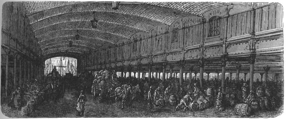
The Great Warehouse by Gustave Doré.
Yet in other scenes individuality is suppressed not by the architecture but by the teeming multitudes. If the working-classes are contained in enclosed spaces, they are also overpowered by the sheer crowding of the slums they occupy and the streets they progress through. In A City Thoroughfare and Dark House Lane the artist critiques metropolitan living by distorting space and the figures within it: in neither is there any room to move, blocked in by omnibuses and crowds in the first and overwhelmed by trays of fish in the second. Pamela Gilbert has noted how space is organized to articulate human activity in a series of ‘meaningful referents’ (21), but all we have in these images is oppressive meaninglessness, congestion and chaos that reduces people to components in a vast urban machine.
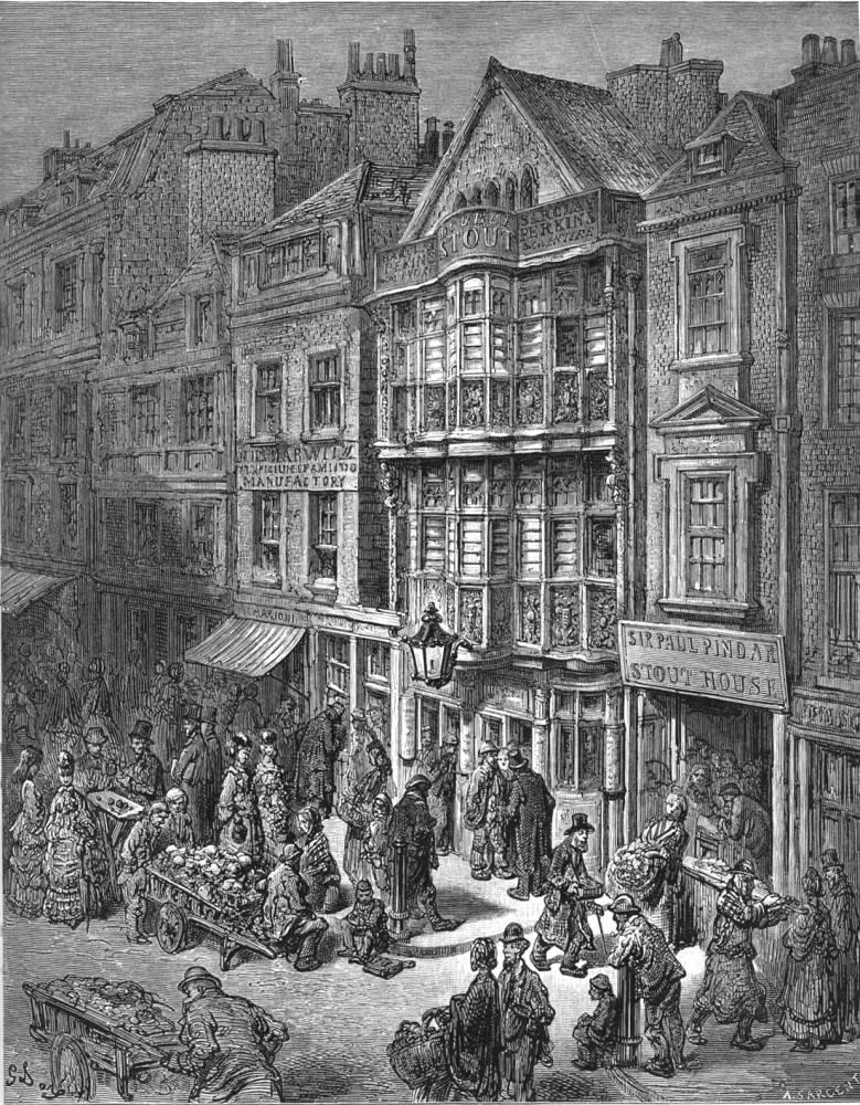

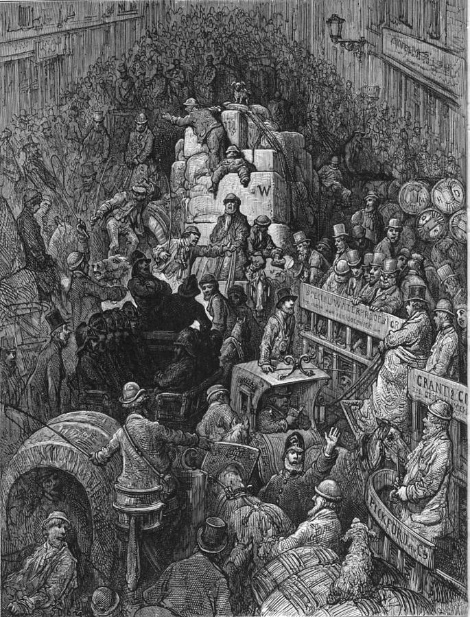
Three of Doré’s plates from London. From left to right: Bishopgate Street, Dark House Lane — Billingsgate, and A City Thoroughfare.
This expressionistic imagery foregrounds the physical impact of poverty, but Doré puts an equal emphasis on the psychological effects of over-work and overcrowding. His figures (like Pinwell’s) are placed in crowds but not in communities; they do not interact, rarely look at each other, never smile or express any emotion other than blank introspection, and seem only to exist as an element within an anonymous ensemble. This approach is very different from Jerrold’s sentimental portraits of the inventive Cockney, and Doré intensifies his vision of hopelessnes by placing his figures in crepuscular light. In London, some of the scenes are nocturnes and others overwhelmed by the pall of industrial pollution: herded today, rushing to work, living in squalor and placed in what seems to be a perpetual twilight, the metropolitan poor are the inhabitants of an urban netherworld. Indeed, it is noticeable that Doré’s vision of a harsh reality is closely linked to his fantastical treatment of the demonic zone in his illustrations of Milton’s Paradise Lost (1866) and the gloomy underworld in Dante’s Hell (1866).
Equally effective, though not loaded with metaphorical resonance, are the images published in The Graphic, which was established in December of 1869. Inspired by the reformist writing of Carlyle and John Ruskin, William Luson Thomas, the founder and first editor, set out to expose the effects of deprivation, and his project was carried forward from the end of the sixties until the end of the eighties.Thomas gathered around him some of the best graphic artists and painters of the time, among them William Small, Frank Holl, Herbert Herkomer and Luke Fildes. These designers, along with several others now mainly forgotten, created a jarringly honest portrait of the conditions of the urban poor at toil and in destitution: there is little difference between them. The aim was to shock, to show the truth of social deprivation in the form of imposing designs validated by their artistic quality and visual impact. In the words of Julian Treuherz:
first hand observation was employed. The drawing of the figure was solid and well-rounded, the compositions were often strongly designed with marked contrasts of light and shade …and the dramatic effects of perspective were sometimes used. The observation of character was keen: portrait-like drawings of individuals, with attention given to nuances of facial expression could elicit sympathy from the spectator, investing a social problem with human interest. [63].
Treuherz overstates the originality of this imagery – claiming there ‘were no patterns to follow’ (63) – but there is no doubt that the Graphic’s designs were unnervingly direct. Its political focus was established in the opening number by Luke Fildes’s Houseless and Hungry (1869).
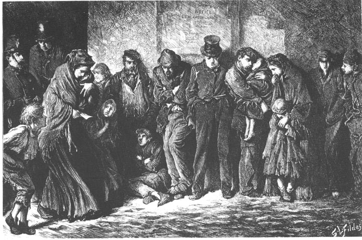
Houseless and Hungry. Sir Luke Fildes. 1869. The Graphic.
This image is a powerful piece of reportage, showing a queue of ragged homeless people waiting to be issued with a ticket from the local police station to give them access to a workhouse (or ‘casual ward’) for overnight accommodation. Fildes encapsulates their rootless misery in a series of resonant signs. Most noticeable is his inclusion of families and individuals, old and young. At the left a mother with three children stumbles to the end of the queue, while a husband and wife, at centre right, do their best to protect a small boy and child; at both ends of the line are young men and in the centre an older man wearing a top hat, the accompanying text tells us, to suggest his higher status. None is saved from this inclusive misery, reaching across the ages.
Fildes focuses on gestures and facial expressions, which vividly convey the physical and psychological impact of homelessness. The artist tellingly specifies gestural details that visualize the characters’ response to snowy cold, with each adopting the own solution: some fold their arms and draw their legs together and others slump forward; others cross their feet; while the woman sheltering a child puts her hand to her mouth. In each case the gesture embodies the notion of withdrawing into the self, conserving heat which is perhaps only really preserved by huddling together in forced, and degrading, intimacy. Equally telling is the artist’s portraiture. Fildes endows the expressions with anguished distortions, but mainly shows them as blanks – self-contained in a sort of torpor signalling the psychological emptiness of being taken beyond suffering and reduced to a sort of unemotional nullity where survival is the only imperative. The blankness of the background, the worn-out clothes and the alternating tones of grey and black add to this sense of emptiness, and the overall effect is one of deadening numbness. Following Doré and Pinwell, Fildes’s showing of the poor accentuates the notion of poverty as a stripping away of sensibility, reducing the individual to a living body in which the main depredations are ultimately mental rather than physical. In this world, Fildes insists, the poor are simply an anonymous mass, denied feeling and reduced to a sub-human nullity.
Fildes revisited this imagery in his painting, Applicants for Admission to a Casual Ward (1874). The original engraving also gained him notoriety as an interpreter of the urban scene and on seeing the image Dickens commissioned him (Cohen, 221), on J.E. Millais’s recommendation, to illustrate Edwin Drood (1869–70.) His opening design, In the Court reaffirms the degradation of squalor, transferring the imagery of The Graphic to the congested setting of Dickens’s imagination.

In the Court by Sir Luke Fildes. Used as Frontispiece for Charles Dickens's The Mystery of Edwin Drood and Other Stories.
Fildes’s emphasis on the notion of the deadened body, of the poor reduced to a robotic state by their physical suffering, features throughout his designs for The Graphic and became the central ingredient in its house-style. Other contributors, notably Holl and Small, emulated his style and in many of their illustrations the cause of this condition is not the weather, as in Houseless and Hungry, but the tedious, reductive nature of manual labour. Influenced by Carlyle and Ruskin’s focus on the impact of mechanization that reduces workers to machines, the Graphic artists project a race of zombies, stripped of identity, figured as extensions to the machine or the repetitive rituals of their duties and forced to abandon any notion of self-expression or even social interaction with their peers. Engels formulates the classic definition of this type of work as purely degrading:
Another source of demoralisation among the workers is their being condemned to work. As voluntary, productive activity is the highest enjoyment known to us, so is compulsory toil the most cruel, degrading punishment. Nothing is more terrible than being constrained to do some one thing every day from morning until night against one’s will. And the more a man the worker feels himself, the more hateful must his work be to him, because he feels the constraint, the aimlessness of it for himself. Why does he work? For love of work? From a natural impulse? Not at all! He works for money, for a thing which has nothing whatsoever to do with the work itself; and he works so long, moreover, and in such unbroken monotony, that this alone must make his work a torture in the first weeks if he has the least human feeling left. The division of labour has multiplied the brutalising influences of forced work. In most branches the worker's activity is reduced to some paltry, purely mechanical manipulation, repeated minute after minute, unchanged year after year. [Condition, English trans., 148–9]
The impact of this situation is shown at its most extreme in a series of designs emphasising the sheer tedium of boring toil. In W. Bazette Murray’s Sack Making by the Light of a Street Lamp (1875) women work with needles in the cold urban setting; in M.W. Ridley’s Pitmen Heaving the Coal (1871) the miners toil to extract the coal in the cramped and gloomy mine; and in Frank Holl’s Shoemaking (1872) the men scrape away at their shoes.
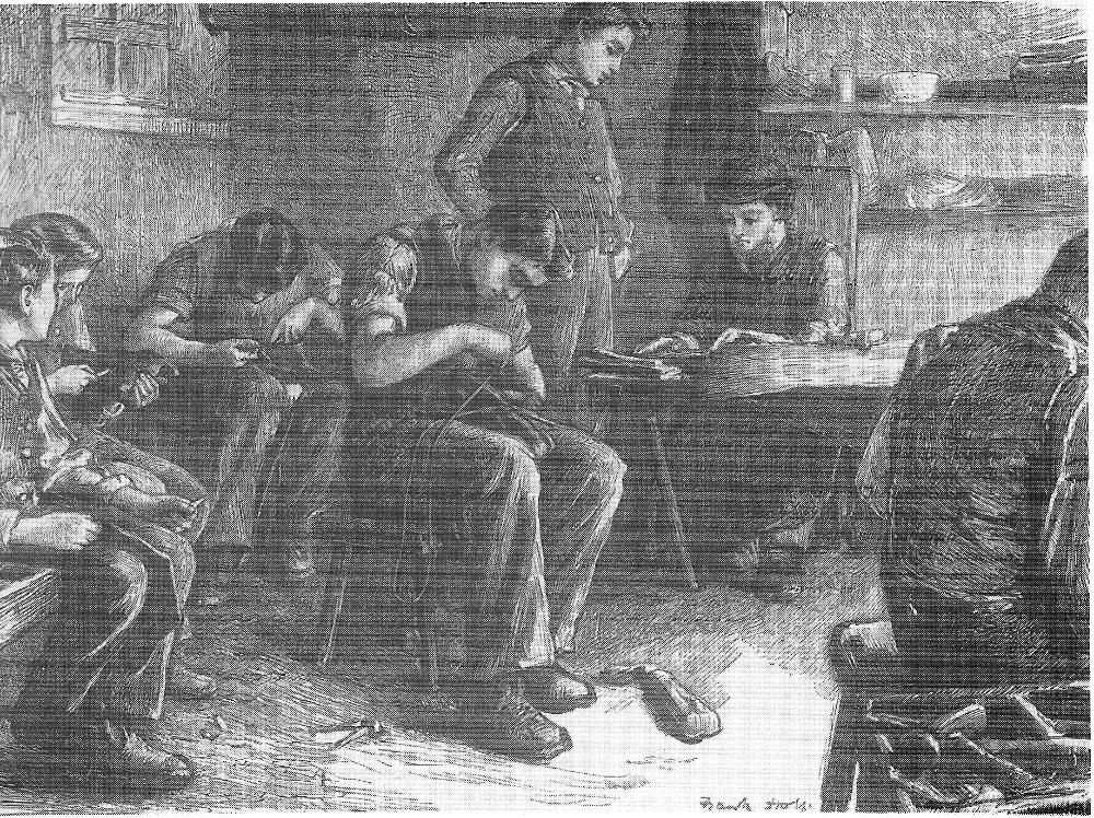
Shoe making. Frank Holl. Wood engraving, 11½ x 16 inches. the Graphic(16 May 1872): 468.
In all cases the psychological deadness is highlighted: these are not cheerful places of work but merely a series of activities in sullen silence with none of the putative dignity of manual labour asserted in paintings such as Brown’s Work (1852, Manchester City Art Gallery) or John Brett’s The Stonebreaker (1856, Walker Art Gallery, Liverpool).

London Life in the East End – Sack Making by the Light of a Street Lamp. W. Bazett Murray (flourished 1871-90). The Graphic (3 April 1875): 321.
These images are perhaps the most effective showing of the condition of the working classes in the long tradition of social realism that runs throughout Victorian graphic art. Again, it is impossible to know how much influence they had on their readership and what social reforms they may have helped to facilitate. They were certainly a powerful influence on the art of Vincent van Gogh, who collected images from The Graphic and responded to their imagery in his own treatments of the poor; for example, there is clearly a close link between the imagery of Fildes and his co-contributors and the composition, lighting, and characterization of Van Gogh’s The Potato Eaters (1885; The Van Gogh Museum, Amsterdam).
Taken as a whole, Victorian graphic art provides a painful record of the lives of the great mass of the Britain population in a period of modernization and rapid social change. The main consequences are made brutally clear in the form of a body of imagery in which the working classes are depicted in terrible degradation and despair. The Victorian age has been characterized in many ways – the age of improvement, the age of empire, the age of invention, the age of capital; but it was also, as these illustrations vividly attest, very much the age of inequality and suffering. The final words, as applicable at the end of the century as in the early Victorian period, are by Engels. Writing in the Preface to the Condition of the Working Class, he observes the horror of the situation: ‘The condition of the working-class is the real basis and point of departure of all social movements of the present because it is the highest and most unconcealed pinnacle of the social misery existing in our day.’ The artists who created their uncomfortable, challenging images of that ‘social misery’ remind us of the sheer squalor of everyday life at a time when Britain was the richest and most powerful nation in the world while the majority of its population struggled to survive.
Social Commentary and Victorian Illustration: The Representation of Working Class Life, 1837–1880
- Introduction: The People of the Abyss
- The Life of the Streets and Punch
- Dickens, Illustrating Poverty, and the Interconnectedness of Rich and Poor
- Social Commentaries of the 1860s: from Dickens to the Idyllic School
- Bibliography: Works Cited
- Bibliography: Suggested Secondary Materials