
Chapter 7 of the author's Dickens and Phiz, which Indiana University Press published in 1978. It appears in the Victorian Web with the kind permission of the author, who of course retains copyright.
Numbers in brackets indicate page breaks in the print edition and thus allow users of VW to cite or locate the original page numbers. Where possible, bibliographical information appears in the form of in-text citations, which refer to items in the bibliography at the end of each document.
April Julia Ang of the Faculty of Arts and Social Sciences produced the electronic text using OmniPage Pro OCR software and created the HTML version, converting footnotes and adding links.
 ablot Knight Browne illustrated ten novels by Dickens in whole or in part, but he
illustrated with etchings some sixteen for Charles Lever (as well as contributing wood
engravings to several others by that author), and between June 1836, when he began work
as a replacement for Robert Seymour's replacement, Buss, on Pickwick, and his death in 1882 — a span twice the length of
his association with Dickens — he produced an enormous amount of other work:
illustrations for serial novels and those in volume form, for periodicals and
"yellowbacks," for children's books, and for a few of his own published
collections of designs on assorted subjects, as well as a goodly number of unpublished
drawings in pencil, pen, and watercolor, and some paintings, both in watercolor and oil.
A complete survey of his career would involve a large study in itself, and here I shall
only attempt to provide a perspective on Browne's work for Dickens and his contributions
as an artist by means of a selection of typical examples at various stages of his career.
An appended checklist of his work during the Dickens period provides at least an
enumerative overview.
ablot Knight Browne illustrated ten novels by Dickens in whole or in part, but he
illustrated with etchings some sixteen for Charles Lever (as well as contributing wood
engravings to several others by that author), and between June 1836, when he began work
as a replacement for Robert Seymour's replacement, Buss, on Pickwick, and his death in 1882 — a span twice the length of
his association with Dickens — he produced an enormous amount of other work:
illustrations for serial novels and those in volume form, for periodicals and
"yellowbacks," for children's books, and for a few of his own published
collections of designs on assorted subjects, as well as a goodly number of unpublished
drawings in pencil, pen, and watercolor, and some paintings, both in watercolor and oil.
A complete survey of his career would involve a large study in itself, and here I shall
only attempt to provide a perspective on Browne's work for Dickens and his contributions
as an artist by means of a selection of typical examples at various stages of his career.
An appended checklist of his work during the Dickens period provides at least an
enumerative overview.
Although Browne's initials appear on some of the engravings in the first two volumes (1835-38) of Winkles's Cathedrals of England, for all practical purposes the young Browne made his debut as the rather crude designer of three cuts for [299/300] Sunday under Three Heads, which foreshadow to some extent his subsequent collaborations with its pseudonymous author, "Timothy Sparks. " His really significant debut, of course, was with Part IV of The Posthumous Papers of the Pickwick Club. At the time, Browne was already developing something of his own style even though his work clearly shows the influence of Seymour. For the first year it does not seem that he received much work, aside from three cuts for Chapman and Hall's Library of Fiction (1836), the main interest of which lies in a visual prototype of Tony Weller (The wood engraving at page 293 of the sixth number, illustrating Edward Mayhew's "John Smith," shows a sheriff's man named Pate Poinden who resembles Tony Weller down to his striped waistcoat (previously noted by Kitton, Dickens and His Illustrators, p. 62).). The first important non-Dickensian job done by "Phiz" — whose pseudonym doubtless determined that of the author, "Quiz" — is Edward Caswall's Sketches of Young Ladies (1837), again published by Chapman and Hall. The eighty-page text, which delineates "two dozen classes of young ladies" (p. 78), is small beer, but the six etchings are delightful, executed with great care somewhat in the style of Seymour, but with far more elan.
Perhaps best is "The Abstemious Young Lady" (illus. 114), which combines a group of rather Seymourean faces and figures, carefully modeled, with several emblematic details both larger and jollier than Phiz usually employed for Dickens: a pair of fat s tuffed ducks, an equally fat ceramic Chinaman, two feasting satyrs, and a framed picture of a tankard of beer with some dead game, all commenting upon the secret nursery feasts of the young lady who plays the fraudulent role of a self-starving, "interesting" beauty in public.
Weak though Quiz's satire is, Dickens felt it was enough to hang a rebuttal on, and so the next year produced Sketches of Young Gentlemen, followed by Sketches of Young Couples in 1840. John Harvey has said of the illustrator's contribution to these three titles that in them can be observed the "gradual relaxation" which "foretells the later slackness of Browne's work." (Harvey, p. 112.) Browne's work certainly did change between 1837 and 1840, but one may attribute the change to more positive factors: a gradual breaking away from Seymour's influence and the development of a distinct style. If one were to show the illustrations of the first Sketches (signatures omitted) to someone who knew Phiz's later work only, such a person might be hard put to identify the artist; but the style of the third Sketches is unmistakable. The Young Gentlemen may be inferior to the Ladies, but I think [300/301] "relaxation" is a virtue of the etchings for Young Couples, which are more like drawings, with a loosening up of line and a pervading impression that the artist is his own man. Most of the awkwardness of the earliest figures is gone, the characters are less grotesque, and a pleasant humor is achieved in such a plate as "The Couple who coddle themselves."


The Abstemious young Lady illustration 114]. Right: Outdoor Relief illustration 115]. Click on images for larger pictures and additional information.
After Pickwick, the first major project for Phiz was James Grant's Sketches in London (1838), apparently an imitation of Sketches by Boz. Most of Browne's eighteen plates are small and lacking in any clear signs of invention, but a few are of some interest. In particular, both plates for chapter 7, "Workhouses," may owe something to Cruikshank, for the hollow cheeks of the paupers in "A Workhouse dinner" recall "Oliver asks for more," and "Out-door relief" resembles "The Beadle" in Sketches by Boz, although Phiz's beadle looks more malevolent than Cruikshank's, or even than the great Mr. Buirible himself. The wretched, starving adults and children are more shocking than anything allowed into Sketches by Boz. The design is well laid out, but a comparison with "Oliver asks for more" indicates something of Phizs limitations: the faces of Cruikshank's workhouse children achieve a response in the viewer seemingly beyond Phiz's powers to evoke.The author, unlike so niany of those for whom Browne worked, took pains to comment upon his twenty-three year old collaborator in a preface:
With regard to the Illustrations by "Phiz," which embellish the volume, the Author can speak more unreservedly than he could do of the letter-press. They are among the happiest achievements of the genius of one who, though yet but voting in years, is unquestionably, in this particular style of engraving, the first artist of the day.
(The confusion of etching with engraving is usual during this period, and later.)

The Supper at Father Malachi's illustration 116]. Click on image for larger picture and additional information.
As I have suggested in an earlier chapter, during the period of Nicholas Nickleby (1838-39) Browne seemed to have been casting about for his own proper style, and sometimes fell below the level of quality already attained in Pickwick. Probably the most important work of this time for demonstrating both Phiz's [301/302] strengths and his stylistic uncertainties is Lever's Harry Lorrequer. The plates for Lorrequer are, like the novel, boisterous, exaggerated, and seemingly done in a fair hurry. The hero resembles Nicholas Nickleby (as Lever complained) (In letter previously cited, by Lever to James M'Glashan, in Edmund Downey, Charles Lever, His Life in His Letters, I, pp. 109-11.), and nowhere more so than in "The Supper at Father Malachi's," where he gives the impression of a normal man who accidentally happens to be present at a gathering of grotesques invented by a follower of Gillray and Rowlandson. The illustrations are generally uneven, though a plate like "Mr, O'Leary charges a Mob" displays a good control of composition in the way Browne has enclosed violent action within a balanced visual structure. The plates in this novel are also notable for the absence of emblematic details, a possible consequence of the hurry with which Phiz had to work owing to Lever's dilatoriness with copy, and his own simultaneous work on Nickleby, for which triplicate and even quadruplicate steels were sometimes required.

The Prosperity going down [illustration 117]. Click on image for larger picture and additional information.
The illustrations for Neale's Paul Periwinkle, another serial novel (with forty plates, to Lorrequer's twenty-two) begun late in 1839, are much in the vein of Lever's work, with the addition of a good deal of bloodshed; but there is more attention to backgrounds and details, and considerably more firmness of line. One of the later plates, "The Prosperity going down," can actually induce giddiness, while in others Phiz's skills in architecture and landscape design are evident. He introduces rather sardonic emblematic details into two of the plates. "Mr. Bamboozle's delicate disclosure & dismissal" has to do with the revelation that Nora — one of the main female characters — is pregnant; above her swooning form there is a painting of the goddess Diana, symbol of chastity. And in " The Haunted Bed," upon which lies a woman who has recently been raped by several barbarous Irish Catholic seamen, Browne decorated the head board with an amoretti-framed carving of a Roman soldier and a naked woman in amorous dalliance, possibly an allusion to the rape of Lucrece. In both cases Phiz went counter to the spirit of the novel, and perhaps should be given credit for viewing the melodramatic tripe he illustrated with such ironic detachment.

The Sunk Fence [illustration 118]. Click on image for larger picture and additional information.
Eighteen-forty was an extremely busy year for Browne (see checklist, p. 318), and some of his work is understandably perfunctory; [302/303] yet there is evidence of artistic growth. A comparison of Harry Lorrequer and Charles O'Malley is especially revealing because of the similarity of the two novels' subject matter. The very first plate in the latter, "The Sunk Fence," showing the hero being thrown off his horse during a fox hunt, is far beyond what Browne appeared capable of two years earlier in its handling of perspective, landscape, degrees of biting-in to provide depth, and management of detail and figures in action. Much of the comic Irish physiognomy is still caricatural — more so than most of his work for Dickens at any time — but his line is surer, and there are few examples of really monstrous grotesquerie in the characters' faces.
From 1841 to 1850, Browne kept up a terrific pace; the number of etchings for the decade (and my list may be incomplete) is 567, and there are 250 designs for wood engravings, which amounts to an average production of about I etching per week (not counting the many duplicates done for the Dickens novels), or a design for either etching or engraving every four and one-half days. This rate was continued for some years thereafter, and in the process Browne developed into a skillful and distinctive illustrator, whose work not only complemented the novels of the one true genius with whom he was associated, but bolstered up many literary performances that would have been less interesting and in some cases entirely negligible — without his illustrations. Up through The O'Donoghue (1845), Charles Lever's novels remained within the limits of comic and/or sensational accounts of military and amorous exploits of Irishmen; yet Browne's style in collaboration with Lever continued to change, as it did with the more versatile and inspiring Dickens. In a potboiler called Chronicles of Crime (1840-41) he used heavy crosshatching as a way of creating texture for the etching, a technique more typical of John Leech. By the time of Lever's Jack Hinton (1841-42), he had largely abandoned this method, and instead alternated plates containing much open space (their incidental shading achieved combined roulette and irregular crosshatching), with others more heavily shaded, but again with irregular and multi-directional lines. The general effect is much freer and less confined than that of Leech's etchings of the period — Leech's real talent having been for wood engravings.
The Career of Puffer Hopkins (1842) is, so far as I know, the [303/304] only work illustrated by "H. K. Browne, Esq. (Phiz)" specifically for an American publisher, and in its preface the author points up one of the central problems of illustration from a novelist's standpoint:
It will be perceived that a portion of the text is illustrated by H. K. Browne, Esq. (PHIZ,) of London. In justice to the artist, it should be added, that the great distance, at which he labored, from the author, has caused him to depart, in some particulars, from the conception it was the author's purpose to embody. As they are the first and only designs procured from that gentleman for America, the author ventures to add, that he regards them, with this reservation, as eminently ingenious and spirited.
I have read carefully the passages depicted in Phiz's three etchings, and can find no apparent respect in which they differ from the text — indeed, Phiz has been scrupulously careful to get in all the incidental details mentioned by the author. Thus the divergence seems to have been entirely from the author's mental conception — a problem which, as we know, was felt keenly by Dickens at times, but which can hardly be blamed on the illustrator.
Thomas Miller's Godfrey Malvern (1842-43), in itself a novel of a good deal more interest than many of the minor works Phiz illustrated, in some respects was a turning point in Phiz's career, and bears more extensive examination than most of his other non-Dickensian work. Nliller himself was a country-man who (like his hero Godfrey, whose writing career resembles Miller's in some respects) came to London and achieved a modest but continuing success as a bookseller, poet, novelist, and essayist of country life. Where Lever was at this stage little more than a remarkably prolific picaresque novelist, Miller in Godfrey Malvern attempted a serious picture of a young man struggling to become a writer in London, torn between a beautiful but passive wife, and an intelligent but unstable young woman with whom he has a passionate and tragic love affair. Miller's tendency toward long passages of moralizing and digression is not redeemed by any Dickensian genius for comic or metaphorical improvisation; yet the novel as a whole gives the impression of total sincerity and a good deal of intelligence. The sketches of the London world of hack writers and editors are lively, and a [304/305] few comic characters are more than mere mechanical Jonsonian humors.
How much Miller influenced his collaborator is difficult to say, but this is the first full-length work illustrated by Phiz in which emblematic details are used extensively, and for that reason alone it is significant in his career, predating Martin Chuzzlewit by about a year. (I have already mentioned that the image of a child playing horsey with a tombstone on the David Copperfield cover first occurs in the text and frontispiece of Godfrey Malvern.) Miller's narrative bent is certainly of the emblematic kind, describing moral and psychological situations in terms of traditional symbols, or creating physical details which sum up situations or character.
The emblematic details in the etchings are special enough in Browne's work to merit some discussion. The hero's difficult position and the obstacles to his success are symbolized in "Godfrey's Interview with the Publisher" by a print captioned "Distressed Author," based on Hogarth's The Distressed Poet; by a bust of Milton looking rather unhappy and languishing behind jumbled volumes (perhaps a reference to mute inglorious Miltons); by a manuscript on the floor entitled "The Handbook of Brain-Suck," referring to the endemic plagiarism of Grub Street; by another manuscript, "A Tragedy"; and by a phrenological head half hidden behind some papers, perhap's intended to represent the stifling of Godfrev's natural talents. In one sequence, the vicissitudes of Godfrey's marriage to Emma and his affair with Maria are developed in emblematic details as well as literal depictions. Thus, "Eryinia waiting for her Husband" includes a picture, "The Truant," and an open book, "Don Juan." The etching entitled "Love and Remorse. — Godfrey and Maria" has a print of Ariadne just deserted by Theseus — a detail which turns up, in different form, in Dombey and Son — and further, on the piano a songsheet, "The Light of Other Days," clearly alludes to Emma. Between these two details is a version of a statuette Phiz used in various contexts, a pair of lovers embracing — likely meant for Cupid and Psyche. A contrast is clearly intended in the caption of another plate, "Guilt and Innocence — Godfrey and Emma," in which Godfrey's state of mind is summed up in a picture labeled "The Penitent." These harrowing relationships [305/306] are concluded in yet another plate with a parallel title, "Love and Death. — the end of Maria," where an angel is shown (in a picture) carrying a baby to heaven, just as Maria has wished in her dying words.
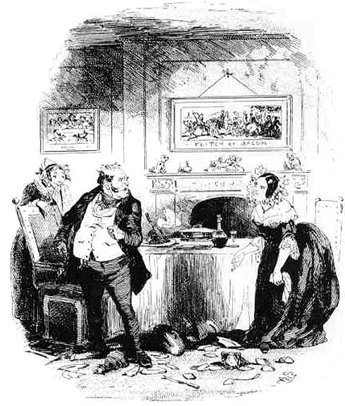
Gregory Gruff's Honeymoon [illustration 119]. Click on image for larger picture and additional information.
Emblematic details used with irony are prominent in the suite of illustrations dealing with the comic subplot of Gregory Gruff's unfortunate courtship and marriage to the Widow Clarkson. A large and rather comical "Samson and Delilah" (Delilah with an enormous pair of shears) comments warningly on the intentions of Mrs. Clarkson as she has Gregory examine a lump on her neck ("Gregory Gruff and the Widow"), while Phiz's ubiquitous peacock feathers and a stuffed wild bird under glass are slightly more subtle omens. A print of a handsome, half-clad woman, entitled "Snake in the Grass," implies that both the attraction and the treachery have gone a step farther in "Gregory taking his Gruel." In "Gregory Gruff s Honeymoon," which depicts the aftermath of a crockery-throwing altercation, a large picture entitled "The Flitch of Bacon" — referring to the story of a prize awarded to a couple who didn't quarrel all year (and based on a well-known Stothard engraving) — contrasts ironically with another of a cockfight; the final commentary is offered by the figurine of a fallen cupid. One is reminded of Gillray's before-and-after pair, Harmony before Matrimony, and Matrimonial Harmonics, the second of which includes a similarly deceased cupid (BM Cat 10472-73.).
Some of the emblems described above are trivial, and few if any achieve the subtlety of comment of Phiz's emblems for Dickens, but they are part of the sudden flowering of a technique which remained a dominant feature of Browne's illustrations for more than a decade. The stylistic developments in Godfrey Malvern are less obvious because Phiz is halfway between the lively, sometimes flowing and compositionally brilliant style of Charles O'Malley, which nonetheless uses a crude kind of caricature, and the more individualized method of portraying characters in Martin Chuzzlewit, a method that entails a more carefully worked out relation between text and illustration, and much more formal control. The Godfrey Malvern plates may seem static in comparison with earlier work for Lever, and unfinished compared with those of Martin Chuzzlewit, but they represent a [306/307] genuine advance, both in use of emblematic details and in the versatility of their manner and tone.
William Ainsworth's Auriol (1844-45), which followed Martin Chuzzlewit, shows still more of Browne's versatility. It is one of the few supernatural tales he illustrated during his prime, and the plates differ from nearly all his other work. None of them makes use of the dark plate method, but a number surely would have been executed that way a few years later, for they are unusually dark and texturally filled out, with a close and careful crosshatching reminiscent of George Cruikshank's work for such Ainsworth novels as Jack Sheppard, The Tower of London, and The Miser's Daughter. Indeed, the author may have wished for a continuation of the style of his earlier illustrator, or Browne on his own may consciously have emulated his predecessor. Doubtless the subjects as well have something to do with the technique, since there are many dark Renaissance interiors and sinister characters and situations.

The Ruined house in the Vauxhall Road [illustration 119]. Click on image for larger picture and additional information.
Most impressive is Browne's handling of small dark and light shapes — building materials, iron objects, sections of interior architecture — to create striking compositions. Perhaps the best of all, and the one which foreshadows Phiz's handling of shading and form in his dark plates, is "The Ruined house in the Vauxhall Road," where the stones, ornaments and contents of the house form a phantasmagorical surrounding for the light-bathed figure of Auriol, being lifted out of the ruins; not least effective are the ominous faces of broken stone ornaments, which appear to be glowering at the novel's protagonist.

Above: A Prairie-Evening Ride (from Lever's Roland Cashel, June 1848) [illustration 121].
The dark plate technique, first used in 1847, is applied to all of the plates in Lever's Roland Cashel (1848-49), which is thus unique among the full-length novels that Browne illustrated. In some of the etchings the only function of the technique is to produce an even tint, softening the general tone; in others, the grayish background helps to set off the foreground subject (for example, "Bravo Toro!"); and in several, a basically dark tone plays against grays of varying shades and white highlights. Perhaps the most noteworthy of these latter is "A Prairie Evening Ride," a horizontal plate in which a horde of stampeding bison emerge from gray skies and form an almost [307/308] abstract pattern of black bodies and white eyes around the protagonist on his struggling white horse. Browne displays his compositional abilities in "A meeting under the Greenwood tree," where trunks and foliage form a design around the human figures. The artist varied the texture with great effectiveness by using several kinds of roulette. In some of the interior scenes, the mechanical tint adds a degree of depth uncharacteristic of most such subjects among Phiz's work, and at least some reviewers were impressed: Chapman and Hall's catalogue for November 1849 quotes the Edinburgh News on the topic of Roland Cashel to the effect that "the illustrations by Phiz are the finest we have ever seen anywhere, combining, in a new and noble style, line with etching, thus producing all the mellowness of mezzotint in the happiest manner." The dark plate is, indeed, a kind of shortcut to mezzotint effects, whereby the laborious pretreatment of the steel with a "rocker" is bypassed. The inclusion of such a quotation in advertising suggests that the publishers were well aware of the part played by Browne's illustrations in the sale of Lever's novels.

A meeting under the Greenwood tree (from Lever's Roland Cashel) [illustration 122].
By the 1850s, the pace had slackened somewhat for Browne, but he still seems to have been fully employed. There are some short periods when work was evidently slack, but the number of etchings in serial novels amounts to 400, and there are 33 other etchings plus numerous cuts; in addition, Browne did 21 title page designs for the Library Edition of Dickens in 1858-59, which look to me like steel engravings, though they may be etchings. Although it seems that Browne was a poor businessman (possibly owing to innate shyness), the publication early in the decade of two books under his own name and made up solely of his etchings suggests a degree of ambition and self-confidence. Home Sketches, the first of these, is a small quarto volume of "Sixteen Domestic Sketches of Childhood," machine-tinted (i.e., like dark plates) and hand-colored etchings. The subjects and style are dated and sentimental by modem standards, but within the context of Browne's work they have special interest. He evidently devoted more time and care to them than to all but the most finished of his work for novelists. although, as Harvey has pointed out, one etching seems to derive from David Copperfield, most of them are original to this volume, and rather in the [308/309] style of the many watercolor drawings of women and children Browne produced during the 1850s and 1860s (Harvey, 151-52.).

Night [illustration 123]. Click on image for larger picture and additional information.
The dark plate technique is used in this volume mainly to soften the tone. The faces and bodies of the figures have an untypical three-dimensionality, and Browne represents female and infant faces in a stylized fashion, full and rounded, in fact nearly circular (the painters Daniel Maclise and C. R. Leslie may have had some influence in this regard). Emblematic details prevail throughout, and in ways which make them more prominently part of the subject than is usual in the novel illustrations. In "Night," the wall space behind the two women who hover protectively over a sleeping child is taken up by pictures of a setting sun; of two angels standing over a pair of sleeping children; of a jovial will-o'-the-wisp near a swamp, which here apparently represents dreams rather than the pursuit of riches; and of a woman with a lantern, leading a small girl through a swamp, with a prone body between them — suggesting something about the relation between sleep and death (perhaps an allusion to the most popular bedtime prayer). Other details of this type include a wall painting of St. Cecilia in "The Musician," a book open to an ostrich and a picture of a stilt-walker in "The Pedestrian" (the main subject of which is a baby's first steps), and in "The Bath," a large picture of Neptune in a chariot, a fisherman, cherubs in shell boats, and a Noah's Ark toy. The concluding plate, "Good Night," shows a ship sailing on calm water through the window of a child's room, a reminder of the type of detail used by Phiz repeatedly in his work for many novelists, but especially in Dombey and Son, where Dickens' use of similar imagery points up the affinities of author and illustrator.
Browne appears to have felt that his talents, outside of what he could do as an employee of writers, lay in the realm of sentimental-humorous pictures of mothers and children. The 1853 sketchbook now in the Victoria and Albert Museum contains forty-eight charcoal and chalk drawings almost entirely on such subjects, but a number are concerned with death, such as Number 24, "Please M'um y're wanted!" in which a skeleton calls to a young woman who is looking in a mirror, or the one immediately preceding, where the skeleton is what the woman sees in the mirror. It is my guess that the sketchbook consists of [309/310] trial subjects for possible future ventures on the order of Home Sketches and Illustrations of the Five Senses (the other independently published collection of Phizs etchings). Harvey has rather overstated the case in remarking that motifs from Dombey are found throughout, for, not to put too fine a point on it, the main images are the traditional and hackneyed motifs that Browne often used when working on his own — and in some of his book illustrations as well.

Old Mat's last resting-place [illustration 124]. Click on image for larger picture and additional information.
Up through Lever's The Dodd Family Abroad (1852-54), Browne's use of emblematic details in illustrations remains fairly steady, but from 1855 on their number dwindles, and although Little Dorrit has a few, Lever's The Martins of Cro'Martin (1854-56) has none at all. Browne's etched line becomes darker and bolder, but it has not lost its sensitivity, and there are a number of plates for this novel which are scenically splendid. They reveal Browne's new interest in composition, and in the arrangement of light and dark shapes almost for its own aesthetic, as distinct from conceptual, value. But what I think must be considered the last three major sets of illustrations are those for Mayhew's Paved With Gold (1857-58), Lever's Davenport Dunn (1857-59), and the completion of the suspended Mervyn Clitheroe (1851-52; concluded 1858). Dark plates abound in all three, and a certain coarsening of technique is not yet evident.
I shall limit my discussion to Augustus Mayhew's Paved With Gold, or, The Reality of the London Streets: An Unfashionable Novel, a fictionalized version of brother Henry Mayhew's researches and moral viewpoint. Augustus' preface "humbly" boasts of the "extreme truthfulness with which this book has been written," and remarks that parts of it were undertaken at Henry's suggestion. The subjects for some of the plates are of a kind that Phiz had not undertaken (unless we count "Tom all alone I s") since Sketches in London or Chronicles of Crime, and a glance back at, for example, "Out-door Relief" from the former book will reveal how far the artist has come. Of the twenty-eight plates in Paved With Gold, only nine (including the allegorical title page) are not dark plates, and the latter contain some of the best and most technically daring among all of Browne's work. Admittedly, the treatment of faces is uneven and at its worst [310/311] perfunctory, though at its best, as in "Baby 'Phil' in the Workhouse," up to Browne's highest level. In this etching, more than half a dozen women's faces are carefully distinguished as to physiognomy and expression, and the infants are neither generalized nor idealized. This eteiiing is a "dark" plate, but its tones are mostly light, and carefully stopped-out into several different grades, to show the varieties of wall coloring and differing lights and shadows.

The Tramps illustration 125]. Click on image for larger picture and additional information.
We also have some of the very darkest of dark plates, such as "The Meeting at Stonehenge," which is a marvel of threatening sky and looming stones, with the very small light of the homeless boys' fire in the center foreground. In "The family of Nathaniel Crosier, Esqr. aroused by an alann of Thieves," darkness is almost too much of a good thing, though I credit Phiz for the extent to which he has succeeded in conveying the effect of objects seen in an all but pitch-dark night. Probably the most visually beautiful plate is "The Tramps," which shows the three boys walking through the wooded grounds outside an aristocrat's estate; the trees are reminiscent of "Making off" in Little Dorrit. The title page bas a different kind of interest: its major theme is the pursuit and worship of money, and this is expressed in two allegorical motifs (both represented as the faces of coins): Pluto as the king receiving homage, and a bunch of ragged children playing with piles of money bags. A third motif, referring to another aspect of the novel, depicts the circus as embodied in demonic harlequin figures sitting on posts, a stage with dancers, and a Punch show with a gallows as its most identifiable prop, suggesting the danger that hovers over several of the novel's principal characters.
There is little or nothing in Browne's final work for Dickens, A Tale of Two Cities (1859), that comes near to matching his own best work in either Little Dorrit or Paved With Gold. The cover design is inferior to many Phiz did for Dickens and other novelists, there are no dark plates or emblematic details among the sixteen etchings, and only a few scenes of revolution in their energetic depiction of the mob add very much to this last collaboration with Dickens. On the basis of his work for Lever in Davenport Dunn (completed shortly before A Tale of Two Cities) and One of Them (which appeared the following year), it [311/312] is difficult to understand why this decline in quality took place. Extant drawings for Davenport Dunn (Huntington Library) make it clear that Browne was still working as assiduously as ever at his illustrations, as we find for several of the etchings two or even three drawings in various degrees of finish and with differing major details; further, most of the plates have an incisive line, a greater attention to detail, and a depiction of human figures which is charged with life and energy. In addition, Browne executed for Lever's novel fourteen good dark plates. One of Them is closer in style to A Tale of Two Cities, and it is perhaps a notch or two below Browne's previous work for Lever, but on the whole the etchings are still more interesting than those for Dickens' novel. There is room for endless conjecture here, and perhaps the most plausible answer is that Dickens himself had by this time lost much of his earlier interest in illustration, and hence gave Browne less interesting subjects and relatively little guidance. Perhaps another factor was that A Tale of Two Cities was written for weekly part publication (in All the Year Round), and it is thus unusually compressed in its bulk and schematic in its plan and development. This is not meant as a critical judgment of the novel, but it is conceivable that Browne simply found it less inspiring than Dickens' other books. Whatever the case, this collaboration was not a very happy ending to the twenty-four year relationship of Dickens and Phiz, nor of Phiz's career during the 1850s.
With the beginning of the next decade Browne, though still respected (if the frequent and prominent use of his name on the title pages of works to which he contributed a few among many illustrations is any gauge), and still receiving many commissions, was clearly, though gradually, deteriorating as an artist. An increasing proportion of what he did can be considered hackwork, as can be seen in some cuts he designed for boys' books before 1860. It would be a very large task to compile a bibliography of his work from 1860 on, because so much of it is ephemeral and difficult to date. For example, from early in the decade Phiz illustrated a series of undated yellowbacks issued in six-penny or penny parts, sometimes with colored printing by Edmund Evans, including such titles as Grimm's Goblins (issued in forty-two parts with a colored wood engraving in each, but possibly [312/313] not published in toto in bound volumes); Ruth, the Murdered Child; The Battle and the Breeze; Life and Adventures of Peter Wilkins; and The Confessions of a Page. This last carries "Illustrated by Phiz" on the title page of each part, but his contributions are infrequent after the first. The others are sometimes illustrated wholly by Phiz, sometimes only partly, but his designs are consistently rudimentary and indifferent, although in Fortunes of the House of Pennyl he makes an interesting use of something like the dark plate technique in a wood engraving.
One of the more interesting items of the early 1860s was a projected collaboration with Browne's friend (and in later years, patron), George Halse. Thomson describes it as originating in the "artist's original idea" to publish "between fifty and sixty quarto drawings" under the title "'The Adventures of Pott,' with a rhyming commentary by himself," but Halse, seeing the work, chose forty of the drawings and wrote a narrative poem to fit them (Thomson, p. 217.). The drawings were apparently chopped up and ultimately destroyed when bits of them were used for the volume that emerged, but photographs of the drawings (now in the Victoria and Albert Museum) suggest that in some ways they are the most ambitious venture ever undertaken by Phiz. The series of comic-fantastic adventures is the artist's invention, and each large sheet (with a few exceptions) includes a clockwise sequence of tiny figures around the perimeter (much like a circular comic strip without words), and a larger subject related to the same episode in the center. The work is delightful, and had the time been ripe or had Phiz managed the right connections with publisher, he could perhaps have been a successful mid-Victorian comic strip man.
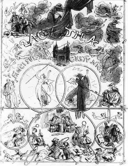
Title page for Agatha illustration 126]. Click on image for larger picture and additional information.
But the actual result, a volume called Sir Guy de Guy, gives practically no sense of the original, and certainly no hint that it was to have been a series of comic drawings "illustrated" in the Combe-Rowlandson manner by verses, rather than a narrative poem illustrated by occasional mediocre cuts. The most successful illustration Browne did for Halse was the dark-plate title page for Agatha (1864), in which some of the power of his earlier allegorical creations is retained.
Assignments continued, though in diminishing numbers. Unhappily, in the middle of the decade Browne was humiliated by the appearance of Our Mutual Friend with illustrations by Marcus Stone; he was also relieved of his commission for Trollope's [313/314] Can You Forgive Her? halfway through. The etchings for the Trollope novel are indeed quite poor, the several dark plates being no more than ordinary designs with a uniform tint that does little to enhance them. During the late 'sixties Browne also produced Racing and Chasing, and Sketches of the Seaside & the Country, published by the Graphotyping Company. Both contain competent quarto pictures in the vein of John Leech, but somehow lacking Leech's incisiveness and humor. It seems likely that Browne garnered no substantial economic rewards from these and similar ventures.
Whether his humiliations and financial difficulties were factors or not, we know that in 1867 an illness left Phiz partially paralyzed for the remaining fifteen years of his life, and made work exceedingly difficult; in view of the handicap-loss of the use of the right thumb was the worst affliction from an artist's viewpoint — it is astounding how much he produced and got published, but none of the work is really of interest to anyone but a collector or enthusiast, and some of it is pitiable, perhaps none so much as All About Kisses, "by Damocles / with one hundred illustrations by Hablott K. Brown (Phiz) ' " which the British Library dates as 1875. It would be heartless to say more about this book than that the cuts are more pathetic than the misspelling of the artist's name on the title page. The name, however, did apparently mean something to publishers for some years, as Browne executed designs for the periodical Judy from 1869 to near the end, a number of toy books, and two or three collections of humorous drawings, as well as wood engravings for reissues of Ainsworth and Lever, and illustrations for the Household Edition of Pickwick which, however, hardly bear scrutiny (Johannsen (J, p. xi) seems to have been under the impression that Phiz did all 866 cuts for the Household Edition, but in truth he did only the 57 for Pickwick.).
In his biography, Browne's son Edgar passes over the last fifteen years of his father's life rather quickly, but Thomson suggests that the artist was in a bad way financially, especially during his later years. He seems to have done no etching after his illness, and the assignments for woodcut designs, although coming in at least until 1878, were probably not enough for him to live on comfortably. An annuity from the Royal Academy a few years before his death was no doubt helpful, and at times he also earned added income from the redrawing of his Dickens illustrations for private patrons. The most extensive assignment was a [314/315] complete set of watercolor drawings done between 1866 and 1869 for F. W. Cosens (who also gave the elderly George Cruikshank similar assignments), but there were others, such as drawings for an unknown patron from The Old Curiosity Shop and Barnaby Rudge (now in the Gimbel Collection); and in 1878 he apparently sold the Little Dorrit drawings to another collector, substituting three new drawings for missing ones (See Slater, Catalogue of the Suzannet ... Collection, pp. 214-16). There may have been others, but it is evident that Browne had few saleable drawings apart from Dorrit, as an 1880 letter finds him informing one William Wilson, "I regret to say I have no 'Dickens' — but will mention yr. name and give your address to my friends," (In the present author's possession.) which suggests that he had earlier in life been overly generous in giving away such valuable material, as he had been overly modest in destroying a large batch of his own drawings and letters from authors in 1859.
It is probably in part owing to his long decline, as well as to Browne's lack of association with any important literary artist during the last two decades of his career, and to the ephemerality of many of the works he illustrated throughout his career, that his reputation remained generally low for so many years. The letter to William Wilson underlines the fact that Browne's importance ties in his association with Dickens, the novelist's attitude toward him remained very much that of an employer to a hired hand. Dickens may never have fully appreciated the contribution of his primary illustrator to the effectiveness of his novels, but we now have the knowledge to evaluate that contribution for ourselves. Even if the circumstances surrounding the creation of a new kind of verbal-visual novel in Pickwick Papers are in some sense accidental, the importance of the role of Phiz's illustrations is not. Dickens was from the beginning a novelist much of whose artistic force depended upon modes of symbol formation which were visual, allusive, or both, and who repeatedly created implicit or explicit parallels in the structure of his novels. In the Pickwick Papers and Nicholas Nickleby the parallelism tends to remain local — as in the attorney's office and the pound — while the allusiveness lacks the intensity it reaches in his later novels. In these early novels, Browne's illustrations help to make explicit certain themes and implications, through both traditional [315/316] symbolism and visual parallels. But as Dickens' art develops so does Browne's. The allegories of the monthly cover and frontispiece and the tacit allusion to Hogarth in the etched title page of Martin Chuzzlewit are more complex visual interpretations than anything Browne had done earlier, as both the structure and texture of this novel are new achievements for Dickens. In Dombey and Son and David Copperfield Browne reaches his highest concentration of allusive, emblematic interpretation, as well as continuing to emphasize meanings implicit in these novels' structures, through visual parallels among the illustrations.
We should take seriously Mrs. Leavis' remark that Dickens no longer needed an illustrator for Bleak House: the increase in complexity and frequency of metaphoric and allusive language in the novel is immense. But at this point Browne reduces the level of his own emblematic commentary, and makes a new and striking use of the dark plate, underlining the novelist's vision of a depersonalized world. The same technique is used by Browne to good effect in Little Dorrit, whose social vision is a development of that inBleak House.
From Pickwick through Little Dorrit, then, Browne's illustrations are essential: in a variety of ways, they complete Dickens' artistic achievement. We must therefore take Hablot Browne seriously as an artist, understanding that the importance of his art lies ultimately in the way he fulfilled his role as a subordinate — but not wholly subservient — collaborator with and interpreter of Dickens. Although Dickens had other illustrators, none fulfilled this role so extensively or so well. One is hard put to think of a comparable achievement by any other British artist of the nineteenth century.
Created 19 November 2002 Last updated 25 October 2022