
Introduction: Dadd as Painter and Illustrator
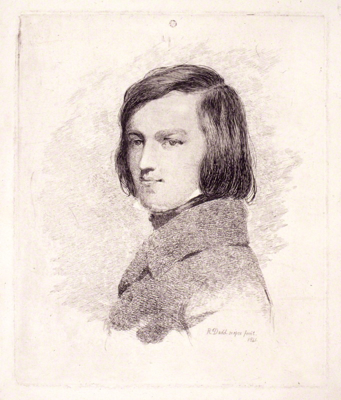
Richard Dadd (1817–86) is primarily remembered as a tragic patricide who painted strange and haunting pictures of the fairy-world. His most famous work, The Fairy Feller’s Master-Stroke (1855–64, Tate Britain, London), is widely regarded as a dream-image in which the artist’s mental disorder is reflected in the picture’s curious distortions of scale, space, and ‘rather disturbing’ colour (Houfe, p.111); produced in isolation during his incarceration in Bethlem Hospital, it typifies his idiosyncratic style.
Treated as a curiosity, Dadd is rarely regarded as an artist whose work can be separated from his ‘madness’. His paintings are viewed as the ravings of a maniac, and psychological interpretations have read them as the transcripts of insanity. As Nicholas Tromans explains in a recent monograph (2011), Dadd has been classified firstly as a practitioner of ‘Outsider Art’ (p. 179), providing aberrant or alternative views of the ‘real’ as he worked in the madhouse; and later as a hero fit for the Surrealists, whose images (allegedly) map unconscious desire (p.180). However, these readings, however inflected, are invariably simplistic. Tainted by anachronism, they fail to consider the artist’s career as a whole, or the historical contexts and ideas of his time.
In fact, ‘Mad Dadd’ was producing strange compositions long before he lost his mind in 1843. As a member of ‘The Clique’ he engaged in all sorts of what he himself described as ‘wild vagaries’ (qtd. Maas, p. 151), and was never a conventional artist. His art was unstable, contradicting traditional notions of realism, and was markedly at odds with the work of other members of The Clique. Indeed, there is no relationship between the prosaic exactitude of William Powell Frith and Augustus Egg, and the fantastical versions of the ‘real’ that appeared in Dadd’s painting as early as 1840; nor is there any obvious connection between his versions of history and Oriental subjects and those presented by John Phillip. Distortion was an integral part of his expressive range, and his pre-madness paintings embody a daring experimentalism, the signs, we might argue, of intellectual focus rather than mental disintegration. These early paintings have been examined in several important studies, and feature in detailed monographs by Tromans (2011) and the classic study by Patricia Allderidge (1974).
Equally challenging, but much less familiar, are the artist’s illustrations in black and white. Dadd produced only five of his idiosyncratic designs for the printed page: one as a pictorial frontispiece for H. G. Adams’s miscellany of poems, The Kentish Coronal (1841); and four borders (each made up of several vignettes) for Samuel Carter Hall’s celebrated Book of British Ballads (1842–4). These illustrations enshrine a complicated style, while also providing a vivid, imaginative, and sometimes incongruous reading of the written texts.
Style and Tension: The Kentish Coronal
In his etching for The Kentish Coronal, Dadd provides what is nominally a conventional frontispiece. The image presents two classical figures, the emblems of the lyric arts: the seated one is Flora, wearing a floral wreath, and Pallas Athene is positioned behind her. The border contains a harp and other musical instruments, and surrounds the design in a cornucopia. Modelled upon the emblematic frontispieces found in poetry books of the eighteenth century, the illustration is a generalized celebration of poetry, and sets an appropriate tone for a book of poems in celebration of rural life in Kent.
However, Dadd’s treatment is subtly distorted. The figure on the left looks askance at the viewer, both faces are melancholy and unsure, and the branch of the oak tree in the background is twisted into an ungainly shape. The effect is two-fold: the neo-classical characters are anything but celebratory, while the distortions of the tree and other details are at odds with a classical aesthetic. In a work characterized by aesthetic strain and ambivalence, Dadd unsettles the viewer and creates a sense of menace, challenging the verse and setting the book on a radical footing when all that is required is visual consonance with the letterpress. This subversive approach prefigures his principal work for The Book of British Ballads.
Dadd, The Book of British Ballads and the Grotesque
The Book of British Ballads was first issued in two volumes in 1842–44, and subsequently appeared in a series of one volume editions for the next twenty years. Originally published by Jeremiah How with Samuel Carter Hall as editor and heavily influenced by Rethel’s Das Nibelungenlied (1840), it was intended to exploit the growing taste for Germanic design. The elaborate borders, with their heroic figures and rustic interlaces, are closely modelled on Rethel’s foliate compositions, and the book is the most accomplished example of a British version of a German prototype. As Gordon Ray remarks, the book was self-consciously ‘ambitious’ (p.61), and set out (as the introduction makes clear, 1, p.iii) to rival its German equivalents.
Later to become the editor of The Art Union (or Art Journal as it was known from 1849), and well-known as an expert on contemporary art, the editor secured the best ‘Germanic’ talent available to him. John Tenniel appears in his first commission, and there is strong representation from Henry Courtney Selous, John Franklin, John Rogers Herbert, and Henry James Townsend. These artists support the texts’ medievalism with intricate scenes of knights in armour, damsels, historical décor and high passion, each framed and contained by elaborate strap-work. This corpus of imagery is handsome, a British version of Rethel’s style.
The only exceptions to this judgement are the four sets of images by Richard Dadd for the traditional ballad-verse, ‘Robin Goodfellow’. Dadd’s illustrations stand out: described by Muir as the book’s ‘great trouvaille’ (p. 35), they are not bound by the conventionalities of the Germanic idiom. As in the artist’s work for The Kentish Coronal, they stretch our expectations.


Title page to ‘Robin Goodfellow’ and two details. [Click on these images for larger pictures.]
Positioned within borders over four pages, they visualize Robin’s mischievousness as it is described in the text: misleading travellers, pinching the girls as they lie in bed and stealing babies are all shown in microscopic detail, and the connection between the textual details and their visual showing is reinforced by the physical proximity between the stanzas and the designs. Presenting his illustrations as stacked compositions in which each part is placed to the left of the scene it represents, Dadd emphasises (and demands) the act of visualized reading. We scan from words to images and back again, with the illustrations providing a graphic version of the textual information. The effect is reminiscent of a comic strip, turned on its axis so that we read the designs as pictures with captions – this time moved (as it were) from below the image to its right hand margin. As with a comic strip, it is hard, at first glance to see which semiotic code should have priority.


(a) The maids to please at midnight I card up their wool and two details. [Click on these images for larger pictures.]
What is more, this process of interchange and checking is different from the relationships between the illustrative borders and the texts in the rest of the book. In illustrations by other contributors, notably Franklin and Selous, there is only a single vertical image placed next to the verse on its page, and embodying just one event. In Dadd’s, on the other hand, we move through multiple scenes, so creating a sequence informed with a sense of fluid progression and change. Such linearity is further stressed by the compositional linkage of each design, with trailing arabesques of lines of dancing grotesques directing the eye from the top of the page to the bottom. As Ray comments, the ‘unusual layout’ provided ‘stimulating’ (p.61) opportunities for the arrangement of the visual response, and Dadd, above all others, manipulates this arrangement to produce a distinctive effect.


The bed-clothes from the bed pull I and a detail. [Click on these images for larger pictures.]
The illustrations act, in short, to provide an efficient visualization of the poem’s narrative, registering the ballad’s episodic structure. Yet they extend well beyond literality. Dadd reinforces the charting of events, but at the same time re-figures the poem in his own terms. The verse is about ‘good sport’ (1, p.87), the exercise of ‘pranks’ (1, p.90) and ‘some tricke’ (1, p.88); the illustrations, on the other hand, are menacing and grotesque, and it is not at all the case, as Tromans remarks, that Dadd catches the poem’s ‘light and playful’ tenor (p.16). Rather, he takes the humour and darkens it; figured as dense patterns of black and white, the illustrations are presented as grotesque arabesques in which the tone of levity is replaced with a brooding atmosphere of anxiety and pain.


Babes new borne steale as we go and two details. [Click on these images for larger pictures.]
In place of Robin’s ‘laughing’ (1, p.90) account of naughtiness, the images inject a sense of nightmare. This is achieved by modifying both the manner of the events and the nature of those who enact them. The minor acts of torment – pinching girls in bed or misleading travellers – are made far more unpleasant. The little people terrify their victims as they lie half-asleep, while those following a false sign end up in quicksand rather than a bog (1, p.88). Moreover, Dadd’s tormentors are not feys but monsters. His fairies, transformed into goblins and incubi, are repulsive figures. Rather like dream-versions of foetuses, with over-large heads and emaciated limbs and always ugly, they convert the whimsical into nightmare.
In these ways Dadd foregrounds the poem’s elements of psychological distress, intensifying the fear, stressing the strange otherness of the magical figures, moving the emphasis from the perpetrators to the victims, and transforming his source into a version of Gothic. Folklore becomes Grand Guignol, and he reinforces his effects through a process of inter-pictorial quotation. The swarms of naked figures cascading from one vignette to the one below it are partly taken from a device found in earlier fairy-art, but are also intended, I suggest, to recall the interlocked forms of the wicked as they tumble helplessly from one torment to the next in the hell-scene in Bosch’s Garden of Earthly Delights (1510; Prado, Madrid). Further, in the third set of illustrations (1, p.89) the incubus squatting on the bed is a direct reference to the goblin in Fuseli’s celebrated painting of The Nightmare (1781; The Detroit Institute of Arts). Both allusions frame the poem in visual contexts in which ‘little people’ express the most negative aspects of human feeling, and both quotations add an extra dimension of threatening unpleasantness.
These references would have been recognized by the visually-literate among contemporaries, forcing the reader/viewer to make a series of telling connections. Other designs, appearing in the book, notably by Franklin and Selous, are versions of British ‘Germanism’ that deploy the illustrative style of Teutonic illustrators and express their visualization of heroic themes. In Dadd’s illustrations, conversely, the allusions are anything but uplifting, and his quotations sit uneasily in a book which is otherwise a straightforward celebration of old English ballads. Juxtaposed with energetic designs of medieval characters by Selous and heroic deeds by Franklin and Townsend, Dadd’s images are (designedly) out of place, curious acts of introversion and fear that distort the book’s celebration of chivalry and English courage.
They also form a telling contrast with other versions of the poem. It is interesting, for example, to compare Dadd’s treatment with Franklin’s visualization in Old English Ballads (1864), a book that forms a parallel with The Book of British Ballads.In Franklin’s work we have a typically good-humoured showing of the little people: lyrical and pleasing, it demonstrates once again how the poem could be read – and how Dadd’s interpretation is far more radical and challenging than its rivals.
Dadd, ‘Robin Goodfellow’, and the Language of Fairy Art
Dadd’s designs for ‘Robin Goodfellow’ are curious and unusual, the work of an iconoclast. They were nevertheless highly influential in the development of the Victorian genre known as ‘fairy art’. This type of image, usually in the form of painting, was already established by the time The Book of British Ballads (1842) was in print. What is noticeable about Dadd’s illustrations, however, is the way in which he re-focuses the emotional and psychological meaning of his figures. In earlier fairy-works, notably Maclise’s Fauns and Fairies (1834; The University of Iowa Museum of Art), the artist presents the little people as neo-classical nudes which express an elevated notion of ‘magical’ beauty; in Dadd’s, conversely, the figures have been transformed into grotesques, the embodiment of malignity.
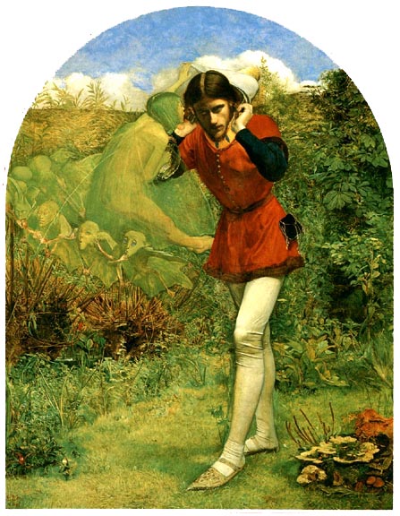
John Everett Millais's Ferdinand Lured by Ariel. [Click on image to enlarge it.]
This emphasis is Dadd’s contribution to the emerging discourse of fairy-art, and left an imprint on the genre; his later paintings produced in the mad-house could not be viewed, but his weird and sadistic book-images of 1842 had wide currency. His illustrations in The Book of British Ballads may well have influenced the Pre-Raphaelites’ treatment of this theme. It is noticeable that in Millais’s Ferdinand Lured by Ariel (1849; The Makins Collection, London), the squinting faces of the grotesques have an emaciated, half-formed appearance about them that recalls the grimacing portraits in the work of Dadd.
Dadd also had a significant impact on the art of Richard Doyle. It is known that Doyle saw the paintings such as Puck (1841; Engen, p. 40), and it is also likely that he viewed and imitated the illustrations for ‘Robin Goodfellow’; his unpublished pen and ink drawings from 1842–3 (Victoria & Albert Museum, London) are clearly modelled on Dadd’s calculated ugliness, and there is a sense of Dadd’s fluid composition in the jovial swirls on the front cover of Punch (1849).
Most of all, Doyle learned from Dadd how the fairies could be menacing, rather than charming in the style of Maclise. This sense of malignity is carried forward in Doyle’s illustrations, and there is a close (but previously un-noted) connection between the sadism of Dadd’s illustrations in The Book of British Ballads and those appearing in Doyle’s illustrations for The Enchanted Doll (1849), and again in his master-work, In Fairyland(1870).
Works Cited
Allderidge, Patricia. The Late Richard Dadd. London: Tate Gallery, 1974.
Book of British Ballads, The. Ed. S. C. Hall. London: How, 1842–44.
Engen, Rodney. Richard Doyle. Stroud: Catalpa Press, 1983.
Houfe, Simon. The Dictionary of Nineteenth Century Book Illustrators. Woodbridge: Antique Collectors’ Club, revised ed. 1996.
Kentish Coronal, The. Ed. H. G. Adams. London: Simpkin, 1841.
Maas, Jeremy. Victorian Painters. London: Barrie & Jenkins, rev. ed, 1978.
Muir, Percy. Victorian Illustrated Books. London: Batsford, rev. ed. 1985.
Ray, Gordon, N. The Illustrator and the Book in England from 1790 to 1914. NY: Pierpont Morgan Library, 1976.
Tromans, Nicholas. Richard Dadd: The Artist and the Asylum. London: Tate Publishing, 2011.

Last modified 29 January 2013