

NY survey of the field of Japanese Art would be imperfect without some reference to three important elements in all pictorial Art—Chiaroscuro, Colour, and Perspective.
Mr. J. Leighton, in his discourse on the Arts of Japan, draws the conclusion that they may be said “in an eminent degree to depend upon the picturesque, though rarely to reach the pictorial ; that is to say, they never produce a picture, because the principal element of pictorial Art is wanting—light and shade.” They certainly do not, as a rule, employ light and shade to make a picture, but they are not wholly ignorant of its effect in giving to flat surfaces the deceptive appearance of objects in relief. Art, however, of the highest kind, as he observes elsewhere, may and often does exist without chiaroscuro, and their defect on this side does not prevent their being as a people a nation of artists, with marvellous feeling and instinct for Art, with a fine sense of the beauty of colour, and after that of form, but this in an inferior degree; reversing the characteristic of the ancient Art of the Greeks, where a love of the beautiful in form was the first to find expression, and of colour only in a secondary degree, while it has been left doubtful whether they understood chiaroscuro any more than the Japanese do at this day. Mr. Leighton suggests that this is a power which seems to have been reserved for less sunny climes—lands of cloud and mist where colour tells the least, and neutral tints predominate. But he begins with the axiom that the Asiatic, from Turkey to Japan, is “gifted with Art powers indigenous to the soil on which they grow, as the gorgeous plants of the tropics flourish independently of care or culture; "and he explains that in this he alludes more particularly to “that marvellous perception of form and colour, founded upon the laws of Nature, and demonstrable by the aid of science or the rules of Art, that seems the heritage of all Asiatics." However this may be, it must be admitted that if one powerful element of pictorial Art be light and shade, the Japanese are without any knowledge of its importance.
The pictorial effect which results from an artistic disposition of lights and shadows, and by the quality in these which is technically termed breadth, is in equal degree unknown to them. “That every light should have a focus of brilliancy, and every shadow a heart of depth,” has not been recognised as an essential condition of the picturesque or pictorial Art. Equally have they failed to perceive another cardinal principle of chiaroscuro by which breadth of effect and unity are attained, namely, the graduation of each, and the grouping together in due subordination of all the lights and all the shadows, if there are more than one of each, by which lights are incorporated with shadows by graduation, and vice versa.
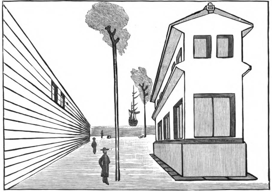
Figure 1
If, as has been said by a writer on Art, those effects of light and shade are most satisfactory to the eye which have manifestly some artificial or arbitrary disposition of light or shade ”-—a position which of course may be disputed—the Japanese neglect of such means of attaining pictorial effect may be explained by their adherence to what they observe in Nature. The simpler disposition of light and shade adopted by European artists with a view to attain pictorial effect and make a picture certain to please by the chiaroscuro alone, independently of colour, has certainly not entered into the artistic mind of Japan. Neither “a wedge-shaped breadth of light or of shade, nor a conspicuous object of agreeable form either in light or in shade, according to choice, at one side of the picture,” is ever consciously resorted to by Japanese artists and workmen with a view to the pictorial effect. The principle so often illustrated by Claude Lorraine’s sunsets, a mass of light in the background relieving dark objects on each side, with a dark graduated intermediate distance; and that preferred by Rembrandt of a point or focus of bright light suddenly graduated into dark shadows, as in the ‘Adoration of the Shepherds;' or the reverse, of general light with a point of dark, often adopted by Turner, Collins, and others—all these and many other more or less artificial arrangements of light and shadow for pictorial effect, easily recognised in European Art, have hitherto found no place in the Liber Studiorum of Japanese artists. So, also, with such rudimentary knowledge of the rules of perspective as they possess, they do not seem to have learned the importance of placing the point of sight out of the centre of their picture, and lower down or nearer to the base line of the picture than the top, the neglect of which is held to be destructive of pictorial effect. The relieving of dark objects against light, and the contrary of light against dark, and many other rules may be equally dismissed. The truth is, that they never have given their minds to the painting of pictures as such. For screens, and fans and cabinets, they invent charming designs, and very artistic groups of‘ flowers, trees, figures, &c., but rather as materials or suggestive motives for a picture than pictures in themselves.
Yet, as has been remarked in a former article, the Japanese have great dormant pictorial power, and sometimes display it with a limited light and shade, with much of silhouette in effect, of which an example was given in one of the illustrations.
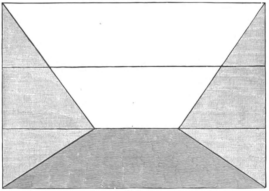
Figure 2
In a question of originality of conception, and power of rendering pictorially a weird and mystic subject by a poetic and purely ideal mode of treatment, another illustration is now before me which leaves nothing to be desired, and would not be easily matched among the best efforts of European Art. It is a moonlight scene, with the moon large and full in a dimly coloured sky, across the broad disc of which a flight of strange-looking birds are shadowed with outspread wings coming from afar, as the perspective admirably renders; while others, all in black, of strange presence, are scattered over the picture, some on a branch, others in the air, and on a shore which seems to look into boundless space.
In regard to their colouring, it is with them a matter of feeling, I fancy, guided by a fine sense of colour and the conditions under which this can be most highly gratified. Certain it is, they have none of the rules recognised in European Art as embodying approved principles derived from the practice of the great masters and colourists of the past ages.

Figure 3
Whether the Japanese workman has any knowledge of the necessity of avoiding “greenish blues and greenish yellows, both being sickly in hue,” or has been taught by his eye never to place such a green “between blue and yellow as would result from the mixture of the particular tint of these two colours which are made use of,” I cannot say. But they have a great love of tertiary compounds, and are perfectly aware that these receive value by the opposition of the colour which enters least into their composition. The balance of colours, of which much has been made in dilettante Art criticism, and the balance of lights and shades in a picture, would seem to have no place in Japanese Art. Yet it is quite certain they have the finest perception of harmony and tone in colours, and rarely seem to make any mistake in the innumerable objects produced, even by the leastskilled workman. Mr. Jarves says, “The aesthetic temperament of a nation is most subtly felt in its use of colour;” and he believes that “in [262/263] the Orient the use of colour seems always to have been coincident with a passionate aesthetic satisfaction in it for its own sake, unchanged by time or ideas foreign to itself;” and Mr. Leighton bears his testimony that, “in colouring, the Japanese are, generally speaking, very skilful, adopting a quiet and refined style, and using full low-toned colours in preference to excessively brilliant ones. In this they differ from the Chinese.
Figures 4 and 5. [Click on these images for larger pictures.]
Of course I do not wish you to understand that the Japanese artists do not use bright colours, for few men know their value better;but what I desire to convey is that they use them judiciously, and in comparatively small proportions, cleverly supporting and contrasting them with the secondaries, and other compound colours they use in grounds and large masses generally.”
I may add, so far as my own experience goes, that they want no instruction from their brother artists in other lands as to the pleasure to be derived from “that tempering of contrast with likeness" which is found to belong alike to the harmonies of form and sound.
Mr. Morris would seem, indeed, to have taken a hint from the Japanese in his taste for painting walls and backgrounds generally of neutral greens and browns. Of course, when positive and bright colours are used in depicting objects in Nature, everything depends on the finer sense of colours in harmony, and those subtle combinations and gradations which must be felt, not described. I have heard it denied that Oriental races have any real superiority over Europeans in their perception of the harmonies of colours, and the finer sense of these, which makes them take a special delight in bright colours. It is urged that in India and elsewhere in Asia they show a taste for what have been styled “degraded colours ”—the magentas and other aniline products. It has been contended further, that what we have admired as Oriental patterns, with their perfect harmony of colouring, are thus shown to have been merely the work of chance, and once adopted, the conservative habits of Asiatics have sufficed to perpetuate them. I do not think there is any foundation for such opinions. Excellence, whether in colour or form, as Sir ]oshua Reynolds observed, is never the work of chance, and instead of one pattern or one combination of colours pleasing to the eye, it is easy to distinguish hundreds varying very much according to the period or locality. That they may not have proved superior to the temptation of some \Vestern novelty of a debased or inferior Art to their own, and which may in addition have had the recommendation of greater cheapness, does notjustify the larger inference that they have no finer sense of beauty than those from whom they buy such goods in preference to their own. It has been truly said that it is with colour as with other elements of Art, excellence or beauty can only be produced by those who delight in it. Soft shades of grey and brown, or dull green, have much to recommend them if used in proper subordination, and with reference to brighter and purer colours. Bright and pure colours are the best, and all richness of effect must be dependent on them. A relative arrangement of tints will do much to produce a sense of harmony, but not a colourist who loves masses of the brightest hues, such as in a sunny clime alone are a perpetual feast to the eyes and a delight to the sense which revels in profusion. The Roman scarf or the handkerchief of the contadina, the bright-coloured sash of the Andalusian and the glowing scarlets and gold of the Indian bazaars, are all the living evidences of an innate sense of the beauty of bright and pure colours. \Ve never have in England the sun of these Southern and Eastern climes, which gives to the skies and mountains, to trees and birds and flowers, a glory of such brightness, that colour of the most vivid and brilliant hues forms a part of their nature by daily and hourly association in the life of the people.
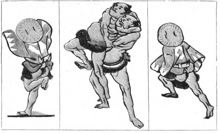
Figure 6
In this matter of colour, Mr. Jarves, who has evidently been a close student in japan of Japanese characteristic excellences, evidently thinks as I do. He remarks that the “two chief branches of the human family, both originating in Central Asia, and which have developed the highest civilisation, are the Aryan and Turanian. The first, guided by its nomadic instincts, in the outset of its historical career became widely diffused and separated, while the second remained in more centralized and compact masses. Each distinguished itself by characteristics that have slowly crystallized into national idiosyncrasies, more or less antagonistic and one-sided as regards one another, and ending in fixed expressions of civil and religious life. The opening of lines of communication and extension of commerce have brought these face to face, if not into direct competition, to stand or fall on their own merits, or possibly to borrow from each other, and in the end intermingle.” He goes on to observe that the latest family achievement of the Aryan branch is the unassthetic, restless American people—the direct antithesis in all essentials of the Turanians. These have met on the soil of Japan, and the Japanese, as a nation mainly under American guidance, has made a plunge into such civilisation as this latest form of Aryan progress has produced. On the aesthetic side it is obvious no greater contrast or antagonism could be found; and in the matter of colour we may fairly weigh what Mr. Jarves has to say. He remarks that “a noteworthy zesthetic trait of the Turanian is his passion for colour, whilst the Aryan shows a preference for pure form. The predominance of brilliant traits in their Art, and absolute delight therein, used with intuitive sagacity and appreciation of harmonious contrasts, gradations, and interblendings, as it were forming refined symphonies or spiritual chords of colour, are a special heritage or instinct of the Turanian family; just as those of Aryan descent are more distinguished by sculpture and architecture in general than by a universal appreciation and skill in using colour, especially in the minor decorative forms of Art.”
Mr. Leighton, speaking ofthe progress made by the Japanese, and the sources of instruction open to them, gives them credit for having acquired some knowledge of linear perspective from the Dutch. In all probability they did. In one of the numerous sketchbooks left by their celebrated artist Hokusai, and the school he founded in the last century, there is indeed a lesson in perspective, no doubt derived from some Dutch source only partially understood. (See Diagram No. 1.)
It will be seen that, although they had some knowledge of a horizontal line passing through the field of a picture at the height of the eye of the spectator, they have not understood that the point of sight on that line is always opposite to it, and that all lines or visual rays in parallel perspective must go to the same point of sight ; whereas, although the ascending and descending lines in both diagrams go to points on the horizontal line, they go to two or more points, some distance apart. As to points of distance out of the picture, to which all diagonal lines should go, they seem to be wholly ignorant. And so of vanishing points in oblique perspective. So in the next diagram (No. 2)they must have learned that in order to secure a pleasing effect the horizon must not be placed equidistant from the top and bottom of the picture, but one-third or two-fifths lower or higher, accord ing to circumstances, but never in the middle. That seems to have been the object of this lesson, defective like the other as to the point of sight.
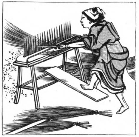
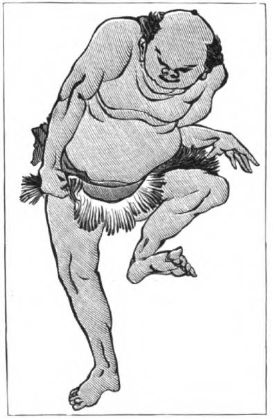
Nevertheless, either by some rule, or more probably by eye, in drawing a circle, as the wheel of a cart, they put it into very fair perspective, as may be seen in the following example, taken from the same book (Fig. 3), in which the complicated piece of perspective is tolerably given. This is perhaps still more clearly exemplified in Fig. 4, representing a woman carding hemp. Of foreshortening in the human figure they have little knowledge, and yet often attempt to render it. Figs. 5 and 6 may be taken as examples, in which there is a fair degree of success. Though it must be confessed, therefore, at the outset, that in perspective and the drawing of the undraped human figure they have little pretension to scientific accuracy, yet their success in each direction is considerable.
Upon the whole we must agree with Mr. Leighton, when he says that their inferiority in perspective, both linear and aerial, is “not without exceptions, for sometimes their linear perspective is nearly perfect, and their aerial perspective very beautiful, though they do not seem to understand the pictorial-—that power of chiaroscuro that makes a picture." Later he remarks, in a letter to me, referring to the same subject, “A work of Art need not be a picture, and a great deal of pictorial Art may exist without much elevated conception. I have no doubt that with their imitative powers, they will some day add perfect perspective and pictorial Art to their pictures, though in the process they may possibly lose some of the higher qualities practised in more primitive times."
Related Material
Bibliography
Alcock, Sir Rutherford. “Japanese Art.” Art Journal (1878): 261-64. Hathi Trust Digital Library version of a copy in the University of Michigan Library. Web. 14 August 2013.
Last modified 6 September 2013