
leeson White designed a large number of book covers, and made a significant contribution to the development of Art Nouveau bindings for the general public. He produced more private work in the form of monograms and bookplates. Known, for the most part, only by collectors and specialists in the field, these small images are fine pieces of graphic design, the products of a distinctive artist who practice was underpinned by thoughtful theorizing.
However, there is a shortage of critical analysis of these works and making sense of them has been hampered by inaccessibility. Gleeson White’s stature as an ex-libris designer has been helpfully promoted by material in The Bookplate Journal (2009), which reprinted his Studio essay (18989) on the subject and illustrated some examples. Yet the Journal does not include any modern interpretations of his style or idiom. In the following section I offer an up-to-date reading of Gleeson White’s bookplates, drawing on material from the family archive and from the archive of the Houghton Library, Harvard University. Much of this work is published here for the first time.
Gleeson White, Books, and Bookplates
Gleeson White was the complete bookman: as he explained half-jokingly, ‘I sought peace everywhere, and found it not, save in nooks with books’ (Journal of the Ex-Libris Society, 1, 147). His friend F. York Powell was more explicit, touchingly describing Gleeson Gleeson White as a bibliophile, a man for whom handling books was always a delight:
He bought his books because he loved them and because he used them. He would choose out its appropriate book-plate (of which he had a plentiful and remarkable variety), for each volume, and would take pleasure in fixing its fitting place in his shelves alongside of kindred volumes [and] he would keep it carefully dusted and free from stain or scar. He handled his books as a born book-lover [cherishing] a book as a relic as well as a thing of beauty or use in itself. [York, Introduction, x]
That approach informed his life: his earlier career was spent as a bookseller, and he went on to become a critic of illustration in the form of commentaries on childrens illustrations, and, more famously, graphic art of the 1860s. In his capacity as the editor of The Studio he wrote theorizing essays on the nature and role of book covers, as well as critical notices of contemporary book artists such as Talwin Morris and Aubrey Beardsley; he also wrote of other aspects of print culture, such as Christmas cards and posters, and made his own mark as a designer of bindings.
Fascinated by all aspects of paratextuality, it was inevitable that he should engage with the art of the bookplate. Not only a collector who enjoyed membership of the Ex-Libris Society, he commissioned artists such as Alan Wright and Charles Ricketts to create plates for him; more importantly, he was a critic who wrote about the form and designed a series of plates for himself, family and friends.
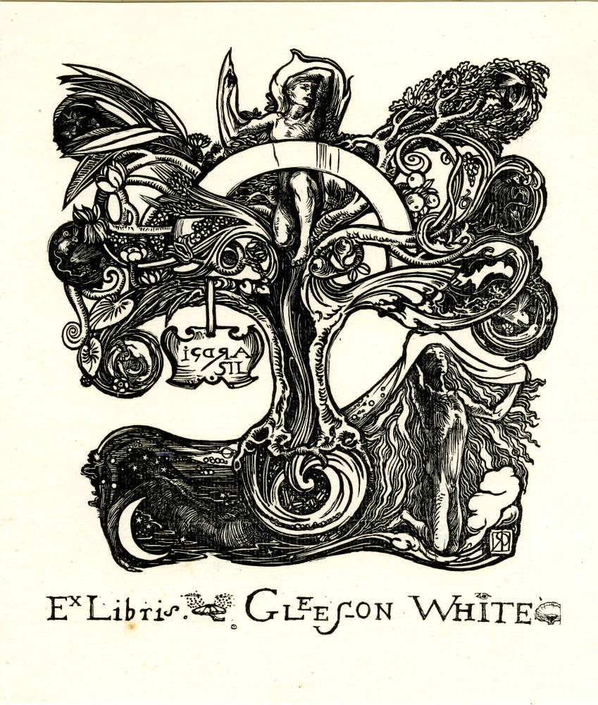
A bookplate for Gleeson White designed by Charles Ricketts (18923).
His critical writing appeared primarily in the form of a series of sixteen articles in The Studio: published between April 1893 and September 1897, these short reviews provide a clear account of the leading practitioners of ex-libris designs, a catalogue that includes Robert Anning Bell, E. H. New, Byam Shaw and the author's favourites, Talwin Morris, C. R. Mackintosh and artists of the Glasgow School. Gleeson White’s writing of these creators work is anecdotal, with many moments of insight in his analysis of style. But his prime work on the subject is found in his extended essay on ‘British Bookplates’ in a Studio Special Winter Number, focusing on Modern Book-Plates and Their Designers (18989).
Some of this article revisits earlier ground, with many of the designers examined in the short essays being reconsidered. Gleeson White’s writing is characteristically discursive as he moves through a raconteurs discussion of his subject, selecting many examples of what he considers to be accomplished examples of the type. More telling, however, are his interleaved comments on the character of bookplates. He claims that what a bookplate should be is a large matter to define (‘British Bookplates’, 10), but careful reading reveals a coherent philosophy of what they are for and what form they should take. Gleeson White argues for two intertwined ideas of what constitutes the perfect plate: it should be functional, giving the owners name in clear titling (‘British Bookplates’, 10); and it should be beautiful, a miniature work of art. As he explains, it would be best here to regard the ex libris solely as specimen of design at the same time [it must be] a good design [and] must fulfil the purpose [as a label denoting ownership] for which it is called into being. [‘British Bookplates’, 9]
Gleeson White's position, in other words, is in strict accordance with the William Morris’s philosophy, embodied in the aesthetics of Arts and Crafts, which insists on the need to create objects both Beautiful and Useful. He applies this creed to his book covers, and he upholds the same belief in relation to bookplates. Indeed, Gleeson White’s scheme for the production of effective bookplates is one based on directness and simplicity, articulating the owners taste in a straightforward way, and conveyed in an aesthetically pleasing design. Free of over-complication, with clear lettering, the plate, he believes, should be sincerely felt and beautiful to behold.
Some of the bookplates he reproduces in the Studio essay seem to conform to this credo, and Gleeson White often praises those both pleasing and functional. Edmund Hort News designs of architectural and rustic scenes are prime examples of the unpretentious clarity that Gleeson White espoused. These bookplates have clear lettering combined with a poetic, intimate perception of their motifs to create a strong aesthetic effect. In Gleeson White’s words, The admirable design and placing of the lettering are conspicuously good The decorative treatment of architecture also finds expression on several plates (‘British Bookplates’, 23).
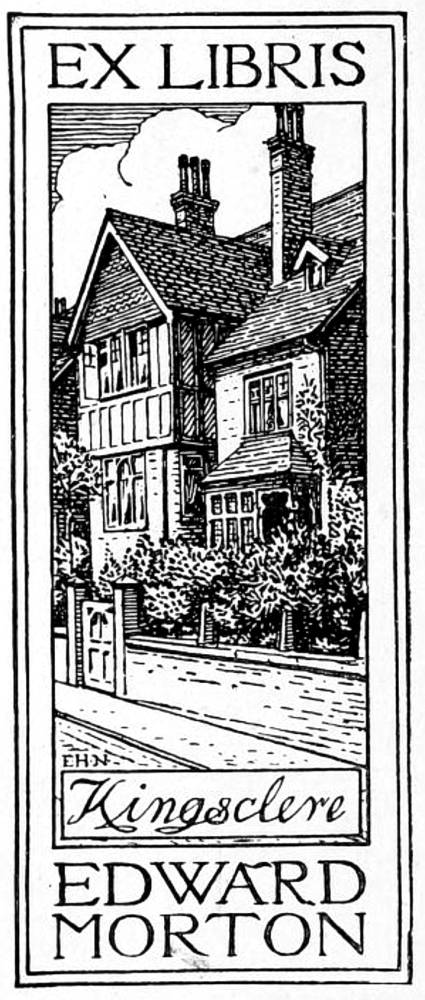

Left: A bookplate for Edward Morton designed by E. H. New (before 1898). Right: a bookplate by the same designer for Herbert B. Pollard (circa 1898).
But Gleeson White’s account is equally telling of what he disliked. Essentially a democratizer who believed in improving taste by disseminating high quality works in applied art to the masses, or at least to the large middle-classes, he is contemptuous of heraldic devices and the arcane symbolism of class, name and privilege. These emblematic images seem to him irrelevant in the Victorian age, noting how very few modern readers can interpret the significance of blazoned arms (‘British Bookplates’, 3). To reproduce an approach that is rooted in a previous historical period seems to him pretentious and pointless; and he is just as disapproving of other forms of symbolism in which the owners character and taste are self-indulgently inscribed in sets of cod heraldry that show he or she likes Bicycles a bit, is fond of roses, sketches a little, keeps bees, admires Egyptian art, is fond of reading, plays golf, and keeps a pet kangaroo (‘British Bookplates’, 11). Facetious as he often is, Gleeson White’s dry humour makes a serious point. He goes on to revile other forms of esoteric imagery in the form of
Some such absurd medley of unrelated facts [that appear] in hieroglyphics in many a plate, mixed up, it may be, with a few great verities Love, Death, the Triumph of the Obvious, and the Consequences of Eating Apples in Eden thrown in to knit the whole design together. As well cover a house with pictorial posters announcing its inmates taste, or add to a luggage label the political, social, and theological views of its owner [‘British Bookplates’, 11]
Such plates are illustrated in Gleeson White’s account, embodying the over-complicated effects he so disapproved. F. J. Billinghurst’s self-consciously Aesthetic designs for Kate Pembury and Oswald Marshall are certainly beautiful in their manipulation of Rossettian motifs, but are overloaded and showy; these, the author stiffly remarks, are hardly sufficient (‘British Bookplates’, 19) as labels, and seem more like illustrations or paintings than simple designs to place in the front of a book.


Left: A bookplate for Kate Pembury designed by F. J. Billinghurst (signed and dated 1898. Right: a bookplate by the same designer for Oswald Marshall (signed, 1898).
More interesting is the question of Gleeson White’s compliance with his own theorizing. He certainly adheres to his ideas about book covers, embodying his pronouncements in a coherent body of work, and there is the same fusion of theory and practice in his bookplates, each of which is economical, clearly labelled, cleverly designed and of high aesthetic quality.
These principles unify the five plates identified in The Bookplate Journal (49) and can be traced in several others which exist as original drawings in the archives, and were presumably unpublished. Gleeson White's bookplates are further unified by their stylistic coherence: drawing on an extensive botanical knowledge, he deploys an iconography of flowers and plants which is sometimes combined with a sort of Romantic cosmology that recalls the imagery of Blake. Quite unlike the over-complex imagery he so disliked, his plates are infused with a sort of pantheism conveying the vitality of the person for whom it was designed.

An unpublished bookplate for the author William Sharp, designed by Gleeson White.
An unpublished plate for the writer William Sharp exemplifies his dynamic approach. The name is figured on an emanating banner, and Gleeson White frames it in imagery of faux naif stars; a swirling astral pathway leads from the bottom of the design and bursts out of the top of the frame, and the whole is animated by the Art Nouveau line and vigorous cross-hatching. The overall effect is one of joyousness: redolent of life, its energy is confirmed by the petals that rise in the upper part of the composition. This is the very essence of an uncomplicated symbolism, with the stars and petals suggesting life and the single, falling leaf denoting mortality.
A variant on this approach, and perhaps the most powerful of all of his designs, is offered by one of Gleeson White’s bookplates for himself. This time an elaborate scroll is enwrapped by a radiating sun and a muscular, curvilinear tree which bears leaves and what appears to be a fruit of ripe peaches. The initial effect, once again, is one of dynamic, assertive joyousness, a romantic delight in nature as life giver. But, as in the design for Sharp, the life-force is balanced against the symbolism of death: the trees branches have been cut and the fruit seems perhaps a little over-ripe. Gleeson White makes his theme unambiguous by including the inscription: Mors et Vita/Vita et Mors. This is literally life and death/death and life in endless circularity, a balance of the two forces.


Right: An unpublished bookplate for his own library, designed by Gleeson White. Left: Another for self-consumption.
Indeed, Gleeson White’s designs alternate between life and death, decay and regeneration a ponderous theme that would seem incongruous were it not for the powerful, uplifting imagery with which he affirms the value of life. His designs for his daughter Cicely Rose, and for Emma Chamberlayne are prime examples of his optimism. Each of these is an image of plants and flowers, with animistic leaves supported on a radiating stalk.
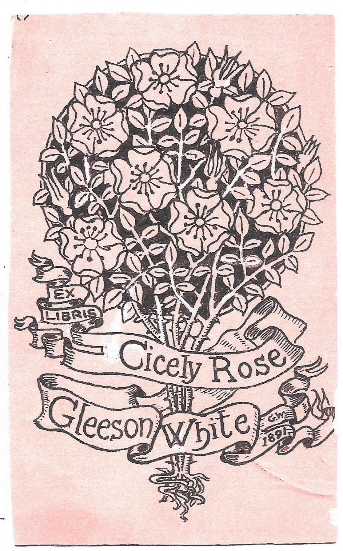
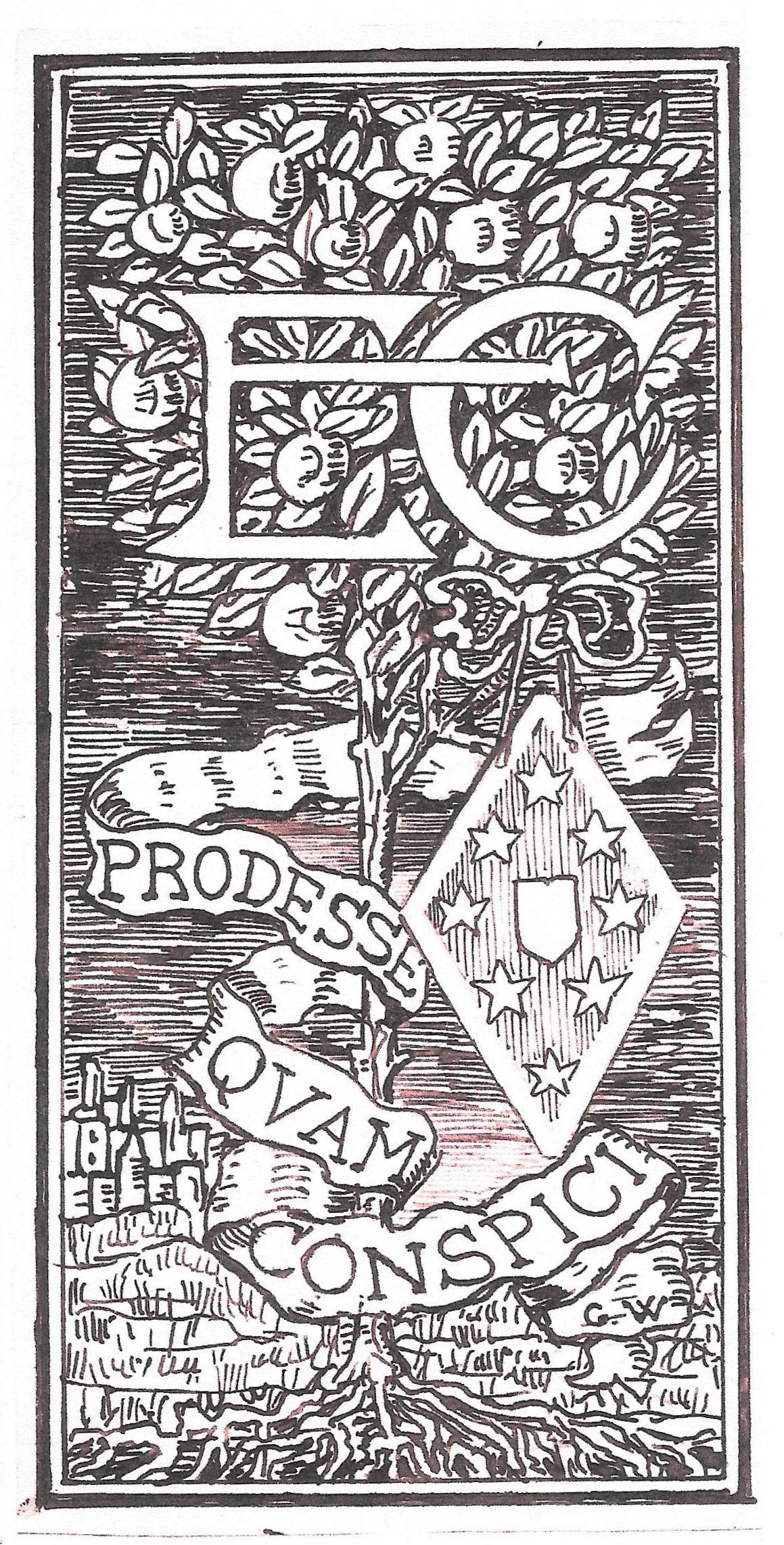
Left: A bookplate for Cecily Rose Gleeson White, designed by her father. Right: One by the same artist for Emma Chamberlayne.
These floral and arboreal displays are closely linked to Gleeson White’s book covers, and it is interesting to compare his bookplates with, for example, his binding designs for The Girls Own Annual and his preparatory sketches for E. M. Edmunds’s Amygydala, with its leaf-forms, and with the flowering stems of a composition for an unknown title.

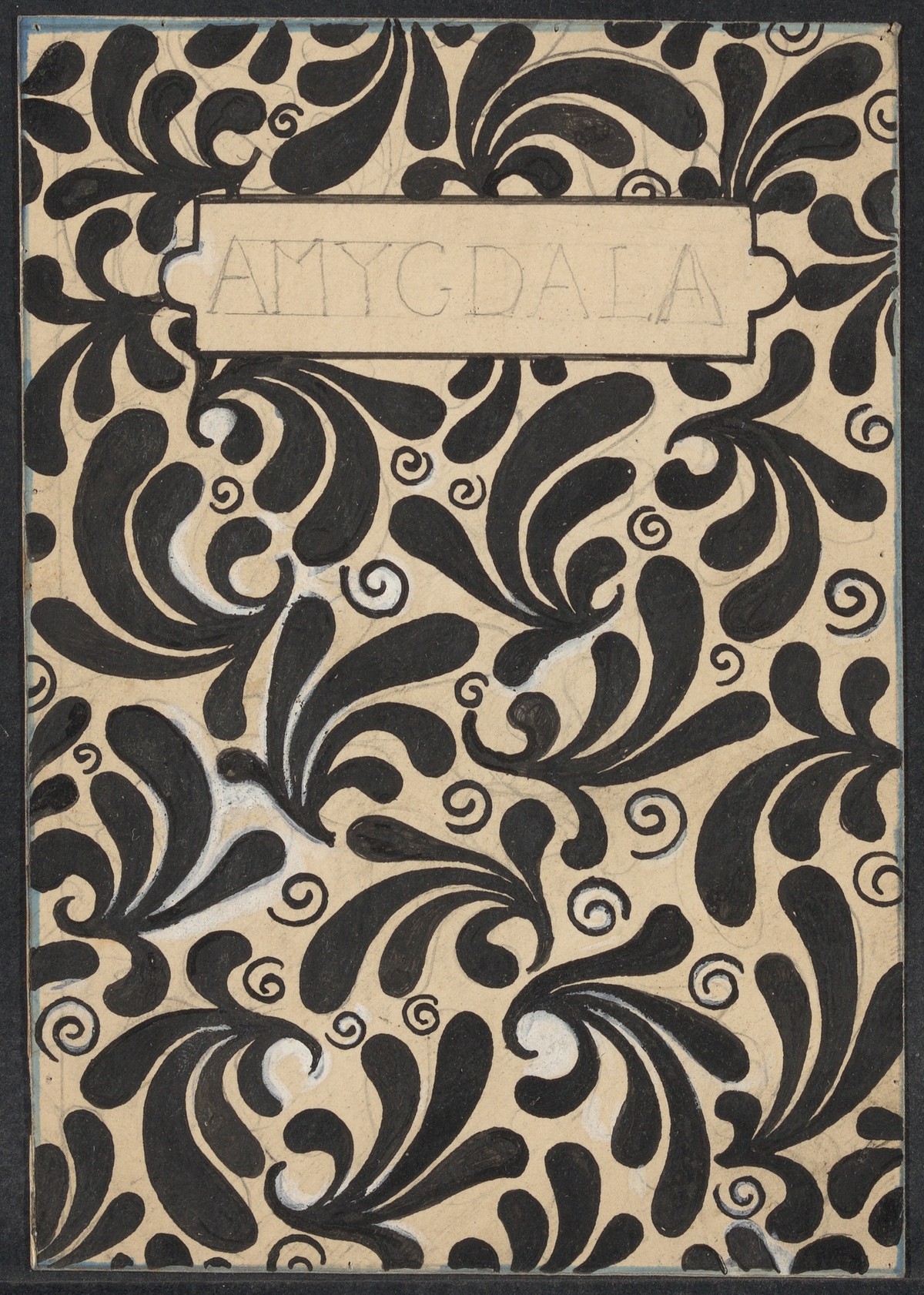

Binding designs by Gleeson White. Left to right: (a) For The Girls Own Annual. (b) For a preliminary design for E. M. Matthewss Amygydala. (c) Preparatory work for an unknown book.
Gleeson White’s bookplates might thus be read as intimate, resonant images which convey their message of optimism in natural and organic imagery. Having explained what he thinks are the main criteria of quality in this small art of the book, he embodies those ideas in a series of lyrical and pleasing designs. Always intending to raise standards, he makes a decisive contribution to the art of the bookplate.
Related Material
- The Applied Art of Gleeson White: Monograms
- Gleeson White as a Book Cover Designer
- The Gleeson White Archive in the Houghton Library. Harvard University
Bibliography
The formerly unpublished material appearing here is drawn from the Gleeson White archive, Houghton Library, Harvard University and from the family archive. I am indebted to both.
The Bookplate Journal 7:1 (March 2009).
Gleeson White, J. W. ‘British Bookplates’. The Studio, Winter Number, 18989. 1-47.
Journal of the Ex Libris Society 1-2 (January 1891December 1892).
York, F. W. Introduction. A Catalogue of Books from the Library of the Late Gleeson White. London: Lionel Isaacs, 1899, vxii.
Created 7 April 2020