Want to know how to navigate the Victorian Web? Click here.
Introduction: launching The Cornhill Magazine

aunching a new publication, especially a magazine which needs to appeal and continue to appeal to its audience, is always going to be a challenge. Promotion in the form of advertising is of key importance, but more important still is the quality of the front cover. The binding is the primary means of attracting readers, establishing the magazine’s identity, and suggesting its contents. The value of making a good impression was pondered in detail by Victorian publishers, who combined appealing titles with impressive or suggestive wrappers.
The rustic front cover of Once a Week is a typical example of a persuasive design, which equates the magazine with the values of relaxed contemplation. The enclosing pergola evokes the imagined values of the English idyll, suggesting to the urban reader that its contents are as refreshing as a walk in the countryside, even though the contents are diverse, with a marked absence of the sort of soothing pastoralism that was found, for example, in The Sunday Magazine. Symbolism is similarly used in the cover of Good Words, with elaborate panels representing the emphasis on science and art, youth and age, faith and discovery. A third strand is provided by the showy exterior of London Society, which asserts its pitch as a leisure publication by being as ostentatious as possible.
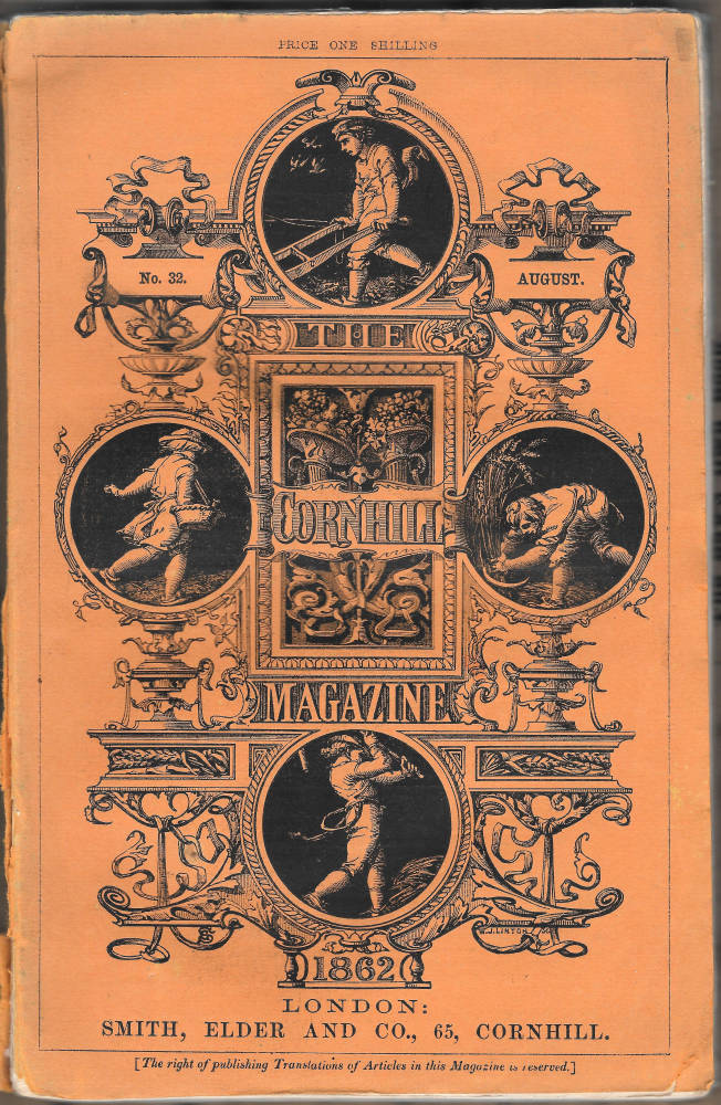
The designers of these wrappers are unknown, although their contribution to their journals’ success must have been substantial. The Cornhill Magazine is unusual in that the authorship of its cover is well-established. Composed by the architectural designer Godfrey Sykes (1824–66), The Cornhill’s paper binding is the most famous of its type. Its popularity was endorsed by its longevity: introduced for number one in 1860 under the direction of W.M. Thackeray, it was used until the periodical's demise in 1975. Richard Doyle’s flamboyant cover for Punch, which endured from 1849 to 1954, is the only parallel. Sykes’s elegant design was widely accepted as a sign of quality, and unquestionably helped to make The Cornhill into the most successful literary magazine of its time.
Finding an attention-grabbing design was Thackeray’s prime concern in the weeks following his appointment, at the end of 1859, as the journal’s first editor. From the start, he appears to have had a distinct idea as how it should project its qualities. In the words of Spencer Eddy, whose study of The Cornhill provides many details, Thackeray was ‘anxious that the cover should be fresh, attractive [and] reflective of the rich abundance of material to be found within’. However, this brief was more difficult to fulfil than the editor expected. Some unnamed artists were approached, but ‘preliminary sketches proved disappointing’ (p.15). Thackeray worriedly tried to invent a design for himself, but wisely recognized the limits of his talents and abandoned the attempt; he also consulted with his friend Charles Keene, who was too busy to take it on (Letters, 4, p.162). He eventually had a stroke of luck when he spoke with Sir Henry Cole. Cole’s guidance proved invaluable; as Thackeray explains in a letter to the publisher, George Smith:
[I] this morning bethought that my friend Mr Cole at the Boilers [South Kensington Museum] might find an artist to my purpose. He introduced me to a gentleman there of the very highest skill to whom I explained the design we wanted, who took immediately my view of it and will bring me the drawing as soon as done [Letters, 4, p.162].
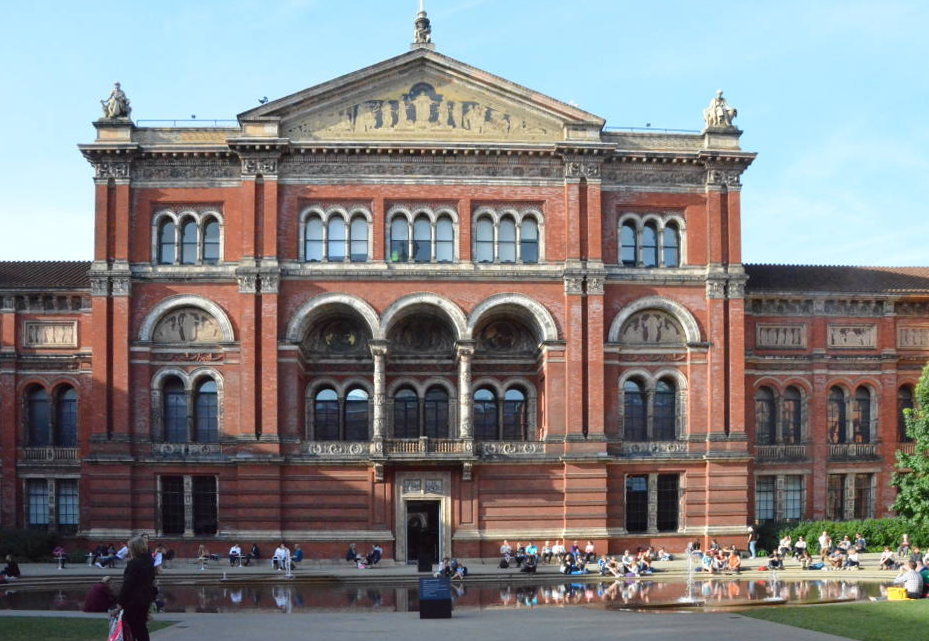
Sykes’s approach was brisk and professional, responding in detail to the brief. Smith inaccurately calls him a ‘young student’ (Huxley, p.96), implying that The Cornhill design was produced as the career move of an inexperienced artist, but at the time of his commission Sykes was working on the decoration of the Horticultural Society buildings, and would shortly be in in charge of the frieze and sculptural embellishments, notably those in terracotta, at the South Kensington (Victoria and Albert) Museum (Jervis, p.125). Thackeray and Smith were fortunate, then, in finding exactly the type of skilled practitioner they were looking for.
Sykes’s design, as presented to Thackeray and the publisher, was immediately recognized as striking the right note. Writing at the end of the century George Smith misremembered the chain of command, believing that he, rather than Thackeray, had organized the commission; however, both were delighted with the cover. Smith described it as ‘most effective’ (qtd. Huxley, p.96), with broad popular appeal, while Thackeray, hard-nosed as usual, was pleased to have the services of ‘a lovely design’, and teased his employer by asking if he ‘had given the man a good cheque’ (qtd. Huxley, p.96). Produced in the face of uncertainty, Sykes’s design was a perfect fit with the magazine’s brand.
The Cornhill’s front cover: design and production


he quality of Sykes’s cover closely reflects his expertise as a designer of architectural ornament. Following a period as a painter he became under the direction of Alfred Stevens and Henry Cole one of the leading practitioners of the ‘Renaissance revival’ (Jervis, p.125); immersed in the visual cultures of the Quattro and Cinquecento, and a proficient draughtsman with a keen sense of pattern, his architectural work employs a flexible language of neo-classical motifs.
The Cornhill’s front cover embodies this language: presented as a decorative tableau, it could easily be mistaken for an architectural device embellishing the walls of a Renaissance palace or church, and forms a continuum with Sykes’s ornamental work at the new museum and with his frieze work at The Mechanics’ Institute in Sheffield (1854). It is clearly linked to his work for the Pirelli Court (Victoria and Albert). Indeed, The Cornhill design deploys several of the Court’s features and there is a close relationship between the pilasters including figures in niches and those appearing in the cover’s four roundels. The Cornhill’s combination of an architrave, classical swags and vases also links to Sykes’s tomb for William Mulready and to sundry other decorative work, especially the coffered and recessed panels which embellish the Henry Cole wing and the designs at the premises of the Horticultural Society.


Work in sculpture and architecture by Sykes: Left: The Tomb of William Mulready, RA (1786-1863), Kensal Green Cemetery. Middle: Column with high reliefs, Henry Cole wing The Victorian and Albert Museum. Right: Pirelli Courtyard, Henry Cole Wing. Victorian and Albert Museum. [Click on images to enlarge them.]
Proficient in this sort of linear pattern-making, Sykes shifted seamlessly from architectural ornament to graphic design. This versatility is impressive, although the intermingling of the two arts was not unusual. Several binding artists also worked as architectural designers. A. H. Warren created ornaments for the Sydenham Crystal Palace under the direction of Owen Jones, and Robert Dudley was a draughtsman supervised by Matthew Digby Wyatt on the preparation of the same complex of buildings. Owen Jones practised as an architect and a binding-designer (King, pp. 25–29) and the same is true of Wyatt (pp. 265–66). Sykes was thus one of many jobbing professionals who exploited their capacity to make decorative surfaces – creating patterns out of plaster and stone, printed surfaces, or etched copper. Ranging across two and three-dimensional design, he was adept at producing everything from free-standing sculpture and bas-relief to metal designs such as a tobacco pot and a candelabra (Victoria and Albert Museum). Like John Sleigh (a binder who made everything from bottle-labels to visiting cards), Sykes was primarily a designer and secondarily a specialist.
Armed with this expertise, he may not have found his work for The Cornhill much of the challenge; he made numerous sketches and studies for his architectural designs, but produced only one preparatory drawing (Victoria and Albert Museum) for the journal. This is practically identical with the printed image, and there is no evidence of his grappling with any significant problems. The work was probably produced very quickly in response to Thackeray’s urgent demands, a straight transfer of the sort of imagery he was manipulating every working day. It is possible that he re-worked a composition he had already prepared for his architectural designs, and made use of it as a ready-made resource. It is claimed, for example, that the rustic figures were based on his observations of sowers working in the fields during his time in Sheffield. We know for certain that he scrutinized the proof (Victorian and Albert Museum) when it was printed by the engraver William Linton, thereafter passing it to Thackeray and Smith for their approval.
The publisher and editor were impressed by the design’s aesthetics qualities, but more important was the way in which Sykes had tackled his brief to present the journal in the most positive terms. As noted earlier, Thackeray wanted the front cover to suggest abundance and vitality; in Eddy’s terms, he intended the design to give the potential buyer the ‘promise of a certain style, or attitude, of culture, refinement, and worldly sophistication’ (p.15). This is indeed a difficult demand, but Sykes’s approach is complex and well-planned. To embody these values, and to establish the magazine’s identity, the artist manipulates the twin dimensions of style and allusion.
Sykes’s design: identity and readership

ykes’s design presents The Cornhill as a journal of high culture. Its neo-classical imagery links the magazine to the aesthetics and philosophies of the Greek and Roman world while invoking the art and architecture of Michaelangelo, Raphael and the Cinquencento. The composition is in this sense a grand proclamation of quality, essentially value through association. This allusiveness informed the decoration of the Victoria and Albert – aligning it with Parnassus and the learning of the ancients – and the same technique is deployed as a means of promoting Smith’s journal.
Classical learning was a central part of bourgeois education, and Sykes makes a direct appeal to the enlightened taste of an audience, primarily male, that was likely to have experienced the rigours of this sort of learning. Classicism was the ‘backbone’ (Wood, p.18) of the upper echelons of Victorian society, and by framing the magazine in these terms the artist sets out, or so it seems, to attract an elite audience. Yet the cleverness of the design lies in the fact that it presents a sort of generic classicism which could be appreciated not only by the classically trained, but also by those who understood the signs of quality: priced at just a shilling, the magazine promotes itself for everyone who wanted to partake in the excellence associated with ‘classic’ as much as ‘classical’ values. As Andrew Maunder explains, The Cornhill is positioned as a ‘commodity text for a new kind of audience, a collective of people who are not simply genteel in the traditional sense’ but genteel in aspiring to experience the best of contemporary art and literature (p.247). This mediation of good taste, asserting value while making it available for all, is cleverly negotiated in Sykes’s design; aiming at those of good taste, the cover is a medium for the democratization of taste.
The impact was immediate. The eye-catching image, with its promise of quality and inclusiveness, was a central ingredient in selling copies, and huge numbers were sold. More than 110,000 of the first issue were purchased, far more than Macmillan’s Magazine, which sold around a tenth of that amount (Glynn, p.127), and many times more than the sales for Good Words. To demonstrate one’s personal culture, it seems, it was necessary to buy a copy of The Cornhill Magazine, just it was later considered de rigeur to possess a copy of The Yellow Book. Smith certainly did all he could to ensure his periodical would meet his readers’ expectations, employing the outstanding writers and artists of the age. But here, once again, the front cover played an important role, creating a vital means of engaging with the audience.
The classical entablature, vases and arabesques indicate the refined nature of the entertainment, but Sykes employs other images to suggest variety and gainfulness in the manner prescribed in Thackeray’s brief to stress ‘abundance’. The magazine’s name, incorporating Smith, Elder’s address at 65 Cornhill, becomes a visual conceit. Cornhill is translated into corn, with four figures positioned in the roundels – ploughing, sowing, reaping, threshing – as the farmers who make good produce for consumption: a visual metaphor that symbolizes the magazine’s role as an agency of the best talent, sown and harvested in order to nourish the reader. In the manner of all farmers the labour is performed every season, and, by implication, The Cornhill will provide the same good service, perhaps in competition with Dickens’s carefully-chosen name for his periodical, All the Year Round, which had first appeared a year earlier in January 1859. The end result is indeed abundance, a cornucopia of fruit, with two horns spilling grapes and apples positioned above the title in the central panel. This imagery is strictly classical, but Sykes characteristically inscribes a hybrid message. The Greek iconography suggests the richness of the ancient world, but the figures are robust versions of English peasantry. The Cornhill Magazine, Sykes suggests, is a very English pantheon of talent, one which will attract the educated and celebrate the experiences of the home audience.
In short, classical and rustic iconographies are combined to articulate a series of messages. Sykes’s binding seems a straightforward piece of decoration, but is in reality a carefully calculated piece, and an important ingredient in establishing The Cornhill’s considerable status.
Works Cited
The Cornhill Magazine. With a front cover designed by Godfey Sykes. 1860–1975.
Eddy, Spence L. The Founding of The Cornhill Magazine. Ball State Monograph, no. 19. Indiana: Ball State University, 1970.
Glynn, Jennifer. Prince of Publishers: A Biography of the Great Victorian Publisher George Smith. London: Allison & Busby, 1986.
Huxley, Leonard. The House of Smith Elder. London: Published for Private Circulation, 1923.
Jervis Simon. High Victorian Design. London: The Boydell Press, 1983.
King, Edmund. Victorian Decorated Trade Bindings, 1830–1880. London: The British Library, 2003
.The Letters and Private Papers of W. M. Thackeray. Ed. Gordon N. Ray. 4 Vols. London: Oxford University Press, 1946.
Maunder, Andrew. ‘“Discourses of Distinction”: The Reception of The Cornhill Magazine, 1859–60’. Victorian Periodicals Review 32:3 (1999): 239–59.
Wood, Christopher. Olympian Dreamers. London: Constable, 1983.
Last modified 4 May 2015