

[Click on thumbnail and images below for larger pictures.]
The August 1864 Wrapper for Our Mutual Friend. Drawn by Marcus Stone, engraved by Dalziel. Wood engraving, 21 cm high x 14.5 cm wide, framed. Although Dickens gave young Marcus Stone a relatively free hand with narrative-pictorial sequence of forty illustrations for Our Mutual Friend, he evidently directed him to provide certain vignettes in the wrapper, which (though freer in style and less cartoon-like than the wrappers executed by Phiz) like the green wrappers from The Pickwick Papers onwards, provides the vigilant reader with a series of characters and situations whom he or she will encounter over the nineteen monthly parts.
As Jane Rabb Cohen points out, Dickens, who attended to every detail, making sure that Stone had not telegraphed too much of the complex plot,
praised the artist's preliminary design, which did not depart sharply either in arrangement or feeling from those by Browne. Stone had surrounded the title with generalized vignettes from the narrative, and appropriately surmounted it with a wide panorama of the Thames, which figures importantly as both setting and symbol in the narrative (and whose appearance and disappearance in the novel, Swinburne observed, coincided with the "ebb and flow" of the author's genius). With a "business" view to optimum legality, however, Dickens wanted the first word of the title, OUR, each letter of which Stone had awkwardly placed between the supports of the triple-arched bridge, to be brought out into the open and made as large as MUTUAL FRIEND. [205]
The process involved in the creation of this particular wrapper design becomes apparent when one places the finished product alongside the preliminary ink and wash draft (now in the Berg Collection of the New York Public Library) that Marcus Stone prepared for Dickens's inspection and reproduced by Cohen in Charles Dickens and His Original Illustrators (1980).
With a view to the narrative, the author thought the inclusion of both the Inspector [a top-hatted figure ion a dark overcoat, upper right] and the murder reward poster redundant, their significance being sufficiently suggested in the sinister moonlit view of the river. With a view to aesthetics, Dickens wanted the figure of the skeletal dustman, whose face he wished more "droll" and less "horrible," to be relocated on the right-hand side of the cover; the resulting space under the title might be filled with the "capital" scene of the unscrupulous Wegg reading Gibbon to the illiterate Boffin. It was left to the artist, however, somewhat to his surprise, to decide for himself which of Wegg's legs would be the wooden one. . . . Dickens cheerily concluded his numerous but perceptive and tactful suggestions. He implicitly understood his young friend's predicament in executing for the first time a complex wrapper for a complex narrative as yet largely unwritten. He pronounced Stone's altered wrapper design "excellent" and worried more than the artist himself about how the Dalziels would engrave its delicate lines. The color of the wrapper was once again green — the author's favorite color — as it had been up to the publication of Bleak House — which seemed to mark Dickens's hopes for renewal in every particular of his present life and work. [205]
Although books feature prominently in a number of Phiz's wrapper designs, notably that for Dombey and Son, in Stone's design books connect just four characters (Bradley Headstone, Eugene Wrayburn, Charley Hexam, and Nicodemus Boffin), since these are the four in the large cast of characters who are most closely associated with books: Bradley and Charley being schoolmasters, Eugene a lawyer, and Noddy a bibliophile and collector. Cohen in her discussion of this wrapper makes only oblique reference to the identities of specific characters in the wrapper, as if the design's generality defies the astute reader to make such identifications. Of the roughly thirty figures in the wrapper connected by the scaffolding design, about one-third are recognizable from their costumes, properties, settings, and situations. However, even for the astute reader of the 1864-65 serial many identifications must have remained tentative until well into the serial run. Whereas Charley Hexam, a secondary character, appears twice, a number of other characters — including some important secondary characters such as Mortimer Lightwood, Jenny Wren, Riah, Betty Higden, Sloppy, Georgiana Podsnap, R. W. and the Wilfers — do not appear at all. Whereas Wegg is obvious, with his wooden leg, his fellow conspirator, Mr. Venus, is not immediately apparent. These noticeable absences suggest that either Dickens did not take his illustrator fully into his confidence, or, at the time of the wrapper's composition, the author had but vaguely conceived of these characters. As reproduced by Cohen, the design of the black ink and wash draft (Berg Collection, New York Public Library) is similar to the final version, but has situated the skeletal dustman at the very bottom of the design, in a position of prominence now occupied by the young male adversaries. The change is not slight since it implies that the main plot will not revolve around the Golden Dustman, but rather around the rivals, Bradley Headstone and Eugene Wrayburn.
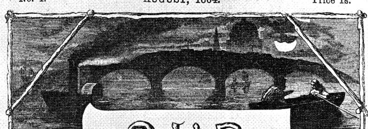
Appropriately, the design begins in the top register with a bridge across the Thames, the source of London's wealth, and the thread that connects the lives of so many of the novel's characters. On the left is the steamer that runs Rogue Riderhood over; on the right, Lizzie and Gaffer Hexam are trolling for corpses, a scene elaborated in the initial illustration, "The Bird of Prey." By the position of the dome of St. Paul's Cathedral above these scenes, with the steamer on the Southwark side, the bridge with three wide arches visible (engineer John Rennie's 928-foot design actually had five, but those at either end may be lost in the margins) can be identified as New London Bridge, which replaced the decaying, six-hundred-year-old structure in August 1831. The clouds obscuring the moon lend a bleak, mysterious atmosphere to this initial vignette that spans the wrapper. The steamer's appearing later in the plot may just be coincidence, but one may infer from the presence of the row-boat to the right that "The Bird of Prey" (May 1864) was conceived of an executed at or about the same time as the wrapper itself. Let us now examine the other scenes, proceeding in a clockwise direction around the central title.


In the original draft, the next vignette (left) is occupied by two women, whereas the final draft retains only the woman with the large, feathered hat — likely, Mrs. Boffin, who wears just such a hat in "Boffin Progress" (July 1864). The identity of the woman in the original is hardly mysterious, for she is likely Bella Wilfer; however, the male figure is sufficiently indistinct in the final design that no identification can be confidently made, although that the figure is her husband, Noddy Boffin, rather than her carriage driver or a servant, is probable. The other strong possibility is the shadowy figure of John Harmon in his person of private secretary, John Rokesmith.
The "Dust Contractor" (right) in the next vignette should be the Golden Dustman, Noddy Boffin, holding a lantern and shovel as in "The Dutch Bottle". However, the artist has fancifully conflated the character with the Spirit of Cholera seen in so many contemporary cartoons as that in Punch entitled "The Silent Highwayman" (10 July 1858), characterising the once-mighty Thames as an open cesspit and breeding ground for disease. The mounds of the Harmon family, inherited by the Boffins, connect death, wealth, and resurrection as motifs in the wrapper. This area of the draft, however, is rather different, so that the present subject probably reflects Dickens's own instructions for revision, for he must have objected to the inclusion of the police inspector (subsequently seen in "The Bird of Prey Brought Down", September 1864) and the wanted poster.
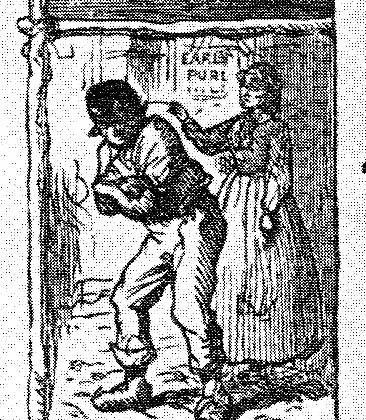
The area immediately under the title, in which the illustrator's name is set in the same font and in the same size of type as that of the publisher beyond the frame of the vignettes in the wrapper, is a scene clearly intended to represent Wegg's reading Gibbon's Decline and Fall of the Roman Empire to Nicodemus Boffin. Although Wegg, seated at a table, writing, is established by his wooden leg, the subject of his reading is represented by a classical frieze based on that from the Parthenon (installed in the British Museum as part of the Elgin Marbles in 1816). Thus, Boffin would be the figure opposite, his hand raised towards the image of the charioteer (perhaps implying his desire for a fashionable carriage and therefore alluding to "Boffin Progress" once again).

In the bottom right corner, the two young women are probably Lizzie Hexam (identified by her brazier, depicted in "Waiting for Father") and, below her, Bella Wilfer, the novel's heroines. If we can accept these identifications, then the shadowy figure beside Lizzie is probably her brother, Charley. If the figure behind Boffin is Charley, now a respectably dressed apprentice pedagogue, the professionally dressed young man nearest him, arms raised and one leg forward, is probably Bradley Headstone. On the other side of the books cascading down would therefore be Bradley's rival, the attorney Eugene Wrayburn. Since the figures are but mirror images of one another, the illustrator may be characterising them as indistinguishable in their obsessions with Lizzie Hexam.

The final series of well-dressed figures, both male and female, likely represents the fashionable society of the Podsnaps, Veneerings, and Lammles. The lady with the fan and the gentleman beside her may — given their prominent position — represent either of the latter couples, the figure at the door being either their host, the banker Podsnap, or his butler. If the figure in the doorway is wearing a fur hat, he would (incongruously) be Rogue Riderhood, who is almost certainly the figure being ejected from the Jolly Fellowship Porters (above) by the publican, Miss Abbey Potterson.
Although the wrapper or cover ostensibly fulfilled one purpose — to contain a monthly number and its two loose illustrations, from the printer's to the bookseller's, and eventually to the book binder's — the wrapper, displayed prominently in the windows of bookstores, was something of a marketing device. Month by month, as the successive serial instalments appeared, readers could re-engage with the story, attempting to identify moments already realised in the text and the narrative-pictorial sequence, and attempting to predict the trajectory of the plot based on scenes not as yet realised.
Such speculative activity was undoubtedly heightened if the wrapper's scenes — as in the case of A Tale of Two Cities — were highly specific, but somewhat dampened by a wrapper containing more generalised scenes, such as that for David Copperfield. In this latter respect, the wrapper for Our Mutual Friend enabled the reader to make certain identifications of scenes and characters — the best example being the miniature of "The Bird of Prey" in the upper register — but must have frustrated such reader response in its failure to depict a significant number of characters, notably Betty Higden, Sloppy, Jenny Wren, and Riah.
Scanned image and text by Philip V. Allingham. Formatting and image correction by George P. Landow. You may use this image without prior permission for any scholarly or educational purpose as long as you (1) credit the person who scanned the image and (2) link your document to this URL in a web document or cite the Victorian Web in a print one.]
References
Cohen, Jane Rabb. "The Illustrators of Our Mutual Friend, and The Mystery of Edwin Drood : Marcus Stone, Charles Collins, Luke Fildes." Charles Dickens and His Original Illustrators. Canton: Ohio U. P., 1980. Pp. 203-228.
Dickens, Charles. Our Mutual Friend. Il. Marcus Stone. Volume 14 of the Authentic Edition. London: Chapman and Hall; New York: Charles Scribners' Sons, 1901.
Davis, Paul. Charles Dickens A to Z: The Essential Reference to His Life and Work. New York: Checkmark and Facts On File, 1998.
Last modified 30 July 2011