
I am indebted to Philip Allingham for information, scans, and guidance. Graham Dry also provided material in the form of scans, information, a sharp critical eye and enthusiasm for an almost forgotten artist. I am grateful to both for their generosity.
Borders and Ornamental Pieces


Left: Decorative title-piece for Gertrude of Wyoming. Middle: Title-page for Good Words. Right: Title-page for Little Bird Red and Little Bird Blue, .
Macquoid designed some hundreds of ornamental devices, ranging from head and tail pieces to initial letters and decorative borders, usually engraved on wood and sometimes printed in colour. Some of these accompanied his own, full-page illustrations, as in his work for Little Bird Red and Little Bird Blue (1861); others embellished books and periodicals where the principal engravings were done by others. Good examples can be found in his title-page for Good Words, first published in 1860, his devices for The Merrie Days of England (1859), where the principal designer was Myles Birket Foster, and his ornamental titles for Thomas Campbell's Gertrude of Wyoming (1862), which was principally illustrated by Harrison Weir.
Produced in the middle of the century, these devices prefigure the dense ornamental borders of the Arts and Crafts publications of the eighties and nineties, anticipating the embellishments of William Morris’s ‘Kelmscott Chaucer’ (1896). There is a closer link, however, to German book design of the 1840s. The rustic bowers, strap-work and floral devices employed by Macquoid are versions of a style which first appeared in the illustrations of Alfred Rethel and were carried forward, for example, in the decorative work of H. C. Selous, E. H. Wehnert and John Franklin. Macquoid was one of this group of ‘Germanic artists’, and his rustic bowers and arbours are closely linked to the decorative pages of the first substantial book to be influenced by this style to appear in Britain, The Book of British Ballads (1842–4), published by Jeremiah How. At the same time, Macquoid’s rustic designs have a lightness of touch; animating his bowers with birds, insects, and radiating flowers, and infused with a lyrical humour, he revitalizes what is essentially an old-fashioned style and presents it afresh to audiences of the fifties and sixties.


Left: Decorative border for Little Bird Red and Little Bird Blue. Middle: Bordered illustration, Little Bird Red and Little Bird Blue. Right: Decorative border for Snow Flakes.
In all of this work the effect is amusing, evocative, and richly decorative. It adds visual interest to the page and enhances the impact of titles and illustrations. However, Macquoid often extended his designs beyond the ornamental by using them to provide an emblematic commentary on the contents of the text. In the title-page for Good Words, for instance, the rustic bower signifies the periodical’s values and the experience it offers for the reader as s/he progresses, metaphorically speaking, through the journal’s entrance ‘portal’. The representation of horse-chestnut vines, leaves and nuts suggests plenty, symbolizing personal growth as a result of reading the magazine; the representation of horse-chestnuts (or ‘conkers’) in their prickly casing is also used as a homely sign of the English countryside, linking the magazine to the notion of leisurely relaxation that the mid-Victorian and largely municipal readership associated with the rural. The deployment of this type of tree is further used to represent luxury – an unusual association for modern audiences, but intelligible to the contemporary readership (Greenaway, 22).

Left: Decorative border for Snow Flakes. Middle: Decorative title-page for Uncle Tom’s Cabin. Right: Crusoe on the Look-out on the Hill.
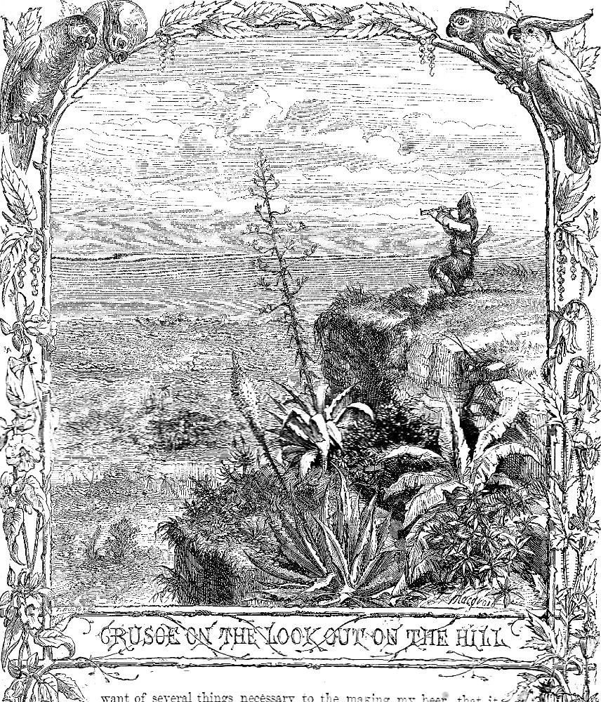
Others borders connote a range of meanings and Macquoid manipulates a series of emblematic schemes to support and extend the content of a series of texts. One of the richest of these, as Philip Allingham demonstrates, is the scheme appearing in the Cassell, Petter, and Galpin edition of Defoe’s Robinson Crusoe (1863–4), for which he designed 63 intricate borders. As Allingham remarks, these combine
motifs such as palm trees, vines, and parrots, others incorporating weapons, both primitive (to suggest the cannibals who are a constant menace in the second half of Part One) and modern, to suggest the technology at Crusoe's disposal. Sometimes the motif in the illustration is highly germane to the subject-matter of the main illustration; for example, in Crusoe in his Bower (Chapter VII, ‘Agricultural Experience’), the border reminds readers that Crusoe has cultivated wild grapes, which he transforms into raisins. In the borders of The Mutineers for Chapter XVII … the elaboration contributes to the reader's sense of suspense in that it contains weapons and of weapons and contrasting flags. The binary opposites of a British naval ensign (upper left, a metonymy for the ship's legally empowered officers) and the skull-and-cross-bones pirate flag (upper right) reinforce the reader’s impression that both sides are about to engage in combat with weapons ranging from swords, cutlasses, and axes (left border) to a variety of firearms (right border). Here, then, the motifs actually contribute to the story's suspense. The most common motif next to tropical vegetation is rope-work, which accompanies most of the illustrations that deal with nautical themes.
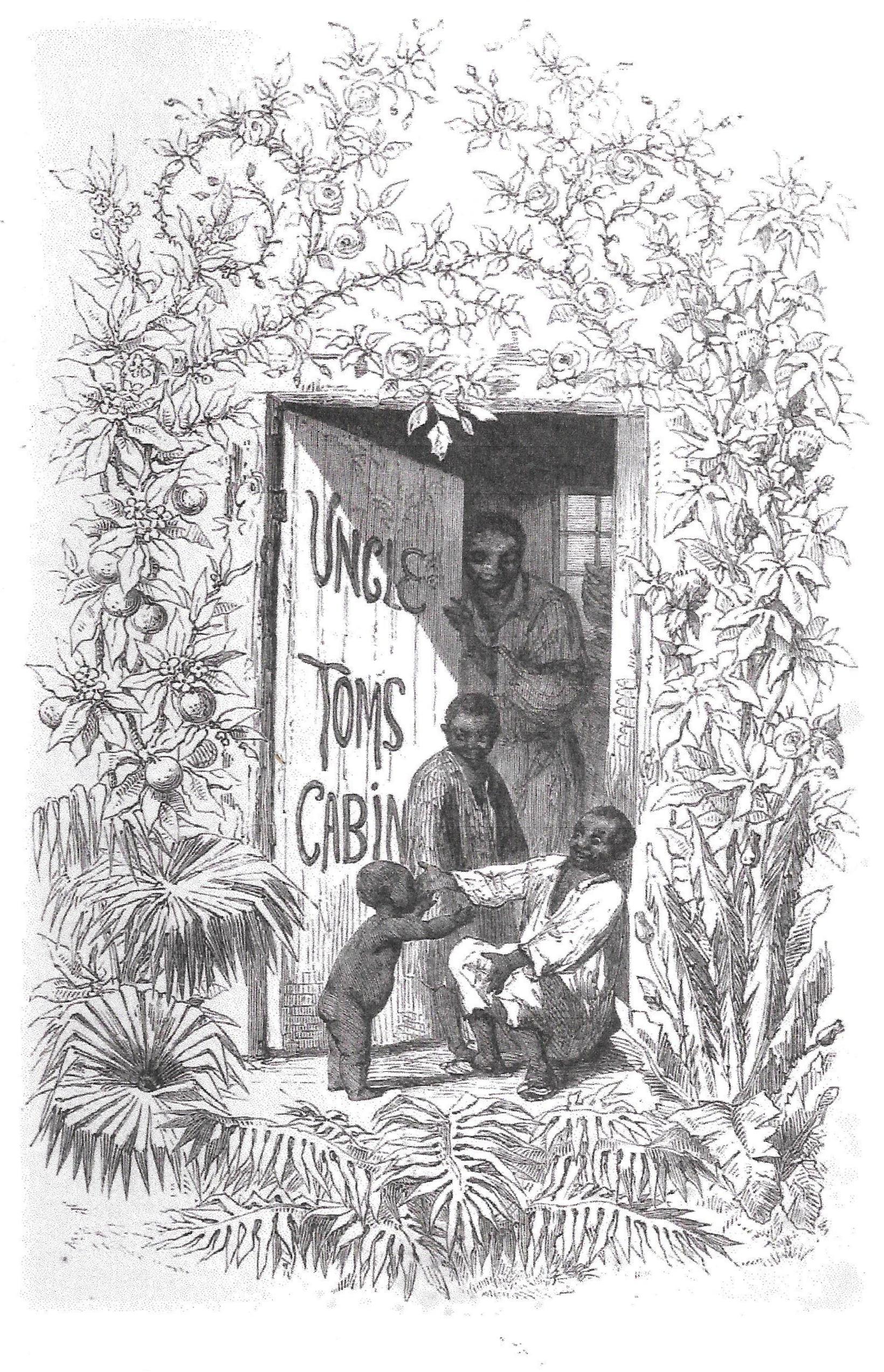
Macquoid also deployed ornamental work for expressive purposes in his designs for Nathaniel Cooke’s 1853 edition of Harriet Beecher-Stowe’s Uncle Tom’s Cabin. The main illustrations are sensitive representations by George Thomas in sharp contrast to George Cruikshank’s caricatures (1852), and bear comparison to the celebrated work of the original illustrator, Hammatt Billings (1852). Macquoid adds other dimensions to Thomas’s interpretation in his initial letters and in his border for the pictorial frontispiece. This usually involves manipulation of the ‘language of flowers’ – using floral codes to articulate a series of messages.
The opening design depicts Tom and his family surrounded by a bouquet of emblematic plants: the left hand frame is made up of exotics, a reminder of the characters’ ancestral journey from Africa, while the top and right-hand border present a display of roses and oranges, the emblems of benediction the family will struggle to enjoy. The image also acts proleptically, anticipating the description of Tom’s cabin as a sort of rural paradise, decked with ‘large scarlet bignonias’ and ‘a native multiflora rose’ (19); complicit in the false realities created by the author, Macquoid projects the life of the ‘negro par excellence’ (19) as pleasant and gainful.
The initial letters, on the other hand, are used to remind the reader of the characters’ suffering under the hand of slavery, sometimes conflating narrative detail and psychological inference. This process is embodied in an initial for the letter ‘T’. It shows the frosty banks of the Ohio River that Eliza will have to cross; but its depiction of an ice-bound tree also suggests her emotional turmoil, visualizing in its jagged outlines her sense of ‘fearful danger’ (44). The expressive distortion of plant-life features elsewhere in the series and it is notable that Eliza’s escape is headed by an ‘E’ in the form of a thistle (55).
.This creative principle informs all of Macquoid’s border and subsidiary work, which acts to enrich and extend the reader’s experience of the text in the manner of interpretive illustration. Though consigned, quite literally, to the margins of the page, the artist still makes an important contribution to the texture of his commissions, with each of his ornamental pieces displaying a carefully conceived response that goes well beyond the purely decorative.
Topographical and Architectural scenes
Macquoid specialized in architectural and topographical paintings and produced hundreds and perhaps thousands of images, many of which are still available on the art-market. He drew parallel subjects in illustrations for his wife’s travel books, reproducing in black and white the conventions that characterize his work in oil and watercolour. Katherine Macquoid’s travelogues ranged across Europe, from Umbria (1905) to northern France (1875) and Britain. Each of these gave the artist opportunities to represent picturesque scenes of ruins, quaint streets and other evidence of an older world: he barely ever depicts contemporary life of the end of the nineteenth century but focuses, instead, on an idealized notion of history and the continued presence of the romanticised past.

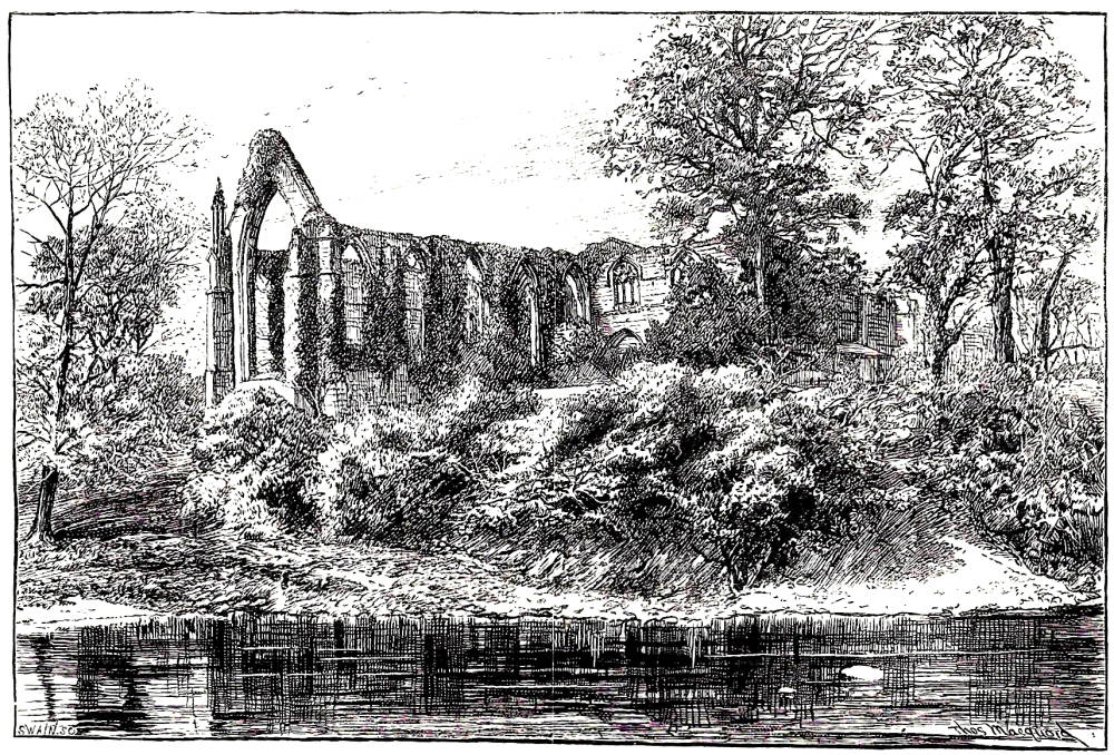
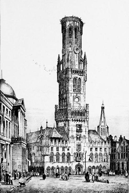
Left: The Shambles. Middle: Bolton Priory. Right: La Halle, Bruges by Samuel Prout.
His studies of buildings draw heavily on his copies of architectural ornament in several books, among them Examples of Architectural Art in Italy and Spain (1850) and Examples of Ornament (1855), which featured work from the British Museum. These illustrations reflect a sensitive understanding that goes beyond the purely mimetic and the same interpretive qualities inform his images of castles and churches. But Macquoid was essentially an eclectic artist – borrowing, as we have seen, from the conventions of German rusticity – and his architectural style is clearly modelled on the work of Samuel Prout. Like Prout, Macquoid combines exactitude with atmospheric lighting, creating an effect that mediates between journalism and poetic evocation. He differs from Prout insofar as his images have fewer figures, sometimes making the scenes seem remote and detached from the everyday, but the ambience of his designs clearly owes a great deal to the older artist’s paintings and drawings, and it is instructive to compare the two.
Books with illustrations, ornamental borders, and other decorative matter by Macquoid
Campbell, Thomas. Gertrude of Wyoming. London: Routledge, Warne, and Routledge, 1862. Head and tail pieces.
Defoe, Daniel. Robinson Cruscoe. London: Cassell [1863–4]. Illustrations and borders for illustrations by George Thomas and a number of others.
Edwards, M. Betham. Little Bird Red and Little Bird Blue. London: Sampson Low, Son & Co., 1861; American edition, New York: James G. Gregory [1862]; later edition, London: Routledge, 1883. Illustrations and borders; both editions have covers designed by Macquoid.
Edwards, M. Betham. The Primrose Pilgrimage. London : Griffith and Farran, 1865.
Edwards, M. Betham. Snow Flakes and the Stories They Told the Children. London: Sampson Low, Son & Co. [1862]. Ornamental borders and cover; others by H. K. Browne.
Examples of Architectural Art in Italy and Spain. London: Thomas McLean (1850).
Examples of Ornament. London: Bell & Daldy. 1855. Architectural drawings.
Favourite English Poems. London: Sampson, Low, Son & Co (1859). Illustrated borders.
Good Words. London: Strahan, 1860–70. Ornamental borders.
Macquoid, Thomas and Katherine. About Yorkshire. London: Chatto & Windus, 1894.
The Merrie Days of England. London: William Kent, 1859. Initial letters, head and tail pieces; illustrated by Birket Foster.
Stowe, Harriet Beecher. Uncle Tom's Cabin. London: Nathaniel Cooke, 1853. Initial letters and borders for illustrations by George Thomas.
Voyage of Discovery and other Stories, selected from Peter Parley's Annuals. London: Ben George [1869].
Created 27 April 2018