

ublished in vast numbers, trade bindings of the nineteenth century are widely regarded as having two outstanding periods of excellence: one was in the years from the mid-fifties to 1870, when gift books were decorated with elaborate gilt designs and polychromatic surfaces; and the other was in the Nineties, when Art Nouveau, by turns exuberant and severe, became the elegant new style. In between 1870 and 1890 there were of course other distinguished bindings for the general public, notably those by Dante Gabriel Rossetti, Arthur Hughes and Walter Crane; but the twenty years between these two turning points are otherwise regarded as an interregnum in which standards declined. In the words of Ruari McLean, book covers after 1870 ‘swiftly … deteriorated’ (14) and were marked, he argues, by the use of poor design and inferior materials, producing an aesthetic ‘dreariness’ that ‘was emphasized by a growing use of black instead of gold’ (14).
McLean’s dismissal is persuasive, and for the most part covers created during this time have been discounted as unworthy of sympathetic critical attention, the debris of overproduction and Victorian tastelessness as the reading audience continued to expand. However, to condemn them without qualification is to distort the history of Victorian book design. A better approach is to re-establish their significance within a ‘lost period’ of populist publication, focusing especially on issues of quality, style, and manufacture.
Problems of Authorship and Quality: the Seventies
In contrast to the sixties and nineties, when bindings were produced by a variety of artists and designers, most of the trade covers of the seventies were anonymous. Unsigned, they are generally afforded an inferior status simply because they do not have the status of being the work of a known practitioner; assumed to be from the hand of a minor designer, or constructed by artisans from pre-existing dies, they are invalidated by their lack of authorship. Such anonymity supposedly reduces them to the level of a sort of mass-produced folk-art, caught between mechanization and popular taste, and lacking in any sense of aesthetic direction. In the words of McLean, ‘during the seventies … abstract design and decoration [for book covers] lost all purpose and meaning’ (14) and led, he argues, to the rise of feeble casings which varied between the timid and hackneyed, and the overworked and overblown.
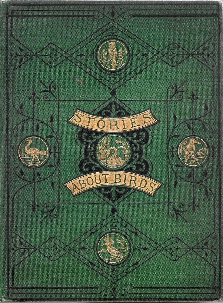
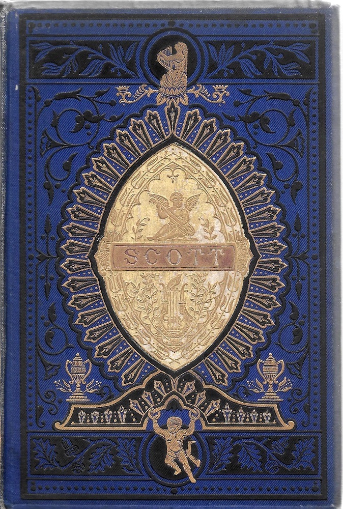
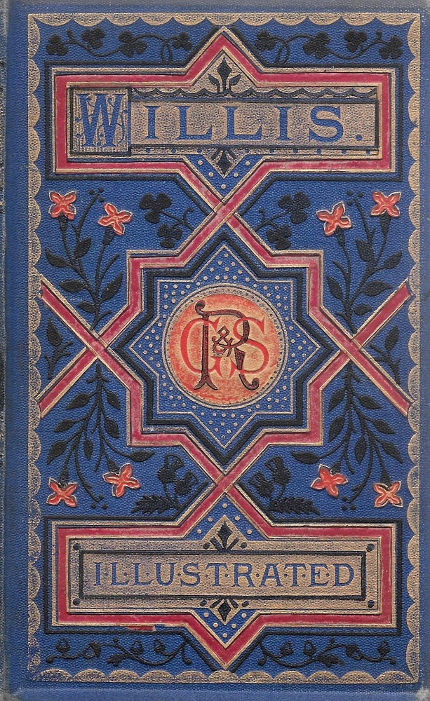
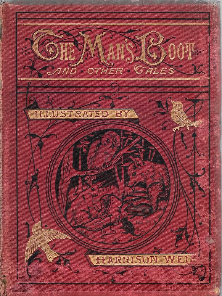
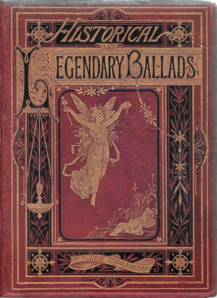
Anonymous bindings of the seventies, left to right: (a) Stories about Birds; (b) Scott’s Poetical Works; (c) Willis’s Poetical Works; (d) The Man’s Boot; (e) Thornbury’s Legendary Ballads.
At their worst, such books are indeed poorly conceived – although many have a vulgar excessiveness that has its own fascination; even kitsch has a perverse appeal, and it certainly appealed to the original consumers. On the other hand, there are some accomplished designs which bear comparison with those of the more prominent periods. As Douglas Ball observes, despite the ‘decline in standards’ there was still room for ‘individual flair to show though’, giving rise to some ‘balanced and controlled designs’ (56–7) that retain some distinctive qualities.

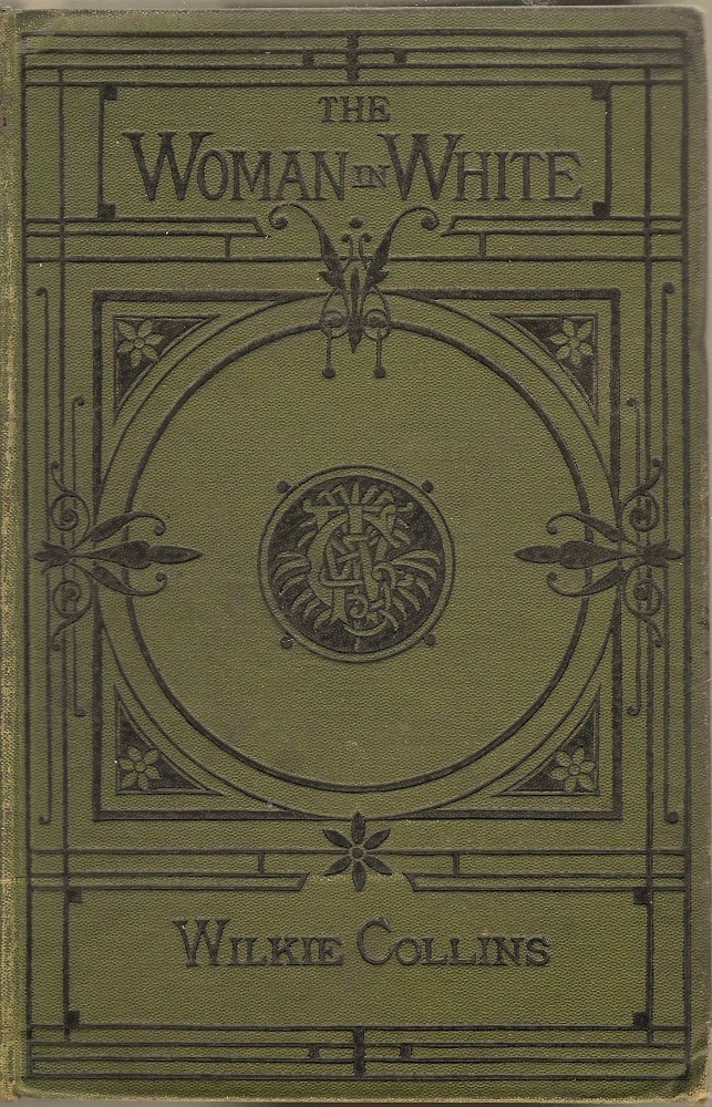
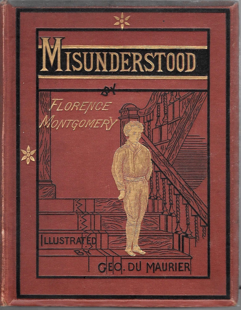
Some more anonymous designs of varying quality (a) Byron’s The Poetical Works; (b) Wilkie Collins’s The Woman in White; and (c), Florence Montgomery’s Misunderstood.
Such covers are of special interest for their stylistic ambivalence: caught between the idioms of the sixties and the nineties, they seem to lean both ways. For example, the casing for Myles Birket Foster’s Beauties of English Landscape (1874) is very similar to the resplendent liveries of the previous decade; the cloth is not polychromatic in the manner of many gift books such as John Leighton’s A Round of Days (1866), but its gilt embellishment, applied to roundels and borders, is luxurious and impressive, setting a standard that is not far short of earlier tomes. Combining the ornament of the sixties with the oft-reviled black lines of the seventies, it achieves a new synthesis. Likewise distinctive is the inventive front cover for Hood’s Poems (1871), which though unsigned suggests the hand of an accomplished designer. Likened by McLean to a pattern in the style of Art Deco (129), it is a bold fusion of Aesthetic flowers and imposing geometry. Once again, this is a work that shows no sign of a diminution in quality.
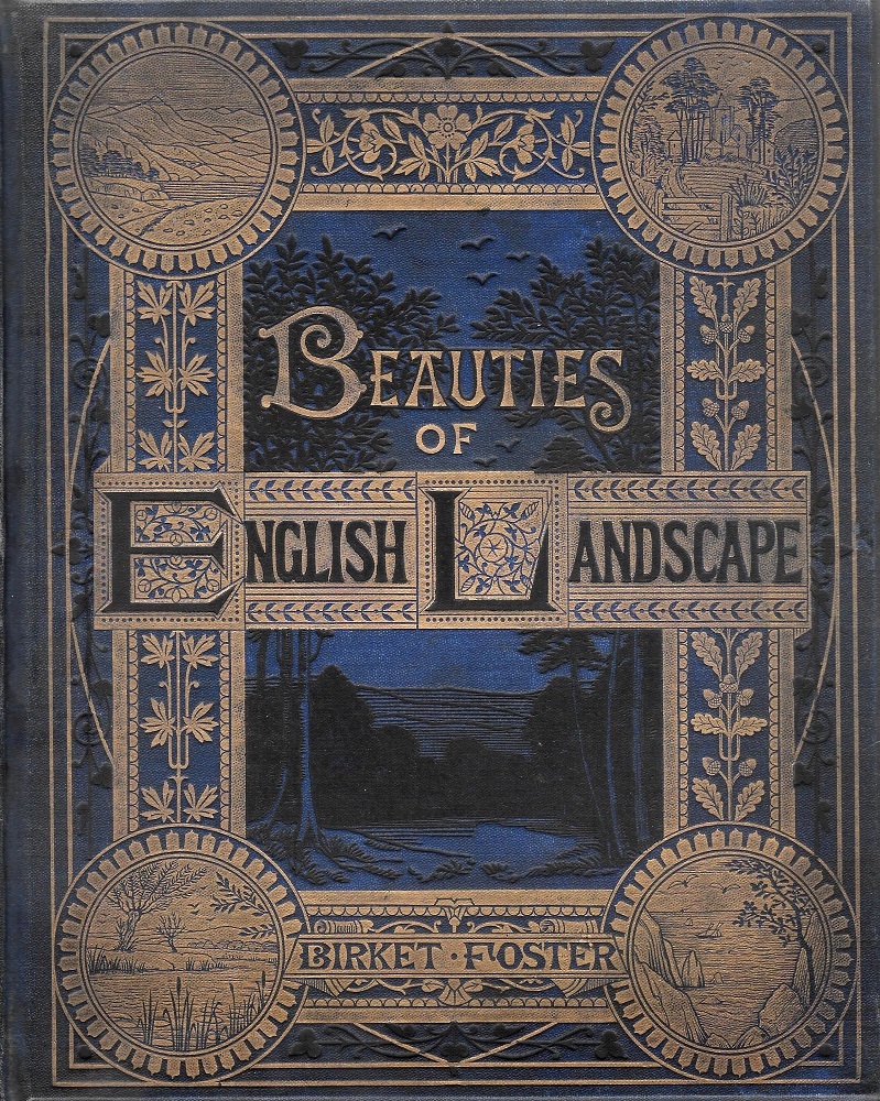
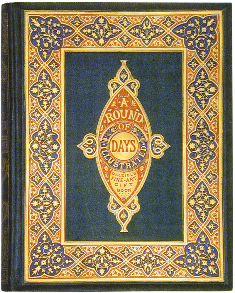
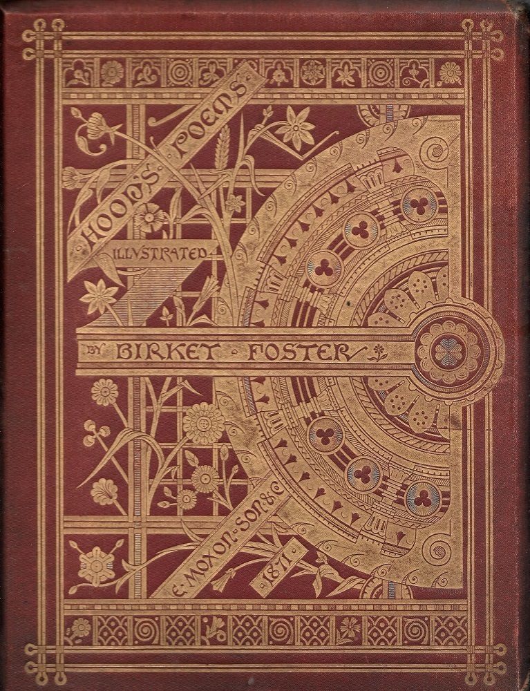
Left to right: The anonymous design for Beauties of English Landscape; John Leighton’s A Round of Days; and finally, the glamorous but unsigned cover for Hood’s Poems.
At the same time, many bindings of the so-called ‘down period’ anticipate the simplification and austerity of Art Nouveau. The spare geometrical composition adorning W. Ralston’s Krilof’s Fables (1871) seems out of its time, looking forward to the bold logic and linearity of Talwin Morris’s books in the ‘Glasgow Style’; while another, for E. V. Boyle’s Beauty and Beast [1876], presents angular lettering and carefully placed roundels that could easily appear on a cover of the nineties. So the period between the sixties and nineties cannot be described as uniformly uninteresting. On the contrary, it contains many works which represent a further phase of an earlier style, while at the same time acting as a workshop for the fin-de-siècle.
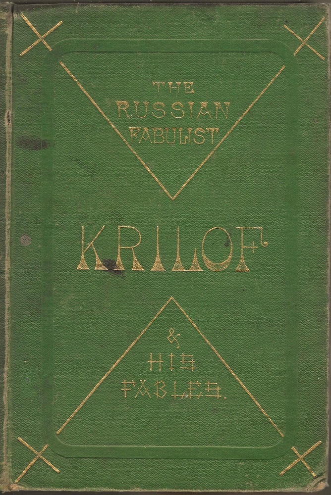
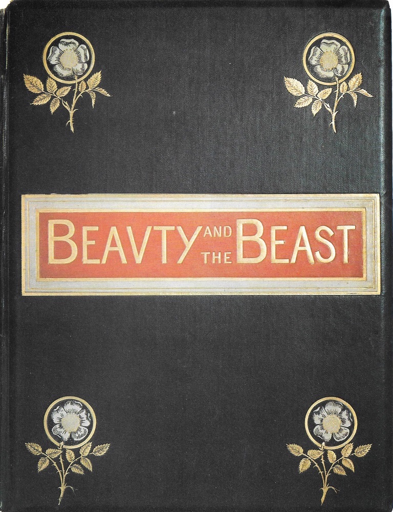
Left to right: (a) The anonymous design for Ralston’s Krilof’s Fables; (b) another anonympus design, this time for Boyle's Beauty and the Beast; (c) an example of an Art Nouveau binding designed by Talwin Morris.
Pictorial Bindings of the Eighties
The worst excesses of the seventies continued into the eighties, with the production of many tasteless extravaganzas in which the main emphasis is on the gaudiness favoured by bourgeois consumers. The trend, Ball remarks, was still a matter of ‘degeneration’ (59), or, as Giles Barber puts it with greater positivity, a ‘lull’ (322) before the up-turn of the 90s.
A characteristic example is the front cover for Cowper’s Poetical Works (circa 1881). This design, which was used as the generic binding for a series, is made up of unrelated parts: the central panel is a cut-out, containing a chromolithographic illustration of flowers in a vase in lurid colour, lacquered to create an enamelled effect and framed by a gilt floral border; gilt banners announce the title and authorship; rustic scenes printed in black ink on a green ground provide the mount; while roundels show images of Shakespeare and Burns, apparently to suggest the great traditions of English or at least British poetry; while two other tondi on the top margin show detailed gilt images of a church and a representation of Edinburgh Castle. Neither of these is directly linked to Cowper, or to Burns (who was from Ayrshire), or to Shakespeare, but were used on all of the volumes in the series.
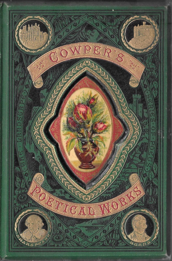
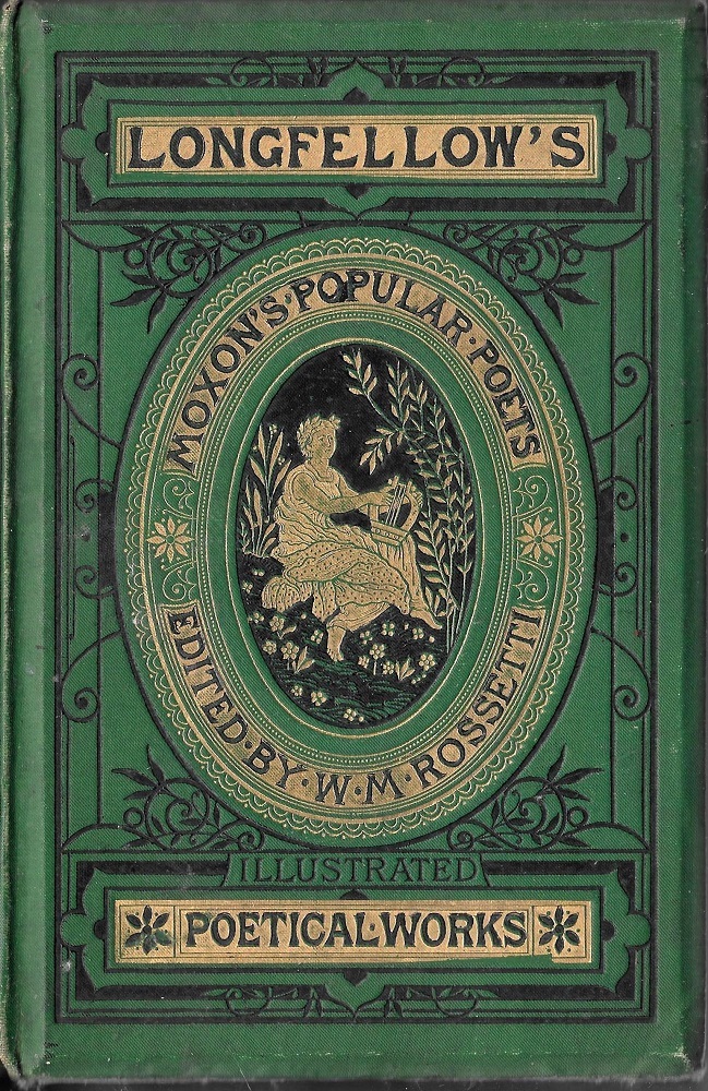
Left: The overworked binding for Cowper’s Poetical Works; Right: a more restrained cover of the period for Longfellow’s complete verse.
The listing required to describe this cover suggests how overworked it is and it can only be seen as a cloying confection that aims to amplify its appeal by cramming sundry motifs into arbitrary juxtaposition. This strategy was typical, however, especially in the formulation of inexpensive books offered for the lower end of the market, of which it is a prime example. Minor publishers – such as Gall and Inglis and Ward and Lock – excelled in such publications, using them to recreate some of the splendour of the sixties gift book but without its pedigree or high price. At worst, these productions seemed like parodies of their models, although it is also true that some achieved a more restrained effect, as in the livery for Longfellow’s Poetical Work (circa 1880).
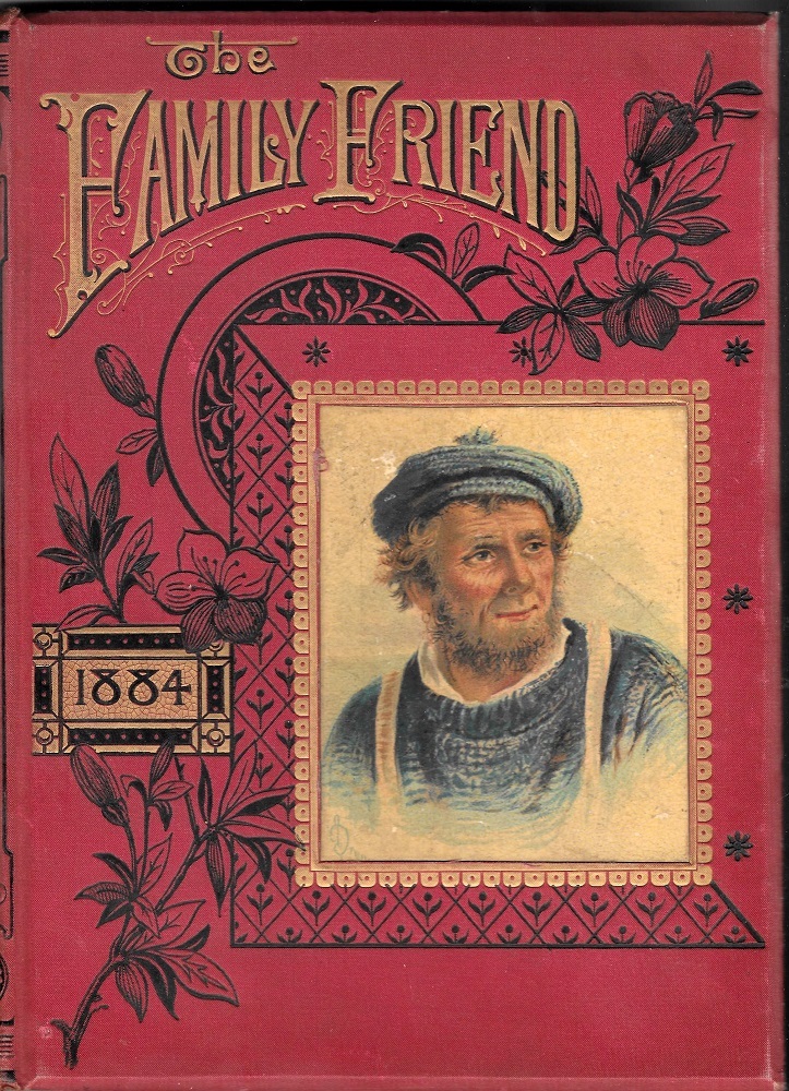
Cloth binding for The Family Friend.
However, the eighties were unlike either the sixties or seventies. Despite the many routinized binding of the period, these years were also characterized by the evolution of pictorial covers which projected their texts’ contents in the form of colour illustrations, sometimes printed using chromolithography and sometimes engraved on wood, rather than gilt devices. This development could perhaps be described as the authentic style of the eighties; a typical example can be found in The Family Friend (1884).
It was in the domain of juveniles, however, that the style finds its most sustained application. Children’s books of the period are often embellished with pictorial front covers, and these were usually the work of the artists who provided the illustrations. Kate Greenaway designed the bindings for her works, so did Walter Crane, Robert Barnes and Randolph Caldecott. These illustrators’ work was promoted by the engraver Edmund Evans, and it is reasonable to assume that Evans was instrumental in presenting their works as pictorial units – with a coloured wood-block illustration printed on the front cover that led naturally to what lay within the pages. Evans had already initiated this development with his production of Crane’s earliest ‘Toy Books’ in the seventies, and in the eighties this innovation became the norm. Composed as a whole, with unities between the parts in the manner of Arts and Crafts aesthetics, these binding also helped to re-establish the authorship of the books’ designers. The same is true, moreover, of Mary Ellen Edwards’s nursery books, although her covers are printed using chromolithography rather than wood-engraving. In her books the luxurious illustrations are again presented on the front boards – and take the form of glamorous, lacquered designs that project a cheerful and uplifting impression.
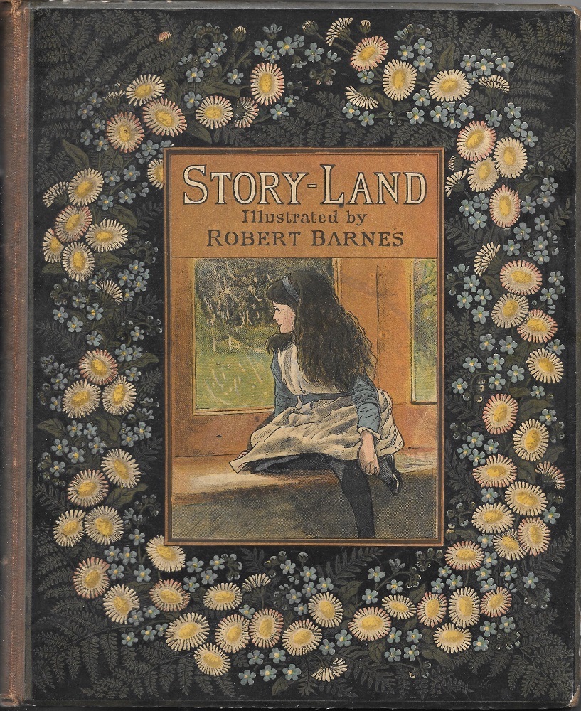
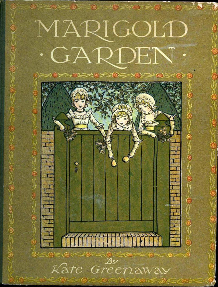
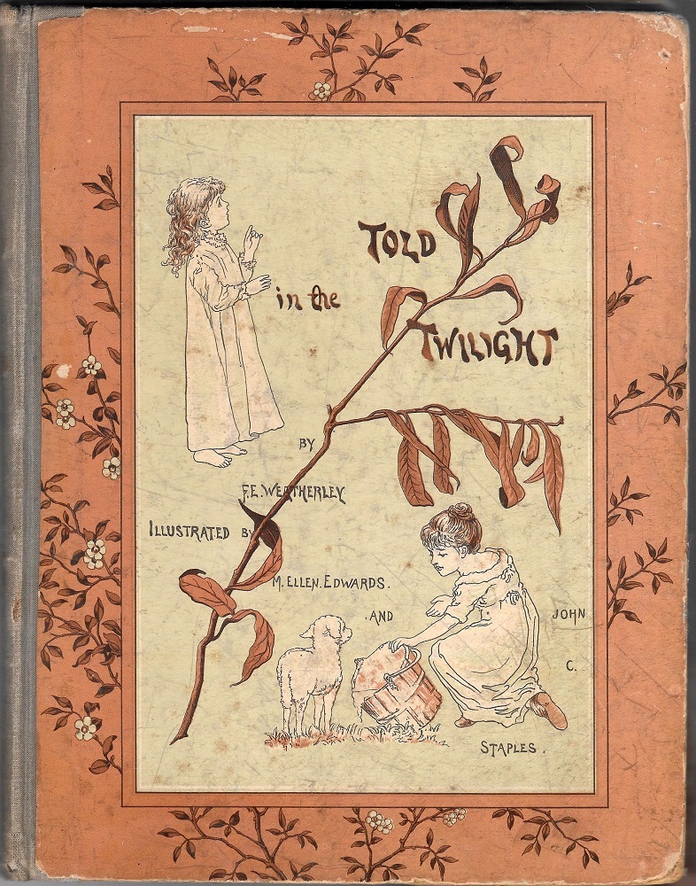
Left to right: (a) Barnes’s design for Story-Land; (b) Greenaway’s cover for Marigold Garden; (c) a typical binding by M. E. Edwards.
We can see, in short, how book covers of the period between 1870 and 1890 are far from devoid of interest, and form a distinctive period in the development of inexpensive casings. Though marred by some productions of inferior quality, it is possible to see how many works are of historical significance, maintain standards, and evolve stylistically. Dismissed or overlooked, such book covers demand close attention as examples of decline, change, and regeneration.
Bibliography
Primary
Beauties of English Landscape. London: George Routledge, 1874.
Beauty and the Beast. London: Sampson Low [1876].
Byron, George. Poetical Works. London: Moxon [1877].
Collins, Wilkie. The Woman in White. London: Chatto & Windus, 1875.
Cowper, William. Poetical Works. London: Gall & Inglis [circa 1881].
The Family Friend. London: Partridge, 1884.
Foster, Myles Birket. Hood’s Poems. London: Moxon, 1871.
Grey, Charles. Story-Land. London: Religious tract Society [1884].
Kirby, M & E. Stories about Birds. London: Cassell, Petter, & Galpin [1875].
Longfellow, H. Poetical Works. London: Ward & Lock [circa 1880].
The Man’s Boot and Other Tales. London: Griffith and Farran, 1876.
Montgomery, Florence. Misunderstood. London: Richard Bentley, 1874
Ralston, W. R. S. [trans]. Krilof and His Fables. London: Strahan, 1871.
Scott, Walter. Poetical Works. London: Gall & Inglis [1878].
Thornbury, Walter. Historical and Legendary Ballads. London: Chatto & Windus, 1876.
Willis, N. P. Poetical Works. London: George Routledge [1875].
Secondary
Ball, Douglas. Victorian Publishers’ Bindings. London: The Library Association, 1985.
Barber, Giles. ‘Rossetti, Ricketts, and Some English Publishers’ Bindings of the Nineties.’ The Library 5th Series, 25 (1970): 314–30.
McLean, Ruari. Victorian Publishers’ Book Bindings. London: Gordon Fraser, 1974.
Created 10 December 2021