
he ‘boxwood age’ of mid-Victorian illustration was dominated by three outstanding engravers. Dalziel and Co. was the foremost concern, closely followed by William Linton and Joseph Swain (1820–1901). Although there were some hundreds of other practitioners who competed for commissions in a period when ‘wood-engraving [was] the dominant representational mode’ (Maidment, 165), these companies were the most productive and influential. Each business generated large profits by deploying industrial techniques to meet the insatiable demands of a large audience, and all three made an important contribution to the development of the wood-engraved illustration and especially to the style of ‘the ‘Sixties’.
The Dalziels’ role in these developments has been explored in a variety of scholarly readings, notably those by Lorraine Janzen Kooistra, Catherine Golden, Simon Cooke and Paul Goldman. These critics have drawn heavily on the engravers’ Record (1901), which provides a wide-ranging source of information on their working practices, relationships with artists, writers, and publishers, and other important details. Linton’s, reflections on his life in the trade, enshrined in his Three Score Years and Ten (1894), have also been source of commentary and interpretation.
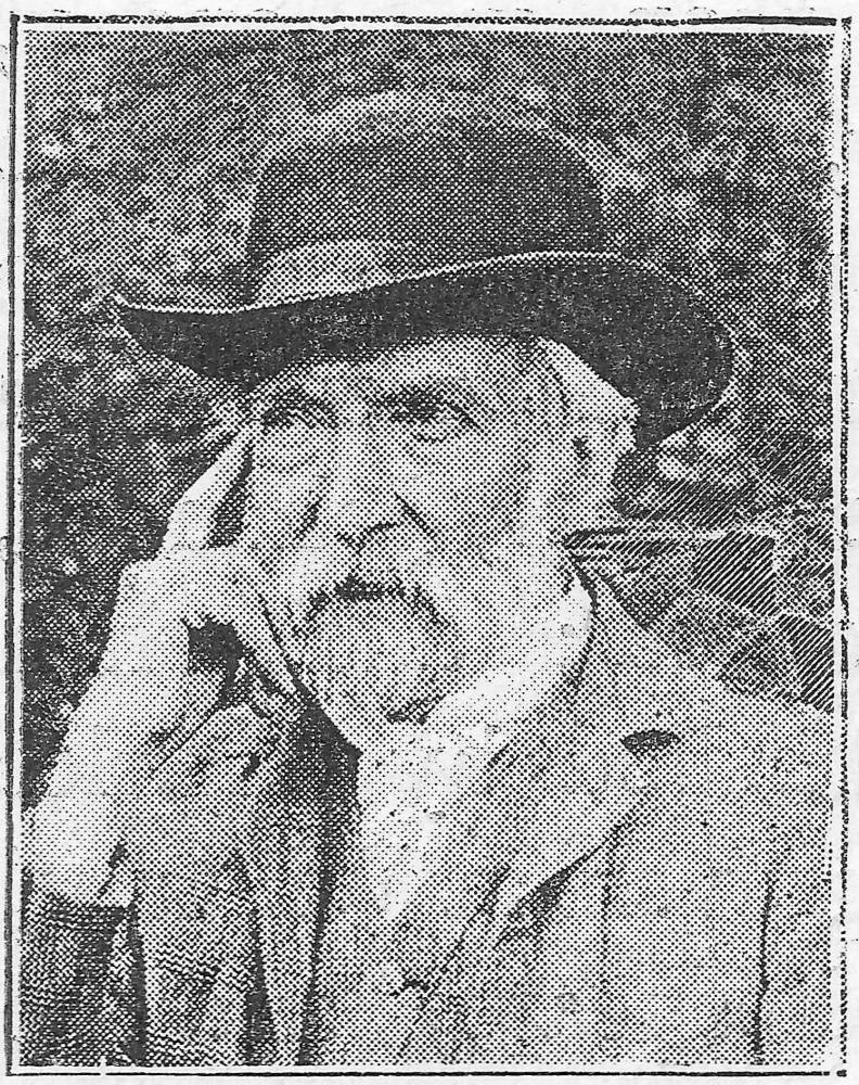
In the case of Swain, however, the information is far more widely dispersed. Swain left no autobiographical record, and although he is a powerful figure in the centre-ground of illustrators’ working lives, his presence is implied rather than expressed, noted in the form of anecdote rather than sustained analysis. This situation implies a lesser significance, placing him behind the monumental Dalziels, with their self-importance and ‘empire building’ (Goldman, Victorian Illustrated, 56), and the radical Linton. It is possible, nevertheless, to reconstruct his practice as one of the leading figures of his time. Described by Vincent Van Gogh as a ‘clever man’, it is worth retracing the outlines of his productive and influential career.
Swain and the Artists: Advocate, Mentor, Interpreter
Critics such as Forrest Reid and Paul Goldman have argued that illustrations printed ‘from the wood’ were images of high aesthetic quality, recreating the effects of painting in black and white. However, it is often the case that while the engravers were highly proficient in converting the drawing into a print, the artists were lacking in the technical skill required to transfer their compositions onto the wooden surface. In the period before images were transferred to a light-sensitized block – a development which took place around 1860 – artists had to use tracing paper or draw directly onto the wood. These methods created endless problems for the inexperienced and there were numerous occasions when Swain acted as a mentor who coached contributors in the technical requirements of being a ‘draughtsman on wood’. Though supposedly limited to the role of a supervising technician, he stepped beyond his brief and helped to prepare some of the outstanding illustrators of the age. In effect, he was the magazine’s director of art, cajoling, tutoring, persuading and sometimes losing patience with his collaborators.
One of the most difficult challenges was Richard Doyle: employed by Mark Lemon as a comic illustrator, the 19-year old, who had in the first instance no idea how to proceed, had to be taught the fundamentals by Punch’s engraver. The first such encounter is recorded in M. H. Spielmann’s history of the magazine, noting how Swain, arriving at the artist’s home,
endeavoured to impart [to Doyle] the art … of drawing on wood, how to prepare his blocks, and so forth, and to give him such further information as might be required. But so nervous was the youth [and so] greatly agitated in mind and manner, that he persisted in keeping his distance out of simple shyness and literally dodged around the dining-room table, altogether too excited and lend the slightest attention to the words of his mentor. [Spielmann, 454]


Two works by Doyle engraved by Swain: Left: Cover of 1859 Punch. Right: A Railway Station . . . Showynge ye Travellers Refreshyng Themselvess. 1849. [Click on images to enlarge them.]
Swain noted that Doyle’s first attempts were ‘smudgy’ and unpublishable, but under his direction the work quickly improved (454); the engraver went on to cut some of the artist’s most memorable work, including the front cover for Punch. Others, however, were just as clueless as Doyle, and Swain spent a good part of his professional time helping Punch contributors to bring their work up to the required standard. Some were minor figures: William McConnell ‘was turned over to Swain … for instruction’ (Spielmann, 460), and so were Georgina Bowers (529) and W. S. Gilbert (522).


Two by Georgina Bowers. Left: Hair-dressing in 1867. Right: Gardening for June. 1867. [Click on images to enlarge them.]
An advocate for developing talent, Swain also mentored the inexperienced William Ralston and supported the advancement of Frederick Walker when he was proposed by George Smith as the illustrator of W. M. Thackeray’s Philip in The Cornhill Magazine.

The Poor Helping the Poor. Frederick Walker. Click on image to enlarge it.
Swain was a major influence on the prime talents as well, and was instrumental if not in mentoring experienced artists then at least in ‘improving’ work which was presented either in an unpublishable form, or in a form which did not translate effectively into a print. Swain’s ‘hallmark’ and ‘great skill’ so Goldman explains, lay ‘in his ability to improve and strengthen a drawing for publication’ (Victorian Illustrated, 56). Leech’s drawings were notably enhanced and according to Rodney Engen Swain ‘transformed’ the artist’s ‘rather lazy pencil drawings’ into lines that were ‘tight [and] sharp’ (Pre-Raphaelite Prints, 87).
However, it was not only the Punch illustrators whose work was in need of enhancement, and it is surprising to find how many of the artists of the Sixties relied on Swain’s interventions. Fred Sandys, a superb draughtsman, confessed he was initially bewildered by the demands of the block (Reproductions, 2) and benefitted significantly from Swain’s manipulations of his original drawings; Du Maurier’s illustrations for Once a Week and Good Words were subject to some telling ‘improvements’; and even Charles Keene, an artist trained in Whymper’s workshop, was in regular need of a helping hand, especially bearing in mind that he drew in a variety of eccentric home-made inks on bits of scrap paper and coloured envelopes and expected Swain to convert them into engravings (Layard, Charles Keene, 114, 143).


Three by Charles Keene. Left: The close of the pic-nic, an illustration for George Meredith’s Evan Harrington. Two illustrations of Mrs Henry Wood’s Verner’s Pride: Middle: [Rumors of Rachel's death]. Right: [Robin discovered in the garden]. [Click on images to enlarge them.]
The quality of the engraver’s cutting, always retaining the lightness of Keene’s line, can also be studied in their collaborative work for M. E. Braddon’s Verner’s Pride.
Nominally employed as a master craftsman or visual amanuensis whose role was supposedly a matter of making an accurate or neutral translation of the artist’s work, Swain was in practice an interpreter. As already suggested, this process at the very least involved the preparation of a print fit for purpose: working with the traced marks on the block, Swain ensured that lines were thickened or thinned, lights were manipulated to meet the demands of printing ink and details were clarified; poor, smudged or vague compositions were the worst of all, and all had to be converted into the linearity demanded by the medium. And there were other complications too. On the face of it, it would seem that the advent of photographic transfer would improve this situation, since it relieved the artist from the chore of tracing or drawing directly onto the surface and ensured that the image on the block was an accurate representation. However, in practice it often meant that Swain’s task was made more difficult still; some designers presented drawings which were entirely unfitted for engraving, passed an ever greater responsibility to the engraver and depended on the craftsman’s interpretive skill. In the words of the Trollope scholar N. John Hall, “once the photo-transfer was established , the hurried or careless artist dash off a wash-drawing of any size [and] as a result the engraver … had to supply line, interpret shadow, employ cross-hatching and parallel cuts” (156). Indeed, in some engravings, the effects owe almost as much to the engraver’s interpretation as they do to the artist; as Ormond remarks in her biography of Du Maurier, the engraving ‘made possible the success of the artists’ (108). Joseph Pennell believed that the Linley Sambourne’s ‘look’ was honed and focused by Swain’s treatment (168) and would be quite different were it done by someone else, and it is widely believed that the smooth classicism of Tenniel’s cartoons, or ‘big cuts’, was in large part a product of the engraving. Though unaware of it, Swain and his workers conformed to the Ruskinian ideal of the creative craftsman – the artisan who took part in the process of artistic making.
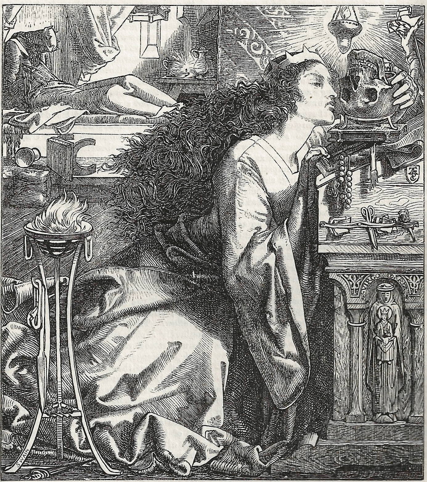
We only have to compare some drawings – which were photographed onto the block and survived intact – with their versions in print to see how Swain and his engravers manipulated the image. This process is exemplified by the differences between the drawing (The National Gallery of Canada) and cut of Sandys’s Amor Mundi (1865), which was published in Samuel Lucas’s successor to Once a Week, The Shilling Magazine (193). Both are outstanding pieces of work, but they are not the same piece of work; directed by Swain, the master-engraver William Harcourt Hooper creates a version of the first. As I explain in Illustrated Periodicals of the 1860s:
In Sandys’s final design … the faces of the lovers are loosely modelled with little definition; in the published engraving, on the other hand, the portraits have been significantly changed. The woman’s jaw-line is clearly defined, making her more refined than in the original drawing, and a similar re-definition is applied to the man’s throat. Other alterations are just as radical. The woman’s hair, originally an amorphous billowing form with minimal hatching, has been converted into rope-like tresses, while the proportions of the figures have been subtly modified to stretch them out ... [43]
This, in other words, is far more than mere ‘improvement’, creating a new interpretation in which the emphasis on the lovers’ voluptuousness is diminished while the detail is privileged. It becomes what I have called a ‘Pre-Raphaelite nightmare’ (Illustrated 43), very much intensifying the effect of claustrophobic, overbearing materiality – as if were a dream in which everything is seen in the same, over-particularizing light. Intended as facsimile engraving, this print exemplifies the impact of re-interpretation, with one image modifying or re-casting another.
The engraver therein partook of the process of authorship and became a collaborator in the production of meaning; having entered into a partnership with an author, or at least with a text, the artist was compelled to share his creation with his engraver too. In this instance, the contribution made by the engraver is problematized by the fact that Hooper believed the woodpecker should not have any sort of personality, and only existed to serve the artist; if Swain the industrialist paradoxically prefigured the Arts and Crafts artisan, then Hooper, a pure ‘facsimile man’, was the very reverse. Here, though, the impact of Swain’s direction is evident, and the interpretive role of the craftsman was pursued by the workshop as a matter of course. The artists’ response, however, was far from straightforward.
Many appreciated Swain’s interpretations as validating improvements which infused the designs with a greater graphic expressiveness than would be achieved if the drawing were left unmodified. According to W. P. Frith, Leech admired Swain’s treatment of his blocks and always ‘acknowledged’ his ‘obligation’ to the engraver’s sympathetic touch (II, 51), only qualifying his judgement with the occasional grumble. W. M. Thackeray, a poor draughtsman, was similarly grateful for Swain’s interventions, openly wondering why he could not translate what he owned as his ‘weak and scratchy’ drawings into the polished imagery of John Gilbert (qtd. Goldman, Victorian Illustrated, 56). But others were more ambiguous. Tenniel was caught between gratitude and a feeling of having lost control of his work, timidly requesting that Swain would consult him before making any alterations (qtd. Morris, 115), and Sandys (who was highly critical of the Dalziels) regarded the whole operation of passing his work into the hands of a craftsman as an impertinence, and resisted ‘improvements’ whenever he could (Cooke, Illustrated Periodicals, 179).


Left: A Change for the Better. John Tenniel. Middle: Helen and Cassandra. Frederick Sandys. Right: Young England. John Leech. [Click on images to enlarge them.]
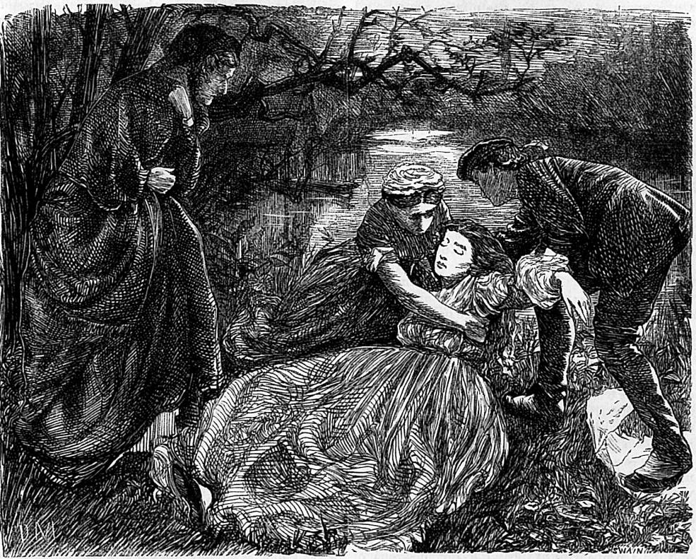
The more characteristic response lay between these extremes of indebtedness and resistance. The practice of sending proofs for the artist’s approval provided a negotiated space; this gave the designer the opportunity to make written amendments and to have the final say on what would be printed. Again, the success of this operation depended on the personalities. Du Maurier, always a canny operator, was probably the most effective in allowing Swain to improve or re-focus his work while still asserting his authorship. In preparing the work for M. E. Braddon’s Eleanor’s Victory in Once a Week (1863), Du Maurier engaged in a productive collaborative relationship which both recognized his authority and paid due respect to the importance of the engraver’s reading of his work. The relationship between Swain and Du Maurier was a prime example of professionalism and the value of a personal relationship, allowing them ‘time to compare notes, inspect and correct the proofs [and make] a wide-ranging series of adjustments’ (Illustrated Periodicals, 184). Surviving correspondence suggests George Pinwell was also an active and generous collaborator and there are doubtless many other examples of this sort of compromise.
Swain was thus engaged in a series of complex relationships with his artists and their work, acting as a mentor and champion who knew how to nurture talent, and as an interpreter who influenced and sometimes dictated the engraving’s effect. The series of negotiations enshrined in this network demanded a wide range of executive and creative skills, and Swain’s ability is reflected in the fact that unlike the Dalziels, who had trysts with Dante Rossetti and several others, he rarely had to defend his work, enjoying predominantly cordial relationships with the artists. A product of the Industrial Revolution whose work was structured by a strict division of labour and task, the final impression is one of collaboration and shared purpose, of organism rather than mechanism.
Style and Technique
What, then, are the defining features of Swain’s engraved images? The emphasis on interpretive cutting always meant that the image was essentially ‘after’ the artist’s work, but wherever possible the engraver constructed a visual identity which matched and promoted the illustrator’s primary characteristics. The subtlety of the approach meant that, for example, the obsessive detail of Sandys’s work is accentuated in his engravings, while Du Maurier’s expressive arabesques are privileged. Good examples would be the former’s Rosamund (1861), with its careful delineation of Pre-Raphaelite clutter, and the latter’s turbulent, suggestive lines, as they are applied to the crinolines of his female characters in the engravings for The Notting Hill Mystery (1862–63).
Left: Rosamund. Frederick Sandys. Right: Gertrude in the Wilderness,. George Du Maurier. [Click on images to enlarge them.]
Essentially a gloss on the source-material, these images encapsulate the engraver’s reading of what he regarded as the most important aspects of an artist’s language. Faced with variable drawings on the block, he did much to co-create the styles of the various illustrators, and always differentiated between them. H. C. Ewart highlights the sensitivity of Swain’s interpretive approach in the form of a direct question:
How is it you are able to preserve the character of each artist’s drawing in the way you do? When I look over any engravings I can generally tell who the engraver is, but when I look at your work I can see at once who is the artist is. [240–41]
That he managed to maintain this consistency is a remarkable achievement, and one all the more remarkable when we remember that the cutting of the block was divided between many hands, a situation that become more fragmented as the company expanded. Indeed, it was commonplace by the mid-sixties for a single illustration to be divided into sections, worked upon by two or three engravers, and bolted together, using the procedure invented by Charles Wells, when the work was complete. On the other hand, an undivided block might be passed between workers, each focusing on their own expertise, a process favoured at Punch. It is recorded that an apprentice might cut the illustration’s background, a journeyman a more complex passage and masters the figures and/or faces; somehow, the parts cohered (Beegan, 59; Carlisle, 24). Swain, who may have done the figures and faces on at least some of the blocks, extolled his craftsmen to ‘search the drawing for the motive of the artist and work up to that’ (Hartley, 10); but this directive seems too generalized to produce the unified results so evident in the company’s vast corpus of work. All we can say, as Gleeson White observes, is that the engravers approached their work with an impressive dedication, taking ‘all responsibility for the work entrusted to them’, and always ‘maintaining a singularly hard standard of excellence’ (12).
Swain’s workshop undoubtedly produced a unified version of the artists’ work helped to establish the ‘look’ of mid-Victorian illustration and, as noted earlier, facilitated the success of the outstanding artists of the period. It is also possible to differentiate between the styles of the competing companies. Paul Goldman believes that Swain’s engraving was superior to the Dalziels’ – which is often heavily blocked – and excelled at producing ‘solidity and firmness of line’ (Beyond Decoration, 35), a focus exemplified by his monumental treatment of illustrations by Sandys such as If and Yet Once More Upon the Organ Play. Engraved for Once a Week and The Churchman’s Family Magazine, these images are small wonders of draughtsmanship – some of it the work of the artist, and some of it the work of the engraver.

Two by Frederick Sandys. Left: Yet once more on the organ play. Right: If he would come to-day. [Click on images to enlarge them.]
Swain further excelled, it seems to me, in rendering effects of light and shade combined with a delicate line. Du Maurier’s Vae Victis! for Elizabeth Gaskell’s Wives and Daughters(1864) and William Small’s illustrations for Charles Reade’s Griffith Gaunt (1864) exemplify this approach. These are moody, expressive scenes which unite a fluid line with suggestive lighting. Unlike the Dalziels’ designs, which often veer between absolute light and dark, Swain’s illustrations deploy chiaroscuro in a series of half-tones varying from light grey and grey to black and highlights in absolute white. The engraving for Small is especially accomplished, contrasting the darkness of the furniture with the folds of the characters’ dress, which are picked out in white, and the flowing treatment of her hair – a theme that recurs in many of Swain’s images. In Vae Victis! (1864), by contrast, the focus is on the intersection between the evening and the night, the light in the parlour and the near-silhouettes of the figures outside. Again, there is a dramatic contrast between the lightness of the opened book and the delicate half-tones delineating Molly’s profile and dress, with its convoluted patters of light and shade; and it is interesting to compare Swain’s treatment of her elaborate dress and the approach of the Dalziels to Millais’s Was it Not a Lie? for Trollope’s Framley Parsonage (1861). Both crinolines are as much symbols of their characters’ frustrated state of mind as they are descriptions of a material effect, but it is noticeable that Swain’s interpretation is far subtler and more nuanced than the Dalziels’.

Left: Vae Victis. George Du Maurier. Right: Was it not a lie?. John Everett Millais. [Click on images to enlarge them.]
The modulation of light in all of Swain’s engravings would have required the cutting of planar gradations, creating tonal as well as linear effects. Never less than an outstanding technician but better viewed as a sensitive interpreter, his work is both a technical miracle and an apt translation of the talent of generations of mid-Victorian artists.Related material
Works Cited and Sources of Information – Primary
The Argosy. London: Strahan, 1866–70.
Crane, Walter. An Artist’s Reminiscences. London: Methuen, 1907.
Dalziel Brothers. A Record of Work, 1840-1890. Foreword by Graham Reynolds. 1901; reprinted London: Batsford, 1978.
[Du Maurier, George]. The Young George Du Maurier: Letters 1860–67. Edited by Daphne du Maurier. London: Peter Davies, 1951.
Ewart, H. C. Toilers in Art. London: Isbister [1901].
‘A Famous Engraver.’ London Daily News. 24 March 1909: 8–9.
Frith, W. P. John Leech. 2 Vols. London: Richard Bentley, 1891.
Good Words. London: Strahan, 1860–80.
Groves, J. B. Rambling Recollections and Modern Thoughts by an Old Engraver. [n.d. MS., The Punch Library, London].
Layard, G. S. The Life and Letters of Charles Samuel Keene. London: Sampson Low, 1892.
Layard, G. S. The Life and Letters of Shirley Brooks. London: Pitman, 1907.
Linton, William James. Three-Score and Ten Years, 1820-1890. New York: Scribners, 1894.
Once a Week. London: Bradbury & Evans, 1859–80.
Pennell, Joseph. Pen Drawing and Pen Draughtsman. London: Macmillan, 1897.
Punch. London: Bradbury & Evans, 1841–90.
Reproductions of Woodcuts by Frederick Sandys, 1860–1866. London: Hentschel, n.d. [1904].
Spielmann, M. H. The History of Punch. London: Cassell, 1895.
Thackeray, W. M. Philip. Illustrated by Frederick Walker. The Cornhill Magazine. (1861–2).
Van Gogh, Vincent. Letter to Theo Van Gogh, 30 October 1877. Reproduced in vangoghletters.org/vg
Works Cited – Secondary Sources
Beegan, G. The Mass Image: a Social History of Photomechanical Reproduction in Victorian London. Basingstoke: Palgrave Macmillan, 2008.
Burton, Anthony. ‘Swain, Joseph (1820–1909)’. Oxford Dictionary of National Biography. Oxford University Press, 2004 [http://www.oxforddnb.com/view/article/36380. Accessed 12 July 2017]
Carlisle, Janice. Picturing Reform in Victorian Britain. Cambridge: Cambridge University Press, 2014.
Cooke, Simon. Illustrated Periodicals of the 1860s. Pinner: PLA; London: The British Library; Newcastle, Delaware: Oak Knoll Press, 2010.
Cooke, Simon. ‘Notable Books: The Dalziels’ Bible Gallery’. The Private Library 5th Series 10:2 (Summer 2007): 59–85.
Elzea, Betty. Frederick Sandys, 1829–1904. With an introduction by Douglas E. Schoenherr. Woodbridge: Antiques Collectors’ Club, 2001.
Engen, Rodney. Richard Doyle. Stroud: The Catalpa Press, 1983.
Engen, Rodney. Pre-Raphaelite Prints. London: Lund Humphries, 1995.
Golden, Catherine. Serials to Graphic Novels: the Evolution of the Victorian Illustrated Book. Gainsville: University Press of Florida, 2017.
Goldman, Paul. Beyond Decoration: the Illustrations of John Everett Millais. London: The British Library, 2005.
Goldman, Paul. Victorian Illustrated Books 1850–1870. London: The British Library, 1994.
Hall, N. John. Trollope and His Illustrations. New York: St. Martin’s Press, 1980.
Hartley, Harold. ‘Introduction.’ R.A. Exhibitors: Book Illustration of the 1860s. London: The National Gallery, 1923.
Kooistra, Lorraine Janzen. Poetry, Pictures, and Popular Publishing. Athens, Ohio: Ohio University Press, 2014.
Maidment, Brian. Reading Popular Prints, 1790–1870. Manchester: Manchester University Press, 1996.
Morris, Frankie. Artist of Wonderland: the Life, Political Cartoons, and Illustrations of Tenniel. Cambridge: The Lutterworth Press, 2006.
Ormond, Leonee. George Du Maurier. London: Routledge and Kegan Paul, 1969.
Reid, Forrest. Illustrators of the Eighteen Sixties. 1928; reprint, New York: Dover, 1975.
White, Gleeson. English Illustration: The Sixties, 1855–70. 1897; rpt. Bath: Kingsmead, 1970.
Last modified 28 August 2017