
[Click on images to enlarge them and to obtain additional information.]
Introduction
Britain’s relationship with Germany has always been complicated. In the twentieth century the war against fascism had a negative influence on British perceptions of German culture; in the nineteenth century, by contrast, Prussia’s cultural achievements, along with those of other German states, were held in high regard.
British admiration for German culture was principally developed in the years after 1840 when Prince Albert was installed as Consort and in various ways set out to promote Teutonic art, music, philosophy and literature. Admiration for the Prince among the educated middle-classes was expressed in a fascination with all things German: Albert was viewed as young and dynamic, and so was the culture of his home-country. Indeed, it was fashionable in the forties and fifties to be knowledgeable of the German poets (whose work appeared in sundry translations), to know something of Goethe, and to have at least a passing familiarity with Carlyle’s works of advocacy such as his Life of Schiller (1822–24) and his hagiography of Friedrich II of Prussia, Called Frederick the Great (1858–61). Both were endlessly reprinted and widely read.
British interest in German culture were similarly marked in the field of visual art. The Nazarenes were imitated by Madox Brown, Selous, Dyce, Tenniel and Maclise, and German idioms gained further currency in the work of the Pre-Raphaelites. Another cultural import was illustrated literature; embellished in a distinctive style by a variety of artists, the images were sometimes lithographs but more usually wood-engravings.
Drawing on wood had wide implications. It demonstrated, first of all, the artistic excellence that could be achieved using the techniques of cutting and hatching across the grain. British engravers such as the Dalziels – the pupils of Bewick – were heavily influenced by the German example, and looked, at least in part, to the work-shop practices of their foreign rivals. British illustrators were similarly impressed by the medium’s expressive possibilities. Du Maurier, Sandys, Maclise, Bayes, and many others came under the Germans’ spell, and there are many examples of borrowing from their styles and motifs. These illustrators were heavily influenced by the book-arts of two outstanding artists who drew on wood: Rethel, and von Carolsfeld. The lithographs of Retzsch were similarly influential.
Retzsch and the Outline Style
The most popular and influential types of German illustrated books were the plate-albums by Friedrich August Moritz Retzsch (1779–1857). These were published originally in Leipzig in the 1820s, but were re-published in Germany and Britain throughout the century. Retzsch invented the ‘outline style’, a type of austere, pared down design in which everything is reduced to the bare essentials; part-theatre and part-pictogram, his images have the schematic clarity of a story-board in which the main emphasis is on psychological drama.
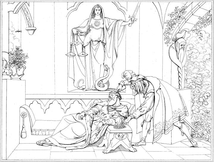
Scene from Hamlet: The poisoning of the king, by Retzsch.
His most important book, and the one which secured his reputation in England, was his Gallerie zu Shakespeare [Outlines to Shakespeare] (1828). Issued in parts, and eventually as a huge volume, this monumental work illustrates all of the plays. A dazzling display of inventiveness, it is only matched by the later pictorial versions of John Gilbert and H. C. Selous. The book was a hit, however, because it visualized the greatest English writer in a stark and impressive way, providing a generation of reader/viewers with a ready-made iconography that seemed both sophisticated and direct. The publishers were clever enough to present the explanatory texts in both German and English, so creating an appealingly complex response in which the British reader/viewer could be both a connoisseur of fine Teutonic design and an English patriot who read Shakespeare. Framed as a hybrid, Retzsch’s art expressed cultural unanimity, and was a powerful sign of the connections between the two nations.


Details from three of Retzsch's Shakespeare illustrations: (a) Hamlet holding Yorick's skull, (b) Gertrude and the ghost of Hamlet's father, and (c) mad Ophelia. Click on the images to obtain the complete plate.
The combination of outline-design and text was taken up as a template and several British artists, seeking to exploit the German’s popularity, presented their own treatments of Retzsch’s model. The most ‘Germanic’ of these was Selous. Selous published outline versions of The Pilgrim’s Progress (1844) and Shakespeare’s Tempest (1836), elaborate quartos built on a calculated symmetry between the letterpress and the full-page designs. The same approach was followed by Noel Paton in his version of The Rime of the Ancient Mariner (1863). This type of book was promoted by the Art Union of London, an organization which published ‘fine art’ on subscription, and was an ardent champion of ‘Germanism’.
There were dissenting voices, however. Although German design was admired, some critics, especially Ruskin, thought the imitation of outline books was un-British. Others dismissed the Retzschian school as dull and over-intellectual. Punch unsubtly re-named him ‘Wretch’ and snide comments appeared in popular fiction, especially in the Sensation novels of Braddon and Collins. There is a telling passage in Collins’s Hide and Seek (1854), in which outline-books are used to torture Zack, a little boy. Zack is forced to educate himself by looking at some albums, essentially punishment by boredom:
The works now referred to were, an old copy of the ‘Pilgrim’s Progress’ [perhaps Selous’s?] and a ‘Life of Moses’ illustrated by severe German outlines in the manner of the modern school. Zack knew well enough what books his father meant, and exhibited his appreciation of them by again beginning to wriggle his shoulders in and out of his frock. He had evidently had more than enough already of the ‘Pilgrim’s Progress’ and ‘Life of Moses’. [p.23]
The style was parodied in visual art as well. It was savaged by Doyle in his mock-outlines Manners and Customs of Ye English (1849), and Bird’s Eye Views of Society (1864). Both appeared in the form of an oblong quarto, with full-page outlines facing the text in insolent imitation of Retzsch’s picture books. Replacing the heroes of English and German literature with images of the bourgeoisie bumbling around their lives, this is a prime example of the mock-heroic, applying an elevated style to a prosaic subject-matter and generating humour in the mis-match of form and content. More importantly, Doyle’s satire curses the original: once his outlines have been seen it is impossible to take Retzsch seriously. Such delicious satire roundly ridicules the pretensions of its target, reducing ‘Germanic’ illustration to the level of travesty.
Rethel and von Carolsfeld: German drama
Retzsch’s books were coffee-table favourites, an easy read for fire-side consumption; regarded as ‘improving’, they expressed the consumer’s cultural capital without being esoteric or demanding. Far more difficult – and challenging – were the illustrated works of Alfred Rethel (1816–59) and Julius Schnorr von Carolsfeld (1794–1872). Rethel and Schnorr published a series of monumental books in which the main emphasis is on an intense representation of drama. These artists’ work was the very reverse of pared-down economy; in contrast to the outlines of Retzsch, their drawings are essentially painterly, small versions of fine art in which the figures and settings are visualised in the manner of historical painting, usually in the form of medievalism or an antiquarian version of a biblical past. They also figure as exemplary examples of wood-engraving, continuing a tradition of drawing on wood that originates in the art of Dürer and self-consciously invokes the standards of that master.


(a) Rethel's Death on the Barricades. (b) Sandys' Until Her Death. [Click on these images for larger pictures.]
Three books were influential: Rethel’s Das Nibelungenleid (1840); the same artist’s Another Dance of Death (1849); and Schnorr’s monumental work of the 1850s, Bibel in Bildern, known in English as the Picture Bible (1855). These severe, intellectual works had a considerable audience among the general public and were widely imitated.


Two works by Schnorr von Carolsfeld — left to right: (a) Gabriels Verkündigung von Maria [The Annunciation. (b) Christ at the Sea of Galilee. [Click on these images for larger pictures.]
We can see a direct link, for example, between the gloomy imagery of Sandys and Rethel’s Auch ein Totentanz [Another Dance of Death], a series of prints lamenting the consequences of the revolutions of 1848. Rethel’s ‘Death the Friend’, with its morbid combination of medieval symbolism and intense feeling, is quoted in Sandys’s illustration for Good Words, ‘Until her Death’ (1862). Uncompromisingly direct, both images present an unpalatable truth – the inevitability of death – in a manner which is markedly at odds with the lyricism and sentimentality of more conventional designs of the time.
A parallel influence was exerted by Schnorr, whose Picture Bible (1852, 1855, 1857, 1860) was one of the inspirations for the Dalziels’ Bible Gallery (1880, dated 1881). Schnorr’s intense visual drama is recreated in the art of Madox Brown and other contributors to the Gallery, and it is interesting to compare the German and British treatment of the same scenes.
Germanic ornament
German illustration was primarily a literary art which focused on the dramatic representation of narratives. It was also intensely decorative. German books of the thirties, forties and fifties are often enriched with ornamental borders enclosing the text. In part alluding to the manuscript art of the illuminated manuscript and in part a representation of the elaborate borders featuring in German incunabula, these publications gave an impression of luxuriousness that went beyond their status as mass-products.


Examples of Rethel's influence — left to right: (a) Alfred Rethel's Siegfried and the Rhine Maidens. (b) Edward Corbould's Sir Lancelot du Lake. (c) John Franklin's The Child of Elle. [Click on these images for larger pictures.]
The borders deployed a narrow range of motifs that quickly became traditional. They characteristically included strap-work, floral devices, swirling arabesques and, most typically of all, wooden or sprig-like frames enclosing the text within a sort of pergola. Rethel’s Das Nibelungenleid (1840) features some of this type of work. Foliate borders, sometimes with the characters climbing onto the frame itself, are found throughout: a device common in German books of the period.


Details from the illustrations by Corbould and Franklin immediately above. [Click on these images for larger pictures.]
In Britain this type of ornament was taken even further, with ever-elaborate borders enclosing the text-block. Selous, Tenniel, Franklin, Pickersgill and other ‘Germanists’ published books including such decorative frieze-work although it is not clear, in each case, who designed them. The outstanding publication, and the one which introduced the Germanic decorative style into the British mainstream, was S. C. Hall, who edited The Book of British Ballads in 1842. Published by James Burns, another ardent advocate of ‘Germanism’, this book exemplifies a graphic arrangement that was adopted in many subsequent works and continued, with slight variation, well into the seventies.
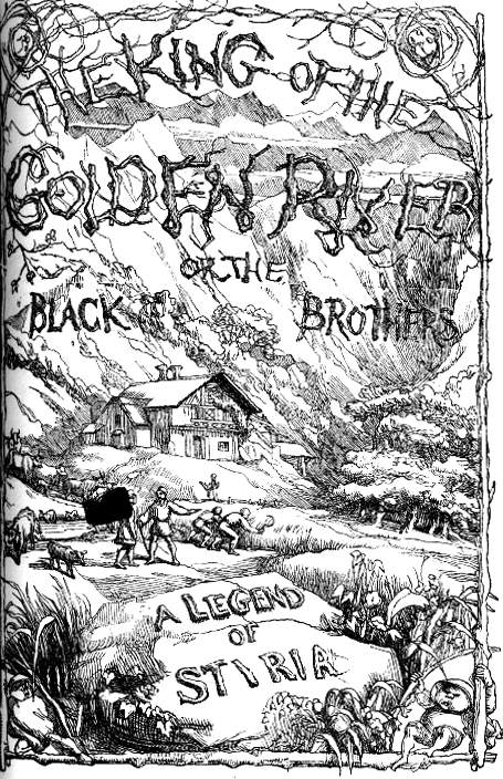

Richard Doyle's title-page for The King of the Golden River and the cover of the 1859 Punch.
Doyle, predictably, viewed this ‘woody’ motif as another example of German excess. His lettering of the title-page for The King of the Golden River (1851) is a mock-version of German typography, and his elaborate wooden frame on the front cover of Punch, with its ludicrous sprigs and scraggy twigs, is typically droll.
Works Cited and Sources of Information
Andrews, Keith. The Nazarenes: A Brotherhood of German Painters in Rome. Oxford: Clarendon Press, 1964.
Buchanan-Brown, John. Early Victorian Illustrated Books. London: British Library, 2005.
Collins, Wilkie. Hide and Seek. 1854; Oxford: Oxford University Press, 1993.
Dalziels’ Bible Gallery. London: Routledge, 1881 [1880].
Doyle, Richard. Bird’s Eye Views of Society.London: Smith, Elder, 1864.
Doyle, Richard. Manners and Customs of Ye Englyshe.London: Bradbury & Evans, nd [1849].
Good Words, 1862.
MacCulloch, Laura. "'Fleshing Out' Time: Ford Madox Brown and the Dalziels' Bible Gallery." Reading Victorian Illustration, 1855–1875. Eds. Paul Goldman and Simon Cooke. Burlington VT: Ashgate, 2012, pp. 115–135.
MacCulloch, Laura. Ford Madox Brown: Works on Paper and Archive Material at Birmingham Museums and Art Gallery. Unpublished doctoral thesis. University of Birmingham, 2009. Typescript and Web. Web accessed 10 December 2011.
Paton, Noel. The Rime of the Ancient Mariner. London: Art Union, 1863.
[Rethel, Alfred]. Auch ein Totentanz. Leipzig: Wigands, 1848 [1849].
[Rethel, Alfred]. Das Nibelungenleid. Leipzig: Wigands, 1840 [1841].
Retzsch, F. A. M. Galerie zu Shakespeare/Outlines to Shakespeare. Leipzig: Ernest Fleisher, 1828.
Selous, H.C. The Pilgrim’s Progress. London: Holloway, 1844.
Selous, H.C. The Tempest. London: Schloss, 1836.
The Book of British Ballads. Ed. S.C. Hall. London: How, 1842.
Vaughan, William. "Facsimile versus White Line: An Anglo-German Disparity." Reading Victorian Illustration, 1855–1875. Eds. Paul Goldman and Simon Cooke. Burlington VT: Ashgate, 2012, pp. 33–52.
Vaughan, William. German Romanticism and English Art. New Haven and London: Yale University Press, 1979.
[von Carolsfeld, Schnorr]. Bibel in Bildern. London: Williams & Norgate, 1855, 1857; Leipzig: Wigands, 1860.
Last modified 13 December 2024