
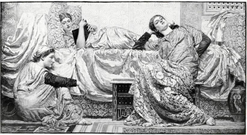
Reading Aloud by Albert Joseph Moore, ARWS (1841-1893). Tempera or oil on canvas. 42 1/4 x 81 inches (107.3 x 205.7 cm). Collection of Kelvingrove Art Gallery and Museum, Glasgow, accession no. 1218. Image courtesy of Kelvingrove Art Gallery and Museum under the terms of the Creative Commons Attribution-NonCommercial-NonDerivatives licence (CC BY-NC-ND). [Click on all the images to enlarge them.]
Moore exhibited Reading Aloud, surely one of the most beautiful and most significant of his late masterpieces, at the Royal Academy in 1884, no. 416. This work has a special significance to the author because in 1976 it was the first work by Moore he ever encountered. During an elective period as a fourth-year medical student, he did a three-month rotation at a maxillofacial unit in Glasgow and spent much of his free time visiting the local art galleries. Reading Aloud quickly became his favourite painting in the collection of the Kelvingrove Art Gallery. My high opinion of this work is matched by Moore's biographer A. L. Baldry who wrote: "With this picture he reached the fullest development of his art, and placed himself on the highest level of performance to which he ever attained" (55). A critic for The Artistdescribed the painting best in a single word "exquisite."
Reading Aloud is primarily an arrangement in rose pink, white and charcoal grey. Three classically draped young women languidly pose around or on a drape-covered sofa. The central figure is lying stretched out on the sofa, her head propped up on a pillow, and reading aloud to her companions from a dark grey book held to her chest. The maiden to the left, clad in a pink gown with black sleeves and with a pale-yellow cap, is seated on the floor in profile to the right. The third maiden is seated on a dark grey chest with mother-of-pearl inlay. Her head is tilted to the left and resting on her right arm and hand while her left arm is tucked behind her against the sofa. She is wearing a similar pink gown with black sleeves, but around her legs is a drapery of white lace sewn to black silk. The background is of white marble carved in low relief with various geometric wavy patterns. A large dark grey and white vase, decorated with an owl, which Moore based on an ancient example in the British Museum, sits on the floor to the far right. According to A.L. Baldry, Moore's treatment of draperies, highlighting white lace against a dark background, was derived "in the course of studying the effect produced by the relief of the foliage of a tree against the sky.,,a parallel to the patterning of the flickering glints of daylight between overhead masses of leaves and interlacing branches" (82).
The Hunterian Art Gallery has a study for Reading Aloud, oil on glass, in quite a different colourway:
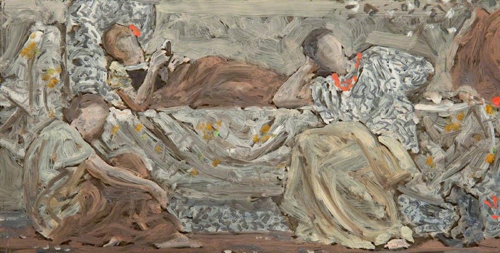
Study for Reading Aloud. c.1881. Oil on glass. 12 7/8 x 6 3/8 inches (29.4 x 43 cm). Collection of the Hunterian Art Gallery, University of Glasgow, accession no. GLAHA_43763. Image courtesy of The Hunterian, University of Glasgow via Creative Commons, reproduced for purposes of non-commercial academic research.
According to Robyn Asleson,
The transparent support enabled Moore to make rapid trials of alternative colour schemes by painting directly on the glass while it overlaid a finished chalk drawing of the composition. This technique saved him the effort of re-drawing the composition prior to each new experiment. He habitually superimposed two sheets of tracing paper for the same purpose, one bearing a sketch of the composition, the other a trial colour arrangement…The figural poses and accessory details in Moore's oil on glass colour study differ in several respects from the final composition, indicating that it was made fairly early in the painting's evolution. The fact that Moore carried out colour trials at this early stage demonstrates his desire to develop the linear and chromatic arrangements in tandem.
Asleson also discusses how Moore's treatment of drapery differed from his Aesthetic Classicism contemporaries like Leighton and Poynter. "Despite its prematurity, however, the glass study already demonstrates the nuances of drapery pattering that would ultimately characterize the painting. In both the oil sketch and the final canvas, drapery enlivens the static composition with a range of contrasting actions: the zigzagging folds across the torso of the reclining reader; the swelling ripples about the lower limbs of the crouching woman at left; the broad, diagonal sweep over the legs of the opposite figure; and the ponderous swags falling from the sofa which bridge the gap between them. It was this 'abstract perfection of fold and combination of line' that distinguished Moore's treatment of drapery from the realism of contemporary classical revivalists [166].
Another way in which the sketch differs from the final composition is that the cat to the lower right has been replaced by the large owl-ornamented vase.
Asleson has once again pointed out an underlying geometric structure in this painting by Moore: "To eyes accustomed to the subsequent experiments of Cubism, Moore's accommodation of human anatomy to ideal geometry no longer appears revolutionary, but to contemporary viewers, the effect was startling indeed…. The figures form part of a complex array of abstract and naturalistic patterns that fill every inch of canvas" (168). Some contemporary critics, however, did understand what Moore was trying to achieve in his art. Austin Chester, for instance, in his review of Moore's career in The Windsor Magazine in 1905, wrote: "It is no exaggeration to say that his pictures are mathematical problems constructed on a pattern, a very network of symmetric lines; and, were it possible to eliminate the figures from the canvases there would yet remain, not only traceable but distinct and easy to be followed, the scientific system on which they are constructed, within which elaborate framework he set himself the task of expounding his philosophy of the beautiful" (370).
While there is no doubt that Moore used a geometric grid system in composing his pictures, this raised two interesting possibilities for Liz Prettejohn:
Should Moore's use of the grid be seen as a technical means for systematizing observed forms into a compositional order suitable for artistic representation? Or is there a strange reversal, whereby the apparently "realistic" figures become merely a vehicle for conveying the abstract harmony of the grid itself?... But in the latter case Moore's project might be understood as proposing abstraction by a reverse method: the geometry of the grid can be seen as basic, and the "natural" forms as merely contingent. Thus the pictures could be considered to have achieved a fully developed abstraction, even though they remain legible as representations of human figures…. The question can be rephrased more simply: which comes first in a picture by Moore, the figural composition or the geometric grid? [120].
There are a number of paintings that were studies for, or after, individual figures in Reading Aloud. Perhaps the most beautiful of these studies is Red Berries, which Moore exhibited at the Grosvenor Gallery in 1884, no. 158, and which is now in the collection of Lord Lloyd Webber. This features the central figure of the reclining girl holding her book, but in a different colourway. The girl is wrapped in a coverlet of white lace backed with green silk. Two vases of white flowers and red berries are seen on a cabinet to the right of the composition. The watercolour An Open Book, in the collection of the Victoria and Albert Museum (accession no. 42.1884), is a study for the seated figure to the right of the composition. The watercolour A Memory at the Williamson Art Gallery in Birkenhead [object no. BIKGM.1768] is a variant of An Open Book, again taken from the figure to the right of the composition. Sweet and Twenty, that Moore exhibited at the Grosvenor Gallery in 1884, no. 83, was also derived from Reading Aloud. It was a study of a girl's head with a background of black and white berries. A study of the central girl's head in black and white chalk on brown paper is in a private Canadian collection.
Contemporary Reviews of the Painting
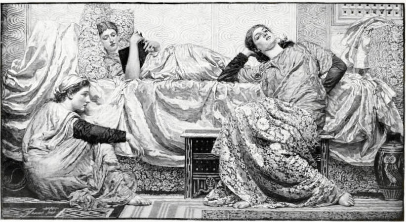
Reading Aloud by Albert Joseph Moore, ARWS 1841-1893. Oil on canvas. Source: Magazine of Art 7 (1894): 365.
Considering the beauty and significance of this painting, it is surprising that it was not even more extensively reviewed by critics. The Academy, however, at least recognized its importance: "The best picture of 'beauty' is Mr. Albert Moore's exquisite Reading Aloud (416), and it is best because he does not pretend to be a Greek, but gives us English girls and Spanish lace and all the beautiful things that he, in England, in the nineteenth century finds to admire" (356). The Architect found this the only example of decorative art on view at the Royal Academy: "In the way of decorative or ideal art not much is to be found. It is, however, a hopeful sign of the times that Mr. A. Moore's large decorative picture, Reading Aloud, which we noted in speaking of the Grosvenor Gallery, should have been assigned a good place on the line; but we see no indication of any competition with the painter in art of this genre, although of subject easel pictures, treated with a view to their place on the walls or in the panelling of a room, there is no lack" (332) ).
A reviewer for The Artist wrote: "Albert Moore has chosen for his subject three Grecian maidens, clad in pink robes, grouped together reclining on a couch, one of the number 'Reading Aloud'" (138). The reviewer for the Art Journalmerely described the work but offered no actual critical commentary: "Reading Aloud, by Albert Moore. A decorative harmony in pink and white and grey. The girl who is reading lies on a couch; her two listeners sit on low seats in graceful though studied attitudes" (211). Henry Blackburn in his Academy Notes described the painting as an "unusually large example of the work of Albert Moore, (416) three reclining figures, with pale salmon-coloured draperies, grey and white, with delicate touches of yellow, in the well known harmonious manner of this painter" (39).
F.G. Stephens in the Athenaeum was impressed enough with this painting that he actually reviewed it on two occasions. In his initial assessment he surprisingly compared it to a seascape by John Brett: "The energy and verisimilitude of this picture of a bitter storm may be contrasted with the voluptuousness and charming, if mannered coloration of Mr. A. Moore's Reading Aloud (416); quasi-Greek maidens recline on and near a couch. It is an exercise in rose, grey, and black" (571). Stephens's second review gives a more comprehensive interpretation of the picture:
Mr. Albert Moore's Reading Aloud (416) repeats the technical motives of more than one of his pictures. It is on a larger scale than he commonly affects for groups such as this of three damsels reclining on or near a couch, while one of them reads, and the others listen absorbed by the words. The picture is an exercise in rose-red, grey, black, and warm white, all delicately harmonized, and so powerfully handled as to ensure solidity. The figures are of that stately Phidian type we know so well in the designs of their author, and if their proportions were worthy of it there would be nothing left to be desired by the most fastidious taste and highest culture. The somewhat exaggerated and demonstrative grace of the large-limbed damsel on our right is the chief ground of complaint against this noteworthy painting. Apart from this it is impossible not to regret that Mr. Moore remains a mannerist whose essays differ from each other not in kind, but in the degree of care he bestows on them. [733]
One of the most extensive reviews was given by a critic for the Portfolio:
A large picture by Mr. Albert Moore is in itself somewhat eventful, and the sight of such on the line of the Academy is yet more unexpected. The painter has an exceptional repute as a fastidious student of decorative design, and the various smaller pictures which he shows this year at the Water-Colour Society's Gallery and the Grosvenor Gallery seem so many experiments for the scheme which is set forth in the Academy picture Reading Aloud. The composition arranges three figures of women – one reclining prone on a couch, reading; one crouched on the floor, hands and knees together; one seated, resting against the couch. The colour-harmony is drawn from pale, rose-scarlet in the robes of the women, and of the piece of silk gauze thrown as coverlet over the couch of black and white diaper, from chintz-patterned stuff in black and white of the cushions, the drapery thrown over the knees of the sitting figure and about the girl reclining, touches of black in sleeves and book, and of yellow in a cap and flower; the wall background of pale green-grey, shaded in wave-lines of pattern, dark-tinted pavement, and reddish Eastern rug. The main tints are, therefore, pale vermilion and a shifting silvery grey produced by black and white. To these must be added the pinkish flesh-tints and hues of fair hair. The colour material is thus limited, and it is by subtle arrangement and balance that variety and a studious equipoise are produced.
The critic then goes on to add that he feels Moore has been more selective than usual of the type of models he used: "In line the composition is no less elaborately thought out, and in this instance Mr. Moore has selected more interesting, if not much more intellectual, types than the usual lazy fair women who loll and repose, not too gracefully always, in his designs, and serve as animated dummies and the decorative motive." He also notes that "Opinions differ as to the success of this studious and refined piece of decorative art, some critics finding an unpleasant spottiness in the patterned stuff, or objecting to the character of the pattern used, which is in isolated floriated patches rather than flowing combinations; others find the treatment wholly beautiful. As may be judged by the comments of the crowd, the art of the work is 'caviar to the general'" (123).
Scanned image from the Magazine of Art by George P. Landow. [You may use this image without prior permission for any scholarly or educational purpose as long as you (1) credit the Internet Archive and the University of Toronto Library and (2) link your document to this URL in a web document or cite the Victorian Web in a print one.]
Bibliography
"Art Chronicle." The Portfolio XV (1884): 122-24.
Asleson, Robyn. Albert Moore. London: Phaidon, 2000,164-68.
Baldry, Alfred Lys. Albert Moore. His Life and Works. London: George Bell and Sons, 1893, 55-57.
Blackburn, Henry. Academy Notes X London: Chatto and Windus (May 1884): 39.
Chester, Austin. "The Art of Albert Moore." The Windsor Magazine XXII (September 1905): 369-82.
"The Exhibition of the Royal Academy." The Art Journal XLVI (1884): 209-11.
"Exhibition Notes – The Royal Academy." The Architect XXXI (24 May 1884): 332-333.
"Fine Art. The Royal Academy." The Academy XXV (17 May 1884): 355-56.
Helmreich, Anne. The Victorians. British Painting 1837-1901. Washington: National Gallery of Art, 1997, cat. 57, 183-184.
Prettejohn, Elizabeth. Art for Art's Sake. Aestheticism in Victorian Painting. New Haven and London: Yale University Press, 2007. 120-24.
Reading Aloud. Art UK. Web. 3 October 2026.
Stephens, Frederick George. "Fine Arts. The Royal Academy (First Notice)." The Athenaeum No. 2949 (May 3, 1884): 571-73.
Stephens, Frederick George. "Fine Arts. The Royal Academy (Fourth Notice)." The Athenaeum No. 2954 (June 7, 1884): 733-35.
"The Studio. Works for the Principal Exhibitions." The Artist V (1 May 1884): 137-40.
Study for Reading Aloud. Art UK. Web. 3 October 2026.
Study for Reading Aloud. University of Glasgow. Web. 3 October 2026.
Walker, Robert. "Private Picture Collections in Glasgow and West of Scotland: Mr. William Connal's Collection of works by Albert Moore." The Magazine of Art XVII (1894): 360-67. Internet Archive version of a copy in the University of Toronto Library. Web. 7 September 2013.
Created 7 September 2013
Last modified 3 October 2026