
[Click on images both to enlarge them and to obtain additional information.]
Introduction: a ‘distinguished’ illustrator?
The book illustrations of Dante Gabriel Rossetti and John Everett Millais have been the subject of detailed analysis and commentary, but far less attention has been directed at the graphic art of the third of the founding members of the Pre-Raphaelite Brotherhood, William Holman Hunt. Hunt’s reputation as an illustrator is principally based on his famous design for Alfred Tennyson’s ‘Lady of Shalott’ (text) in the Moxon edition of collected poems (1857), but his other works for the printed page are undervalued. Usually marginalized, these non-Tennysonian illustrations are invariably treated as inferior to his paintings, and are noticeably absent or under-treated in what are otherwise wide-ranging studies. Their status as designs in black and white is enough to preclude them from many examinations which focus on ‘fine art’, and even critics writing within the discipline of book-design have struggled to interpret or appraise them.
Gregory Suriano (2000) describes the corpus of drawings on wood as ‘modest’ and ‘relatively’ good, although he does not allow them to be consistently interesting (p.102). ‘Rather laboured’ and lacking in either ‘passion’ or ‘skill’ is Eric de Maré terse condemnation (p.100), and Allan Life finds little of value in the work produced after 1857 (1974). Even critics of unimpeachable fairness – such as Forrest Reid (1928) and Paul Goldman (1996, 2004) – are underwhelming in their evaluations. Reid is the most outspoken and draws a disparaging comparison with Rossetti, noting how ‘Hunt’s illustrations … do not reveal the same intensity of vision [as his Pre-Raphaelite colleague]. Hunt’s work may be less exotic than Rossetti’s, but it is at the same time less imaginative, less lyrical in quality’ (pp.46–7).
Here, as elsewhere, generalizations replace clear-minded assessments, and in making sense of this artist’s work critics have failed to engage with its complexity. Hunt’s illustrations appeared in a wide variety of publications but (unlike at least some of his contemporaries) his treatments are highly diverse, making it difficult to characterize or define his approach.
Wide-ranging in their subjects and styles, his illustrations encompass images of modern life, neo-medieval and oriental evocations of a dream-world, scenes from the Old Testament and pious moralities; though famously published in The Germ (1: January 1850) and the Moxon Tennyson (1857), he also contributed to Good Words (1862), Once a Week (1860), Gatty’s Parables from Nature (1865), the Dalziels’ Bible Gallery (1881) and English Sacred Poetry (1862). Within his commissions he deployed a variety of styles that ranged from Pre-Raphaelite ‘copying from nature’ to an almost neo-classical simplicity and directness. By turns brilliantly lit or immersed in an oppressive half-light, the illustrations defy classification. Such stylistic complexities make it easy to condemn his work as uneven and lacking in focus, but it is more productive to view it as inventive and experimental, a minority view taken by Simon Houfe (p.188). Indeed, it can be argued that Holman Hunt is a true illustrator insofar as every text produces a unique, idiosyncratic image in which he discovers his material afresh and never relies on formula or repetition; in each case he alters his style and idiom to respond to the content of his letterpress, and unlike others he could never be accused of resorting to conventionalities.
This inventiveness has not been accorded the acclaim it deserves, and should be brought to the fore. In my view Hunt should be re-positioned as a major illustrator whose work has parity with that of his Brethren. Influential in establishing the type of graphic design associated with the Pre-Raphaelites, his illustrations are intellectually demanding and difficult in the manner of the first phase of the Movement, making no concessions (as Timothy Hilton notes of his paintings) to the niceties of aesthetic pleasure (p.92); he also makes a major contribution to the poetic realism of The Sixties, and provides another link between the revolutionary styles of the Pre-Raphaelites in the fifties and the poetic realism that became the avant-garde of the period after 1860.
With all of his reservations, Reid has to admit that Holman Hunt’s illustrations are in many ways ‘distinguished’ (p. 47). That quality can be traced in a close reading of their styles and subjects, which, apparently dissimilar, can be conceptualized in terms of a series of underlying themes.
Pre-Raphaelite aesthetics: figures
Holman Hunt’s drawings on wood deploy a range of visual styles, though all of them include Pre-Raphaelite devices. These extend over all domains of composition, space, the treatment of character and the articulation of detail – or ‘accessories’, as his contemporaries called them. His illustrations are perhaps most impressive in their development of character. Sharing a keen sense of theatre with Millais and Rossetti and always focused on an individual psycho-drama, his illustrations always present ‘a large central figure pictured at a moment of great intensity’ (Kooistra, p.49).
He takes this approach to an extreme, depicting his characters as monumental types at a point of psychological and sometimes overwhelming crisis. In his illustration for Tennyson’s ‘Godiva’, for instance, he presents the heroine as a dynamic figure, racked by doubt. Her uncertainty is enshrined in the contrapuntal turn of her body, wanting to remain in the safety of her chamber while knowing she must pass through the portal in order to display herself, naked, in the streets of Coventry. Her face is turned in trepidation away from us, and she has one hand on the clasp as she prepares to undress. ‘The Lady of Shalott’ is another at a moment of crucial change, and so is the doomed Maiden tempted by Will o’the Wisp in Gatty’s parable, The Light of Truth. Genghis Khan in Temunjin is similarly poised between detection and escape, and danger or threatening situations and their psychological implications are figured throughout Hunt’s designs.


Left to right — three illustrations by Holman Hunt: (a) Godiva. (b) The Light of Truth. (c) Temujin [Click on these images for larger pictures.]
Others are quieter moments, showing the characters in reverie. In contrast to artists such as John Franklin and Henry Courtney Selous, who represent emotions in terms of exaggerated gestures and facial expressions, Hunt’s figures are engaged in a complex process of inner reflection and inward debate, amplifying their sense of psychological strain, somewhat paradoxically, though understatement. This suggestion of an inner life is notably achieved by manipulating the gaze.
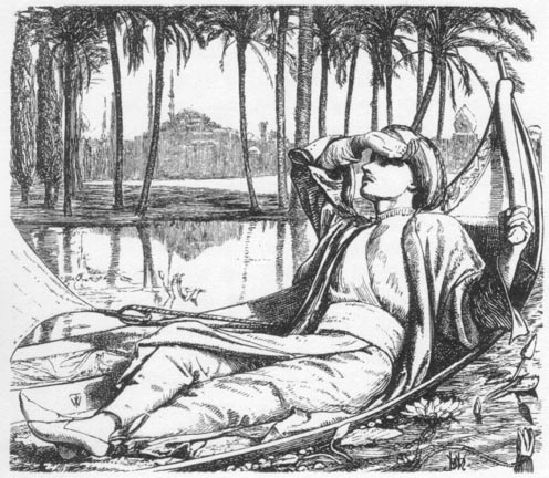
The characters’ feelings are sometimes suggested by gazing at the viewer. In Go and Come the reaper glances both at the spectator and out of the frame, his eyes and facial expression suggesting a mixture of contentment and stoicism which is not quite the faithful optimism depicted in the verse (Good Words, 1862, p.32). Others are more inward, implying how they feel by looking at some unseen subject, or, most characteristically, averting or covering their eyes. The dreamer’s absorption in his memories is powerfully conveyed in the first illustration to Tennyson’s ‘Recollections of the Arabian Nights’, with one hand concealing his gaze as he reflects on his imaginings. Closed or half-closed eyes are further deployed to suggest the intimacy of couples and the complex dynamics of grief. The bereft lover’s lament for the loss of Oriana is figured in the concealment of his eyes as he leans down to kiss her, and a similar playing with the gaze features in the little-known illustration, At Night. This shows a young couple embracing, their eyes closed, as the ‘young wife’ passes away. Such emotions are entirely self-absorbed and self-absorbing, and, as noted above, Hunt suggests what the characters might be feeling by withdrawing any outward display: inner feelings are not explicitly registered externally, and the viewer is compelled to speculate at the mysterious workings of the mind.


Left to right: (a) Come and Go. (b) The Ballad of Oriana. (c) Recollections of the Arabian Nights [Click on these images for larger pictures.]
This charting of deeply-felt emotion, felt but only implied, forms a direct link with the reveries of Rossetti’s female portraits and Millais’s designs of lovers’ intimacies. Holman Hunt’s designs also exist in a complex relationship with his paintings. Several devices used are derived from his canvases and watercolours, although he manipulates the language of painterly composition, and especially the requirements of Pre-Raphaelite style, to fit the demands of the printed page.
Pre-Raphaelite space
One of the defining features of Hunt’s illustrations is their painterly use of space, notably deploying the unusual spatial schemes that characterize Pre-Raphaelite painting and are a central characteristic of the artist’s work on canvas. This is often a matter of animating the figures by placing them within a fluid space in which the characters are about to move from where they are placed to another domain which they can see, but we can only glimpse or guess at.
In Godiva the heroine looks out through the portal, anticipating what will happen, opening new room where it is only implied. This device bears comparison with the half-glimpsed but promise-laden space that is seen by the kept woman in the painting of The Awakening Conscience (1856; Tate Britain, London). In both compositions Hunt continues the characters’ narratives by projecting them outside the frame, but more important is the way in which he engages the viewer in their stories by ventilating the scene. Indeed, he compels the viewer to imagine what will happen off stage, creating new worlds to draw the spectator into half-tangible places that do not exist in the pictured image but are presented as a sort of credible progress, a continuation of the narrative only made accessible through the portals of the painted and printed surfaces. This approach is also used in The Beggar Maid, in which the characters walk up the stairs, taking us, once again, to some half-glimpsed domain; in the edited space, with its suggestive backgrounds, in Active and Passive; and in The Light of Truth. In every case he recreates the sense of all-involving, beguiling domain, an invitation to project the mind as if into a dream-world.

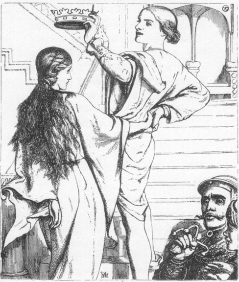
Left to right: (a) Godiva. (b) The Awakening Conscience. (c) The Beggar Maid [Click on these images for larger pictures.]
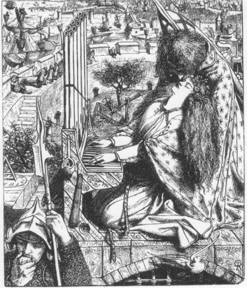
However, the artist deploys a sort of reverse process as well. He typically draws us in, but he also projects his characters’ space outwards and into the space of the viewer. Emulating the effects of Baroque art, his illustrations have the dynamic openness of his paintings, and there are numerous connections between his graphic designs and his work on canvas. A typical device involves glancing out of the frame: in Oriana, for instance, the eponymous heroine and her lover dissolve the apparently insurmountable constraint of the frame surrounding them by looking outward at some unseen subject (Tennyson, p.51). This action extends the fictional space, with its sharp enclosure, and involves the reader/viewer in the action just as it does in The Awakening Conscience, where the woman’s gaze is directed at an unknown domain positioned, as it were, behind the spectator.
The illustrations also work to collapse the classic perspectival box, deploying the Baroque technique of placing subjects as if to fall into the ‘real’ space. This tactic features in paintings such as A Converted British Family Sheltering a Priest from the Persecution of the Druids (1850; Ashmolean Museum, Oxford), and there is a direct analogy between this canvas and Temujin. In both compositions the main action is shown in a spatial plane continuing as if with no boundary into our own: in Temujin the persecuted figure crouches forward, as if to tumble out of the page, and in the British Family we are placed in close proximity to the main group of figures as if we were hovering in a shared space.
Left to right: (a) Temujin. (b) A Converted British Family sheltering a Christian Priest from the Persecution of the Druids. [Click on these images for larger pictures.]
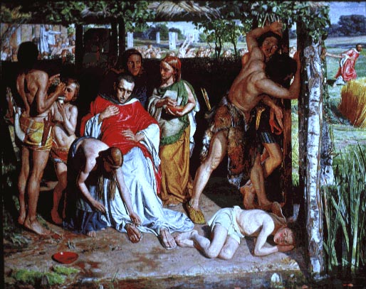
Such physical immediacy is given variant forms elsewhere. The edited spatial scheme of The Light of the World (1853; Keble College, Oxford), with its emphasis on Christ’s absolute nearness, finds a graphic equivalent in The Light of Truth, in which the female character is brought to the closest possible point; and the same is true of the grave-digger in Active and Passive, whose excavations tangibly convey the idea of mortality by carrying it out of the frame. Not just a picture of a grave, it seems to project outwards and pull us in.
This spatial complexity dissolves the bounds of traditional illustration and infuses Hunt’s designs with a visceral immediacy and directness. Challenging the limitations of Renaissance perspective, he presents his designs as fluid movements, both inwards and outwards, transgressing and dissolving the real and imagined space into a continuum, an open-ended exchange and involvement that demands our psychological involvement by insisting on our physical engagement. As already noted, this process emulates his painterly technique, but in many ways Hunt’s illustrations are even more experimental than his oils. Unconstrained by the proprieties of the fine art market and subversively operating within the conservative domain of the illustrated gift-book, Hunt uses his graphic designs to challenging effect.
Pre-Raphaelite detail: text and interpretation
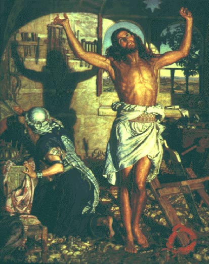
Though unconventional when measured against the graphic art of the time, Holman Hunt’s illustrations are bound, nevertheless, by the language of Pre-Raphaelite painting. They notably recreate the combination of physical or material reality and the symbolic that is so central to the complex dualities of first-stage Pre-Raphaelitism. In the 1901 re-issue of The Germ, William Michael Rossetti explains the Pre-Raphaelites’ fusion of nature and human nature as ‘the intimate intertexture of a spiritual sense with a material form; small actualities made vocal of lofty meaning’ (‘Introduction’, The Germ, p.18), and this is precisely the technique carried forward in Holman Hunt’s designs for the page. In practice, his illustrations present dense iconographic schemes which articulate a series of emblems, inscribing meaning in the fabric of the real and compelling the viewer to become a reader. This ‘disguised symbolism’ (Life, p.ii) operates within the same register as the major works in oil and there many analogies between the typological signs at work in the drawings on wood and the semiotics traced by George P. Landow in Holman Hunt and Typological Symbolism (1979; reproduced on the Victorian Web). In several designs the artist recreates the complex surfaces of canvases such as The Awakening Conscience (1856; Tate Britain, London) and The Shadow of Death (1870–73, Manchester City Art Gallery).
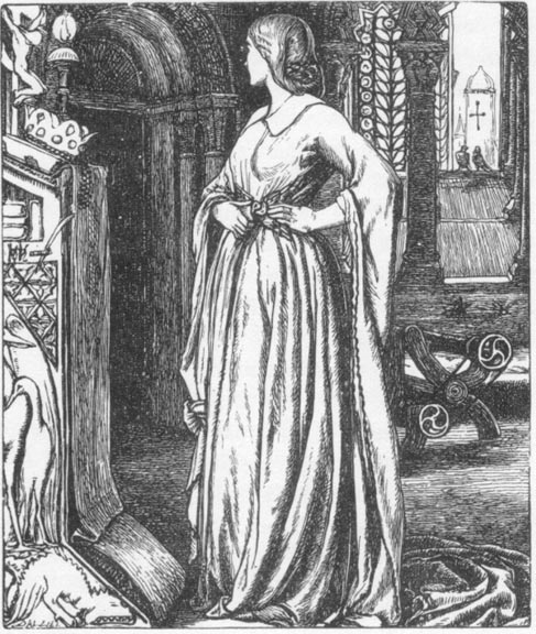
Godiva, is assembled as a typological scheme in which the accompanying detail reinforces and extends the main situation as it does in both of these paintings. Godiva is placed in the centre, torn between alternatives, and around her are small apparently naturalist items that convey the notion of conflict and duality. The (anachronistic) chevrons decorating the window-portal are emblems of opposition and tension, with each diagonal tensioned against the other, and the tiny doves at the window, which are not mentioned in the text, suggest another choice between two possibilities. They also imply the love-conflict between Godiva and Leofric and provide a visual echo of the ‘wedded eagles’, soon to be separated, that make up the buckle on her belt. Godiva’s situation is similarly conveyed by the roundels of the loom, which suggest the turning wheels of fate, and the pelicans carved on a panel of what appears to be a prie-dieu. The pelican is an explicit sign of her sacrifice. Believed, in Christian bestiaries, to feed its chicks from the blood of its own breast – something it appears to be doing in the panel – the pelican symbolizes Godiva’s giving; the holy bird gives of its flesh, and so, in a sense does Godiva, who, by giving her body in sacrificial display, feeds the children who will starve if the taxes go up. It is especially noticeable that Holman Hunt creates a visual rhyme between the sensuous arabesque of the carved pelican and the flow of her dress, making a formal link between the two figures.
The notion of sacrifice and service is given another dimension in the positioning of the crucifix and crown, with the crown placed firmly below Christ’s feet as a sign of Godiva’s obedience to Jesus’ example. Such giving is holy, explicitly framing her actions in a Christian context which is further expressed in the form of an arrow-slit glimpsed through the window; supposedly an image of a ‘real’ window-light which had a transverse slit to allow the bowman to move sideways, it also forms the shape of the Cross. The artist closes his symbolic scheme with a carved griffin, crouching beneath the pelican’s feet. This is an emblem of evil and greed surmounted and overcome by the bird placed above it, just as Godiva transcends the sordid wickedness of taking from the poor. In so doing, she aspires to a state of grace.
The deployment of ‘symbolic realism’ in the manner charted by critics such as Chris Brooks and George P. Landow is thus figured as a means of suggesting the central themes at work within Tennyson’s poem, while also adding other inflections of the illustrator’s own. He importantly changes the poet’s emphasis by incorporating Christian imagery; Tennyson remarks only that ‘she built herself an everlasting name’ (p.284), but Holman Hunt converts her into a saintly figure. This status is expressed, as we have seen, in the placing of the crown; but it is especially realized in the use of ornithological items, doves and pelicans, Hunt’s own invention to match the poet’s eagles. These not only suggest sacrifice and conflict, but point to Godiva’s spirituality, linking her through the power of analogy with angelic flight. Hunt also seems to suggest the complexity of her character by making a contrast between the eagles (the sign of masculinity, a gift of the ‘grim earl’), and the pelican. On the face of it, the pelican, symbol of Godiva, overcomes the eagle: an assertion of tenderness and charity which demonstrates how giving is ultimately stronger than the predatory cruelty of the uncharitable Leofric.


Left to right: (a) The window in Godiva. (b) The pelicans. (c) The Light of the World. (d) The Shadow of Death. [Click on these images for larger pictures.]
It can be argued, in short, that Holman Hunt uses the emblematic language of painting as a means to articulate his reading of Tennyson’s poem. The end result is not so much a matter of an image which buttresses the text through replication, but one in which the artist provides a sort of parallel version, a tangible enriching and complicating of his source material. This deployment of symbolic detail in the domain of book illustration is a key part of the Pre-Raphaelite revolution, and in advancing the expressive range of graphic design Holman Hunt is just as radical and experimental as Rossetti and Millais.
Holman Hunt and ‘The Sixties’
Appraisals of Hunt’s illustrations have focused on his work for Tennyson and have tended to disparage his other contributions to periodicals and books such as Mrs Gatty’s Parables from Nature (1865) and R. A. Willmott’s English Sacred Poetry (1862). Allan Life purportedly offers a study of Holman Hunt’s designs as a whole, but is almost entirely dismissive of work which is not obviously bound by Pre-Raphaelitism. Later illustrations, Life comments, ‘afforded little scope for the iconographic complexity of “The Lady of Shallot” and “Godiva”’ (p.238), and are not of the same quality or interest as the artist’s earlier achievements. However this judgment is misleading because it does not recognise the fact that the post-Tennyson designs are in a different idiom from those published in 1857; shifting from Pre-Raphaelitism to the style known as ‘The Sixties’, Hunt’s subsequent illustrations are just as inventive as those produced in his earlier phase, and are equally moving and engaging. Indeed, Holman Hunt was one of the leading figures in the (mainly) non-emblematic style which developed in the latter part of the fifties; closely controlled, his Sixties style exemplifies the idiom’s emphasis on still moments of intense reflection in which the subjects’ emotional life is conveyed in resonant gesture and gaze, rather than symbolism or dramatic crisis.

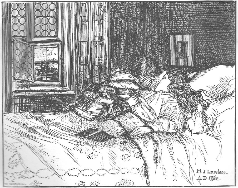
Left to right: (a) At Night by W. Holman Hunt. (b) One Dead by Matthew James Lawless. [Click on these images for larger pictures.]
One of the best of these is At Night, another death-bed scene of a type recently explored by Julia Thomas. In part conventional, Hunt’s treatment has a considerable emotional resonance. Still and understated, it is a more convincing representation of grief and loss than many of the more explicit and emotionalized depictions of contemporaries such as Matthew Lawless and Frederick Sandys, and has none of the sentimentality of George Cattermole’s showing of the death of Little Nell. In Hunt’s design the central emphasis is on the unspoken understanding of the young couple: locked together in extreme closeness to the viewer and moved forward into the spectator’s space, their feelings are conveyed in their introspective expressions and in the treatment of the room, which is itself a catalogue of domestic items symbolising the shared life that is now coming to an end. With no sense of a reassuring divinity and nothing of the after-life – a transition routinely suggested in mid-Victorian art by the inclusion of an open window and a budding plant – the artist’s approach is notable in its directness. Its apparent secularity is given an added resonance when we recall the inclusion of religious items in Hunt’s Pre-Raphaelite designs – a crucifix in both The Lady of Shallot and Godiva, which includes other Christian symbolism as well.
This sparseness is developed at greater length in his work for Mrs Gatty. In Active and Passive, we are shown an old sailor reflecting on the past and the future as he looks at the sundial: a moment of absolute stillness that is brought into a sharper focus by the contrast between the old man’s careful scrutiny of the inscription and the movement of the grave-digger in the foreground, with one figure looking down and up looking down.

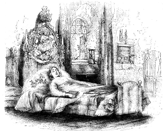
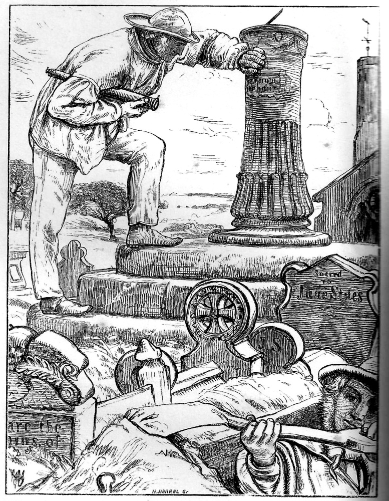
Left to right: (a) At Rest (Nell dead) by George Cattermole. (b) Sleep by Frederick Sandys. (c) Active and Passive by W. Holman Hunt
The illustration for Active and Passive exemplifies Hunt’s use of an austere, linear style, with little hatching and bright illumination. The style contrasts with the crowded surfaces of his Pre-Raphaelite illustration, and this later treatment is used in order to concentrate entirely on the figures rather than supporting them with symbolic accessories. The same approach is applied to dramatic effect in two scenes from Old Testament or Judaic sources, The Lent Jewels, which is the frontispiece to Willmott’s English Sacred Poetry (1863), and Eliezer and Rebekah at the Well which was produced in 1863 but not published until the Dalziels published their Bible Gallery at the end of 1880. Both images are fine examples of economy and directness: a characteristic that runs through all of Holman Hunt’s work of the 1860s.
Holman Hunt as illustrator and interpreter
As noted in a previous section, Holman Hunt employed emblematic detail as a way of illustrating the text, notably in his work for Tennyson. This imaginative strategy necessarily involved the addition of visual items that do not appear in the poems. He also interpreted his source material by refiguring the written material, creating a meaningful equivalent in a pictorial form.
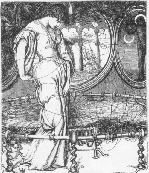
‘Godiva’ exemplifies the incorporation of significant ‘signs and tokens’, but Hunt’s most celebrated design, for ‘The Lady of Shalott’, is a prime example of his re-figuring of the poet’s imagery to create an expressionistic effect. Although he preserves many of the writer’s specifications – notably recreating the loom and the details of the ‘silver bugle’ – the illustrator otherwise focuses on the Lady’s torment, expressing her state of mind primarily in the form of her swirling hair, but also in the unravelling thread and the twisted brass legs of the stand positioned in the foreground. The line literally illustrated is ‘Out flew the web and floated wide’ (Tennyson, p.72), but Hunt goes well beyond the material information contained in the verse, infusing its evocation of formlessness with a deeper significance and figuring all movement in terms of twisting arabesques. Tennyson’s line does imply a sudden crisis, but in privileging this information and giving it visual form Hunt discovers its psychological meaning. His literal illustration of a textual detail is thus developed as his own reading of the poem in which he highlights his notion of the Lady’s mental collapse. The unwinding of the thread and the swirling of her hair became metaphors: ‘nature’ transformed into a representation of ‘human nature’ in which literal or physical unravelling becomes a sign of the process of mental disintegration.
This is an illustrative strategy that bears comparison with the process of selection and re-orientation that Rossetti exploits in his showing of St Cecelia in the first design for ‘The Palace of Art’ (Tennyson, p.113). Both Rossetti and Hunt provide idiosyncratic responses to the verse, illustrating, interpreting and enlarging its range of implication. But Tennyson was unimpressed, and Hunt preserves his responses in his monumental memoir, Pre-Raphaelitism and the Pre-Raphaelite Movement (1905).
Tennyson believed ‘an illustrator ought never to add anything that he finds in the text’ (Holman Hunt, 2, p. 125), and goes on the challenge Hunt’s visualizations. The artist’s answers reveal his technique, and it is instructive to consider both the poet’s objections and the ways in which they are fielded. The writer enquires of Hunt, ‘why did you make the Lady of Shalott, in the illustration, with her hair wildly tossed around as if in a tornado?’ His explanations are clear: he made her hair toss around because he:
wished to convey the threatened fatality by reversing the ordinary peace of the room and of the lady herself; that while she recognized that the moment of catastrophe had come, the spectator might also understand [2, p.124].
The artist added this detail, in other words, to present the poem’s ideas in a spatial form. As he goes on to explain, Tennyson had several pages ‘to convey the impression of weird fate’ while he had ‘only half a page’ (2.125). Conscious of ‘the difference in requirements in the two arts’, with one a temporal art and the other concerned with space and single moments in time, he uses the swirling hair to distil the poem’s ideas, ‘clear and strong’ (2.125).
Hunt’s response suggests a systematic approach to the question of illustration in which the reader’s perceptions are enhanced by the artist’s emphasis on key ideas, scenes and themes. This may be the quality G. S. Layard has in mind when he comments on Holman Hunt’s capacity to ‘idealize’ his subject matter (p.9), making a distinct point that is drawn from the complex messages contained in his literary material. Put like this, we can say that Hunt has all the traditional virtues of an illustrator, whose task is always to disentangle and depict the principal ideas.
But he also offers his own ideas, where is not always the case that his distortions or manipulations are purely at the service of the writing. Like Rossetti, he sometimes illustrates in an entirely individual way, seemingly only using the literature as an imaginative starting point. This is evident in his addition of emblems (particularly in his work for the Moxon Tennyson), but it also features in his highly individual treatment of his figures, and points to some interesting ambiguities at the heart of his visual strategy.
Hunt repeatedly uses his literary commissions to explore notions of gender and gender ambiguity. Of course, the Pre-Raphaelites’ challenging treatment of this theme, which is typically manifested in the form of androgynous figure-drawing, has been studied in detail by critics such as J. B. Bullen (1998). Hunt’s approach, on the other hand, is generally understated: never obviously intermingling the signifiers of gender, so that men appear effeminate and women mannish, he is more concerned with a free interchange of psychological features, using small inflections to suggest how women can be ‘masculine’ and men have the ‘sensitivity’ that is conventionally associated with femininity.
In his designs for the Moxon Tennyson he repeatedly points to a gender ambivalence that lies at the heart of Tennyson’s writing, materializing the poet’s theme in his own, idiosyncratic terms. In Godiva he suggests how the heroine, though ‘clothed’ in ‘chastity’ as she moves like a ‘creeping sunbeam’ (Tennyson, p. 283), is in fact more male than female in her assumption of a masculine courage and forthrightness. This notion is subtly suggested by her stance; she appears stereotypically female in the curvaceous outlines of her robe, but the turn of her head is decidedly dynamic – a woman whose appearance is not compromised by mannishness, but whose demeanour is entirely masculine. Though about to remove her robe, she could be in the process of putting on armour: a visual play on the notion of taking off her clothes/putting on her courage. In the first illustration for ‘Recollections of the Arabian Nights’ (Tennyson, p.13), on the other hand, the male dreamer is endowed with the qualities of reflectiveness and reverie that are more usually associated with women than men; again, his gender is not in doubt but Hunt suggests his female sensitivity by placing him on the under-sized boat as if he is lying on a chaise-longue, his feet crossed and finished off in a pair of girlish slippers. These sorts of inflections recur throughout the graphic designs, endowing them with a depth of implication that problematizes the poet’s writing of heroism and greatly enriches it.

Left to right: (a) Active and Passive. (b) The Lent Jewels. (c) At Night [Click on these images for larger pictures.]
Hunt is equally distinctive in his highly nuanced treatment of setting and atmosphere. He inscribes narrative and psychological details in the material objects that surround his figures, but he also manipulates the ambience of the situation. His prime medium is light. Rossetti’s illustrations are primarily in the same register, and Millais occasionally experimented with nocturnes (as in his design for ‘Love’ in Poets of the Nineteenth Century,1857; p.137); but Holman Hunt varies the illumination and uses its variations to create a series of distinct settings, each with its own emotional tenor. The effects vary between a stark directness and a mysterious obfuscation. In Active and Passive and Eliezer and Rebekah at the Well (Bible Gallery), the clarity of light endows the illustrations with a sense of acute unavoidability: we have to look at the sharply focused scenes, and we are compelled to engage with their subject matter. In his two nocturnes, on the other hand, the darkness suggests psychological uncertainty, the domain where emotions are forming and re-forming, light as a metaphor for shifting thoughts and understandings as it envelopes the young couple in At Night, and overwhelms the doomed girl in The Light of Truth.
In all of these examples the effect is visionary, images seen afresh as the illustrator discovers his material. Imaginative, idiosyncratic and highly suggestive, Holman Hunt is a distinguished interpreter of text and an original contributor to the discourse of mid-Victorian graphic art.
Related material
Works Cited and Sources of Information
Brooks, Chris. Signs for the Times: Symbolic Realism in the Mid-Victorian World. London: Allen & Unwin, 1984.
Bullen, J. B. The Pre-Raphaelite Body: Fear and Desire in Painting, Poetry, and Criticism. Oxford: Oxford University Press, 1998.
Cooke, Simon. ‘Interpreting Masculinity: Pre-Raphaelite Illustration and the Works of Tennyson, Christina Rossetti, and Trollope’. Pre-Raphaelite Masculinities. Eds. Serena Trowbridge and Amelia Yeates. Burlington, VT: Ashgate [forthcoming, end of 2013].
Dalziels’ Bible Gallery. London: Routledge, 1881 [1880].
De Maré, Eric. The Victorian Woodblock Illustrators. London: Gordon Fraser, 1980.
English Sacred Poetry. Selected and edited by Robert Aris Willmott. London: Routledge, Warne, & Routledge, 1862.
Gatty, Mrs. Alfred. Parables from Nature. London: Bell & Daldy, 1865.
Goldman Paul. Victorian Illustration: The Pre-Raphaelites, the Idyllic School and the High Victorians. Aldershot: Scolar Press, 1996, rev. ed. 2004.
Good Words. London: Strahan, 1862.
Hilton, Tim. The Pre-Raphaelites. London: Thames and Hudson, 1970.
Holman Hunt, William. Pre-Raphaelitism and the Pre-Raphaelite Brotherhood. 2 vols. London: Macmillan, 1905.
Houfe, Simon. The Dictionary of Nineteenth Century British Book Illustrators. Woodbridge: The Antique Collectors’ Club, 1978; revd ed., 1996.
Kooistra, Lorraine Janzen. Poetry, Pictures, and Popular Publishing: the Illustrated Gift Book and Victorian Visual Culture, 1855–1875. Athens, Ohio: Ohio University Press, 2011.
Landow, George. William Holman Hunt and Typological Symbolism. New Haven: Yale University Press, 1979. Reproduced in The Victorian Web.
Layard, G. S. Tennyson and His Pre-Raphaelite Illustrators. London: Elliot Stock, 1894.
Life, Allan. Art and Poetry: A Study of Two Pre-Raphaelite Artists, William Holman Hunt and John Everett Millais. Unpublished doctoral thesis. The University of British Columbia, 1974.
Once a Week. London: Bradbury & Evans, 1860–61.
Reid, Forrest. Illustrators of the Eighteen Sixties. 1928; reprint, New York: Dover, 1975.
Rossetti, William Michael. ‘Introduction’. The Germ: The Literary Magazine of the Pre-Raphaelites. Reprint of the 1901 edition. Oxford: Ashmolean Museum; Birmingham: Birmingham Museums and Art Gallery, 1979.
Suriano, Gregory R. The Pre-Raphaelite Illustrators. London: The British Library & Delaware: Oak Knoll Press, 2000.
[Tennyson, Alfred]. Poems by Alfred Tennyson. London: Moxon, 1857.
Thomas, Julia. ‘Happy Endings: Death and Domesticity in Victorian Illustration’. Reading Victorian Illustration, 1855–1875. Eds. Paul Goldman and Simon Cooke. Burlington, VT: Ashgate, 2012, 79 –96.
Last modified 26 December 2023