
Directions: (1) Clicking on superscript numbers brings you to notes, which will appear at the bottom of the screen; hitting the back button on your browser (or command + [) returns you to your place in the body of the main text. (2) Click on images to enlarge them.

Maryhill Burgh Halls.

ne clue to the unusual neoclassical (rather than neo-Gothic) style of Adam’s stained glass panels for Maryhill Burgh Halls might be found in the artist’s own references to neoclassical design and specifically to the work of John Flaxman. We have already noted one such reference in Stained Glass: Its History and Modern Development. In the author’s own words, “a certain external form and balancing of parts, as evinced in classic frescoes, Flaxman’s cartoons, and some bas-reliefs by other artists, [. . .] better define my ideas and suggest our limits.”141 Another clue might be the reference, in the lecture on “Truth in the Decorative Arts” of two decades later, to Puvis de Chavannes, the nineteenth century French painter and muralist, cited by Adam as one of four artists who had influenced his own work.
In his path-breaking doctoral dissertation of over half a century ago, the late Robert Rosenblum wrote of Flaxman’s drawing that it
completely eschews the intricate formal vocabulary evolved by previous generations in their attempt to render the subtleties of optical experience. Favoring an art of radically reduced means, it seems to reject consciously that rich variety of spatial, luminary, and atmospheric values which post-medieval painting had achieved. [. . .] At all costs, the illusion of three-dimensionality is minimized. Even the pedestals on which [. . .] statues rest are drawn as rectangles, not cubes, so that no suggestion of depths may intrude. [. . .] Preceded by a period which had reached a maximum of facility in the recording of the most transient and subtle images of the optically perceived world, Flaxman’s drawing would seem to substitute a conceptual, linear art, founded upon basic symbols of reality, rather than upon illusions of it, an art whose severity of means and expression suggests a pure and early phase of image-making.142
It is easy to understand that Adam felt drawn to an artist whose principles and practice were so close to his own. While Flaxman was a major influence on the neo-classical school of artists of the late eighteenth- and early nineteenth-centuries -- Ingres in France, Carstens and Runge in Germany -- his clear, elegantly simple outline drawings of figures and scenes from the Iliad, the Odyssey, and Dante’s Divine Comedy also found favor among a group of deeply Christian artists from the German-speaking lands. Though their focus was on religious painting and their models were Giovanni Bellini, Pietro Perugino, and the early Raphael, along with Albrecht Dürer, Hans Baldung and the German artists of the fifteenth century, the so-called “Nazarene” artists shared the neo-classicists’ negative judgment of the complex, restless, sensuous and illusionistic art of the baroque and the rococo and subscribed in practice to Johann Winckelmann’s neo-classic ideal of “noble simplicity and quiet grandeur” (“edle Einfalt und stille Grösse”). Franz Pforr, a founding member, along with his close friend Friedrich Overbeck, of the Lukasbund or brotherhood of St. Luke -- the original group of students who rejected the modern academic training they were receiving at the Vienna Academy and in 1810 settled in Rome, the “eternal city” -- described the reactions of the young rebels on a visit to the reopened Imperial art collection in the Belvedere Palace on the outskirts of Vienna:
We were stunned. Everything now seemed different. We hurried past a large number of paintings that we had previously admired with a feeling of dissatisfaction; other works, in contrast, which had formerly left us cold, now drew us irresistibly. [. . .] Canvasses by Tintoretto, Veronese, Maratti, even many by the Carracci, Correggio, Guido, and Titian that had once filled us with admiration now made a feeble impression on us.
The future Nazarenes were no longer impressed by the “bold brushstrokes and striking colour effects” of these artists, which they now saw as intended “to excite a voluptuous sensibility.” In contrast, they were enchanted by “some works by Michelangelo and Perugino and a painting from the school of Raphael.” As for the German painters of the fifteenth century, “with what purity and charm” they spoke to the young visitors.
Much here had once struck us as stiff and forced, but now we had to recognize that our judgment had been distorted by familiarity with paintings in which every artistic technique, however common, had been exaggerated to the point of ridiculous affectation, and that as a result we had taken gestures, which were drawn from nature as she truly is, to be stiff and lacking in appropriate movement. Their noble simplicity spoke directly to our hearts. 143
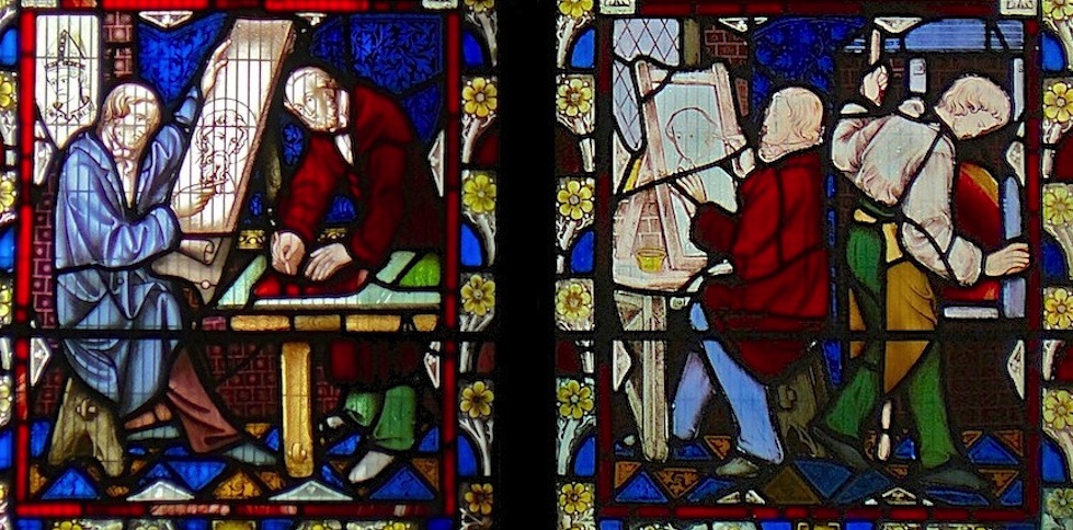
Committed to the representation in their art work of what they understood to be essential reality rather than pleasing representations of optically perceived, transient, empirical reality, avoiding illusionist effects, concentrating on clarity of outline and composition, and seeking harmony, rather than seductiveness, of color, the Nazarenes aimed at the same time to restore the public function of art, its role in communicating meaning and representing the highest values of a community with the “noble simplicity and quiet grandeur” advocated by Winckelmann. “Truth” (“Wahrheit”) in art had been the motto inscribed on the stamp devised by Overbeck for the founding Lukasbund in 1809. Not surprisingly, the Nazarenes promoted a return to fresco and some of their best and most characteristic work took the form of wall decoration using fresco techniques. (Figs. 1, 2) Given that neo-classical and Nazarene artists shared in unexpectedly large measure a common understanding of the aims and methods of pictorial representation (the sculptors Canova and Bertel Thorvaldsen and the German neo-classical painter Gottlieb Schick were among the supporters of the young Nazarenes in Rome, while the Austrian neo-classical artist Joseph Anton Koch joined them in decorating the Casino Massimo in Rome), it is in no way surprising that the earliest artistic efforts of one of the best and most successful of the Nazarene painters, Julius Schnorr von Carolsfeld, should have been copies of drawings by Flaxman.144


Left: Figure 1. Peter von Cornelius. Joseph recognized by his brothers. Fresco. 1816-1817. Casa Bartholdy, Rome. Now in Alte Nationalgalerie, Berlin. Right: Figure 2. Julius xSchnorr von Carolsfeld. Ariosto room. Fresco. 1819-1822. Casino Massimo Lancellotti, Rome. [Click on images to enlarge them.]
Did Stephen Adam have direct knowledge of the work of the original Nazarene painters, such as Johann Friedrich Overbeck, Franz Pforr, and Julius Schnorr von Carolsfeld? Did he know of the Nazarenes’ watchword of “Wahrheit” when he himself demanded “truth in the decorative arts”? Though there is no clear evidence that he did, it is not unlikely, since the art of the Nazarenes was well known in Britain at the time, and as we have seen, Adam never failed to acknowledge his respect for the drawing skills of the Nazarene-influenced painters who made cartoons for the Königliche Glasmalerei-Anstalt in Munich, even though these later painters had moved further in the direction of the style of the High Renaissance than the original Nazarene artists would probably have approved. As Puvis de Chavannes had been in his turn influenced by the principles and practices of the Nazarenes and their French disciples of the École de Lyon (Hippolyte Flandrin, Louis Janmot, Victor Orsel), it is possible that a discernible line may lead from Flaxman to Puvis and on to the Adam of the Maryhill Burgh Hall panels. Now a rather neglected and unappreciated painter, despite being extensively studied and written about by art historians, who see him as a founding figure of modern art,145 Puvis enjoyed considerable celebrity in the years of Adam’s activity as a stained glass artist and it is not unlikely that Adam had occasion to view his work on a visit to France. However, Puvis was not well known in Britain (except, significantly, to Burne-Jones)146 and this makes Adam’s reference to him as an influence all the more significant. Much of Puvis’ best known work, it is true, was produced some years after the Maryhill panels: “Christian Inspiration” and “Antique Vision” in 1886, or the great mural “The Sacred Grove” commissioned in 1880 for the Musée des Beaux-Arts of his native Lyon. Nevertheless, his embrace of mural painting and the clear, flat, simplified style he developed for it, drawing on both neo-classical and Nazarene models, were already visible in his Work of 1863 -- so strikingly different in its idealizing classicism from the realism of Ford Madox Brown or William Bell Scott – and, if he had an opportunity to view it, could hardly have failed to strike a chord in the imagination of the budding stained glass designer from Glasgow. (Figs. 3-5)


Two paintings by Pierre Puvis de Chavannes. Left: Figure 3. Le Travail [Work]. 1863. Right: Figure 5. Inspiration Chrétienne.. 1887-88.
This style has been well characterized by Aimée Brown Price who curated a major Puvis exhibition at the Van Gogh Museum in Amsterdam in 1994. Her remarks are sufficiently relevant to Adam’s style in the Maryhill panels to warrant quotation at some length.
The style that Puvis developed for his wall paintings can only be understood in the context of what in the mid-nineteenth century was advocated as a proper mural aesthetic. By the middle of the nineteenth century, a fundamental distinction was made between mural and easel painting based on what was perceived as their different purposes. Murals to decorate a wall owed their allegiance to it and were to subordinate themselves to their architectural surrounds, not detracting (or distracting) from them or from the planarity of the walls themselves. Paintings, however, were to imitate nature. The “tableau” and the “decoration” were to have differing rules, conventions and appearance. [. . .] Prosper Mérimée (of Carmen fame), Inspecteur général des monuments historiques, advised suppressing perspective and other illusionistic effects and evening the intensity of mural surfaces so no single tone would dominate. [. . .] The prolific critic Théophile Gautier, who prided himself on being the first to discover Puvis [. . .] declared the sober tones of building walls would teach painters tranquillity of color. [. . .] “A balanced composition, rhythmic poses, a sequence of symmetries [. . .] must be sought before all else. [. . .] Clear, matte areas defined by a nicely fixed contour, modeled with moderate relief [. . .] are eminently suitable. Farewell, chiaroscuro, brush play, impasto, lapidary tones [. . .], all those artifices of the palette to which amateurs are so drawn. The wall rejects these niceties: it wants purity of design, grandeur of style and sober harmony of color.” To maintain the two-dimensionality demanded by wall painting, Puvis nearly eliminated chiaroscuro and produced figurations in which flat shapes and colors are salient.147

Figure 4. Pierre Puvis de Chavannes. Le Bois sacré [The Sacred Wood]. 1884.
Though stained glass, which transmits light, is in that respect fundamentally different from fresco or wall painting, the characteristics of the art work required of Puvis, the mural painter-- simplification, purity of design, clearly drawn contours, severely limited relief, balanced composition, respect for the architectural context -- thus bore many resemblances mutatis mutandis to what, in Stephen Adam’s opinion, as communicated in his writing on the subject, was required of the stained glass artist.
It is indeed highly likely that Adam took the architecture for which his windows were commissioned into account when drawing up his designs. Built to the plans of the local Glasgow architect Duncan McNaughtan and ceremoniously opened in 1878, the Maryhill Burgh Halls, are not in neo-Gothic, but in French Renaissance style (Fig. 6; see below), and Adam could well have read in fellow-Scot Francis Oliphant’s Plea for Stained Glass that such buildings -- Palladian, Neo-classical or one of the “more mixed styles of modern work” -- require a different design of glass than anything to be found in Gothic churches. “I am distinctly of the opinion,” Oliphant had written, “that the demands of the spaces afforded by the windows of such buildings will never be adequately met, nor their advantages for painted glass sufficiently brought out, by the introduction either of the Romanesque Norman or Byzantine modes of treatment, nor by the gaudy glories of the Cinque Cento. The former are too powerful in colour, too much diversified and broken in their parts, to harmonize with the extent of smooth and pannelled surfaces offered in these buildings; and the latter is no true style at all.”148

Figure 6. The Adam Panels in situ in Mary Hill Burgh Halls.
If we now turn to the panels Adam created for Maryhill Burgh Halls, I believe it will be possible to discern how close in fact they are in conception and style, despite the different medium, to the work of neo-classical artists, such as Flaxman (to say nothing of Flaxman’s contemporaries, the German neo-classical sculptors Gottfried Schadow and Daniel Rauch, of whose creations Adam is unlikely to have had knowledge), to that of the early Nazarene painters, such as Overbeck, Pforr or Schnorr von Carolsfeld, and to that of the mid- to late nineteenth-century muralist Puvis de Chavannes. First, clarity and firmness of line is a salient feature of every one of the panels, as it is of the work of all the above-mentioned artists. The leadlines in the Maryhill panels outline and define the elements of the scene represented even more strongly and simply than in Adam’s ecclesiastical designs, the individual glass segments being unusually large and few in relation to the total design. Second, the carefully balanced, spare composition may well have been conceived by Adam with the shape and location of the panels in the French Renaissance style building in mind (namely, that they had to fit into plain rectangular spaces above a series of tall windows) and this too may well have led him to follow neo-classical models and to adopt a frieze-like design. (Fig. 7) Third, the restricted representation of depth -- required, according to both Winston and Adam himself, by stained glass as a medium -- is a dominant feature of the work of Flaxman, the Nazarenes, and Puvis. And finally, as in the work of the Nazarenes and Puvis, the spectrum of colors, each filling a relatively large area of the panel, is limited and quite muted – browns, golds, yellows, greys, dull greens, whites, an occasional red or blue -- compared to the more complex and brilliant color arrangement of most stained glass windows, including those designed and built by Adam himself, both before and after the Burgh Halls panels.


Figure 7b. Three panels from Maryhill Burgh Halls. Left: The Glass Blower. Middle: The Iron Moulders. Right: The Chemical Workers.
No less significant is the impression of stability and fixity that the viewer receives from all the panels, including those (The Gas Worker, The Chemical Workers, The Glass Blower, The Zinc Spelters, The Iron Moulders, The Dye Press Worker,) in which strenuous activity is represented. ( The figures are clearly engaged in action and at the same time frozen in action. Despite their seeming realism -- the meticulously accurate representation of machinery and the contemporary mid-nineteenth century working clothes in which the figures of the workers are clad (strikingly unusual, as already noted, in stained glass at the time) -- the images have an iconic, timeless quality reminiscent of the classical Greek frieze, with the contemporary working man (and woman) as modern hero in place of the warriors, gods, and goddesses of antiquity.149 It is as though the images are intended to represent the essential condition underlying fleeting visual impressions of an empirically real one -- whence the extremely simplified, uncluttered backgrounds, the prominence and clear, classical lines of the industrial machinery, and the absence of the dirt and disorder inevitably accompanying in “real” life most of the activities represented. The workers are portrayed alone or in carefully defined and symmetrically arranged groups of two or three at most. Communication among them, when more than one is represented, is indicated by minimal positioning of head or body. It is never dramatic, it is never a singular gesture represented as happening now; it is always the essential nature of a working relationship that is portrayed, rather than an immediate empirical reality.
Correspondingly, there is nothing seductive about the scenes represented. The figures do not engage with or appeal to the viewer; on the contrary, in several cases, even when only one figure is represented on the panel, the figure’s back is turned to the viewer, so that the viewer’s attention is focused, like the figure’s, on the task at hand. The viewer identifies with the railwayman or the dye-press worker. 150 Adam’s panels, in short, realistic as they may in some respects appear, present with “noble simplicity and calm grandeur” an ideal, iconic vision of modern work and of the modern industrial worker as the “hero of our time.” This manner of representation conforms perfectly with the artist’s own frequently expressed ideas of representation on stained glass, as opposed to painting on canvas. It is also in line with the principles and practice of those artists whose work he himself acknowledged as having helped him to form his own style.

Left: Figure 8. Window with two lights depicting workers. Augustus Welby Pugin and John Hardman. 1850. Right: Figure 9. Cornish Miners Working at Dolcoath. Clayton & Bell. 1907. Truro Cathedral.
The originality – indeed, the uniqueness -- of Adam’s panels emerges clearly from a comparison of his representations of modern workers with other stained glass representations of modern life both in his own time and later, whether in the medieval-style portrayal by Pugin’s collaborator John Hardman, in one of the windows he made for St. Chad’s Roman Catholic Cathedral in Birmingham, of workers in his own Birmingham workshop (Fig. 8), or in bars, pubs, and WWI and WWII war memorials. Though some of the latter show signs of the simplified design characteristic of the Burgh Hall panels, mostly they remain faithful to the colors and patterns of traditional stained glass. (Figs. 9-12)


Left: Figure 10. Window in Chesterfield Parish Church. 1984. Middle: Figure 11. John Radecki, Memorial Window, Sydney, N.S.W. Museum of Freemasonry. 1951. Right: Figure 12. Napier Waller, East Window, Australian war memorial Hall of Memory. 1950.
This is in large measure true not only, as suggested earlier, of Adam’s own later panels for the Clyde Navigation Trust Building (1908), but of somewhat similar windows depicting Cornish miners executed around the same time (1907) for Truro Cathedral by the long and well established London firm of Clayton & Bell, and of later stained glass representations of modern figures by exceptionally gifted artists such as the modernist Dutch painter Jan-Thorn Prikker and the American Charles Connick (Figs. 13, 14), not to mention Herbert Hendrie’s 1930s windows depicting workers for Glasgow Cathedral. (Fig. 15)

Left: Figure 13. Jan-Thorn Prikker. Der Künstler als Lehrer für Handel und Gewerbe Hagen-Bahnhof. 1911. Middle: Figure 14. Charles Connick, Broadcasting (detail). St. John the Divine, New York. Early 20th century. Right: Figure 15. Herbert Hendrie, window replacing one of the Munich windows and representing workers. Glasgow Cathedral. 1939.
If, as I am not the first to suggest, the Maryhill panels are exceptional, even probably unique among works in the medium of stained glass in their time – or since -- how should this unusual situation be accounted for? Why did other stained glass artists not come up with a similar style and composition, or take up the methods and designs developed by Adam for the panels? Why did Adam himself – or the responsible assistant in his studio – adopt a more familiar style for the later panels representing riveters, dock workers, and engineers that were commissioned for the board room of the Clyde Navigation Trust building? While any answers to those questions must obviously be speculative, one could consider that, for one thing, conditions and opportunities similar to those offered by the Burgh Halls may well have been rare. The demand for stained glass continued to come primarily from churches or for the purpose of providing attractive decoration for domestic or commercial properties. Clients may well have found the style of the Maryhill panels too austere for their tastes and purposes. In addition, while Adam continued to subscribe to the basic principle of the “Mosaic” method in the Maryhill panels,151 he did not exploit it there as most stained glass artists, including himself, often did, using many small fragments of variously colored “pot” glass to create a work in which, even when the pieces are used to constitute whole figures or a setting, a recognizably “mosaic” effect remains essential.152 (Figs. 16, 17) In contrast to most stained glass windows, the leaded glass pieces constituting the Maryhill panels tend to be large, unbroken, and of uniform color. In this respect they also contrast strikingly with the panels representing modern workers that the gifted Dutch artist W.A. Van de Walle created for the Factory Workers Union and the workers’ insurance company De Centrale in the 1930s. 153 (Fig.18)


Left: Figure 16. Stephen Adam. Sacrifice of Isaac. Clark Memorial Church, Largs. 1893. Middle: Figure 17. Edward Burne-Jones, St. Cecilia. c.1900. Right: Figure 18. W.A. Van de Walle. Miner. 1939.
Fortunately, the artistry and originality of the panels have been recognized by the local authorities. With the absorption of Maryhill into the city of Glasgow in 1891 and then the drastic decline of industry in Glasgow in the post-WWII years -- in the Maryhill-Springburn area no less than in the old shipbuilding districts north and south of the Clyde -- the Maryhill Burgh Halls fell into disrepair. In the 1960s, however, the panels were removed and stored for safekeeping in the city’s Museums and Art Galleries; thanks to Michael Donnelly, some were displayed in one of those Galleries, the remarkable People’s Palace. As the Burgh Halls were refurbished in the last decade and transformed into a local community and convention centre, the decision was made to return a selection of Adam’s panels to their original site. First, however, some restoration work had to be done. Adam, it turned out, had been one of many stained glass producers who adopted the use of borax as a means of speeding up the firing process, and this had led – ironically enough in view of his criticism of the Munich windows in Glasgow Cathedral -- to considerable fading. With expert help, the work of restoration was completed in reasonable time and a number of the panels can now be seen in their original architectural setting. The Maryhill Burgh Halls Trust has put out a beautifully illustrated booklet describing the panels that can be accessed online anywhere in the world without charge. Most of the illustrations of the panels reproduced in this essay were taken from this booklet with the approval of the Trust and the permission of Glasgow Museums, the copyright holder.
As must be clear from the numerous references in the endnotes to the rich literature on stained glass and from the many individuals acknowledged in the Foreword, this short study of a little known but highly original work of art could not have been undertaken without the help of established scholars in the field and the encouragement, co-operation, and practical input of countless well-wishers in Glasgow and the towns and villages in Scotland where most of Stephen Adam’s work is located – conservationists, local historians, church and other building administrators, photography enthusiasts. The input of some individuals, notably Ian R. Mitchell, has been so immeasurable that it is difficult to conceive of the study otherwise than as the product of a community rather than an individual. However the reflections and speculations in the text may be judged, the endeavor will have been worthwhile if it succeeds in getting out the word about an unusual and underappreciated masterpiece.
Endnotes
143 Cit. Margaret Howitt, Friedrich Overbeck. Sein Leben und Schaffen. Nach seinen Briefen und anderen Documenten des handschriftlichen Nachlasses geschildert, ed. Franz Binder (Bern: Herbert Lang, 1971 [orig. ed. Freiburg i. B.: Herder, 1856]), 2 vols., 1:82-83.
144 See my article, “Beyond Modern: The Art of the Nazarenes,” Common Knowledge (Winter, 2008) 14: 45-104, on pp. 71-72.
145 See, in particular, Puvis de Chavannes, 1824-1898 [exhibition catalogue, Paris, Grand Palais, November-February 1976-77 and Ottawa, Galerie nationale du Canada, March-May 1977] (Paris: Éditions des Musées Nationaux); George Lemoine, ed., Toward Modern Art. From Puvis de Chavannes to Matisse and Picasso (New York: Rizzoli, 2002); Thomas Kerstin, Welt und Stimmung bei Puvis de Chavannes, Seurat und Gauguin (Berlin: Deutscher Kunstverlag, 2010); Aimée Brown Price, Pierre Puvis de Chavannes (New Haven and London: Yale University Press, 2010).
146 Robert Upstone, “Echoes in Albion’s Sacred Wood: Puvis and British Art,” in George Lemoine, ed., Toward Modern Art. From Puvis de Chavannes to Matisse and Picasso, pp. 277-89. Upstone points to the admiration Burne-Jones and Puvis had for each other’s work.
147 Aimée Brown Price, “Pierre Puvis de Chavannes: The Development of a Pictorial Idiom” in her exhibition catalogue, Pierre Puvis de Chavannes (Amsterdam: Van Gogh Museum and Zwolle: Waanders Uitgevers, 1994), pp. 11-27, on p. 15.
148 Fras. W. Oliphant, A Plea for Painted Glass (see note 11 above), p. 68. In similar vein an earlier comment: “We have yet to find a suitable mode of treatment for the Classic and Palladian buildings that have risen up among us.” (p. 18)
149 Two decades earlier, in 1854, the Sheffield-based sculptor and painter Godfrey Sykes (1824-1866) had created a frieze representing modern laborers for the Sheffield Mechanics’ Institute. “Admire Godfrey Sykes’s adaptation of the Parthenon frieze to a Sheffield context,” write the editors of the King’s College, London website entitled Classics and Class, “substituting artisans, labourers, miners and steelworkers for Pheidias’ procession of Athenian horsemen. Headed by Minerva/Athena and other gods, in Sykes’s vision the workers of Sheffield proudly wield their tools and push their trucks around the whole thirteen painted panels, extending to 60 feet, of the frieze. The background of the frieze is a bright (aqua marine) blue and the figures stand out in a deep gold” (“Godfrey Sykes and the Mechanics’ Frieze 1854”). Web. 18 June 2016. There is no evidence that Adam was aware of Sykes’ work.
150 See Diane Radycki’s comment on Paula Modersohn-Becker’s “Reclining Mother and Child Nude” (1906; Paula Modersohn Becker Museum, Bremen) which portrays the child, with its back to the viewer, snuggled up against the woman’s large naked body: “A figure in the center foreground with its back to the viewer is a trope whereby the viewer is inserted into the painting. Here the viewer – male or female [since the child’s sex is not identifiable – L.G] — is the child.” (Paula Modersohn Becker: The First modern Woman Artist [New Haven and London: Yale University Press, 2013], p. 172)
151 Albeit with moderate use of paint. Adam’s technique in the Maryhill panels was described to me by Marie-Luise Stumpff, Senior Conservator at the Burrell Collection of Glasgow Museums, who worked on the restoration of the panels. With Ms Stumpff’s permission I reproduce part of her illuminating note:
As to your technical questions:
The colour in the panels is mainly achieved through the use of “pot metal” glass, i.e. glass coloured with metal oxides and blown into sheets from which the required pieces are then cut. The light that comes through the glass is modulated by iron oxide paint: Trace lines (opaque) accentuate the detailed drawing and wash (translucent) adds texture and depth to the design. The iron oxide paints used in Adam’s panels are unstable and there have been significant losses of detail. This is a common problem with 19th C. glass and has been attributed to the added borax in some of the paints used by stained glass makers, but it may also be as a result of under-firing the paint. Many of the trace lines in Adam's panels were repainted with cold paint in the 1970’s. In a recent conservation project for the Burgh Halls one of the panels - The Canal Boatman – was restored and conservators were able to bring back some of the finer detail of the design.
In a few areas (for instance the sky in The Canal Boatman), large pieces of glass are stained yellow using silverstain (oxides or nitrates of silver that literally stain the glass). There are a few areas where enamel has been used (blue hat on the boatman) but this paint is not very stable and looks flat and dull compared to the other colours. We have no reason to assume that the areas painted in enamel are not original” (E-mail to author, dated 1 June 2015).
152 The work of Stephen Adam Jr., both figurative and decorative, does often show a preference for large segments of glass and uncluttered design, as does at least one panel of four female figures, attributed to Stephen Adam himself, at 22 Park Circus in Glasgow’s West End. (See www.Scran.ac.uk ID: 000-000-034-210-C)
153 My thanks to Janice Gossman, an art teacher at the Arthur L. Johnson High School in Clark, N.J., for drawing my attention to the stained glass works of the Dutch artist Willem A. Van de Walle, many of which have regrettably been destroyed. Fortunately, Van de Walle’s full-size cartoons have been preserved at the International Institute of Social History in Amsterdam.
Created 17 June 2016