
hackeray’s initial letters for Vanity Fair have been the subject of sustained investigation, and are widely regarded as the most inventive elements within his illustrative scheme. This judgement is shared by Harvey (1970), Stevens and Sweeney (1974), although it is important to note that Thackeray developed the images’ role as the serialization progressed. The letters opening the first instalments are small-scale and decorative, embellishments to break up the densely written letterpress; the later ones, symbolic signs which focus key aspects of the text. As in the case of the full-page etchings and the ‘small cuts’, they enrich our understandings and enhance the story’s range of possible meanings.
The initials work in three dimensions: as narrative signifiers, which underscore or advance aspects of the story; as emblematic figures, revealing half-concealed aspects of character and theme; and as pictorial allusions that link a character or event to a literary or visual source, so framing the text in other terms.
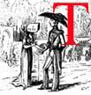
Three of Thackerays decorated (or illuminated) initial letters: Click on images to enlarge them.
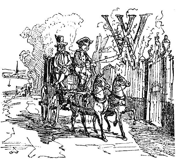
The narrative ingredient usually involves an economical showing of a key event which initiates the action by visualizing what is about to happen in a proleptic image. The initial for Chapter 1 is a prime example (p.1; see above). It represents the carriage arriving at Miss Pinkerton’s, and is an exact match to the written description, recreating every detail from the coachman’s wearing of a three-cornered hat to the black servant’s bandy legs and the brass plate on the academy’s front gate. Such precise replication of written detail seems pedantic in so small a design, but Thackeray’s exactitude proclaims his intention to create an imaginative world in which each part contributes to the movement of the plot. The narrative initials’ emphasis on movement is especially effective in preparing the reader/viewer for the rapid pace. The rush of an arriving coach (p.1), a coach departing (pp. 289, 369), meetings (pp. 238, 539), games (pp. 34, 298) and confrontations (p.198) are all part of this strategy, and the author consistently engages the reader by presenting a sharply-focused composition which encapsulates the information in an arresting form.
In this sense the narrative letters reinforce the work of the full-page engravings. More challenging are those which amplify the novel’s playful ironies, deploying images in counterpoint to the characters’ social pretentions. These divide between travesties of grandiloquence and scenes of poverty and deprivation; both are sets of ironic signifiers, exposing the emptiness of a world based on vanity and deception.
The characters’ self-delusory belief in their importance is mocked in child-like iconographies of power and status, each revealing the limitations of pride while depicting the underlying truth. The characters’ sense of self-worth is cleverly mocked in images of royalty and courtly procedure. The Crawleys’ pretentious belief in their quality as ‘old stock’ is ridiculed by a design showing the moment when Elizabeth I supposedly endowed the family with their name, although the occasion of the bestowing was an absurd one. The text notes how she stopped at the family’s home for breakfast, and the illustration showing a portly woman quaffing a large mug of ‘Hampshire beer’ (p.57). The reward for supplying this hearty pint is royal recognition. The Crawleys’ claim to quality is thus instantly undermined in a process of mock-heroic bathos: the banal infects the grandiloquent and any claims to social distinction are shown to be based on catering for the queen’s commonplace appetites. Georgie’s idle aspirations are similarly exposed in the initial showing him as a newly-crowned king (p.502) – complete with an embroidered ‘G’ – and others travesty the characters’ celebrations of their importance in the form of ridiculous statuary. One shows tiny figures surrounding a gigantic demonic sculpture (a comment on Becky’s unbridled vanity, p. 79), and another is a vast sculpture of the Prince Regent, an emblem of Becky’s belief that her ‘myth’ of greatness is finally taking the form of imperishable stone (p.449). However, the subtlety of this illustration is invested in its ambiguity. The statue appears to be in the process of construction (with the designer, complete with a portfolio, looking at the work completed so far while a mason with a hammer talks to him); but it is positioned horizontally, and already looks like a piece of ancient classical statuary lying among the foliage. Becky may think she has finally ascended to the highest circles of influence, but Thackeray conflates her rise and fall in what appears to be an irrelevant detail. The illustration almost visualizes the adage, ‘how are the mighty fallen’; but in this resonant sign Becky’s fortunes seem not so much as having declined, as never risen.

An initial B depicting Arcadian simplicity. Click on image to enlarge it.
The difference between what the characters think of themselves and the realities of their moral nature are consistently represented in initials which are set in ironic counterpoint to their self-perceptions. One set of designs sarcastically shows their sexual conspiracies as if they were the courtship of innocents, depicting them as rustics who occupy the pastoral imagery of Thomas Gainsborough and J. H. Fragonard (for example, pp.22, 43, 97, 137, 539). Of course, the irony lies in the disparity between what is shown and the reality of the salacious manoeuvrings. Thackeray makes the point ever more explicit, especially in his initial for ‘Arcadian Simplicity’, in which a calculatedly naïve (p.84) style is juxtaposed to the text’s description of moral iniquity.
The oft-noted representation of children is another ironic hit, and here, as in the mock-pastoralism, the initials only exist as a measurement of the characters’ behaviour. The comparison between juveniles and adults frames the action in innocent terms, but the divergence from what is shown and what is read, a grotesque mismatch, is the real meaning. The infantile fight of Dobbin and Cuff (p.33), though ornamental, prefigures the military engagement at Waterloo while also suggesting that the entire cast is engaged in a struggle not just for advantage, but for survival.


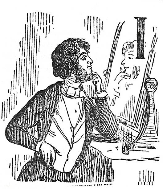
Examples of illuminated capitals with small emblematic details. Click on images to enlarge them.
Indeed, the initials often contain small emblematic details which signal the cruelties inside the innocent appearance of play. One of George’s sisters, busy plotting his marriage to Ms. Schwartz (p. 178), is shown playing with a black doll – just as she manipulates the real person. Becky fishes for a fat fish (p.22), a sign of her fishing for Jos’s fat soul. The quaint children sheltering from the rain (p.341) are a resonant sign of the Osbornes’ distress; and the flying of kite, subject to the winds of chance and advantage, a parallel mark of the Crawleys’ life-style (p.321), one day on high and another in the doldrums.
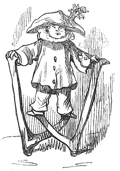
In these ways the initials are sophisticated exemplifications of the ‘real’ situation, presenting the truth behind deception in the manner of the Renaissance emblem book. As a general principle, the more innocuous they appear, the more caustic the satirical point. The child figures the corrupt, the unsophisticated rustic the super-refined urbanite. This paradoxical arrangement is carried throughout the initials and allows us to re-read several of the designs that might seem trivial. Taking Thackeray’s satirical schema in its own terms, we can see that the many images of clowns are far from jovial: rather, they point to the absurdity of the characters who juggle their chaotic lives just as jesters fall and tumble, or totter on stilts (pp. 151, 378, 328, 233).
Underlying all of these is a body of others which points to the realities of the situation in the form of symbolic scenes and visual allusions. These typically cite moral aphorisms and well-known literary situations. Some of them point to the characters’ rootlessness in the second part of the novel. Scenes of nomads and empty spaces recur, the symbols of endless, pointless journeying as the characters become increasingly detached, one step ahead of disaster (pp. 441, 464,, 473). All of them contrast with the image of the hearth, left vacant by old Osborne’s death, and a touching representation, with its slippers and kettle, of a domestic ideal of rootedness (545).

Initials a suggesting Becky’s personality. Click on images to enlarge them.
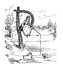
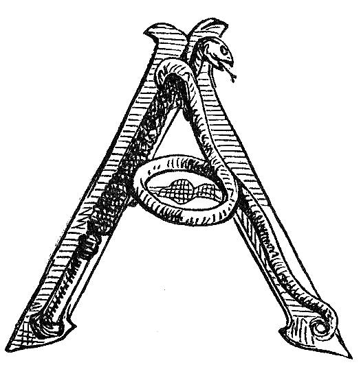
Thackeray is perhaps at his most acerbic, however, in his use of initials as a means of suggesting Becky’s personality. Others are occasionally shown, but the most sustained work is focused on depicting his unlovely heroine. Aspects of her character are progressively revealed as the process of corruption and degradation take hold. In the first instance she is little more than mischievous, a charming trait depicted in the form of a demon in the initial for Chapter 2 (p.9); this is taken up, still with a degree of innocence, in the sly glance of Rebecca as a devil, worshipped by followers (p.79); but by Chapter 15 her presence is signalled in a coiling snake (p.114). Such details suggested a fundamentally wicked nature, and Thackeray systematically reveals her iniquities in emblems which crystallize the work of the text. Her predatory sexuality, always for advantage, is a prominent theme. In the famous device for Chapter 4 she is shown fishing for a husband and almost catching a fat fish, the unfortunate Jos (p.22). The idea of temptation recurs in Becky as a siren, complete with a miniature harp (p.393), and finally a crone, one of the eternal undead in the company of Lord Tapeworm (p.567).
Thackeray’s initials can be read, in short, as an important part of the reading experience. They propel the narrative forward, they encapsulate the situations in an allegorical form, and they point to the realities lying behind the veneer of pretence. The tone is always one of ironic contradiction which undermines the information in the written text; at the same time, and somewhat paradoxically, they enhance the range of implications, suggesting that what is read is just one version of the story. To negotiate the complex messages enshrined in the dual work of art we have to engage with both sets of signs, and accept their relativity.
Works Cited
Thackeray, W. M. Vanity Fair.London: Bradbury & Evans, 1849 [this is a reprint of the first edition, retaining the same pagination].
Created 21 January 2014