[Crane's essay has been transcribed from The Magazine of Art using the Internet Archive version of a copy in the University of Toronto Library. I have used the online images of the text to correct the rough OCR text, and I have added links to material in the Victorian Web. The headpiece and the neo-medieval illuminated capital that begin the chapter come from the original. Click on images to enlarge them. I have added color to the word Design to make it easier to see. — George P. Landow.]

rt, like the parti-coloured shield of the fable, has two sides, or two fields, which 0 to maintain our heraldic simile ‚ are constantly counter-changed one upon the other by the Evolution of Design. These may be broadly distinguished as —
1. Aspect.
2. Adaptation.
The first comprehending what we call pictorial work, with the impression, or the imitation, of the superficial aspects of life nature as its chief aims: the second comprehending the province of the designer, whose object is rather to suggest than to imitate; or to express and relate by careful selection of the more permanent ami typical characteristics of life and nature, or of linear forms derived from these, certain ideas of harmony and relation or of poetic thought and fancy. The object of the designer being, in short, to ornament, his aim is rather ideal beauty than literal fact.
Since the times of the unity of the arts and crafts in architecture, in the course of their differentiation, these main distinctions have become more and more pronounced, until we have reached a period of development in which the very widest divergences of conception, method, and aim exist between one form of art and another, both in principle and in practice.
While, on the one hand, we have the pictorial artist striving with photographic impartiality and fidelity to record the superficial facts, phases, and characters of nature in their must unstudied and accidental conditions, with as much force but as little conscious selection and combination as possible, on the other we have the ornamental designer dealing with purely abstract qualities of line and form, and his work strictly governed by geometric plan.
Now an easel picture, or any pictorial rendering of nature, is supposed to be complete in itself. It does not necessarily concern itself with its surroundings; and even its frame — the last relic of the connection of painting with architecture — is often only an arbitrary boundary, not to define its decorative limits, but to isolate it more completely. We might call pictorial art of this kind unrelated art — its form dependent only on the caprice and individual impressions of the painter. Anything in the nature of a decorative design, on the other hand, must he considered in relation and harmony, not only with itself, but to its surrounding conditions. The most careful selection must he exercised in the choice of form; the utmost consideration given to plan, and play of counterbalancing line. The result may be a picture, but it must also be a pattern.
A poet, while using the common tongue and forms (if speech, casts them in certain rhythmical shapes, and in seeking the highest form of literary [79/80] expression imposes certain restraints, and exercises the strictest selection.
Design, too, is a language, full of richness and variety, and in the various forms of its application through the whole range of the handicrafts, by the very necessity of its adaptation to them, finds new methods for the expression of beauty, harmony, fitness, unity in variety, variety in unity — whatever we like to call it.
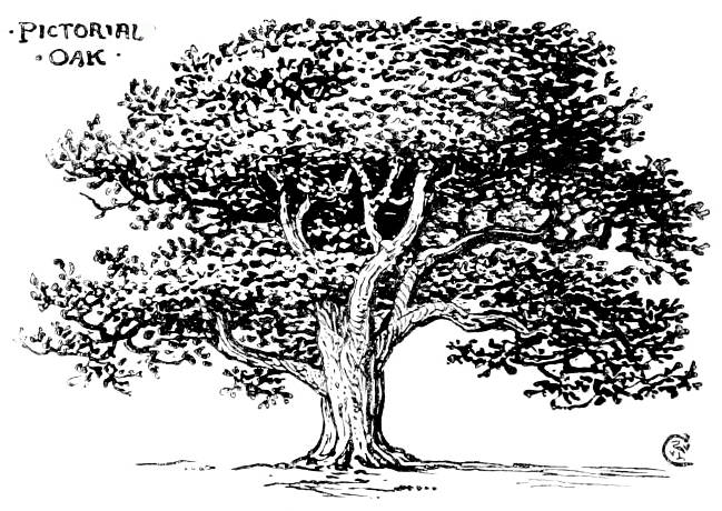
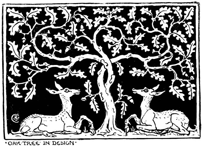
Crane's examples of art versus design — his (a) Pictorial Oak and (b) Oak Tree in Design.
Now, under our head Adaptation, there are at least three main points of view from which we may regard Design. Firstly, design in its least applied sense, as connected solely with the embodiment of ideas, and expressed by beautiful drawing alone — depending on qualities and conditions of line and colour and values — design, in fact, on the pictorial side, less dependent, on material, although always influenced by it, as in the hands of individuals different qualities are brought out. For instance, the character and quality of a drawing with a pen and ink will differ from one in pencil, though by the same artist; while in the designs of different masters, of different ages and countries, the greatest contrasts in spirit and methods of expression are found, even when the material is the same; as, for instance, between a drawing of Albert Dürer and one by John Flaxman, whether rendered by pen or graver.
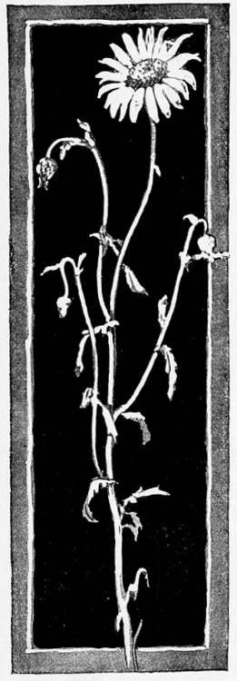

More of Crane's examples of pictorial art versus design — his (a) Daisy, from Nature and (b) Daisy, decoratively applied.
So, from the very simplest methods of the draughtsman to the utmost complexities of the painter, Design most be influenced by the characteristics and facilities of the materials with which the artist works, and must constantly vary in intellectual and poetic expression according to individual use and touch.
The second sense in which we may understand Design is as constructive drawing; as the plan, working drawing, or pattern, to be translated or expressed in other materials, and adapted to certain spaces or objects, and as deriving, therefore, its chief value and interest from the success with which it is adapted to such materials and such spaces or objects, over and above its own intrinsic qualities, and the measure of its beauty and invention.
The third conception of Design is as it may be expressed by means of the characteristic qualities of the different materials themselves, and as the natural outcome of those qualities, with which it is inseparably hound, as thought with language. This is when designer and craftsman are one, and think and work in the material of their thought, as it follows the ductility of the metal, the erispness of the wood, the pliability of the leather, the plasticity of the clay— or whatever may be the vehicle of expression.
It is chiefly of Design in the sense of constructive [80/81] drawing, as understood in the second of my three divisions, that I propose to deal; though, necessarily (since there is no hard-and-fast line between them), with occasional excursions into the first and third.If it may seem that in this matter of design I am drawing mostly on my own experience and my own illustrations, it is because I think it may be more useful to give the results of a definite personal practice, as far as it goes, than to rely on theories and assumptions about the work of others which could not possibly have the same certitude.
In these literal and photographic days one of the first questions which meets the designer is the degree of naturalism which is within his scope and purpose. There are endless ways of looking at nature. We may use our eyes alone, or we may use all our faculties and not find them too much. It is certain that what we feel and know enter as largely into art as what we see. Now the designer may as many careful studies from nature as the painter, but he will look for different facts, and express them in a different kind of shorthand. Take an oak tree, for example — the pictorial sketcher might represent it somewhat in the manner I have done on p. 8O, which would lie his method of saying, "This is an oak tree." But the designer (while he might also make a sketch from this modern landscape point of view) could not stop here, if he wanted to make a decoration of it. He would have to geotnetrise it, or systemise it — to make a pattern of it, in short, to make it speak clearly ami intelligibly in decoration. He would go to work somewhat in the way represented in the second illustration on p. 80. This would be his manner of saying, "This is an oak tree."
Now the first, or pictorial, method of representation involves quite as distinct a convention in its own way as the second or decorative method. In the first a species of shorthand is employed for the statement of certain external facts, uncontrolled by any ornamental intention or decorative purpose. The second emphasises certain facts, but makes external appearances subservient to the decorative purpose.
In making a book-illustration, for instance, the artist may think exclusively of the scene he has to represent, without reference to what may be called the architecture of the printed page, or the mechanical conditions of its existence. The result, however admirable and brilliant as an independent work, remains unrelated to its purpose and conditions: or he may, availing himself of these conditions, produce not only an illustration, but also a decorative design, fitted to the mechanical conditions of the printing-press, and adding to the beauty of the book: a point brought home by Mr. Emery Walker in his admirable lecture on letterpress printing.
The designer would, moreover, have in viewsome particular space or shape he wanted to fill with his oak tree, and so he would control its contours with an imaginary line, curved or angular, as might best adapt itself to his decorative purpose and the method and object of the work. In adapting it to fill a panel, he might find it desirable to balance the design and add to the interest by the addition of the stags beneath the tree (see p. 80), or, by repeating the device, obtain a motif for a diaper pattern, and by printing it on wallpaper or cotton, bring a whole deer park within the modest domicile of the landless citizen.
Supposing we plucked a field-daisy and drew its [81/82] portrait, as in the previous page. We should feel it made a somewhat meagre device for a panel: but if we proceeded to make a treatment of it, as shown in the next illustration, we should fill our space and produce a design. Here, again, we build upon a linear plan, geometric in its origin,and we follow the alternate system in the arrangement of the leaves and flowers.

Crane's examples of design principles with self-explanatory titles.
These geometric plans, which govern all ornament, are the very alphabet of design, and, like all alphabets, have played a very important part in its history. The earliest forms of ornamenl were purely linear and geometric. Borders were constructed of a series of horizontal or perpendicular lines and strokes, or by the simple repetition of geometric [82/83] forms, such as the square or circle, as on the gate of Mykenae, as well as in the patterns of all primitive peoples. From the square and circle, as from parental roots, a whole troop of patterns develop, as indicated in the diagram (see p. 82), giving a kind of rough genealogical tree of their primal types. We get here certain leading types of controlling systems, or plans of pattern and design — square, circle, spiral, scroll, scale, radiating, or fan, which form not only the plans and liases in design, but themselves in combination forming patterns, are what might be called decorative units. Governing these again, we have other controlling systems, or principles in design, such as the Symmetric and the Alternate.
Under such systems of structure, or their varieties, all designs might be classed. To any wishing to pursue the subject of the value of geometric bases in designing I cannot do better than refer them to the excellent text-books of Mr. Lewis F. Day.

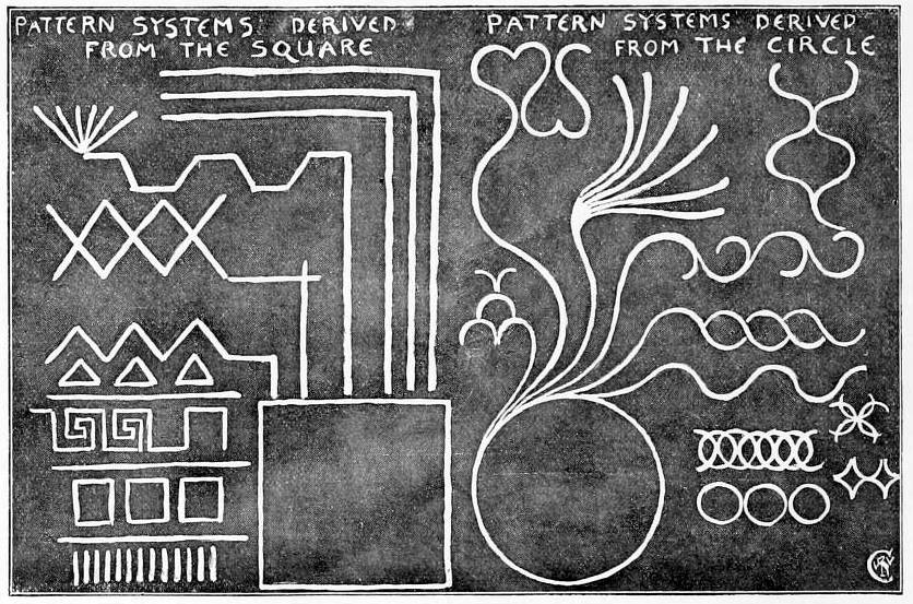
Crane's examples of design principles: (a) Radiating curves shown in wing of a bird and shell and (b) Pattern systems derived from square and circle.
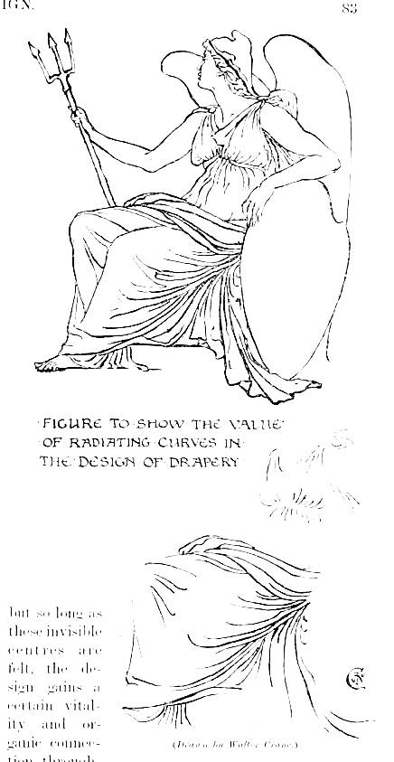
Perhaps the most universally valuable in design is the radiating principle — the spring of a series of lines from a common centre, or what might be termed "local self-government" in design. We may find this principle controlling the simplest repeating border up to the highly complex figure design. Take the drapery of a figure, for instance: we may have a vast number of different centres, and our lines may diverge sharply or gradually from their common centres, but so long as these invisible centres are felt, the design gains a certain vitality and organic connection throughout. And where we see the principle most emphatically expressed, as in a fan, a shell, or the wing of a bird (see p. 82), it conveys a sense of both organic vigour, and yet lightness, combining, in fact, the minimum of weight with the maximum of strength. The human figure contains in its plan and the principles of its structure all the most important principles of decorative construction, besides being itself the most inspiring source and chief factor and most expressive unit in design. The outline of the figure itself, built on the firm and symmetric framework of the bones, yet expresses in its contour a series of counterbalancing curves, and we gel the radiating or centering principle in the ribs, and in the set of the lingers and the toes, its whole beauty depending upon its construction.
Related Material
Bibliography
Crane, Walter. “Design in Two Parts. Part I.” Magazine of Art 16 (1893): 79-83. Internet Archive version of a copy in the University of Toronto Library. Web. 28 October 2013.
Last modified 28 October 2013