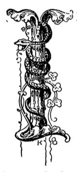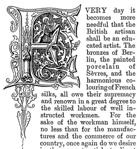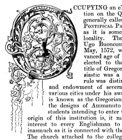

These examples of illuminated initial letters for printed text, which began the first paragraphs of major articles in the Art-Journal, show how the Victorian interest in medieval and later illuminations affected mid-nineteenth-century book design. Unlike The Studio, Magazine of Art, and The Dome, all of which came into existence long after the Art-Journal first appeared, this earlier periodical, which had a format characterized by text set in small type with a two-column layout, had a crude look, so the illuminated letters do not seem to fit very well at all.


Location of illuminated capitals in text


Source: Hathi Trust e-version of the 1862 Art-Journal. Text and formatting by George P. Landow. [You may use this image without prior permission for any scholarly or educational purpose as long as you (1) credit the University of Michigan and the Hathi Trust Digital Library and (2) link your document to this URL in a web document or cite it in a print one.]
References
Delamotte, F. Primer of the Art of Illumination for the Use of Beginners. London: E & F. N. Spon, 1860. Internet Archive version of a copy in the Brigham Young University Library. Web. 13 January 2014.
Last modified 16 January 2014