Selwyn Image (1849–1930), one time an Anglican clergyman and later Professor of Fine Art at Oxford, was an accomplished designer and writer. He was heavily influenced by the aesthetics of William Morris; not only a member of the Art Workers’ Guild, Image was the co-founder, with Arthur Mackmurdo and Herbert Horne, of the Century Guild (1883–92), and was a key contributor to its periodical, The Century Guild Hobby Horse.
As one of the many polymaths generated by Morris’s example, Image moved seamlessly between fine and applied art, two and three dimensional art, literature and the book arts. Best known for his stained glass, he also designed furniture, painted panels, wallpaper, embroidery, domestic items such as wooden trays, Christmas cards and sundry other objects for the home; a critic of contemporary art, he still found time to publish a small corpus of lyrical verse.
In addition to these activities, he created a series of ornamental schemes for the printed page and a number of distinctive book covers, which were offered not as elite products of the private presses but as trade bindings on cloth. Scholarship on these aspects of his work is relatively undeveloped; there is no extended analysis of his book-art and his name is often confined to generalist comments in histories of the period. The following sections provide an introduction to a book artist whose work is often eclipsed by the more famous achievements of Charles Ricketts and Aubrey Beardsley.
Arts and Crafts, Art Nouveau
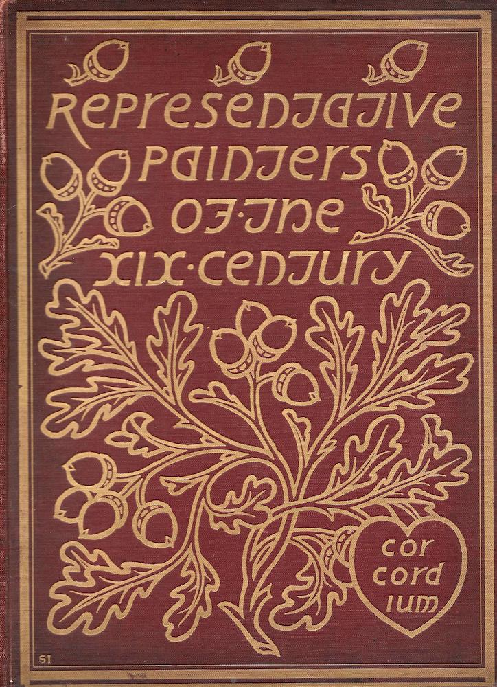
Selwyn Image’s binding for Representative Painters of the Nineteenth Century.
Image’s book-covers, like those of Gleeson White, are complex artefacts which reflect the development of overlapping styles in the 1880s and 90s. Though a contributor to the discourse of Arts and Crafts, his bindings move between the conventions of Morris’s decorative style and the greater economy of British Art Nouveau. Image probes the relationship between alternatives; exploratory in nature, and apparently unwilling to accept the restrictions of a single style, he finds the genesis of Nouveau within the conventions of Arts and Crafts. These creative tensions can be traced by analysing the tensions and contradictions at work within his bold and imposing designs.
Though Image’s applied art is securely based on Morris’s principles, his patterns for covers are ambivalent, fusing the polarities of Arts and Crafts decoration; in part naturalistic and in part abstracted, they represent motifs drawn from observation in a stylized way.
Image’s particular inspiration is floral, and all of his designs reflect a botanist’s view of flowers, vines, trees and varieties of blossoms. As he explains in an essay on stained glass that also reveals aspects of his approach to bindings, the artist should always ‘make careful studies from nature … for there is no fine designing possible [until] we are familiar with the anatomy’ of the ‘objects’ (‘Stained Glass’, 169) or plants under scrutiny. This close observation is embodied in all of his covers; for example, the blossoming thistles on the binding for The Tragic Mary (1890) by Michael Field [Katherine Harris Bradley and Edith Cooper] are clearly based on observation and so are the sprouting acorns and oak leaves on the upper board of Mrs Bell’s Representative Painters of the XIX Century (1899). Yet these motifs are far from realistic in the strictest sense of the term; while naturalistic, they are simplified to create decorative patterns. This emphasis is explained, once again, by the artist in his own writing. Though he proclaims the importance of Pre-Raphaelite copying from nature, he simultaneously insists on the need for the artist to interpret and arrange, noting in an article ‘On Design’ in The Century Guild Hobby Horse that
It is the inventive arrangement of abstract lines and masses in such as relation to one another, that they form an harmonious whole, a whole, that is, towards each part contributes, and is such a combination with every other part that the result is a unity of effect, which completely satisfies us. [Century Guild Hobby Horse, October 1887, 118].
This interpretation of nature informs The Tragic Mary, the cover for Representative Painters, the binding for Ernest Radford’s Old and New(1895) and the front pages of The Century Guild (1884). The effect, in all cases, is one of energizing the design. Image draws his stems and vines in dynamic, curvilinear lines which highlight a sort of pantheistic view of nature – of nature made up of observed parts, simplified so as to stress its vitality.
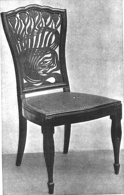
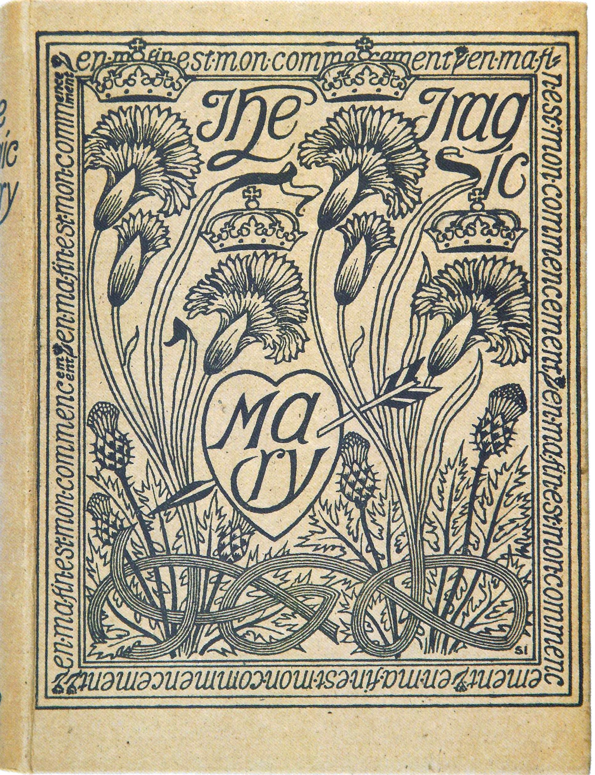
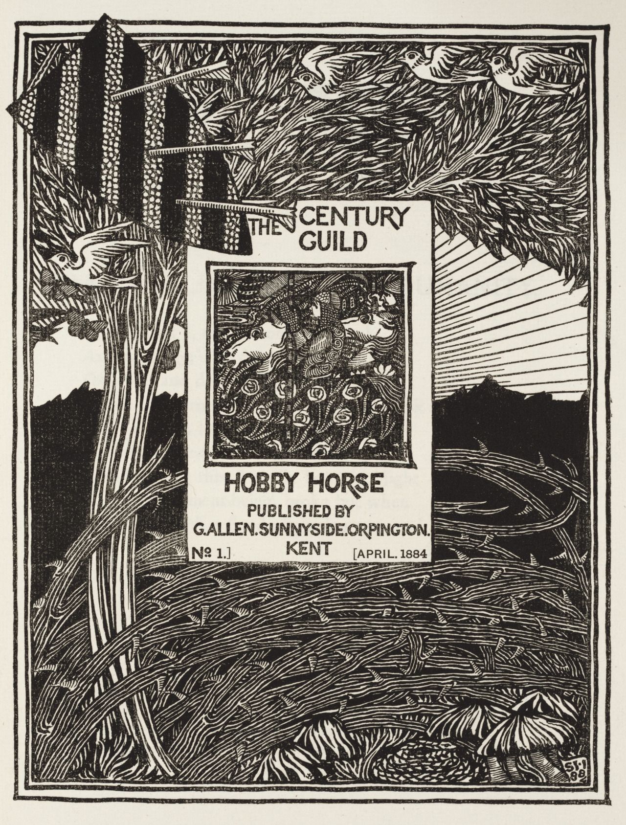
Left: Arthur Heygate Mackmurdo’s binding for Wren's City Churches . Middle left: A chair with similar design by Mackmurdo. Middle right: Selwyn Image’s paper binding for Michael Field’s The Tragic Mary Right: Image’s binding for The Century Guild Hobby Horse. [Click on images to enlarge them.]
The front cover of The Century Guild Hobby Horse exemplifies his approach in the swaying form of the abstracted tree and especially in the swirling arabesques made up of barbed and dangerous looking brambles. However, Image’s combination of swirling arabesques points in two directions: in part a piece of Arts and Crafts design, which mediates between abstraction and realism, it also prefigures Art Nouveau; though ‘quite claustrophobic in its insistent detail’ in the manner of Morris’s borders for the Kelmscott Press (Taylor, 58), it anticipates the Nouveau decorations of Aubrey Beardsley’s Le Morte d’Arthur (1893).
Image similarly maps a position between two styles in The Tragic Mary, combining realistic flowers and congested detail with the pure linearity of its stems and interlaces. This approach was largely original, but Image was probably influenced by Mackmurdo’s restless designs for a chair of 1881 and a title-page for Wren’s Churches (1883). William Blake’s designs for The Songs of Innocence and Experience (1789), which appeared in The Hobby Horse were another source, Blake was widely admired, Stephan Tschudi-Madsen observes, by members of the Century Guild (238), and Image fuses Blake’s linearity with Arts and Crafts and Art Nouveau to create his own, synthetic style.
Bindings, Texts, Reputations, Influence
Image adhered to the idea, voiced throughout Victorian book art and emphasised in design of the 80s and 90s, that book covers should be linked to the contents of the texts they enclosed. In keeping with this tradition, Image produced covers which act as proleptic signs, establishing the book’s theme or ambience in a symbolic form. The oak-clusters on the front cover of Bell’s Representative Painters suggest development and growth (‘from tiny acorns do mighty oaks grow’); the writhing plants on the wrappers of the Hobby Horse similarly convey a notion of fertile inventiveness. However, the artist’s most developed and challenging design is the binding for Bradley and Cooper’s play exploring the life of Mary, Queen of Scots. For this text he created a dense visual scheme which establishes the drama’s key concerns.
Image’s design has several levels of signification. Mary’s status as a romanticised emblem of Scottish culture is registered by the pattern of thistle stems and flowers, traditional signs of Scotland and one familiar to Victorian readers who would have seen decorative bindings, embellished by a parallel iconography, of popular editions by Walter Scott and Robbie Burns. Image’s use of a generic sign frames her in the same terms. Other elements of her story are symbolized by the placing four crowns, emblems of English sovereignty, over a series of thistle-flowers. This unusual device conveys the idea that the representatives of the house of Stuart became monarchs of England and Scotland; although Mary herself was never to reign, and was executed by Elizabeth (a tragic circumstance suggested by the arrow-pieced heart), her son James I united the two thrones. The metaphorical linking of crowns and thistles acts, in other words, as a visual metaphor for a political arrangement, a piece of mock-heraldry that points to Mary’s contribution to the development of British history. The tenacity of her lineage is also suggested by the dynamic interlaces of stems, which seem to burst out of the frame; working to symbolize the regeneration of the moribund English throne by introducing Mary’s son, it offers a highly idealized, emblematic telling of the events which though inaccurate – James being widely regarded by historians as one of the very worst of British monarchs – it is nevertheless entirely faithful to the eulogizing content of the text. The executed Mary becomes in this sense a seed-bed of thriving plants, the mother of future kings and a source of the fertile continuation that was so obviously lacking in the childless house of Tudor. Should the message be missed, Image inscribes the legend of regeneration in the border: in rough translation from the French, ‘in my end is my beginning;’ the Celtic intertwining of the stems similarly stresses the idea of regeneration. Image’s design for Tragic Mary is thus conceived as a complex inscription of messages, crystallizing the salient facts of her political history while visualizing the text’s romanticism.
At the same time, its visual effect, as a piece of lyrical pantheism, is pleasingly decorative, vibrant, and uplifting. Though intimately linked to the text, it functions as an art-work in its own right, asserting the role of the cover artist as an original creator in pursuit of beauty. Produced as one of several bindings which established the binding designer’s status, it bears comparison with the elaborate artifice of covers by A. A. Turbayne, Gleeson White and Charles Ricketts, and is one of the essential imprints of the period. Oscar Wilde considered it one of the most ‘beautiful books … of the century’ (Field, Works and Days, 139), and it is perhaps only surpassed by Ricketts’s binding for John Gray’s Silverpoints (1893).
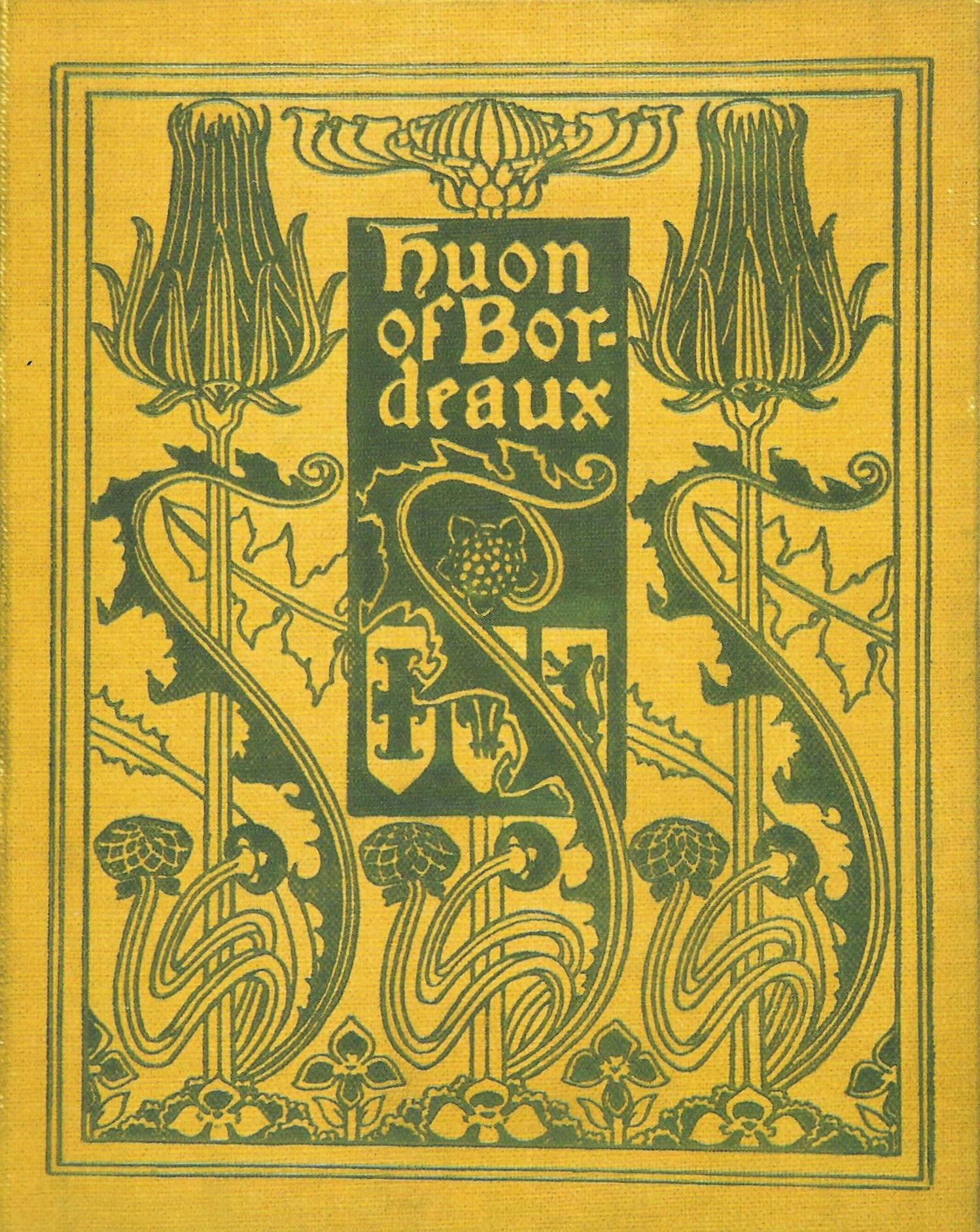
Fred Mason’s binding for Huon of Bordeaux.
Image’s design participates in this discourse of the ‘book beautiful’ and his work was influential in shaping covers of the last twenty years of the century. Tragic Mary was especially important and was much quoted and sometimes imitated. There is a direct relationship, for example, between Mary and Fred Mason’s binding for Robert Steele’s version ofHuon of Bordeaux (1895). Ricketts, likewise, drew heavily on the example of Tragic Mary, creating his own, modified version of floral imagery in his Poems for Oscar Wilde (1893) and In the Key of Blue for J. A. Symonds (1892). Image also had a significant impact on Gleeson White, whose compositions recreate the older artist’s organic imagery and emphasis on muscular simplification; his binding for Burne-Jones (1894), notably, combines a bramble-motif which is directly lifted from the cover of The Century Guild Hobby Horse.
In short, Image made a significant contribution to the art of fine binding. Aiming, like all of the late Victorian cover designers, to improve standards, he set out to democratize the appeal of advanced aesthetics, producing work both synthetic and striking, original and entirely of its time.
Words Cited: Primary
Bell, Arthur, Mrs [Nancy Bell]. Representative Painters of the Nineteenth Century. London: Sampson, Low, Marston & Co., 1899.
Bell, Malcolm. Sir Edward Burne-Jones. London: Bell, 1894.
The Century Guild Hobby Horse (1886–92).
Gray, Thomas. Silverpoints. London: Elkin Matthews & John Lane, 1893.
Field, Michael [Katherine Harris Bradley & Edith Emma Cooper]. The Tragic Mary. London: George Bell, 1890.
Mackmurdo, Arthur. Wren’s Churches. Orphington: George Allen, 1883.
Malory, Thomas. Le Morte d’Arthur. London: Dent, 1894.
Radford, Ernest. Old and New. London: T. Fisher Unwin, 1895.
Steele, Robert (translator). Huon of Bordeaux. London: George Allen, 1895.
Symonds, J. A. In the Key of Blue. London: Elkin Matthews & John Lane, 1893.
Wilde, Oscar. Poems. London: Elkin Matthews & John Lane, 1892.
Words Cited: Secondary
Field, Michael [Katherine Harris Bradley & Edith Emma Cooper]. Works and Days. London: John Murray, 1933.
Haslam, Malcolm. Arts and Crafts Book Covers. Shepton Beauchamp: Richard Dennis, 2012.
Image, Selwyn ‘Cartoons for Stained Glass.’ Practical Designing. Edited by Gleeson White. London: George Bell, 1893,163–180.
Taylor, John Russell. The Art Nouveau Book in Britain. London: Methuen, 1966; revd. ed., 1980.
Tschundi-Madsen, Stephan. The Art Nouveau Style. London: Weindenfeld & Nicolson, 1967.
Created 25 May 2019