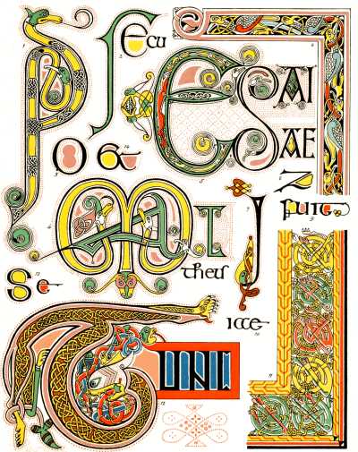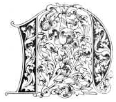

Left: Plate VIII. Examples from the Book of Kells, 9th Century. Right: Early Irish Initial Letters from Lessons in the Art of Illuminating by W. J. Loftie. Source: Project Gutenberg EBook #40423 produced by Chris Curnow, Matthew Wheaton and the Online Distributed Proofreading Team. [Click on images to enlarge them.]
Description of Plate VIII

o book on this subject would be complete without something more than a passing reference to the earliest of all the fashions in illumination which have prevailed in our islands. This Plate gives some examples from the very curious manuscript in the Library of Trinity College, Dublin, known as the "Book of Kells." This venerable volume contains the four Gospels in Latin, and, it is sometimes asserted, dates from the seventh century, but more probably belongs to the ninth. The late Sir M. D. Wyatt says of it: "Of this very book Mr. Westwood examined the pages, as I did, for hours together, without ever detecting a false line, or an irregular interlacement. In one space of about a quarter of an inch superficial, he counted, with a magnifying glass, no less than one hundred and fifty-eight interlacements, of a slender ribbon pattern, formed of white lines, edged by black ones, upon a black ground. No wonder that tradition should allege that these unerring lines should have been traced by angels."
The examples before us are purposely taken from a less complicated page, but will be found sufficient to try the skill and patience of even the most painstaking student. The colors are rather more vivid than in the original, which has now greatly faded through age and ill-usage. There is little to be said as to the beauty of the design. Grotesques have an attraction in spite of their ugliness: but we can hardly expect the most enthusiastic admirer of antiquity to imitate these extraordinary complications of form and color, except as an exercise of skill and patience. In one respect, however, early manuscripts and especially manuscripts of this class, are well worthy of imitation. The writing is very clear and distinct. It is easier to read a charter of the seventh or the eighth century than one of the seventeenth. Illuminators might do worse than learn the old Irish alphabet, if only on this account.
There is no gilding in the Book of Kells, but some occurs in the contemporary, or nearly contemporary Book of Durham. The effect depends wholly on the skill of the scribe in using a very limited palette so as to make the most of it. The modern student would do well to remember this. A wide range of colors does not always conduce to bright or good coloring. Harmony is often found to follow from a sparing use of the more brilliant pigments at our disposal, with a careful eye to effect. The beginner too often imagines that he can make his border or his initial look well if he puts enough gold or vermilion on; but he should remember that the more sober and simple his scale of coloring the more splendid will the bright colors look when he does employ them. It is well to remember that absolute harmony is obtained by the use of blue, red, and yellow in these proportions:—blue, eight; red, five; yellow, three; and that all good pictures or illuminations must depend on this principle. White and black, and also in some cases gilding, may be treated as neutrals. There is usually a sufficiency of black in the lettering of a page. White, in the shape of dots and as heightening, may be largely employed if there is any want of harmony detected. Gold should not be used for this purpose, except in certain styles; and the student may rest assured that a design which does not look well without gold will not look better with it.
A few other specimens, without color, will be found on the back of Plate VIII. It might be good practice for the student to tint them in the style of the colored examples.
The Byzantine style, as it is called, prevailed about the same period in the countries of eastern and northern Europe. The books are of a very different but equally ungraceful character. The work is not so minute or complicated, but the lavish use of gold distinguishes them. Sometimes a page is written in gold letters on vellum stained purple; sometimes the page is entirely gilt. None of the examples in the British Museum are worth the trouble and indeed expense of copying, but they are curious as specimens of barbaric splendour.
References
Beckwith, Alice H. R. H. Victorian Bibliomania: The Illuminated Book in Nineteenth-Century Britain. Exhibition catalogue. Providence. Rhode Island: Museum of Art, Rhode Island School of Design, 1987.
Loftie, W. J. . Lessons in the Art of Illuminating: A Series of Examples selected from Works in the British Museum, Lambeth Palace Library, and the South Kensington Museum.. London: London: Blackie & Son, nd. “The Colored Illustrations are Printed by W. G. Blackie & Co., Glasgow, from Drawings by J. A. Burt.” Project Gutenberg EBook #40423 produced by Chris Curnow, Matthew Wheaton and the Online Distributed Proofreading Team. Web. 11 January 2014.
Last modified 11 January 2014