
Introduction
Charles Ricketts (1866–1931), a polymath of restless energy, was one of the most important figures in the art-world of the final years of the nineteenth century, and continued to be influential into the 1920s. The subject of critical biographies by Joseph Darracott (1980) and Stephen Calloway (1979), Ricketts dominated several fields. Not only a painter and sculptor, he designed jewellery, costumes, and settings for the stage; he was also a collector, art-historian and critic who wrote widely on art and design and advised on the acquisition of art-works for the National Gallery of Canada. However, he is best known as a book-artist, or, to use Joseph Gleeson White’s memorable phrase in The Magazine of Art (1897), a ‘book builder’. He illustrated contemporary and classic texts and from the beginning of the nineties designed a variety of book-covers. Working, for much of the time, with his collaborator and partner, Charles Shannon, Ricketts took control over all aspects of the books he produced for commercial publishers and for his own company, the Vale Press, which he set up in with Shannon in 1896 and ran until 1904.
His approach to book design was explicitly reformist, setting out to promote a new, more intellectual treatment in which Beauty, the prize of Aestheticism, was actively pursued. Authorship of all aspects of the design – sometimes shared with Shannon – was the means through which he improved aesthetic standards; unlike the multi-collaborations practised by earlier productions of fine books for a mass audience, his publications were conceived as the coinage of a single brain, or at least of two minds working in unison. As in the case of Aubrey Beardsley, who adopted the same strategy, Ricketts’s work revolutionizes the ‘cobbling’ of gift-books of the 1860s, which were made up of illustrations, bindings and typeface by many separate hands, often with little relationship between them.
Of course, Ricketts’s emphasis on integration complicates the process of critical evaluation. His best books, like Beardsley’s, have an organic unity which renders analysis somewhat artificial – picking apart a structure which is specifically designed as a correspondence and merging of parts. My aim here, nevertheless, is to deal with just one aspect of the artist’s book design: his covers.
These are complex artefacts which respond to a variety of influences, move through a number of styles, sometimes seem at odds with each other, and are themselves influential in the development of the styles practised by cover designers such as A. A. Turbayne, Laurence Housman, Paul Woodroffe and Joseph Gleeson White. Ricketts, more than anyone else, created the ‘look’ of nineties’ publications, and was instrumental in the creation of what John Russell Taylor has characterized as ‘the art nouveau book in Britain’. His achievement is carried over the mass and elite markets, with some of his books (especially for the Vale) composed as luxury items mounted on leather or vellum and hand-tooled, but most being issued as gilt-stamped designs on cloth for the bourgeois audiences of the nineties.
Styles
Ricketts began designing commercial or trade bindings around 1890 and produced his best work before the end of the century. He was commissioned by a variety of publishers, several of whom responded imaginatively to the new tastes of the nineties and wanted to produce stylish books which reflected the innovations of William Morris and T. J. Cobden-Sanderson. Foremost among these were Osgood McIlvaine, whose authors included Thomas Hardy and George Du Maurier; John Lane, who issued The Yellow Book with binding and illustrations by Aubrey Beardsley (1894–7); and Leonard Smithers, the promoter of work by Arthur Symons, Oscar Wilde and Ernest Dowson.
These enterprising publishers were to varying degrees ‘determined to back new fields’ (Barber, 325) and Ricketts became one of the artists who projected the notion of the ‘book beautiful’ and the value of a binding as a work of art in its own right. As so often happens, Ricketts emerged as a major designer at the very moment when his talents could be exploited: as Nicholas Frankel remarks, a ‘self-conscious aesthetics of book-binding had been emerging in England’ (113) since new ground was cleared by D. G. Rossetti in his Poems of 1870 and associated covers, and reading audiences expected imaginative literature to be bound in an attractive livery.
Two bindings by Dante Gabriel Rossetti. Left: Rossetti’s own Poems. Right: Shelley's Poetical Works. [Click on images to enlarge them.]
Ricketts’s response to this demand was complicated. In the short period from 1891 to 1903 he worked in contrasting idioms, sometimes creating figurative imagery for his covers and sometimes in near or pure abstraction; some of his bindings are resplendently overladen with gilt or pictorial devices which crowd the surface, while others are sparse to the point of minimalism; some recall the congestion of gift-book casings of the 1860s, while others prefigure Modernist simplification; most include the swirling arabesques of Art Nouveau and some figure an austere, architectural geometry which anticipates the Art Deco of the 1920s. Informed with the rhythms of natural growth and typically incorporating floral motifs, all of them have an underlying sense of organic unity. There is however no progression from one approach to another; rather, Ricketts shifts between styles concurrently, producing one design in strict abstraction, another including figurative and naturalistic elements, and (more typically) others combining both.
Natural Forms, Patterns, and Influences
Ricketts’s design for Oscar Wilde’s A House of Pomegranates (1891) is naturalistic. Projected as an Arcadia of high taste and plenty, it is made up of a peacock, a fountain, and a basket of fruit. For Lord de Tablay (John Warren’s) Poems, Lyrical and Dramatic (1893), on the other hand, the artist deploys an entirely abstract approach. This takes the form of a pattern composed of gilt motifs which seem like hearts – there being a more conventional heart-motif in the top-right hand corner – but also recall a sort of generic or simplified ‘natural’ form, rather like a seed or a nut. Here, at least, nature is reconfigured as ornament, an idea of the natural world based on an understanding of its forms rather than a description of its appearance.


Two bindings by Ricketts: Left: Wilde’s House of Pomegranates. Right: Tablay’s Poems. [Click on images to enlarge them.]
The difference between these two designs is substantial and seem like the work of different hands: one is embedded in the traditions of Victorian painting and illustration, essentially a projection of figurative art from the inside to the outside of the book; while the other treats the boards and spine purely as a decorative surface in the manner of recurring gilt patterns on leather-bound Renaissance incunabula.
Yet Ricketts more typically moves between the two idioms in a single binding. In these works, the designer playfully experiments with his patterns – retaining enough of a resemblance to link them to the natural world while refiguring and editing their forms to create Art Nouveau surfaces – elegant structures of arabesques and abstracted motifs which, in the manner of decorative art of the 1890s, bespeak both nature and artifice. His covers for the first book edition of Hardy’s Tess of the D’Urbervilles, published in three volumes by Osgood McIlvaine in 1891, typify this approach. On each of the boards, front and rear, he places two sinuous honeysuckle stems in rhythmic parallel, along with two simplified versions of the flowers emanating to either side. The effect is completed by the placing of abstracted berries, barely more than circles, which appear on the boards and on the spine. The whole ensemble is mounted on sand or brown coloured cloth, so fusing a notion of the novel’s rusticity with the sophistication of the gilt patterning. Ricketts applies the same approach in the covers of The Pageant (1896), which he decorates with repeated motifs of an abstracted bird and leaf, and another variant is ‘Michael Field’s’ [Katherine Bradley and Edith Cooper’s] Wild Honey (1908), in which he places three linear honeycombs and several (quite realistic) bees in a delicate arrangement.

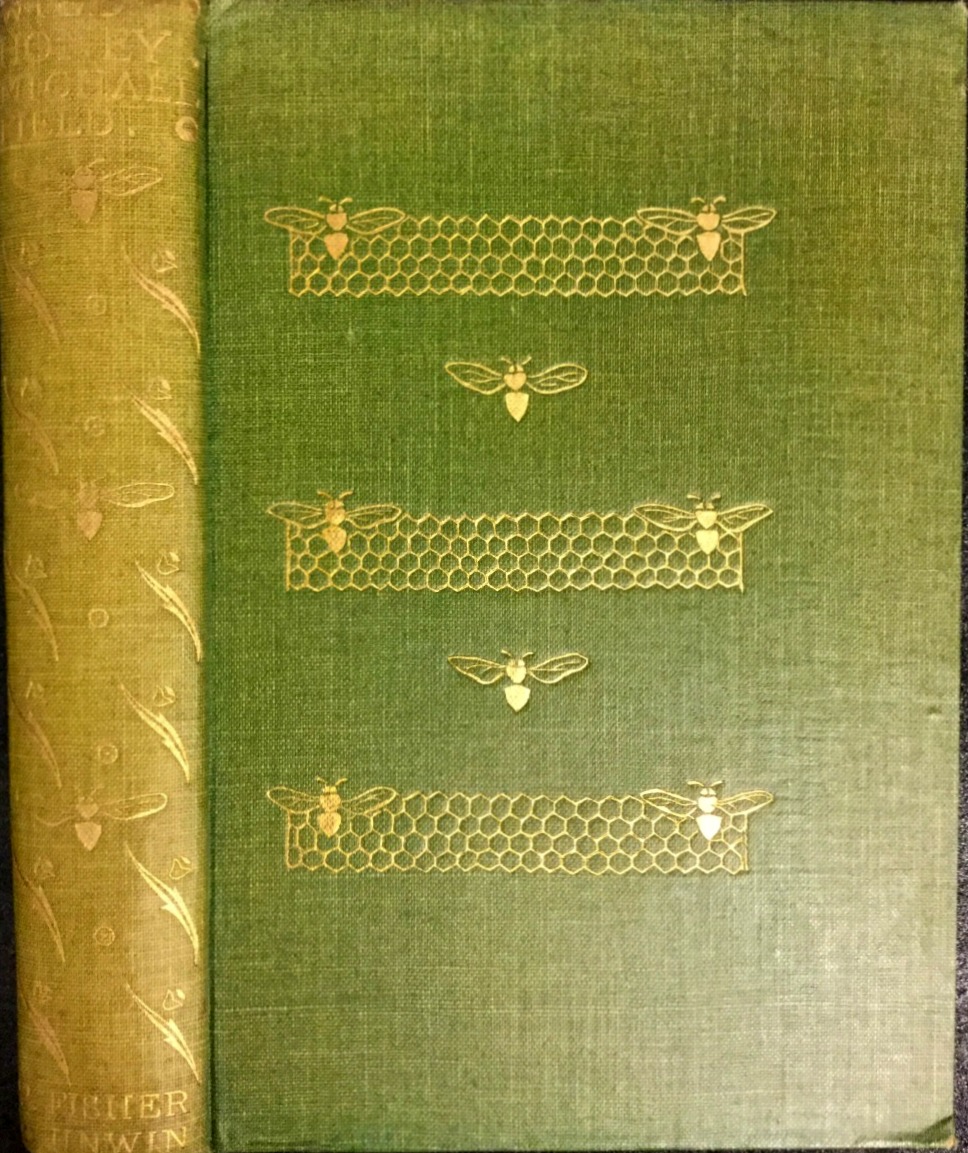
Left: D. G. Rossetti’s design for his own Poems. Middle and Right: Ricketts’s designs for the periodical The Pageant and Michael Field’s Wild Honey. [Click on images to enlarge them.]
These are eclectic productions. The simplifications generally recall the influence of Japanese design, especially woodcuts, without revealing a specific source; like so many of his artistic contemporaries, notably Albert Moore and J M Whistler, Ricketts was fascinated by Japanese art and viewed it, as they did, as an exemplar of style and sophistication (Taylor, 78). However, he undoubtedly derived his bindings for The Pageant and Wild Honey from the example of Rossetti’s book-designs. Wild Honey, with its honeycomb panels, recalls Rossetti’s composition (Tidcombe, 170) for the boards and endpapers of his Poems (1870), and the simplifications of Tess and a later book, de Tablay’s Collected Poems (1903), are echoes of Rossetti’s bindings for his sister’s Goblin Market (1862) and The Prince’s Progress (1866). Ricketts takes up and re-applies the austere linearity of these compositions, emphasising minimalism and the all-importance of pattern, space and interval.
These casing might thus be described, at least in part, as the product of typically Victorian eclecticism, borrowing which occasionally veers close to plagiarism. As Taylor explains,
[Ricketts] was a born eclectic. With complete (and in general justified) confidence in his own powers of assimilation, he accepted influences and ideas from all sorts of conceivable and inconceivable source, using them only in so far as, and only in the way that, they had any relevance to the object in hand, and discarding or drastically modifying them when their immediate usefulness ceased … [73].
Taylor eloquently explains Ricketts’s creative strategy, but his work extends well beyond the work of synthesis, the rewriting of existing codes. Though influenced by others, principally Rossetti, his bindings are more than derivative: clearly part of a discourse, he makes his own contribution too, producing work which is often radical.
New Art/Art Nouveau
Ricketts’s contribution to the development of late Victorian binding extends over several domains. Firstly, he contributes what can only be described as vividness: his covers are intense visual statements which revolutionize the timid understatement of most trade bindings of the eighties, and function as autonomous images.
His cover for J.A. Symonds’s In the Key of Blue (1893) exemplifies his robust approach. Though incorporating some naturalistic elements in the form of bluebells, the design is primarily an abstract pattern of sinuous forms which interact in a series of visual rhymes. The effect he creates is one of dynamic movement; the dominant curves to the right are counterbalanced with others curving to the left to create an interlace of swirling stems, a version of reality in which the vitality of nature is amplified. Sinuous patterns overlaid on a triple motif of stylized trees similarly animate in gilt the covers of Oscar Wilde’s Poems(1892), and in those for Thomas Chatterton’sThe Rowley Poems (1898) he combines a geometrical pattern of rose-stems with an arabesque entwining them; a song-bird punctuates the design, while the back-strip and a quarter of the boards are embellished with a triangular device. This cover is made up of wood-engraved patterns printed on paper and attached to the binding; as in the case of the work for Symonds and Wilde, the effect is one of dynamic intensity.


Rickett’s designs for three books: Left: Symonds, In the Key of Blue. Middle: Wilde, Poems. Right: Gray, Silverpoints. [Click on images to enlarge them.]
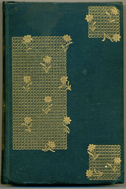
Ricketts’s bindings are perhaps even more distinctive in their emphasis on unusual arrangements, especially in the relationship between the title and the decorative surface. Titles are either worked into the design or placed in a compartment, creating a delicate balance between the pattern and the wording. In the cover for Wilde’s Poems (1891) he subordinates the lettering to the design, arranging it so as to force the viewer to decode a series of broken-up words: the process of reading, Ricketts proclaims, starts here. On other occasions he privileges the visual composition and diminishes the letters, as in his design for the front cover of Wilde’s The House of Pomegranates (1891). The most elegant solution, however, is his binding for poems by John Gray, Silverpoints (1893). Here he reduces the title-panel to a tiny oblong in the top left-hand corner; the surface of the cover is otherwise completely dominated by a sinuous repeated line punctuated by abstracted leaf forms.
This pattern fits within and enhances the narrow format, and Rickett repeatedly experiments with the dynamic of attenuated and elongated forms, a device recalling the Art Nouveau imagery of Charles Rennie Mackintosh’s patterns for furniture and graphic design, as well as linking to the Glasgow Style of another cover designer, Talwin Morris. Ricketts’s illustrations, both figurative and decorative, are typically extended, and the same treatment informs his binding for Wilde’s The Sphinx (1894). His linearity eventually translated into Art Deco, and most of his designs after 1900 are geometrical rather than organic in feeling.
.Ricketts’s Influence
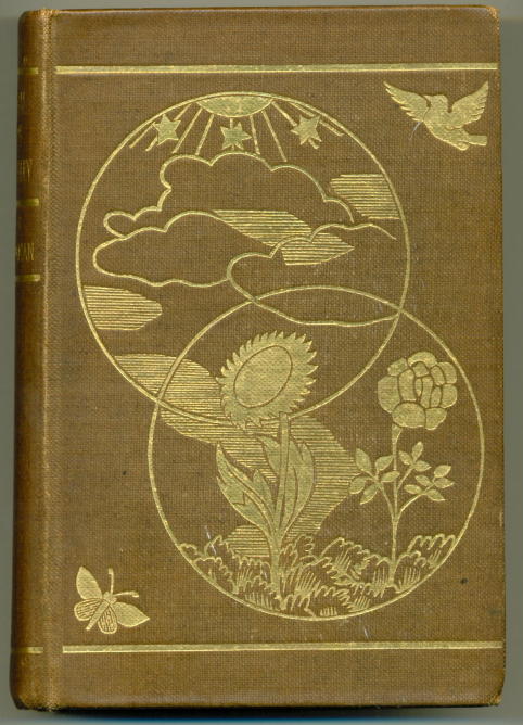
Ricketts’s cover designs were influential: published as trade bindings and available to a general audience, they were emulated by a number of contemporaries working in the same context. There is a close relationship, for example, between A. A. Turbayne’s The Life of Christ (1894) and the front cover of Ricketts’s design for Wilde’s Poems (1891). Turbayne borrows the architectural motif of the thrice-repeated trees, and as in the Poems deploys a style which is both naturalistic and heraldic, referenced to reality but converting natural forms into abstractions.
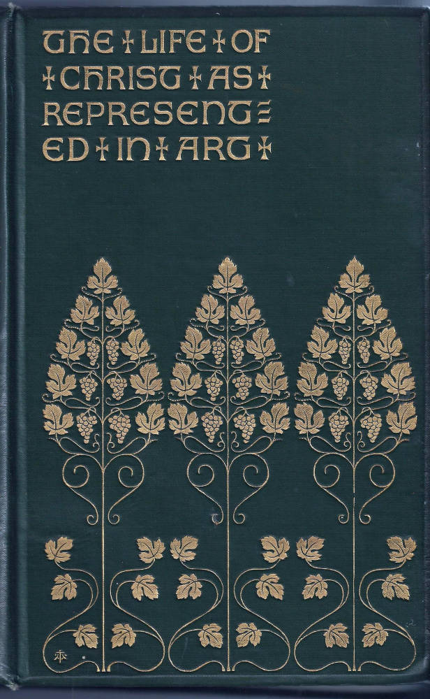
Left: Rickett’s design for Wilde, Poems. Right: Turbayne’s design for Farrar, The Life of Christ as Represented in Art. [Click on images to enlarge them.]
Laurence Housman was similarly influenced by his contemporary. The austere simplification of Ricketts’s binding for Wilde’s Picture of Dorian Gray (1891), with its descending pattern of abstracted petals, is revisited in several of Housman’s designs, and finds typical expression in his front cover for Bethlehem (1902). But Ricketts was most influential in showing how the surfaces of the boards could be animated with dynamic forms, an approach mirrored in the flamboyant gilt excess, usually presenting floral motifs, of the ‘Cranford’ and ‘Peacock’ series of the 1890s. Turbayne’s covers for Reynard the Foxn (1895) and Hugh Thomson’s Pride and Prejudice (1894) are populist versions of the elaborate pattern-making that first appears in his In the Key of Blue and elsewhere. What none of these covers recreates, however, is the poise of Ricketts’s designs, which manage to seem both delicate but overwhelmingly intense.

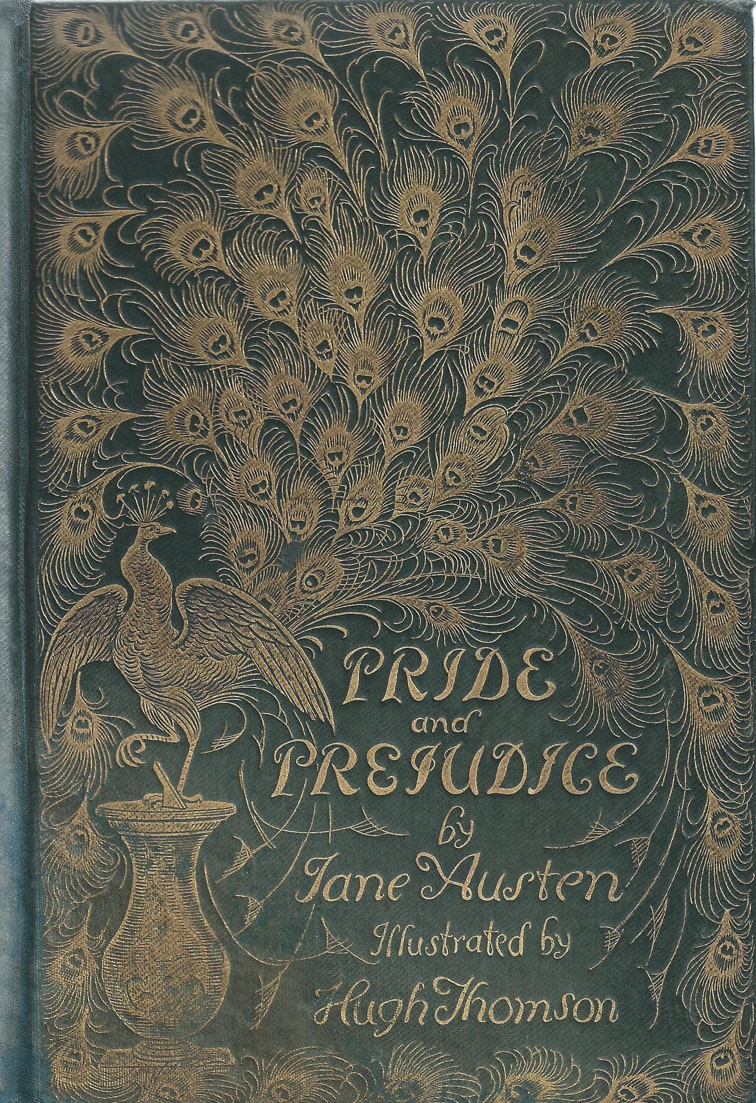
Ricketts’s book cover designs compared top those of two other artists. Left: Ricketts’s design for Symonds, In the Key of Blue. Middle: Turbayne’s design for Reynard the Fox. Right: Thomson’s design for Austen’s Pride and Prejudice. [Click on images to enlarge them.]
The Unified Book and Collaborations with Oscar Wilde
Ricketts set out to create perfect books that would integrate the interiors and the exteriors, the illustrations and additional decorative material in the form of initial letters, head and tail pieces. At the heart of these relationships is the connection between the text and the illustrations and in most cases, as Taylor explains, Ricketts managed ‘to match with almost uncanny precision’ (83) his interpretive designs and the letterpress. Bound by the discourse of Victorian illustration, Ricketts creates a close-textured relationship between the visual and verbal texts, changing his idiom to match the author’s.
More problematic, however, is the linkage between the books’ exteriors and the content of the pages; sometimes Ricketts characterizes the book efficiently in the decoration and layout of the boards, and sometimes not. Critics have argued about this issue, and it remains contentious. Writing of the design for Wilde’s Sphinx(1894), for instance, Calloway notes how the exterior ‘precisely mirrors the exquisite and perverse text’ (44). Taylor, though, is suspicious of the logic of Ricketts’s approach. In his view the elegant binding for Gray’s Silverpointsmatches its contents, but reads the cover for Lord de Tablay’s Poems as purely decorative, an example of Belgian ‘jam-tart’ style (74), and unrelated to the verse.
This issue resonates throughout Ricketts’s work and the covers for Hardy’s Tess of the D’Urbervilles (1891) exemplify its complications. Figured as two sinuous lines with abstracted honeysuckles and berries positioned on the stalks, the pattern has the elegant harmonies of Japanese prints; it has no obvious relationship to the grim fatalism of Hardy’s text, and seems to me to mislead rather than manage the reader’s expectations. Yet for Paul van Capelleveen the relationship is clear. Although he concedes there is ‘no direct link’ between the text and the flower, he argues that ‘the symbolism of the honeysuckle is one of devoted affection and of the inconstancy of love, thus reflecting the generous love and sad fate of Tess’ (191). Van Capelleveen’s source for this claim is probably Kate Greenaway’s The Language of Flowers (22). but in ascribing this meaning he does not register the instability of the floral cipher: it could symbolize Tess’s ‘affection’, but it is also a sign of dangerous sexuality and temptation, as it is in Rossetti’s Venus Verticordia (1864–8, Russell-Cotes Art Gallery, Bournemouth).


Three of Ricketts’s designs. Left: Hardy's Tess of the D'Urbervilles. Middle: Vellum backstrip and card boards for Wilde’s The Picture of Dorian Gray. Right: Wilde’s House of Pomegranates. [Click on images to enlarge them.]
Van Capelleveen similarly applies this type of ‘reading’ to the interpretation of the front cover of Wilde’s Dorian Gray (1891), which appeared in both card and paper and as a version mounted on leather. In both of these, the binding is embellished with a small cluster of plant-like forms which according to van Capelleveen represent a daisy. He goes on to decode it as a symbol of the book’s primary themes:
The daisy, of course, symbolizes purity and innocence, and the plucking if it foreshadows Dorian’s downfall … The daisy is a curiously apt symbol for the book as a whole, and Ricketts illustrated the very act of plucking the daisies: the curve of his design is composed of five or six petal, while the dots at both ends represent the heart of the flower. It seems that Ricketts [like Lord Henry] had also been … pulling it to bits, thus visualizing the novel’s dramatic events. [191]
The interpretation is ingenious, but as in the reading of Tess’scover could be challenged as over-literal.
There is some justification for this approach insofar as Wilde’s contemporaries, trained in reading the symbolic accessories appearing in paintings and illustrations, also tried to decipher bindings as systems of signs functioning within contemporary codes. However, Ricketts’s abstraction of natural forms makes even the identification of those objects a problematic issue. Searching for a clue as to the book’s meaning by scrutinizing the cover for Wilde’s The House of Pomegranates(1891) a critic writing in The Speaker in November 1891 declared himself baffled: he could not identify its meaning and he even unsure as to what the complicated pattern was supposed to depict.
We do not like the outside of the cover of Mr Oscar Wilde’s [latest book]. The Indian club with a house-painter’s brush on the top which passes muster for a peacock, and the chimney-pot hat with a sponge on top of it, which is meant to represent a basket containing a pomegranate, or a fountain, or something of that kind, are grotesque. [qtd. Barber, 327]
Wilde’s response is revealing, contradicting the idea that Ricketts’s design was ever intended to be viewed in these terms:
What I want to indicate is this: the artistic beauty of my book resides in the delicate tracing, arabesques, and massing of the many coral-red lines on a ground of white ivory, the colour-effect culminating in certain high gilt notes, and being made still more pleasurable by the overlapping band of moss-green cloth that holds the book together. [qtd. Barber, 328]
Wilde’s descriptive powers make the binding sound like an artefact made of precious materials – coral, ivory and gold – rather than paper and cloth which we can only judge today in terms of the worn copies that survive, but the point he makes is clear: it is a waste of time trying to decode the iconography or the literal representation of objects because the designer’s aim is to realize Beauty, making all judgements other than aesthetic ones redundant. As Wilde insists, ‘resemblance’ and ‘recognition’ are irrelevant; all that matters is ‘aesthetic quality’ [qtd. Barber, 328]. This attitude also reflects his belief, as noted in his response to Cobden-Sanderson’s claims for book bindings as an ‘expressive art’, that the ‘beauty of bookbinding is abstract decorative beauty. It is not, in the first instance, a mode of expression for a man's soul’ (Wilde, 104).
Wilde’s ripostes thus provide a clear definition of Ricketts’s binding as a statement of beauty and not as a coded representation of the text’s thematic concerns other than its focus on aesthetics. With that in mind it is productive to re-examine the front cover of The Picture of Dorian Gray not as a representation of the book’s daisy imagery, but as a beautiful binding that encloses a book exploring the notion of beauty. To that extent it is symbolic – but it is symbolism of a more generic type than van Capelleveen suggests.
Ricketts’s designs for Wilde’s publications all embody this notion of a beautiful binding as an appropriate frame that ‘holds the book together’ (qtd. Barber, 328). As noted earlier, the elaborate vellum covers for The Sphinx (1894) is a good fit, and the elegant cloth composition for Oscar Wilde’s Poems (1892) is a bold assertion of the super-refined. Each prepares the reader/viewer for the tone of the books’ content, an approach developed in many other bindings.
Reputation
As noted in an earlier section, Ricketts was an influential figure who borrowed eclectically from earlier contributors to the discourse of binding but created his own aesthetic. Never less than sophisticated, his covers are precious objects which promote the philosophy of Aestheticism as it was expressed in the self-referential idioms of the 1890s. Always sensuous and sometimes sensual, Ricketts’s designs embody the zeitgeist of the Decadence. Unfortunately, the fragility of many of his covers means that it is not always possible to appreciate their impact at the time of publication. Most modern copies are worn and faded, with only the finest examples commanding very high prices in the antiquarian book-market.
Ricketts’s contemporary importance was recognized by many in the nineties and the final, most appropriate words are those of Gleeson White. White is well-placed, as a critic and binding designer, to give an expert opinion. Writing in The Pageant (1896), he sums up his colleague’s achievement:
Cloth binding, but latterly a thing of horror, has suddenly become illuminated with intelligence; and for this no second name need to be coupled with that of Mr Ricketts. In his decorations for many modern book … he has set up new standards that have largely been appreciated … [qtd. Calloway, 15]
That ‘intelligence’ pervades his work and is perhaps the defining feature of this most sophisticated, and appealing, of late Victorian designers.
Related material
Books with Bindings by Ricketts, the Nineties and the Turn of the Century: a Select List of the Most Important Titles
Campion, Thomas. Fifty Songs. London: Hacon & Ricketts, 1896.
Chatterton, Thomas. The Rowley Poems. London: The Vale Press, 1898.
Field, Michael [Katherine Bradley and Edith Cooper]. Wild Honey. London: T. Fisher Unwin, 1908.
Gray, Thomas. Silverpoints. London: Elkin Matthews & John Lane, 1893.
Hardy, Thomas. A Group of Noble Dames. London: Osgood McIlvaine, 1891.
Hardy, Thomas. Life’s Little Ironies. London: Osgood McIlvaine, 1894.
Hardy, Thomas. Tess of the D’Urbervilles. 3 Vols. London: Osgood McIlvaine, 1891.
Marlowe, Christopher. Hero and Leander. London: Elkin Matthews, 1894.
The Pageant. London: Henry, 1897.
Sidney, Sir Philip. The Sonnets. London: Hacon & Ricketts, 1898.
Symonds, J. A. In the Key of Blue. London: Elkin Matthews & John Lane, 1893.
Tablay, Lord de [Warren, John Leicester]. Poems Dramatic and Lyrical. 2 Series. London: John Lane, 1893, 1895.
Vacaresco, H. The Bard of Dimbovitza. 2nd Series. London: Osgood McIlvaine, 1897.
Wilde, Oscar. The Ballad of Reading Gaol. London: Leonard Smithers, 1898.
Wilde, Oscar. A House of Pomegranates. London: Osgood McIlvaine, 1891.
[Wilde, Oscar]. An Ideal Husband. London: Leonard Smithers, 1899.
Wilde, Oscar. The Picture of Dorian Gray. London: Ward & Lock, 1891.
Wilde, Oscar. Poems. London: Elkin Matthews & John Lane, 1892.
Wilde, Oscar. The Sphinx. London: Elkin Matthews & John Lane, 1894.
Secondary Works Cited and Consulted
Barber, Giles. ‘Rossetti, Ricketts, and Some English Publishers' Bindings of the Nineties’. The Library5th Series 25 (1970): 314-30.
Calloway, Stephen. Charles Ricketts: Subtle and Fantastic Decorator. London: Thames & Hudson, 1979.
Darracott, Joseph. The World of Charles Ricketts. London: Eyre Methuen, 1980.
Frankel, Nicholas. Oscar Wilde’s Decorated Books . Ann Arbour: University of Michigan Press, 2012.
Greenaway, Kate.The Language of Flowers. London: Routledge, 1884.
Haslam, Malcolm. Arts and Crafts Book Covers. Shepton Beauchamp: Richard Dennis, 2012.
Taylor, John Russell. The Art Nouveau Book in Britain. London: Methuen, 1966; revd. ed., 1980.
Tidcombe, Marianne. ‘The Development of Modern Design in British Bookbinding’. The Private Library Fifth Series 1:4 (Winter, 1998): 146–185.
van Capelleveen, Paul. ‘Butterfly, Abstraction or Flower? Another Look at Charles Ricketts’ The Picture of Dorian Gray’. The Private Library Fifth Series 1:4 (Winter, 1998): 186–192.
Wilde, Oscar. ‘Beauties of Book Binding’. Pall Mall Gazette (November 23, 1888). Reproduced in The Complete Works of Oscar Wilde. Vol. 6. New York: Bigelow, 1909, 103–4.
Wood, Esther. ‘British Trade Book Bindings and their Designers’. The Winter Number of The Studio, 1899–1900, 3–37.
Last modified 20 August 2018